
The frame lingers—not for show, but to let something deeper register. Light enters gradually, softening the edges, revealing details you weren’t looking for but now can’t unsee. There’s a quiet before the movement, a stillness that feels intentional. Nothing rushes. The transition doesn’t call attention to itself. It simply unfolds, as if the design already knows what it needs to become. You’re not just watching. You’re inside it—carried by rhythm, held by atmosphere.
This kind of emotional clarity defines the work of Jiani Hong, a visual and motion designer based in Los Angeles. Her practice merges 2D/3D animation, film-inspired design, and emotional storytelling into visual systems that don’t just move—they remember. Her frames breathe with intention. Her compositions hold tension. And across every medium, she works with a kind of authorship that prioritizes resonance over spectacle.
To understand her process is to understand how rhythm, light, and feeling become the structure, not the surface, of design.
How Cinema Shaped Her Lens
Jiani Hong’s relationship with motion began in movie theaters, where light flickers shaped her understanding of time, emotion, and silence. “There’s a rhythm in the pause before a line is delivered,” she says. Those early moments now guide how she designs: not just with visuals, but with breath, tension, and pacing.
While earning her BFA in Graphic Design at ArtCenter College of Design, she developed a hybrid practice of narrative design, emotional tone, and cinematic precision.
“I don’t treat motion as an afterthought,” she explains. “It’s the structure I build everything on.”
Motion as Memory
Jiani’s independent projects distill her creative intent—they are self-directed, concept-driven, and led by emotion, and motion serves as narrative, not ornament.
Amoeba Music Rebrand: Reimagining Cultural Memory
When rebranding Amoeba Music, California’s iconic independent record store, Jiani approached the project as a restoration, not a redesign. The goal wasn’t just to update assets but to interpret a living cultural history archive through contemporary visual language.
She designed the whole brand identity system, including brand identity film, logo design, posters, signage, print collateral, and a digital platform. The identity system merges retro aesthetics with bold typography and layered compositions, channeling both the analog soul and community energy of Amoeba’s legacy.
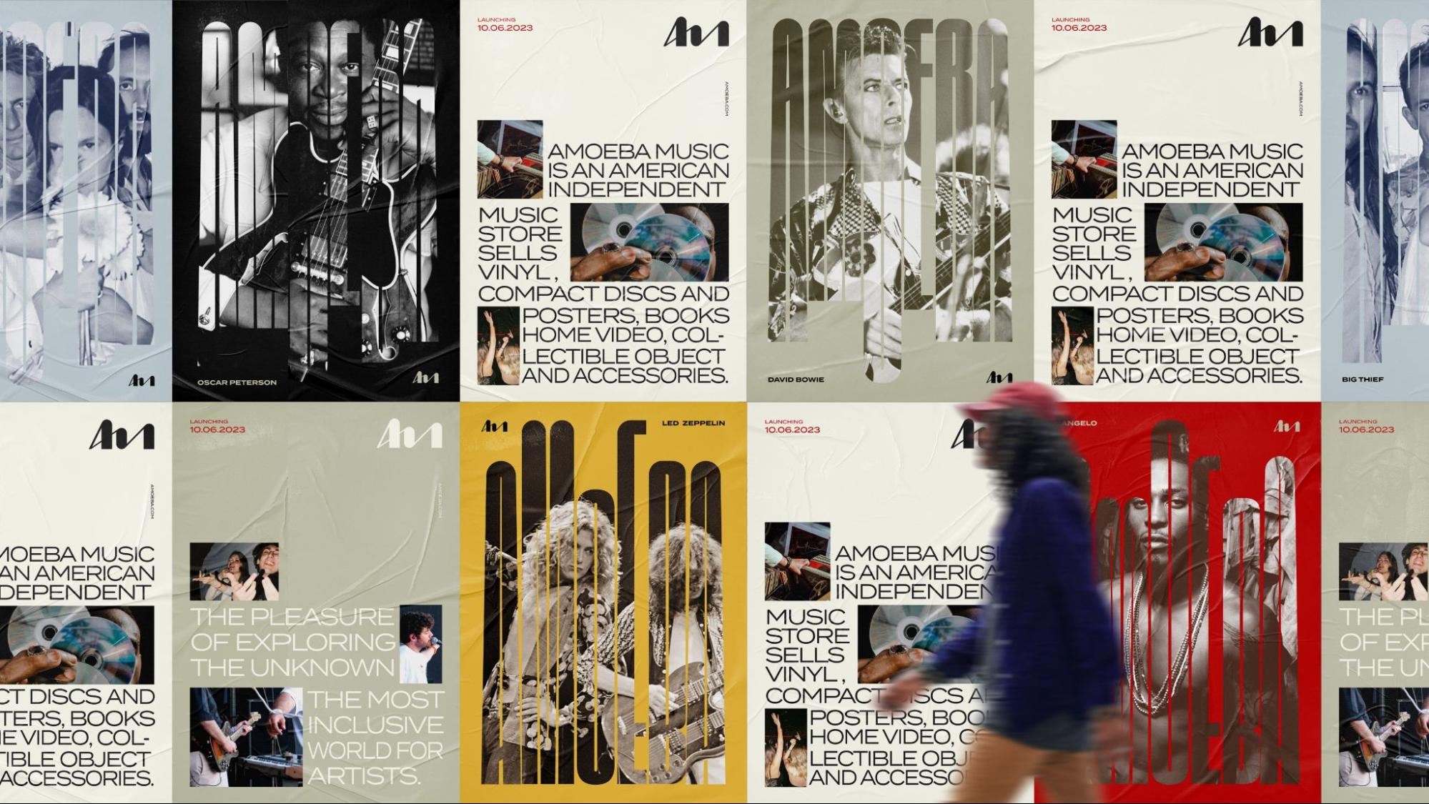
Image courtesy of Jiani Hong
The color palette was grounded in contrast: Venetian reds convey rhythmic passion, capturing the emotional impact of live performance. Beige shades allude to Golden Years and Highlight Moments, providing a sense of warmth and balance. The gray-black tone reflects Vinyl Memory, grounding the palette with material depth. Secondary accents—nostalgic blue and vibrant yellow—enhance the overall rhythm and cultural resonance. Motion plays a central role. Her transitions aren’t just effects—they simulate flipping through records, scanning posters, and catching movement from the corner of your eye in a crowded store.
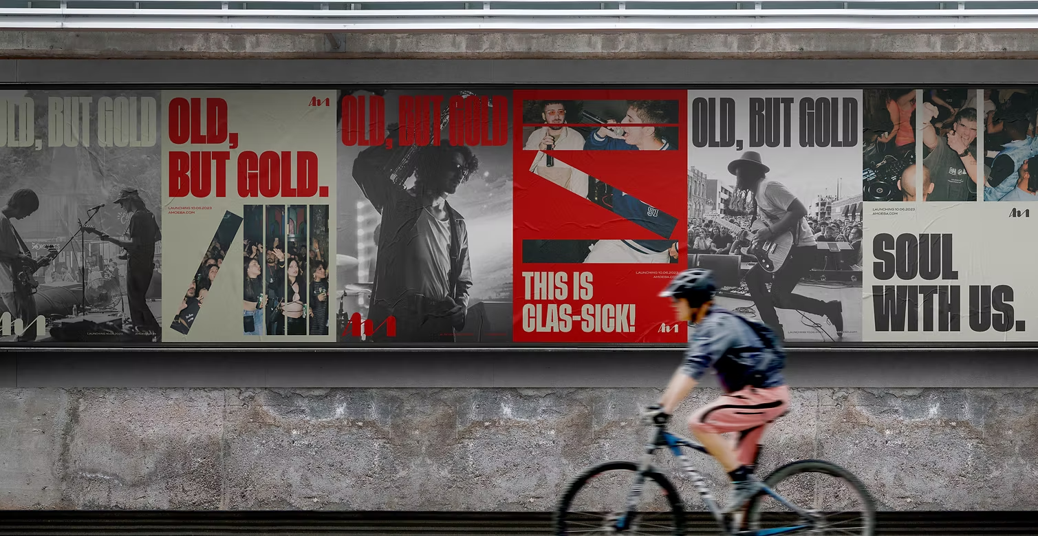
Image courtesy of Jiani Hong
The result feels like rediscovery: familiar but recharged. It captures physical media’s tactile and emotional nature in a digital-forward design. This project earned awards from Communication Arts, Young Ones TDC, Core77, and Graphis New Talent—affirming its ability to resonate beyond nostalgia and into relevance.
Dead Poets Society Title Sequence: Framing the Intangible
Inspired by the emotional weight of Dead Poets Society, Jiani created a cinematic title sequence that reframes the film’s tone through animated visual storytelling. This wasn’t an homage. It was a retranslation—rebuilding the film’s core themes of longing, rebellion, and reflection through design.
Jiani directed every stage: storyboarding, visual development, 2D and 3D animation, lighting, and scene composition. Each frame was treated as a miniature film set, intentionally using shadow, space, and light to mirror the characters’ internal landscapes.
Typography was used sparingly, allowing silence and image to lead. Motion design here serves as emotional pacing, guiding the viewer not through exposition, but intuition. The sequence earned recognition from Communication Arts for its cinematic execution and narrative sensitivity.
Leading with Vision
Jiani Hong’s storytelling carries into her professional work as a Motion Art Director at Petrol Advertising, where she led motion graphics in campaigns for major game and entertainment properties. Her motion direction and concept development have shaped trailers and visual assets for projects including Squid Game: Unleashed (Netflix), Call of Duty: Black Ops 6 (Activision), Dragon Ball: Sparking Zero (Bandai Namco), Additional work for Bethesda and Tripwire Interactive.
Jiani maintains a focused approach in high-speed pipelines: every movement must have purpose. Even within a few seconds, she constructs arcs with intentional framing, emotional beats, and visual rhythm.
The Way It Moves
For Jiani Hong, design starts with timing. Before color or type, she considers how a moment should land—abrupt or gentle, held or released. Motion design isn’t decoration; it’s how she structures memory.
Lighting becomes tone. Transitions guide emotion. “I want the work to be felt before it’s understood,” she says. “Design should stay with you.”
As motion expands into immersive platforms, Hong continues to build experiences where narrative and interaction overlap. Whether shaping a brand identity or crafting a title sequence, her focus stays constant: to create motion that carries meaning.
To explore more of Jiani Hong’s work, including her cinematic design projects and visual identity systems, visit her website.
