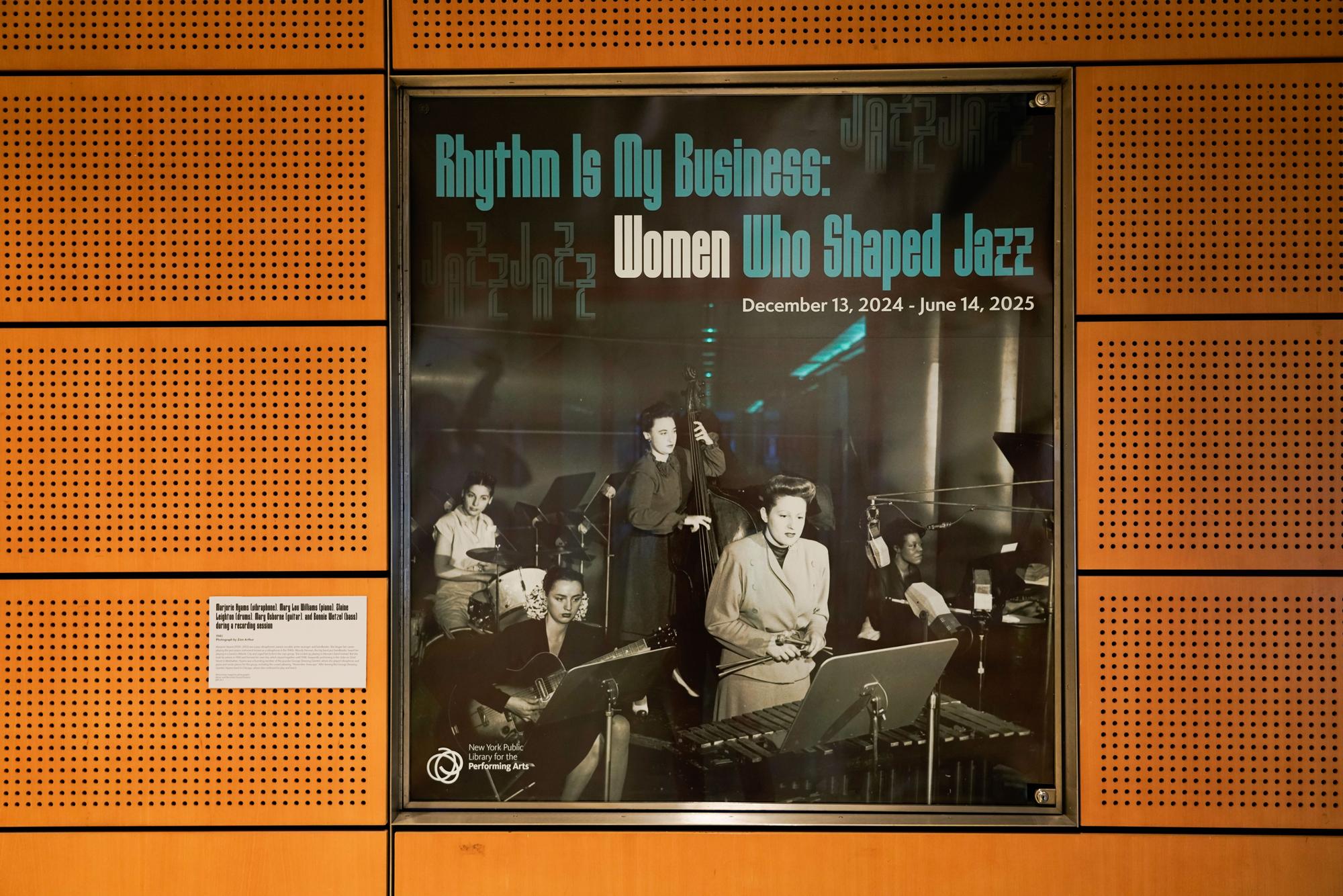
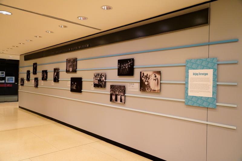
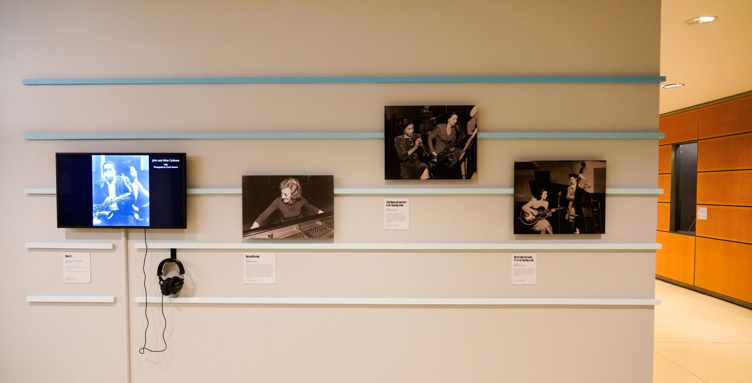
At the New York Public Library for the Performing Arts, the exhibition Women Who Shaped Jazz, on view in the Plaza Corridor Gallery, honors the artists whose work shaped the sound and spirit of the music, voices that have always been here but rarely heard at the center.
Jazz is a music of presence. It lives in the moment of its creation, in the breath that precedes a phrase, in the energy exchanged between performers who listen as closely as they play. It is music that thrives in openness and responsiveness. However, the stories told about jazz have not always reflected that same openness. Many of the women who shaped this music at crucial moments have often been included in history only as side notes, background voices, or exceptional anomalies. This exhibition brings them back into the center. It acknowledges that their work did not sit alongside jazz. It formed jazz.
The exhibition design for Rhythm is My Business, created by Ming Cheng, grew from an understanding that the project was not only graphic in nature. It was a matter of how history would be encountered by the public. The challenge was how to create a visual language that supports the recognition of these women without flattening them into symbols or reintroducing the hierarchy that had obscured them in the first place.

The design process began with an attentive study of sound. Recordings featured in the exhibition, drawn from both studio sessions and live broadcasts where applause is faint but intimacy palpable, are used as reference material. Through this listening, patterns of phrasing, pauses, and sustained notes informed the rhythm and pacing of the visual system. The approach recognized that jazz often moves forward through the expansion of time rather than speed, and this principle guided the formation of the exhibition’s identity. Structure and meaning unfold at a deliberate pace, echoing the temporal quality of the music itself.
This approach led to a visual identity built around the spacing, rhythm, and pacing of text. Instead of treating typography as static messaging, the design considers typography as performance. The shape of a word on a page can slow the reader or let them glide. A line break can mimic the intake of breath before a vocal riff. Vertical arrangements suggest the height of a phrase rising, while generous margins give space for interpretations. The viewer is not rushed. The design allows them to arrive at meaning gradually, in their own time. The slower the reading, the more presence the viewer brings.
Color plays an equally intentional role. The palette draws from photographic archives depicting rehearsal rooms, club interiors, and after-hours spaces where musicians gathered away from the spotlight. The final palette includes a measured blue with restrained saturation. In the context of jazz, blue has long functioned not as a symbol but as an emotional register. The term “blue notes” refers to the subtle bending of pitch, a shift from the expected tone that conveys intimacy and vulnerability. Within the exhibition, the color carries associations of memory and reflection, encouraging a slower, more contemplative form of looking. Through the visual system, blue becomes an environment that holds the work of these artists with respect.

The New York Public Library for the Performing Arts provides the proper context for the cultural approach. As a public institution charged with holding culture in trust for everyone, the Library requires design that is clear and generous. It cannot be authoritarian. It cannot lecture. It must offer space for discovery.
The design team worked across curatorial, archival, fabrication, and administrative departments to understand how the exhibition would be experienced. The identity needed to speak clearly to visitors who might walk in by chance, and also offer nuance to scholars, musicians, students, and artists who come with existing knowledge. A public cultural institution is not a museum of static objects. It is a place where learning is ongoing, and understanding is layered.
The artists highlighted in this exhibition each carried a world of influence. Billie Holiday changed the emotional vocabulary of singing. Mary Lou Williams shaped generations of musicians through composition, mentorship, and arrangement. Melba Liston developed horn arrangements that remain foundational to jazz orchestration. Ella Fitzgerald created a standard of vocal clarity and improvisation that remains unmatched. Betty Carter redefined the dynamics of phrasing and breath. Toshiko Akiyoshi built an entire orchestra around a personal vision that expanded the identity of jazz beyond national borders. These women did not simply participate. They created directions.
Their stories also contain realities of exclusion, restricted opportunity, and the need to sustain artistic conviction in environments that did not always welcome them. Part of designing this exhibition meant acknowledging these complexities while not reducing these women to struggle narratives. The design honors their musicianship, leadership, intellectual rigor, and cultural influence. Their resilience is understood through their work, not imposed as a summary of their identities.

The location of this exhibition in the heart of Lincoln Center carries a particular cultural significance. As a symbolic center of American performing arts history, Lincoln Center provides a visibility that integrates the contributions of these women into the ongoing cultural life of the city. Visitors may come to hear the Philharmonic, to attend jazz performances, to see ballet, to study in the Library, or simply to walk through the plaza. They encounter the exhibition in a shared public space where it does not call attention to itself, but remains present as part of the everyday movement through the site.
As the visual identity extended into banners, exterior signage, interior graphics, print materials, and digital communication, the intention was to maintain clarity and dignity. The work seeks to be seen, but not through force. The presence acknowledges the artists rather than speaking over them.
Design in this context becomes an act of cultural care. It supports visibility without imposing narrative. It allows history to breathe. It provides room for the viewer to realize something for themselves. When visitors say the names of these women out loud in conversation, when they recall a lyric or a phrase, when they go home and look up a recording they had never heard before, the exhibition is continuing to do its work.
Jazz is not finished. It is still being made, reinterpreted, and lived. The musicians are not figures of the past. They remain active through influence, transmission, memory, and sound. Their rhythm continues in females who learn from them, in listeners who find resonance in their voices, and in cultural spaces that honor their presence. This exhibition is one way of making sure that their rhythm continues to be heard. It invites the visitor to slow down, to look closely, to listen with intention. It brings forward what has always been there.
Design Lead: Ming Cheng
Art Direction: Caitlin Whittington
Spatial Designer: Christine Rung

