
In an age saturated with images—where speed, spectacle, and immediacy dominate visual culture—award winning designer Eleanor Shuxuan Yang’s work asks a quieter, more unsettling question: what is it that we do not see, yet constantly feel? Moving between motion design and typography, Yang constructs visual systems that do not merely present form, but reveal the structures beneath perception itself. Her practice resists the impulse toward excess, instead turning to absence, balance, and transformation as primary agents of meaning. In works such as Apres and Vessel, she challenges the viewer to reconsider whether meaning resides in what is shown—or in what is withheld, implied, and allowed to emerge.
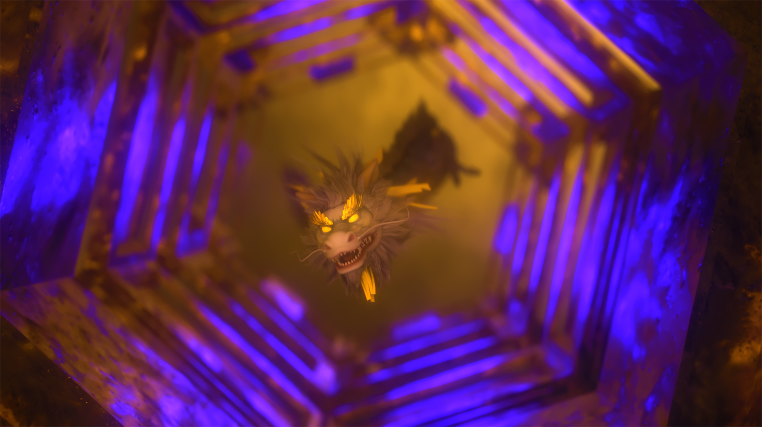
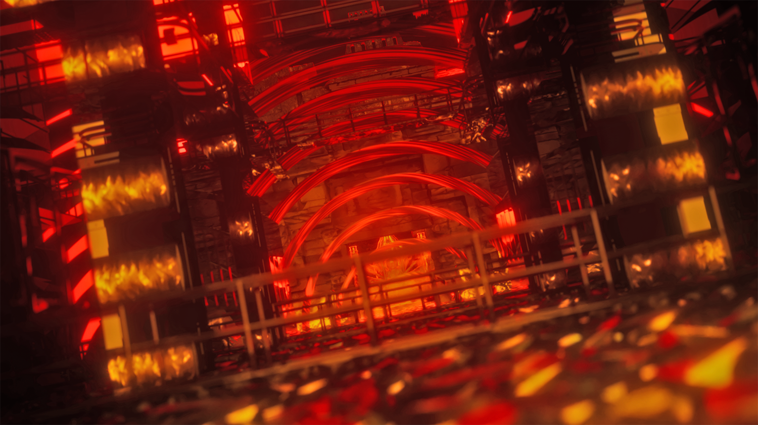
Apres reflects on uncertainty and resilience through a visual language shaped by memory, atmosphere, and gradual transformation. The project draws on visual experiences that informed Yang’s early sensibility in Beijing, including the saturated reds of Peking opera costumes, the symmetry of courtyard architecture, the flicker of lantern light during festivals, and the deliberate use of negative space in ink wash painting. These influences do not appear as quotation or ornament. They shape the work’s underlying logic, particularly its understanding of contrast as balance.
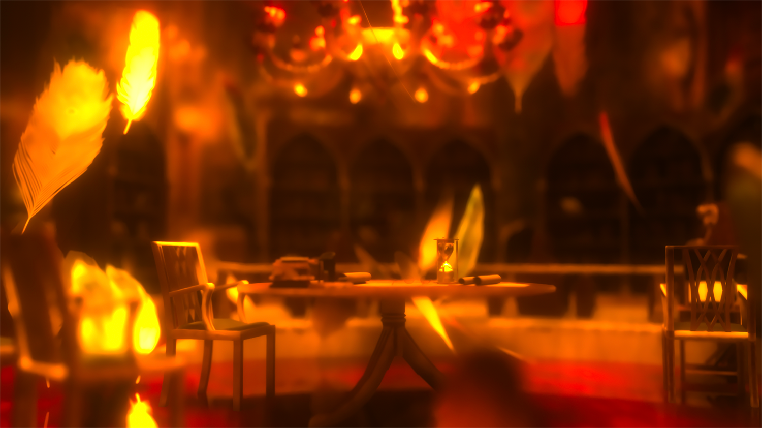
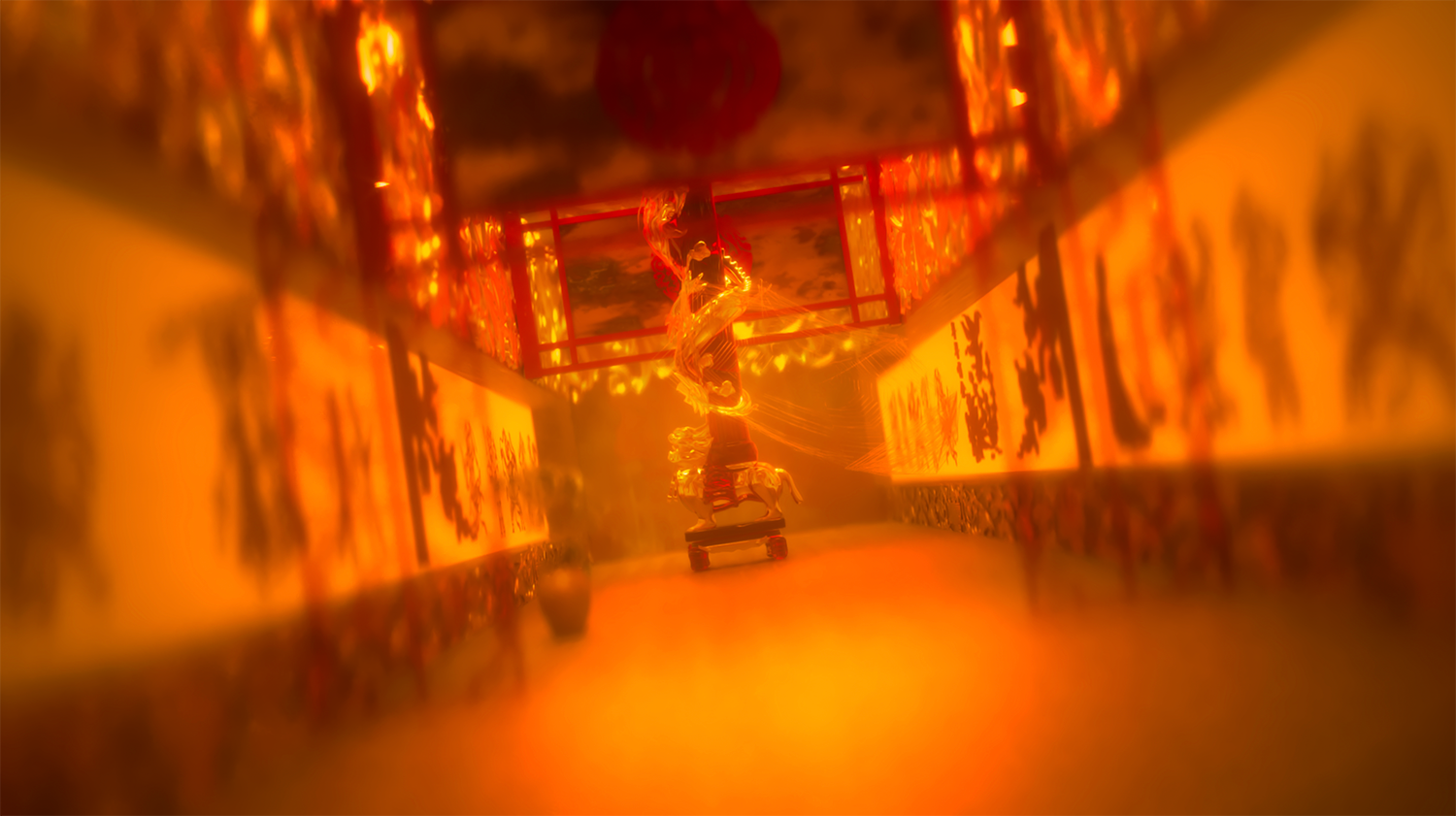
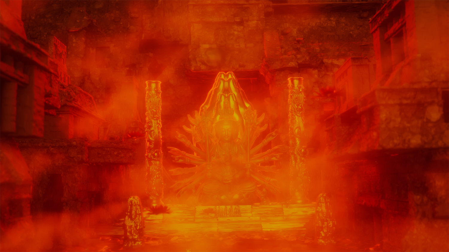

That logic is reinforced through the project’s engagement with traditional shadow puppetry, or piyingxi, in which narrative unfolds through silhouettes projected onto illuminated fabric. Because the puppeteer remains unseen while the figure becomes visible, the form provides Yang with a clear metaphor for cultural inheritance. Identity, in this framework, is shaped not only by what can be directly seen, but also by structures of transmission that operate quietly and persist over time.
In Apres, figures emerge as layered silhouettes before dissolving into abstraction. Ink-like textures move into digital gradients, and shadows extend and recede through soft light. These formal choices give the work its emotional rhythm. Transformation is presented not as rupture, but as a gradual process in which instability, darkness, and change remain part of a continuous movement forward.
The project is also informed by Daoist ideas of balance and cyclical movement. Within this framework, light and shadow, like yin and yang, are complementary forces. Difficulty is not separate from growth, but part of its condition. This perspective shapes the work’s treatment of hardship, which is not dramatized as spectacle but understood as a necessary passage within renewal. The emotional force of Apres lies in this quiet conception of courage: persistence without certainty, and movement without full resolution.
Awarded Bronze in Mixed Media at the 2025 Indigo Design Awards, Apres shows how motion can function as a contemporary visual language for inherited philosophical ideas.
If Apres is concerned with shadow, Vessel turns to emptiness. Inspired by Lao Tzu’s line from the Tao Te Ching, “The emptiness inside is what shapes the vessel,” the typeface examines how absence defines function. A bowl is useful because of its hollow interior, and a room is inhabitable because of its open space. Yang extends this proposition into typography, asking how interior space, spacing, and restraint shape the way form is perceived and used.
This philosophical interest is closely tied to her engagement with Daoist thought, which values balance, flow, and restraint. In a visual culture marked by saturation and informational excess, Vessel returns to the idea that emptiness is not lack, but capacity. The typeface develops this argument through its formal construction. Its serif letterforms are carefully weighted, with measured contrast and gentle curves that create stability without heaviness. The counters are intentionally generous, allowing interior space to remain active, while the spacing between letters creates pause and openness within the line.
In Vessel, typography becomes a way of thinking about perception itself. Yang has reflected on whether we notice the cup or only the water it holds. The question is simple, but it points to a larger design principle: viewers often focus on message and image, while overlooking the structures that shape how meaning is received. In this work, spacing, margins, and negative space are not secondary elements. They determine rhythm, attention, and the movement of reading.
The accompanying posters extend this idea through bold structural grids interrupted by large fields of negative space. The tagline, “Designed to Be Filled,” presents the typeface through openness and space, inviting meaning to unfold within it. Winner of Gold in Typography at the 2025 Indigo Design Awards, Vessel argues that restraint can be an active design principle and that emptiness can function as a meaningful form.
Apres and Vessel make clear that Yang’s work is grounded in a consistent intellectual and cultural framework. Across motion and typography alike, she is concerned with how design holds meaning through balance, contrast, restraint, and the structuring role of what remains unseen. At a time when visual culture is often shaped by speed, saturation, and constant assertion, Yang’s work takes a more deliberate position. It uses animation to examine resilience and typography to examine contemplation. Across both, design becomes a way of thinking about how uncertainty is inhabited and how meaning is made through space as much as through form.
