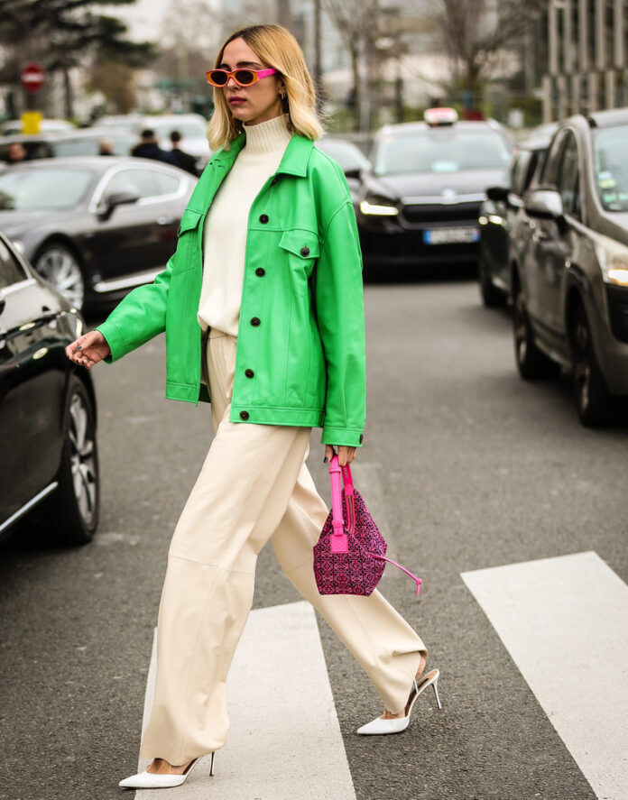
Soft transitions and neutral combinations are out. Color theory thrives on edges, contrast and intent, the streets don’t care about pastel matches and neither should you. We’re breaking down three basic color wheel tricks stylists use to make each piece feel like it’s in dialogue with the next, never competing, always loud. Consider this your invitation to throw a little chaos into your wardrobe, and actually make it work.
Contrast Is King
Opposites attract, no metaphor needed. Think steel blue vs burnt orange, they shouldn’t work but they do, and the key is proportions. Grab two colors that sit opposite on the wheel, pick the anchor shade and let the other cut through, just enough to feel intentional. One should be loud and the other should be subtle, and suddenly you’re wearing color, contrast and balance.
Next-Door Hues
But you don’t always need tension to make it work, after contrast comes calm. When shades sit side by side on the wheel, the transition feels natural and needed, like coral bleeding into rose and blue melting into green. Just stay in the same temperature, switch up the fabrics and let it read as one long thought instead of a conversation.
Three’s The Power
Sometimes, two just aren’t enough. Pick three shades evenly spaced around the wheel and assign roles. Dominant, support and accent is your fast pass to a bold outfit. Let the silhouettes, layering, textures and accessories argue a little, until its all tied together into one statement look, chaos optional.
View this post on Instagram
Mix opposites, slide neighbors, roll with a trio, whatever makes you look like you know exactly what you’re doing. Color isn’t a rulebook, the wheel is here to inspire, not box you in. Wear it, bend it, break it, just let it land where it wants to and it’s going to feel right.

