
For a group bent on subverting the expectations of what it means to be a rock band by spreading the message of love and kindness, IDLES’ music sure does sound like the equivalent of getting hit in the face. That was certainly the case with their relentlessly ferocious 2017 debut, Brutalism, and their sound lost none of its visceral impact with the release of its critically acclaimed follow-up, Joy as an Act of Resistance, a year later, even as it saw frontman Joe Talbot and company wearing their heart more prominently on their sleeves. Continuing to embrace vulnerability and self-acceptance as they expand their sound and build their reach, the cover artwork for their brand new album, Ultra Mono, out now via Partisan, seems to embody the bracing energy of the group, that in-your-face directness that gives it much of its appeal, while also underlining the approach they’ve taken when it comes to dealing with haters they’ve picked up along the way: as Talbot deadpans towards the end of the album, “Fuck you, I’m a lover.”
For the latest instalment of our Behind the Artwork series, we interviewed Russell Oliver about meeting Joe Talbot, how their political differences inspired their first collaboration for the single ‘Mercedes Marxist’, and the process of creating the cover artwork for Ultra Mono.
Your first collaboration with IDLES was for ‘Mercedes Marxist’. How did that come about?
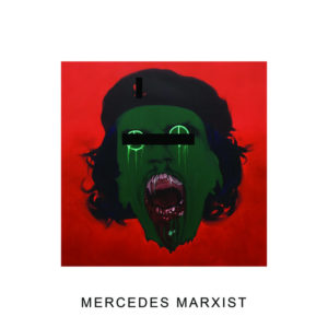
I had met Joe a few years before IDLES released their debut album Brutalism. Soon after, he would often mention that he had been keeping me in mind for future IDLES projects, as he was impressed by the paintings I had been producing. Joe would later conceive of a charity project wherein each track from the band’s second album, Joy as an Act of Resistance, would be assigned an artist to produce an original artwork to be auctioned-off with all proceeds going to The Samaritans. The artworks would also be reproduced in the limited edition deluxe LP as double-sided prints. Even though ‘Mercedes Marxist’ was dropped from the album before release, my contribution was included in both the charity auction and deluxe LP. Later, ‘Mercedes Marxist’ would be released as a single featuring a censored version of my painting due to its use of copyright/trademarked corporate logos, I believe.
You’ve mentioned that you and Joe Talbot have some political differences, which is part of what makes ‘Mercedes Marxist’ interesting. How did the discussions you had with Joe inform your approach to the painting?
On meeting, Joe and I quickly realised that we were (and remain) on opposite sides of the political spectrum – with Joe firmly on the Left, and myself of the Right. There has never been any animosity when discussing issues of the day, and even though we often disagree – we enjoy the conversation. Perhaps that’s why Joe asked me to produce a painting for ‘Mercedes Marxist’ as the song, Joe had explained, expressed his inner turmoil as a “lapsed Marxist” and anti-capitalist, who, on occasion, engages in frivolous consumerism – specifically his unquenchable thirst for expensive trainers. Joe left any concept for the painting completely in my hands. I could produce anything I saw fit – total artistic freedom. As IDLES often like to play with clichés lyrically, my finished painting employed Marxist cliché poster-boy Che Guevara, mixed with the screaming and melting Nazi face from the climax of Raiders of the Lost Ark – a portrayal of ideological meltdown, green with shame-induced sickness and of capital (money). The background “revolutionary” red and green clash in opposition (as on the colour wheel). The eyes became the titular Mercedes insignia, and Che’s beret sported a Nike and Apple corporate skull and crossbones configuration in a clash of ideology, principals and values.
Working with IDLES again on Ultra Mono, what were some of the initial ideas for the album’s cover artwork, and how did they evolve over time?
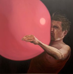
The concept for Ultra Mono‘s cover art was entirely Joe’s. He’d assured me many times that he wanted an album cover from me, and knowing that I’m a versatile painter, also perceived that I could deliver something radically different stylistically from the ‘Mercedes Marxist’ work. Joe knew exactly what he wanted – a shirtless guy, arms by his sides, defenceless, being hit in the face by a bright candy-pink ball – but could I “do it in the style of Italian master Caravaggio?” – and that remained the brief throughout.
How do you feel that the painting relates to the themes of the album as a whole?
The painting – or the concept behind the painting – relates to Joe and the band’s ideal of unconditional love and acceptance for all, including their critics, or political opposition, or for other bands who may have positioned themselves as “rivals” or adversarial. The large pink ball (Joe’s favourite colour) represents this unstoppable and unavoidable ideal of love and acceptance colliding forcefully with such an opponent – to “Kill Them With Kindness” (Track 5 on Ultra Mono).
Could you talk us through the process of actually making the painting? Did you have to make any significant changes before it reached its final form?
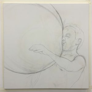
With the concept understood, I had to first collect source material to work from which included boxers being punched, for facial impact reference, and guys taking a football to the face, and many balls and spheres for light references. The first problem I encountered was, that when Joe had said “ball” he hadn’t specified a huge ball, and I had presumed by ball he’d meant football-sized ball. I’d already sketched the scene on to the canvas but luckily thought to consult Joe before going ahead with the oil paint. “Ah” he said, “the ball needs to be much, much bigger – taking up most of the canvas,…sorry” – so it was back to the drawing board, because increasing the size of the ball dramatically changes the physics or dynamics of the impact on it’s “victim”.
I also anticipated that too much pink ball would be visually uninteresting and so I sort to have that dominant space interrupted by having the “victim’s” arm raised across the ball, as he’s knocked back off balance. I used a footballer heading a football, arms raised for balance, and combined that with another footballer taking a hard and fast football to the face. I also had my twin brother Ryan pose identically and under strong lighting in the Caravaggio style, so I could fill in the blanks anatomically, as the footballers were not shirtless, and also to achieve the required lighting conditions.
I devoted myself solely to the painting for over a month of toil with the brush, solving unforeseen problems along the way, as is quite normal. When I thought I had finished, I messaged Joe a photo – one problem – the ball was a far too dark, hot pink for his liking, and so I had to repaint the ball completely, which seemed a daunting task. In the end though the ball worked out much better than the first attempt. Joe still tweaked the colour in post for the album cover – I don’t think he’d have been completely satisfied unless he’d mixed the paint himself – He was after something very specific that only he could pinpoint.
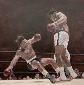
I see some similarities between this work and your painting ‘The Flight/The Fall’, except that ‘Ultra Mono’ focuses closely on the moment of impact. Do you see those two pieces as being in any way related?
They’re defiantly depictions of conflict and collision, a single moment captured in the midst of fracas. When seen together, they seem to inform one another, because they depict different stages of a vanquishing, separated by mere seconds. I had been keeping Joe updated with each painting coming out of my studio, and when I showed him ‘The Flight/The Fall’ he immediately said that the painting wasn’t a million miles from what he had in mind for the album that would become Ultra Mono. Also, ‘The Flight/The Fall’ probably convinced Joe that I could pull-off what he envisioned.
What would you say you’ve learned from this experience, both creatively and when it comes to working with artists in a different field?
I had a fairly tight deadline to meet, but I work best under pressure – you have to solve problems on the fly and really knuckle down – you have to “live and breathe” the painting, it’s a bit like a dream. Painting the album cover for Ultra Mono was a great experience. It’s a joy to be tasked with bringing another talented artist’s vision to life, especially for a friend, and an honour to be given that responsibility. What’s fantastic about producing an album cover for a hugely popular band, as an artist, is that my painting is going to be seen infinitely more widely than any of my previous work and in print form at least, be owned and hopefully enjoyed by thousands and thousands of people around the world – that’s a real buzz.
Find more work by Russell Oliver here.
