
Over the past two decades, Dave Thomas, a graphic designer and illustrator who creates under the alias dlt, has helped build the visual language around some of the most successful and influential bands in alternative music. The impressive range of his work can partly be attributed to his early connection with FatCat, the English independent label that was founded in 1997 and whose output spans various genres, from experimental rock to electronica. After moving to Brighton to study illustration, Thomas wanted to avoid being pushed down a path as an illustrator where he would have to be defined by a specific style, and was more interested in engaging with the ideas around a project. He always had a love for music, gravitating to punk and indie at an early age, and figured he could try combining his two interests. He sent his work to pretty much every record label he knew, but didn’t receive any positive responses. One day, about a year after he’d finished university, he walked into a record shop: FatCat had just moved from London to Brighton in 2001 and was looking for an office junior. Even though it wasn’t immediately related to his field, he took the opportunity.
Thomas was already familiar with some of the bands the label represented, like Sigur Rós and múm, and got to work with the latter. Even though these acts were gaining plenty of traction around that time, it was still a relatively small label, and he was able to gradually take on more responsibilities. As he became more involved with the packaging and visuals for each release, he got to work with bands like The Twilight Sad from day one, building long-term relationships that have lasted until today. He worked closely with the late Frightened Rabbit frontman Scott Hutchison on the artwork for every album since their debut, and was involved in every record Vashti Bunyan put out in the second phase of her career. With the establishment of the FatCat imprint 130701, a home for post-classical music, he got to collaborate with the likes of Max Richter and Hauschka over multiple records.
Since going freelance around 2005, Thomas has retained his relationship with the label and some of the acts that have been associated with it, including We Were Promised Jetpacks, Mice Parade, and Gregory and the Hawk. One of his biggest projects came with Mogwai’s 2006 record Mr Beast, which has led to many collaborations with the band in the years since. He’s had the opportunity of working with different kinds of artists, helping to mark the sounds and storytelling of Agnes Obel, Tom Brosseau, and David Karston Daniels in visual terms. This year alone has seen Thomas reuniting with We Were Promised Jetpacks for their latest LP, creating the striking cover for Mogwai’s first UK No. 1 album, and conceiving an illustrated lyric book in tribute to Hutchison.
Over two extensive Zoom conversations, we talked to Dave Thomas about the story behind many of the albums he’s worked on, from Giddy Motors’ acclaimed 2002 record Make It Pop to Mogwai’s As the Love Continues. Although his work varies from project to project, the artistic philosophy that drives much of it remains largely the same: Thomas sees the process of creating album artwork primarily as a vehicle for the music, but uses it as a means of exploring his creativity when the job calls for it. Whether responsible for the illustration or assisting in the layout and design, his focus is set on ensuring the visual world of an album ties into its sonic qualities in a way that is immersive and imaginative. He is drawn to analog techniques and working around real, physical objects, but is capable of breaking boundaries when translating them into a digital space. And whether his contributions are subtle or eye-catching, they offer a portal to the music we have come – or have yet – to love.
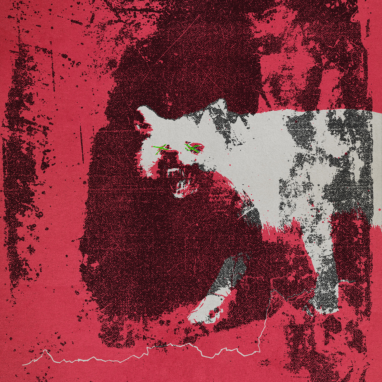
Giddy Motors
Make It Pop (2002)
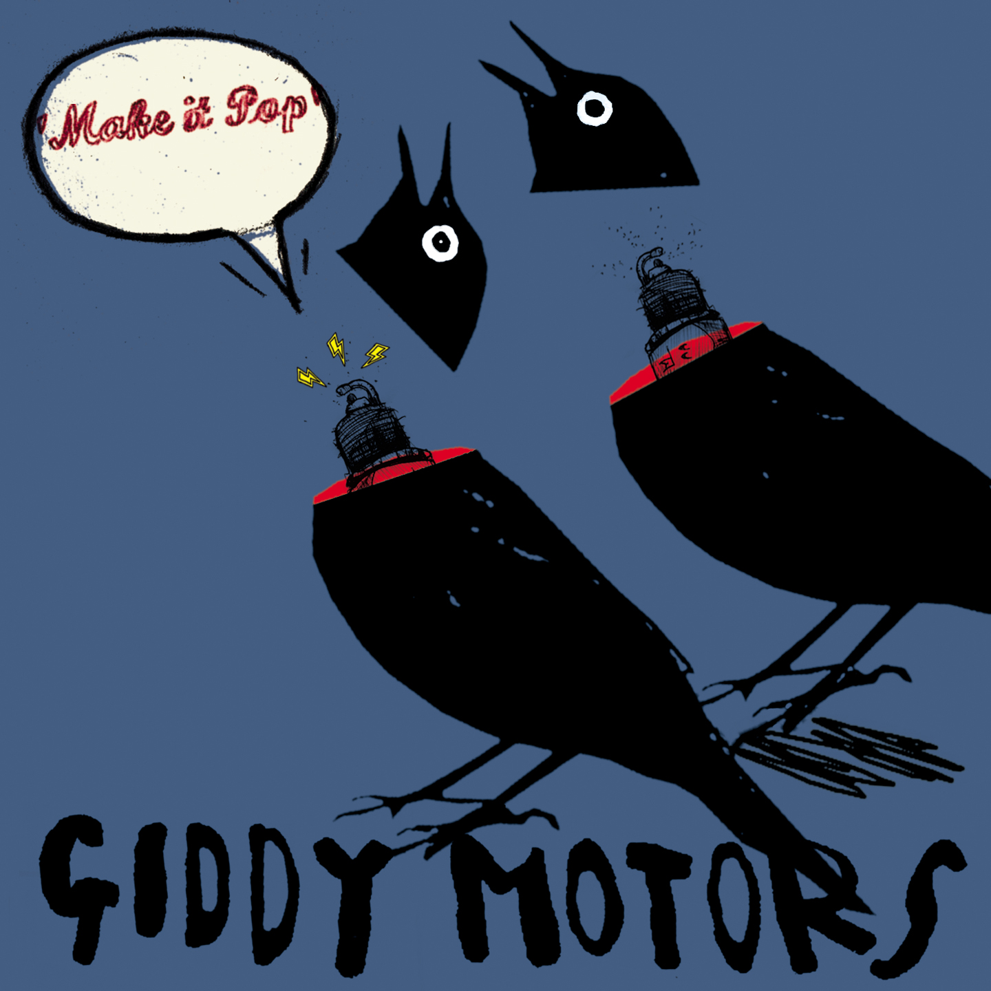
It was only a year after I first started at FatCat. They were a band that came to FatCat through sending demos to the label, and it just struck a chord with everyone that was there in the office. The lead singer in the band is called Gaverick [de Vis], he’d got some ideas himself, he did some comic book illustrations. They were heavily influenced by bands like Jesus Lizard, pretty heavy guitar stuff, and I was aware of that music. They were looking at the artwork of Big Black and stuff like that and going, “We want something in this kind of world.” The imagery on the cover started from a place which was to do with elements in the lyrics – there was lots of absurdist leanings in the lyrics. Gaverick wanted to create a world that that would make sense around the music. I’d done a couple of quite quick illustrations with those birds on the front, and he saw that and said, “Maybe we could try this,” so the idea of the heads popping off the bird and having a little spark plug inside, it was a real collaboration of taking some of the more graphic, flat colour illustration stuff I’d been trying and running with it.
The FatCat logo is quite a graphic vector cat with pointy ears, and I didn’t really feel like putting that logo on the artwork when the artwork was all hand done and written. And it was the first time I was like, “Why don’t we draw the logo?” So it feels like it sits as part of it, it’s not this corporate identity that’s kind of hovering – imagine things like they are in Photoshop layers, that the artwork is one layer, and then the label kind of is another layer, this corporate stamp over the top. I always felt like all those elements, whether it’s the barcode and all the stuff that has to be on the sleeve, should be incorporated into the same style. So it’s the first time we’ve done that, and that’s how it appeared on the artwork. I think I must have done maybe 30 or 40, maybe more different style FatCat logos over the years that all tie into the specific record that the logo is sitting on.
múm
Summer Make Good (2004)
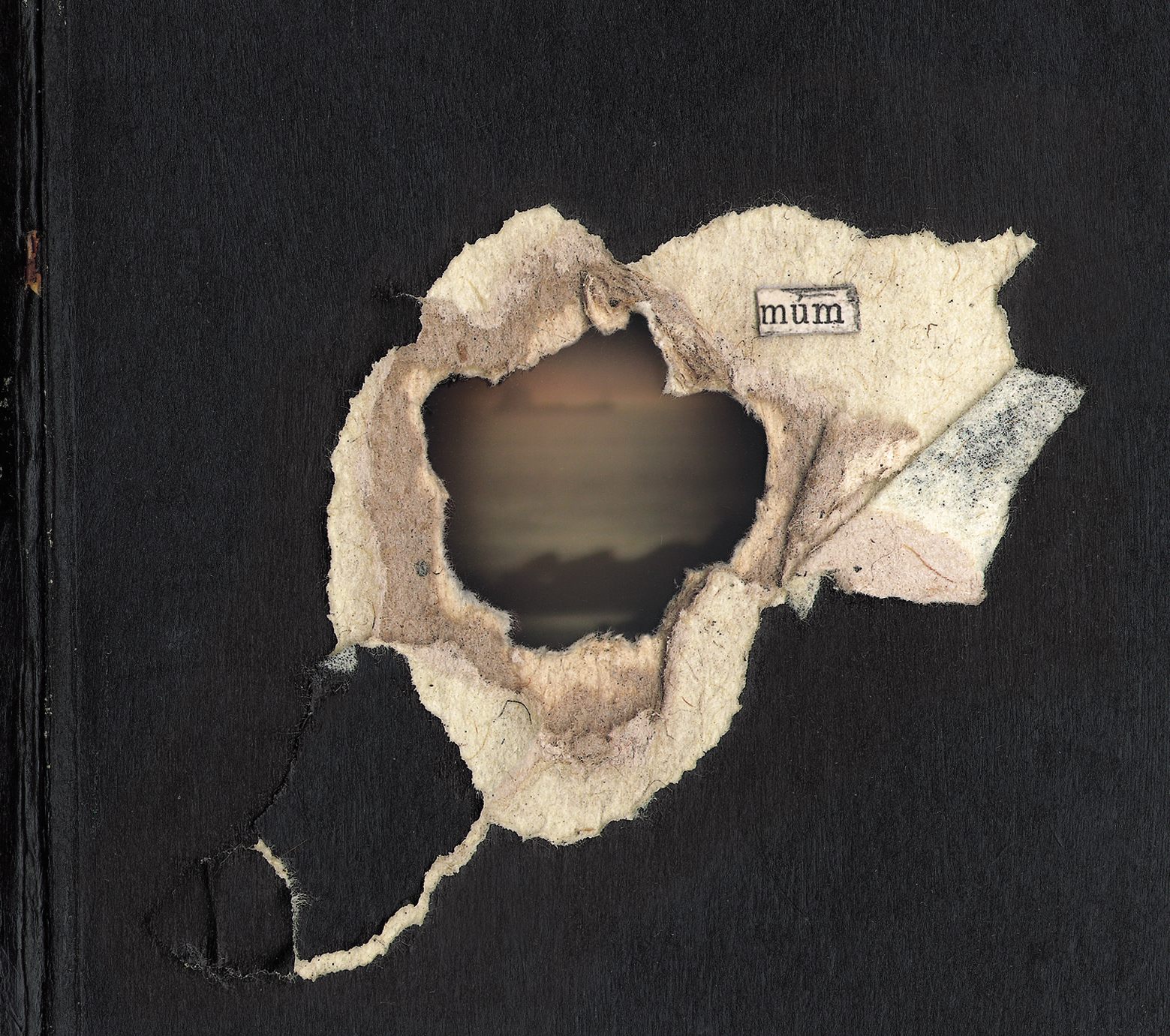
múm were one of the bands that drew me to FatCat records in the first place. I’d bought their debut album, Yesterday Was Dramatic – Today Is OK, maybe three or four months prior to starting to work with FatCat. They’d come through the connection with Sigur Rós in Iceland, but they’d also sent their music to FatCat, and I remember seeing a little package that they’d put together of hand-sewn CD sleeves with little inserts. A number of them are really prolific illustrators and creative people in lots of different ways as well; Örvar [Þóreyjarson Smárason] from the band did lots of little illustrations which ended up featuring on things. I was actually working for FatCat when their second record, Finally We Are No One, was put out. They created a lot of it themselves, but I was helping with some other guys in the office to kind of piece it together, so I’d already been involved with them to some extent on that record. The popularity of that was huge for FatCat as a label. To have that running alongside Sigur Rós – because around that time we were working on the Sigur Rós untitled ( ) record, so it was just loads of really exciting records all happening at the same time.
So when their next record, Summer Make Good, came along, we had been talking about artwork way upfront, and it ended up being probably one of the most unique artwork experiences I’ve had. Even though we came back and worked on it back in the UK, myself and Dave Howell, who runs the 130701 side of FatCat, so the post-classical stuff – he also has a background in printmaking and is an artist as well, so he’d done quite a lot of the artwork with the label in the past. They actually flew me and him out to Iceland when the band were recording that record and they hired an old lighthouse keeper’s cottage that was outside of Reykjavik, way out on the coast. They had that for maybe a month, maybe six weeks, and for some of that time, we went and stayed with them while they were making the record in one part of the house. We were going into town and finding bits and pieces in old antique book shops, because they wanted it very much to be based on old books and ripped-up things. It was great because you could really immerse yourself into it – we were sitting in one room, scanning old books and making linocut stuff, and you could hear the album being created down the corridor.
I think once you go to somewhere like Iceland, the environment really does have an effect on you. On the night that we got there – it was in the winter – they’d said we might even see the northern lights. And the very first night that we were there, we were sitting down, having dinner, and someone glanced outside and went, “Oh my god, that’s amazing.” And we all rushed outside, and they were really bright and very prominent right above the place that we were staying. And I think all of those things – being right on the coast, being in Iceland – had a real effect on the general mood of the artwork.
It was a great collaboration with everyone in the band, suggestions would be thrown in, and quite often I was going around taking photos which then became linocut prints. I know Dave Howell did some of the actual house that we stayed in, which became little motifs that we had on the record and was used for merchandise, T-shirt designs, and tote bag designs. Everything kind of tied in from one thing to another, and I think that really had an influence on things I would go on to work on by myself with different bands. So often it’s the case that you’re in a completely different location and trying to make a connection with bands that you work with for the first time and work out what they’re doing with the record. For this record, we were there. We were right there when they were doing it, so that connection was much quicker, much more direct.
We were there for about a week in total, and we came back with lots of stuff and worked on actually piecing everything together and doing all the layouts for the various different formats. It was brilliant, and not something I’ve had the opportunity to do again since then. On the previous record, they’d had quite a lot of airplay on certain singles, and it really captured people’s imagination. The tone of this record was slightly darker and I don’t think it’s as immediate, but I’ve still got a real soft spot for that record.
Vashti Bunyan
Lookaftering (2005)
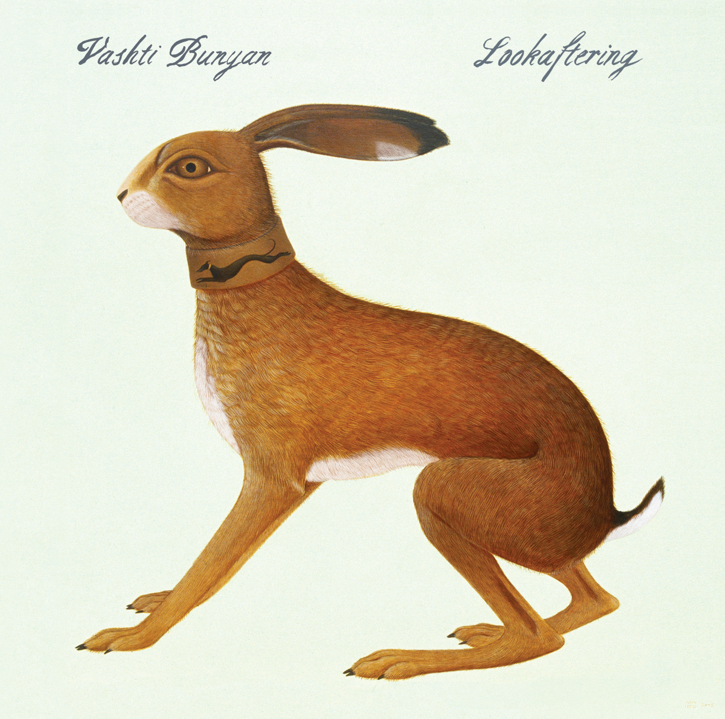
She’d recorded with Animal Collective on Prospect Hummer, and I remember I used to have a little notebook that I had next to me when I was working in the office, and they’d been talking to Animal Collective about all the things that influenced them. And the guy who sat behind me was reeling off some names, and I heard he said Vashti Bunyan and I was like, “I don’t know how to spell that.” I just phonetically wrote it down in my notebook, and then I went to find out a little more about her. And off the back of working with Animal Collective, they just started in the office to talk to her about, “Oh, maybe you have some songs you want to put out.” And she did, and they started working with Max Richter on recording. Her daughter, Whyn Lewis, is quite a well-known painter and she did the cover for this particular one. Initially, Vashti was like, “I’m not really sure what I want to use,” and then came across Whyn’s image and it just felt absolutely ideal. The record has a lot of space on it, so having something that’s very subtle – but the painting of the hare is still really striking, something that really sticks in your mind.
My involvement with Vashti was just to try and keep everything else of the design as subtle as possible. So that the typography felt in the same way world as Whyn’s paintings – they’re amazingly detailed, she paints with a tiny, tiny little brush. When you see them really up close, it’s just amazing in terms of the level of detail that she goes into. So I was like, we should do that all the typography by hand. It was just a case of trying a few different things and seeing if it struck the right mood. I don’t really have any formal training in typography or lettering; as an illustrator, I always kind of saw it as the same thing. I don’t really see typography and illustration as two separate disciplines.
Heartleap (2014)
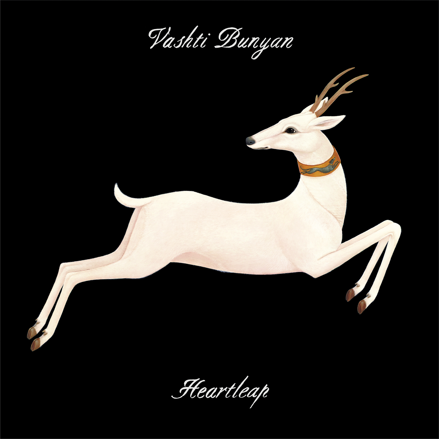
Lookaftering and Heartleap I kind of see as the same thing, because even though Heartleap came out nine years later, we picked up the same ideas that we’d been using on Lookaftering. It was another Whyn painting that we used, and inside Vashti wanted to tell the story of the things which inspired the music. So, in Lookaftering, there are pictures of her children and drawings she’d done at the time. The inside artwork is again very pared back, and there are a few more of Whyn’s paintings inside. Vashti would say, “This particular song really reminds me of this painting, so I’d like that to be sitting next to those lyrics.” It’s almost the complete opposite end of the Giddy Motors record, which was big and in your face and bold. This still does reflect the energy of music, but the energy of music is the other end of the scale. I’m really proud of both of those records; I think they both work really nicely as a touchstone for introducing people to the sound in the record. I can’t really listen to either of those albums without imagining that they sit in that colour scheme or that world.
Some Things Just Stick in Your Mind – Singles and Demos 1964 to 1967 (2007)
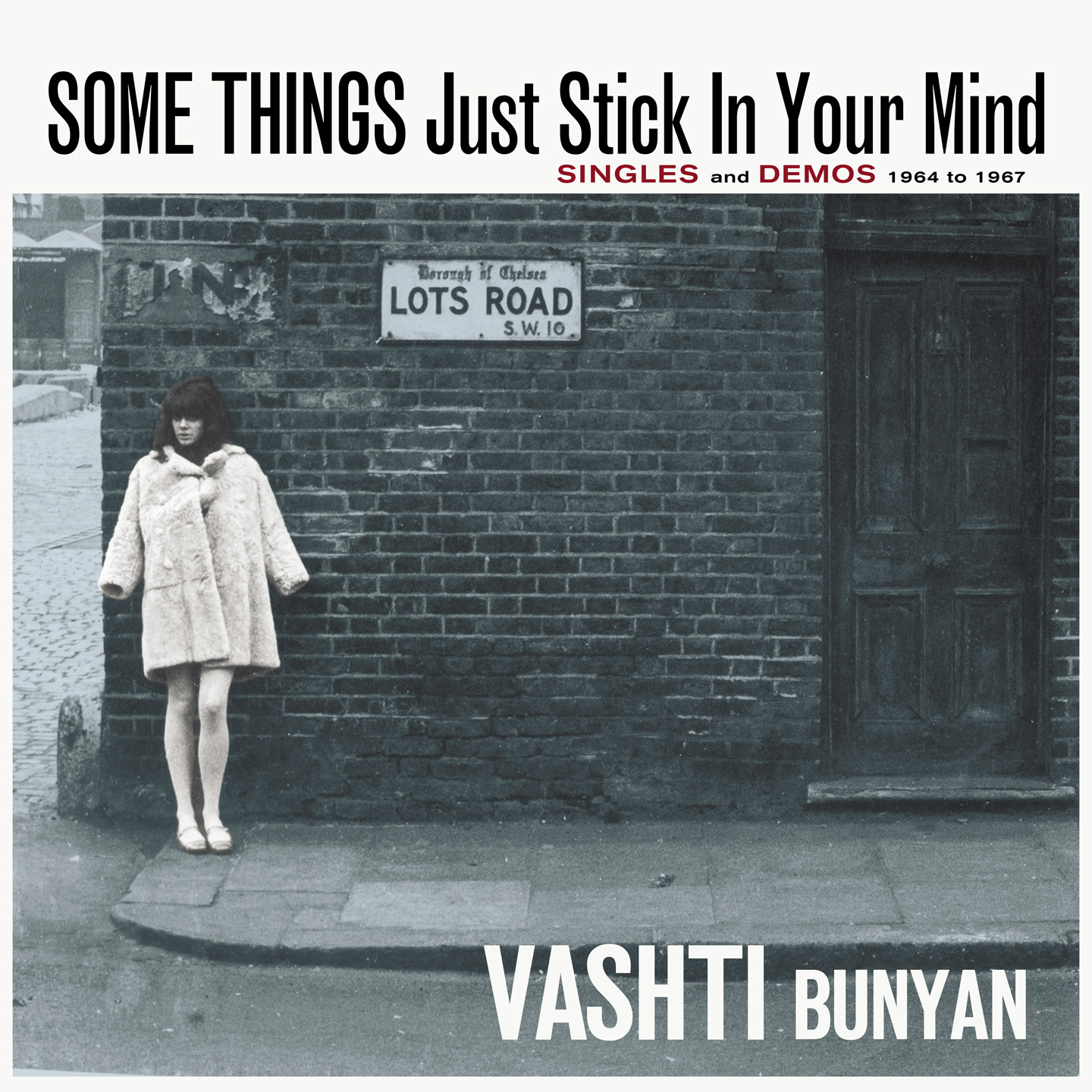
Originally, some of the songs were out on Decca Records, so you look at old Rolling Stones records that were out the same year and you’re like, “That font is beautiful, but I don’t know what it’s called.” So some of those times, I’ve actually scanned and rebuilt fonts from pulling bits from old sleeves and stuff like that, trying to recreate things in the style they were in originally. A lot of those were songs she imagined might come from when she first wanted to put records out.
When she did the single to Some Things Just Stick in Your Mind, which is a Rolling Stones song, they were trying to get her to be the next big pop star. I think she was 18 or 19 when she was doing those. She wasn’t doing that to be a folk artist, she wanted to be a pop star. And the fact that it didn’t really work out meant that she has all these amazing press shots and things which were created around the time where that was the road that she was going down. The idea behind Some Things Just Stick in Your Mind was to create the record that never actually came out, so that particular record looks very much of an era – it looks like a ‘60s record that takes lots of influence from Bob Dylan records or Rolling Stone records. The back of the sleeve on that one is laid out much like those old ‘60s records with a big explanation of the album alongside the tracklist, and almost a PR sheet on the back of the record. There was a moment where we were going to make that look like it had come out at the time and then had been kind of water damaged or degraded, like bits of the photo was falling away. But Vashti was like, “No, actually, I want it to look the way it would have come out on release day.”
Just Another Diamond Day (2018 Reissue)
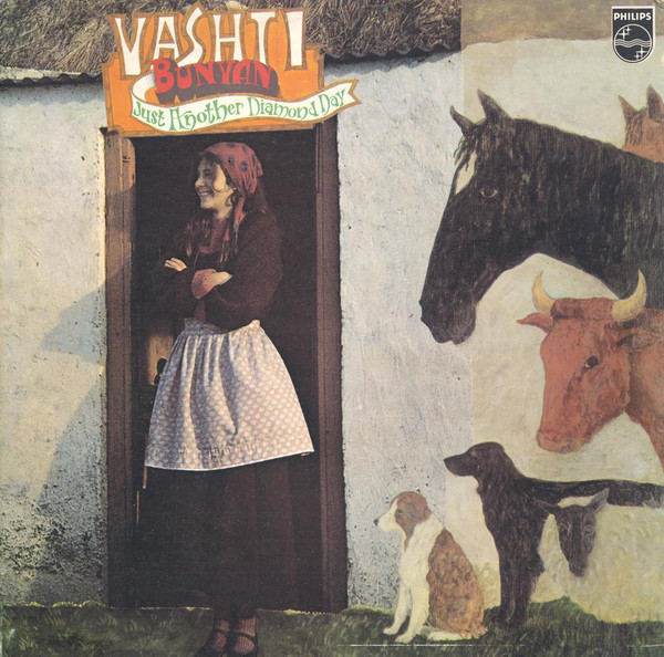
I know the guy at the label who reissued Another Diamond Day, Paul Lamden at Spinney, which is now called Branch, so I’ve been involved in working on those things. Diamond Day hadn’t been out on vinyl since the first Spinney reissue [in 2000], and it was long enough ago that they didn’t have the artwork anymore at the pressing plant. With that 2018 reissue, it was a case of getting the original sleeve, getting somewhere that would scan it really high resolution, and then I did a load of retouching and colour adjustment to try and bring back as close as it could be to the way it would have been seen when it came out in 1970. It’s been nice to be able to do to get those things back out into the world, because the way that vinyl is, some of those records are so rare, so you always feel like other people should get the chance to have this without it costing 100 pounds plus that some of rarer records – I mean, the original, God knows how many hundreds, probably thousands of pounds that’s worth now. I’ve really enjoyed the few times I’ve been able to work with bands where it’s been a case of reissuing stuff. It’s a completely different process to coming up with things – you’ve already got that, so it’s more of a technical challenge.
Gregory and the Hawk
Moanie and Kitchi (2008)
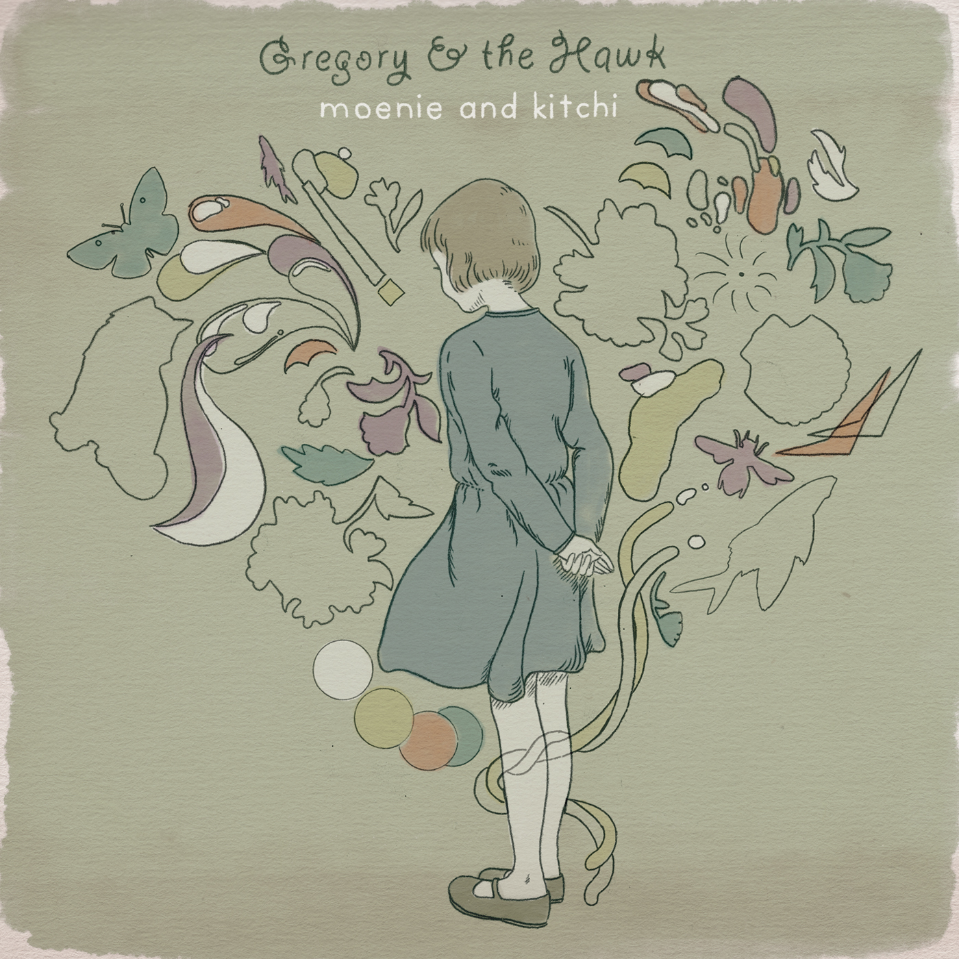
I love how the artwork captures the tone and the mood of the album, in this way where the colour palette and the typography avoids being overly twee or melancholy and instead leans into the imaginative elements of the music.
That was the first time I worked with Meredith [Godreau] as an artist. She’d had lots of people listening to her stuff on MySpace when that was a huge deal, and she came to FatCat through Adam Pierce, who’s run the label in America for a long time. He’s in a band called Mice Parade, which I’ve also worked with over many albums. Some of the experience I probably took from working with Vashti kind of came to fruition with the Gregory and the Hawk stuff as well, of paring back and giving things a little bit of space. I feel like in 2008 I was crazy busy, but with lots of really interesting, different-sounding stuff, and also visually different things. With Meredith, I didn’t really know her music beforehand, but really liked what she did. She’d sent me some demo stuff, just trying to get a sense of what she wanted to capture from the artwork in terms of themes.
Like with lots of stuff I work on, I want the person picking it up to bring as much to the table as we’re giving in terms of the artwork, so that it’s never really explaining anything. It’s suggestive, and it’s setting the tone for something. With Gregory and the Hawk, I wanted to do something similar with the fact that the character was kind of gazing off into the distance, not really looking at anything in particular, but it’s almost as if the imagination of all these objects is surrounding that character. But not saying “This is what we’re thinking of,” just little things which could start other people’s imaginations. And it does have a sombre mood, but it’s kind of calm. There’s a contemplation in the character which we wanted to put across. And like you say, not try and make it too overly twee, and add an element of: there is something deeper behind the meaning of the artwork, which there is in the lyrics of the songs, to do with relationships and memory. I didn’t want in my conversations with Meredith to give a definite answer for anything, it was more about striking a mood.
Nina Nastasia
Outlaster (2010)
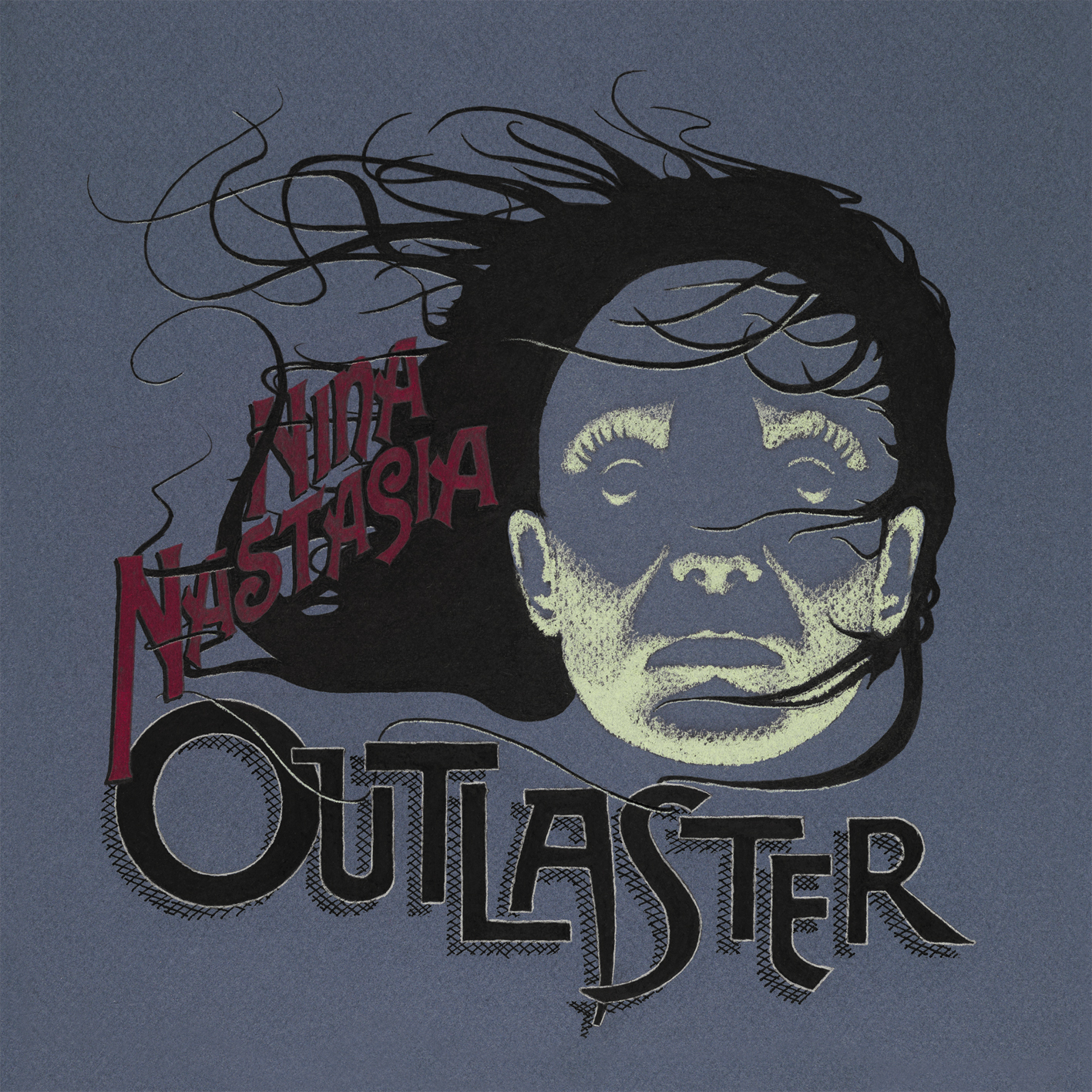
This is another collaboration, and the actual finished rendering was done by Kennan Gudjonsson, Nina’s partner. I worked with him across three Nina records – this one, You Follow Me with Jim White, and On Leaving. Kennan was the creative driving force behind the artwork with those, and unfortunately, he passed away a couple of years ago. But he was quite a big character, intensely intelligent, and also got involved on many levels of the record. He was not only involved in the orchestration and arrangements, he loved packaging, he loved the artwork side of things. Run to Ruin and Dogs, which were her first two records, he did all the artwork to those himself. [Nastasia signed to FatCat for 2006’s On Leaving].
With Outlaster, he did the illustration, but we’d gone back and forth about the typography and he hand-rendered it at the end. Because of his attention to detail, a lot of people said he was quite difficult to work with, but I love going into that level of detail as well, so it was a real joy to work with him. There was always that thing of like, I’ve not thought of going quite that detailed on it. Like, the CDs for all of Nina’s releases have little round corners on them because Kennan loved round corners. It’s something that you would never see if you didn’t buy the CD version to those records. But yeah, her music is amazing. Hopefully some of these albums will get back out there.
The Twilight Sad
The Twilight Sad EP (2006)
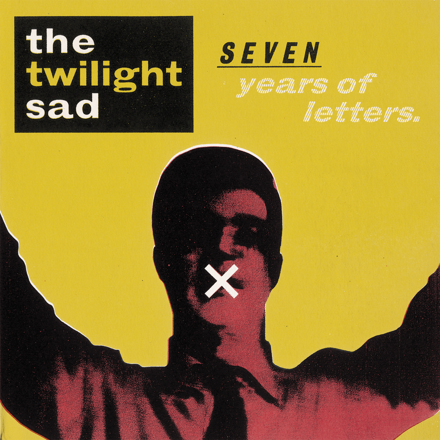
They were another band that had been sending FatCat demo material, so I heard the songs being played – I wasn’t working in the office at that time, I think that was probably just about a year after I started working from home, but I was still heavily involved in the process. The early demos, which I think have been put out on a Record Store Day reissue of Fourteen Autumns a couple of years ago, they’re pretty rough and ready sounding, but that’s as they came to the label. I loved the songs, but they were really buried in loads of Andy [MacFarlane]’s guitar sound and had multiple layers of instruments and James [Graham’s] lyrics were way back in the mix.
They hadn’t had anything out at all, and they’d come down to Brighton to play gigs around 2006. We just struck up a relationship with them as friends to go out for a drink with more than anything, and Andy mentioned the things that he was really into terms of artwork. I was looking back at – I keep a little folder of influence stuff for every project that I work on, stuff that the band sends me, stuff that I find. Mainly, Andy was sending me old book covers and old printed posters and things that were in two colours and a lot of 1950s stuff. Which I love – we are mass collectors in this household of old books and old bits and pieces, so I was in the same headspace as him in terms of finding old instruction manuals, old little bits of printed ephemera.
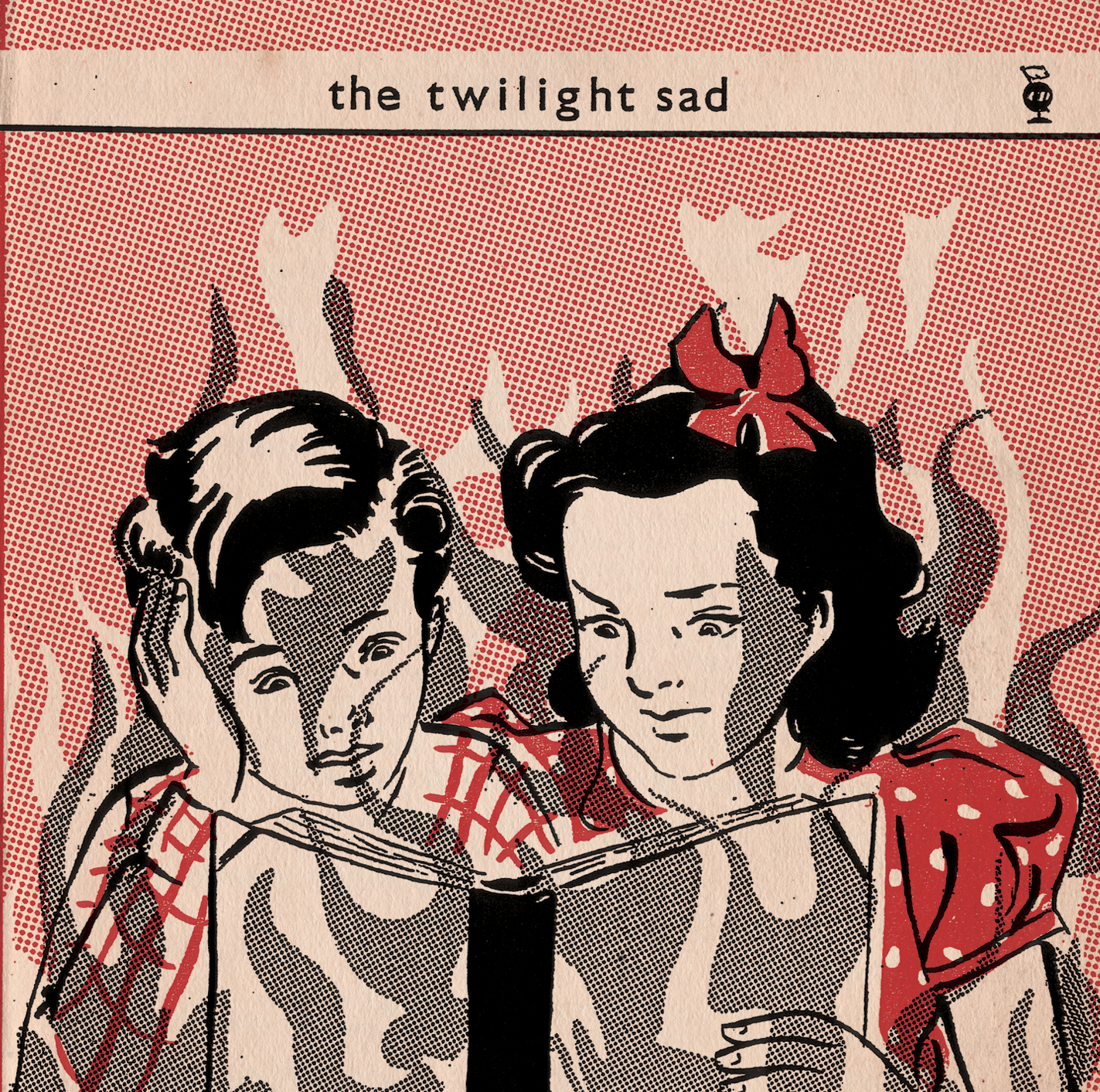
Speaking to James and listening to the lyrics, they already evoke images. That particular EP cover is probably as direct as we’ve ever gotten in terms of the lyric, “The kids are on fire in the bedroom.” I’d seen this old instruction drawing, and I was like, that’s the style I want to go with, so it’s a case of kind of working out what the actual illustrations were going to be and then repainting them in that style. But because all of the influence on this was old print techniques, I went to the next level of, I’m going to actually present everything done as if it is an old book. So not only this EP but the first album as well, I laid it all down as Photoshop stuff, then exported it all out and printed them out as separate, almost like colour plates, as if you were printing something in 1940, 1950 where everything would be done in separate colour plates. So, all the black is on one layer, then printed that out and degraded it on a photocopier, so it all had a much more textural sort of feel. Plus, the photocopier pulls things in different directions, so everything in the final things is slightly off register. That kind of led to some interesting conversations with printers who were like, this is way off, everything’s off, they want to make everything exact and put it back to neat and tidy. And I was like, “No, it’s meant to be that way.”
That EP I see as really setting the stall for everything that we did from then on. Lots of the conversations we’ve had across all the years is really not wanting to be too obvious. It’s dark subject matter, death is involved, bad memories, things where you could be quite gory about the subject matter and quite direct. And we’ve always said, let’s be suggestive of something that is happening, in the same as I was saying with Gregory and the Hawk, that is going to leave people’s imaginations to fill in the gaps. Because people’s imaginations will be way darker than you could ever create by putting skulls or blood on the cover.
Fourteen Autumns and Fifteen Winters (2007) and Singles
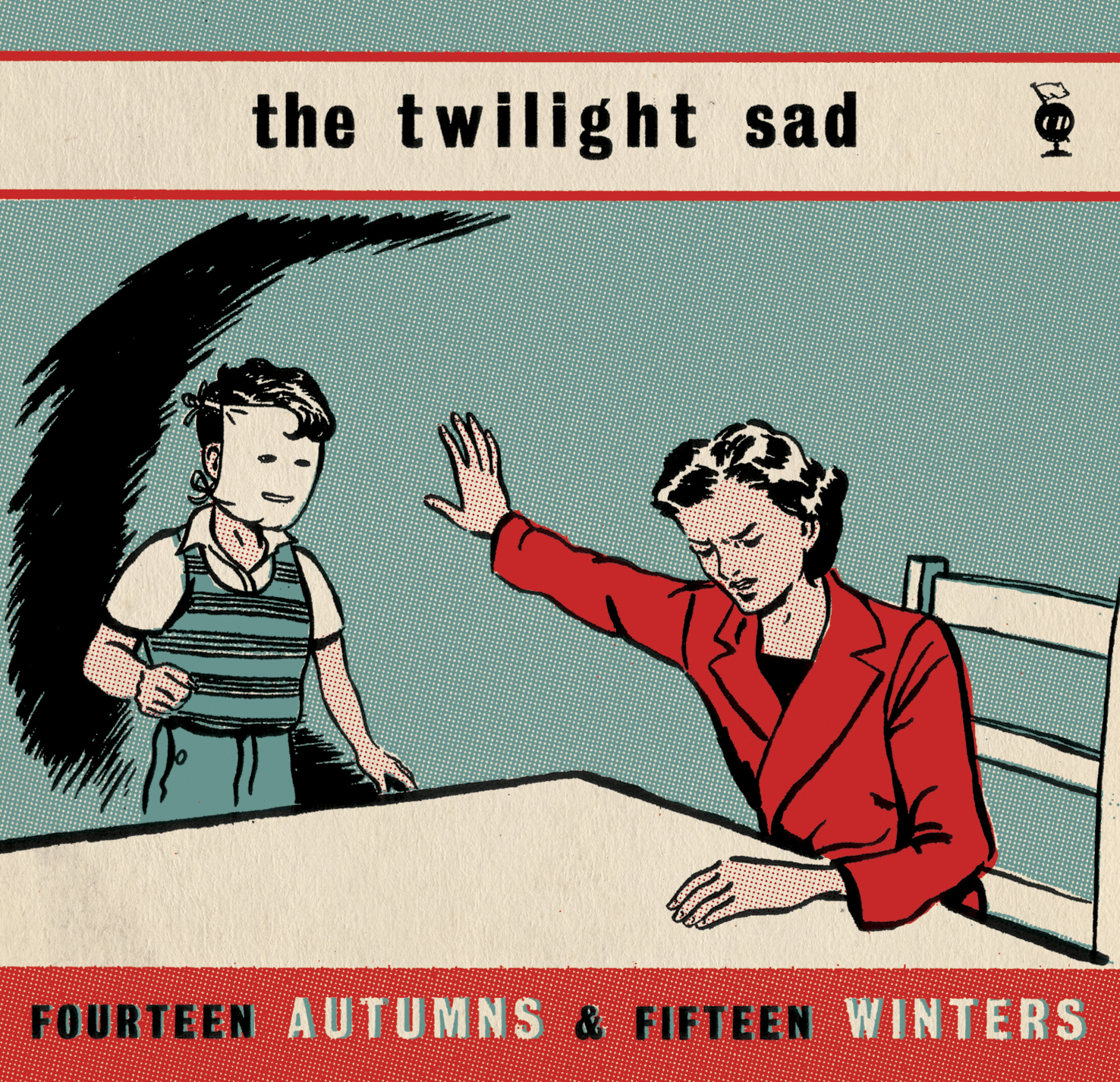


With that particular one, not so long ago I posted – because they’ve had those Tim’s Listening Parties on Twitter over the last year, and they had Fourteen Autumns, so I posted up some of the earlier versions of that album cover before the boy had a mask on, the mother standing up and the boy kind of having his hands pushing her away. It differs from something like Gregory and Hawk, where I did one version, sent it to her, and she was like, “That captures what everything we’re talking about.” With some of the Twilight Sad stuff, there tends to be earlier versions. I send them five or six options and automatically, some fit as an album idea and some fit as a single idea. It’s been a similar process pretty much through every album. Even when Andy and James are working on the music, I say to Andy, let’s create a Dropbox and anything you see, anything that you like, even if we’re six months off from having finished music, just throw in there. And it allows it to just kick about in your mind a little bit as you’re walking around and doing other things.
Forget the Night Ahead (2009) and Singles
Going from the EP to the first album and then Forget the Night Ahead and the singles that were associated with it, there seems to be a shift in terms of the typography and influences that come up.
With Forget the Night Ahead and all the associated singles, there was more of an influence of ‘60s British kitchen-sink drama and the posters and book covers that you’d see around those films. And the subject matter was similar. James was purposely not necessarily talking from a personal point of view for this record; there was a lot of dark subject matter, but from almost someone watching a situation looking in. We were looking at that from the artwork point of view, that it wasn’t stories that were from his childhood. Where people assumed from Fourteen Autumns that he’d had a terrible upbringing and these stories were from his point of view – I don’t think they ever were in any way, but he grew as a lyricist by the second album and has continued onwards through all of them. But he wanted the step on in the imagery to reflect that step on in lyrical content, and the types of things that being talked about weren’t necessarily from a personal point of view. The typography came from seeing old film review magazines and those sorts of things. I’d see titles in an old film review magazine and I would see a font that I just wouldn’t choose or that had fallen out of fashion, and that became quite an influence on the direction we went with that particular record.
No One Can Ever Know (2012) and Singles
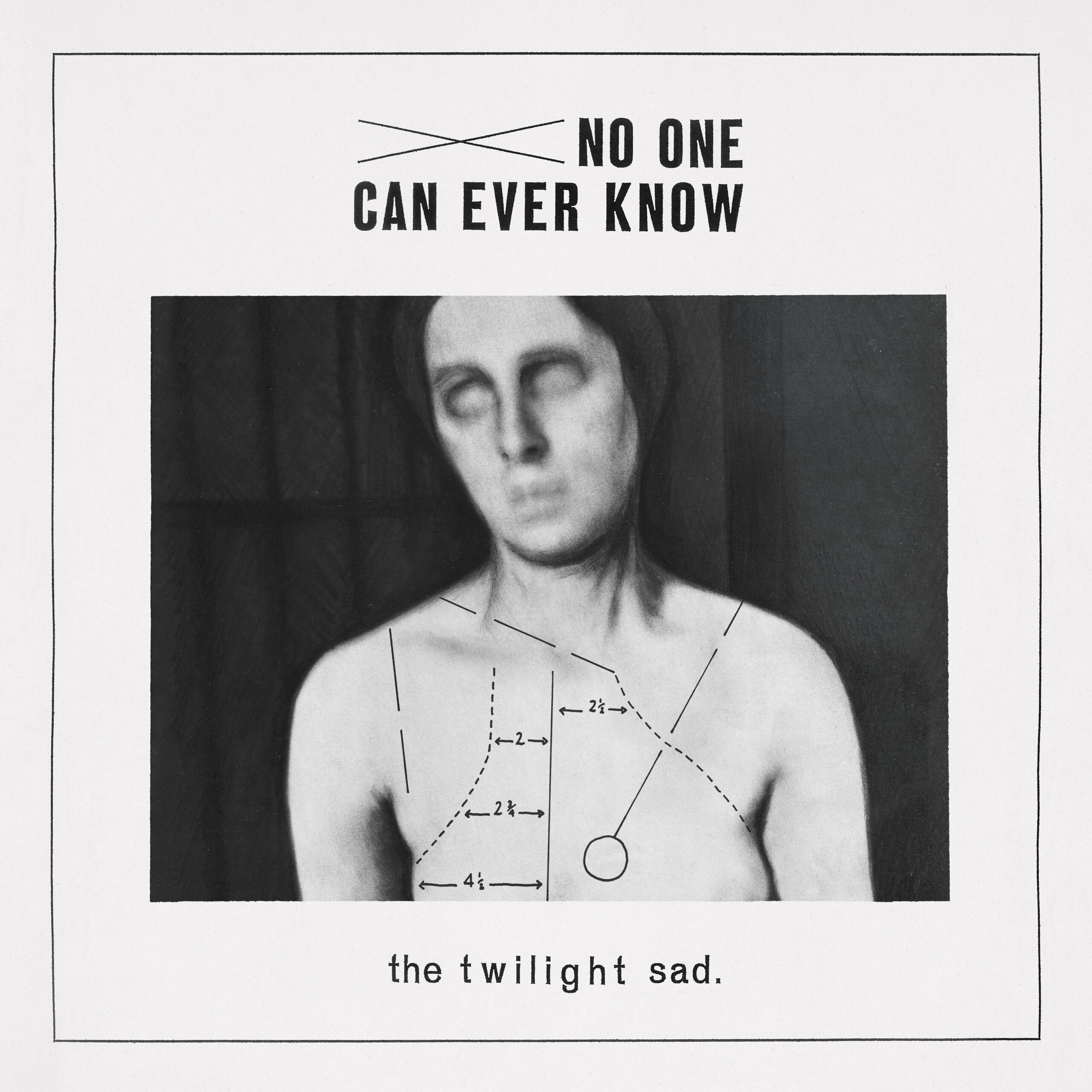

When you get to No One Can Ever Know, musically there’s a shift there again. They went away from the huge guitars and it was a much colder record, much more sparse record, they started using old vintage synths in the music. Andy had pointed me towards old medical medical diagrams as an influence, so that’s fairly obvious to see, but stripping it back, taking the colour out of it and going much more monotone and cold in terms of the feel of things. Whereas on the first two records, I’d added in little details – like on the first record the little globe which has LP at the top, or CD depending on the format – because they were little things I’d seen in old print, flourishes which added sort of a printers’ language to some of the albums. Whereas by album three, we were stripping all of that stuff out.
But I did still treat it the same way, the border around the outside of the cover, I’ve exported it all out and degraded it, because there’s a sense that they were doing a similar thing with the way they were processing sound and his guitar pedals or old analog synths they were using for that particular one. Nothing was straight digital, it was kind of fed through filters and layers. I was doing a similar thing in terms of the artwork to kind of say, there is a real element to this. Even though everything’s built in a computer, in the end, I’d been using photocopiers and fax machines and drawing stuff and overlaying things as well.
Nobody Wants to Be Here and Nobody Wants to Leave (2014)
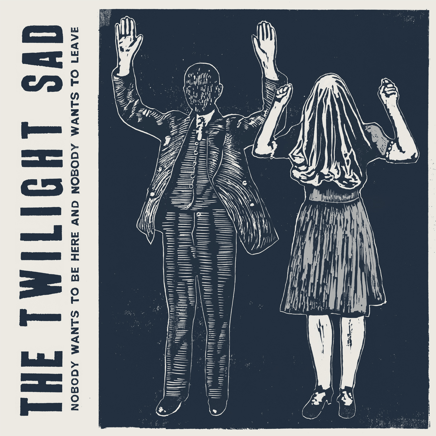
With all of the Twilight Sad stuff, there is this big influence on old printed matter, or films that Andy’s watched. With Nobody Wants to Be Here and Nobody Wants to Leave, he’d been watching films like Badlands and Bonnie and Clyde. The couples on the front cover of that particular one came from influences of certain films he’d been watching at the time and doing our own take on, creating almost like a screenplay for the film, but just the early sketches so that people can create a narrative themselves. Like with everything in Fourteen Autumns, it doesn’t necessarily flow from beginning to end as a story, it’s just little moments that allow people to connect one event with another and make up their own story.
By that album, there was a thread of people knowing what to expect from the artwork, to some extent. Andy had talked about lino printing and woodcut printing, and again, on some of those Tim’s Listening Party things, I posted some of the pictures of the actual hand-cut things. They’re all actually cut and printed in lino, so there was a huge amount of work that went into that one, but I’d always wanted to create in that way. That one was probably the most involved in terms of the actual illustration work itself. There wasn’t any digital shortcuts.
I’ve seen lots of tattoo versions of the characters, which is amazing to see someone take something that you’ve created and want it on them. I haven’t got any tattoos, I would never know what to put on myself for all time, but seeing it on people’s thighs and on their calves – like a calf with one character from the cover on one and the other one on the other – it’s really humbling to see when people have felt the effect of an album so much that they feel like they want to have tattoos of it.
Was this album the first time that you’d seen tattoos of your artwork?
Yeah, I think so. People have had stuff from the first Twilight Sad record, but I don’t know whether I’d seen them prior to this. And it was around this time when they started going on tour with the Cure. They were putting this record out and I think initial pressings of it would probably be only five or six thousand for the whole world, and then to play with the Cure, where they’re playing every night in front of 25,000 people, 30,000 people every single night. And they obviously struck a chord with those fans, because they kind of come from a similar place in terms of their aesthetic. To see a band that you’ve seen right from day one, playing in a tiny little pub, right up to the stage of playing at Wembley Arena or going to see them in Amsterdam, in Brussels, to see them in that place where you just stand looking at the sheer number of people – it really takes you back a little. When you see people singing along or people wearing T-shirts of stuff that we’ve created or having tattoos, you suddenly see the wider effect of stuff. Yeah, it’s a weird one. I never get used to it, still.
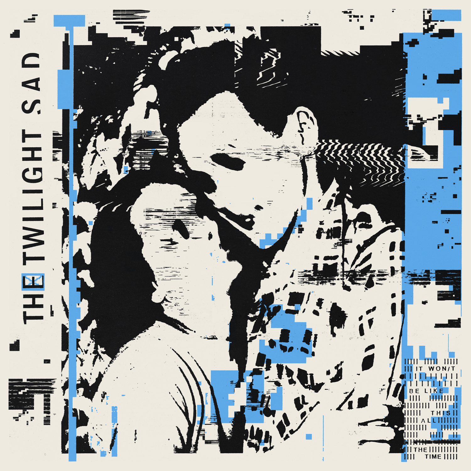
IT WON/T BE LIKE THIS ALL THE TIME (2019) and Singles

This is a really striking cover, and I read that it was cut-and-paste punk scenes that were the original inspiration for that.
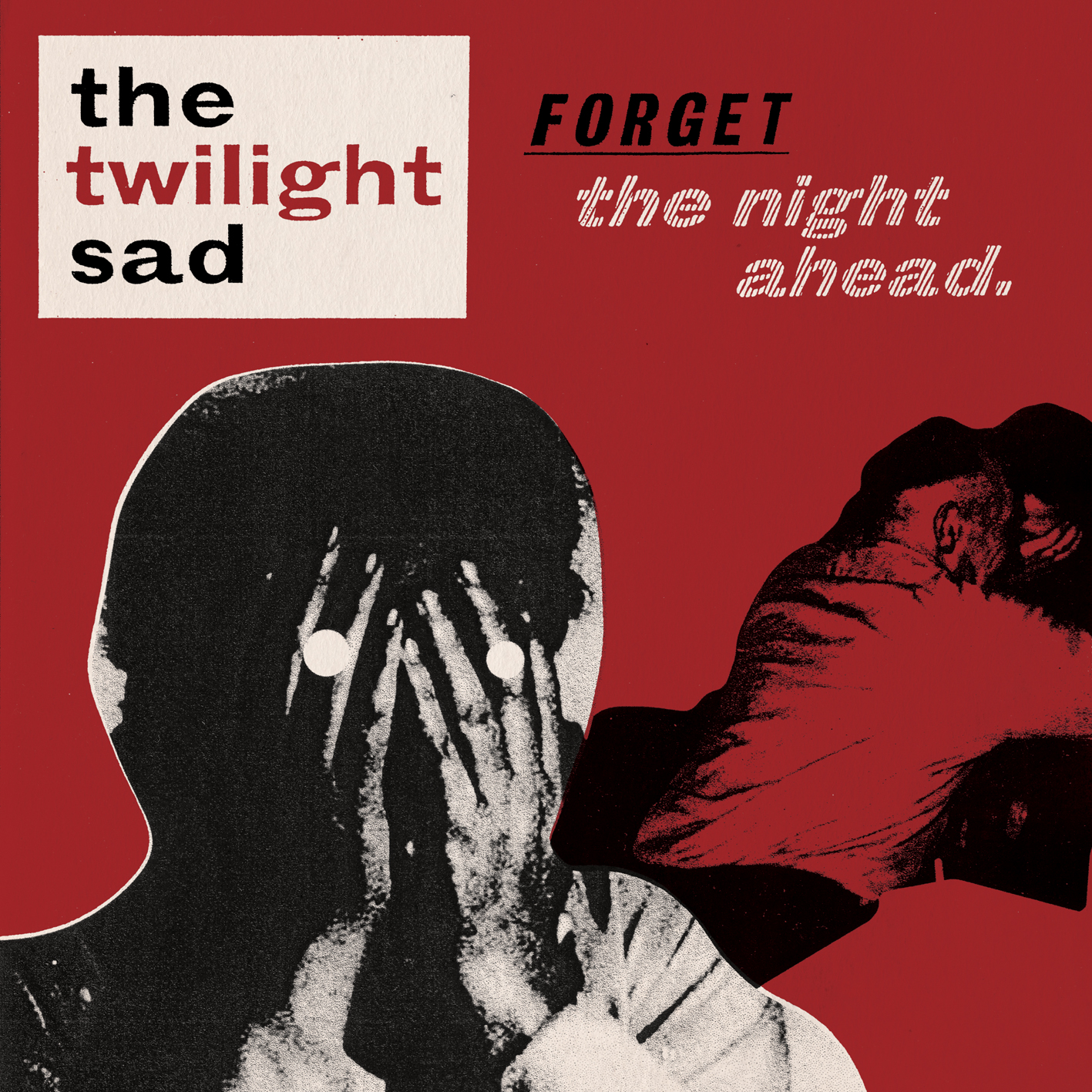
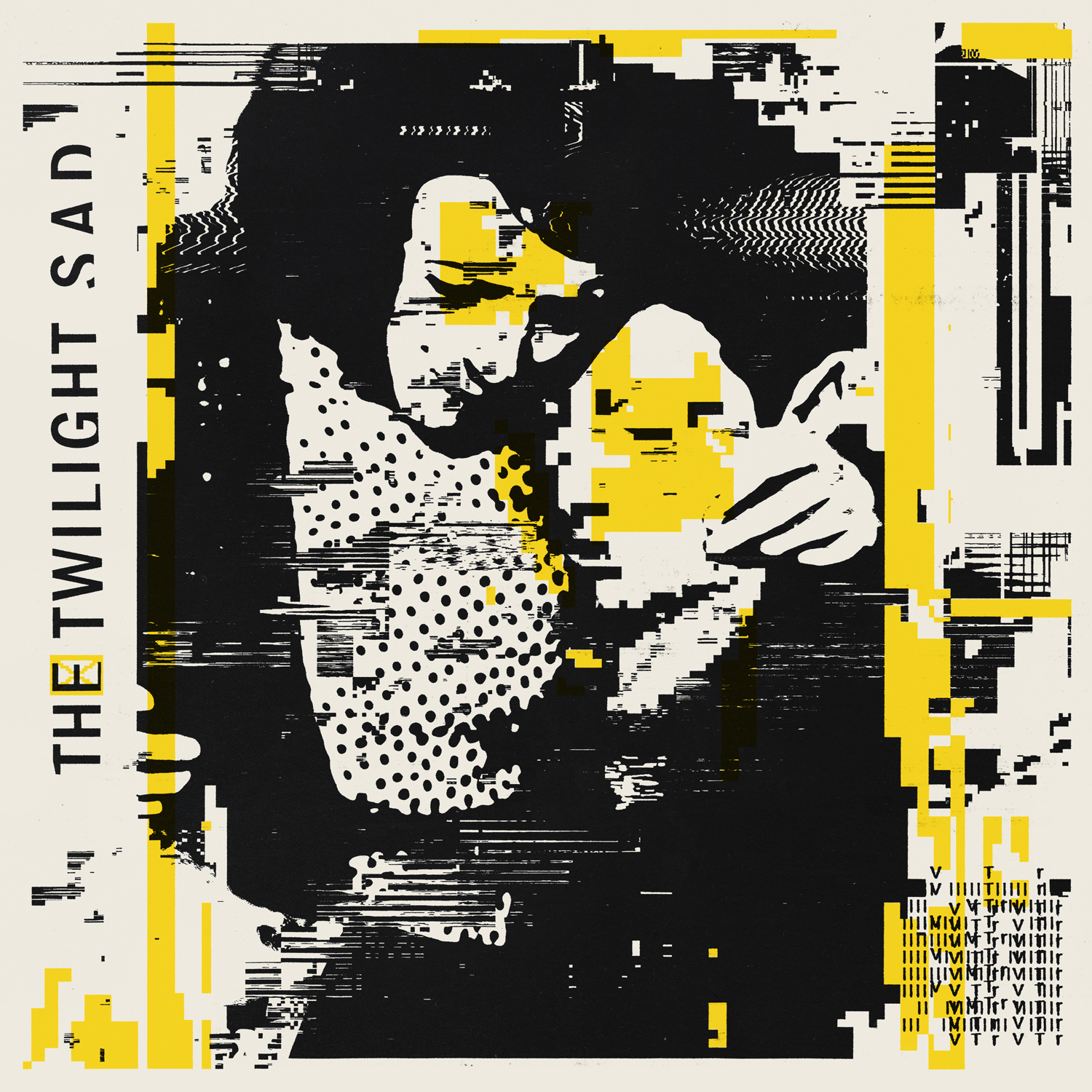
John Foster at Vinyl Factory chatted to me about that, and that was really interesting, because that was the first time that someone had specifically contacted me to talk about the artwork at the same time as the album comes out. For this one in particular, James was involved in terms of the overarching subject matter a little bit more. There were suggestions of fading memory and remembering emotions that were really important to him in the subject matter of the songs, and it was about trying to find some way of capturing that moment that you remember something, like when you wake up from a dream and you try and describe it to someone immediately, and as you’re describing it, it’s fading, it’s disappearing. We talked about trying to visually capture that sort of feeling in some way, so that was what was behind the degrading, the warping of the imagery. You could pick up enough that it was characters, you could pick up the emotion between a couple, but the details were almost flickering in and out of focus.
Someone had mentioned to me, “Have you ever opened a JPEG in TextEdit?” And I’d never done that. So I literally started taking images that I was looking at and opening them in raw text. And then it becomes like coding. I just started bringing in JPEGs, changing all the zeros for nines, resaving it, and then opening that JPEG back up in Photoshop, seeing what happened to it. It just becomes crazy noise. And sometimes it doesn’t – sometimes changing twos to threes just shifts things very slightly. You can’t set a rule and go, if I change all the ones for threes, this is going to happen. It was just trial and error.
I started messing around with that, and things started really weirdly reacting to things. I started just laying those in as part of the layers, and then turning them to single colours and seeing what that pixelated mash would look just black. And suddenly, things were popping out as elements of – that little bit of pixelation where it should be a block of red, it actually then was blocks with sections kind of coming out of it. And there was something in that, just playing with things, I was like, I could use this. This could become a technique across the record. A lot of the imagery was collaging found images of different people together, so way back in the process – in the same way as I showed you the woman with her hands up from the previous record, once upon a time that was one person on her own. Some of these were a collage I’d done of different faces on their own, and then you put them with another character, and the process of running through this sort of pixelation and warping them a little bit suddenly gave them a different kind of life.
Agnes Obel
Citizens of Glass (2016)
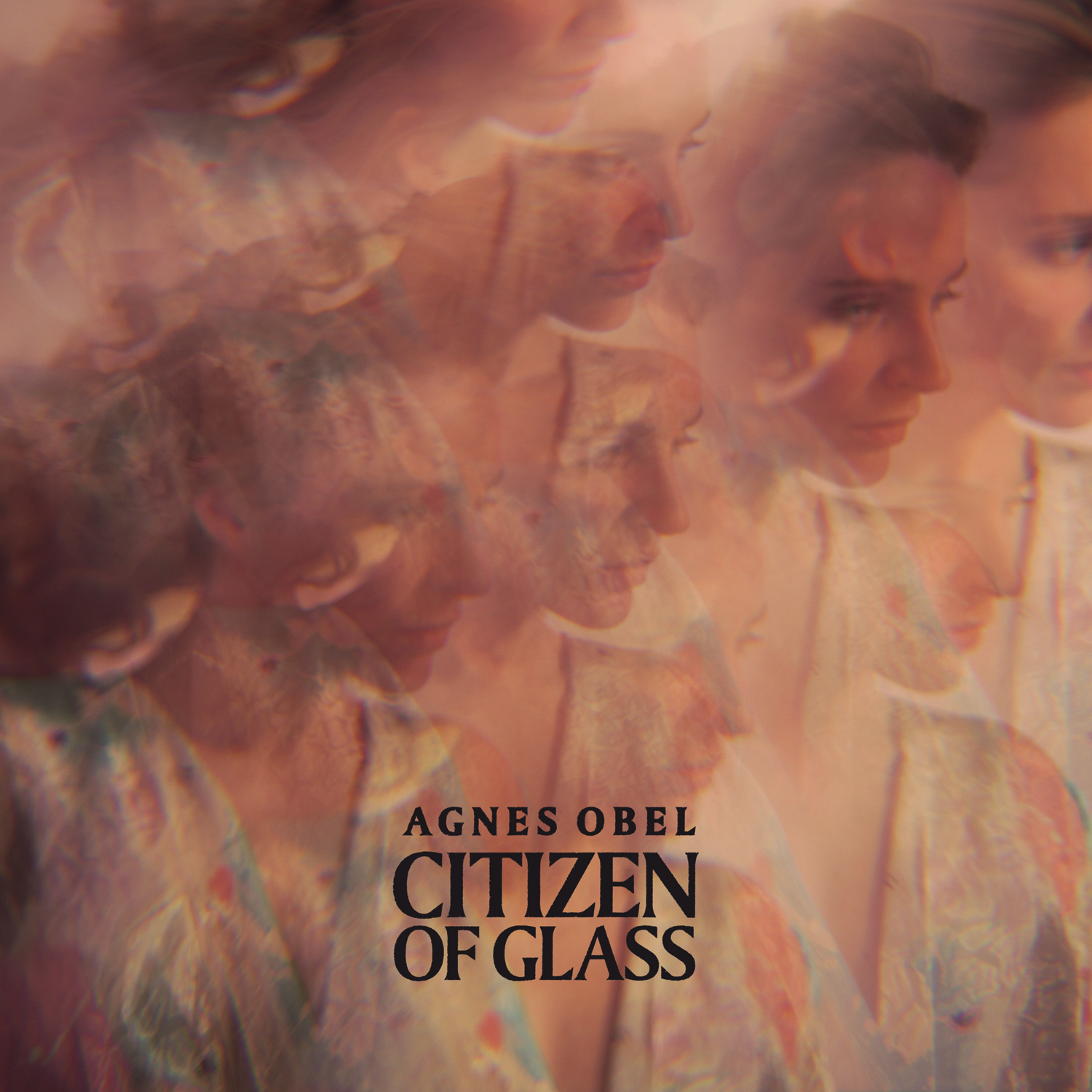
I remember reading about the concept of the “glass citizen” and how that inspired the album, and I’m curious how it inspired the artwork and how you became involved in the project.
I had not worked with her before. She released that record through PIAS distribution and the Play It Again Sam label, and I have a connection with them going back – FatCat were distributed through them, Mogwai put stuff out through Play It Again Sam for years. I’d been put in touch with their management and they were interested in working together, so I went to London to meet her partner, Alex Brüel Flagstad. He’s quite heavily involved in the creative side of stuff that she’d worked on, and he had a lot of the photography already done for that record. It was just a case of trying to take the conceptual ideas that they’d been working on around the creation of the record but using the photographs in a way that would tie into that. I was more involved with the layout and design side of things and striking the right balance in terms of the typography, so it was a slightly different job.
There was lots of mirror imaging, because some of the videos around the tracks on that album tied in with what Alex had already done in terms of photography. It’s just trying to have this thread that moved through from the photographs to all the other elements around the album, taking textures which he provided as part of the photos and mirroring them, just trying to keep it as stripped-back as possible and not be too heavy-handed in terms of the design. Let the imagery do the talking, because the actual range of colours really strike a tone for the music. I had not been aware of her music before that, and as soon as I’d heard it, I made connections with other artists that I work with – I hear elements of Gregory and Hawk or Kathryn Joseph that I’ve worked with as well.
The cover really does strike a tone for the music. I remember it was my introduction to her as well, because I was intrigued by the artwork.
He’d done a lot of experimentation with photographing through prisms, and what appealed to me is, you can create those things digitally just by putting effects and Photoshop filters and things, but what I really liked was the feeling that they had this more analog, real life feel. They’re almost happy accidents at times, where you’re getting that multiple image of her face but it’s not too forced. We had quite a range of different ones to pick from, so it was a case of finding the right crop that really felt like it worked.
We did have lots of conversations about how to strike the right tone with the typography; because the colours were quite saddle and pastel-y, almost skin tone shades, in the front cover, she was very aware that she didn’t want it to look too soft or sweet. Because the music is quite direct as well, it has quite a lot of power to it, it was trying go with the typography that didn’t look too overly modern but then didn’t feel like it was something ancient.
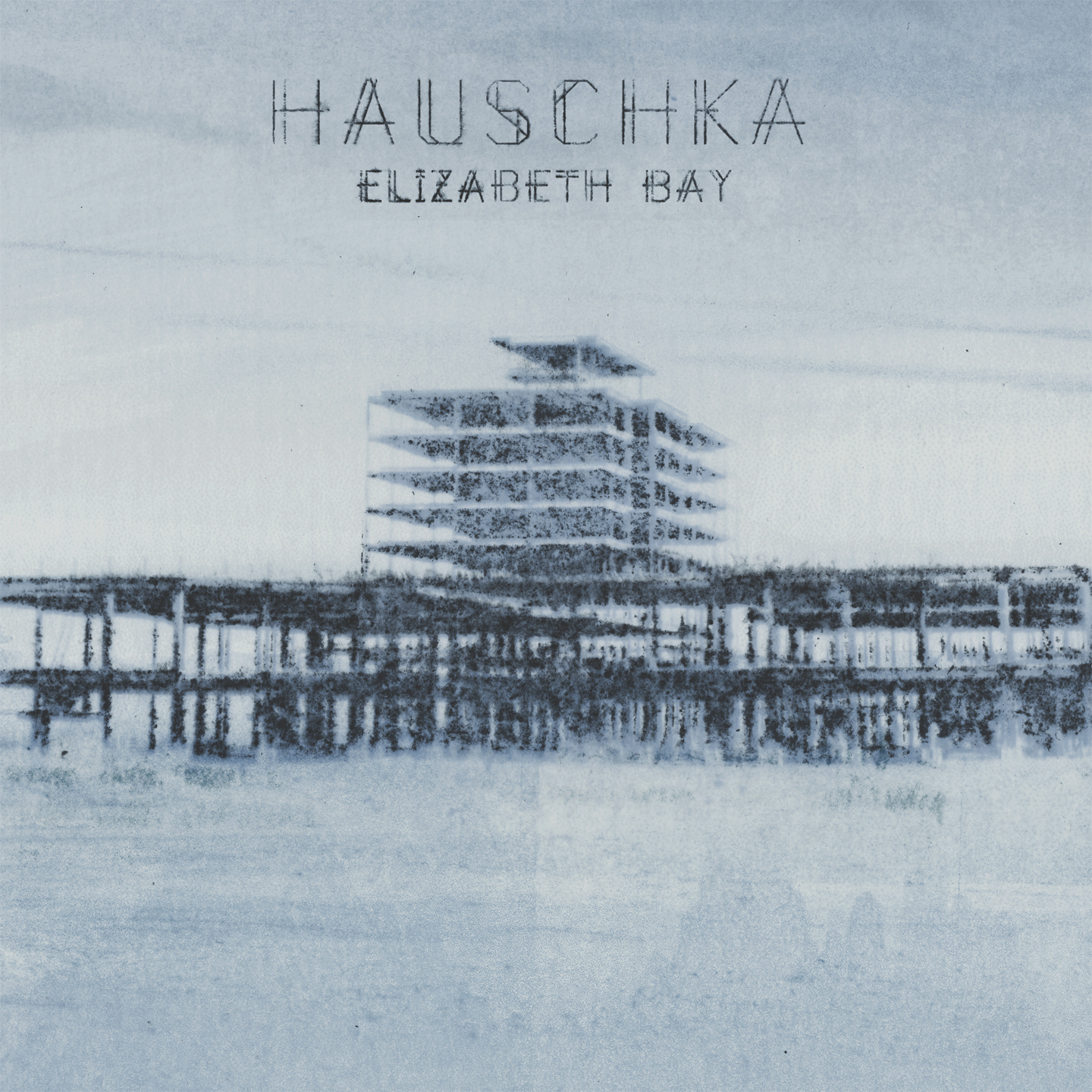
Hauschka
Room to Expand (2007)
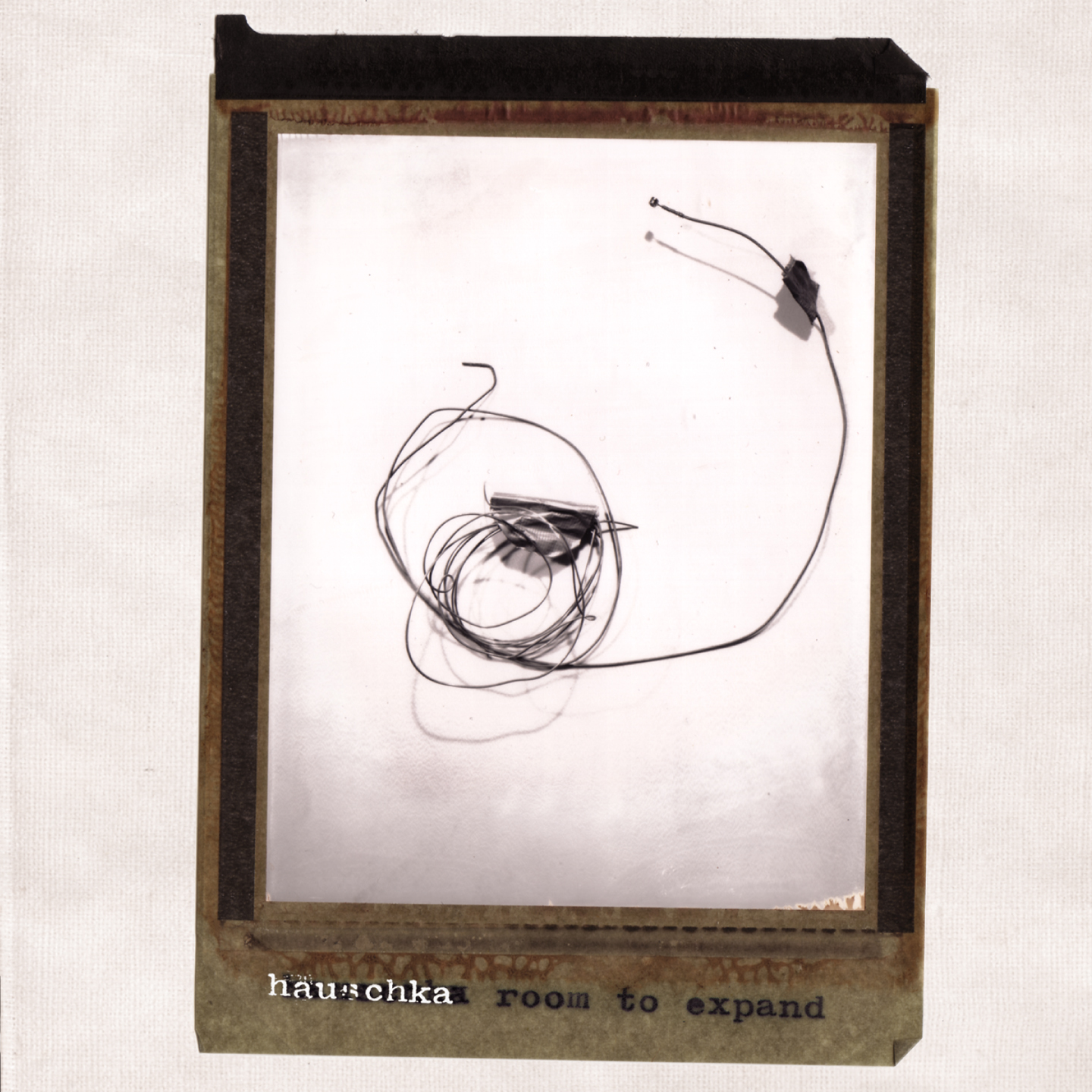
Room to Expand was the first one that they worked on with 130701 sub-label on Fat Cat. We’ve kind of stepped away from it a little now, but the early records on that sub-label, we were trying to create an aesthetic which was all based around photography – if you look at the Set Fire to Flames record, Sylvain Chauveau, Max Richter, black and white photography featured fairly heavily in all of those. For Room to Expand, we did use photography, but in a completely different way. It wasn’t just a scene or landscape or something like that. In speaking to Volker [Bertelmann] and listening to the record, it was very apparent that he used a piano in a completely different way to most people, the fact that he affects the sound by elements and objects he puts inside. We felt that that was a really important part of the narrative for the artwork, so for Room to Expand, everything you see on the cover and throughout the booklet, he wanted to make it quite playful because that’s the way he creates music.
We actually got him to send some of the things that he puts inside the piano, bottle tops and bits of wire and stuff with bits of tape on it. I worked with a photographer who I’ve known for years through FatCat connection, Nic Shonfeld. I went up to London and he used medium format Polaroids for that, so he was shooting it and physically getting these bigger-than-normal sized Polaroids, and it allowed for the process of taking the photos to be similar to the playfulness in what he was doing musically. Because you take it and then you have to expose it and sometimes light has got in there or something catches on the picture, so it’s not a true representation. You get a little bit of bleed in how it’s processed.
Ferndorf (2008)
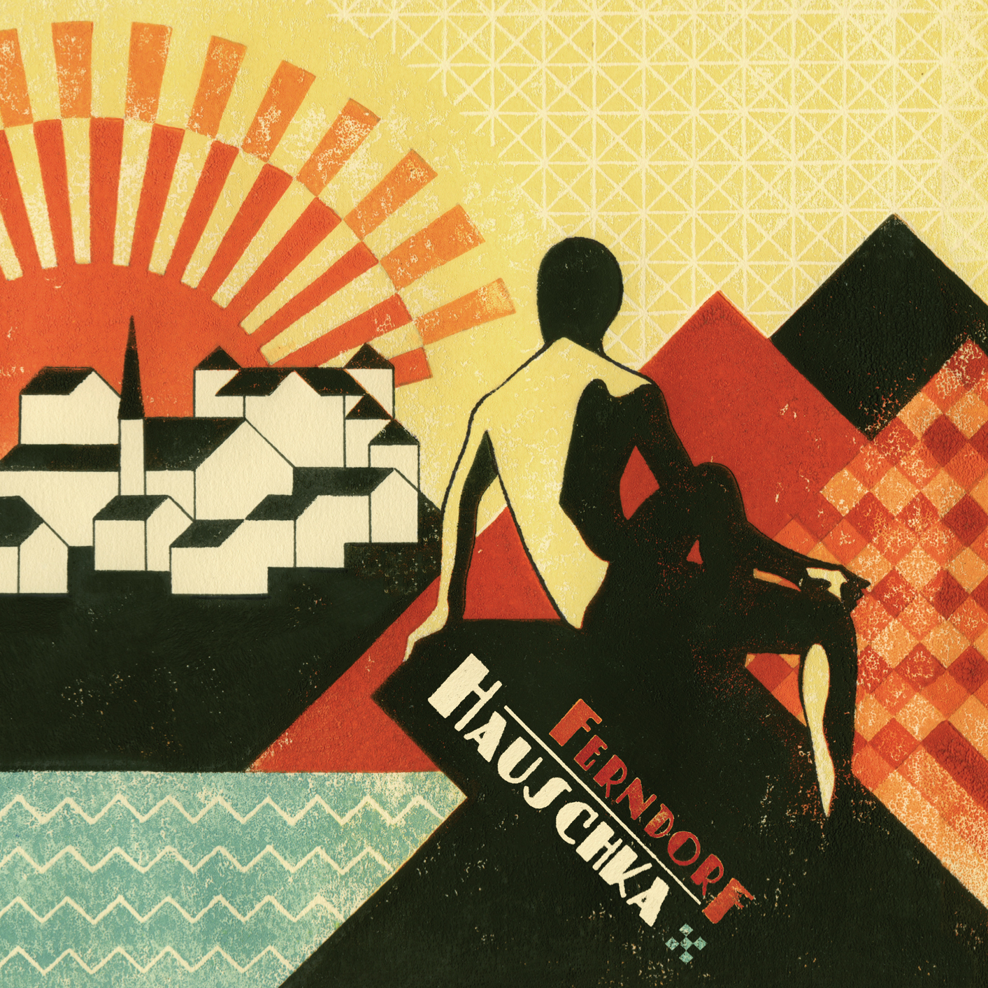
Volker had found some illustrators that he was really into. For Ferndorf, he’d found this guy called Iker Spozio, who’s a print maker and illustrator. His stuff was very colourful, and it’s all, again, done by hand, it’s not created purely in a computer. He’d come for Ferndorf with that cover image – it wasn’t just a cover, it was kind of a fold-over, a double-page spread. And I loved that so much. I was like, “I’d love to recreate that same feel for the rest of the artwork.” One thing that I loved which we’d done for Room to Expand as well, but also on some of the other records, is that Volker had got someone to write a little story, which goes in as part of it. It’s almost like the story of the artwork, as if it’s a real place, because I think it’s influenced by areas he grew up in in Germany. It’s a fictional story that kind of goes into that, and then the imagery for the Ferndorf artwork expands on that. Iker supplied the front and inside page, and then I’d learnt how to recreate something similar to do the back cover to work with all the other elements and the inside pages. I didn’t print it in the same way he did, but trying to get as close to that, so I was printing it out and using photocopies to give it a texture.
Foreign Landscapes (2010), Silfra (2012), and Salon Des Amateurs (2011)
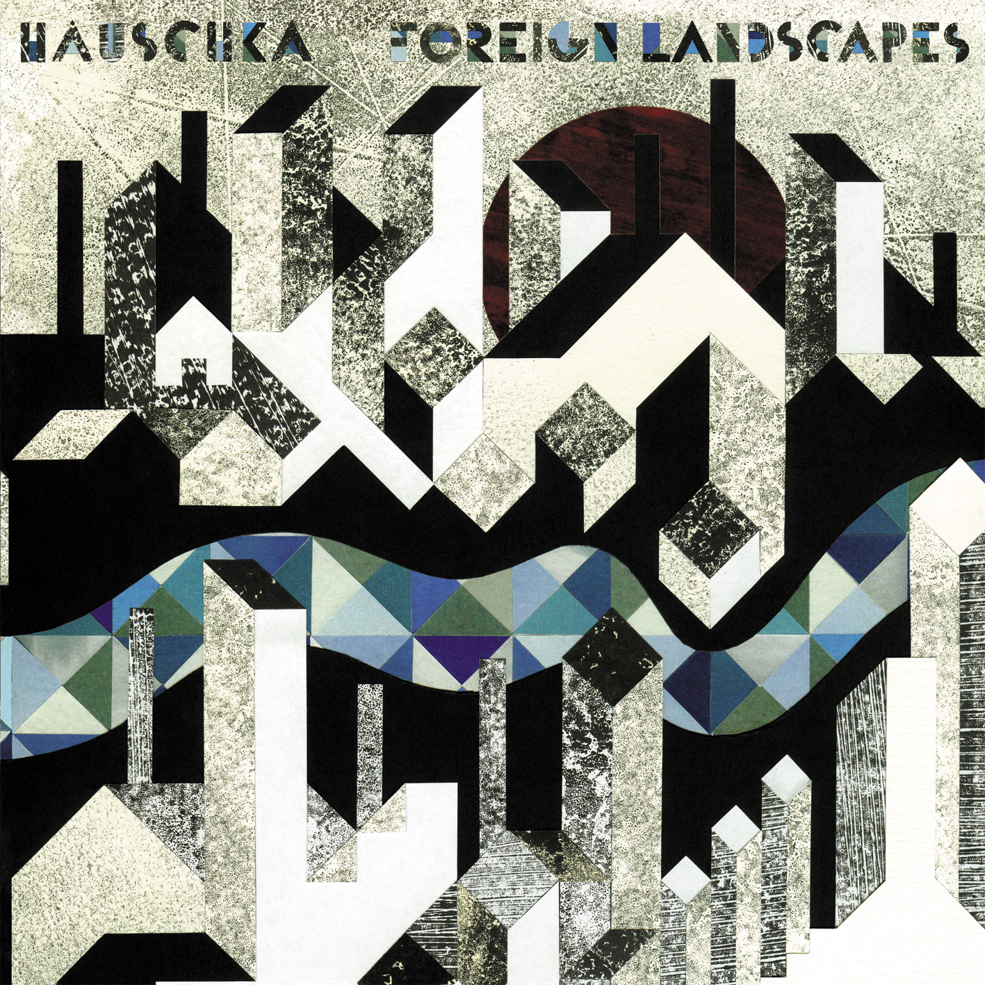

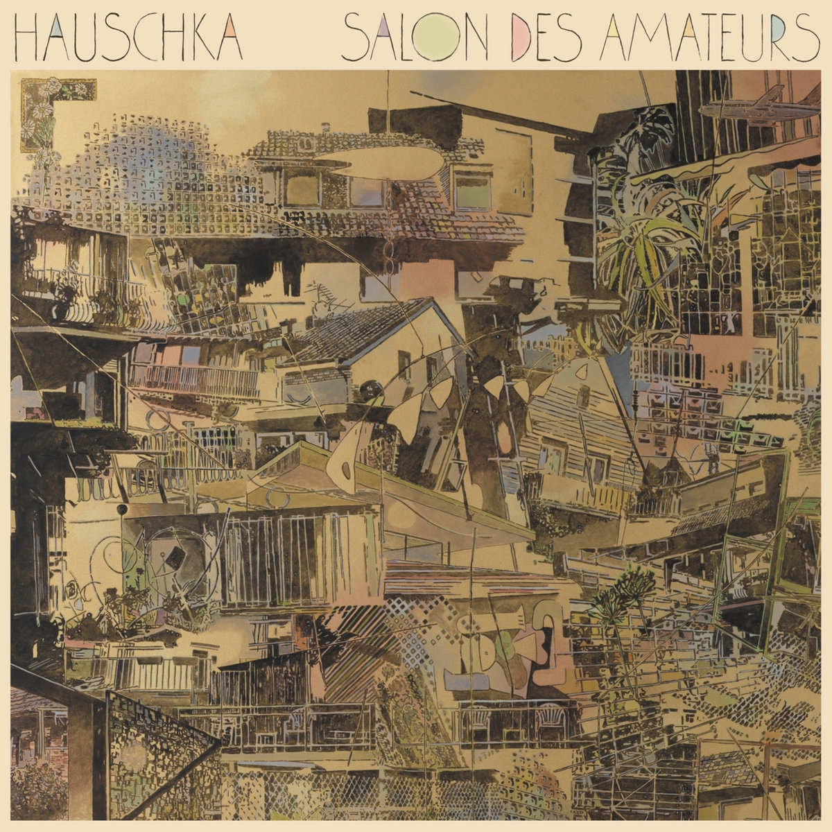
Iker also did the next record, and the process was very similar on that. He supplied a double-page which would expand, and then I followed his lead and created other elements for the rest of the artwork. He also created the artwork for Silfra, the album that was on Deutsche Gramophone. Again, same process with that, but it was done in a slightly different way, more hand line work and some watercolour painting. The cover image was him and then I created the typography, but in the same way so it felt like it was all done in ink and it was kind of bleeding into watercolour paper. And because Silfra ties in with that crack in Iceland, it also brought me back to the connections with Iceland as a place. Each Hauschka album has come with different people involved in some of the process, but he comes with quite a few ideas of what he would like for cover images. For Salon Des Amateurs, he’d found a painting which he thought exactly summed up what he wanted, and then again I did the typography and tried to bring it together so that the typography had a similar feel to the line weight of the painting.
Abandoned City (2014) and Singles
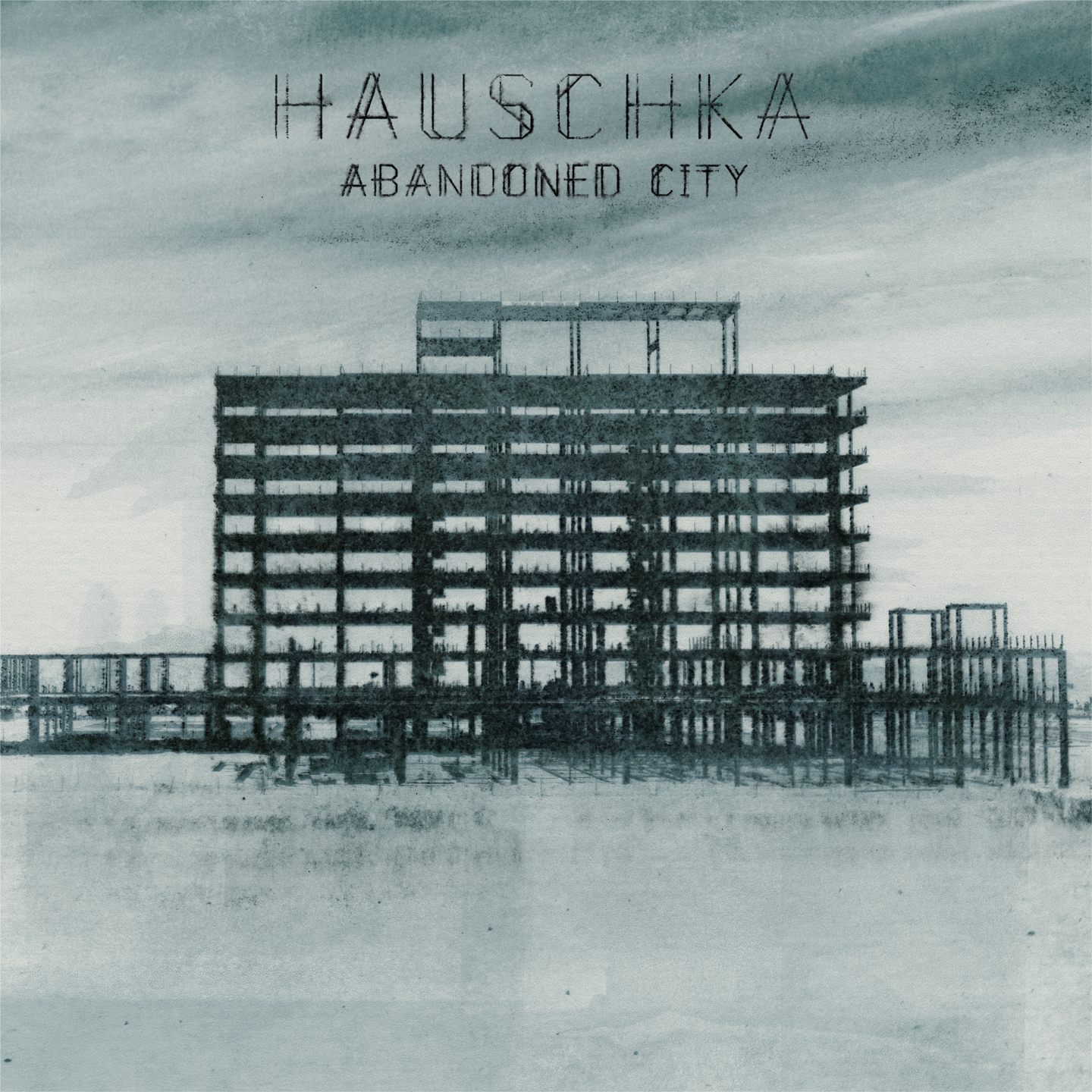
Those were the ones I worked on for Hauschka on 130701, and then around the time of Abandoned City, he’d gone off to other labels, and I kind of went with him. He’d been given this photograph by a friend of this half built building in Las Vegas, but didn’t want to just use the flat photo. With Hauschka’s stuff, similar to some of the other artists I work with, there’s this element of trying to bring the feel of the music into the visuals. There’s so many constructed layers in the music, and we wanted to do something to make it a little bit more human, so it’s not just a straight photo. So I took that photo and used this photocopy transfer stuff, that when you print out something on a photocopier, you can use a chemical which you rub over the back of it and it then presses it onto another surface, so you actually pick up the texture of the paper. I took the photo and turned it into an illustration, brought in other layers, and with that one in particular, it was the first one where I was like, let’s just go to town on how we create it.
That particular building, I think it had been started and then just left for quite a few years. I looked it up on Google Earth not so long ago and now it’s completed. For the first few years in the run up to working on that album, it just stood as this skeleton, and now it’s like a proper finished car park. But because it was such a weird area that there were all these buildings, it was sort of half done, I found other photographers that had been around there and taken pictures from different angles, so we were able to contact them and say, would we be able to use your photographs as the starting point, and then treated them in the same way as I did with the album for the singles.
What If (2017)
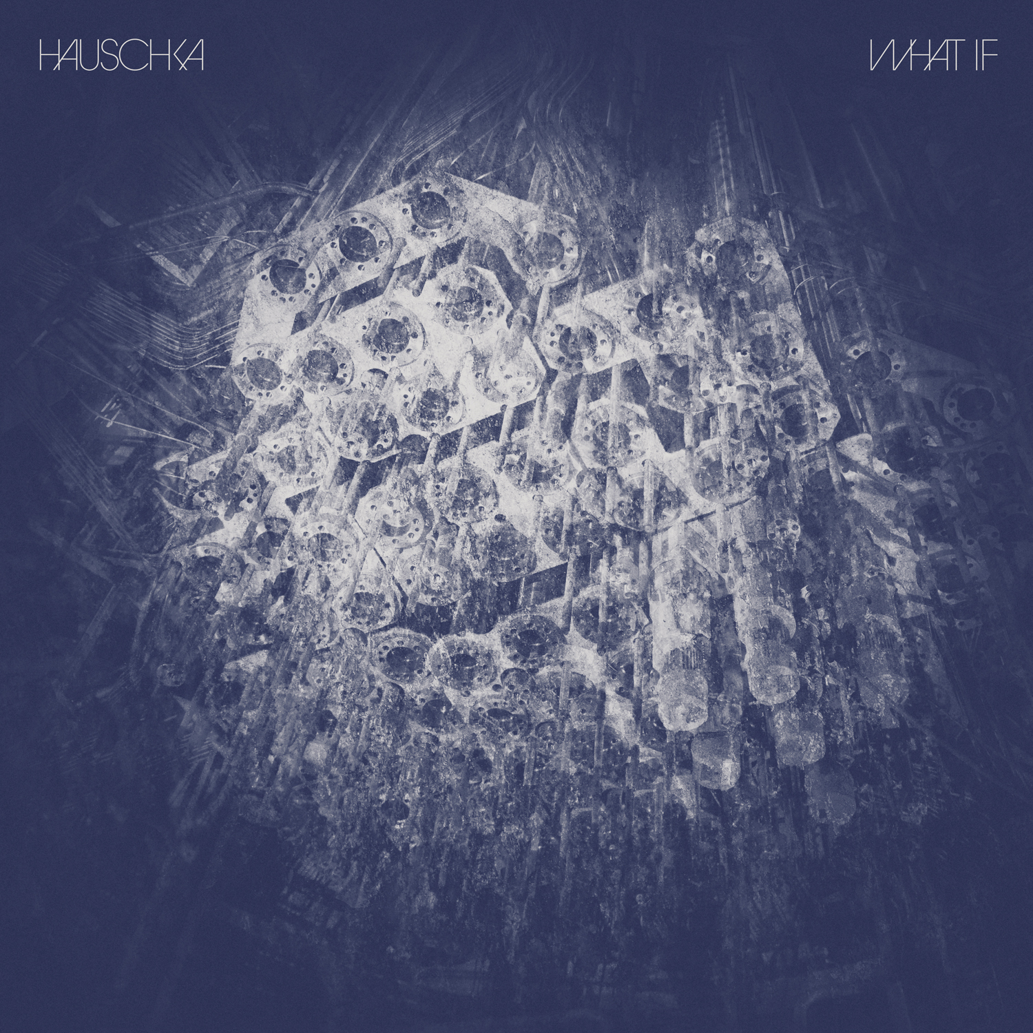
I love this typeface that you created for Abandoned City, which you also use for the next record [2.11.14], and then it changes with What If. There’s an interesting progression in terms of the typography with the Hauschka records.
For What If, he’d found a photographer that he really liked, her name was Nicola Hackl-Haslinger. And he picked out a few images that he loved, and I thought that really struck a chord, especially the close ups of some of the things where you weren’t really sure what it was. It’s elements of, like, the inside of old analog machines, so there is this sort of industrial, technological feel to it. And when you hear Hauschka’s music, even though it is played on a piano, because he has a background in more electronic music from years and years ago, he brings in that sort of feel of the rhythms of electronic and dance, but to analog instruments. So with this particular record, I loved that the subject matter of the some of the photography, you could couldn’t quite place what it was.
I didn’t create the font for What If, it’s an existing thing. I think it’s Avant Garde Gothic, but they do have all these separate characters which kind of overlap each other. It became a fun typographic sort of experiment, to make those words still legible but to be playful with the forms, which that particular font allows you to do because of the tons of extra characters it has. With Abandoned City, it was making the typography feel like it was the same as the imagery behind it, whereas with What If, it was quite a different thing of wanting to keep it very simple but still have a character of its own.
Max Richter
Songs from Before (2006)
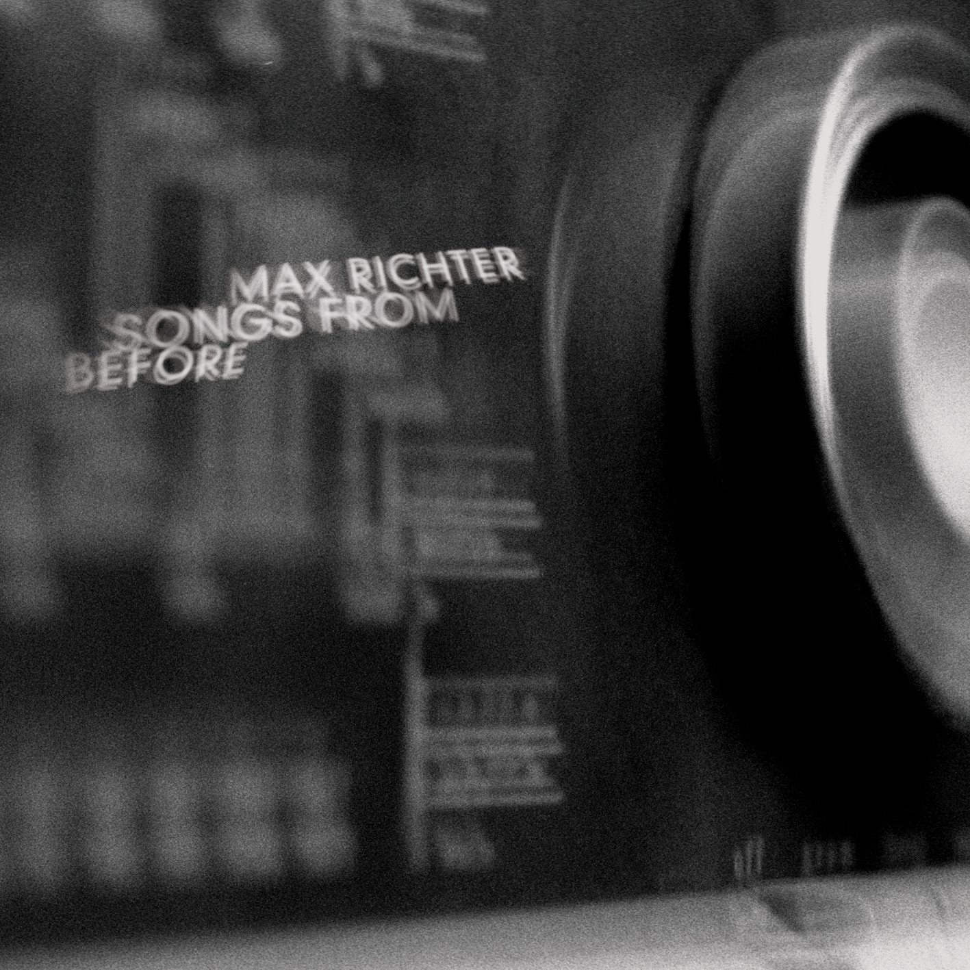
The photography for that was done by Nic Shonfeld, the same guy who did the first Hauschka record. It came from his ideas of close ups of those old analog radio dials, the ones where you could almost see the different countries as you went through them. It was really trying to set the mood for Max’s record, because there’s all these spoken word sections, and you’ve got these layers of music kind of fading in and some kind of the spoken word elements coming over the top of that.
I really saw the artwork as almost like stills from – I’d love to be able to see it moving, and that was everything behind the typography as well. I wanted to do something that looked like it could be the opening credits to a film where it’s kind of fading in and out and various elements of the type are morphing out of the background. I think the influence was the way that, when he was taking close ups of some of the old radios, you could bits of blurred in and out of focus text. And I was like, I wonder if I could treat typography on the record in the same way and get it to work. It was a real trial and error of taking multiple layers of typography, and it was one where I did actually treat it all in Photoshop, kind of like: I’m going to try and bring flecks of light in and blur that bit. There are hundreds of layers that go into making up some of those bits of text.
24 Postcards in Full Colour (2008)
Max had collected a lot of those pictures as he traveled around the world. He always took pictures out of his windows in various places he stayed, so he had this collection of stuff. And the actual tracks themselves, I think he started them as the idea that, could you create a piece of music that almost for a ringtone? How much of a journey could you take someone on in just these short moments? So that narrative of the journey came into the thinking of the artwork, and it had these little snippets, little bits of views through windows. The vinyl and CD artwork is different for that one: On the vinyl, there are 24 pictures split across front and back, kind of like postcards, little memories from those places. And then the CD one focuses on just one of them, and then we use the rest of them inside – trying to have something that works proportionately different for the two records. Because we were still going along the line of using muted or black and white photography in Max’s stuff, I just hand-tinted some of the black and white pictures that they’d sent.
Infra (2010)
That was supplied imagery from the actual performances that the whole album was based on. I think a guy called Bill Cooper took the photo, but Julian Opie, who’s quite a famous artist, did those walking characters that were always across the back of the ballet performance. So we used that as a focus for the artwork. Again, that became more of a layout and typography kind of thing, and I ended up keeping it very simple but using little motifs which tied into the themes of the record, not only the ballet movements but musical notation and timing.
Each Max project was different, and I know that now that he’s gone to Deutsche Gramophone, those records have been reprinted. His wife, Yulia [Mahr], is a filmmaker and a photographer, and a lot of the reissued ones have used her photography across different records. He’s put out a few reissues of things and I think uses that as an opportunity to refresh the artwork in different ways. So they are different now, but I kind of like that they still exist somewhere out there from the things that we worked on.
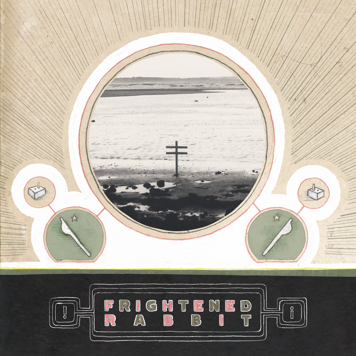
Frightened Rabbit
Sing the Greys (2008)
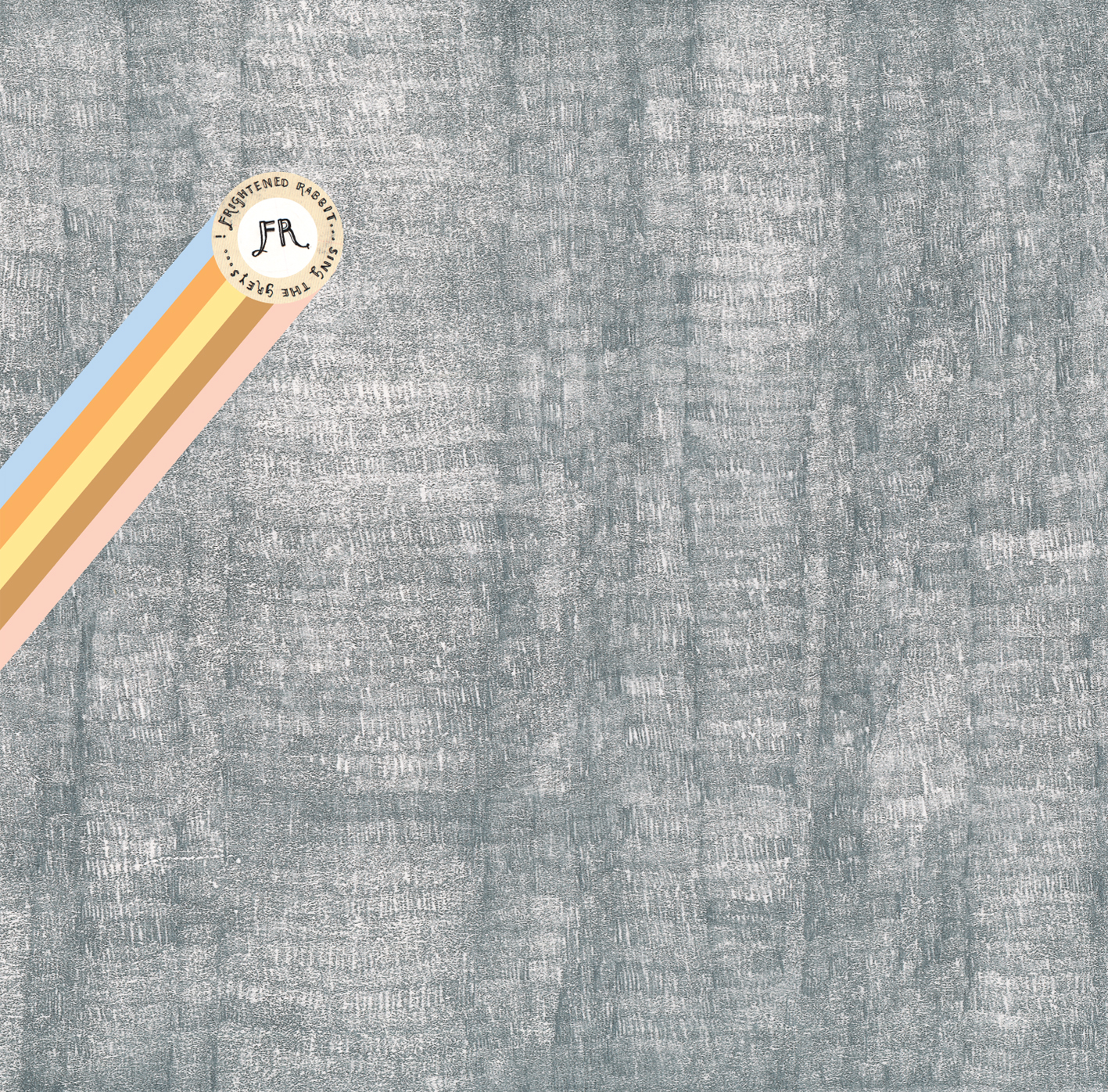
They came along just after Twilight Sad, so I know FatCat were talking to both bands at a very similar time. I had already been working with Twilight Sad and doing some of their stuff, and they’re obviously both from a similar area – I think they may have both been living in Glasgow, even though Frightened Rabbit grew up further south in Scotland. I met them before Midnight Organ Fight came out – their friends’ label Hits the Fan had put Sing the Greys out on a very small CD pressing. When they started working with FatCat, I think the feeling was it’d be great to get that record back out to a wider audience around the time that Midnight Organ Fight was coming, because it really does show a progression between how they started as a band. They were only a three piece and it’s quite rough and ready, but everything that goes on to become Midnight Organ Fight, I think you can see the threads of that happening in Sings the Greys. There’s some great tracks on there that they continued to play live for years and years.
I’d met them in person at a big FatCat event down in Brighton and remember them saying, “Dave can help you with your artwork,” and Grant, who’s the drummer in the band, going, “No, Scott does all the artwork.” He had quite a similar background as me in terms of, he’d went to Glasgow School of Art to do an illustration degree, I’d done an illustration degree in Brighton, so we both come from an illustration point of view. He was an amazing illustrator. So much of the stuff that he does, I absolutely loved. He’d already done all the artwork to Sings the Greys, all of that is his own illustration stuff. The FatCat version of that was just, I looked at the original versions like, “I think we could scan that better, get it sharper.” It was really trying to just rebuild it exactly as it originally was, but just to make it come out better in print. Just little things, like we talked about last time, we’re doing different versions of the FatCat logo, so he found a little cat and we made it look like it was just stuck over the top of the original logo. That’s kind of what set the precedent for – he’d already handwritten everything on Sings to Greys, and I was like, let’s just carry on with that.
The Midnight Organ Fight (2008)
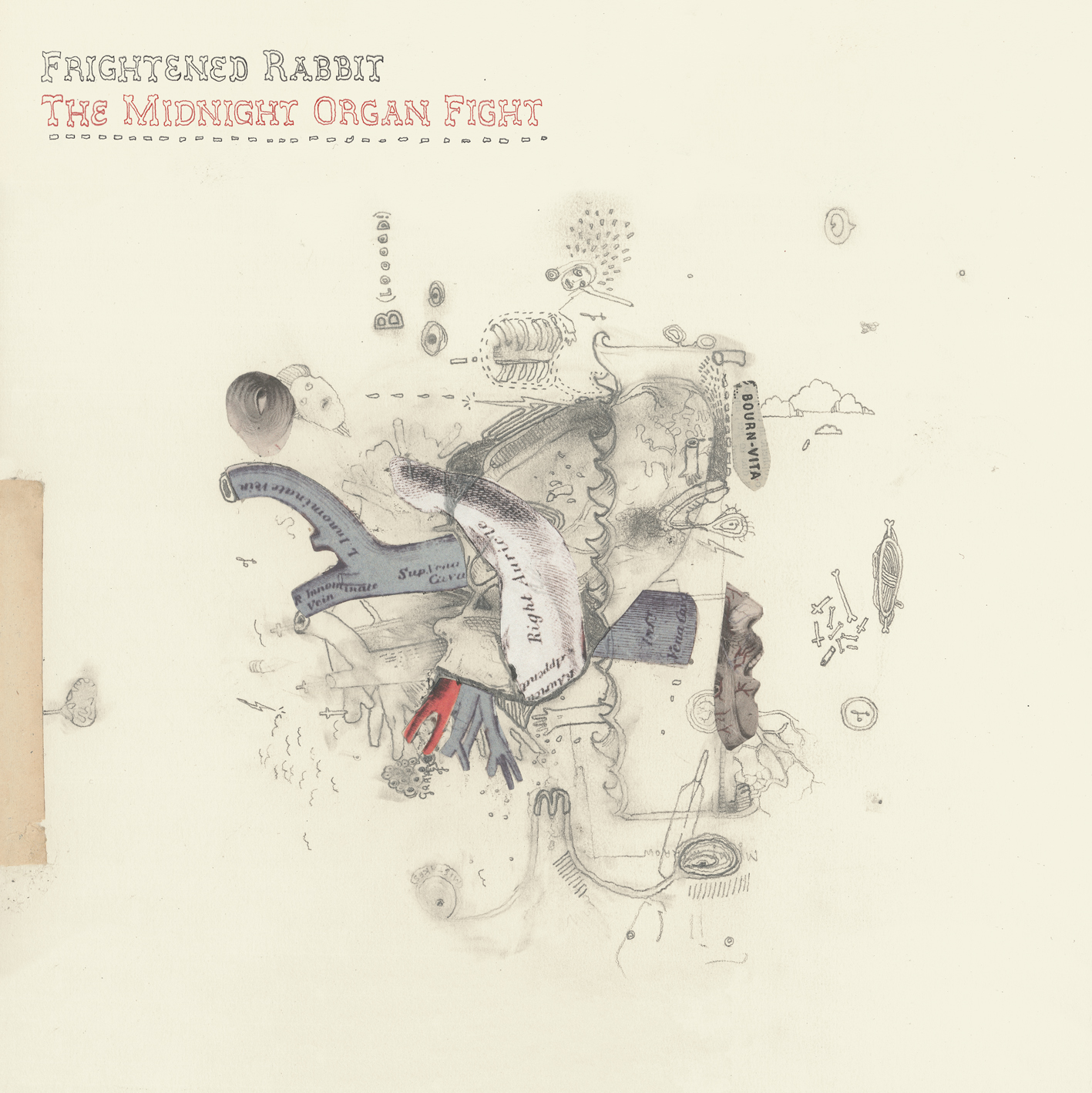
He already knew what he wanted for the front and back covers, but he wasn’t really too bothered about the sort of technical side of things in terms of piecing it together. He would give me physical bits of artwork, so the front cover to Midnight Organ Fight, he illustrated it on a piece of card – he’d already drawn a little image on the back. We talked about handwriting all the text, so he had written that. Midnight Organ Fight tended to be about how can I help him piece all those things together, almost help lead the project, so I would suggest something and he’d go, “Oh yeah, I’ll go and do that.” And then disappear off, draw it, send me a little phone picture, and you’d go, “Yeah, that’s great.”. And then it would arrive in the post and I’d scan it and piece it together.
With Scott, because I knew he was such a good illustrator, quite often he’d be thinking of stuff and I’d go, “You could do this or that,” and I wouldn’t know how it would turn out. And then he’d go, “Look, this is what I’ve been working on.” And it was just, “That’s great. That’s better than I had imagined it looking.” And that got me really excited. It was a case of helping with the little details that would really make it feel like it was the work of just one person. And that person being Scott, I was like, “Yeah, I’ll help out in the background.”
The Winter of Mixed Drinks (2010) and Singles
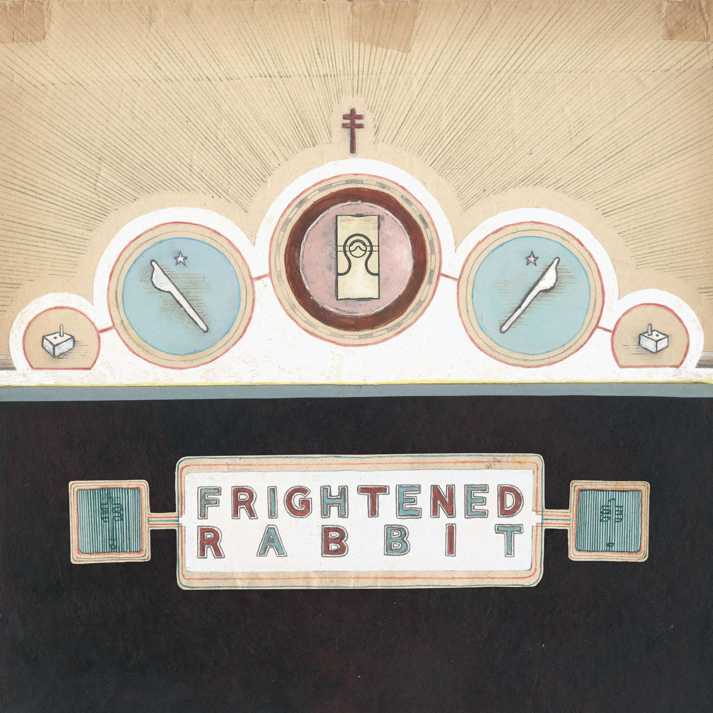
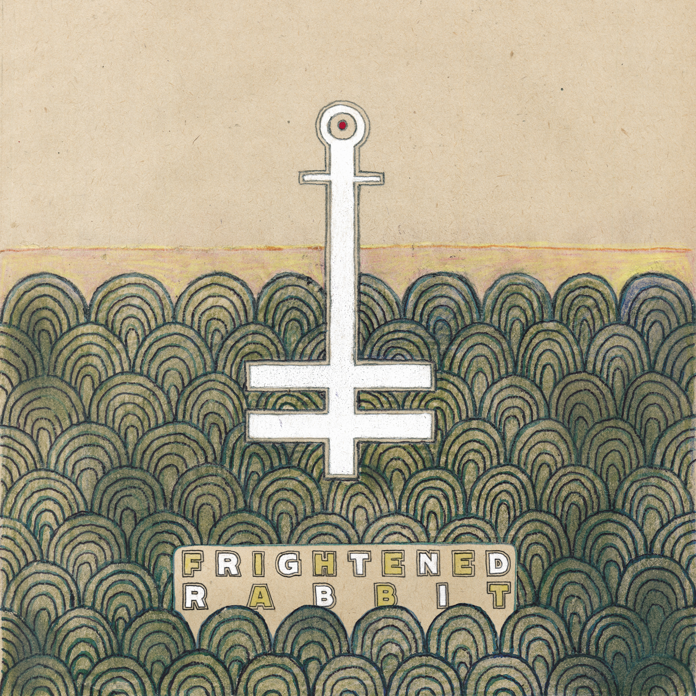

Each record kind of developed in the same way, and as I got to know him more, we’d talk about what it could be for each release. When it came to Winter of Mixed Drinks, we’d already been talking in advance about stuff that he was into. He’d developed more of a love for bold typography and different diagram elements. He sent me the Winter of Mixed Drinks front cover and then it was, “Oh, I could mirror that for the back cover.” He would send me the front cover, and originally it was just black at the bottom, and I said, “We should do some type.” So he sent me this [Frightened Rabbit] as a pencil drawing, and then I filled it in and coloured it to look the same. Around the albums and singles for Winter of Mixed Drinks, it became very much more of a collaboration. It was split between the two of us, again, with the end goal that it just didn’t look like two people working on something. It was still his vision for these projects, and it’s important that he was still doing a lot of the illustration stuff.
There were all these little motifs that appeared in Scott’s artwork, and I know that when he was in university, he actually made a 3D wooden club in the same style as that. There were things that were in his little drawings and illustrations all the way along, and we’d had conversations about, if you start to use those again and again, people will attach meaning to them. Like, people were always saying, “Is that a reference to something religious?” And you’re like, “No, not really.” When you start using symbols again and again, it takes on a meaning that we weren’t really putting any of that on there, other than, on the cover you’ve got a cross there, you’ve got one there, you’ve got one there. They appear all over it. And so that being the second record, we were like, we’ll continue that in the next one. We actually made a 3D thing for the next one with three bars on it.
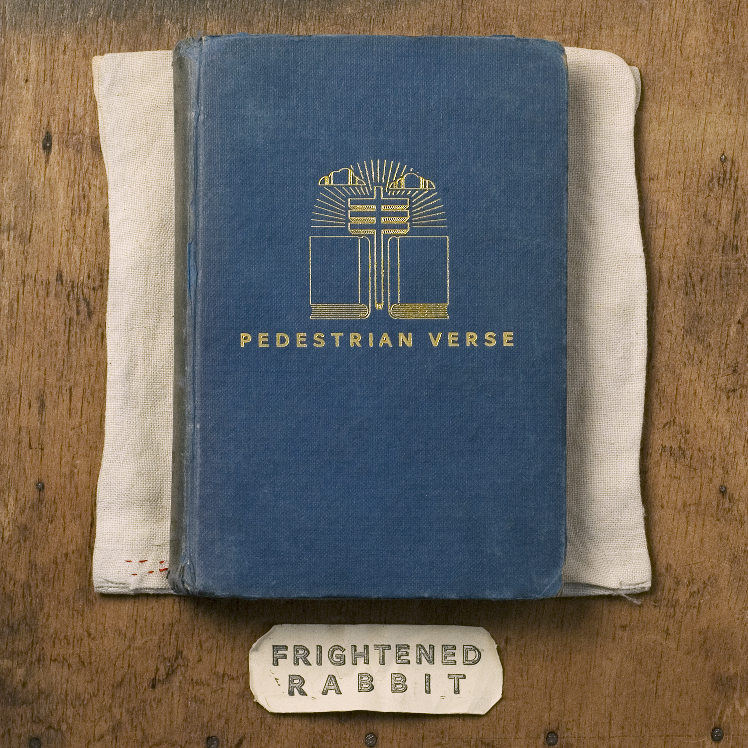
Pedestrian Verse (2013) and Singles

Those are the three records on FatCat, and then they went to Atlantic. When they came to the end of their FatCat deal, I was really kind of taken aback that they were like, “Dave is going to come and work with us.” I actually went along when they met everyone at Atlantic and we already were talking about what we could do for artwork. You hear these stories of a band going from an indie to a major and then you get this feeling from the outside like, “Oh, are they going to be told what their record needs to look like?” But Atlantic were actually really good in going, “You’ve got that aesthetic already. It’s already rolling. We’re not going to come in and tell you how to change that.” So I’d still work with Scott to create those things.
The A Frightened Rabbit EP, that was the first thing on Atlantic, he did do the illustration for that and I did the back cover and various things to match. But then we were moving towards State Hospital and the first record on Atlantic, Pedestrian Verse, I suppose that was point where Scott felt that he was they were traveling so much with playing live that our working relationship had got to the point of, “Why don’t you take over a bit more on this one?” So for Pedestrian Verse, everything had been illustrated prior to that. He’d taken his ideas of all the illustrations that he would do and he was like, “Let’s take some of that iconography, but use the symbols on physical, actual objects. Rather than Photoshop onto a book, let’s actually create the book.” So the book that’s on the front of Pedestrian Verse, that’s actually a hardback book with gold embossed onto the front.
It didn’t become a kind of fancy studio shoot or anything like that. I shot all the photos with my with a guy that I work with quite closely called Joby Barnard, another designer I’ve known for years. He had a great camera and much more knowledge of photography, so he came to Cardiff and we photographed everything for that in my bedroom. We had loads of bits and pieces and wooden textures. We were looking around the room to the backs of old photos and old paintings we had and went, “Look at the wood on that, that’ll be great for a background for something.” I hadn’t been involved in still life photography before, so it was a real learning process.
I talked to Scott about what objects we could use, so there were various things he went off and found up in Scotland and would send me, and then I would paint onto it. It went back to the sorts of things I was doing with Hauschka on Room to Expand, that was the precursor to everything on Pedestrian Verse: They’re going to be real objects in situ. I even went to the stage of, every bit of typography on that record I laid out on a computer and printed it out onto rough old paper, and then it was kind of aged. And then I’d worked out how to lay that out in real life size so it would fit onto the cover. Everything down to the tracklist and where the barcode went was all printed out and degraded and photographed in real time. The only photoshopping was adjustment of lighting or colour just to give it the last little elements of control on those things.
Painting of a Panic Attack (2016)
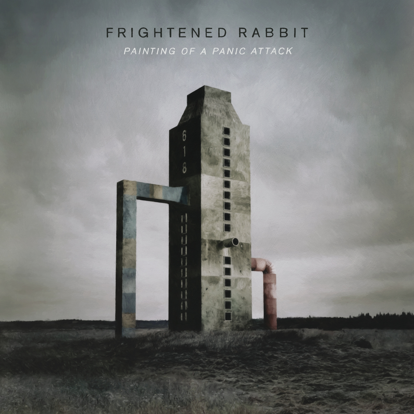
Again, Scott stood back a little bit on that. I started with little sketches that he’d drawn – a lot of the idea behind the record was being able to escape into your own little space, and he’d sketched these various different buildings on legs and towers and things like that. I went away from that and painted those objects but in different environments, creating these landscapes which the subject matter of the album could kind of exist in.
I’d been toying with using 3D programs prior to the final paintings – I actually built all of those in a program called SketchUp, so that it’s actually a three-dimensional building and I could zoom around it. In the process of getting to what we were going to do for the final thing, I could quite easily go, “Right, we’re going to use this building,” and then try different angles and crops. You’re almost doing it like we had with the photos on the previous one, but this time in a three-dimensional program so you can you work out the perspective. And then once I knew that, I could draw and paint the actual finished thing.
I just loved the whole process of working with Scott because it was really a shared passion for similar things. It was very easy as a collaboration to work with, and I don’t think those things come up too often. The more I enjoyed that over the years, the more now I realize I miss that now that it’s not around since Scott’s passing. You’re kind of like, Wow, there was a special working relationship with him, when you become friends with someone and also you’re able to work together – the bits that he brings to it, hopefully I helped piece everything together.
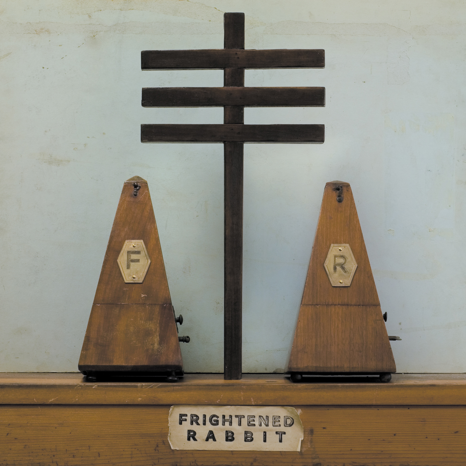
Tiny Changes: A Celebration of Frightened Rabbit’s ‘The Midnight Organ Fight’ (2019)
We’d already started on the anniversary edition to Midnight Organ Fight, which became Tiny Changes before he passed away. We already said we want to redo the cover, so it’s similar but more graphic and stripped back compared to the original one. He’d already given me illustrations for maybe three elements of it, so that went back to almost exactly how we worked on Midnight Organ Fight. He’d created the drawings and sent them to me, and think I went to London to pick up one of them, maybe the cover image. Because the creative process through all the albums, me and Scott would be doing that, when it came to Tiny Changes, I went up and met with the rest of the band and talked through how we wanted to do it. Everyone else in the band hadn’t really been involved too heavily in the past – me and Scott would work on it and then go, “This is what it’s gonna look like.” I know with Painting of a Panic Attack, the band were involved a little bit more.
But when we came to Tiny Changes, there was lots of conversations about, how do we do this? It felt right because it was a project that Scott had already been heavily invested in. He’d already been in touch with a lot of the artists in terms of the cover versions that they’d done for the record. And the fact he’d already started the artwork, we were very aware of not wanting to force anything that he wouldn’t have wanted to have been involved with. We knew what we wanted to do, so it was a case of just carrying that on as much as possible and trying to celebrate the process that I would have gone through with Scott. I tried to get all of the artists that covered tracks for that Tiny Changes record to send me their own handwriting, because in the booklet there’s little explanations from everyone about where they first heard the track that they were working on and why they wanted to work on that particular one.
The Work (2021)
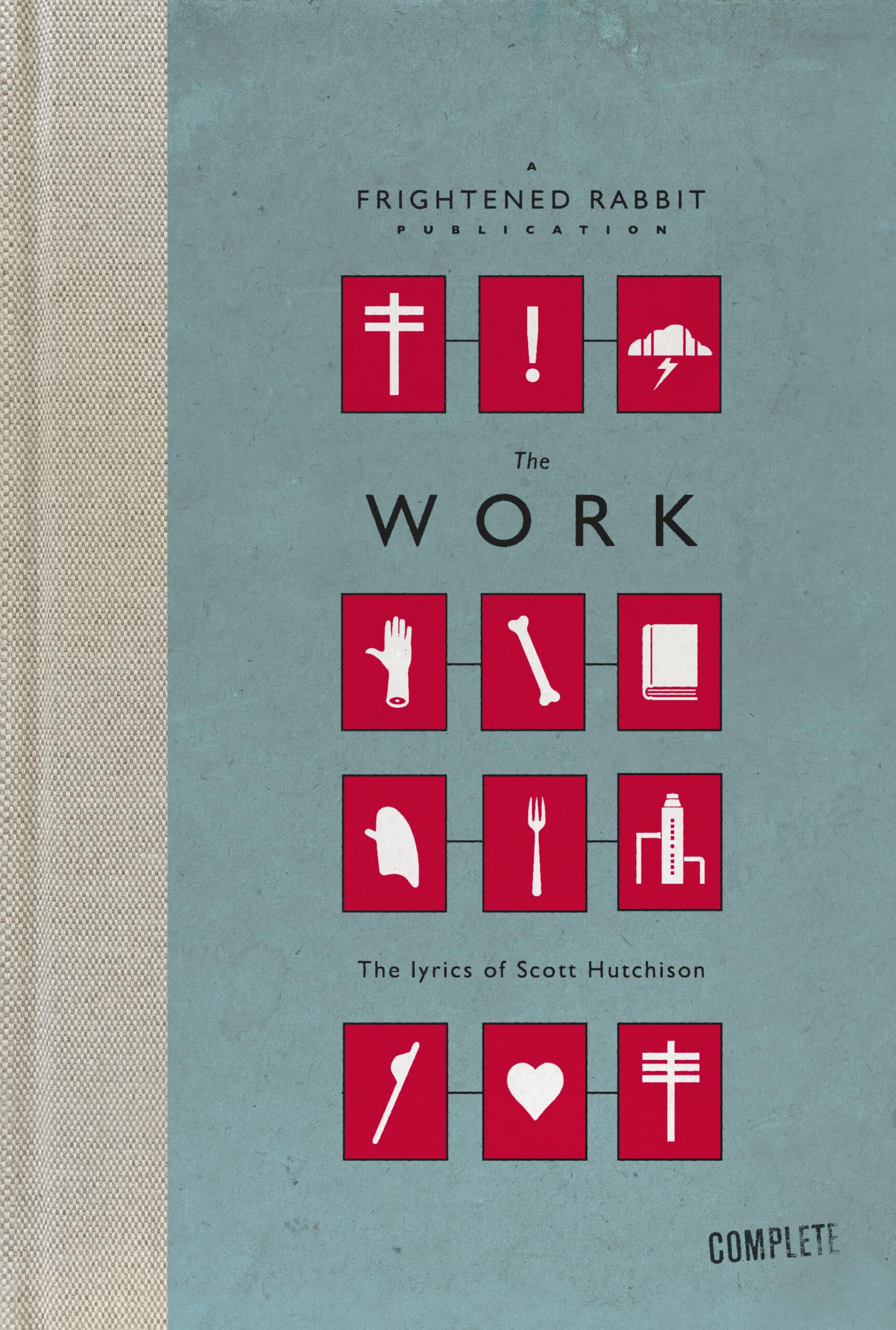
I’d had a conversation years ago with Scott about wanting to – we had this joint love of illustrated books, and we talked about an illustrated book of every track in The Midnight Organ Fight. He would rewrite the lyrics but with drawings all around it, so it was completely immersive. I think he’d done maybe three, possibly four tracks where he’d already started to do that. About a year ago, the band and everyone involved with them was like, it would be lovely still to do a lyric book, because those lyrics mean so much to so many of the fans that are into the band. The band have really been involved in Tiny Changes, the charity, really helping in terms of mental health and suicide awareness, and obviously the lyrics speak of a lot of those things. So there was a feeling that maybe it would be a really nice thing to collect together those lyrics that are so special to people.
It was really good to have joint conversations with everyone involved in the band, to figure out which bits are they comfortable with people seeing, which bits should we keep. Because that’s the thing – all of Scott’s notebooks are private things, but it’s amazing to see where a song that is so well known, so well-loved, started. You see these little snippets of ideas and possibly where a well-known line started and then scribbled out. We felt it was important for fans to see elements of that stuff, to see the genius at play in the creation of some of those words.
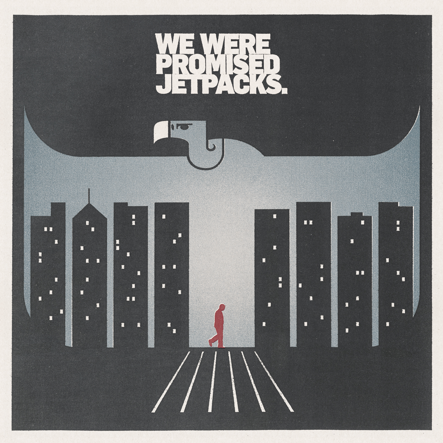
We Were Promised Jetpacks
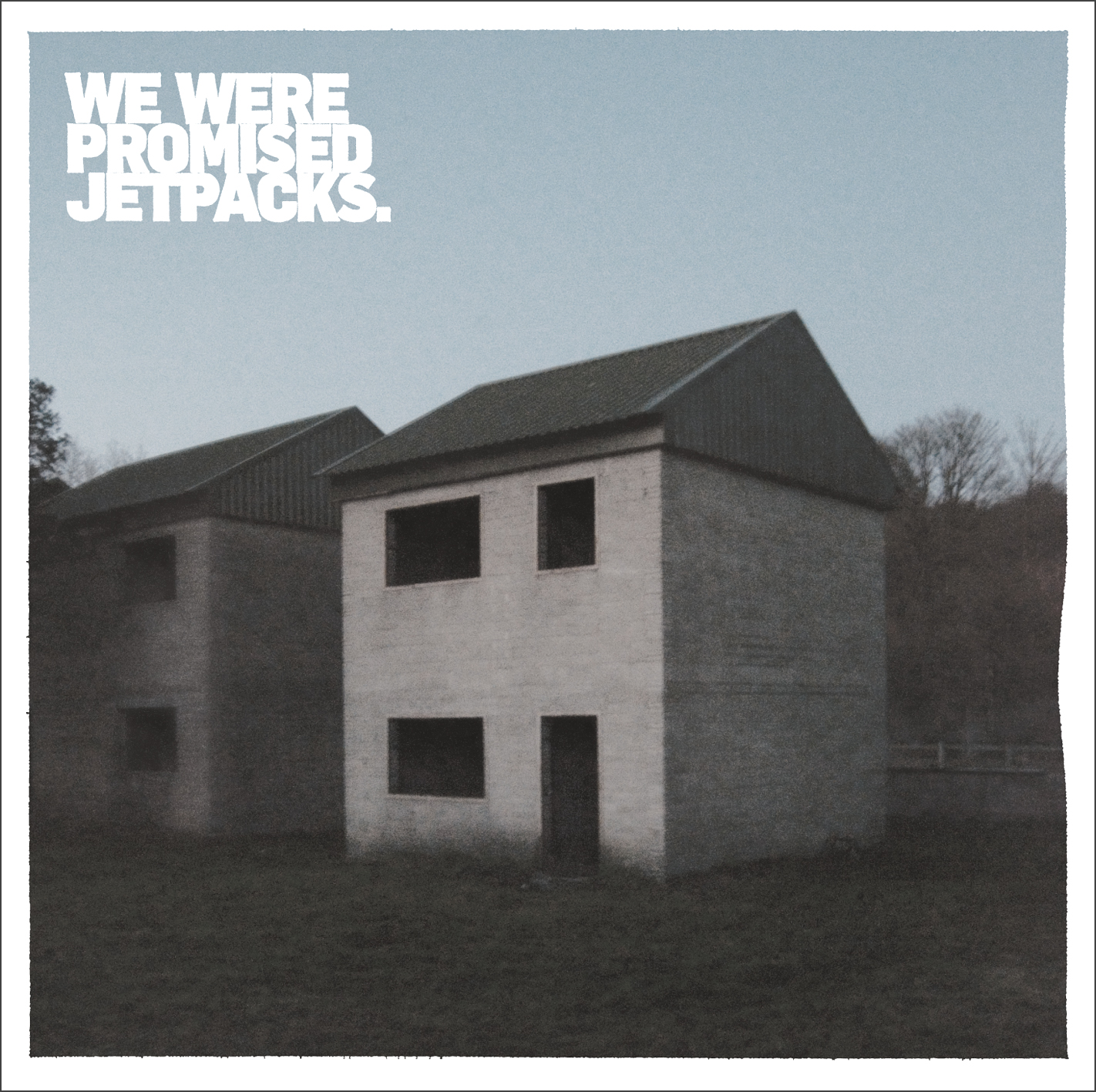
These Four Walls (2009)
I’m interested to hear the story behind this one, because for an emo-adjacent band like We Were Promised Jetpacks, there’s a specific association with having an abandoned house on the cover.
It was another FatCat connection. Off the back of Frightened Rabbit and Twilight Sad being on the label, suddenly people had lots of personal relationships with people who were up in Glasgow and up in Scotland. Other bands that were a few years younger Frightened Rabbit and Twilight Sad, they were doing the rounds at the same sort of time. They came to the label and I was put in touch with them. They had little bits of visuals, they kind of started with photography and then these little symbol logos that they were starting to use, which featured on early demos. I think the general feeling was that the photos that they started with needed to reflect the heavier side of the band a little bit more.
With Jetpacks, it was an interesting conversation where they were open to just trying some different things. They didn’t have necessarily exactly what they wanted, so it made it more of an open conversation. I don’t think I was averse to going down the route that they’d already started, but there was an opportunity to try some different things, whether it was more illustrative, more found imagery, and different types of typography. They quite quickly were like, “We’d like to stick to the band logo that we’ve already started using. We don’t want anything about space or actual jetpacks.” They were very happy with that as a name, but didn’t want that to be the imagery that went with it. It felt too playful, it didn’t strike the right tone in terms of what the albums were about, which was totally cool. So it was about narrowing down those options and working together to find what the right direction is.
When I’d been asking about subject matter, I’m pretty sure there was something they sent me where they said, “The idea of somewhere humans should be, but they aren’t,” or something like that. Abandoned places, so very similar to stuff I’ve come across with Hauschka. I’d been looking up abandoned villages and abandoned towns, and there was this amazing place on Salisbury Plain, which is a village called Imber that was taken from the people who lived in the village during the Second World War because a lot of Salisbury Plain in England is used by the Ministry of Defence as military practice areas. And this village was right in the middle of what they wanted to use for that as part of the war effort, except it was never returned to the inhabitants. It’s now still owned by the MOD. I’d seen that it was open only twice a year for the public to go in there, and one of it is just over Christmas.
I’d seen these amazing shells of houses that they use for practices, and I just thought, there’s something about that that strikes a chord with – something that looks very familiar in terms of, it looks like a family home, but it’s just a shell. There’s none of the humanity in it. It’s just walls and a roof and floors. I was living in Brighton and I happened to be back here where my parents live, which is only about an hour and a half drive to Salisbury Plain over Christmas. And I was like, “I’ve got to go and see it, because you never know, it might be the perfect thing for this record.”
It being that time of year, the amount of daylight you have is very short. By the time I arrived, it was probably three o’clock in the afternoon, so I only had about an hour’s more light in the day, and just walked around this amazing village. The building that featured in the front cover is a practice area that the military run around. It’s a shooting range, essentially, in the rest of the year. You can walk around the boundaries of the area as a member of public – the original church is still there, the original pub is still there, so they hold a service at Christmas to remember the people who lived in the village originally, a sort of vigil for the people who ever had their houses returned to them. It’s a really evocative place. It wasn’t abandoned by choice, whereas some places, like you get out in the middle of nowhere in America in the desert, people went there because of mining, and then that didn’t work out and they just upped and left. Whereas this was forcefully taken away, so all those things tied into the feeling of it. I took maybe 100 photos that day, and really only ended up with one or two that actually worked, and one of them ended up being the cover to the record.
The fact that it was already called These Four Walls, it did fall into place with what the band wanted to say. As you mentioned, there is a history with empty buildings featuring on similar albums. I don’t think I was aware of those so much at the time, like the cover to American Football’s [self-titled album]. They were are an influence on the band – members of Jetpacks and Frightened Rabbit have visited that place when they’ve been on tour in America. But at the time, it didn’t really occur at all. It just felt like it was right for the album itself.
In the Pit of the Stomach (2011) and Singles


They wanted something very graphic after it being photography the first time. They wanted to keep a similar sort of mood so it felt like one record going into another because musically, that’s what was happening, but wanted it to be much more illustrative. A lot of the imagery in the artwork are things that tie in to – they would send me all the lyrics, and picked out little scenes or objects or that are mentioned as part of the artwork. There’s interconnected diagrams and illustrations inside the artwork, and those tie into bits that are in the lyrics. And then we expanded on some of those for the singles.
Unravelling (2014)
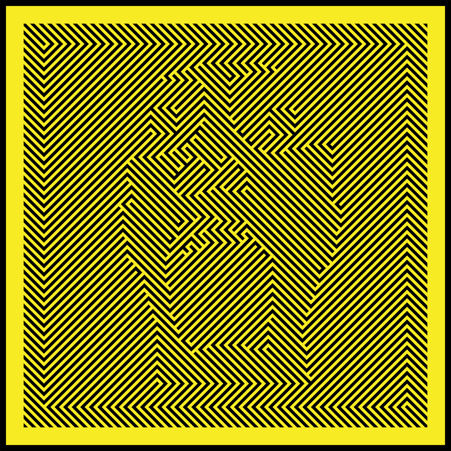
Unravelling was completely different from that. They wanted something really pattern-based, and they’d seen these different graphic tricks, hiding things amongst patters. We did try versions which were much straighter pattern-based stuff, but the subject matter was missing from it – you could probably change the name in the top corner and it could be any artist. The way that we went felt much more like it was interlinked with some of the lyrical content of that record. It was an interesting one to work on, because it’s odd to look at just by glancing at it. But the creating of it, you had to zone in on one colour and just try and blank out the other. I built a grid system and then built it block by block in Illustrator. People would come in and look at it and go, “How can you concentrate on that?”
It was another one where I’d never done that as a style before, and I found it really exciting to try something I hadn’t done before, something really clean, whereas the previous two records had this element of degrading stuff and photocopied backgrounds and were grounded in something more analog. It was a real challenge to try and get the image to work – at first glance, you could just see pure pattern, and then when you look at it, you can see the screaming character. Lots of people say they can’t even look at it because it’s too full-on.
Enjoy the View (2021) and Singles
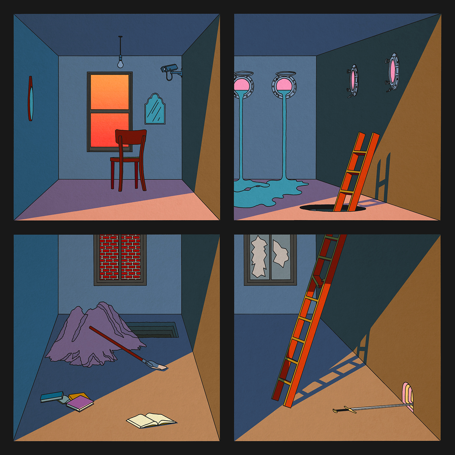
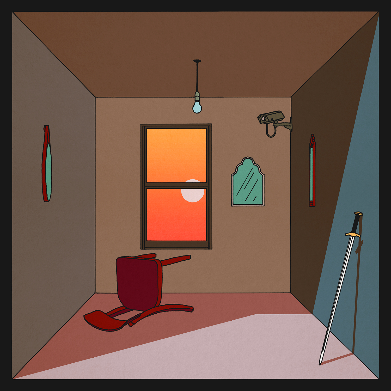
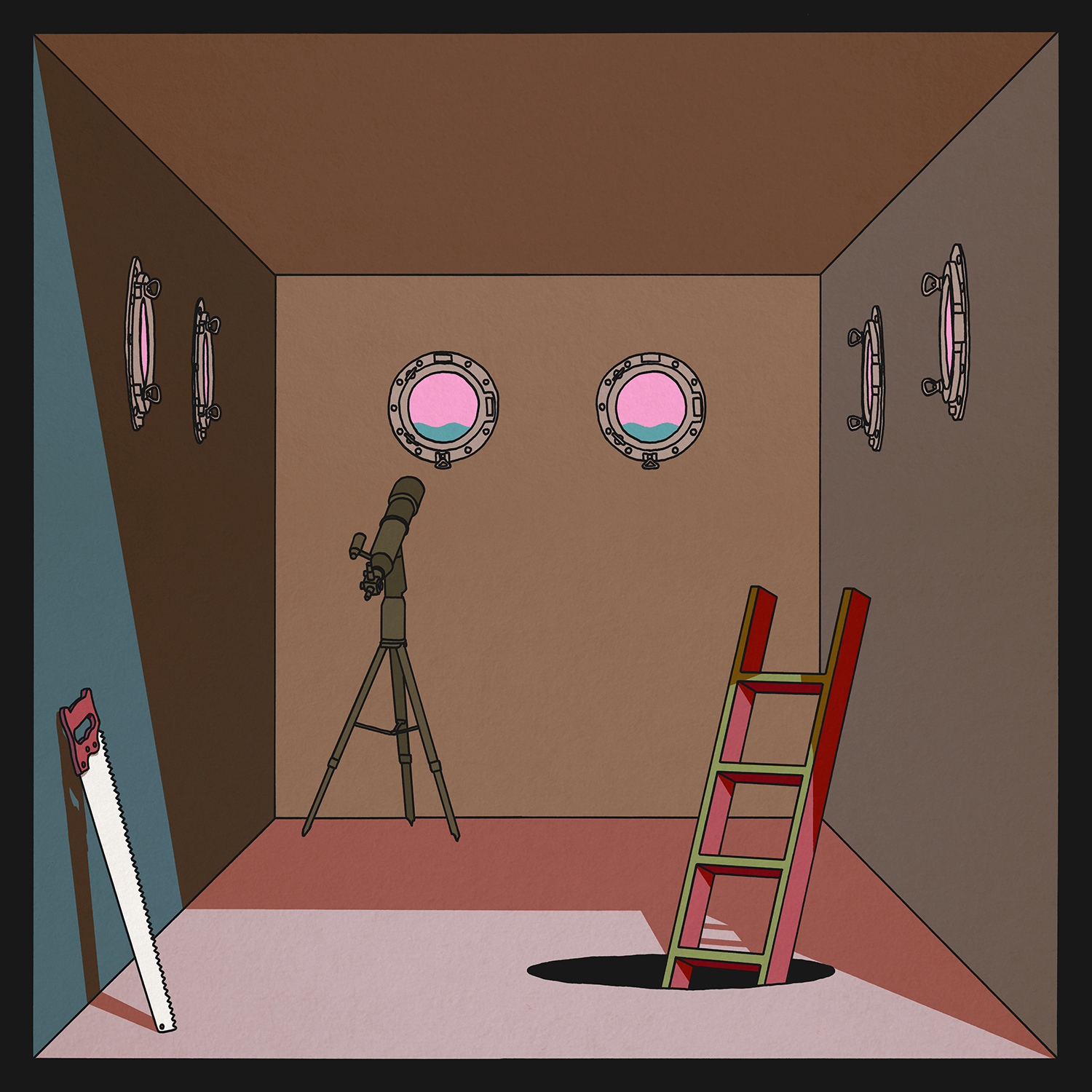
They’d moved from FatCat to Big Scary Monsters on their previous record, and I didn’t work with them on that one. They got in touch at the end of last year, and they really wanted to work together again on stuff. Everyone had been in lockdown, so we did Zoom chats with everyone involved in the band, just trying to get a sense again of what they wanted to do differently for this record. They’d picked out some graphic styles that they were really into and looking at stuff like three-dimensional, looking into spaces, so it kind of felt like each room could be a different song, a different situation that the lyrics were talking about.
I was asking them about what things popped up in their memory when they were recording it, and I think I came out of the conversation with 15, 20 objects and locations. Because everyone had been at home for however many months at the time and part of the writing process had been involved in that, some of that was integrated into these compartmentalized boxes of different things happening. It’s a challenge in terms of an illustration style, because that very structured line drawing type thing I hadn’t really done before. When you compare These Far Walls to this one, the tone of it is quite different and it has a lot more space in it, so it’s not so claustrophobic in terms of the artwork. It’s a really exciting process to be back working with them.
Mogwai
Mr. Beast (2006)
Mogwai is different to some other ones, because I was a proper Mogwai fan before I ever worked with them. I’d bought stuff of theirs and seen them play live when I was in university in maybe ‘98. They were a real sea change in terms of the music I loved. I’d been buying lots of alternative guitar music, stuff that I suppose gets termed now as Britpop, and read about Mogwai in the NME and was like, “Wow, that sounds amazing.” I was too young to have been into Slint first time round or Tortoise or any of those things, so my introduction to post-rock music was through Mogwai. I’d already bought their first record and seen them live, and it was mind-alteringly crazy. It was in a tiny little venue in Brighton where you could practically touch the ceiling, the old Concorde. Just completely all-enveloping, and I remember that being the loudest gig I’d ever been to at that point by a long distance.
By the time it came to working with them in 2006, it came through my connection with FatCat, because FatCat were distributed by PIAS and Mogwai were putting their stuff out on PIAS. The cover artwork was done by Amanda Church, and they just needed some help with the rest of it. That was the biggest album artwork project I’d worked on – that came before working on Twilight Sad, before Frightened Rabbit. I’d worked on the múm record and some of the other ones we’ve mentioned on the FatCat level, but this is just as I’d gone freelance, so I was working on my own. I worked in conjunction with Mark Beacock on that, and we double-teamed the artwork and did layout things together, trying to marry together some of the almost Art Nouveau-ish feeling in Amanda’s painting with the rest of the stuff. It was a real learning process about the scale of an album project when it’s a much bigger band. I was quite nervous about meeting them as people; it felt like a meeting of your heroes sort of thing.
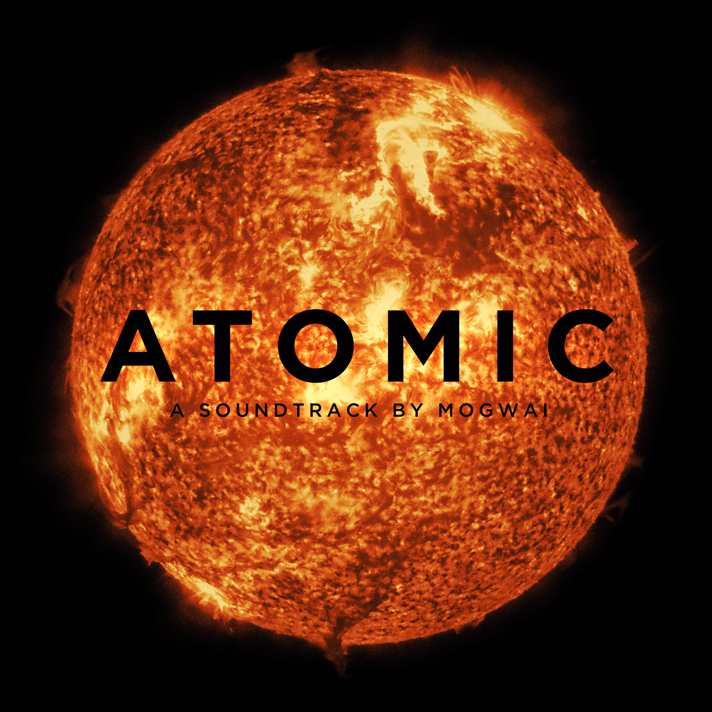
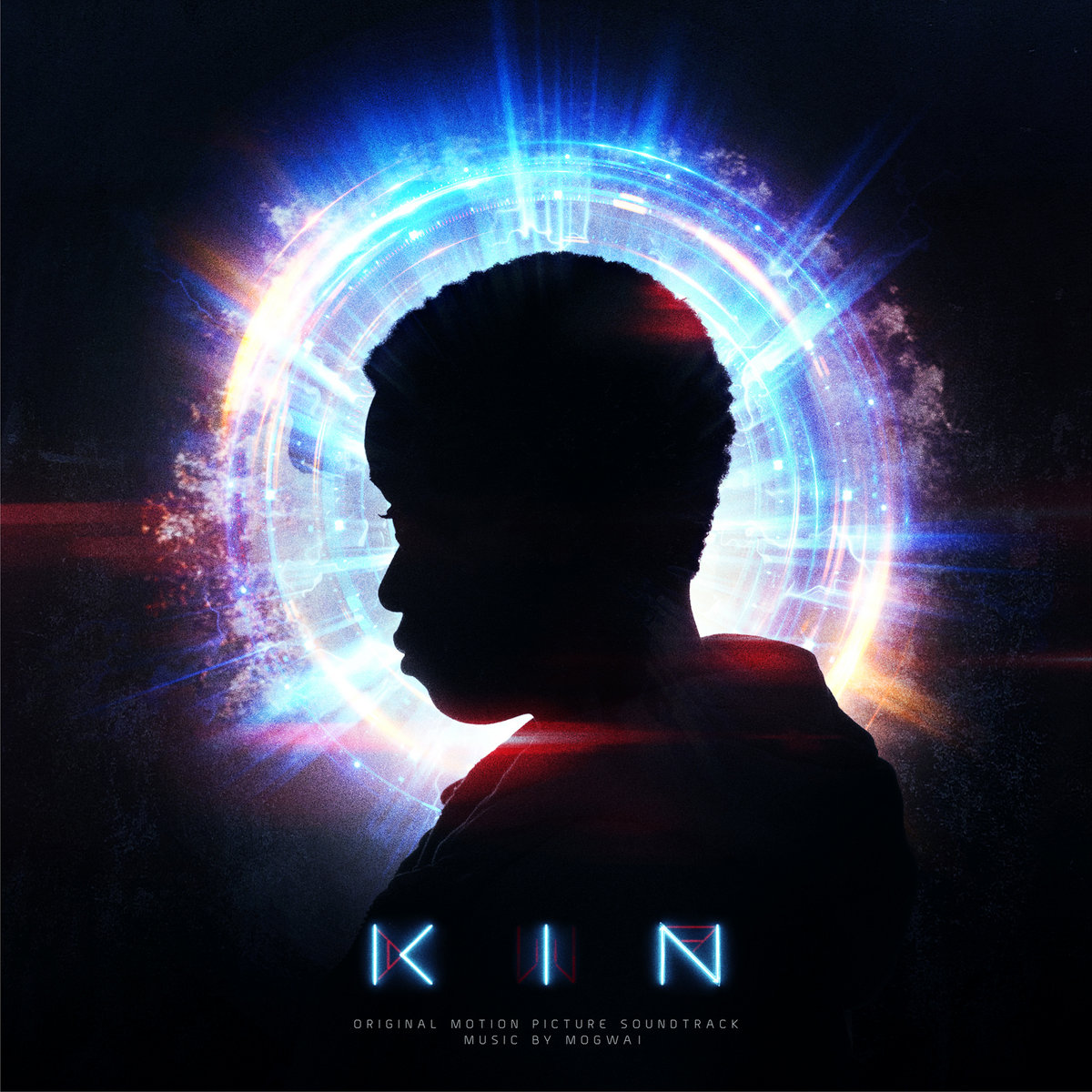
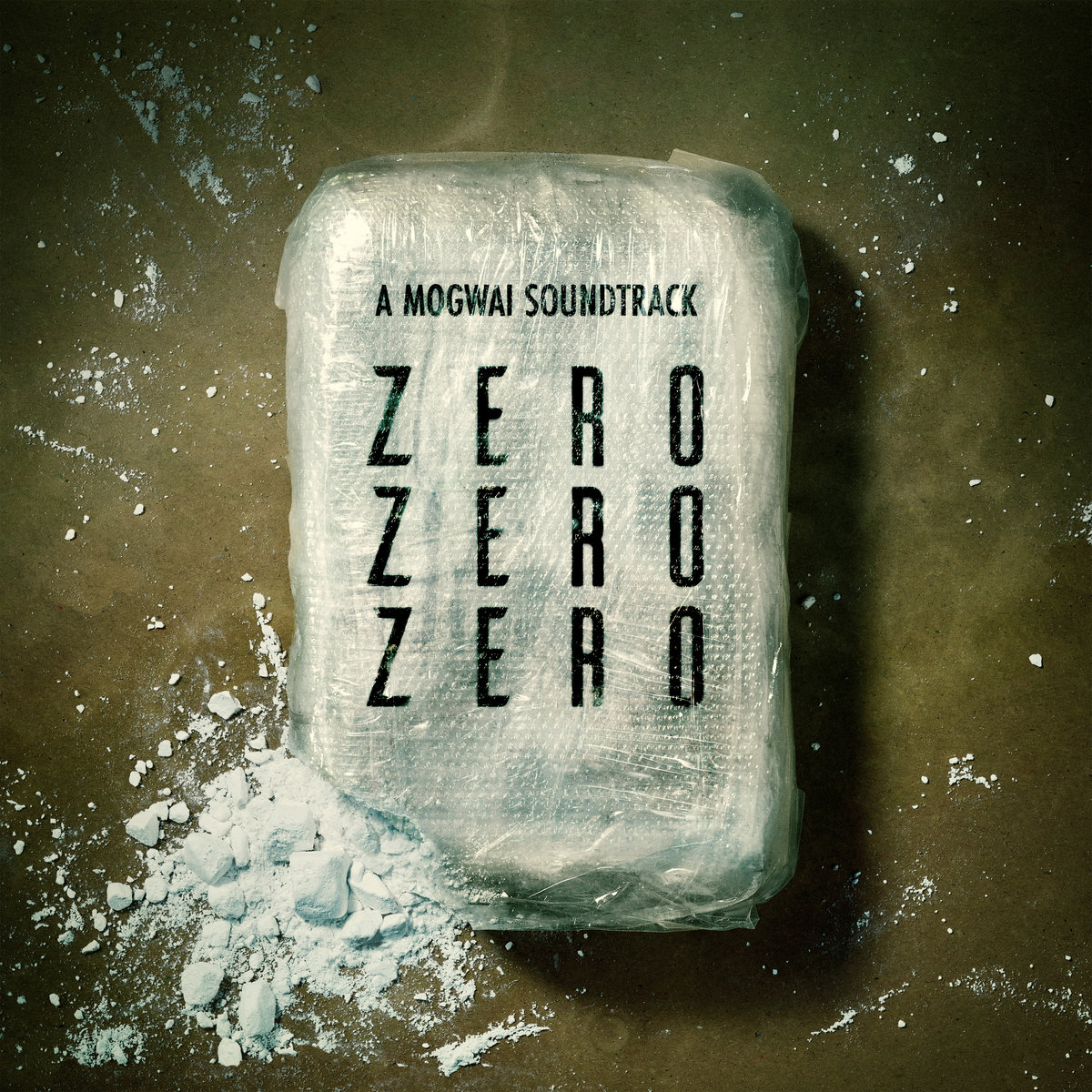
Soundtracks: Zidane (2006), Les Revenants (2013), Atomic (2016), Kin (2020), ZeroZeroZero (2020)


Zidane was the first time that I’ve worked with people on film soundtrack stuff, which I ended up doing with Mogwai lots of times after that. Just learning that process of, when something is set by a film company, it’s not just the band and you and maybe the band’s management that are involved, there’s a whole other step of people that have already created those things. And they want the album artwork to sit in line with what they’re doing for a different format, in that case a film. It was all stills from the actual film itself, so a lot of it was a case of just doing the layout, the design. It wasn’t being involved too much creatively.There are almost two threads with Mogwai’s stuff: The soundtrack stuff, because you have film companies involved, you have to take that into the account; whereas with the full album stuff, they kind of let go of the reins.
Hardcore Will Never Die But You Will (2011)
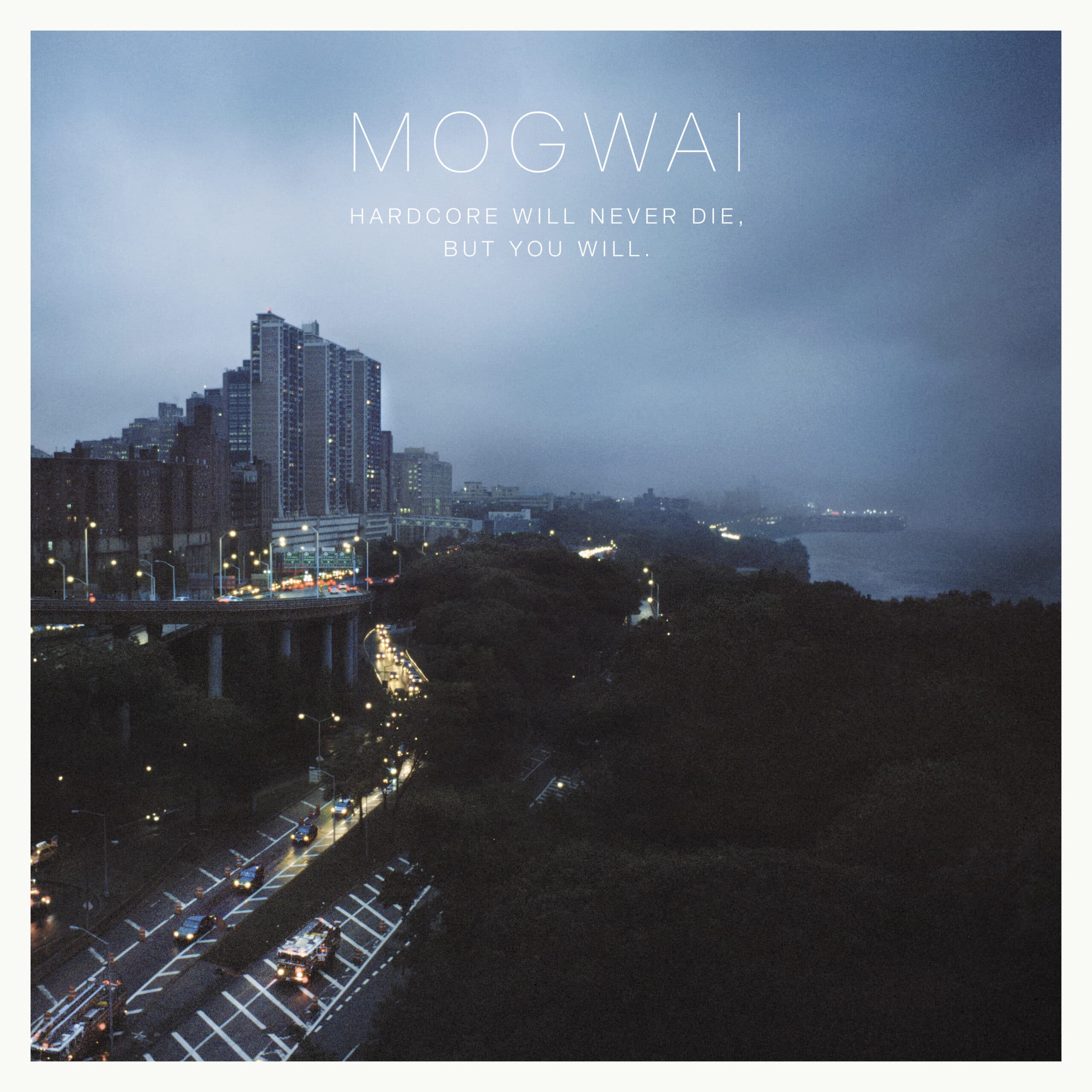
They’d worked with the same photographer over years, this guy called Antony Crook, and they just loved his photographs. He’s been involved in a lot of the making the videos around Hardcore Will Never Die, and I think he’s currently making a film about them as well. He’s the guy who did the photos around Hardcore Will Never Die. I think that was the first one where I really felt involved in the whole process, and it became a typographic, layout job. I wanted to the type to not take anything away from Anthony’s photos and let them lead everything and keep everything else crisp and clean.
Rave Tapes (2014)
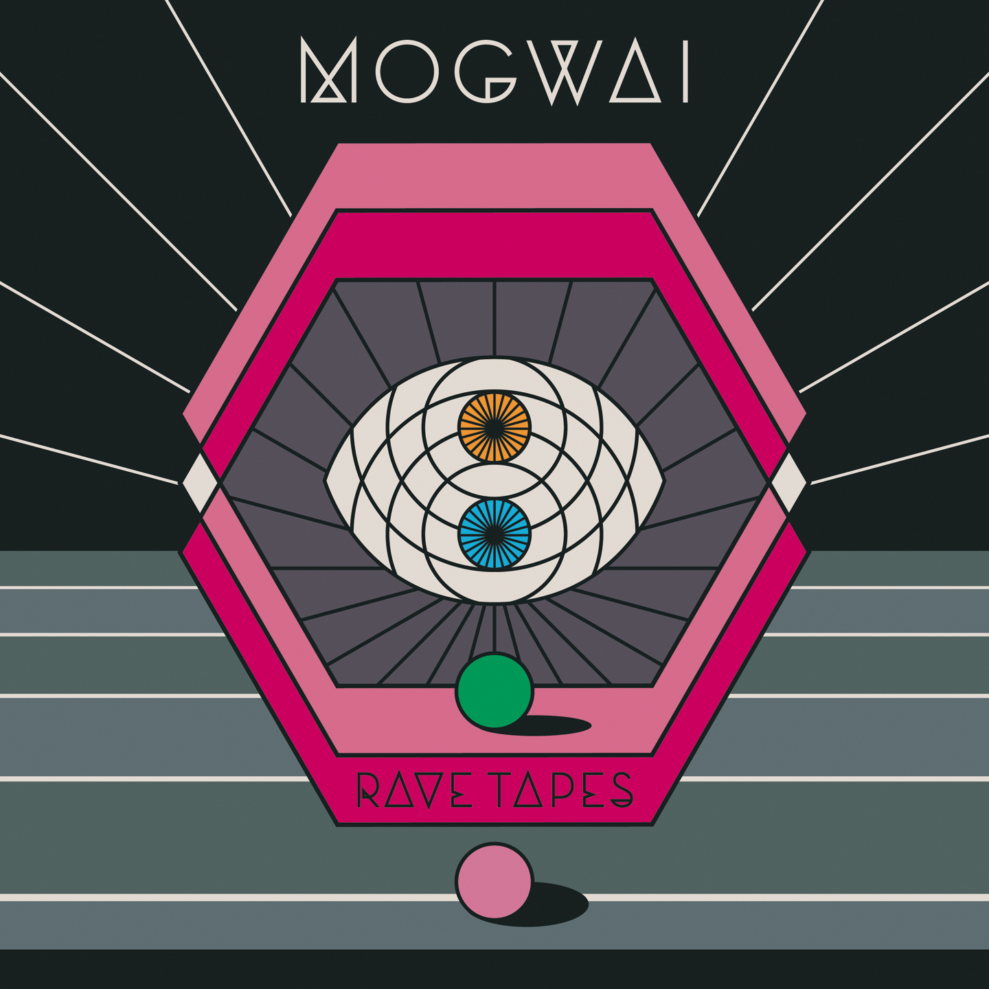
Since then, the actual creative process, they’ve kind of let go of the reins more and more as each one came along. By the time we got to Rave Tapes, they were like, “What do you want to do?” It was quite a different sound for Mogwai, so I think the feeling was that visually they wanted to do something different. So was I like, “I think it should be something more graphic, something that would tie into the weird sci-fi aesthetic that you’ve been mindful of in the making of the music.” I sent them lots of graphic shapes and patterns, a big grid of about 15 or 20 different options that were all quite flat colour, graphic shapes. And the one that was picked, I hovered over the mouse and I was like, “It’s so different to the others, I don’t know whether I’m into it, I’m not sure.” And it was just black and white at the time, everything was black and white. I almost didn’t include it, and that was the one that they went, “We really love that one, but how about adding some colour?”
I’d never thought about quite neon tones, pinks and stuff around Mogwai. If I think back to the old older artwork, if I think of the music, until that point I hadn’t thought of bright tones. I was quite nervous when that came out because it is so different in terms of an aesthetic for them, but lots of people have been pretty positive about, saying that it made sense once you heard the record.
Every Country’s Sun (2017) and Singles
It was a heavier record compared to Rave Tapes, and with Mogwai I’d always wanted the visuals to represent those immersive layers of sound. It led me down the road of these imagined landscapes, sort of semi-abstract, that, in the same way as with Twilight Sad, playing the game of letting people’s imagination bring something to the artwork. You’re not kind of saying this is exactly a certain place, you’re kind of letting people listen to the music and get immersed in it. With Every Country’s Sun, it was like, let’s take little elements of those abstract landscapes and make singles from it. So the singles had a similar colour scheme, but they were zoomed in elements to the landscape that was created for the full album.
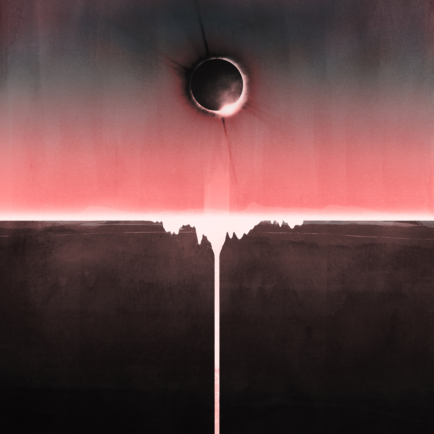
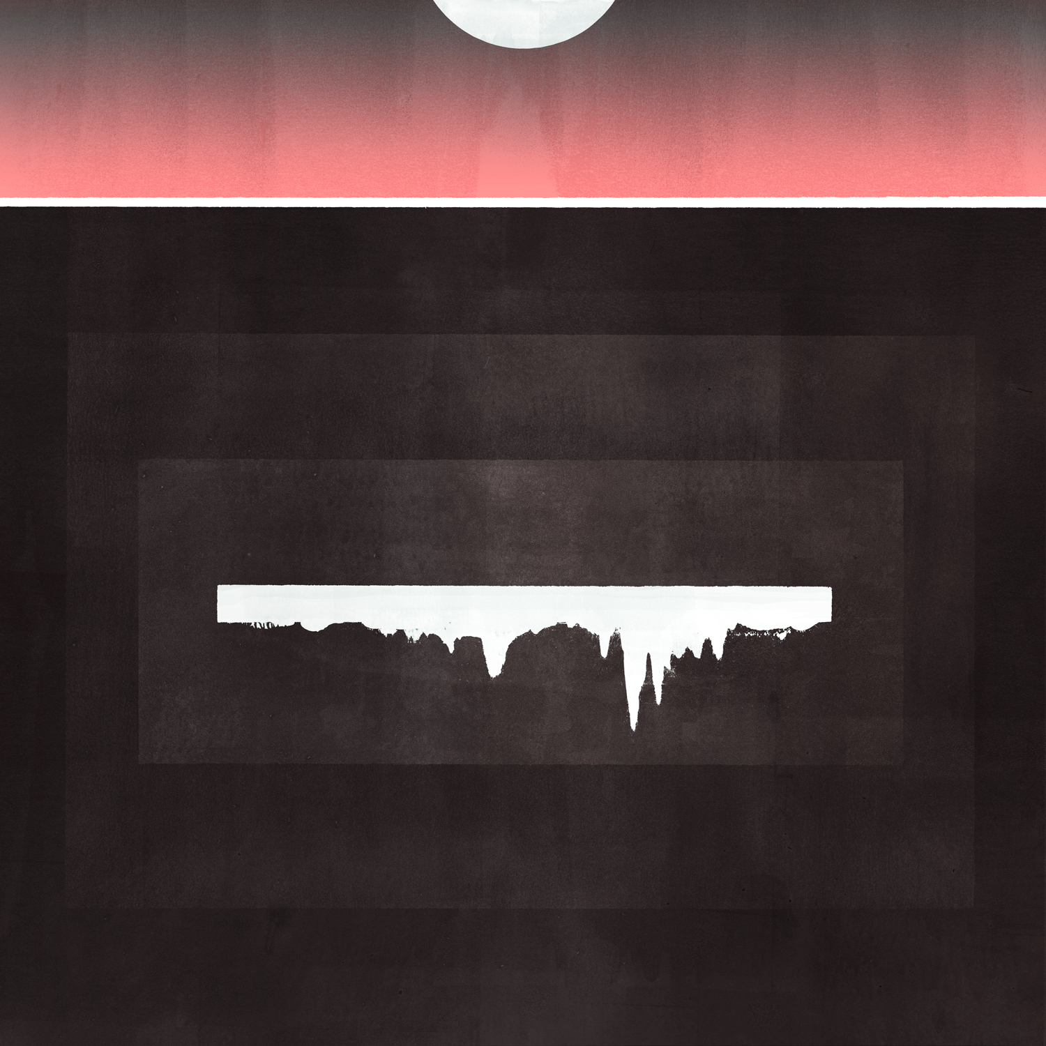
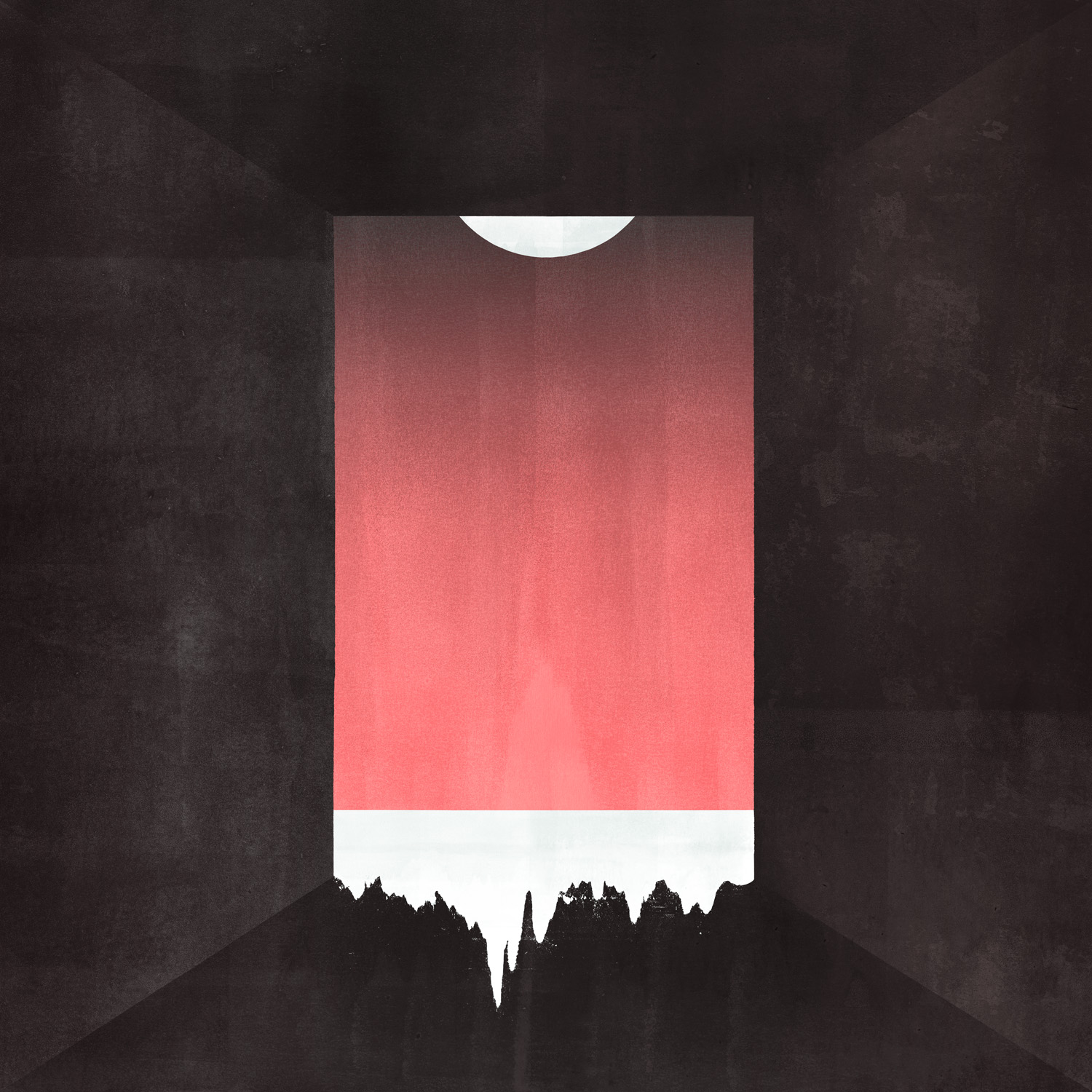
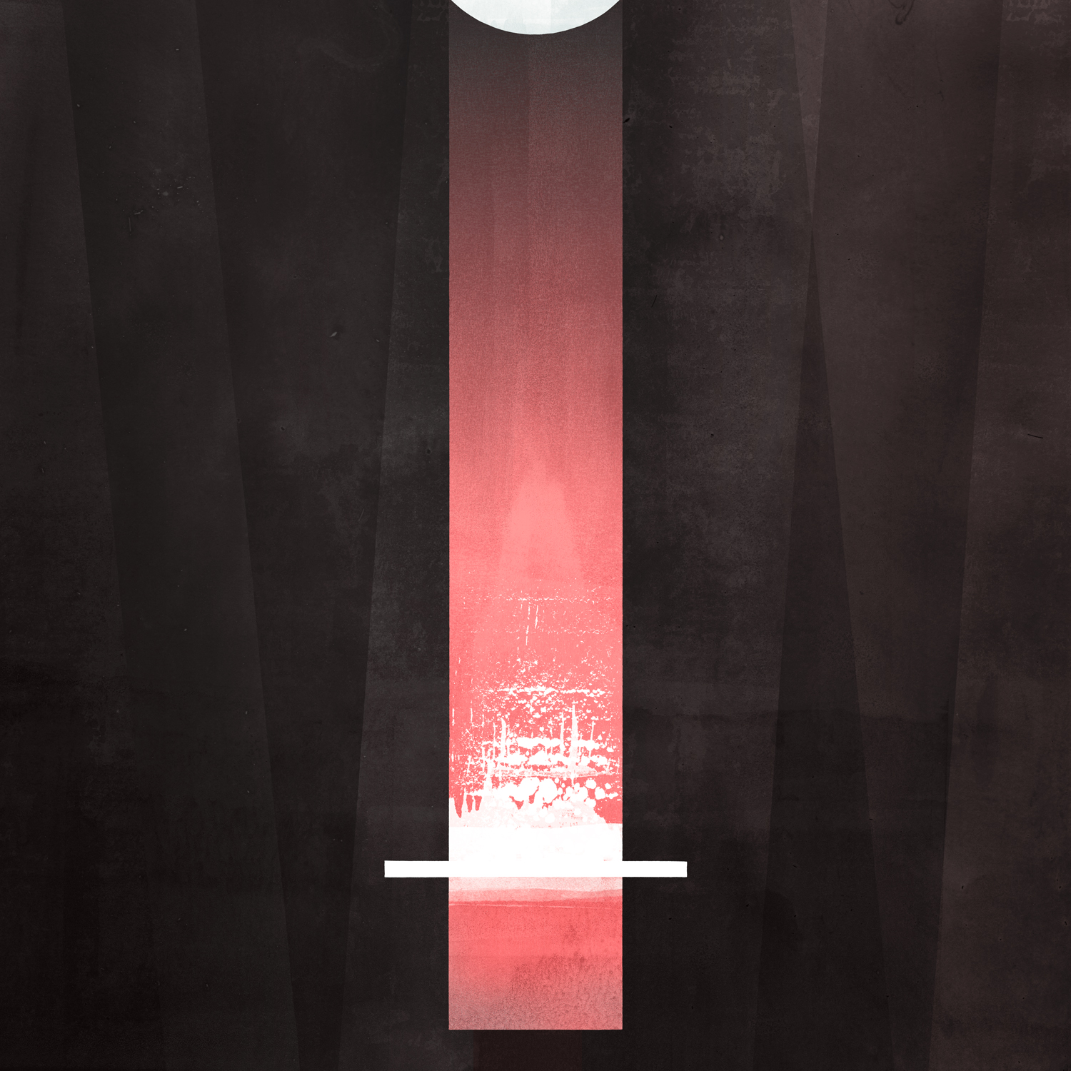
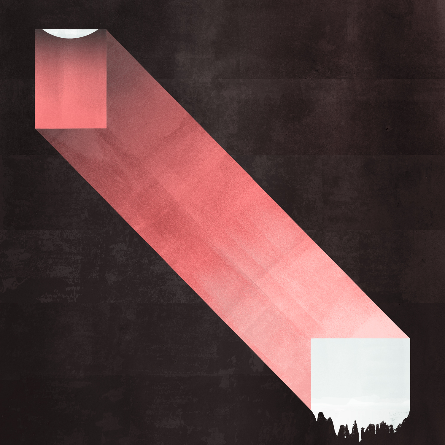
As the Love Continues (2021) and Singles
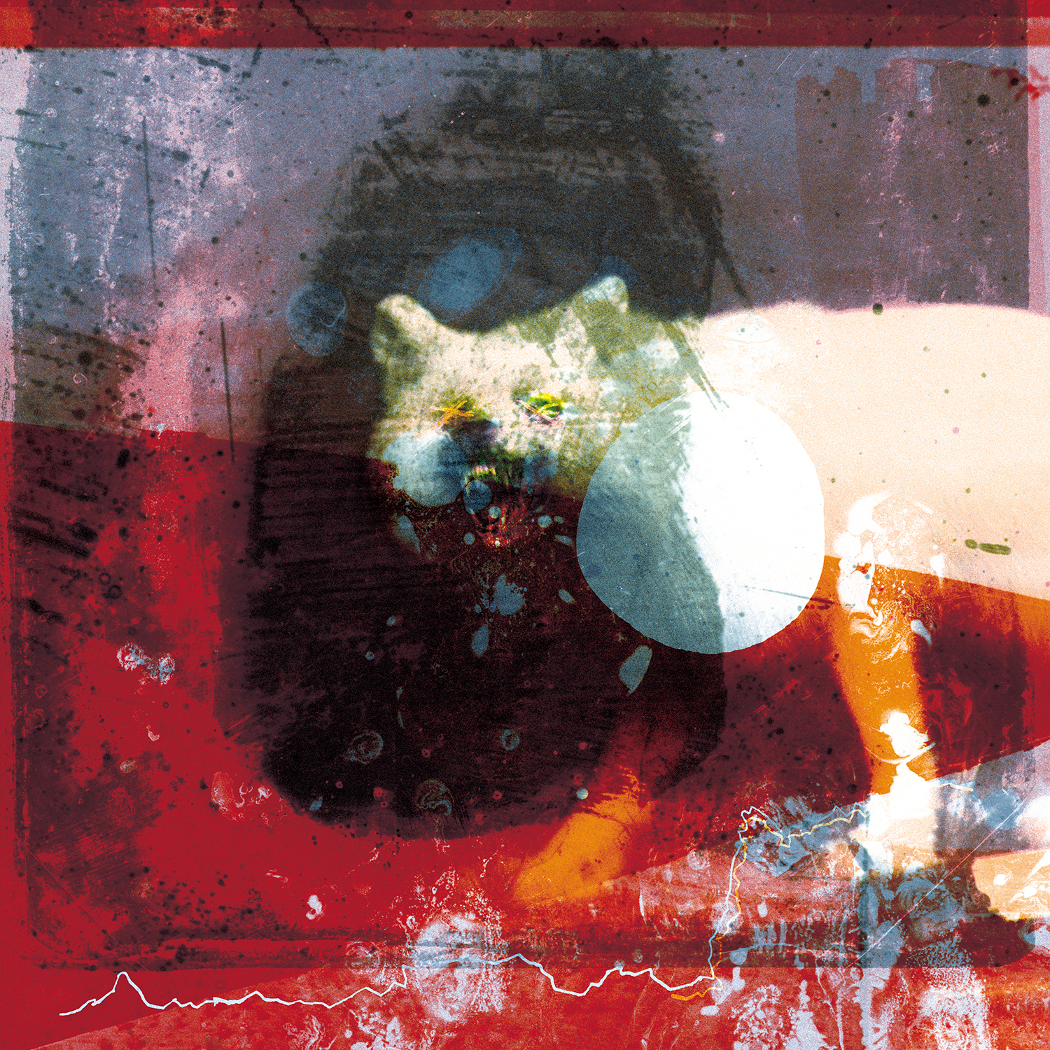
As the Love Continues was really a continuation of the thought processes I’d started with with previous record, wanting to work again on multi layers. It started with looking at old photography, the original process of colour photography where you had glass layers with different kinds of colours that were overlaid to create the colour layers. I’d seen these old Russian photographs from the turn of the century, and some of the some of the colour plates are damaged, so you get this sense of multi layers of things. I felt I could really play with that, in the sense of: with the music you have all these different layers of sound coming in, and they’re all meshed together but they have their own sort of character within the song. I wanted to start playing that game with the visuals, and they were these multi levels of stuff where it felt like one was falling apart and they were almost bleeding into the next level.
The image of the arctic fox was one I found from these turn of the century old photos, and it was something about the mood of it that just struck the right chord for the sound of the record. It’s one of those things that’s almost unexplainable. I’d seen it a few years ago searching through stuff, and they’re rights free images because it’s so old. When I was thinking ideas for this one, I’d completely forgotten about it, other than the fact that I’d kept a folder of stuff I’d found.
Because the title itself was As the Love Continues, it kind of felt like, especially after the year that everyone had gone through, this process of memory and remembering little elements of family, lots of the inner images to that record are found old slides, some of which have been damaged and kicked around. There’s various house clearance markets near where we are, so some of it comes from that, where you’re just literally picking through things and finding really cool landscapes or pictures of people, whatever it might be. And that seemed to really strike a chord with with the title, and and also this multi layering of different memories all fighting for attention.
That one was completely unexpected from both my point of view and the band’s point of view that it’s become what it has. It’s an amazing thing to go to number with that record. The support from smaller record shops was just amazing. It was that point where shops have been shut for so long, and everyone felt like it was a real community supporting each other. I don’t think anyone had felt that a band or like Mogwai or any of the stuff I work on would go anywhere near number one ever. I’m so happy for the band and everyone involved in it, the amount of hard work that has gone in over the years. It’s not something they ever aimed for, but when it comes along, it’s crazy.
It’s been amazing to see it pop up all over the place. Not so much this record because of the way lockdown was, but previous records, seeing those things on like billboard-size posters, posted around all over the cities. It kind of comes into its own. That’s been crazy, to see it go out into the world from there, and how it continues to – even two weeks ago, going in and seeing all the stuff around SAY awards [Mogwai won the 2021 Scottish Album of the Year award after being shortlisted four times] in Scotland and seeing the album image on a stage, it just takes its own kind of life.
This interview has been edited and condensed for clarity and length.

 breaks down his album artwork for albums by Mogwai, The Twilight Sad, Frightened Rabbit, and more.)