Movies have this incredible way of speaking to us, don’t they? They cross language barriers and cultural divides like nothing else can. But behind cinema’s biggest leaps forward, you’ll find directors who weren’t afraid to break the rules and try something completely new.
Let’s look at five filmmakers who didn’t just make great movies – they changed how we watch them entirely.
George Lucas: The Guy Who Made Space Feel Real
Before Star Wars, space movies looked pretty cheesy. George Lucas changed all that. This wasn’t just about better special effects (though Industrial Light & Magic certainly delivered on that front). Lucas made us believe in lightsabers and the Force because he understood something crucial: technology means nothing without a great story.
Think about it – when you watch the Millennium Falcon jump to hyperspace, you’re not thinking about the technical wizardry behind it. You’re just along for the ride. That’s Lucas’s real genius. He opened the door for filmmakers to dream bigger, and suddenly movies could take us anywhere.
Today, when you’re watching these classics on something like the Samsung TV, you can see every detail Lucas and his team crafted. The clarity makes you appreciate just how far ahead of his time he really was.
James Cameron: The Man Who Won’t Take No for an Answer
Cameron’s obsessive. Ask anyone who’s worked with him. But that obsession gave us Terminator, Aliens, Titanic, and Avatar. When Avatar hit theaters in 2009, it wasn’t just a movie – it was an event. Suddenly, everyone was talking about 3D again, and theaters were scrambling to upgrade their equipment.
Cameron doesn’t just use new technology, he invents it. Underwater cameras for The Abyss, motion capture systems for Avatar – the guy literally went to the bottom of the ocean. That’s not normal director behavior, but it’s why his movies feel so real. When you’re watching Avatar, you’re not just seeing Pandora – you’re visiting it.
Alfred Hitchcock: The Master of Making You Squirm
Hitchcock knew something most directors don’t: the best scares happen in your head. Take Psycho’s shower scene – you think you see everything, but Hitchcock barely shows anything at all. It’s all quick cuts, shadows, and that screaming violin music. Your imagination does the rest.
What made Hitchcock special wasn’t just the suspense (though he was ridiculously good at that). He understood audiences. He knew exactly when to give you information and when to hold it back. Watching a Hitchcock film is like being in a conversation with someone who’s always one step ahead of you.
Stanley Kubrick: The Perfectionist Who Changed Everything
Kubrick was famous for doing dozens of takes. Actors either loved him or wanted to strangle him (sometimes both). But look at 2001: A Space Odyssey – made in 1968, and it still looks better than most sci-fi movies today. That’s not luck. That’s obsessive attention to detail.
Kubrick didn’t just make movies; he made statements. The Shining isn’t just scary – it’s a study in isolation and madness. Full Metal Jacket isn’t just a war movie – it’s about how institutions break people down and rebuild them. Every shot means something – every color choice, every piece of music, every camera angle. It’s exhausting to think about, but the results speak for themselves.
Steven Spielberg: The Storyteller Who Gets It
Spielberg has this gift – he can make a movie about a killer shark (Jaws) or the Holocaust (Schindler’s List) and somehow find the human story at the center. That’s not easy. Most directors are good at one thing. Spielberg seems to be good at everything.
What I love about Spielberg is that he never talks down to his audience. Kids can watch E.T. and get swept up in the adventure. Adults can watch it and see a story about divorce and childhood loneliness. Same movie, different layers. That’s masterful filmmaking.
He also understands that movies are collaborative. The shark in Jaws wouldn’t be scary without John Williams’ music. Indiana Jones wouldn’t be Indiana Jones without Harrison Ford’s performance. Spielberg knows when to step back and let his collaborators shine.
Why These Five Matter
These directors didn’t just make good movies – they expanded what movies could be. Cinema keeps evolving with new technologies, new storytelling methods, and new ways to reach audiences. But the foundation these five built is not going anywhere. They set the bar, and every filmmaker since has been trying to clear it.
As movie lovers, we’re lucky to live in their aftermath. The tools they developed, the techniques they pioneered, the boundaries they pushed – all of that lives on in every film we watch today.
Startups often face a tough balance between delivering high-quality 4K streaming and keeping bandwidth costs under control. Many assume that ultra-high-definition streaming demands enterprise-level budgets, but that’s not always true. With the right planning, infrastructure, and optimization, startups can achieve smooth 4K streaming without overspending on bandwidth.
The key lies in understanding how bandwidth works and how to make every megabit count. Factors like codec efficiency, adaptive bitrate streaming, and network setup can significantly reduce data use without cutting quality. By focusing on cost-efficient planning, startups can maintain professional-grade video performance even with limited resources.
This article explores practical ways to optimize bandwidth for 4K streaming, from choosing the right compression methods to managing multiple streams effectively. It shows how small teams can compete with larger players by using smarter, not necessarily faster, network strategies.
Understanding 4K Streaming Bandwidth and Cost-Efficient Planning
Achieving smooth 4K streaming depends on stable bandwidth, proper compression, and smart network management. Cost efficiency comes from balancing resolution, bitrate, and the number of active streams without reducing viewing quality.
Defining 4K Streaming and Bandwidth Requirements
4K, also called Ultra HD (UHD), delivers a resolution of 3840×2160 pixels—four times more detail than Full HD (1080p). This higher resolution increases data transfer needs, making bandwidth a key factor in maintaining steady playback.
Bandwidth measures how much data travels through a network per second, usually in Mbps (megabits per second). A higher bitrate produces clearer images but consumes more data.
The codec used also affects efficiency. H.265 (HEVC) compresses video better than H.264, using less bandwidth for the same visual quality. For example:
Resolution
Codec
Typical Bitrate
Estimated Bandwidth
720p (HD)
H.264
3–5 Mbps
Moderate
1080p (Full HD)
H.264
5–8 Mbps
High
4K (UHD)
H.265
15–25 Mbps
Very High
Network congestion, multiple devices, and poor Quality of Service (QoS) can reduce throughput, causing buffering and lag even with high nominal speeds.
Minimum Internet Speed and Bandwidth for 4K Streaming
Most streaming platforms recommend at least 25 Mbps per stream for 4K playback. This allows for consistent download speed to handle large frame sizes and higher frame rates.
However, startups managing multiple streams or remote teams should plan for 50 Mbps or more to maintain reliability during peak usage. Upload speed matters less for viewing but is critical for live broadcasting or content uploads.
Smooth 4K streaming bandwidth depends not only on raw speed but also on stability. Temporary drops in throughput or packet loss can disrupt playback. Using wired Ethernet connections and modern routers that support Wi-Fi 6 helps maintain consistent performance.
Testing with tools like Fast.com or Google’s speed test gives a realistic view of actual speeds under real network conditions.
Balancing 4K Quality With Bandwidth Budget Constraints
Startups can control costs by optimizing bitrate and compression settings without sacrificing noticeable streaming quality. Using HEVC (H.265) or similar modern codecs reduces bandwidth usage by up to 40% compared to older formats.
Adjusting QoS settings ensures that streaming traffic gets priority over background tasks. Limiting simultaneous 4K streams or switching some displays to 1080p can also lower total bandwidth demand.
Monitoring data usage helps avoid overage fees or throttling from internet service providers. A single hour of 4K content may use 7–10 GB, so planning for monthly usage is essential.
Efficient bandwidth management allows startups to deliver HDR and Ultra HD video while keeping network expenses predictable and sustainable.
Practical Strategies to Optimize 4K Streaming on a Startup Budget
Reliable 4K streaming depends on efficient bandwidth use, stable connections, and compatible hardware. Careful selection of internet plans, routers, and streaming settings can help startups maintain high-quality video without overspending.
Choosing the Right Internet Plan and Router
A stable connection matters more than raw speed. Most platforms like Netflix or YouTube Live need at least 25 Mbps per 4K stream, but shared office use may require 50–100 Mbps. Startups should run a speed test during peak hours to measure real performance before upgrading plans.
Fiber internet offers the best stability, but cable or DSL can work if speeds remain consistent. Avoid data caps, which can quickly increase costs when streaming or broadcasting regularly.
A dual-band router that supports Wi‑Fi 5 (802.11ac) or Wi‑Fi 6 helps manage multiple devices efficiently. Routers with Quality of Service (QoS) settings can prioritize streaming traffic, reducing lag and buffering. Placing the router centrally and minimizing interference from walls or other networks improves signal strength.
Router Feature
Benefit
Dual-band (2.4GHz + 5GHz)
Reduces interference and congestion
Wi‑Fi 6 support
Faster data handling and better range
QoS settings
Prioritizes streaming data
Wired Ethernet ports
Provides stable connections for key devices
Device Compatibility and Network Setup
Devices used for streaming must handle 4K efficiently. Outdated hardware can bottleneck performance even on fast networks. Systems should have enough RAM and modern processors to run encoding tools like OBS smoothly.
Connecting main streaming devices through Ethernet instead of Wi‑Fi reduces latency. If Wi‑Fi is necessary, use the 5GHz band for lower interference. Testing each setup before going live prevents issues during broadcasts on Twitch, Facebook Live, or other platforms.
Smart TVs, streaming boxes, and laptops should support the latest HDR and codec standards. Regular firmware updates help maintain compatibility with evolving streaming services and compression formats.
Efficient Streaming Service and Compression Choices
Choosing the right streaming service and compression settings can save bandwidth without sacrificing quality. Platforms like Netflix and YouTube Live use adaptive bitrate streaming, which adjusts quality automatically based on available speed.
For startups producing their own content, optimizing encoder settings in OBS helps balance clarity and data use. Using efficient codecs such as H.265 (HEVC) can cut bandwidth needs by up to 40% compared to older formats.
Reducing frame rates from 60fps to 30fps also lowers bandwidth while keeping image quality acceptable for most viewers. Testing different resolutions and bitrates ensures stable playback within budget limits.
Conclusion
Achieving 4K streaming quality on a limited budget is possible when startups plan carefully and use efficient tools. They can balance cost and performance by focusing on bandwidth management and adopting modern compression technologies.
Using HEVC (H.265) or AV1 codecs can reduce data usage by up to 50% compared to older formats. This allows smooth playback without requiring expensive internet upgrades.
A reliable CDN and adaptive bitrate streaming (ABR) further help maintain quality across different connection speeds. These systems adjust video resolution automatically, preventing buffering while keeping data use low.
Startups should also monitor network use and prioritize streaming traffic. A simple bandwidth plan might look like this:
Number of 4K Streams
Recommended Bandwidth
Connection Type
1
25 Mbps
Wired or Wi-Fi 6
2–3
50–75 Mbps
Wired Preferred
4+
100 Mbps or more
Fiber or Dedicated Line
By combining smart compression, stable infrastructure, and traffic control, startups can deliver 4K content efficiently. This approach keeps costs manageable while still meeting viewers’ expectations for sharp, high-quality video.
This Is Lorelei – the project of Water From Your Eyes’ Nate Amos – has shared ‘Holo Boy’, the title track from his upcoming LP. The album, out December 12, finds him re-recording 10 songs from his back catalog. Its title references a holodeck, a device used to project realistic simulations in Star Trek. Check out ‘Holo Boy’ below.
“‘Holo Boy’ was originally written in Chicago sometime in 2014 or 2015,” Amos explained in a statement. “I’m pretty sure it’s the oldest song on the album and I’m pretty sure it’s one of my favorites.”
Charli XCX has teamed up with Velvet Underground co-founder John Cale for ‘House’, which was written for Emerald Fennell’s Wuthering Heights. One of several songs she contributed to the soundtrack, the eerie, claustrophobic song comes paired with a music video directed by Mitch Ryan. Check it out below.
Last week, Charli wrote a note on X about how the collaboration came to be. She said:
I got a call from Emerald Fennell last Christmas asking whether I would consider working on a song for her adaptation of Wuthering Heights. I read the script and immediately felt inspired so Finn Keane and I began working on not just one but many songs that we felt connected to the world she was creating. After being so in the depths of my previous album I was excited to escape into something entirely new, entirely opposite. When I think of Wuthering Heights I think of many things. I think of passion and pain. I think of England. I think of the Moors, I think of the mud and the cold. I think of determination and grit.
A few years ago I watched Todd Haynes’ documentary about The Velvet Underground. As many of you know I’m a huge fan of the band and was really taken by the documentary. One thing that stuck with me was how John Cale described a key sonic requirement of The Velvet Underground. That any song had to be both “elegant and brutal”. I got really stuck on that phrase. I wrote it down in my notes app and would pull it up from time to time and think about what he meant.
When working on music for this film, “elegant and brutal” was a phrase I kept coming back to. One day whilst on tour in Austin, Finn and I went to the studio and wrote the bones for a song that would eventually become “House.” When the summer ended I was still ruminating on John’s words. So I decided to reach out to him to get his opinion on the songs that his phrase had so deeply inspired, but also to see whether he might want to collaborate on any.
We got connected, we spoke on the phone and wow… that voice, so elegant, so brutal. I sent him some songs and we started talking specifically about “House.” We spoke about the idea of a poem. He recorded something and sent it to me. Something that only John could do. And it was… well, it made me cry.
I feel so lucky to have been able to work with John on this song. I’ve been so excited to share it with you all, sitting quietly in anticipation. And on Monday, it’s yours.
Wuthering Heights arrives in theaters on Saturday, February 14, 2026. Fennell’s adaptation of the Emily Brontë novel stars Margot Robbie as Catherine Earnshaw and Jacob Elordi as Heathcliff.
Rosalía‘s fourth studio album is a towering epic, a four-movement work that draws inspiration from female saints and poets with “the intention of verticality.” But the most disarming, by pop standards, aspect of LUX isn’t the Spanish superstar’s spiritual and musical ambitions, or the way she folds them into a compelling structure, but its heart-rending sentimentality, apparent in both the dramatic ways she wields these stories and every small waver of her voice. That’s the quality of its operatic scope that cuts through on each listen, taking stock of her lived experience as much as it seeks to undress it and ascend to a new world. Recorded in 13 languages with the assistance of the London Symphony Orchestra, it’s a sensational record that undoubtedly reaches for the universal. But it’s also a singular document of an artist at the top of her game, shamelessly looking to the past while confronting the oblivion of the future. Gaze still upward, this is her soul overflowing like it’s all unfolding right before her eyes.
1. Sexo, Violencia, y Llantas
LUX’s opener positions the album in the space between earthly love and divine connection. Rather than flitting between the two, the singer carves a linear progression: “First I’ll love the world then I’ll love God.” Beautiful as her lone voice is, the first spine-chilling moment comes when it is supernaturally, if briefly, amplified, as if going through a portal.
2. Reliquia
Lest LUX’s overture appear too high-minded, Rosalía presents a startlingly personal map of memory that becomes an immediate highlight. You may not have found yourself in all the places she mentions – she is a pop star, after all – but it’s likely a few bits and pieces resonate. Over the understated flamenco beat that sounds like an acknowledgement of her past, I was reminded of listening to Los Ángeles upon its release when I was in the UK, where she says she lost her smile. When those glitchy electronics come in – in case you were wondering what Daft Punk’s Guy-Manuel de Homem-Christo is doing in the credits – I remembered MOTOMAMI breaking out while I was in Jerez, where she lost her hands. She’s allowed her heart to be touched by them all, but never felt ownership over it, a question lingering over her lament: How much can the world be worth, then?
3. Divinize
“This ghost’s still alive/ I’m still alive,” Rosalía sings, the album’s first English lines signalling profound vulnerability. And hanging by a thread, the song’s arrangement, swirling and muffled, seems to add. When she gets to the pre-chorus, singing “Each vertebra reveals a mystery/ Pray on my spine, it’s a rosary,” she channels LUX guest star Björk, both vocally and in her organic imagery. Through “divine emptiness” her performance remains totally embodied.
4. Porcelana
LUX may not open with a ‘SAOKO’, but for those who care, there’s still ‘Porcelana’ to scan as the record’s pop-adjacent “banger.” Rosalía uses AutoTune as a means of transformation, paying tribute to the Japanese monk, teacher, and poet Ryōnen Gensō, whose beauty distracted other students to the point that she burned her face. Rosalía focuses less on the story than its complex elements – grief, fragility, mutability, anger – while capturing every linguistic nuance of the word diva.
5. Mio Cristo Piange Diamanti
“That’s gonna be the energy,” Rosalía mutters at the end of the song, rapturing its grandiose orchestral finale. Even when she conducts a more traditionally structured aria – singing in Italian with no AutoTune or off-kilter experimentation – the energy is all that matters to her, and it is deeply human even as her acrobatics make her sound like no other human on Earth. When her voice pierces the gut in its smallness, you have to control yourself in anticipating the eruption. Yet she’s in full command of it and the music around her; when she wonders, “How many hugs have you given that could have been blows?” the orchestra seems to stab right back.
6. Berghain
‘Berghain’ is no less baffling in the context of the album than it was as an early single. It’s less Rosalía’s operatic vocals – you’re used to them by now – that strike like thunder, but her guests: Björk’s elegiac intervention and Yves Tumor’s fiery reprise of Mike Tyson’s tirade: “I’ll fuck you ‘til you love me.” It feels like an important piece of the puzzle that doesn’t totally fit, which is enough to announce we’ve moved on to the second movement of the album.
7. La Perla
LUX may be an album inspired by the stories of female saints, but for a brief waltz, Rosalía abandons its dramatic pretenses to throw a bit of shade (presumably at her ex-fiancé Rauw Alejandro). It’s playful and gossipy, even if there’s weight to accusations of emotional terrorism and unfaithfulness. Rosalía knows this language well, and she’d rather speak it now than forever hold her peace.
8. Mundo Nuevo
Rosalía quickly swerves from the jauntiness of ‘La Perla’ for what might be another side of heartbreak; surrender. She sings of going back into the womb to “see if in a new world I’d find more truth.” As if her attempt to love the world has failed, her instinct is to recoil rather than ascend. Her voice still exalts, but the silence between the lines is painstaking.
9. De Madrugá
Pharrell’s assistance adds another layer of immediacy to a track that already feels right in Rosalía’s comfort zone, taunting and surging in less than two minutes. And just like that, the second movement is over.
10. Dios Es Un Stalker
Rosalía complicates the concept of divinity through cheeky first-person narration; a devilishly funny take on ‘God Is a Woman’. She frames herself as “the labyrinth you can’t escape,” yet every left turn is invigorating.
11. La Yugular
The album’s epic scope reveals itself on ‘La Yugular’, where she reaches back out and immerses herself in the world: “I fit in the world/ And the world fits in me/ I occupy the world/ And the world occupies me.” Skip around the song and you’ll notice it sounds heavenly in all sorts of configurations: guitar and voice; a breathtaking chorus backed by strings; an elegiac choir. She drives the point – infinity as transcendence, the plurality and oneness of voices – home by sampling a 1976 interview with Patti Smith. Simply being part of the world can mean liberating it, breaking on through.
12. Sauvignon Blanc
‘Sauvignon Blanc’ is one of the most straightforward love songs in Rosalía’s catalog; as she dreams of renouncing luxury in favor of partnership, it feels like the purity she seeks throughout the album has come to bear. It’s a song she cannot stretch very far, perhaps because her fame does not permit her to. Yet she gives it one of the album’s most memorable endings: just as she’s done climbing up and down her vocal register, those familiar handclaps bow the song out, almost like a call to arms.
13. La Rumba del Perdón
Or an old song fading back into view: if ‘La Rumba del Perdón’ also stirs flashbacks to El mal querer, it might be because Rosalía and El Guincho have had it in the bag for over five years. Joined by flamenco stars Estrella Morente and Silvia Pérez Cruz, she opens the fourth movement with a story about forgiveness that you actually have to read into; it’s the one song on LUX where the text carries as much, if not more, weight than the music around it.
14. Memória
It’s notable that Rosalía isn’t singing alone on two of the album’s concluding, and arguably most emotional, songs. If ‘La Rumba del Perdón’ is about the meaning of forgiveness, the rueful ‘Memória’ is about the feeling of remembering. Portuguese fado singer Carminho makes it sound like Rosalía isn’t addressing someone in her life but rather another, perhaps future version of herself.
15. Magnolias
One of the things Rosalía wonders about is if she’ll be grateful; she’s quick to answer her own question in ‘Magnolias’. “Life flashed me its knife, took everything I had, and I thanked her for that,” she sings. Her voice, in its constant flux, pierces and stabs like that, too, but the overall feeling is one of delicate serenity. As in the opener, she frames herself between the ground and the beyond, promising to meet God in the middle. On one hand, LUX demonstrates Rosalía’s cultural omnipresence and appetite, peering through the centuries to elevate examples of female divinity; on the other, it is a strikingly disarming and humanizing portrait of her own celebrity that goes as far as to imagine her funeral. It’s a lot to balance, and Rosalía unflinchingly holds her own.
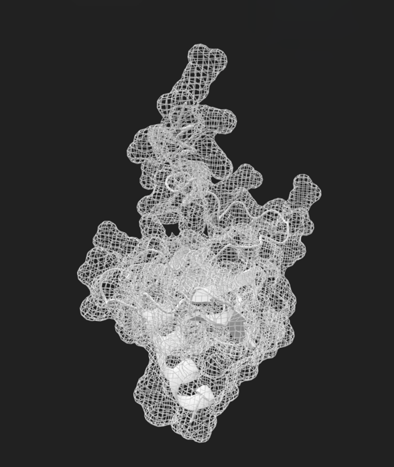
What might a protein sound like as it folds? How could a constellation of microtonal harmonics reconfigure our sense of space, attention, and temporal flow? For artist and researcher Haoxuan Zhang, sound is never merely a signal awaiting reception. It is an energetic agent – one capable of restructuring living systems and the material substrates that surround them.
Digital visualization from The Blue Jet I, the artist’s ongoing body of research translating microscale vibrational phenomena into perceptible form.
Operating across sonic art, visual installation, computational modelling, and interactive environments, Haoxuan constructs multisensory experiences in which audiences encounter phenomena typically foreclosed from perception: acoustic interference patterns, material resonances made visible, infinitesimal modulations in amplitude and frequency, the liminal threshold where sensation dissolves into structure. Recent projects synthesise research undertaken between Imperial College London and the Royal College of Art, investigating whether particular frequency bands and material interfaces might influence biological processes-protein assembly, particle suspension dynamics at the molecular scale.
In Something Human 1, an audio-visual work premiered within the international digital exhibition thumb2 and physically launched at Ladder Space, Aarhus, Haoxuan weaves sine tones, band-filtered noise, and processed field recordings with visual elements into a gradually unfolding sensory field. The composition develops through calculated tensions: frequencies phase-lock before drifting apart, waveforms obliterate and regenerate one another, fragments of human respiration fuse with algorithmic architectures. Audiences describe the experience as simultaneously intimate and monumental – an encounter with vibration and materiality as sculptural media, and with attention itself as perceptual apparatus.
Haoxuan’s performances and installations have addressed audiences throughout the UK and internationally. At the Royal Albert Hall’s Open Stages programme, a site-responsive sound -visual installation and live performance transformed the Elgar Room into an active resonant chamber, bridging traditional piano and acoustic instruments with frontier sound technologies to reveal the architecture’s hidden sonic properties.
Within a clinical setting, Haoxuan contributed sound and material interface work to Design Innovation in Healthcare at Chelsea and Westminster Hospital NHS Foundation Trust, examining how multisensory design might enhance perceptual acuity and care protocols within public health infrastructures.
This research-led practice inhabits the intersection of artistic and scientific inquiry, yet studiously avoids reductive illustration but to manifest the fundamental relationships between sound, matter, and life. Rather than transcoding data into audible or visible equivalents, the works establish perceptual conditions through which audiences might apprehend how the universe organizes itself at multiple scales: the characteristic beating produced by minimally detuned sine waves mirrors protein oscillations; acoustic interference patterns echo quantum behaviors; material transformations rendered perceptible through carefully designed interfaces reveal the malleability of matter under vibrational influence. The implicit proposition is that perception is not passive reception but an active, continuously reorganised process – one fundamentally shaped by multisensory encounter and capable of accessing truths that remain perpetually unseen through conventional means.
Haoxuan represents a new generation enacting a paradigm shift in how art and science co-pilot human creation. Moving beyond the traditional divisions that have long separated artistic intuition from scientific rigor, this practice demonstrates that the two are not merely complementary but fundamentally unified, both modes of attending to and participating in the universe’s ongoing formation. The work refuses hierarchy between sensory knowledge and empirical data, between felt experience and measured phenomenon, proposing instead that genuine understanding emerges precisely where these seemingly disparate ways of knowing converge.
Haoxuan’s broader concerns encompass ecology and collective experience, realised through collaborations addressing climate consciousness, epistemic distortion, and communal modes of sensing. Exhibited at venues including the Grantham Institute Climate Research Showcase, Exhibition Road Festival, and London Design Festival, the practice maintains methodological consistency: establish lucid sensory parameters that bridge seemingly disparate domains, honour systemic complexity at every scale, and permit multiple modes of perception to uncover relationships that single-sense comprehension might miss.
In the year ahead, Haoxuan is developing a tripartite series engaging three scalar domains: the acoustic, the microscopic, and the subatomic. Each project will manifest as paired installation and performance, employing bespoke software alongside minimal transducer configurations and visual systems to generate granular, spatially distributed sensory experiences. The ambition is not sensory bombardment but refined sensitivity, an invitation to dwell within vibration, materiality, and visual resonance, and register their transformative effects.
When asked what audiences might derive from this work, Haoxuan gestures toward attention itself. “Perception operates as both action and instrument, it’s a transformation in how we understand existence itself. If we cultivate responsiveness to minute variation across sensory modalities, we may simultaneously cultivate responsiveness to one another and to the precarious patterns sustaining our shared world.”
Artist: Haoxuan Zhang Selected presentations/exhibitions: Royal Albert Hall Open Stages; thumb2, Ladder Space, Denmark; Design Innovation in Healthcare, Chelsea and Westminster Hospital NHS Foundation Trust; London Design Festival (with PriestmanGoode); Grantham Institute Climate Research Showcase; Exhibition Road Festival; Somers Gallery Affiliation: Royal College of Art–Imperial College London; Research Member, Edinburgh Futures Institute
Support:
Supported by The Blue Jet Foundation
Portfolio: www.thebluejet.com
Instagram: @haoxuan_3am
When guests arrive at your venue, the first person they are likely to meet is the valet. And that first impression is an important one – it’s what sets the tone for the rest of the experience they’re about to have with you. So, making sure your valet team looks the part is crucial – not just to show they’re professionals but also because it gives your brand its first big make-or-break moment.
One of the simplest ways to achieve that is to give your team a uniform that really stands out. Not just for making them look good, but also because it helps them feel good too. But how do you strike the perfect balance between looking sharp and feeling comfortable?
Building a great uniform is a lot easier said than done. You’ve got a bunch of factors to think about to make sure your team’s look represents your brand and keeps your team happy. To help you get it right, here are the main things to consider.
Make Sure the Uniform Reflects Your Brand’s Personality
You should choose a valet uniform that’s an extension of your brand – not just something that your employees put on because it’s required. The colours, materials and overall style should match the vibe you want to create from the very first second your guests arrive. That said, if you’re a high-end hotel or restaurant, you’re going to want to go for something smart and elegant, like tailored blazers and crisp shirts. On the other hand, if you’re a more laid-back venue, smart polos and lightweight jackets might be more up your street.
The colours you choose are also going to make a big difference, not just because they match your logo or interior design (although that helps). Neutral colours like black, navy and charcoal are safe bets because they look smart and professional. But if you want to add some personality to your team’s look, brighter colours can be a good way to go as long as they’re true to your brand.
Comfort and Functionality
Valet work is physically demanding. Your team is on their feet for hours, moving quickly, getting in and out of cars, carrying items and being active all day. That’s why comfort and functionality should be the top priorities when designing uniforms.
A comfortable valet uniform starts with breathable, lightweight fabrics that allow for full movement and temperature regulation in hot and cold conditions. Stretchy materials like cotton blends or performance fabrics with a bit of elastane make bending, reaching and walking much easier without compromising on style.
Functional details make a big difference. Think pockets for essentials, durable buttons or zippers and layers that can adapt to the weather. By combining comfort and practicality with style, you ensure your team can focus on providing great service without being held back by their uniform.
Durability and Maintenance
Valet uniforms need to withstand daily use. Between constant movement, weather and long hours, a uniform that’s not durable will quickly lose its professional look. Choosing high-quality fabrics that resist wrinkles, fading, and wear is key to ensuring your team always looks polished. Materials like polyester blends, treated cotton or performance fabrics are often great choices as they combine durability with comfort.
Maintenance is just as important. Uniforms that are easy to care for (machine washable, quick-drying and stain-resistant) save time and money for both staff and management. When your team can easily clean and maintain their uniforms, it ensures they always look crisp and professional, reinforces your brand image and avoids the frustration of constantly replacing worn or damaged clothing.
Seasonal Changes
Valets work outdoors in all weather, so their uniforms need to be versatile enough to handle seasonal changes. A smart approach is to design a uniform system with layers that your team can add or remove as the conditions change.
In warmer months, lightweight, breathable shirts or polos made from moisture-wicking fabrics will keep the team cool and comfortable. When it’s colder, add layers like vests, jackets or softshell outerwear to keep them warm without restricting movement.
Also maintain style and colour consistency across all seasons so your team looks the same whether they’re wearing short sleeves in summer or a jacket in winter. Water-resistant materials and weather-appropriate accessories (gloves, caps or rain gear) will make a big difference in comfort and presentation.
Personalise Your Uniform
Personalisation can do wonders. It’s what gives a standard uniform a bit of personality and shows off your brand’s unique identity. Adding some thoughtful touches, like embroidered logos, name tags or a splash of your company colour on the uniform, makes your valet team instantly recognisable and helps to reinforce your company’s image.
Even tiny details, think branded buttons, some colour on the collar, can make the uniform look far more polished and memorable.
About Creating A Uniform Policy That Really Works
Having a solid uniform policy in place is just as important as getting the design right. A clear policy outlines what your valet team need to wear, how to keep it looking good, and what’s expected of them in terms of presentation. This helps make sure that every team member looks their best, no matter who is working on any given shift and regardless of the time of day.
A good uniform policy actually has plenty of benefits beyond just looking good. It makes things easier for management by setting clear expectations, reducing the confusion of what is and isn’t acceptable and helping keep your brand image looking sharp all the time. You can also include guidelines for seasonal changes, replacing gear and looking after the uniform itself to keep it in good nick for longer.
But while all of that is great for the business side of things, a well-thought-out policy also encourages staff to have pride in their uniform and take care of it. When employees understand how important it is to keep themselves looking great, they’re more likely to present themselves with confidence and uphold the professional image your brand represents. In simple terms, a strong uniform policy makes sure everyone is on the same page – and that helps protect your brand’s reputation and keeps your team looking its best.
Astral Throne II: Age of the Phoenix has been recently announced by developer Zero Sun Games. This new title serves as a prequel and a sequel to the original game launched earlier this year.
While it might be too early for a new version, the developers said the changes they were adding were too fundamental. That is why they decided to make another one. In the same way, it could be a good move since the first game got positive community feedback despite dismal commercial performance.
While a new one is coming, the original title is not ending soon. In fact, there will still be another patch for it. The makers also believe it is okay to have both at the same time.
“We don’t intend to replace Astral Throne; we think the games can exist side-by-side,” Zero Sun Games said in the announcement.
Despite the changes, the studio said that the sequel will still offer a unique strategic experience.
Refined Gameplay Mechanics
According to the official Steam page, Astral Throne II leans more toward the Roguelite genre. Even so, the turn-based mechanics remain. Likewise, players can still build their army and go through a continent-spanning quest. Particularly, this popular SRPG lets players lead a team through tactical battles. It now also has smaller maps and shorter runs. Each run is different, with permadeath mechanics, randomized loot, and more. This change ensures that the process does not feel like a long grind. More importantly, the studio wants to focus more on meta progression.
Transformed Graphics, Better UI, and New Story
Aside from the fresh gameplay, Zero Sun Games said that Astral Throne II will now use a hybrid 2D-3D pixel art style for its visuals. Removing the 3D low-poly look fits with the player’s preference in the genre. At the same time, it enables the developers to add content more easily.
Similarly, they are working on improving the UI to support controllers. In particular, the studio wants the game to get the Steam Deck verification.
On top of that, players can look forward to a new story that is more linear. The creators are very excited, as award-winning fantasy novelist Shami Stovall will write it.
Upcoming Demo and Release Window
Fans can expect the first demo to be available in the first quarter of 2026. However, there is no official launch date for the game yet. Looking at the situation, developers could drop the game by the second half of next year. For now, players can Wishlist the game on Valve’s Steam.
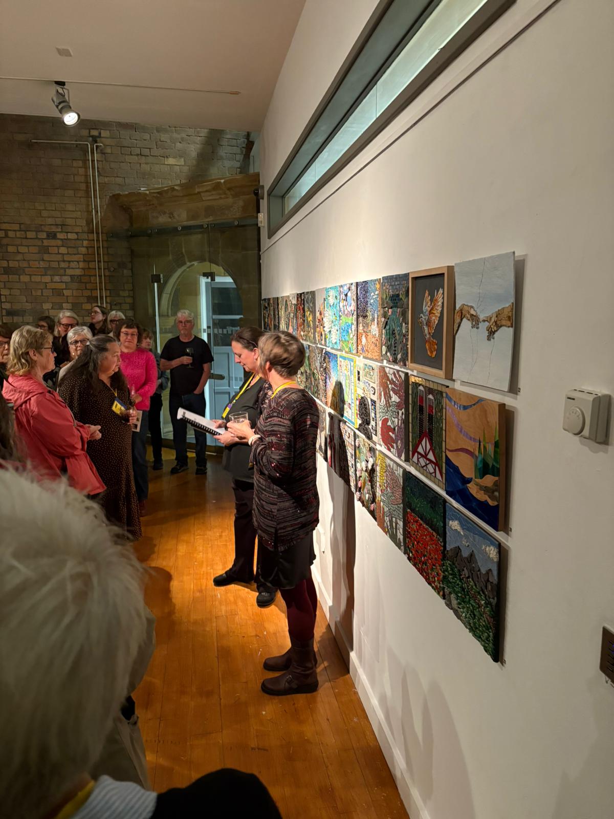
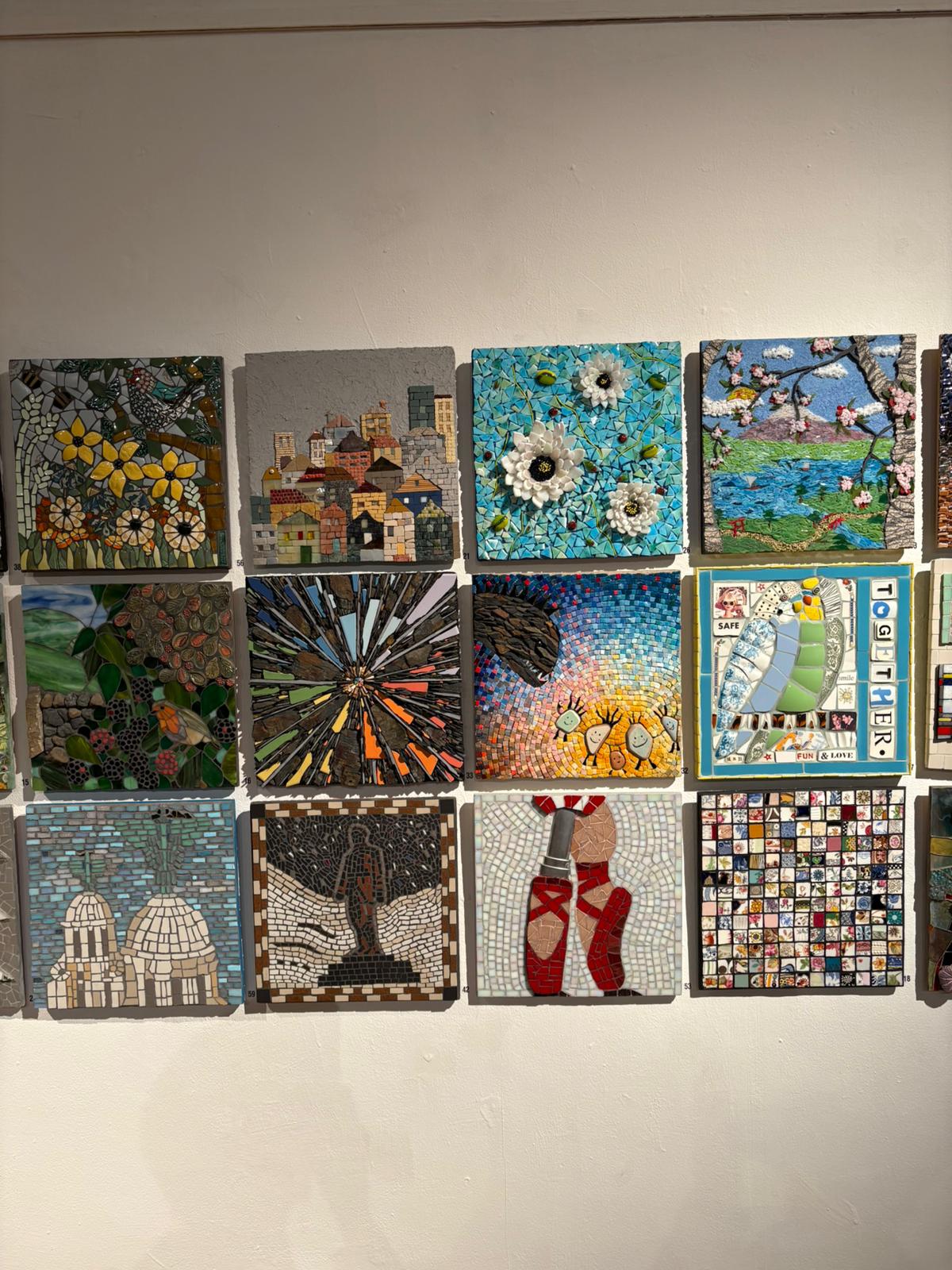
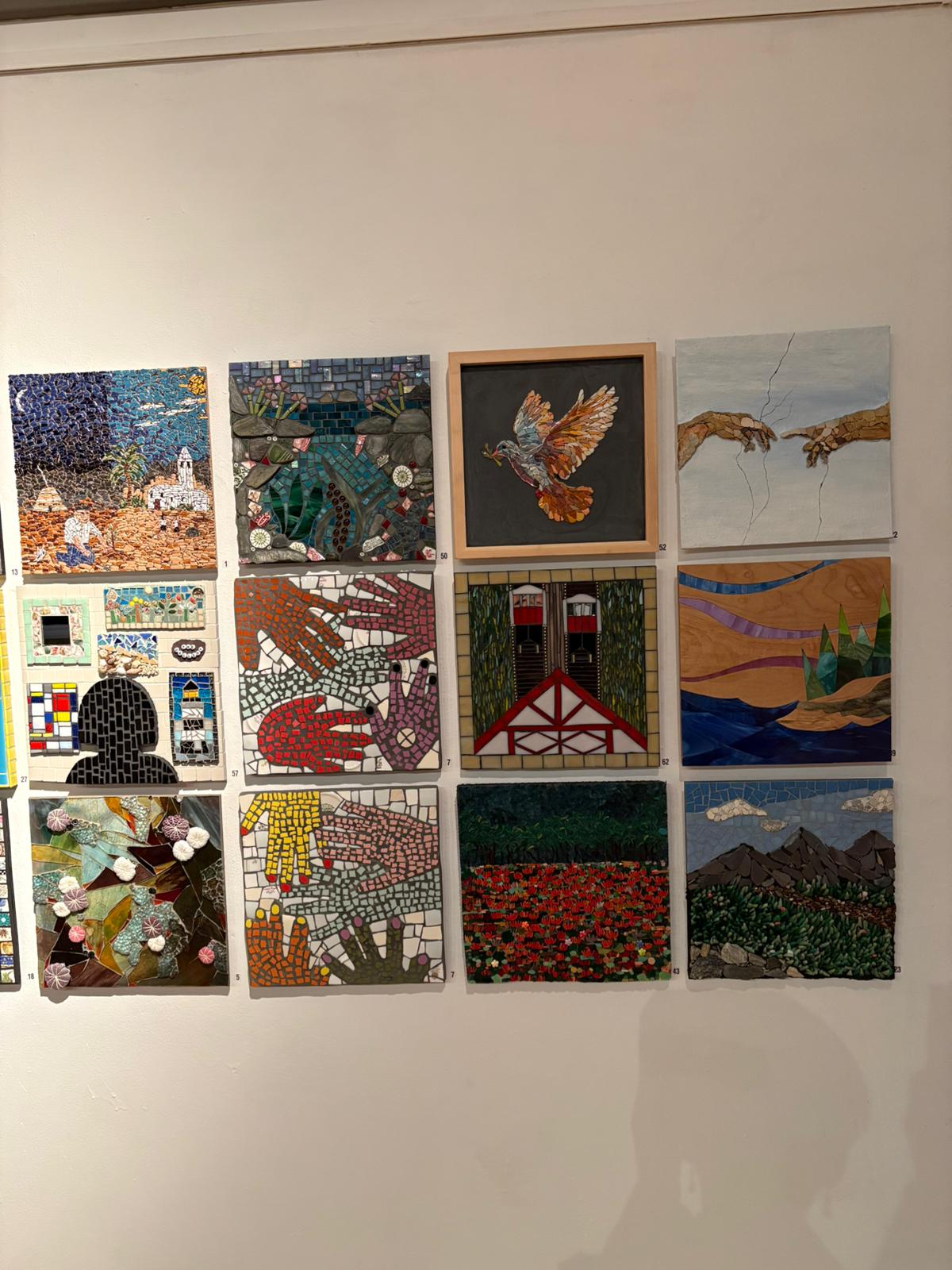
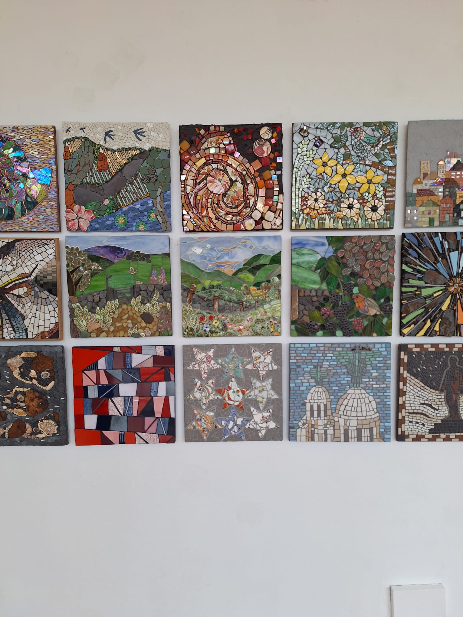
‘Piece Together’ is an international exhibition of cutting-edge mosaic art, curated by the British Association for Modern Mosaic (BAMM). It represents a new era of collective authorship, where individual voices and shared creativity converge to redefine the boundaries of this timeless medium. The end result is a vibrant collection of 65 works inviting viewers into a captivating world of fine art mosaics . From glimmering tesserae that evoke light -dappled water to tactile fragments shaped into soaring birds or abstract rhythm, the collection celebrates the infinite possibilities of materials often underestimated.
There is a long-standing contradiction between the singular and collective aspects of mosaic art. The individual tesserae of a mosaic rely upon one another to create a cohesive image, as do the artist’s decisions and skills, which are influenced by traditional techniques, artistry and the time-consuming process of assembling a mosaic. In Piece Together, this duality is expanded to include the actual creation of a collective mosaic. The theme of the exhibition is collaboration and, by working together or swapping materials. This exhibition has been curated by Crescent Arts, a contemporary arts charity based in Scarborough. Each artist involved in the project exchanged either materials, ideas or portions of their work in order to create a new piece of art together. The collective aspect of the exhibition is reflected in its layout. The 65 mosaics are arranged in rows on a wall, creating a 30 cm grid of panels that function as a sole entity made up of many individual mosaics of colour and texture.
While no two panels exhibit the same language, they are part of a common vocabulary. There are mosaics that shine with glass and light, while others rest in the grounded beauty of ceramic, stone and slate. While many of the mosaics exhibit recognizable images, others blur into abstraction, where the individual tiles become the subject rather than a tool used to depict a subject. When viewed collectively, the mosaics demonstrate a medium that is liberated from its historic associations with decoration and monumentalism, and are instead using the medium to explore experimentation, environmental awareness and emotional expression.
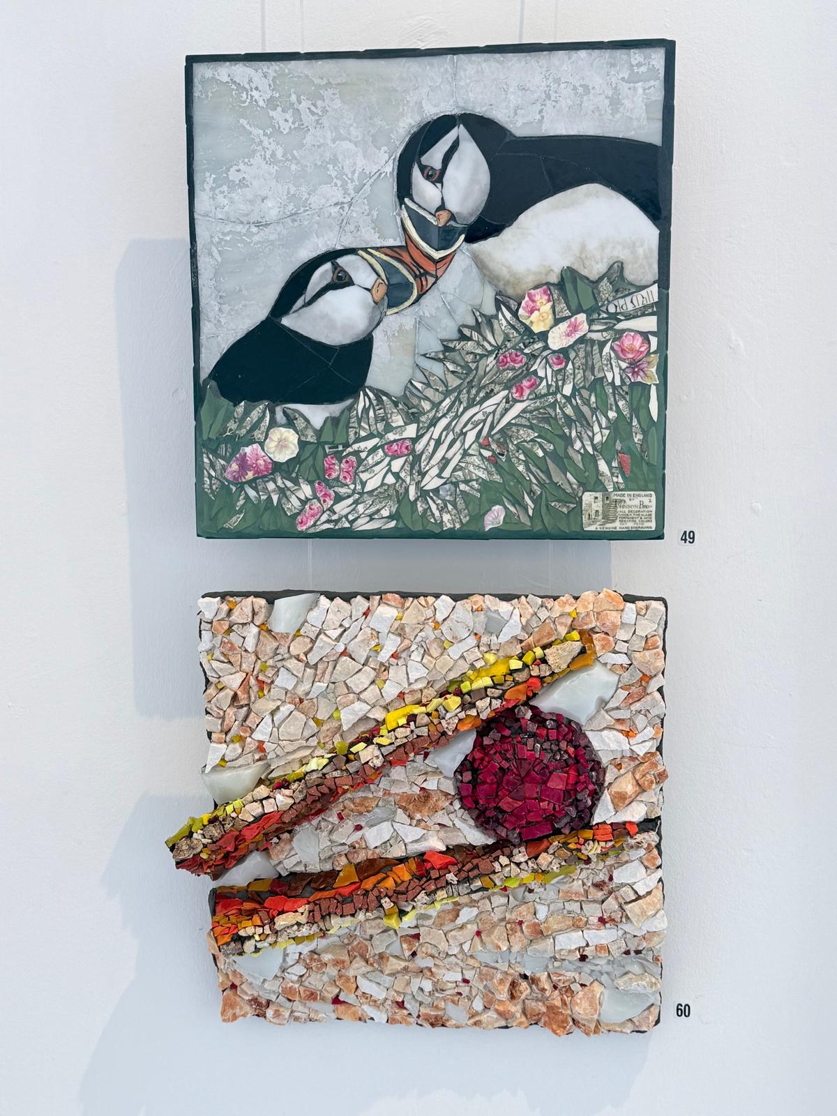
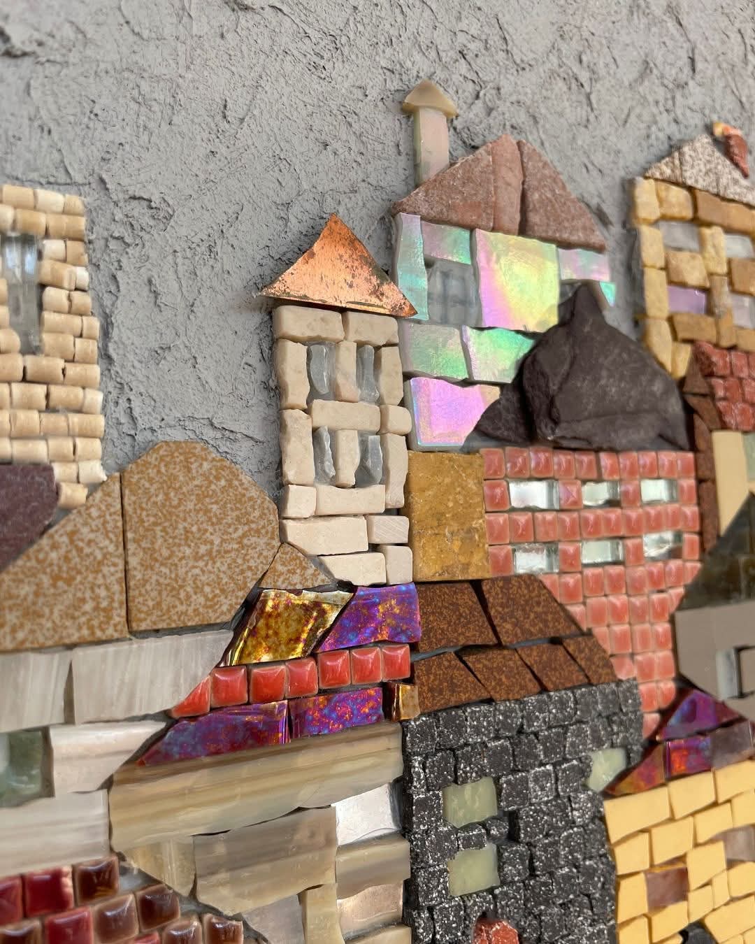
Several works exhibited at Piece Together illustrate this new direction for the medium. For example, a delicate depiction of two puffins titled ‘Puffins – A collaboration of Sea Clowns’ by Gillian Goldsmith. The puffins are rendered delicately out of handcut stained glass, against a grey-blue sky. The precision of the cuts creates a sensation of softness, and adds to the overall impression of delicacy. Next to this piece is a more tactile abstraction of thick shards of stone and glass in reds, ochres and sulphur yellows, that push mosaic towards the realm of sculptural relief. Titled ‘The red berry’ by artist Sandrine Soubes, it depicts a bird beak holding a little berry, tenderly. The uneven surface of this work casts shadows that change throughout the day, suggesting movement and instability. The juxtaposition of these two works illustrates the curatorial approach of the exhibition, which is based on contrast. The first work celebrates representation and gentleness, while the second work celebrates material energy and fragmentation.
In addition to exploring the potential for mosaic to express narrative, several works in the exhibition use mosaic as a way to tell stories. For example, a panel depicting a crocodile, a bird and a turtle in an unlikely co-existence, demonstrates a classically-arranged composition by Judy Tocher titled ‘Reaching for the golden pear’ Each animal is represented by tiles of varying scales and tonalities, creating a dynamic rhythm within the surface. Immediately below this work is a monochromatic geometric design in black, white and ochre titled ‘Posh not posh’ by Coralie Turpin, that recalls Roman pavement motifs, but updates them with broken symmetry and varying thicknesses of stone. Both works reflect the ability of the exhibition to balance history and innovation, without favoring one over the other.
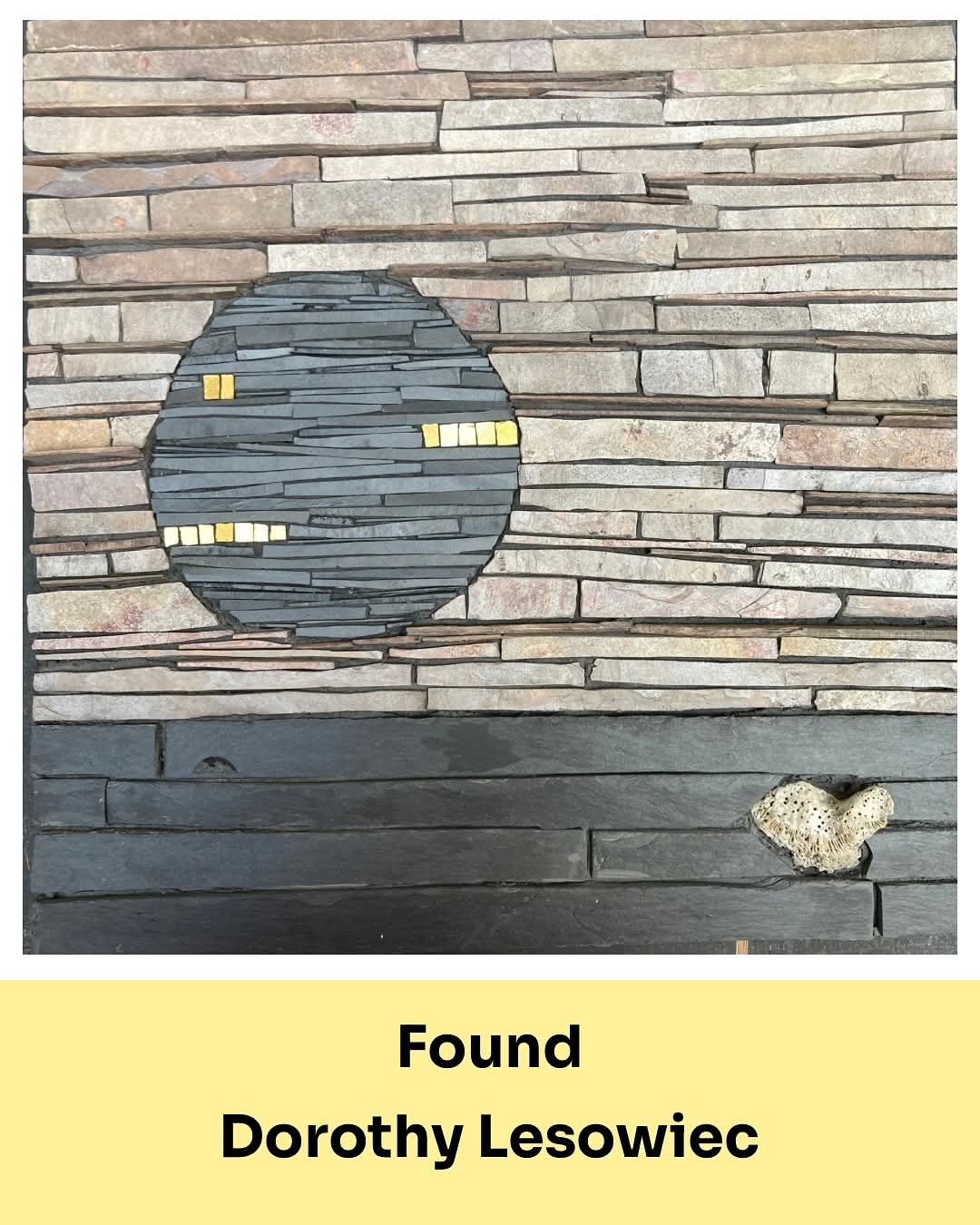
Dorothy Lesowiec’s Found brings a tender close – a deeply personal work celebrating the rediscovery of family. Gold smalti shimmers through the surface, symbolising the richness of love, belonging, and reconnection.
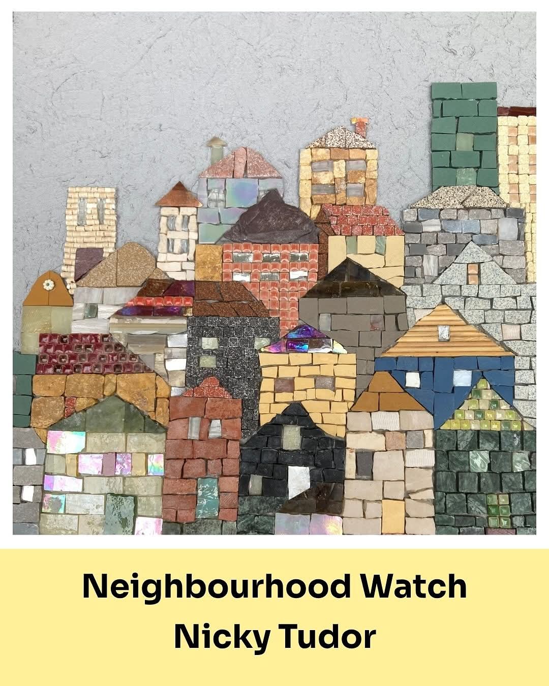
Neighbourhood Watch by Nicky Tudor celebrates the quiet strength of community – the everyday acts of care that bind neighbours together. Tudor has transformed the spirit of connection into a richly textured mosaic. Tudor assembles unglazed ceramic, stained and glazed tile, beads, bamboo skewers, marble, aluminium, copper, and mirrored fragments. Each material in the mosaic catches the light differently, like individual voices in a collective harmony. It’s a radiant tribute to the beauty of togetherness and the resilience of shared humanity.
When viewed as a whole, the wall of 65 mosaics functions as a musical score, where each work is a note contributing to a complex, cross-cultural symphony. Some of the works stand out for their luminosity, such as those created with iridescent blue glass that evoke water or the sky. Other works anchor the composition in earth tones and heavy textures. The natural tendency to interpret narrative or emotion in patterns makes it impossible to avoid reading the individual mosaics as a cohesive unit. The viewer’s eye moves from one fragment to another, following the visual threads of technique and colour that run through the wall like invisible lines of communication between the artists.
The decision by the curator to limit the works to uniform dimensions was crucial to the success of the exhibition. The decision eliminated hierarchy and emphasized dialogue. A larger-than-average mosaic could have asserted dominance through size alone; here, all the pieces share equal space, and require the viewer to focus on nuances rather than sheer scale. The exhibition rewards prolonged viewing. Each panel of the mosaic reveals subtle decisions: the tension between smooth and rough surfaces, the contrast between precise and spontaneous cutting, and so forth. Those contradictions mirror the collaborative process itself, where compromise and conflict can be creative catalysts.
. Piece Together locates mosaic in terms of collaborations, processes and global exchanges and therefore places mosaic within discussions of conceptual and social practice art. The artworks presented here are not just visual or aesthetic; they represent a record of communication, dialogue, and mutual trust. Each joint, each line of grout, serves as a testament to numerous decisions and layers of authorship.
Piece Together also acquires additional significance due to the inclusion of documents detailing the collaboration between Turner Prize winner Jeremy Deller and Coralie Turpin. Working with local communities, environmentalists, and archaeologists, the two artists created a permanent public mosaic installation on Scarborough Sea front. Inspired by Scarborough’s Roman past and the rich marine life of the local coastline, the work- Roman Mosaic c.2025 – forms part of the new Sea Watching Station on Marine Drive. This inclusion of documentation regarding the project, in the form of ephemera and preparatory materials, extends the conceptual scope of the exhibition. Piece Together thereby positions mosaic as a democratic art form which can connect local experience with global issues of environment, heritage and collective identity.
Both the intimate and the monumental, are represented in Piece Together. There are works which function in the manner of personal meditation, exploring texture and rhythm as metaphors for memory or emotion. There are works that directly address social or environmental concerns, utilizing recycled materials and/or found fragments as statements on sustainability. The inherent need to reuse and recombine in mosaic lends itself to such themes. In some of the artworks, the tesserae contain fragments of porcelain, mirror, or broken tile, and each fragment retains a remnant of its former life. The disparate components of these fragments achieve new coherence through careful placement, and reinforce the exhibitions’ overall message: that beauty and meaning arise from unity, not uniformity.
Formally, most of the artists in this exhibition resist the flatness that has traditionally been associated with mosaic. Relief and three-dimensional layering are common characteristics of these artworks. Examples include an abstract composition featuring alternating bands of red and orange. Additionally, there are surfaces which are intentionally irregular and force the viewer to interact with the tactile aspects of the medium. Such formal choices position mosaic back to its material basis, while liberating it from the attempt to imitate painting. The artists do not strive to create the illusion of depth, but instead, acknowledge the physical presence of stone and glass. The artworks appear to “breathe” with the rhythmic process of creating them, and surfaces rise and fall in a manner reminiscent of geological formations.
While the collaborative premise of the exhibition could easily lead to thematic repetition, the variety of results maintains the vitality of the exhibition. Some combinations of artists have resulted in harmonious blends of styles, while other combinations have resulted in deliberate dissonance. Where two artists with different sensibilities have combined their approaches, the resulting tension is evident in the structural elements of the artwork: sudden changes in the size, colour, or orientation of tesserae indicate the intersection of two sets of hands. The visible seams between these two sets of hands serve as metaphors for dialogue, indicating where two individuals have communicated and resolved differences and disagreements.
One of the successes of ‘Piece Together’ lies in how it transforms mosaic into a language of time. Each tessera represents a decision that has been frozen in time, yet collectively, the tesserae express movement and rhythm. The labor involved in cutting and placing tesserae is slow and meditative, and thus, it stands in direct opposition to the rapid pace of contemporary digital culture. As such, Piece Together functions as a quiet resistance to the rapid pace and isolation of modern society. Piece Together provides a reminder that creative endeavors can be communal acts of patience, and that dialogue can be sustained over distance and delays.
This aspect is heightened by the fact that the exhibition is located within the Scarborough Museum & Gallery. The white walls and soft natural light provide the perfect conditions for the artworks to demonstrate themselves without distraction. Light reflects off the glass, and textures change as the light changes, much like how dialogue changes based upon who is speaking and when. The spatial rhythm of the installation invites the viewer to walk through and revisit the installation. The installation viewed from a distance appears as one large tapestry, while up close, it breaks down into hundreds of separate decisions. The viewer oscillates between viewing the installation as a whole, and individually viewing the myriad of decisions that comprise it, mirroring the process of collaboration itself.
It should be stated that ‘Piece Together’ is an exploration of empathy. Collaborating with mosaic requires not only trust in another artist, but also trust in the ability of the material to unite elements. The title of the exhibition is a clear statement of this trust. While the title of the exhibition clearly states the concept of literal assembly, it also conveys the psychological process of assembling perspectives, aesthetics, and experiences. The final product is not a unified whole, but rather a mosaic of voices that retain their individuality while contributing to a greater shared entity.
About BAMM
Founded in 1999, The British Association for Modern Mosaic (BAMM) is a membership organisation which aims to promote, encourage and support excellence in contemporary mosaic art in order to raise public awareness of mosaic and of the artists creating it.
These vibrant mosaics are best viewed in person, so if you can make it to Scarborough to visit the exhibition, please do.! You won’t be disappointed.!
The Piece Together exhibition continues until 14th November 2025 at Woodend Gallery, curated and managed by Crescent Arts.
Slim Aarons, a name synonymous with elegance and leisure, left an indelible mark on the world of photography during the mid-20th century. His work beautifully captures the essence of luxury and the affluent lifestyle of his time, creating an inviting glimpse into a world of sophistication and charm. Today, Slim Aaron photography has transcended its historical roots, becoming a popular choice for home décor. This article will guide you through the enchanting world of decorating with Slim Aarons prints, offering tips and ideas to integrate these timeless pieces into your living spaces.
Why Choose Slim Aarons Prints?
There are several compelling reasons why Slim Aarons art prints have become a favorite in interior design:
Timeless Appeal: Aarons’ work captures a moment in history that continues to captivate audiences across generations. Each photograph tells a story of glamour and opulence, making them an enduring choice for any décor.
Historical Context: His photography offers a window into the mid-century era, showcasing the lifestyles of the rich and famous. This historical element adds depth and interest to any room.
Distinctive Qualities: The composition of Aarons’ photographs often features vibrant colors, captivating landscapes, and a sense of adventure that can invigorate any room with a sense of liveliness and elegance.
Versatile Aesthetic: Whether your home leans towards a modern sleek look or a more vintage style, Slim Aarons prints are versatile enough to enhance and complement various design schemes.
This combination of historical richness and visual beauty explains why they have become a cherished staple in numerous homes today.
Incorporating Slim Aarons Photography into Different Spaces
Decorating with Slim Aarons framed prints can add a touch of timeless elegance to your home. Whether you’re working with a minimalist style or a more eclectic mix, here are some practical tips for incorporating Slim Aarons art prints into various rooms:
Living Room: Choose a large print to serve as a focal point above a mantle or couch. Pair it with neutral-colored furniture to let the colors and details of the print stand out. Consider prints like “Poolside Gossip” for its vibrant depiction of luxury.
Bedroom: Opt for softer, relaxing images, such as those featuring serene landscapes or leisurely afternoons. Placing a Slim Aarons print above your bed can create a sophisticated ambiance.
Home Office: Inspire productivity and creativity with vibrant art prints that capture leisure in opulent settings. They can add a sense of inspiration and motivation to your workspace.
Designers often source curated framed photography selections from Leisure Piece, alongside boutique galleries and independent artists, to complement a range of interiors.
Styling with Vintage Slim Aarons Prints
Vintage Slim Aarons prints evoke nostalgia and bring a classic charm to any home. These prints work exceptionally well with mid-century modern decor styles, which emphasize simplicity, functionality, and a connection to nature. Here’s how to style these prints for a vintage appeal:
Theme Consistency: Choose vintage Slim Aarons prints that match the overall theme of your home. Prints that showcase retro leisure activities or glamorous holiday locations can complement a vintage aesthetic.
Color Palette: Select prints that share colors with your existing decor. This will help the artwork blend seamlessly with the room’s ambiance while still making a statement.
Room Placement: Highlight specific areas in your home, such as the entryway or a reading nook, with vintage prints to create a warm, welcoming environment.
These prints can stand alone as statement pieces or be combined with other decorative elements reminiscent of a bygone era. To delve deeper into vintage decorating trends, you can check out this detailed article by Architectural Digest.


 Artist: Haoxuan Zhang