
World of Warcraft has always rewarded progress with better equipment, but the value of its most desirable rewards now goes far beyond character power. A rare mount, seasonal title, elite transmog set, or difficult achievement can communicate experience before a player says a word. For those balancing ambitious goals with limited playtime, WoW Boosting Services have also become part of the progression ecosystem, helping players pursue specific milestones with less pressure.
What makes these rewards powerful is visibility. Gear is often replaced within a season, while a distinctive appearance, mount, or title can remain attached to a character for years. In a capital city or at a raid entrance, players notice signals that suggest skill, persistence, luck, or long-term dedication. These items function as digital status symbols because others understand the effort and timing behind them.
Status in a World Without a Final Ending
Most games have a clear finish line. World of Warcraft does not. Each expansion introduces new raids, dungeons, PvP seasons, reputations, and collections. Character power rises and falls with every major update, so lasting prestige depends less on having the highest item level and more on what a player has collected along the way.
This is why an old title can feel more meaningful than a new weapon. The weapon may be stronger today, but the title tells a story. It might show that the player completed difficult content while it was current, reached a competitive rating, or participated in a moment that cannot be recreated in the same way.
WoW’s seasonal structure strengthens that effect. Blizzard connects PvP progress to elite appearances, mounts, weapon illusions, tabards, and titles, while Mythic+ and raid seasons offer their own achievements and visual rewards. When a season ends, some opportunities disappear or become impossible to earn under the same conditions. Scarcity turns progression into history.
The Rise of Visual Prestige
In early World of Warcraft, powerful gear was itself a public display. Players could recognize famous raid sets or weapons on sight. Transmogrification changed that relationship by separating appearance from current power. A character could wear modern equipment while displaying a look earned years earlier.
That shift made personal presentation a larger part of the game. Players began building outfits around class identity, expansion themes, and rare weapons. Mount collecting developed in a similar way. A mount is transportation, but it is also a moving trophy displayed in social spaces.
The Trading Post has expanded this culture by regularly offering themed mounts, weapons, and transmog appearances. These rewards may not prove competitive skill, but they still communicate taste, consistency, and participation. Prestige in WoW is no longer one-dimensional. It can come from high-end performance, patient collecting, creative styling, or being present at the right time.
Why Limited-Time Rewards Matter
A reward becomes more desirable when players believe they may lose the chance to earn it. Seasonal mounts and titles create urgency because they belong to a specific period of the game. Even relaxed players can become highly focused when a favorite reward is about to disappear.
This is not only fear of missing out. Limited-time rewards preserve context. A title earned during a particular season shows that the character existed in that competitive environment. It carries a date, a difficulty level, and a shared memory. In that sense, the reward is closer to a medal than a cosmetic purchase.
Two visually similar mounts can have different meanings if one was freely available and the other required success during a demanding season. The design matters, but the story of availability often matters more.
Achievement as Personal Identity
Digital status is not always about impressing strangers. Many players use rewards to define their characters and remember what they have accomplished. A favorite title may represent a first major raid clear. A mount may recall months spent with the same group. An elite appearance may mark the season when a player finally became comfortable in competitive PvP.
These objects turn an account into a personal archive. They record friendships, difficult encounters, changing metas, and years of participation. That emotional value explains why players continue collecting long after a reward stops being rare or fashionable.
More Than Better Gear
World of Warcraft rewards became status symbols because the game gives them meaning through challenge, scarcity, visibility, and memory. Item level remains important for progression, but it is temporary. Prestige rewards survive balance changes and new expansions because they represent something more durable: what a player did, when they did it, and how they want to be seen.
In Azeroth, the most valuable reward is not always the one with the strongest stats. Sometimes it is the one that turns a character into a story other players can recognize.


 Steve Lacy’s new album,


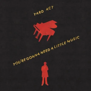 Yard Act vocalist Jamie Smith characterizes the band’s first two albums as “laptop records essentially,” but
  Swapmeet, an indie rock quartet from Adelaine, Australia, have come through with their debut album,
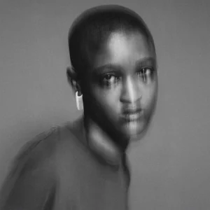 Syd’s first solo album in four years has arrived. The Broken Hearts Club follow-up finds the Internet co-founder at her most relaxed and confident, boasting collaborations with collaborations with Raphael Saadiq, Big Sean, Rodney Jerkins, and more. “
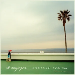 In the last three years, the Menzingers vocalist/guitarist Greg Barnett got married and welcomed his first child, while co-frontman Tom May went through a divorce. Those experience coalesce on the band’s eighth album, Everything I Ever Saw, which finds them reuniting with producer Will Yip. “Working with Will was like a homecoming,” May reflected. “We’ve grown up together over these years, and we’re still incredibly close friends. He’s the best at gassing you up and making sure everybody’s on the right page, but he’s also so good at pointing out stuff that might not fit the vision without being a f*cking prick. He’s the hardest working person that we’ve come across in the music industry, and he’s incredibly inspiring.”
