

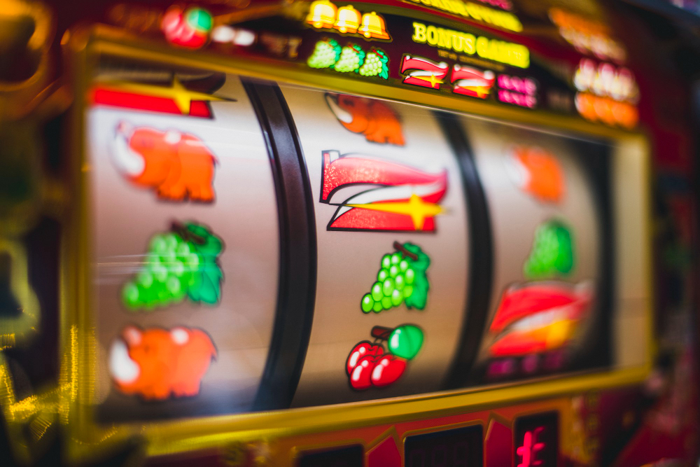
Cherries. Bells. Lucky sevens. A chrome edge catching the light, letters that look as though they’ve been poured from neon, and a row of symbols framed with unapologetic colour. Even if you’ve never stood in front of a classic fruit machine, you probably recognise its visual language straight away.
That’s the curious power of retro fruit-machine design. It has travelled well beyond its original setting, turning up in shop signs, album sleeves, fashion shoots, film sets and illustration. The imagery is simple, loud and instantly familiar. It asks very little of the viewer, yet it says plenty: funfairs, late-night streets, American diners, seaside arcades and a particular version of twentieth-century optimism.
It’s not just nostalgia for old machines. It’s nostalgia for a way of making things visible.
A handful of symbols that everybody seems to know
Fruit-machine imagery lives in popular culture’s shared visual memory because it is wonderfully direct. A cherry reads as a cherry at a glance. A bell has a clear silhouette. A seven is already a striking character, and becomes even more so when it’s slanted, outlined and coloured red.
These symbols were built to be read quickly, often from a slight distance and amid visual noise. That practical need produced a design vocabulary with real staying power:
- bright primary colours and warm yellows
- heavy black outlines
- high-contrast lettering
- repeated motifs across reels or panels
- glossy, metallic surfaces
- simple objects with bold shapes
- lights used as both decoration and direction
There’s a lovely confidence to it. Nothing is muted. Nothing is hiding in the background. A fruit machine, much like a classic high-street sign, needs to make an impression in seconds.
For designers, that clarity remains useful. You can borrow the punch of the colours, the rhythm of repetition or the rounded lettering without recreating the machine itself. It’s a visual shortcut to a mood, but a surprisingly flexible one.
How mid-century machines made bold graphics feel natural
The roots of the modern fruit machine go back to mechanical devices of the late nineteenth century. Charles Fey’s Liberty Bell machine, developed in San Francisco in the 1890s, simplified earlier card-based machines into three reels and a small set of recognisable symbols. The bell became such a defining feature that it helped shape the category’s visual identity. Wikipedia’s overview of slot-machine history is a useful starting point for the broader story.
By the middle of the twentieth century, fruit machines and arcade cabinets had established a look that was equal parts engineering and showmanship. Their fronts were not flat screens in the modern sense. They were physical objects, made from glass, metal, painted panels, buttons, lamps and printed strips. Every component had to work hard.
The typography tended to be chunky because it needed to hold its own beside flashing bulbs. The fruits were exaggerated, with plump curves and shiny highlights. Borders were often gilded, striped or chromed, giving even a compact cabinet the feeling of a miniature stage.
That connection with stagecraft matters. A good machine front is a tiny proscenium, with its symbols appearing within a carefully lit frame. The arrangement gives the eye a route to follow: title, reels, symbols, buttons, surrounding decoration.
It also shares DNA with other mid-century commercial design, including petrol-station signage, fairground lettering, diner interiors and jukeboxes. Each used colour, illumination and big forms to catch the eye. In Britain, the fruit machine became part of the familiar furniture of certain adult social spaces, but its graphic influence was much wider than its use.
Why screen culture keeps returning to the bells and neon
Retro chance imagery is a brilliant production-design shorthand. A filmmaker can place neon lettering, reflective chrome and a handful of fruit symbols in the background and immediately suggest a particular atmosphere. It might be Las Vegas fantasy, a faded seaside promenade, a club interior or an imagined version of 1970s commercial glamour.
The appeal is not limited to literal recreations. In music videos and stage visuals, spinning symbols and blinking lights provide movement without needing complicated imagery. They work well with a beat because repetition is already built into their structure. A reel turns, a light pattern cycles, a sign flickers, then starts again.
Album artwork has often drawn from the same pool. There’s room for camp, glamour and a faintly worn texture, especially when an artist wants something that feels tactile rather than pristine. An overprinted cherry, a starburst, a cursive sign or a scuffed metallic typeface can make an image feel found rather than manufactured.
For more screen-led inspiration, the Our Culture Mag film section is a good place to follow the ways visual worlds are built around music, objects and mood. The site’s music coverage also offers a useful route into the artwork and visual identity surrounding new releases.
Pop art, collage and the joy of commercial clutter
Artists have long been interested in ordinary signage and mass-produced images. Pop art, in particular, treated the visual language of advertising, packaging and consumer display as serious material for art. Fruit-machine motifs fit naturally into that tradition. They are familiar objects, reproduced again and again, already halfway to being graphic icons.
What makes them useful is their mixture of innocence and excess. Fruit looks wholesome. Bells feel ceremonial. Stars and hearts are almost childlike in their simplicity. Put them against chrome, electric blue and hot pink, though, and they become knowingly theatrical.
Collage artists often use old tickets, signage fragments, printed fruit and faded photographs to build a sense of time passing. Illustrators may lift the curved outlines and sticker-like shapes, while photographers are drawn to glowing machines as ready-made portraits of places. The reflected lights, fingerprints on glass and slightly battered surfaces offer texture that clean digital work can struggle to imitate.
I find the most interesting work doesn’t simply copy a retro panel. It notices what made that panel compelling in the first place: scale, contrast, repetition and surface. Then it carries those principles into something new.
For more visual-art perspectives, explore Our Culture Mag’s art archive, where contemporary artists and image-makers are often considered in relation to the wider culture around them.
Tactile loops still matter in digital entertainment
The shift from mechanical cabinets to screens changed the materials, but not every design lesson disappeared. Digital entertainment still relies on feedback. A button changes colour when pressed. A panel responds to touch. A short sound marks an action. Repetition creates familiarity.
Retro fruit-machine design understood this almost instinctively. The physical click of a button, the movement of a reel and the glow of lamps all told the user that something had happened. Modern interfaces often aim for the same sense of acknowledgement, though in quieter forms.
There’s also a design lesson in uncertainty. Not uncertainty as a promise of an outcome, but as a way to hold attention for a moment. Animation, delayed reveals and looping motion can make a screen feel alive. The important thing is proportion. The best contemporary designers use these cues to make an experience legible and playful, not overwhelming.
18+ commercial example
This is an adults-only, 18+ design reference, not a recommendation or invitation to gamble. The visual presentation of double bubble slots draws on bubblegum-style fruit-machine iconography, using fruit symbols, bright colour and an arcade-adjacent presentation. It’s a clear example of how this older graphic language continues to be repackaged for screens.
If gambling is part of your life, keep it strictly recreational, set personal limits and take a break if it stops feeling enjoyable. It is not a way to make money or solve difficulties.
Nostalgia is a language, not a free pass
There is a difference between using retro imagery thoughtfully and treating its source material without context. Cherries, reels and glowing signage can be borrowed as graphic references, but they also come from gambling environments intended for adults. That history should not be airbrushed away.
A responsible creative approach puts the focus on form rather than on gambling itself. Consider the typography, colour systems, materials and period references. Use the fruit as a still-life element, perhaps, or the curved chrome framing as a layout device. Avoid presenting gambling as glamorous, risk-free or central to a desirable lifestyle.
Nostalgia works best when it is slightly questioning. Why do these objects still look exciting? What do they tell us about commercial art, public spaces and our relationship with signs? Those questions can give a retro-inspired design more depth than a straightforward imitation.
Keeping the look alive without getting stuck in the past
Retro fruit-machine design remains iconic because it is built from basics that still work: bold symbols, vivid colour, tactile surfaces and clear visual hierarchy. It’s communicative, playful and a bit over the top, which is precisely why designers keep coming back to it.
If you’re using these references in contemporary work, start with one or two recognisable qualities rather than the whole cabinet. A glowing border. A plump cherry. A hand-painted sign style. Let the reference support your own idea rather than swallowing it.
That way, the bells, sevens and neon can remain what they have always been at their best: memorable pieces of visual culture, full of colour and character.

