
The number one video streaming website YouTube has introduced a redeveloped logo on their platform
After twelve years of running with the same logo, Google owned YouTube has redeveloped the look of their logo by making several changes in the way it is laid out.
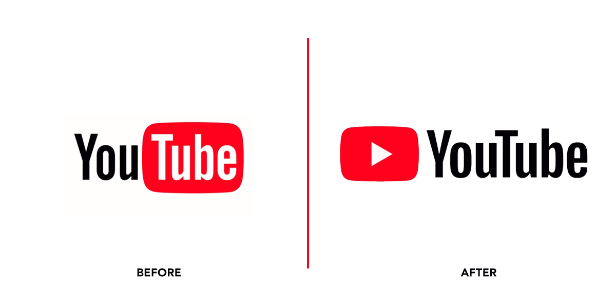
Some of the main changes are the way YouTube is now joined up instead of being separated by white and black text colour. Furthermore, the ‘Tube’ has been moved from the rounded rectangle and put together with ‘You’, whilst also the red rounded rectangle has been transformed into a play button. It could be said that this new logo has a clearer meaning to what YouTube is and the old even though nice is a tad too basic to really dig into the meaning of YouTube.
The changes whilst minimal in some ways, really showcase that YouTube is being rebranded, some even saying that this could be due to the new rules YouTube have been introducing about monetisation.
Here are some responses from YouTube users online.
everyone: youtube my entire channel has been demonetized for saying heck please help i cant afford food
youtube: we made a new logo lol pic.twitter.com/7Ak8Tmy44K
— Mike (@Piemations) August 29, 2017
YouTubers: please fix sub boxes and monetization
Youtube: ok we hear you, we fixed the logo pic.twitter.com/JpArZPudfs— Joe (@Tofuugaming) August 29, 2017
New YouTube logo…I dig it. What u guys think? pic.twitter.com/7uB9ZgiMv2
— TechSmartt (@TechSmartt) August 29, 2017
