")
More often than not, musicians are incredibly intentional about the way their albums are packaged, particularly when it comes to settling on the cover artwork. Whether it’s carefully planned or sort of a happy accident, designed by themselves or collaboratively, they know that no matter how much effort they put into the music, the cover holds the power to draw a listener in and set the tone for an album before you even hit play. Yet they’re not discussed as often as they should be. Following our list of the 50 best albums of 2023, we’re highlighting the most memorable and striking album covers of the year, and as with previous years, we’ve included quotes from many of the featured artists about the process behind them. This is an unranked list, but we’ve placed the 10 artworks that stood out the most at the very top.
Tiny Ruins, Ceremony

The musical world of Ceremony, the latest album by Tiny Ruins – the indie folk band led by Hollie Fullbrook – is vibrant, earthy, and intimately arranged. Its songs are described as “chapters” of a saga set on the shores of Auckland’s Manukau Harbour, where Fullbrook lives. “It’s beautiful but also muddy, dirty and neglected,” she said in a press statement. “It’s a real meeting of nature and humanity.” While making the album, Fullbrook would walk around the area with her two dogs, who are portrayed in the cover artwork, a wonderful painting by Christiane Shortal that’s dotted with references to the album’s lyrics: the animals, the lighthouse, even the donut. Loss and grief run through the album, but the image is a tribute to the environment where she found not only inspiration, but a beautiful kind of peace.
Black Belt Eagle Scout, The Land, the Water, the Sky

When Katherine Paul, the singer-songwriter and multi-instrumentalist who records as Black Belt Eagle Scout, noticed the similarities in the colour palettes of her first two albums, she wanted carry that thread onto her third LP, The Land, the Water, the Sky, which was inspired by her return trip to her ancestral lands in the Swinomish Indian Tribal Community. “This last album, I wanted to do it during this time when the sun is setting and there’s that pink that happens, it’s kind of like cotton candy,” Paul explained in our Artist Spotlight interview. “I wanted to try and do that, but it didn’t happen, so the album could have potentially also been the same color. But then it just ended up being blue, and there are some aspects of that pinkish color in some of the other elements. With the album title, I wanted to be able to show in a visual way what that was, what I was singing about and singing to. And so, I just kept seeing myself in water. Water is really important to my culture and to my people, and to the specific region of where I’m from. We spend a lot of time on the water – there’s this thing called canoe journeys, it’s a really big part of our culture and way of life.”
“I knew I wanted to be photographed in some way on the cover, but I didn’t realize that you’re going to see the behind shot, from my perspective of looking out,” she added. “That was when I started working with my friend Evan Atwood, who is really creative and an incredible photographer. They did all of my music videos for this album campaign, and they’ve done two other music videos for previous albums. We just worked really well together, and Evan took what I was thinking and brought their own creativity to the shoot. The thing that I love the most about working with Evan is it’s very spontaneous. We have this idea, and what feels good is it tends to happen naturally. It wasn’t one of those things where a month beforehand, the schedule is set, the time is set. It was like, “Let’s just go here.”
Blur, The Ballad of Darren

Blur are no strangers to using swimmers as part of their album imagery, and the thread continues with The Ballad of Darren, their first album in nearly a decade. The band worked with Undercard Studio, a creative studio founded by Matt de Jong and Jamie-James Medina, to put together the artwork, ultimately landing on a picture by British photographer Martin Parr, captured in 2004 at the Gourock Lido, the oldest outdoor heated swimming pool in Scotland .“It was in the summer and you have the blue of the lido but there was the gray sky so familiar in Scotland,” Parr told the BBC’s Good Morning Scotland. “I thought this was going to be a great backdrop. I just stood there for maybe half an hour, waiting for the right person to swim by.”
Speaking to Magnum Photos, De Jong commented: “If you look at Blur’s original album covers, they are very British and quite fun. We had talked through the album’s themes with Damon, so we knew how sincere this album was. We started pulling Martin Parr’s images of beaches and resorts and came across the Gourock pool image. There is a melancholy, yet uplifting feel to the album, so a swimmer fighting against the odds felt like the perfect accompaniment to the music.”
Lucy Liyou, Dog Dreams (개꿈)

The blurry aesthetic can be an easy way around a striking album cover, but it’s not always the right match. The cover for Dog Dreams (개꿈), though, perfectly mirrors not only the way Lucy Liyou’s subtly eerie and opaque compositions submerge you in her recurring dreams, but how she foregrounds her voice and self like she never has on a record before. “When I got my press pictures professionally taken last year, I was embarrassed by how terribly awkward I felt throughout the process,” Liyou explained in a statement. “I just wanted comfort this time, so I asked my sister, Irene Pak, a college student with no photography experience, to take some pictures on my phone through this app that captured motion blur. She reluctantly said yes. We were on a family vacation. There was a pool, she was getting extremely impatient. And after a few tries, she showed how deeply annoyed she was by violently shaking the phone. That’s how we got the album cover. I did not feel any more comfortable this time with the shooting process because she was being such a bitch (love you, Irene), but the cover makes me laugh and we had a good laugh on the phone because we can’t believe it’s going on this list!”
Cicada, 棲居在溪源之上 Seeking the Sources of Streams

Seeking the Sources of Streams, a contemporary chamber music album by the Taiwan ensemble Cicada, documents composer Jesy Chiang’s hike in the Central Mountain Range. As gorgeous as the compositions themselves, the cover art is a collaboration with woodcut print artist Muran, who wonderfully depicts this journey as a stream of enriched awareness and rejuvenation. “Inspired by the two pieces ‘Remains of Ancient Trees’ and ‘Seeking the Sources of Streams’, Muran created an abstract and intricate space with streams, fallen trees, and grass owls,” Chiang explained. “The visual is like a hazy recall after a long journey in the mountains, corresponding to the instant scenes depicted in the music.”
Fireworks, Higher Lonely Power

When Fireworks released Higher Lonely Power, their first album in nine years, at the very beginning of the year, one of the most surprising things about the announcement was seeing the album cover, a shot of an overgrown forest floor that hardly bore any resemblance to their last two records. Like the music, it’s lush, striking in its bleak minimalism yet imposing at the same time. “The cover of Higher Lonely Power was shot by Danny Ribar on an old iPhone about 10 years ago,” Chris Mojan explained in a statement. “Danny and I went to school together and I’ve always admired his ability to capture nature in a dark manner using shadows, forest cover, etc. It probably has something to do with the fact that we grew up in the same place and spent summers in Northern Michigan, like most from Metro-Detroit do. When the album was about halfway done, I found the photo and we kind of used it as a North Star, vibe wise.”
deathcrash, Less

For Less, a tender, minimalist follow-up to deathcrash’s 2022 album Return, the London decamped to the UK’s most remote studio in the Outer Hebrides. It finds them working once again with producer Ric James as well as longtime collaborator and artist Kaye Song, who created all of the videos, photographs, and design for the album on-site, responding to the environment. “The music and imagery for Less was recorded over three weeks on and around Great Bernera, a small island just off Lewis in the Outer Hebrides,” Song explained over email. “I wanted the artwork accompanying the album to be a record too – a record of the setting, the remoteness of the location but also the agile circumstances in which Less was made. I designed a shape-shifting sculpture inspired by the topography and changeable climate of Lewis and used its different configurations to document the landscape around us. The version on the front cover was photographed on the outrcrop behind the studio and the version on the back cover was assembled precariously by the band after days in confinement, spending long hours producing, mixing and finessing. We set it on fire for the first single’s music video – a cathartic moment to mark the end of our time together on Great Bernera.”
Liv.e, Girl in the Half Pearl

Some of the lyrics on Liv.e’s sophomore album, Girl in the Half Pearl, are couched in melancholy, but there’s hope in there, too: “When I looked inside myself/ I found there was no one to help/ Guess I’ll find my super power/ Light by fire in the darkest hour.” The lyrics are more introspective than Liv.e’s debut, while the instrumentation is often shadowy and distorted. These qualities are echoed in the cover art, captured by Qlick (Cinque Mubarak), who also shot the photos for the rest of the campaign. “Had such a fun time creating this cover with Liv,” the photographer told us. “I think we really just wanted to create something real and true to that moment. We really dug deep, this was the very last shot we took at 4 in the morning. I feel like we really pulled the best out of each other on this one. So much luv to her.”
Yves Tumor, Praise a Lord Who Chews But Which Does Not Consume (Or Simply, Hot Between Worlds)
Jordan Hemingway’s cover for Yves Tumor’s 2020 album Heaven to a Tortured Mind perfectly mirrored the qualities of the music: darkly cinematic yet processed in striking and experimental ways. It depicted two nude figures, presumably Tumor, locked into each other under a bright white light. On its follow-up, Praise a Lord Who Chews But Which Does Not Consume (Or Simply, Hot Between Worlds), Tumor remains an enigmatic presence – they’ve done virtually no press for the album, but was interviewed by Courtney Love – but they more fully embrace the persona of alt-rock bandleader and superstar. The cover art – once again by Hemingway, who also directed the videos for singles ‘Secrecy Is Incredibly Important to the Both of Them’, ‘God Is a Circle’, and ‘Echolalia’ – feeds into the same world as much as it signals Tumor’s evolution, less abstract but just as bold in its glammy surrealism. The line between public and private is still blurred, but the impact of their sonic and visual expression shines through.
draag me, lord of the shithouse

draag me’s second LP, lord of the shithouse, took shape during the pandemic, as Spirit of the Beehive’s Zack Schwartz and Corey Wichlin started emailing ideas for songs back and forth. Some of the material originated from the sessions behind Beehive’s ENTERTAINMENT, DEATH, whose cover artwork, created by bassist/vocalist Rivka Ravede, landed in our 2021 list. Along with Wichlin, Ravede is also credited for lord of the shithouse’s cover art, which underscores the music’s mangled, murky beauty – a kind endlessly tied to online spaces – and, in evoking in the knot of depression, its human element. Rather than directly using one of Ravede’s paintings, in part to distinguish it from their other project, they tried something different.
“Rivka began work on this art as a painting in the earlier stages of making this album,” Wichlin told us. “As we got closer to finishing the album, it felt important to separate this release from the work of our other project which primarily uses Rivka’s paintings as cover art. We iterated art in the Discord-based AI engine midjourney, using her original painting and a few different prompts as the source material before landing on this as the final.” It’s worth noting that the cover for one of the year’s most high-profile releases, Lil Yachty’s Let’s Start Here., was generated using AI. “It seems that AI’s presence in art is polarizing,” Wichlin added. “I’m not sure that it will have any long term staying power, but I think that these early engines can have interesting artifacts and imperfections in the same way that more physical mediums do.”
La Force, XO Skeleton

XO Skeleton, the sophomore album from Ariel Engle’s project La Force, is vividly haunting and contemplative, contending with what a press release describes as “the gooey center of love, loss, touch, and memory.” That description feels particularly apt when looking at the cover art, which emerged serendipitously as the team worked on the project’s visual component. “We worked on XO Skeleton’s visuals over the span of two years, mostly with an experimental approach and not a lot of formality – this image came from the first of such creative sessions, and was one of those beautiful accidents that materialized into the album cover,” creative director Sara Melvin explained in a statement. “Ariel (La Force) had this incredible idea we were trying out – to undergo the physical transformation of moving from human to fossilized statue, in real time, for the ‘Condition of Us’ music video. We had Ariel outside with a make shift studio setup surrounding her, rain coming down, and the continuous liquified goop pour. The light was moody, overcast and perfect so I took a few photos on black and white film. When they came back, we all loved the feeling of this image.”
Protomartyr, Formal Growth in the Desert

The artwork for Protomartyr’s last album, Ultimate Success Today, depicted a mule as a fascinating symbol of America’s war industry and the way they used animals, but the colours – white, blue, purple – were surprisingly vibrant in contrast to the band’s dark, apocalyptic music. The Detroit post-punk band’s sixth LP, Formal Growth in the Desert, makes space for wary optimism and self-acceptance, but its cover actually looks more bleak. Frontman Joe Casey initially had the vague idea of a woman embracing a statue after seeing it in a book, then relayed it to Trevor Naud, who took it in a new direction through a photoshoot using different props.
“Originally intended as a source image for Joe to print, manipulate and hand color – the finished product wound up being a simple scan of the original film negative,” Naud told us. “What’s cool is that it feels archival (like a photograph from an obscure theatrical production), and I think that’s exactly what we were aiming to create. This process was exciting and challenging – as Joe had a very specific idea of who these characters were and what mood the image should have. We shared a Google doc of old movie stills, sculptures and works by Dada artists to get started. There were about six different masks I created, and photographed the two actors in various configurations using natural light. This one was the favorite (and has the most disturbing mask).”
Christine and the Queens, PARANOÏA, ANGELS, TRUE LOVE

PARANOÏA, ANGELS, TRUE LOVE, the fourth album from Christine and the Queens, revels in both naked vulnerability and ambivalence. It’s not hard to lose yourself in its ambitious, dreamlike story, inspired by Tony Kushner’s play Angels in America, but the album is most engaging for what’s almost a hyperfixation on the self in its most its most exposed and sublime form. Paolo Roversi’s photographs, from the ‘To be honest’ artwork to the album’s front cover, recognise and amplify those qualities. “There is a matador energy and bravado [in the album cover photo], lots of defiance, but also a bit of humour I hope,” Chris told The Standard. “It’s like kids dressing up and playing tough guys. The story can be understood in different ways.”
James Blake, Playing Robots Into Heaven

Playing Robots Into Heaven sees James Blake returning to his electronic roots after 2021’s Friends That Break Your Heart, a rather strightforward singer-songwriter album, and the results are both dynamic and emotive. The cover art centers on Blake carrying his beloved instrument while hinting at a kind of communal journey towards transcendence. Crowns & Owls, the studio behind the artwork, told Office Magazine: “It’s hard to pin down an inspiration really… we’ve seen a bit of discourse online citing Bergman, Tarkovsky… neither of those guys came up in our idea development phase to be totally honest, but that’s deeply flattering stuff and we’ll take any comparisons to those masters all day long. Thibaut Grevet was an amazing partner as his work is so timeless, and that’s exactly what we felt this record needed. The central visual theme of the record depicts James crossing landscapes as part of a procession of people, with an analogue synth/sculptural tannoy mounted on his back. We loved the idea of the collective nature of dance music being conveyed through this strange pilgrimage, this bringing together of people, transcending as a group.”
Algiers, Shook

Mark Mahaney’s Polar Night series documents the American photographer’s passage through Alaska’s northernmost town of Utqiagvik, located 320 miles above the Arctic Circle. One image in particular struck a chord with Lee Tesche, the bassist of Atlanta’s Algiers, whose fourth album evokes a bleak, chaotic world while more than hinting at the life of joyful endurance it necessitates. “The cover image of Shook was taken by Mark Mahaney from his incredible book Polar Night. The first time I saw this image, it stopped me dead in my tracks and I kept coming back to it time and time again,” Tesche told us. “Shook is a collage about the collapse of time, place, and sound with a glimmer of hope. There is a lot of overlap of themes between the two projects, the dizzying prolonged darkness and the disintegration of existence within, the glimmer of light at the end. We felt that the image really spoke to our record in the best way possible.” Tesche concluded with a quote from the photographer: “When midnight sun is replaced by polar night, everything’s different. Eyes to the horizon and it’s nothing. And then more nothing, in every direction. Just waiting for the sun to rise above it, so time can exist again.”
Yaeji, With a Hammer

In the most basic sense, the hammer on the cover of Yaeji’s debut album is a manifestation of anger. “I want to begin this album with intent,” the New York singer-songwriter wrote in a statement announcing the LP. “I want to take all that I’ve suppressed and let it breathe and live through this process of creation. I want my music to be free. So I started writing a story about me and my hammer. A hammer created from my anger.” But what the metal mallet represents – in interviews, Yaeji suggested the emotion isn’t quite anger but “a black blob inside of me that I had been living with for a while”– than the fact that she’s wielding it, unleashing it, and learning to be playful about it. In the cover photo, captured by photographer Dasom Han, a face is cheekily drawn over it, and in the video for ‘For Granted’, she channels the immediate catharsis of hitting a rage room. By attempting to articulate and give it shape, the feeling becomes something entirely new, no less elusive but no longer suppressed.
Model/Actriz, Dogsbody

Press materials describe Dogsbody as “a violent ode to the explosive joy of being alive – the overwhelming brightness of staring at the sun,” and Model/Actriz vocalist Cole Haden has said that he wanted it to “feel like my life, as a cabaret: a very earnest, kind of ridiculous, melodramatic, homespun opera.” I don’t know if that’s your first thought when you realize the object on the cover appears to be a tastefully decorated penis, but give the album a listen and a clearer aesthetic starts to formulate. Somehow, the band gets away with not being totally ridiculous, sexual, or filthy, but Dogsbody isn’t not any of those things, either. The cover – captured by Leia Jospé, with props by Rusty Snyder, ceramic by Abril J Barajas, and additional layout and design by Jesse Osborne-Lanthier – feels like an opportunity to revel in the clattering, exuberant mess of the album’s sonics as well as its lyrical ambiguity. Just don’t think too hard about it.
Pile, All Fiction

The lyrics on Pile’s ninth album, All Fiction, delve deeper into the abstract and ambiguous than perhaps any of their previous records, often veering into surreal territory. There’s even a song titled ‘Nude with a Suitcase’, ostensibly a reference to Marcel Duchamp’s surrealist painting ‘Nude Descending a Staircase No. 2’. There’s a lot happening on the LP, but Scott Anderson’s cover art brilliantly captures its juxtaposition of eeriness and beauty, the multi-layered processing of familiar and unrecognisable, dreamlike elements. In a statement, Rick Maguire said: “Kris, our drummer, started our Instagram account back in 2015 and followed a bunch of people he knew. When I took over responsibility for the account, there were a bunch of people in our feed I didn’t know. One day, I came across a painting by Scott Anderson that connected with me. I told the band I wanted to use it for album art, and Kris identified Scott as the brother of a bandmate he used to play with almost 20 years ago. I reached out to Scott and he was happy to let us use the art, and it turns out the title of the piece is ‘Medium’s Pile’ which was unbeknownst to me at the time I chose the piece.”
BIG|BRAVE, nature morte

nature morte, the sixth studio album by BIG|BRAVE, builds on the Montreal trio’s dense, harrowing sound and deceptively minimalist framework, both visceral in intensity and textured in its abstraction. In their music, heaviness disintegrates into a distorted and immense atmosphere, not so much finding as fashioning beauty out of the decay. “Unlike our previous records, with this one, we had the album name before even having entered the studio,” guitarist Mathieu Bernard Ball, who created the album cover, told Our Culture. “Having at an early stage settled on the title ‘nature morte’, it conceptually informed the writing, recording and visual aspects of the record. Translating to ‘still life’ and also quite literally to ‘dead nature’, it became quite obvious to me what I’d be doing for the cover art. I broke down the multiple meanings of the title and as I knew the cover had to be a still life sculpture, to depict the ‘dead nature’ part of the meaning, using melted plastic flowers as the material was a no brainer. The process was a mix and sculpting and melting of the flowers, assembling the structure in a variety of ways and finally of photographing it with proper lighting against the chosen backdrop.”
JPEGMAFIA & Danny Brown, Scaring the Hoes

JPEGMAFIA and Danny Brown’s Scaring the Hoes started out as a tribute to blaxploitation films, particularly Henning Schellerup’s 1973 movie Sweet Jesus, Preacherman, whose poster directly inspired the cover art. But the collaborative LP splintered off in unpredictable directions thanks to the pair’s oddball chemistry: JPEG’s production pulls and twists obscure audio samples from the digital realm, pitches up songs like Diddy’s ‘I Need a Girl (Part 2)’, and melts everything into chaos, all while the duo cycles through so many references you can barely keep up even when you recognise them. But Pat Dagle’s artwork, like the sample of the Sweet Jesus, Preacherman theme song that appears on the closing track, traces things back to the original jumping-off point, a reminder of the bold, subversive, and independent spirit that threads them together.
Zulu, A New Tomorrow

A New Tomorrow, the debut album by Los Angeles powerviolence outfit Zulu, is vividly joyful and dynamic, meshing relentless blastbeats and furious riffs with elements of soul, reggae, and funk. The richly detailed and colourful cover continues the collaboration between the band and multi-disciplinary artist Savannah Imani Wade, who created the artwork for Zulu’s first two EPs. In drawing inspiration from the style of ‘70s soul records, it reinforces the music’s ethos, which is not only communal but connective, celebrating black musical history by drawing a line between icons like Marvin Gaye and Nina Simone and peers like Soul Glo’s Pierce Jordan. “Why must I only share our struggle/ When our Blackness is so much more?” vocalist Aleisia Miller asks on ‘Crème de Cassis’. “We’re favored by the sun from the moment we’re created.”
“Our process for A New Tomorrow was similar to how our two previous album covers were completed,” Wade explained. “Anaiah had a vision through sound, and I created what he saw. This iteration was deeply rooted in the joy of Black folks through dance. As a dancer in the lineage of club culture, I immediately understood the essence Anaiah was envisioning. We took heavy inspiration from the classic Marvin Gaye album, I Want You, illustrated by Ernie Barnes in ‘71. It’s a powerful and iconic piece in the Black American cultural lexicon, and we wanted to be in conversation with this visually. After choosing the first sketch, we proceeded to decide figures, color, form to complete a vibrant and satisfying piece. I truly enjoyed this collaboration.”
Angelo De Augustine, Toil and Trouble

While making Toil and Trouble, Angelo De Augustine was longing for escape, overwhelmed by everything happening around him. On ‘The Painter’, a striking reflection on what it means to be an artist, he sings, “Run far away from your kind/ As you carry the life that you left far behind/ Lost for words to convey/ As the artists relies on the eyes to relay.” After years of working on every element of the music by himself, De Augustine was feeling stuck, and it was a piece of visual inspiration – Ghanaian artist Daniel Anum Jasper’s cover art, which depicts an anthropomorphized cauldron with crazed eyes, surrounded by test tubes, spell books, and opium poppies – that showed him the way through.
“I think at that point I maybe was just so stuck that I thought, I’ll just put out one of these songs, so I think I was gonna put out ‘Toil and Trouble’,” De Augustine said in our Artist Spotlight interview. “I asked him to do a cover for it and I gave them all the things I wanted on the cover, and he made it.When I got it, it just really felt like an album cover to me. When I saw it, and I don’t know how to put this into word for you so well, but I was able to connect the dots of which song should be on it. It was just based on a feeling of seeing the cover and having an emotional response to the cover, and then being able to say, “Okay, this is actually the album. All this stuff you’re you’re fretting on, all this other stuff is just noise. But this is the record right here.” It helped point me in the right direction. But I don’t think that was necessarily Daniel’s intention. It was just to make a cover for me that I asked for, but unknowingly he actually was helpful in me figuring out what songs should be on the record, and that it should be a record, because at first I didn’t really know if it could be a record.”
Anjimile, The King

Speaking about the cover art of his debut album, Give Taker, which was inspired by the colour palette of The Lion King, Anjimile said in an interview: “I feel like it’s a subtle nod to a lot of influences in my life, and also just the prospect of being king, in the way that royalty, lineage relates to Black American music, whether that’s like Prince or Duke Ellington. I wanted to dive into that lineage in a less direct way.” On his sophomore album, titled The King, that thread is a lot more direct. Drawing on religious themes, the record explores what it means to be a Black trans person in America; the title track recounts the Biblical story of King Belshazzar and Daniel as a means of raging against white supremacy. “While the punishment of eternal hellfire has been weaponized against me as a queer and trans person (and many other queer and trans folks growing up in religious households), I wanted to turn that trope on its head and be the one invoking some fucking hellfire on my behalf, for once,” Anjimile explained. The mix of fear, fury, and grief that pervades the album is reflected in the mesmerizing cover art, designed by Daniela Yohannes, an artist who uses her own Ethiopian-Eritrean heritage to comment on the racialised movement and conditional belonging of African diaspora. It sets the tone for the drama that unfolds, which, bleak and ominous as it may seem, glistens with heavenly, intractable beauty.
…And Oceans, As in Gardens, So in Tombs

On its latest album, As in Gardens, So in Tombs’ brand of melodic black metal sounds as majestic as it is visceral, opening with the lines: “The connection between the seen and the unseen/ The bond of the sacred and the ordinary/ To vibrate as one, to resonate as hundred and ten/ As strings where time and place does not matter.” Continuing his collaboration with the band, artist Adrien Bousson offers his interpretation of the lyrics, which speak of a “controller of the multiverse,” through the stunning cover artwork. “The main idea in the process of creating this artwork was to attempt to represent the multitudes of connections, interconnections between all living elements, and in particular humans,” he wrote in a statement. “Everything had to gravitate around this protean, faceless central entity, which can represent a divinity as much as any quest for the absolute, any idea of transcendence. Entity with which humans are connected, and who are also connected to each other, via these cords, through which flows of information circulate.
“Nothing is lost, nothing is created, everything is transformed,” he added. “Everything is just transformation via energy flows of all forms, of all kinds. The water that nourishes the earth, the earth that nourishes humans. The human who feeds on information, meaning, and who transmits this information to other humans, attempts to access, to connect to something greater than himself, via spirituality, the divine. The endless cycle of living, learning, exploring and dying.”
Kali Uchis, Red Moon in Venus

The album cover of Kali Uchis’ enchanting Red Moon in Venus is as dreamy and warm as the music encased inside, invoking its central message: love. “Red Moon in Venus is a timeless, burning expression of desire, heartbreak, faith, and honesty, reflecting the divine femininity of the moon and Venus,” Uchis said in a press statement. “The moon and Venus work together to make key aspects of love and domestic life work well.” Though this fieriness is better captured in the rest of the photoshoot by Cho Gi-Seok, the crown of butterflies she wears on the cover is also representative of transformation, another theme that empowers not only the album but Uchis’ career more broadly.
Tkay Maidza, Sweet Justice

After wrapping up her brilliant Last Year Was Weird EP series, Tkay Maidza was unsure where to take her music next. The Zimbabwe-born, Australia-raised rtistd decided to take a break and started getting tarot card readings, often landing on the Justice card, which ended up forming the basis for both the album’s themes and its accompanying visuals, including the striking cover art. Steeped in reds and golds, it’s futuristic, fiery, and confident, like the music she makes. And in contrast to her previous album covers, it’s the first time she’s not on the move. “The cover is an ode to my star sign, Sagittarius, but also transformation and arrival,” Maidza told Our Culture. “I always want to create an environment with Easter eggs that symbolise a part of my journey throughout that music cycle. My past projects have had me sitting on a vehicle, where is this one? It’s a kingdom that people are trying to enter (which they can’t), it’s still being built that’s why there is scaffolding but it’s sitting in its ultimate environment. I always wanted to juxtapose hard and soft that’s why there is a euphoric energy – red is the colour of love, anger, excitement & energy.”
King Gizzard and the Lizard Wizard, PetroDragonic Apocalypse; or, Dawn of Eternal Night: An Annihilation of Planet Earth and the Beginning of Merciless Damnation

With PetroDragonic Apocalypse; or, Dawn of Eternal Night: An Annihilation of Planet Earth and the Beginning of Merciless Damnation, King Gizzard and the Lizard Wizard delivered a thrash metal concept in the vein of 2019’s Infest the Rats’ Nest. It’s thrilling in both its immediacy and complexity, but also appropriately self-aware: “I guess we kind of made the record backwards,” bandleader Stu MacKenzie said in a statement. “It’s about humankind and it’s about planet Earth but it’s also about witches and dragons and shit.” Yet it takes the genre’s fantastical imagery and preoccupation death and destruction to not only expand the band’s own lore but continue to stretch out the theme of climate anxiety. The incredible album artwork, made by longtime collaborator Jason Galea, manages to feel not just genre-appropriate but specific to the aesthetic of the group, who described it as “a vivid, fiery painting of a lizard like monster in an industrial, apocalyptic landscape.”
Ulthar, Anthronomicon / Helionomicon


Like every other Ulthar album, the cover artwork for Anthronomicon and Helionomicon – as extremely intricate, dense, and gnarly as the blackened death metal that sprawls across the two companion albums – was created by Ian Miller, the legendary British illustrator best known how his covers for books by H. P. Lovecraft and contributing to David Day’s Tolkien-inspired compendiums. In an interview with From the Bowels of Perdition, the band’s Shelby Lermo said: “This cover art is the first time we actually commissioned a new piece of art from Ian Miller ˗ his art on the covers of Cosmovore, Providence, and our recent demo re-release Nightgaunts MMXVI were all pre-existing pieces we licensed ˗ but outside of just asking him for something cosmic horrory, and suggesting a few things about the color palette, we just let him do his thing. It’s sort of serendipitous that his art fits so well with our music ˗ while I think that each piece of his art that landed on the cover of an Ulthar album fits perfectly, I also think there are several others in his portfolio that would’ve worked just as well.”
White Reaper, Asking for a Ride

White Reaper’s fourth studio album, Asking for a Ride, is exuberant and playful to the point of almost being cartoonish, packing a great amount of hooks in just under half an hour. The frenzied scene of the cover art, created by Mark Stutzman – best known for the young Elvis Presley Stamp as well as artwork for Jurassic Park, Space Jam, and Steven King – came about as a result of bringing together a cast of characters the band chose to represent each track from the LP. “The challenge with Asking for a Ride was to make the image feel like one, cohesive environment,” Stutzman told Heaviest of Art. “Because the band had a variety of seemingly incongruent subjects and scenarios in mind, it could have easily become a compost of disconnected ideas. My task was to have enough interaction between the different characters that it felt like a twisted cast of urban characters who passed each other frequently throughout their busy days. The hitchhiker is the one who is out of frame with the exception of his thumb. He is at the mercy of the treachery that lies along the road ahead. It’s a fictitious place that could feel like heaven to one person and like hell to another.”
Mary Lattimore, Goodbye, Hotel Arkada

Ever since 2013’s The Withdrawing Room, Becky Suss’ detailed interior paintings have provided not so much a visual representation of, but rather a home for, Mary Lattimore’s gorgeously soothing, luminous compositions to exist within – familiar and lived-in, imagined or otherwise remembered. Though it’s not tied to the namesake of Lattimore’s new album, a formerly grand hotel on the Croatian island of Hvar, the cover art for Goodbye, Hotel Arkada is similarly evocative in its interiority, inviting you to dream about the richness that’s either faded into the past or simply kept out of view. “Becky’s paintings have meant so much to me, interiors painted in such detail from a combination of her memory and imagination,” Lattimore told us. “This one is not only stunning but also, coincidentally, I own chairs in this exact shade of green and small white glass hands that sit on a table just like this. Seemed like a wink to use this painting for the cover. A dream to live inside of her paintings.”
Mega Bog, End of Everything

The cover art for Mega Bog’s eerie yet triumphant new album, End of Everything, was made by Erin Birgy’s oldest friend Joel Gregory. Painted after a nude photograph of Birgy, it’s imbued with the richly symbolic imagery of a calla lily reflected in water and studies of melted wax from the candles used in her meditation practice. “End of Everything reckons with trauma, the destruction of Earth, and our collective despair,” Gregory commented in a statement. “And yet, there’s a feeling of clarity and determination driving the record forward. We wanted to express this duality in the album art. Erin proposed that the design center around her nude portrait. Her pose signals both vulnerability and power, as if the stakes of this record were her own body. From there, we collaborated on visual concepts to engage with the portrait. We drew inspiration from surrealism and romantic-era painting, developing a series of shadowy abstractions that evoke floral, geological, and demonic forms. The artwork was painted in oil, gradually, over several months. As a whole, the album art occupies a space between violence and intimacy, ritual and chaos, grief and hope.”
Prewn, Through the Window

Izzy Hagerup, the Northampton, Massachusetts artist who records as Prewn, is also a member of Kevin McMahon’s Pelican Movement collective, and McMahon co-produced her debut album, Through the Window, at his Marcata Recording studio in New Paltz. The cover is a painting titled ‘Izzy in the Studio’ by Maine-based artist Gideon Bok, who also provided the inside cover art for Pile’s latest full-length All Fiction and the outside cover for their Hot Air Balloon EP. (For a look at what appears to be an earlier version of the painting, check out the single artwork for Pile’s ‘Scaling Walls’.) In our Artist Spotlight interview, Hagerup explained, “Gideon is very close friends with Kevin, I’ve known him since I went on a little tour with Kevin and Pelican Movement. I love that man, I just think the world of him. Gideon painted some stuff for Pile’s latest album [All Fiction]. He also has a barn studio in Maine, and we went up there for like four days. It was really cool to watch his process; he had a bunch of paintings, and he painted me into eight of them.”
“We would just hang out every day, I was just playing music with Kevin or chatting or eating food,” she continued. “He was just hanging out there, I didn’t have to pose or anything. I would just sit there, and he would just paint. I just think his art is so incredible. I’ve never been painted into a painting before, much less by Gideon Bok. Gideon is someone who I just feel like a special connection to, and I feel seen by him. It felt like in this whole circle of what this music is, Gideon was in this peripheral part of this project, so it felt really special to let him create what’s gonna represent this. It’s really an honor to get to work with him.”
Ratboys, The Window

The cover art for The Window, Batboys’ tenderly triumphant fifth album, isn’t a photograph, but an extremely photorealistic painting by Jennifer Cronin, warming you to the themes of nostalgia and home that permeate the LP. “It’s truly a very unique style that I haven’t really seen elsewhere,” the band’s Julia Steiner said in our Artist Spotlight interview. “I approached her about commissioning two paintings for the record, because she did the front and back covers. The original idea was to have the window be the subject of the painting rather than a person, and to have this amorphous, indistinct, colorful presence within the room, and jive with the feeling of looking for a presence of someone who’s not there anymore, someone that’s left at one point or another – we wanted to leave it kind of open-ended.”
“She and I had a really wonderful conversation just about themes of the record, and specifically of the title track,” she continued. “It really resonated with her, just these themes of nostalgia and memory, strange loss and grief and place. She likes to take her own reference photos for her paintings, and she was able to go back to her childhood home and take the photo of the album cover that she ended up painting, so there was a personal connection for her as well. The back cover is the reverse perspective, it’s from inside the room looking out. She just nailed it. It’s hard for me to describe or even really understand, but I feel the emotions of the music when I look at the painting. It just fit perfectly for me.”
The New Pornographers, Continue as a Guest

The cover artwork for Continue as a Guest, the New Pornographers’ ninth album, is a 2008 painting by Amy Casey. It was around that time that New Pornographers member Neko Case came across her artwork, some of which she ended up using for her 2009 LP Middle Cyclone. The artist had started focusing on urban landscapes after moving from the edge of Cleveland closer downtown – wonderfully and intensely rendered buildings of all kinds, tangled up in absurdand fascinating ways. But though her paintings then were often chaotic in their surrealism, perhaps suggestive of environmental collapse, the one that appears on Continue as a Guest is more zeroed-in. “She sees these houses as individuals that create a whole but aren’t tightly connected, almost like people in a neighborhood who don’t know one another yet maintain a slight connection,” John Canale, who interviewed Casey earlier this year, wrote in his article. It’s an approach that echoes the inspirations and thematic concerns of Continue as a Guest: feeling estranged from society, living simplified and separate lives, yet connected and swept up by forces beyond our control.
Complete Mountain Almanac, Complete Mountain Almanac

Complete Mountain Almanac is the collaborative project of Norwegian-born, Sweden-based singer and composer Rebekka Karijord and American-born, Italy-based poet, dancer, and multimedia artist Jessica Dessner, who met by chance in Brooklyn in the late 2000s. Initially, Karijord’s vision was to compose an album about climate change in 12 suites that would represent the 12 months of the year, and she approached Dessner to handle the visual component of the project. Shortly after the collaboration began, Dessner was diagnosed with breast cancer. Instead of ending the project as she recovered, she found that the cycles of nature inspired her own creative and healing process, and in addition to the project’s artwork, she wrote a book of poetry called Complete Mountain Almanac.
“Like the poems that became the lyrics for the record, the artwork for Complete Mountain Almanac evolved out of my effort to embody an entirely new vocabulary and relationship to time that I was delivered with my breast cancer diagnosis,” Dessner told us. “’You only have to take the pills’ became pill-size paintings of mountains. I painted a tree a day for all of 2019. The healing and endurance in the deep time forces of geology, the quiet resilience of trees, gave me remedies no one can make or purchase.
Sigur Rós, ÁTTA

The striking cover art for ÁTTA, Sigur Rós’ first album in 10 years, is an image of a burning rainbow flag taken from Icelandic artist and activist’s 1983 performance and installation Rainbow I. “The rainbow materializes out of the blue, lasts for a few moments and disappears as suddenly as it appeared,” its description reads. “Nobody can grasp it, nor even get close to it, yet it holds a very special value for most people.” All of the album’s songs were accompanied by a video from a different director, and Rúri – whose work tackling environmental destruction echoes the record’s thematic concerns – helmed the visual for ‘8’, which she said felt “immediately connected not only to the present, but also to infinity. Catharsis—soft, melancholic, powerful and uplifting.” In an interview with Rolling Stone, frontman Jónsi Birgisson said, “Before we decided on this photo, we were thinking of some kind of climate disaster imagery. Then we stumbled on Rúrí, and it’s an extremely powerful image — you can interpret that in so many ways. We probably would have been cancelled for it if it weren’t for the fact that I’m gay!”
Tomb Mold, The Enduring Spirit

This year, Tomb Mold returned with The Enduring Spirit, the Toronto death metal band’s first album since 2019’s Planetary Clairvoyance; until then, they were quite prolific, releasing three albums in three consecutive years. Gloriously ambitious and exploratory, The Enduring Spirit became one of the biggest and most celebrated metal albums of the year. “To match the spirit and overall tone of the album, the artwork had to feel triumphant, grandiose, resilient,” the band’s Max Klebanoff said in an interview with Heaviest of Art. “It had to visually represent the cycle of reincarnate necessity the brought about both the death and rebirth of TM. The lighter colour palette reflects the improved clarity and transparency that we aimed for when writing the album, while they darker primordial entities swarming in the dark corners of the piece represents the sinister and gloomier era of the band.”
Jesse Jacobi, the artist behind the artwork, added: “Listening to the songs, reading along with the lyrics, I felt like the accompanying art needed to be bright, colorful, vaporous, open-skied. One thing that also lodged itself in my mind while listening was a sense of triumphant rebirth. I kept seeing this loose mental image of green insectoid wings flitting through the clouds. Max had also brought up some old fantasy/mech anime, and I feel like maybe both of these loose images coalesced into the large, semi-abstract figure on the cover. Of course, this ultimately still being a death metal record, I wanted on some level to include imagery that felt a little bit more traditionally befitting of such a thing. Most of that is on the backside of the album.”
Helena Deland, Goodnight Summerland

“The view in the morning rain welcomes us like no painting/ Bright green, vibrant gray, and everything pulsating/ Four hundred million years opened wide, and no waiting,” Helena Deland sings on ‘Bright Green Vibrant Gray’. A contemplative, achingly gentle album about grief, her latest album Goodnight Summerland sets its subtle intricacies against the immensity and timelessness of nature, a strange kind of balm. In a statement to Our Culture about the cover art, Deland explained: “In 2021, I lost my mother, Maria. Goodnight Summerland, recorded in the year and a half following her death, played a crucial role in navigating my grief. Over the past two years, I learned a lot about my mother, reaching out to her childhood friend, Beverly Zawitkoski, an incredible painter. Her artwork adorned my childhood home, and through our conversations, she unveiled untold stories of my mom, leaving me enchanted yet melancholic. Beverly’s art now graces the album cover, an abstract piece resembling an aerial view of a mountainous region with a river beneath a dark night sky. When choosing from the eight paintings crafted with my mother and the album in mind, this particular piece resonated, evoking a sense of multiple perspectives, as if soaring through the night.”
Art School Girlfriend, Soft Landing

The sonic pallet of Polly Mackey’s second album as Art School Girlfriend, Soft Landing, is hazy, tender, and slightly mysterious. “Sleeping so close to the clouds/ Fall at the peak, well, look now/ Didn’t know the hardest plan/ Has given me the softest land,” she sings on ‘Close to the Clouds’, invoking the kind of figurative language that permeates the album’s lyrics. “Before the record was finished, I knew I wanted to work with the artist Rose Pilkington,” Mackey explained in a statement. “Rose is a 3D digital artist who creates incredibly vivid images that feel so hyper-real and natural despite being fully digital. Originally, I wanted some kind of landscape texture, but as the album came together and the name Soft Landing emerged, a more cloud-like palette emerged. She somehow made them look like old medium format photos which adds to their timeless nature. The series of single artwork alongside the album cover represent the sound of the album so well; gauzy, soft, liminal with an internal glow.”
Mitski, The Land Is Inhospitable and So Are We

On The Land Is Inhospitable and So Are We, Mitski carves out space for her organic, rustic arrangements, but her lyrics often reach for the cosmic, searching for greater beauty and hope in the beyond. When she finds a certain kind of light, distant as it may be, she lets it flow all over the music, which becomes hauntingly epic. As Mary Banas, who designed the album art, wrote on Instagram, Ebru Yildiz’s cover photo shows “Mitski, on the floor of a rustic space, light peeking through flat wooden slats behind her, her whole body seems to be reaching for the stars—or was she just dropped down from Heaven??”
In a statement to Our Culture, Banas explained: “The design for this album began with Ebru’s photographs (hundreds) and a playlist (normal size). Together they sparked a lot of ideas: dirt, dust, archaeological dig sites, mythology of ‘the road’, property, grids, weaving… some highlights from my notes include ‘a big stick’ ‘fences’ and ‘hand as land’ — it all makes sense in the end, right?” Mitski has called The Land her “most American album,” but the record interrogates as much as it embraces the contradictions of what that means. She embodies them, and she stretches her sound to convey feelings beyond what a body can contain. “In America, land is carved up by property lines, fences, and borders, but the musical landscape of this record suggests an unruly freedom—the title of the album (in the typeface ‘Ready’) is always lawless; breaking the borders of the images,” Banas added. “The typeface itself was chosen for its ability to express this insurgence.”
“The album title is what inspired the idea of the shards — if the land was (literally) inhospitable it would hurt to walk on,” Banas elaborated. “I found this early American jug (Weller pottery, 1872) on Etsy and traced the silhouette. Then I ‘broke’ the vector into 11 pieces for the 11 songs on the album. The shards as a graphic gesture have carried some other moments of the campaign, which is ultimately photo-driven by Ebru’s beautiful and dramatic images.”
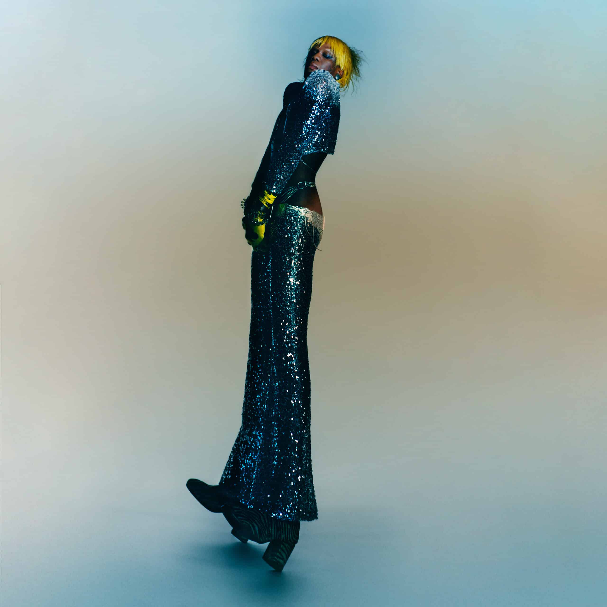
10. Skrillex, Quest for Fire
Bountiful, detailed, and psychedelic, Skrillex’s second studio album doesn’t so much center on a clear narrative as it draws on its key elements to create a sense of adventure, using it to reinforce another, more important feature of dance music: perpetual movement. But the record’s visual identity is striking for the way it does foreground Quest for Fire’s narrative and thematic anchors. Alongside Paul Nicholson, who designed Skrillex’s new logo, Sonny Moore collaborated with Alfred Pietroni, a digital artist working at the intersection of fashion and fantasy. “Myself, Sonny and Paul had many conversations about the energy we wanted the album artwork to embody, the sense of purpose, fight, journey and discovery which we envisioned for the main character which would parallel similar themes represented in the music of QFF,” Pietroni commented in a statement. “The design came from my love of blending sci-fi and fantasy, taking great inspiration at the time from the dreamlike artwork of Yoshitaka Amano, Aubrey Beardsley and the heated and barren landscapes of Dune. We wanted the art to set the scene for a story of adventure, fire, innocence and strength.”
9. Wednesday, Rat Saw God

The album cover of Wednesday’s marvelous fifth album, Rat Saw God – which we named our album of the year – is a photo of an oil painting made by bassist Margo Schultz, based on Zachary Chick’s portrait of the band. In its final form, captured by Charlie Boss, it’s both eerie and a little funny in its regality (and placement in what must surely be rotten grass), vibrating with the horrors that lurk within and the darkness beyond. You don’t have to overthink it; it just lures you in. “This cover was my attempt to fulfill a lifelong dream of mine to play dress up in historical clothing with my friends,” vocalist Karly Hartzman told Our Culture. “I got really into studying Edwardian/Renaissance fashion over the pandemic so I wanted to get dressed up in a way that paid homage to a few historical fashions. The room we are photographed in is an old house in New Orleans we had stayed in before after the show. I knew it was the place I wanted to capture in an album cover the moment I saw it.”
8. Caroline Polachek, Desire, I Want to Turn Into You

Caroline Polachek’s Desire, I Want to Turn Into You is captivating in part for how kinetic and fluid it sounds, qualities that are reflected in Aidan Zamiri’s mesmerizing cover photo. It sees Polachek crawling on all fours inside an old subway carriage, headphones on – but wait, the maps don’t make sense, there’s coffee stains on her dress, and is that sand on the floor? Where’s she headed? Of course, they’re all subtle nods to the lyrics on the album. “I wanted the cover to be a kind of explosion of being in the real world,” she told Vogue. Speaking about the connection between the image and the music, she said in an interview with Pitchfork: “Both have that feeling of being in this dynamic whirlwind in transit out in the world. Without a plan, coffee stains on the dress. You’re on the subway – you could be on the wrong line, maybe the very, very wrong line.” Chances are, you ain’t leaving.
7. boygenius, the record

With so much of boygenius’ debut album revolving around the intimate bond between Julien Baker, Phoebe Bridgers, and Lucy Dacus, you’d figure the striking photo on the cover was pre-planned. After all, the cover of the boygenius EP purposefully mimicked Crosby, Stills & Nash’s self-titled album. But as Matt Grubb, who shot the cover for the record as well as the subsequent the rest EP, told Our Culture, it all came together rather serendipitously. “I met the band in Malibu at Shangri-La studios where they were making the record. We went to a nearby beach in early sunset and brought smoke bombs. One of the only unplanned photographs of the evening was the image that turned out to be the cover. Lucy wanted to try a shot where their long, late evening shadows were being cast towards the camera.”
“The only hiccup was that the low sun kept blasting into the lens,” Grubb continued. “I asked if one of them could use their hands to cover the camera from the direct sunlight but it wasn’t quite enough shadow, so all three of them raised their hands to try. It was such a casual, fun moment, and I ran in to get a close-up. They quickly realized that all of their matching tooth tattoos could be visible so they rearranged their hands to show them. At a certain point, as their hands were held up high and they were giggling at how hard it is to arrange yourself like that, I remember Lucy saying ‘We may want to avoid looking like we’re having the best time at summer camp,’ and we moved on to other shots.”
6. Shame, Food for Worms

Canadian artist Marcel Dzama’s artwork for Food for Worms depicts five synchronised swimmers wearing blue bodysuits with yellow polkadots, a crescent moon and stars hanging in the background, fairytale-like. Reminiscent of Smashing Pumpkins’ Mellon Collie and the Infinite Sadness, it’s a shift from the band’s first two album covers, both photographs, and evokes both the surreal qualities of the music and the darker themes lurking underneath. Speaking to Our Culture, frontman Charlie Steen admits that finding the right artwork is one of the most challenging aspects of making a album. “With the band, the cover is seen as one of the most important parts in the process, it’s gonna be the face of the songs, always there to stare back at you whenever you reach for it,” he said. “Because of this it was guaranteed to cause a storm of indecision and passive-aggressive comments in the past. However, because of Marcel, it couldn’t have gone more differently. Our manager Cal reached out to him, after showing us his work, and to hear he was more than happy to give us his time brought a lot of smiles, saved a lot of stress and gave us the opportunity to work with someone we greatly admire.”
“We sent him the demos and asked him to come up with whatever he thought worked, we’d decided before that if we were all pitching in, it would be a shit show – some people wanting collage, others painting, so on, so on, until we’d be left with something trying to go in every direction at the same time and ending up nowhere,” Steen continued. “When he came back he had seven sketches, we loved all of them. He put colour to them and we used every single one – covers for all the singles, inside sleeve and, of course, the good stuff that goes on the back. On our part it was the quickest creative process we’ve all been through as a band and we are eternally grateful, it was him that put in all the elbow grease and took the album into a different light. They live in a world he’s created – one of colour, drama and mystery. It’s exactly what we wanted because anything and everything to do with it can be up for interpretation, if you’re that way inclined.We’re all big fans of his work and himself as a person. We couldn’t have asked for a better cover and the reaction to it has been incredible. Shame about what’s on the inside. All our love forever to l’artiste!”
5. Young Fathers, Heavy Heavy

The lyrics and visual identity around Young Fathers’ fourth album, Heavy Heavy, may still have a cryptic quality, but the music is arresting and urgent, radiating with the joy of community as it incorporates more African influences than any of their previous records into its sonic palette. The album artwork is a collaboration with Hingston Studio, which was also behind the memorable cover for 2018’s Cocoa Sugary. “The record is a celebration of music as shared and spontaneous practice – it summons the feeling of an elevated state, unbridled energy and the desire for physical release – the feeling of being untethered and liberated,” Tom Hingston, founder and creative director at Hingston Studio, wrote in a statement. “The beating heart of the album artwork is a distinctive character whose appearance is influenced by the Nkisi figure found in several west and central African cultures. These figures are broadly said to have powerful spiritual capabilities, although appearing brutal with their formation from wood and nails, they represent a symbol of hope and community.”
4. Bell Witch, Future’s Shadow Part 1: The Clandestine Gate
![]()
Future’s Shadow Part 1: The Clandestine Gate, a 83-minute, single-song album that serves as the first in a planned triptych of LPs meant to loop eternally, is beautifully solemn and immersive, minimalist in approach yet cosmically expansive. It finds the Seattle doom metal duo moving at a glacial pace that nevertheless feels ceaseless, the kind you can’t just drift so much as dig into. The cover artwork evokes not only the apocalyptic weight of the music, but its rich grandeur, gesturing at the infinite cycle of life and death as, perhaps, one of eternal tumult.
“The cover art from The Clandestine Gate was painted by the incredibly talented Jordi Diaz Alama, founder and teacher at the Barcelona Academy of Art, who studied under masters such as Odd Nerdrum, Guillermo Munoz, and Antonio Lopez,” the band wrote in a statement. “We were drawn to his work by the striking beauty and dynamic mythical scenes he portrays with distance, texture, and raw emotion. Getting lost in one of Alama’s paintings is to be transported to a dimension that will be as terrifying as it is beautiful. His series around Dante’s Inferno in particular moved us and we could not be more pleased with the masterful work he has done for this record. It offers the first impression of what one will hear in the album and we can’t imagine a better foundation to stand on.”
3. Kelela, Raven

The cover of Raven finds Kelela submerged in water, which happens to be a motif on the album, from its sensual language to its aqueous, atmospheric beats. But the image – credited to Alessandro Belliero, Denis Olgac, and Hendrik Schneider – is also surprisingly dark and ambiguous, evocative of its nocturnal, introspective soundscapes as well as its mysterious dynamics. She doesn’t seem to be struggling – is she sinking in, floating, or being reborn? “The artwork, the sound of this album — I think a lot of people would say it’s darker,” Kelela said in an interview with Vulture. “And maybe, topically, people would receive that sadness. Yet its symbolism is complex.” In press materials, she elaborated: “I started this process from the feeling of isolation and alienation I’ve always had as a Black femme in dance music, despite its Black origins. Raven is my first breath taken in the dark, an affirmation of Black femme perspective in the midst of systemic erasure and the sound of our vulnerability turned to power.”
2. Sufjan Stevens, Javelin

Heartbreaking as it may be, Javelin doesn’t rid itself of the grand, vibrant, and playful qualities that have marked Sufjan Steven’s music in the past, instead melding them in captivating fashion. Still, I’m always struck by just how colourful the cover artwork is, impervious to interpretation yet overflowing with meaning. In addition to recording and producing the album, Stevens handled the artwork, typography, layout, and design for the album cover and its accompanying 48-page booklet, which features 10 essays. But Javelin has no unifying concept or theatrical bent, and the collage of friends, families, heroes on the cover, like the booklet, has the strange effect of both distancing the album from any autobiographical throughline and making it feel more personal and precious. It often seems to start from an intimate glimpse of the self, a memory, then expands upwards in a way that feels intuitive, devotional, and communal. It’s an immense piece of work you can’t reason yourself around.
Dedicating the album to his late partner, Evans Richardson, Stevens – who did no press for it – wrote, “I know relationships can be very difficult sometimes, but it’s always worth it to put in the hard work and care for the ones you love, especially the beautiful ones, who are few and far between. If you happen to find that kind of love, hold it close, hold it tight, savor it, tend to it, and give it everything you’ve got, especially in times of trouble.” In its splendor and fullness, Javelin is nothing but a beauty to behold. So hold it.
1. Caroline Rose, The Art of Forgetting

Much of Caroline Rose’s intensely personal fifth LP, The Art of Forgetting, centers on the blurry, complex nature of memory, the way it not only contorts reality but can also comfort, soften, or sharpen the details we then fold into a story. It juxtaposes lyrics about yearning to let go of the past with voicemails left for Rose by their grandmother, who was struggling with dementio: two different kinds of memory loss. Musically, Rose weaves these dualities into the production in intimate and dreamlike ways, but the album’s fluid structure is boldly crystallised in the album cover, a visual culmination of the emotional catharsis the songs continually chase. “a couple years ago i made a sketch of an idea based on a really beautiful photo my friend monica murray had taken with some special polaroid film she’d gotten,” Rose wrote on Instagram after the artwork was nominated at the 2024 Grammys. “i thought this photo was so lovely, of me in my red chair where i spent so much of my time every day. i remember when she peeled back the photo we both gasped at how magical it was! i knew this would be the album art well before the music was even finished.”
Rose added: “when we went to make the thing, i was hell bent on getting it absolutely perfect. we would recreate the photo of my living room and light it all on fire!! i had a pyro studio all lined up, which is basically a scrillion dollars and a nightmare to try and do. my dear friend Samuel Bennett (who also directed the short film) eventually talked me out of the pyro studio bc controlling the light once the set was on fire would be virtually impossible, so instead i recruited my brilliant friends andie flores and tori reynolds (who also built the set of the short film) to recreate my living room in the warehouse in my backyard. it was literally 100 degrees in there with no AC, in the dead of summer in Texas (Andie and Tori were out there every day, bless them!). we had to shoot the photo super early in the morning bc it was too hot to even think.”
