
No matter how you first encounter it – whether it’s a picture on social media, a tiny image on a digital streaming service, or the first thing you see when you hold a physical record in your hands – the album cover undeniably shapes our experience of listening to music. Even though it’s inextricable from the ways we consume and interpret albums, cover art isn’t even considered a relevant factor when assessing the perceived quality of a record; I’m not here to argue it should be, but it’s definitely worthy of more attention. So, to kick off our year-end music coverage, we’re once again highlighting some of the most memorable and striking album covers of 2022 – ones that not only stand out on their own, but pair along with the music in fascinating ways. Like last year, we’ve also included quotes from many of the artists involved to provide context and insight into the process of how they came together. There is a loose ranking, and while for the most part it follows an aesthetic or conceptual logic, we’ve placed the ones that left the strongest impression closer to the top. These are our 50 favorite album covers of the year.
50. caroline, caroline
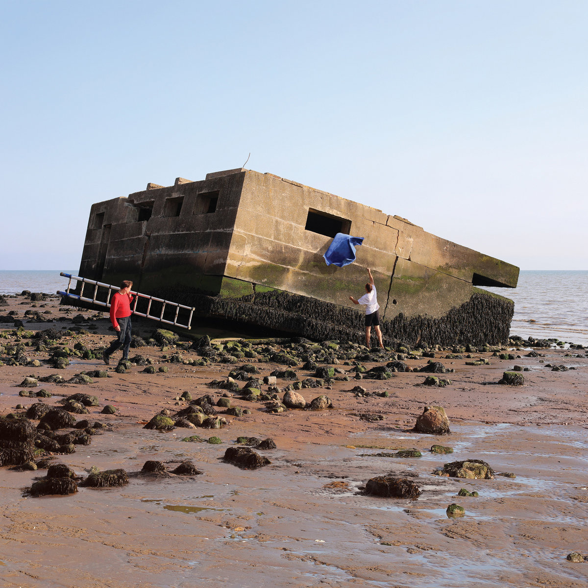
The music of UK eight-piece caroline is richly textural and atmospheric, pulling you into an empty space as much as it builds on it. There’s a gentle hopefulness to their self-titled debut album where others might lean on desperation, even as it subtly gestures toward collapse. And like its cover photo, you might find yourself drawn to the single element that’s clearly the conceptual focus before you start paying attention to each detail that makes up the picture: the clear blue sky, the rocks, a ladder, people at work.
“We knew we wanted the album art to form a set with the ‘Dark blue’ and ‘Skydiving onto the library roof’ single covers,” the band explained. “Jasper’s friend Selina Bonelli had made a performance on the old WW2 bunker at Warden Point on the Isle of Sheppey and after seeing the documentation of the piece, we instantly felt like the structure could work for the record’s cover. So Jasper, Casper and Mike went and stayed in a campsite on the clifftop and then went down to the beach at 5am when the sun was coming up and took some pictures. The picture we ended up using for the cover was one of the last we took that day, just as the tide was coming up to swallow the bunker again.”
49. Beth Orton, Weather Alive
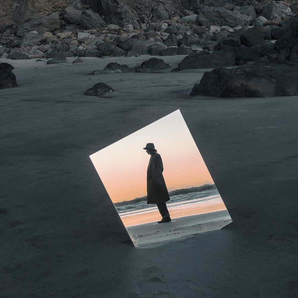
Beth Orton’s first album in six years evokes more than a single headspace: there’s a breathtaking physicality to it, but also a gorgeous, ethereal ambience. Eliot Lee Hazel, who shot the cover art for Weather Alive and directed the video for its title track, explained that the inspiration behind the visual was “pretty straightforward… I tried to capture the feeling that Beth’s new album gave me, a feeling of warmth yet also a feeling of isolation and being in a dreamlike state. I was quickly moved by the sound and lyrics from the moment I started listening to her album, it sounded warm yet lonely, it sounded inviting yet also slightly haunting… most of all it sounded very personal, fragile and timeless.” To capture this multitude of feelings, they decided to shoot the video on 8mm film, imbuing it with “a warm tone yet at the same time giving it a classic timeless feel,” while “for the album cover itself I used mirrors and special lens to give the visuals a dreamlike quality, no special effects or photoshop was used in the process.”
48. Deserta, Every Moment, Everything You Need
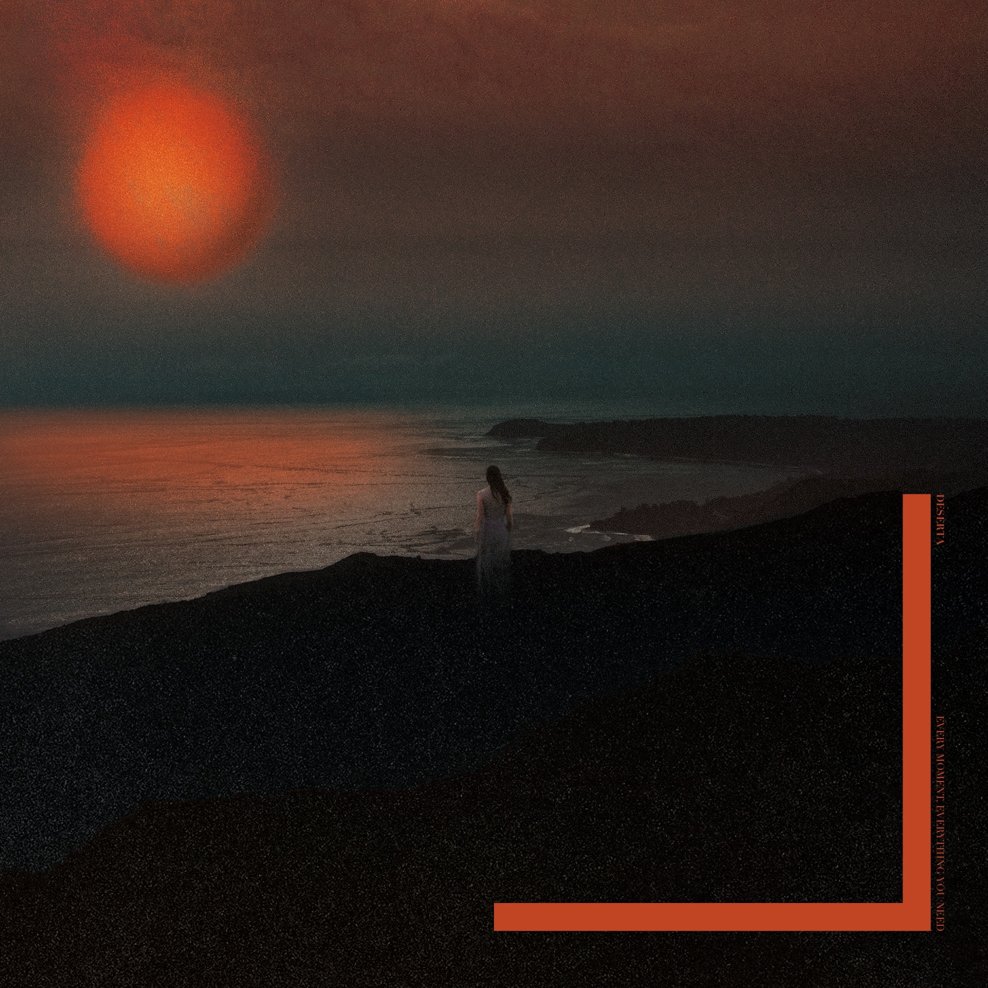
Though recorded in the studio he set up in his family’s two-bedroom apartment while working as a healthcare worker during the pandemic, Matthew Doty’s second album under the Deserta alias sounds as majestic as it is expansive. The music’s kaleidoscopic palette was only part of what Philistine DSGN, who also created the artwork for Deserta’s 2020 debut Black Aura My Sun, sought to capture in the cover for Every Moment, Everything You Need, emphasizing its range of emotion, otherworldly beauty, and apocalyptic stakes. “Philistine DSGN was trying to do something really painterly, romantic/apocalyptic for this one,” Dotty explained. “Something that felt as big as the album, but also as dark and restrained, classical feeling too. Without feeling like ‘now’. At first it’s like a sunset, then it’s a Melancholia level end of the world moment, then it’s a sunset again.”
47. Rachika Nayar, Heaven Come Crashing
On her sophomore full-length, Rachika Nayar conjures a world of haunting, cinematic beauty, cascading between moments of somber reflection and sweeping euphoria. “Much of the album for myself comes from some confrontation with fantasy—embracing, celebrating, and destroying it,” the Brooklyn-based composer told us. “The romantic love plot especially feels like this governing cultural fantasy you can’t escape, the narrative that promises to explain and consummate desire.” The cover image, which echoes the urban romance of the ‘Heaven Come Crashing’ video, is just as luminous and enveloping, reminding me of the Roland Barthes quote Nayar has referenced about fantasy being “just a glimmer of the narrative of desire […] a body I catch sight of in a car as it goes round a bend, before it plunges into the shadows.” Nayar is credited for the artwork along with Yulissa Benitez, “with special thanks to my tranny daughters Issei and Chong for embracing on the highway median.” She concluded: “There’s something in the image for me about that fantasy and about desire and convention and hurtling into it all till you make it explode. I meant for it to look gayer, but nonetheless, as it’s my two friends in drag, it’s also meant as a caricature of a norm.”
46. Let’s Eat Grandma, Two Ribbons
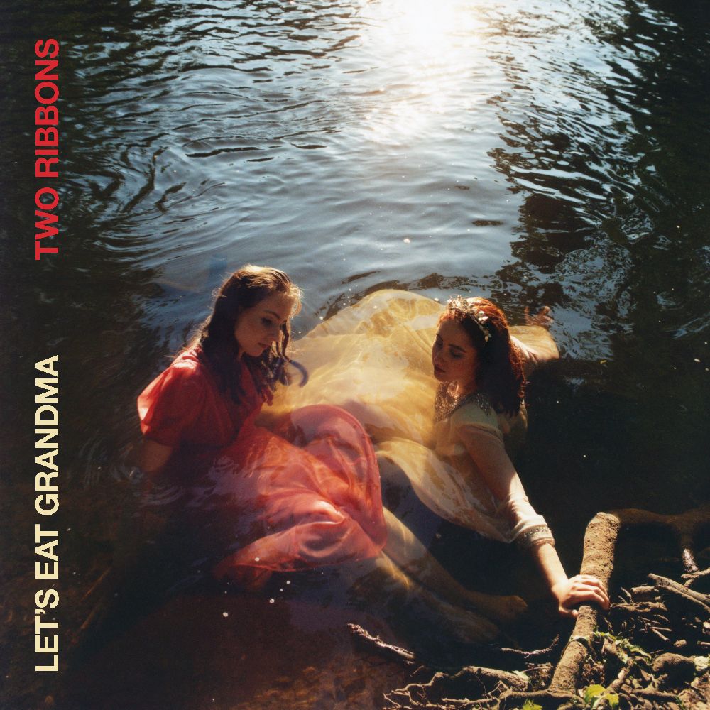
During the making of Two Ribbons, Jenny Hollingworth and Rosa Walton found themselves writing separately for the first time in their collaboration, yet they both gravitate to nature and water-related imagery to convey the ebb and flow of relationships – including their own friendship. Looking at the album’s stunning cover, I’m reminded of this line from the dramatic highlight ‘Insect Loop’: “Why don’t we sit by the water and watch our drawings wash away/ Just the friends we are today/ And know that that’s enough.” The photo gestures at both the hope and connectedness contained in such moments.
“Water was a repeated metaphor throughout the lyrics on the album, so the band always knew they wanted the cover to be a portrait of them submerged in it,” photographer El Hardwick explained. “The river where we shot it also carried a personal connection, as they had both spent a lot of time there during the time that the album was reflecting upon. When we were planning the photographs, we had a lot of conversations around grief and the relationship between spirituality and nature. I’m so honoured to have been asked to visualise a project that’s so personal to the band, and I feel like the final photograph that was used for the cover really looks like Jenny and Rosa’s bodies and dresses form the shape of a ribbon tied together; tied together, but separate selves.”
45. PENDANT, Harp
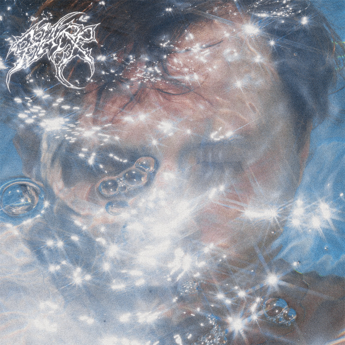
After being forced to shift away from guitar-based music and reorient his approach, Los Angeles-via-Oakland artist Chris Adams’ second LP as PENDANT finds him plunging into a different array of sounds. Harp anchors in a shimmering fusion of rave, hip-hop, shoegaze, and pop to grapple with the enormity of grief and love, capturing glimpses of euphoria in the midst of pain. This complexity is vividly, yet rather serendipitously, amplified by its cover art. “We had no intention of even shooting the album art that day,” Adams told Our Culture. “We were working with Tonje Thielsen – an outstanding photographer from New York – to get some press photos for the rollout of my album, Harp. Tonje randomly suggested at one point during the day that we find a pool to shoot in. It was super hot that day so it sounded like a fun pursuit. My friend Amy offered up her pool and we just started going for it. The shots in the pool were among my favorites from the entire day. The water generated all of these cool bending shapes and textures over my face. It was pretty obvious once we got the shots back that they’d make great album art.”
Adams added: “The Harp logo was done by my good friend Peace on the Sun. His art has been so important to me over the years – the way he infuses feelings of love and compassion into dark, extreme imagery has always really resonated with me. Combining these two images was so easy – they very obviously complemented one another and emphasized the album’s major themes: love, grief, pain and forgiveness. I was very fortunate to work with two artists I adore on a project I care about so deeply.”
44. Naked Flames, Miracle in Transit
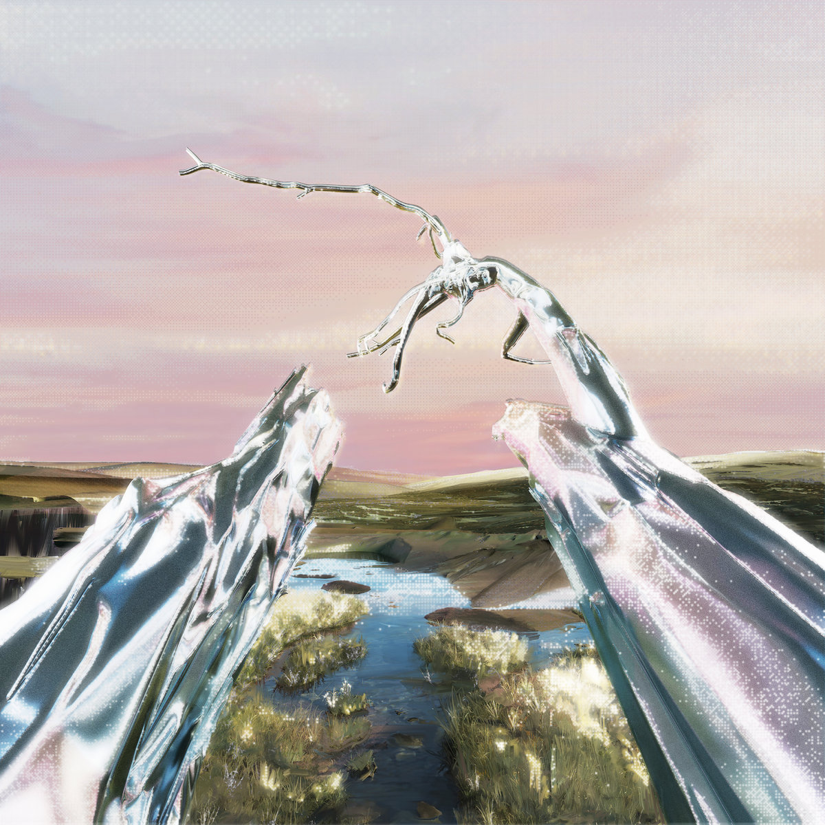
Miracle in Transit is a glimmering, gloriously exuberant electronic record from Naked Flames, trading the lo-fi production of the Bristol producer’s earlier work for a more polished sound. Gabe matches the vibrancy and liminal space of the music in the album artwork and accompanying visuals. “Having been close friends with Naked Flames since childhood, when it came up that the album needed a piece of artwork I was passionate about being involved,” the artist commented. “Discussing what we might create, we collated a series of images that we felt connected to the sound of the album. Amongst them was a photo we had taken late at night, after happening upon a dead tree in a country field. An image of two tree limbs reaching out, suspended in the air. Something about it felt right.”
Elaborating on the process, Gabe added: “The tree limbs from the photo were then meticulously replicated in 3D and suitably framed within a digital landscape. Wishing not to shy away from the digital processes involved, the topography is unmistakably formed from thin digital layers that have been distorted and collaged together. Taking a multidisciplinary approach, I worked to layer hand-painted, rendered and digitised designs on top of each other. It is intended that the cover, with its shimmering sparkles and blurred glows, hovers somewhere between both tangible landscape and dreamscape. A window into the ethereal soundscape created by Naked Flames.”
43. more eaze, oneiric

Though most adjectives relating to dreams often describe a vague mood or some abstract approximation of actually experiencing one, oneiric can be defined as both “of or pertaining to dreams.” It’s an apt title for more eaze’s album, which inhabits a unique liminal state, shuffling through familiar, everyday sounds while gesturing at an orchestral lushness, a timeless romance. “Each song is on the verge of communicating some deep truth but not quite being able to articulate it,” Mari Maurice has explained, and her vision of love is almost akin to sci-fi, its grand scope turned inwards. Evoking a sense of boundless drifting, oneiric’s cover artwork was made by incepBOY, who explained that it had “a very fluid and instinctive gestation that reflected the almost telepathic connection with Mari on the themes and aesthetics of the record.”
“The fluidity and temporal dilatation of the music continuously projected me/us on an edge between reality and fantasy,” the artist added. “At the time I was collecting photos of the Dubai fog phenomenon and Mari was sending me very Blade Runner-esque visual suggestions which uncannily matched. The simple superimposition of two images did the rest, bringing back that dreamlike unreality that is manifested throughout this record. An imaginary world that is both desirable and profoundly inscrutable at the same time.”
42. Caterina Barbieri, Spirit Exit
‘The Landscape Listens’, the final track on Caterina Barbieri’s latest album Spirit Exit, takes its name from the Emily Dickinson poem ‘There’s a certain slant of light’. “When it comes — the landscape listens/ Shadows — hold their breath/ When it goes, ’tis like the Distance/ On the look of Death.” Like Dickinson, the Italian composer and synth virtuoso uses natural, profane imagery to evoke scenes that are otherworldly and transcendent yet hauntingly intimate. “The Heft/ of Cathedral Tunes,” “Heavenly Hurt,” “seal Despair” – all these would make great song titles for Spirit Exit. But nothing encapsulates its pervading mood quite like the album cover, photographed by Furmaan Ahmed with design by Nicola Tirabasso – the way it treats each ending like a graceful ascension, how it makes cold, alien landscapes feel like a comforting embrace. Though it captures a transitory, doomful experience, like Barbieri’s music, what rises through is a strange and ecstatic form of humanity.
41. Disq, Desperately Imagining Someplace Quiet
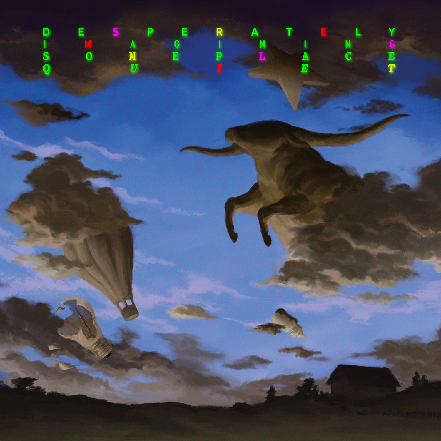
There’s a clear tongue-in-cheek irony to the title of Disq’s sophomore LP, Desperately Imagining Someplace Quiet, but there’s an earnestness to it, too. The album often gives the impression that its characters are floating in a sort of dream state, as if caught in a collective daze; that things get noisier and messier only confirms that any effort to escape has left them all the more exasperated. The follow-up to 2020’s Collector is also a somewhat gloomier effort, pervaded by an unsettling dread that’s echoed in the cover artwork by Dave Campos. More striking than the looming threat of an apocalypse, though, is the way it underlines the group’s playful surrealism, letting the unconscious take over. There’s more sunny hooks to be found than the cover gives away, but as they suggest on ‘Prize Contest Life’, you might have to dig a little deeper to find what you’re truly after: “Bright, never-ending light/ Ever-changing shapes, dancing in the sky/ Things I knew before, come back to my mind/ I can see the glow, shining all the time.”
40. KMRU & Aho Ssan, Limen
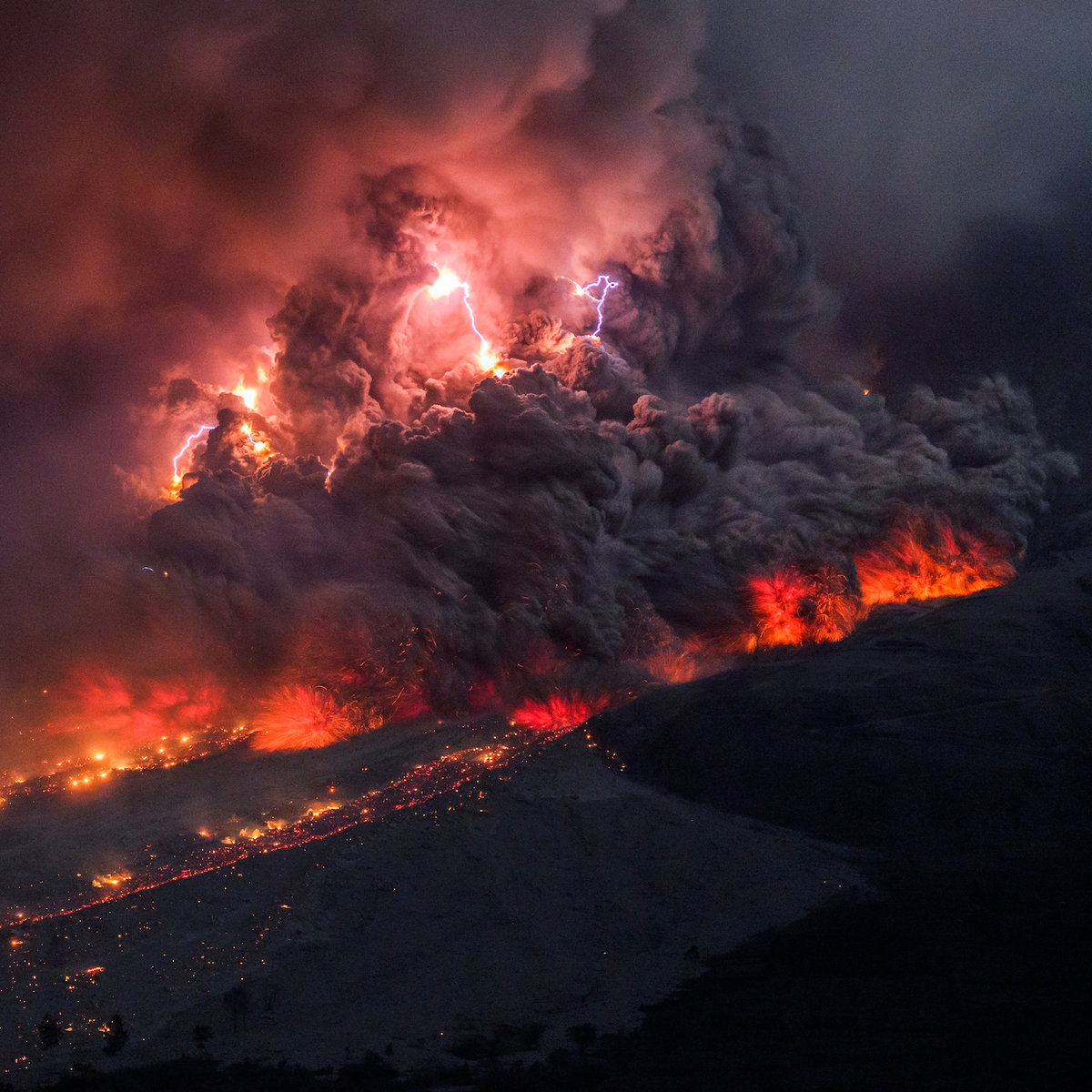
Limen is a fascinating collision of styles. Given Kenyan sound artist KMRU and French electronic musician Aho Ssan’s normally divergent approaches to minimalism – contemplative ambient and chaotically abrasive deconstructed club, respectively – you would expect the duo to try to find an effective middle ground. Yet what they describe as a seamless back-and-forth led the two artists to push themselves to new extremes, and the resulting album reaches the sort of gracefully volcanic intensity that its cover beautifully exudes. “For the cover of Limen we were looking for an image that mirrored and expressed the sense we had of our collaborative working process,” Joseph Kamaru told us. “The image, by Martin Rietze of Sumatra’s Sinabung erupting in 2014, expresses various materials and elements — stone, air, lightning, cloud, and pyroclastic flow — that are driven into synchronization by geologic forces as one dynamic process in which everything becomes a single organic and explosive moment, transcending its constituent elements.”
39. Fontaines D.C., Skinty Fia
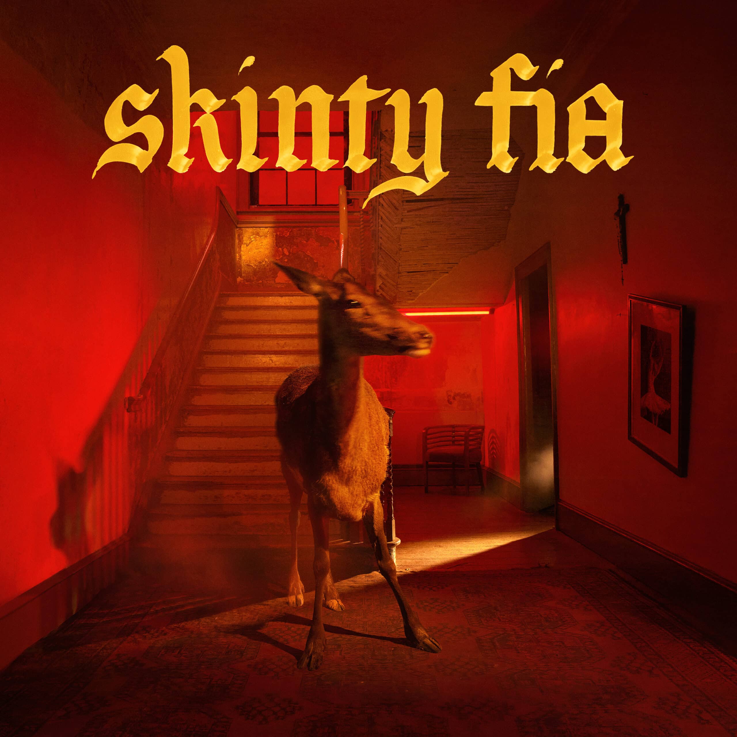
The title of Fontaines D.C.’s third album, Skinty Fia, is an Irish expletive that translates to “the damnation of the deer” – which only partly explains why there’s one inside a house on the cover. “The Irish giant deer is an extinct species,” bassist Conor Deegan III, aka Deego, explained in press materials. “But ‘skinty fia’ is also used as an expletive, in the way you’d say ‘For fuck’s sake’ if you bang your arm on a table or whatever. We just thought there was something really beautiful about that, because it’s really representative of Irish culture in some sense. We were interested in the idea of something really precious or sentimental and attached to family, but also something that’s been taken away from us. Which doesn’t mean we can’t cherish it.” The dear that appears on the cover is real, displaced from its natural environment to convey the sense of alienation the band members have felt since moving out of their home country. Aidan Cochrane collaborated with guitarist Carlos O’Connel on the art direction, evoking the record’s beguiling, bleakly romantic atmosphere while leaving the door open as to what it might signify.
38. Empath, Visitor

Visitor, the sophomore album from Philadelphia noise-pop outfit Empath, doesn’t just soundtrack memories but abstracts, distorts, and reconstructs them into stories that better fit the emotion they elicit. In this set of songs, vocalist Catherine Elicson is particularly interested in channeling “memories and feelings that remain in places people have left behind.” In press materials, she uses the album cover, a photograph by Andrew Emond depicting two open doors in a deserted home, to further describe what they’re about. “The spaces look lived in and altered by humans but no humans are present,” she said. “The songs are similar in the sense that they talk about the ‘space’ between people. They’re not about specific people per se, but they illustrate the feelings people leave between each other, these subjective experiences.” Like the music, the photo is intriguing precisely because of its contrasting elements: it’s marked by empty space yet emanates warmth, clean and aesthetically satisfying yet strange in its liminality. You never know which direction a sound or memory will come at you from, if it’s real or a product of fantasy, but Empath are both dizzied and thrilled by the possibilities.
37. Shamir, Heterosexuality
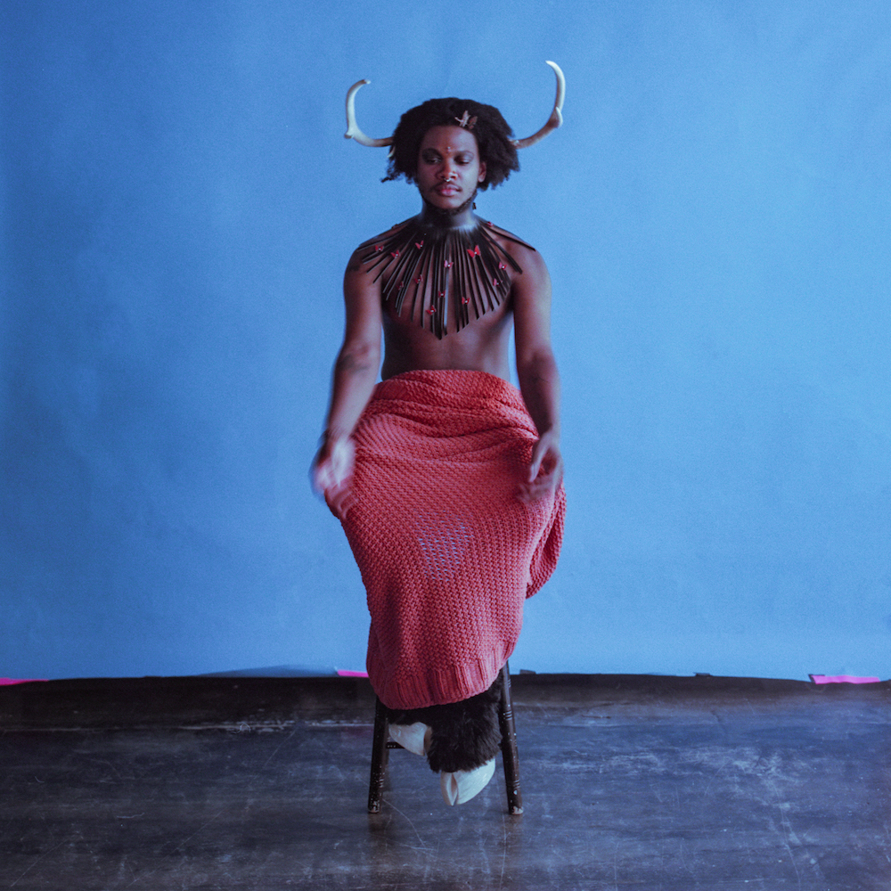
Though his eighth studio album, Heterosexuality marks the first time Shamir has confronted his queerness directly in his music. It’s a record that thrives on contradictions, as signaled by the evocation of an androgynous Baphomet in its cover. Wearing horns and hooves, the artist embodies a symbol of non-conformity conveying beauty as well as terror. “One aspect is the inherent androgyny of the Baphomet,” Shamir told Alt Press. “Because of my androgyny and because I look very queer, I often feel subhuman in the way that people approach me. So it’s a play on that. I was actually doing a photoshoot around a park, and I noticed that when I was dressed up like that, a lot of the stares and the looks [were] not dissimilar to how people stare at me when I’m [dressed] normal. That was very eye-opening. I think the Baphomet is a very misunderstood figure as well. The Baphomet, over the years, has become a symbol of negativity to a lot of people that don’t know [about it]. It is so easily demonized just by virtue of what it is and what it represents. I feel like, not even just me, but most queer people can relate to that.”
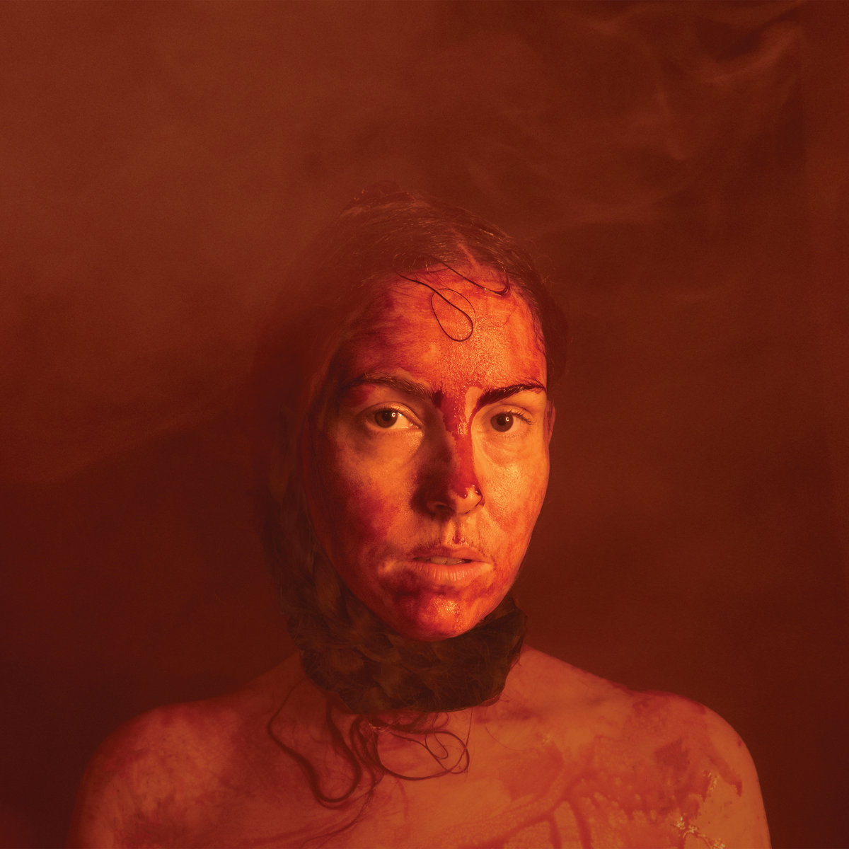
36. Ethel Cain, Preacher’s Daughter
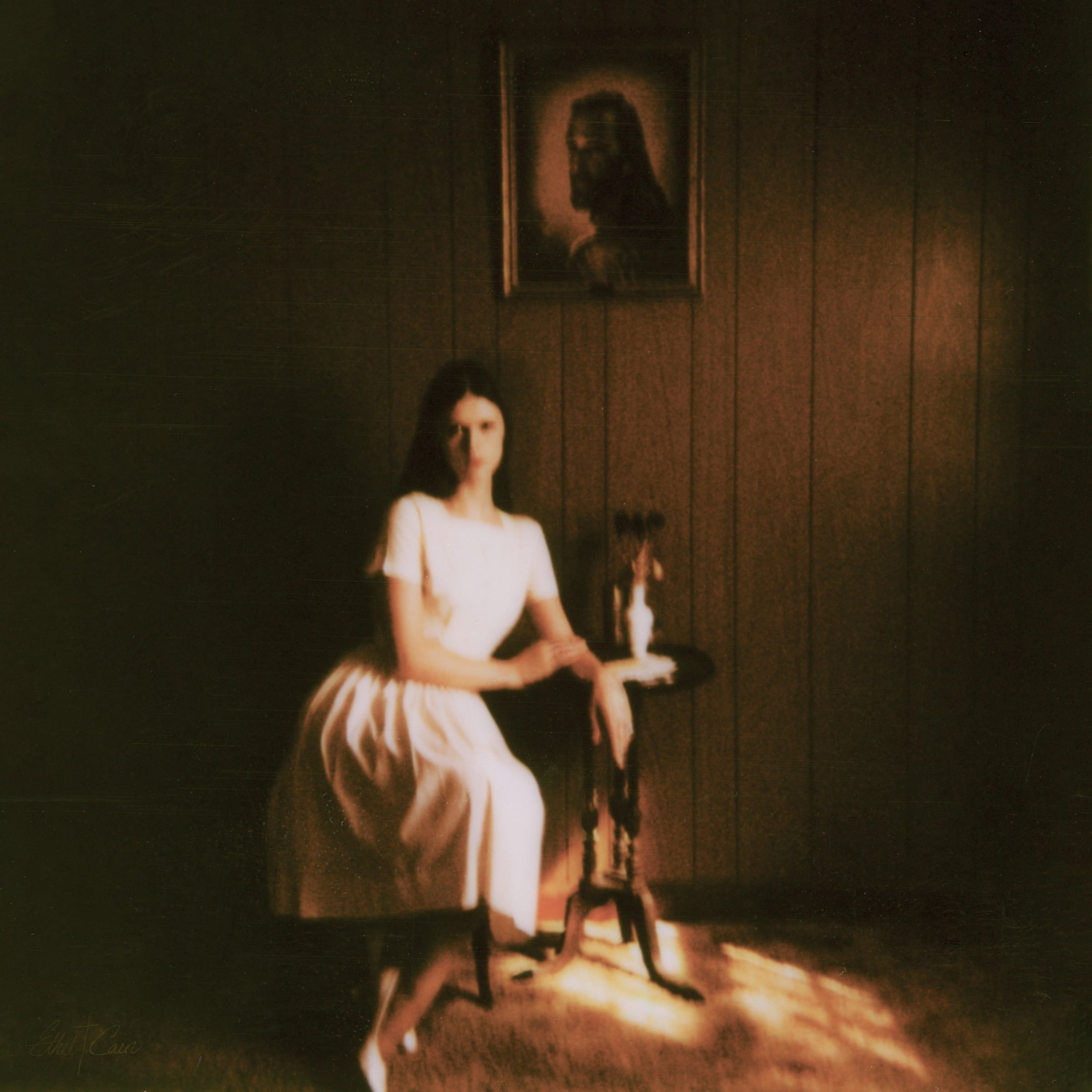
Whenever I look at the album cover for Preacher’s Daughter, I can’t help but think of “Christ-haunted,” the phrase Flannery O’Connor coined to describe the American South of which she wrote, particularly since writer Meaghan Garvey applied it in her analysis of Ethel Cain’s harrowing epic. For a startlingly ambitious debut album that serves as an introduction to the Ethel Cain persona but encompasses a fully-fleshed narrative, I can’t imagine it was easy to try and contain its singular, “Christ-haunted” vision in one image. But if the accompanying single covers offer bits and pieces of the story, the album art feels like a stark, chillingly still portrait of a protagonist who’s always running from something but can never fully escape her past. Hayden Anhedönia dressed the set, styled herself, and framed the shot, which was taken by her sister Delilah on Polaroid film and then scanned and used for the album cover. As further echoed in these alternate covers, darkness casts a shadow through the walls of that house before Cain’s relationship with the divine starts to become twisted, and before we ever get the chance to hear of it.
35. Kee Avil, Crease

On the surface, Crease, Montréal producer and guitarist Vicky Mettler’s debut album as Kee Avil, may seem somewhat impenetrable. But much like its album artwork, photographed by Lawrence Fafard with a mask provided by Ariane Paradis, you don’t need to peel back any layers to be beguiled by its experimental, fragmented sonics, or for them to leave a lingering impact. “The album cover was very influenced by an image by the photographer Tim Walker, and I wanted to create something that was very still, almost like a statue. Something frozen, statuesque,” Mettler said in our Artist Spotlight interview. “Almost like something from an art gallery, but at the same time, it’s strange. Something from a very clean kind of aesthetic paired with something a bit – I guess some people find it creepy […] How do you balance creepy with something that’s kind of softer? Those kinds of contrasts is what I find interesting, whereas the principal intuition could be to just go full-on creepy. Beating those intuitions is kind of the fun part, I think.”
34. Aldous Harding, Warm Chris
Aldous Harding’s music has a way of being inscrutable without appearing invulnerable, her performances haunting and theatrical while harnessing an intense intimacy. The New Zealand singer-songwriter remains an enigma on Warm Chris, her latest album; she only did one interview to promote the record, and much of it centers on the burden of discussing the meaning of her songs. “When people are asking me about things like this, I wanna help us get there, but the memories have been stolen,” she told Pitchfork. “Whether they were snatched up for the music, or whether I just can’t face them, I don’t know. But it’s hard for me to go back and talk about it because it feels like it had very little to do with me, I mean this person. And I don’t wanna just fill gaps with words.” Though the surreal video for ‘Lawn’ did come up, there’s no mention of the album cover itself, and neither she nor the photographer, H. Hawkline, offered to comment. Yet the image alone only further reinforces the relationship she holds with the audience and her own artistic identity: while some of her facial features are obscured, she’s clearly staring at us, letting the listener fill the gaps, as she does, with warmth and curiosity.
33. Shoko Igarashi, Simple Sentences
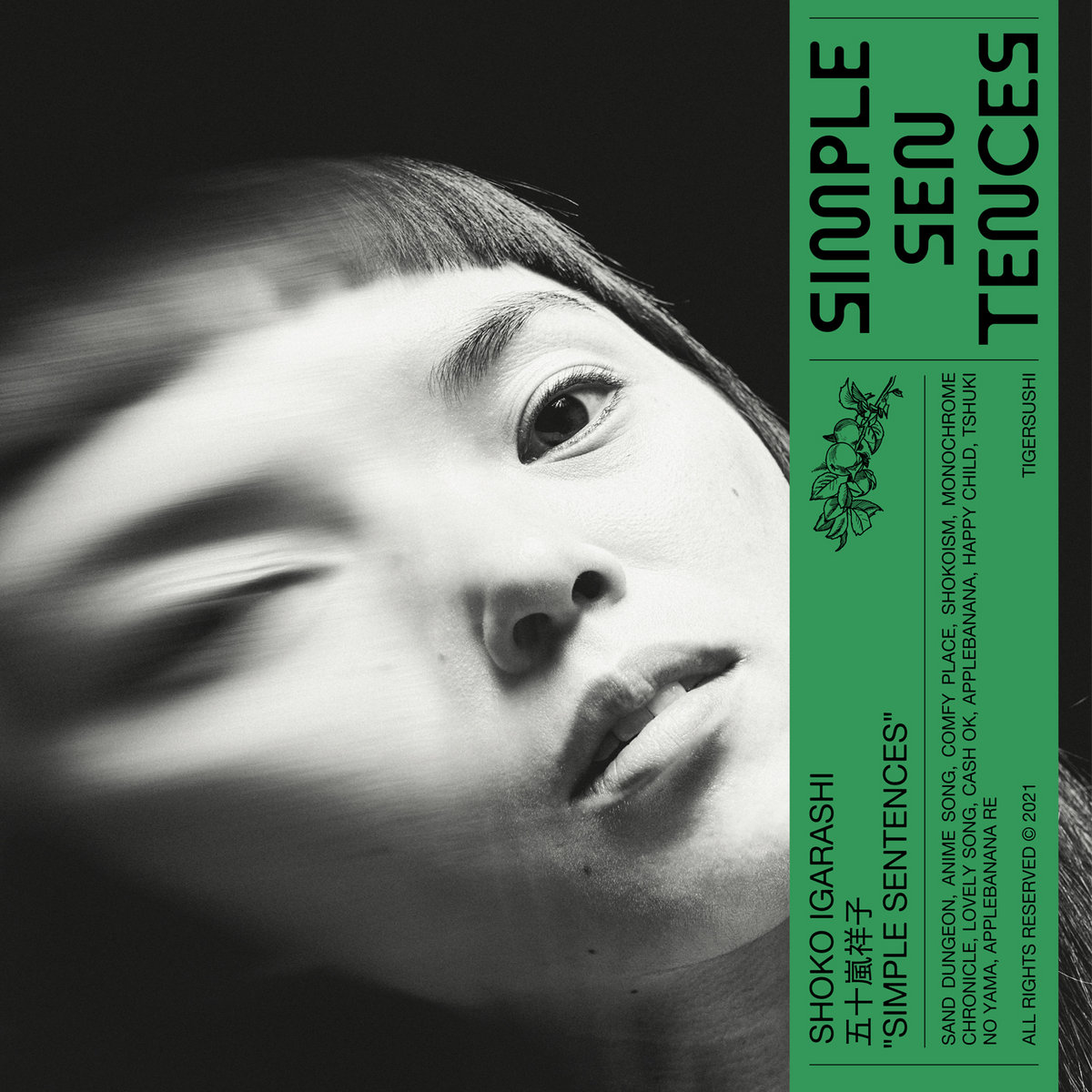
The compositions on Simple Sentences, the debut LP from Japanese musician Shoko Igarashi, are soothing, fluidly arranged, and playfully enchanting. Its diverse range of influences blend into each other seamlessly, balancing a sense of wistful naivete and dream logic. The beguiling cover image suggests a blurring of consciousness; photographer Victor Pattyn aimed for “a mix between aesthetic & feelings,” juxtaposing “the tenderness in her eyes” with the void the character dissolves into. Igarashi commented on the process: “The album cover was made out of experimentation around the idea to shoot through different glass objects so by placing pieces of glass in front of the camera lenses which created some cool natural distortion effects. No editing was needed because Victor Pattyn the photographer knew how to improvise with these elements and get the result that he imagined. I’m really pleased with the way it came out so spontaneously.”
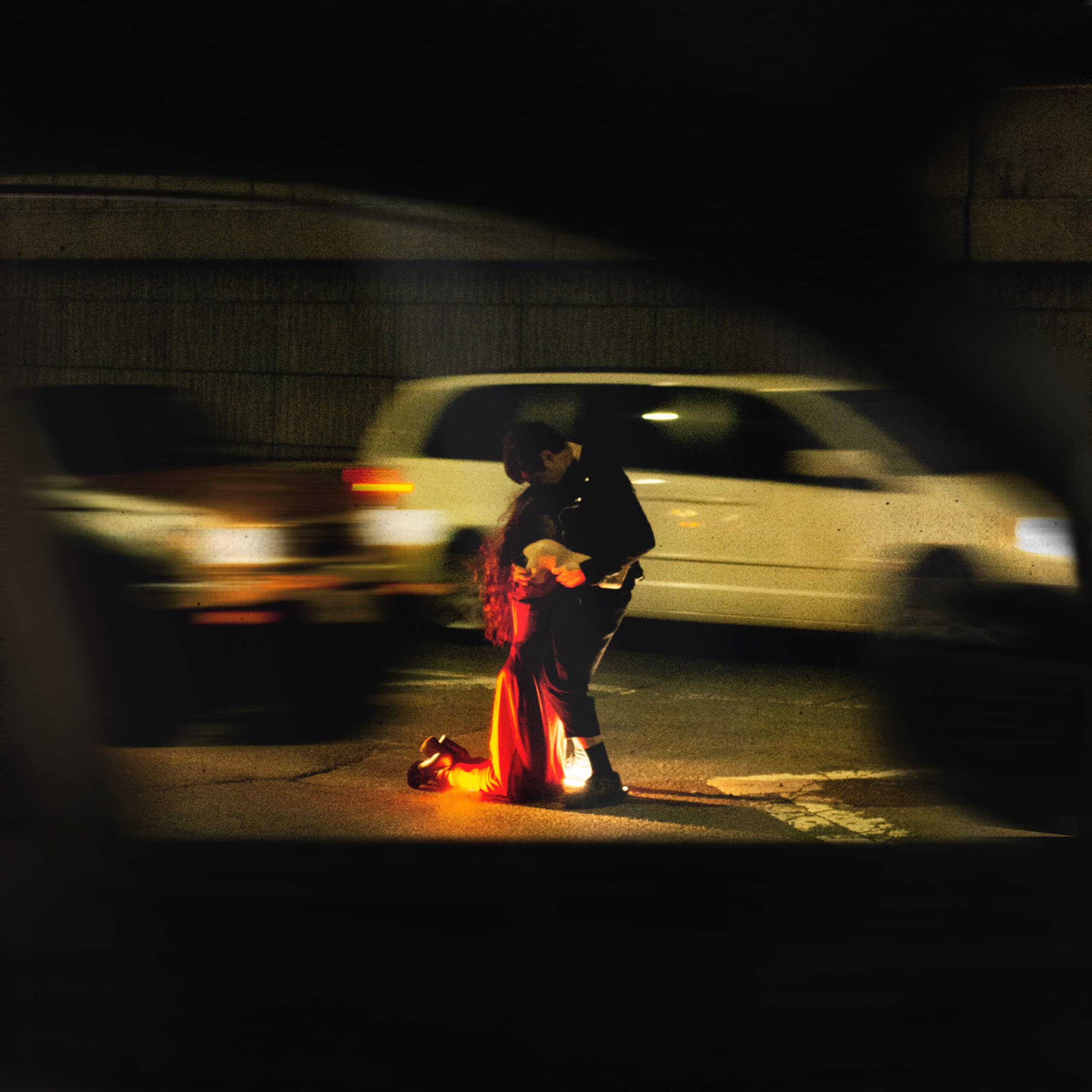
32. Lykke Li, EYEYE
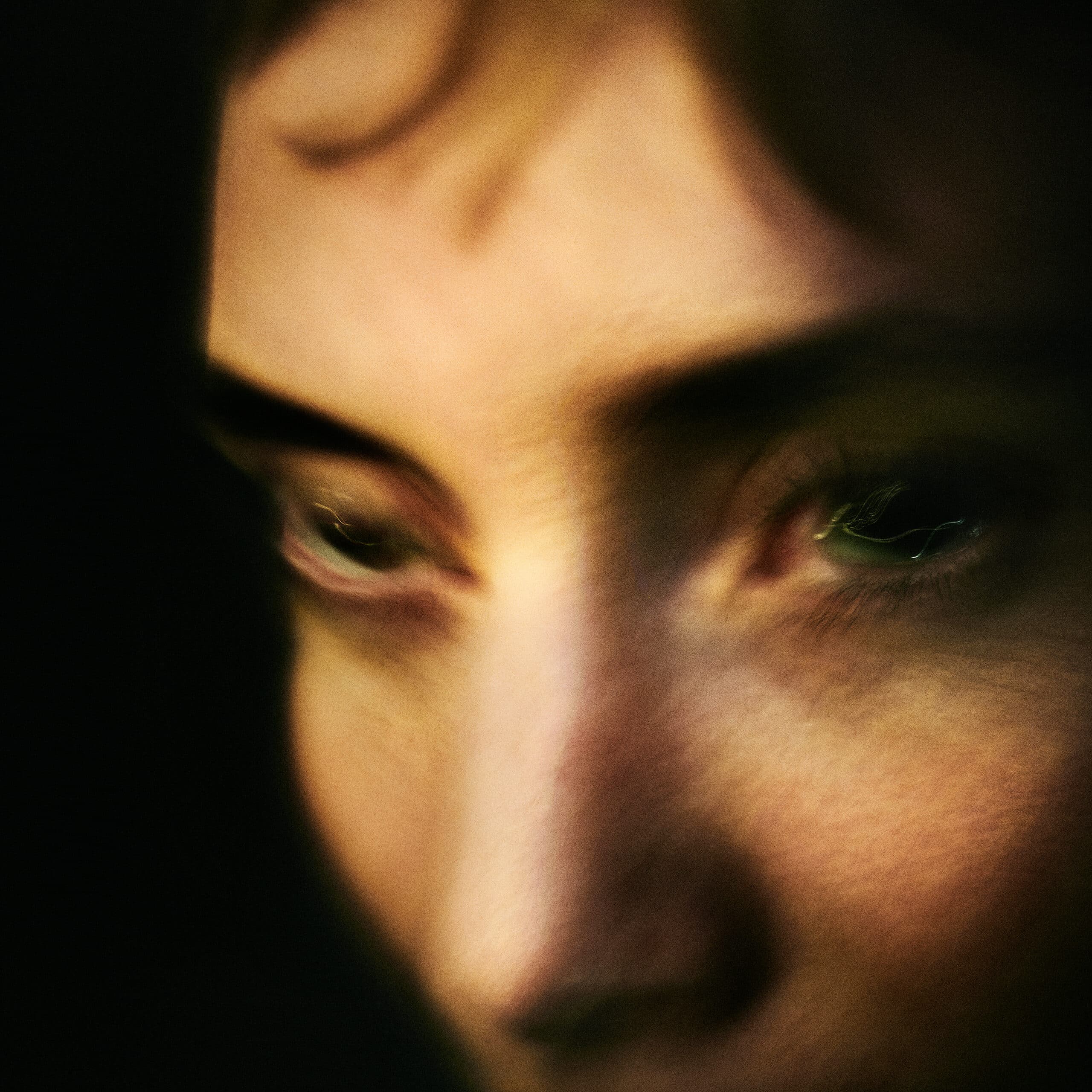
“Is it only in the movie you love me?” Lykke Li asks on ‘5D’, a highlight from this year’s EYEYE. If the Swedish singer-songwriter’s discography scans like an unending confrontation with love, her latest finds her making music in the aftermath of heartbreak, tackling it not so much as a conceptual theme but an addictive neurological response. Accompanied by a striking video project comprised of seven “loops,” EYEYE channels the ghostly, disorienting, and painful feelings that emerge when love becomes a cycle that blurs the line between dreams, art, and reality. Their cumulative effect manifests in the album cover by Theo Lindquist, who also helmed the visual project, while also hinting at the lo-fi intimacy that marks its production.
“I wanted to really capture the hunger, fever, longing and desperation of when you are love sick, I wanted it to feel very raw and animalistic,” Lykke Li told Our Culture in a statement. “Also it distorts your whole reality when you are in that phase… We actually took this in my living room the day before the actual cover shoot, I was sick and sweaty wearing no make up. I feel it really captures the state I was in while writing the album. And I love how it almost looks like a renessaince painting of a love addict.”
Lindquist added of the process: “Lykke and I developed a good sense of what the EYEYE cover should feel like from having worked together on the six videos prior. The image was shot at Lykke’s house using just one light source: her large television. We wanted to capture the pain and longing felt throughout the work without being too literal. We ended up doing a composite of three separate photographs for the final image. Two for each eye and another for the remainder of the head, which achieved a fragmented sense of turmoil. It was funny, in the end we ended up going with a casual test shot taken the day before the ‘official shoot’. It turned out that the additional lighting, glam and styling, although beautiful, actually worked against the naturalism we were seeking.”
31. Zola Jesus, Arkhon

The cover art for Arkhon immediately feels like an embodiment of several elements that define Zola Jesus’ music: its cavernous soundworld, a dark timelessness, the theme of nature as an extension of self. But like ‘Desire’, the sparse ballad and album highlight that was recorded in a single take, what’s most striking is just how much a simple idea can convey. “I didn’t think about the album cover for Arkhon until the last night in the studio that I finished making the record. It was at that moment that I could finally hear and see the world that I had slowly built over time,” Nika Danilova told Our Culture. “A vision came suddenly as I was falling asleep. I saw myself in a dark red cave, like a forgotten empress of the Earth.”
“The next morning I made plans to go to Cave of The Mounds, a natural limestone cave that’s over a million years old,” she continued. “It’s located only a couple hours from my house in Wisconsin. I took my mother and sister-in-law to help me shoot the photos. I didn’t want the photos to be fussy or overly styled. I felt as though the image needed to feel like a raw snapshot of another life. When I saw the photo that would eventually become the album cover, it hit me instantly: my inner vision had come to life. The rest is history.”
30. Ganser, Nothing You Do Matters
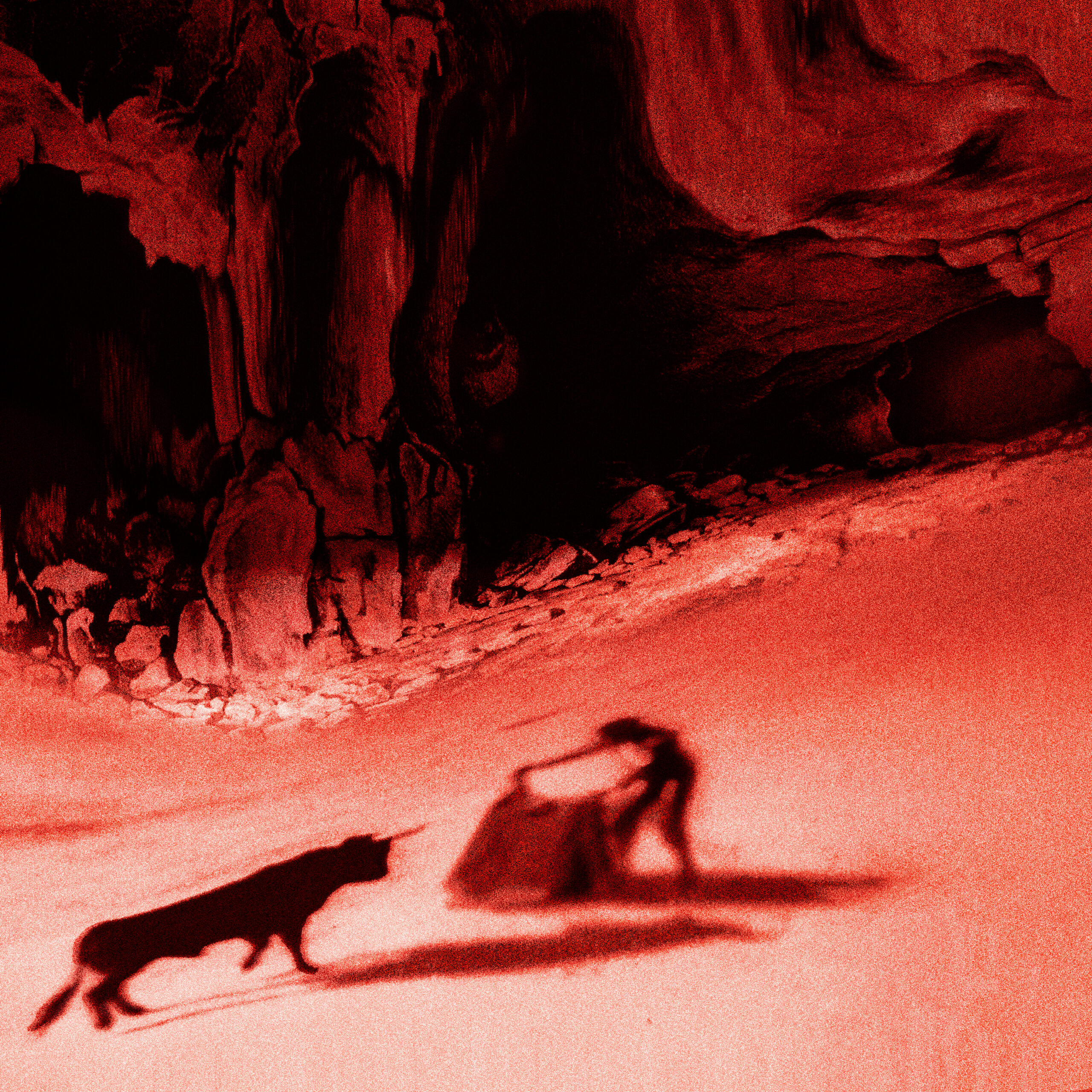
Ganser’s Nothing You Do Matters, a short EP produced by Liars’ Angus Andrew, is propulsive in a way that has you questioning not what drives the music but what sort of chaos the group is running from. Along with two ambitious videos, it comes with visually striking artwork that paints survival as a disorienting battle where reality is distorted and each layer bleeds into another. “We were writing a lot about feeling chased for the past two years, and the warped state of things,” the band’s Alicia Gaines told us. “What I like about doing artwork for the band is that I get a long period to think about a feeling made of words and music, how to combine that with imagery as a shortcut. An unknown protagonist facing off against a bull felt like the right metaphor for the moment.”
“When it came to the physical artwork,” Gaines added, “we went with a red layer of cellophane between black and white artwork and the shrink. I like the idea of multiple versions of artwork existing in different formats (digital, print), and the depth of color varied materials can bring. We always try to hide a phrase or artwork in our physical vinyl and tapes, and I think that reflects in our music. It’s all mirroring off of each other.”
29. Dawn Richard and Spencer Zahn, Pigments
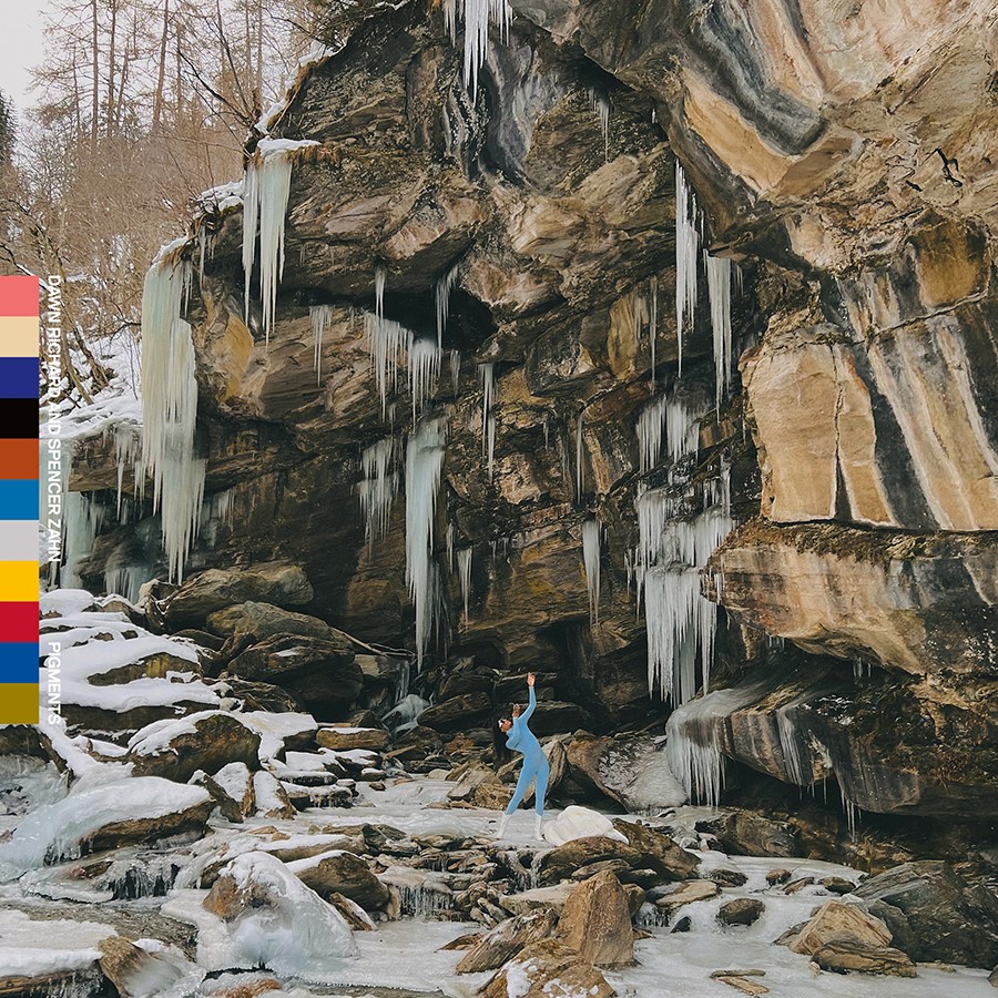
Pigments, the first full-length collaboration between singer-songwriter Dawn Richard and neoclassical composer Spencer Zahn, mesmerizes with spectral, prismatic soundscapes while telling the story of discovering one’s self through dance, drawing from Richard’s heritage as well as her experience in the New Orleans contemporary arts scene. “I wanted to show the beauty of my journey from the lower 9th ward of New Orleans to a place like Switzerland,” Richard said in a statement to Our Culture. “How painting with broken brushes (my unconventional story) led me to this masterpiece of a musical collaboration.” To evoke the sumptuous physicality of Pigments via a still image would be a challenge, but the cover artwork, photographed by Monty Marsh, captures even more elusive qualities: the merging of body and space, how warmth can sift through icy environments. “The chilling woodwinds and spatial movement of the vocals on the project embodies the cover perfectly,” Richard continued. “To be surrounded by these natural elements deep in the mountains of Vals, Switzerland, in my Mardi Gras heels and bodysuit made from own hands in New Orleans, seem to paint the perfect concept of what is possible.”
28. Epitaphe, II
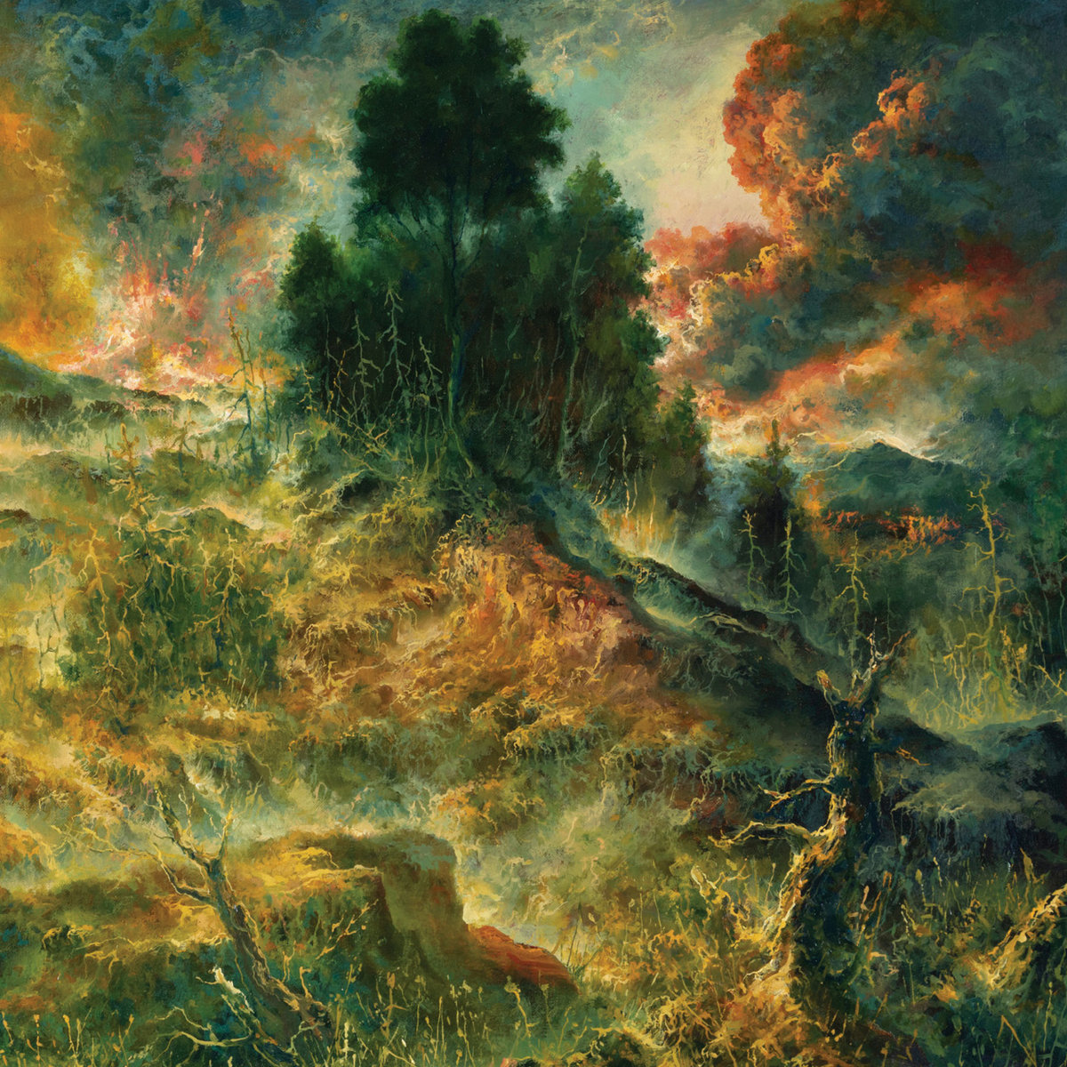
The remarkable cover art for II, the sophomore album from French progressive doom outfit Epitaphe, not only mirrors all the majesty and terror of the record’s hour-long journey, but also the way it balances intricately beautiful detail with an overall cataclysmic atmosphere. Visually, it sees the band continuing their collaboration with Finnish artist Petri Ala-Maunus, who let them use one of his paintings for their debut album. “The main painting for II, entitled ‘Celestial Explosion’, was created from the perspective of being the cover of the new album,” guitarist/vocalist LB told Grizzly Butts. “We told Petri the names of the new songs, as well as the main themes and ideas behind the record. To illustrate it, we thought of a pastoral and slightly hallucinogenic scene, with a melancholic mood, contrasting with more elusive, fuming and chaotic patterns. Other than these vague ideas, Petri had no other indication and no constraint. The painting was complete before we finished to write the album, and it was a source of inspiration for us, for some sections of the music and the lyrics.”
27. Vein.fm, This World Is Going to Ruin You
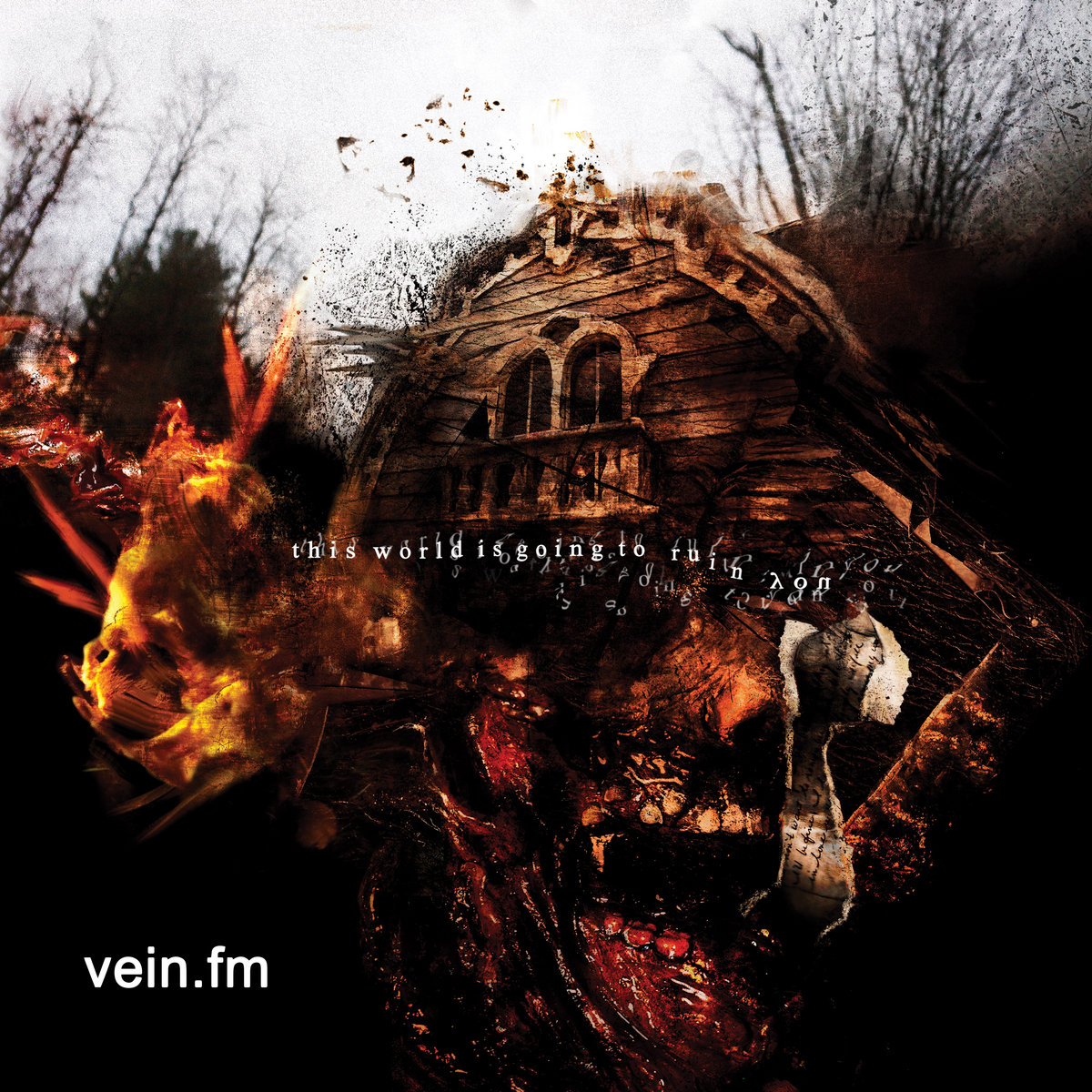
This World Is Going to Ruin You, the follow-up to Vein.fm’s 2018 debut Errorzone, finds the Boston hardcore band expanding their sound in cathartic and gloriously chaotic ways. The house on the album cover is the one from the horrific ‘The Killing Womb’ video, forming the basis for the artwork created by graphic designer Autumn Morgan. “When I listened to the album and watched the video for ‘The Killing Womb’, it felt like the nightmare of the adult version of the boy with the scissors,” she said in a Behind the Cover feature with Heaviest of Art. “It felt like this album was exploring more of the dark crevices of someone’s mind. That was the approach that I had in my mind when I was putting together the digital collage for the cover image. It felt like the soul of the album.” The process involved combing through a selection of photos, collaging, and layering a digital painting over them, which Morgan likens to “sinking your teeth into a sculpture.” She concluded, “What I’m hoping people get out of the imagery, if anything, is a dark sense of belonging, almost like a monster that you recognize in your own psyche.”
26. Undeath, It’s Time...To Rise From the Grave
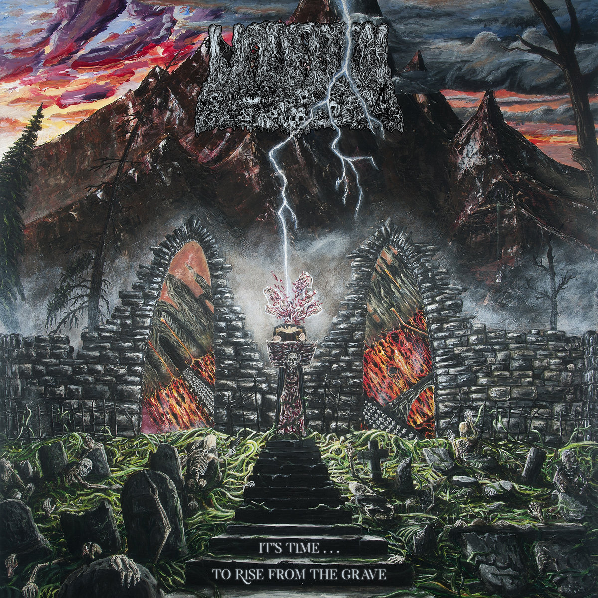
It may not be quite as filthy as the artwork for Undeath’s 2020 debut Lesions of a Different Kind, but one look at the gruesome painting on the cover of the Rochester quintet’s latest outing and you know exactly what you’re in for. (Besides, they’re both part of the same universe.) It’s old-school death metal in both style and execution, but because this is Undeath, their necromantic tendencies don’t inspire music that’s funereal so much as relentlessly, wickedly ecstatic, the most fun you can have listening to a guy bellowing about “Piles of death/ Corpses en masse.” The cover illustration from drummer and artist Matt Browning reflects that quality while also reveling in the intricate and fantastical detail that distinguishes Undeath’s brand of horror, like the scene described in ‘Head Splattered In Seven Ways’.
“The process of doing it was pretty similar to the Lesions one,” Browning told Heaviest of Art. “I was working on it at the same time as we were writing some of the songs. Kyle, who comes up with the lyrics, would talk to me about ideas for the art, which is where the idea of a cemetery scene came about. One of the earlier songs we had written was obviously ‘It’s Time to Rise From the Grave’, so we decided on that as the album cover with the cemetery scene and a skeleton army rising out of the grave. We talked about it taking place at night, but ultimately, I went with the more sunset kind of look.”
25. black midi, Hellfire

Hellfire sees black midi continuing their collaboration with David Rudnick, whose artworks have now become synonymous with the group’s visual identity. After working on 2018’s Schlagenheim and last year’s Cavalcade, Rudnick once again used different tools to illustrate the dramatic themes of Hellfire while framing it as part of an ongoing evolution rather than a departure from previous albums. Teaming up with graphic designers Emiel Penninckx and Rani Yasmine Putri, his process involved feeding lyrics from the album into an AI image generator, a contrast to the more tactile approach he took with Cavalcade. Though it’s unclear how the generated images were then manipulated, the end result – besides being as absurd and blisteringly chaotic as you’d expect – hints at the stories of decay and degradation that populate the LP, as well as the way truth is distorted as they’re being told. As a press release puts it, “You’re never quite sure whether to laugh at or be horrified.”
24. Psychedelic Porn Crumpets, Night Gnomes
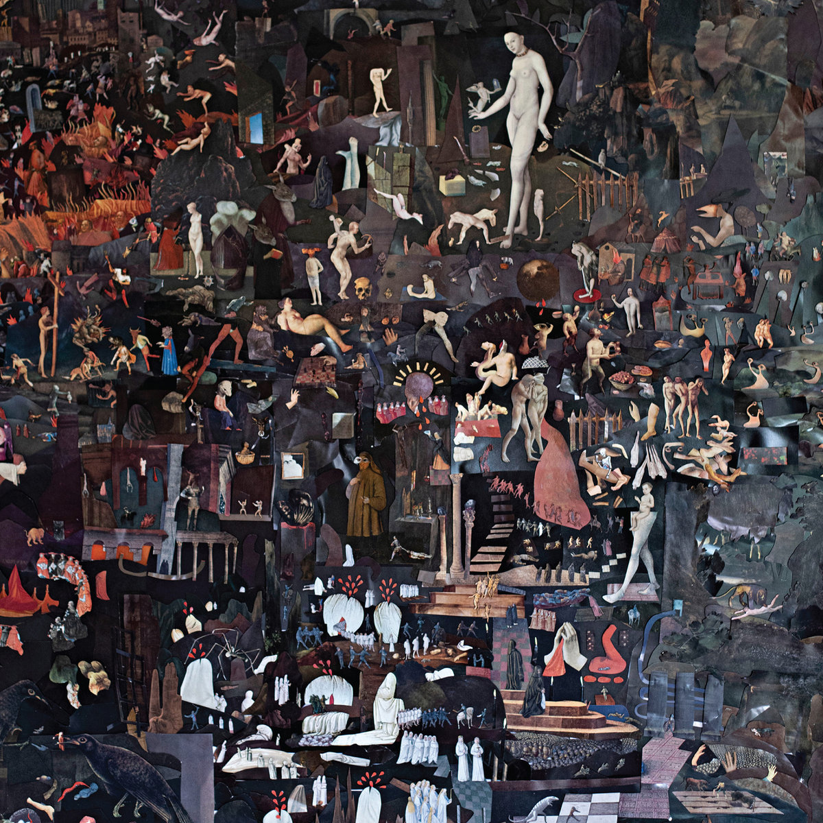
Psychedelic Porn Crumpets’ take on psych rock is exploratory and detailed, and the cover art for Night Gnomes matches their exuberant ambitions. In press materials, frontman Jack McEwan summarized their fifth album as being about “trying to work out what the fuck is going on,” and you might find yourself doing the same thing after taking a look at its impressive artwork, a collaboration with Ben Giles, who also worked on 2019’s And Now for the Whatchamacallit. “He took this nice collage approach which looks like Hieronymous Bosch,” McEwan noted in an interview with All Things Loud. “Stuff like sticking bits and pieces onto a gargoyle’s face and legs, which really made it feel like a Night Gnomes-esque world. I saw the art before the album was written and I really wanted to tailor the music to the visuals. We wrote songs with that in mind.”
23. Keeley Forsyth, Limbs
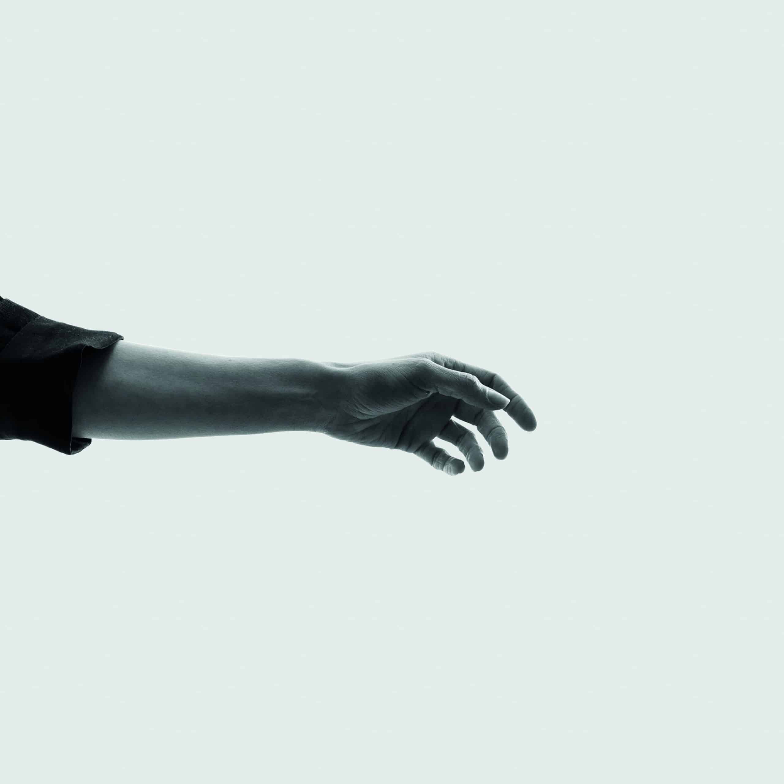
The cover art for Keely Forsyth’s second album, Limbs, immediately foregrounds three of the most essential qualities in the English singer-songwriter’s work: openness, subtlety, and movement. Beautifully aligning with the cover for 2020’s Debris, the photo also mirrors the record’s compositions by eliciting a stark vulnerability and coldness out of its minimalist framework. Ross Downes, who collaborated with Forsyth on the artwork as well as the production, explained: “This idea came late and after many others. The photo was taken with a borrowed camera in the backyard of Keeley’s house. We were trying to follow some sort of aesthetic development from Oli Bentley who designed the beautiful cover for Debris, going one step further from obscuring Keeley’s identity to focusing on just one feature, an outstretched arm with all the meanings that can be attached to such an open image. There’s a timeless quality to such a simple photograph shot in black and white that we decided not to complicate by adding text or over design. We also wanted to in some way encompass Keeley’s passion for dance/theatre and the performative side of what she does in the gigs, which this image attempts to allude to.”
22. Nyokabi Kariuki, peace places: kenyan memories
On her latest EP peace places: kenyan memories, Nyokabi Kariũki journeys through a series of memories associated with her upbringing in Kenya, with each track evoking a location of particular significance through field recordings, keyboards, kalimbas, and other instruments. Notably, the final track transports us to the peace place of Naila Aroni, a Kenyan artist and Kariũki’s childhood friend, who also created the project’s stunning artwork. In addition to the musical pieces, Kariũki also sent her photos and colour schemes as reference points. “There was this element of supporting each other through this journey of the creation of the EP and the paintings, which was so amazing,” she said in our Artist Spotlight interview. “Even in terms of just being able to talk about these places and her knowing where they are or having been there went such a long way.” Of seeing the artwork for the first time, she added: “I obviously had not envisioned what she was going to paint, and it’s just amazing that that’s what she was seeing in her mind.”
21. Heather Trost, Desert Flowers
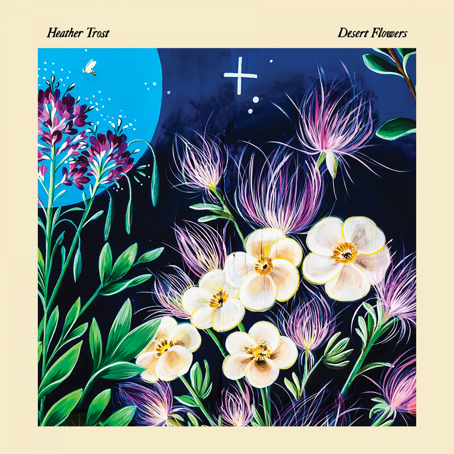
The latest solo outing from Heather Trost is a gentle, enchanting record that’s filled with dreamlike imagery while honouring the singer-songwriter’s relationship with the natural world. In our Artist Spotlight interview, Trost talked about how her preoccupation with the environment as a theme is reflected in the title, Desert Flowers, but also how it was inspired by the wonderfully rendered artwork by Nani Chacon. “She’s from here, and she’s very connected with the land and the people here,” Trost said. “She actually does huge murals, so the cover is a close-up of a mural that she did that is two miles from where I live, and it’s on a wildlife nature preserve. So I wanted that image of the flowers that she painted so beautifully, and those are all local wildflowers that grow here.” Trost has also copared desert flowers to the songs on the LP, “pushing their way towards the sun, and in turn searching and pushing roots deep into the ground for water. As above, so below, the light and the dark, extroverted and introverted, color and monochrome.”
20. Weyes Blood, And in the Darkness, Hearts Aglow
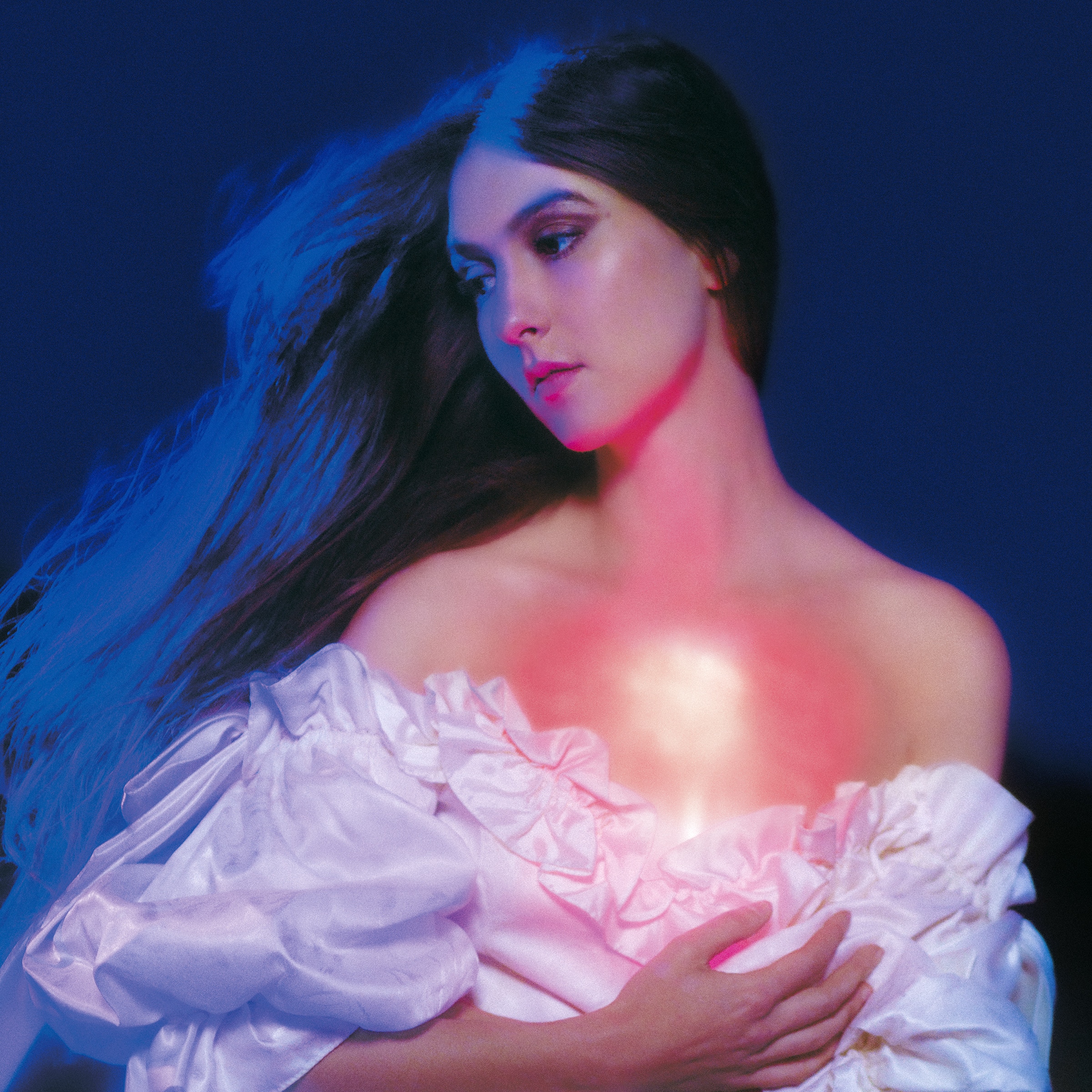
The album cover for 2019’s Titanic Rising is one of most striking in recent memory, depicting Weyes Blood’s Natalie Mering submerged underwater in a recreation of her childhood bedroom, like a mythical figure drowning in her own sacred altar. Considering the album’s environmental themes, it now feels like a haunting portrayal of a private space being infiltrated by forces out of our control. Mering once again delivers with the visual imagery surrounding its sequel, And in the Darkness, Hearts Aglow, where doom is no longer simply on the horizon. Photographed by Neil Krug, the beautiful cover reflects the intimate vulnerability with which Mering approaches feelings at once personal and universal. The glowing chest renders her a kind of angelic presence, a powerful symbol of a broken heart emanating hope. As she put it in a statement announcing the album: “My heart, like a glow stick that’s been cracked, lights up my chest in a little explosion of earnestness. And when your heart’s on fire, smoke gets in your eyes.”
19. Cate Le Bon, Pompeii
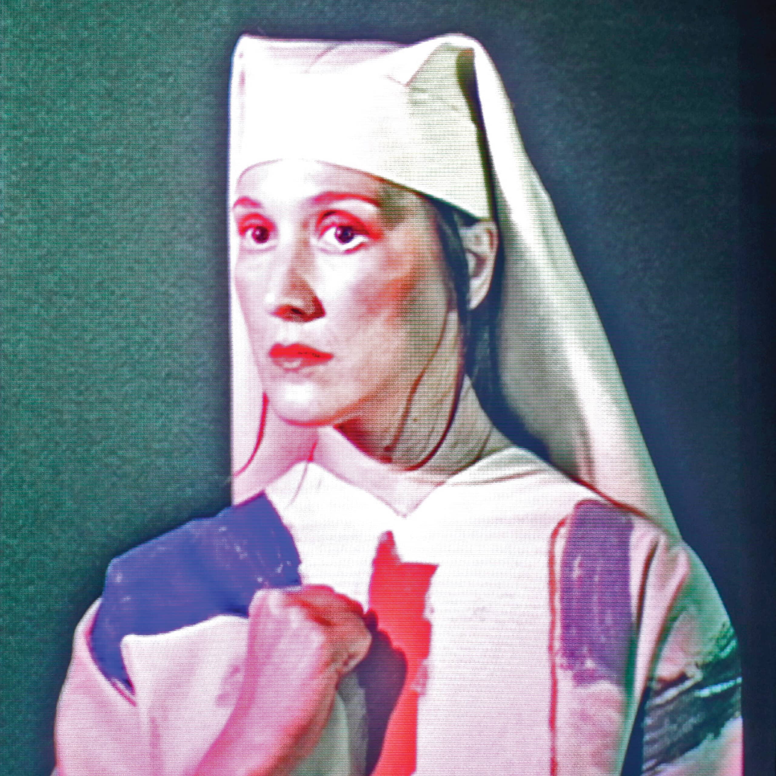
In the early days of the pandemic, Cate Le Bon’s partner, the artist and musician Tim Presley, presented her with a painting that would become vital in the creation of Pompeii. So vital, in fact, that it serves as the centerpiece of nearly every interview the Welsh singer-songwriter gave around its release. It portrays a divine woman emanating a quiet power; Presley said it was her. The haunting beauty it invoked guided every part of the album-making process; I doubt a visual had as powerful of an influence on any of the albums listed here as that painting had on Pompeii. Which perhaps explains why it’s not actually on the cover – the image is a replica of the painting, a photographic portrait of Le Bon. “I couldn’t bring myself to reproduce Tim’s painting,” she told Pitchfork. “I saw everything in it, both strength and fragility. There was something quite religious about it, but it was more spiritual than that, too. There was something really powerful, something I couldn’t put words to.” What we’re presented with still carries those inscrutable qualities: fist across her chest, Le Bon’s figure looks holy and ancient yet staring into the future. There’s no doubt it sounds like Pompeii.
18. yeule, Glitch Princess
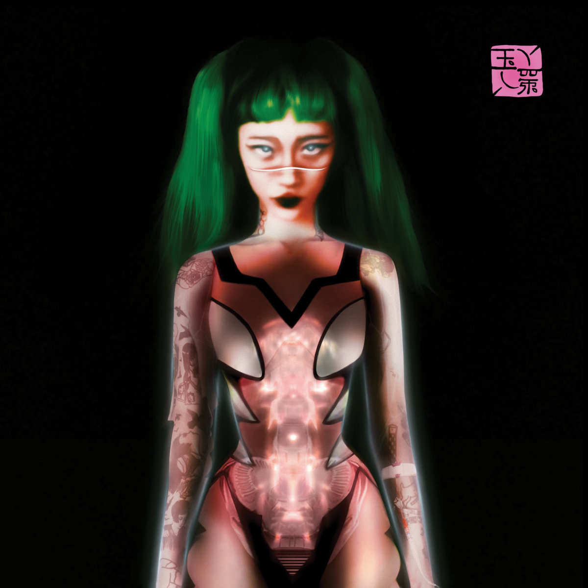
The experimental pop artist born Nat Ćmiel reunited with photographer Neil Krug to craft the visual identity of Glitch Princess, the follow-up to 2019’s Serotonin. The album delves further into yeule’s identity, explicitly framing them as a cyborg while still leaving things open-ended. There’s a noteworthy resemblance to Krug’s cover for Weyes Blood’s aforementioned album, even though the two artists contend with the apocalypse from different angles. Here, the glowing machinery animating the character’s body elicits a strange warmth, blurring the line between the human and the artificial, the real and post-conscious. Whatever beauty and tenderness it holds seems tainted by the threat of destruction. Describing the album’s overall aesthetic in an interview with the FADER, yeule said they “wanted to depart from this natural earthy Gothic Renaissance-esque world that I built with Serotonin to by bringing it over into neo-technical, cyber-Gothic, still mixed with hints of pre-Raphaelite,” adding that “I wanted to express a part of me that was a bit more, I think, forceful. It’s not gentle. It was really forceful. It needed to be a bit violent, almost. Sanitized but technological and clean, unbroken, manufactured, but still having those gentle notes in it.”
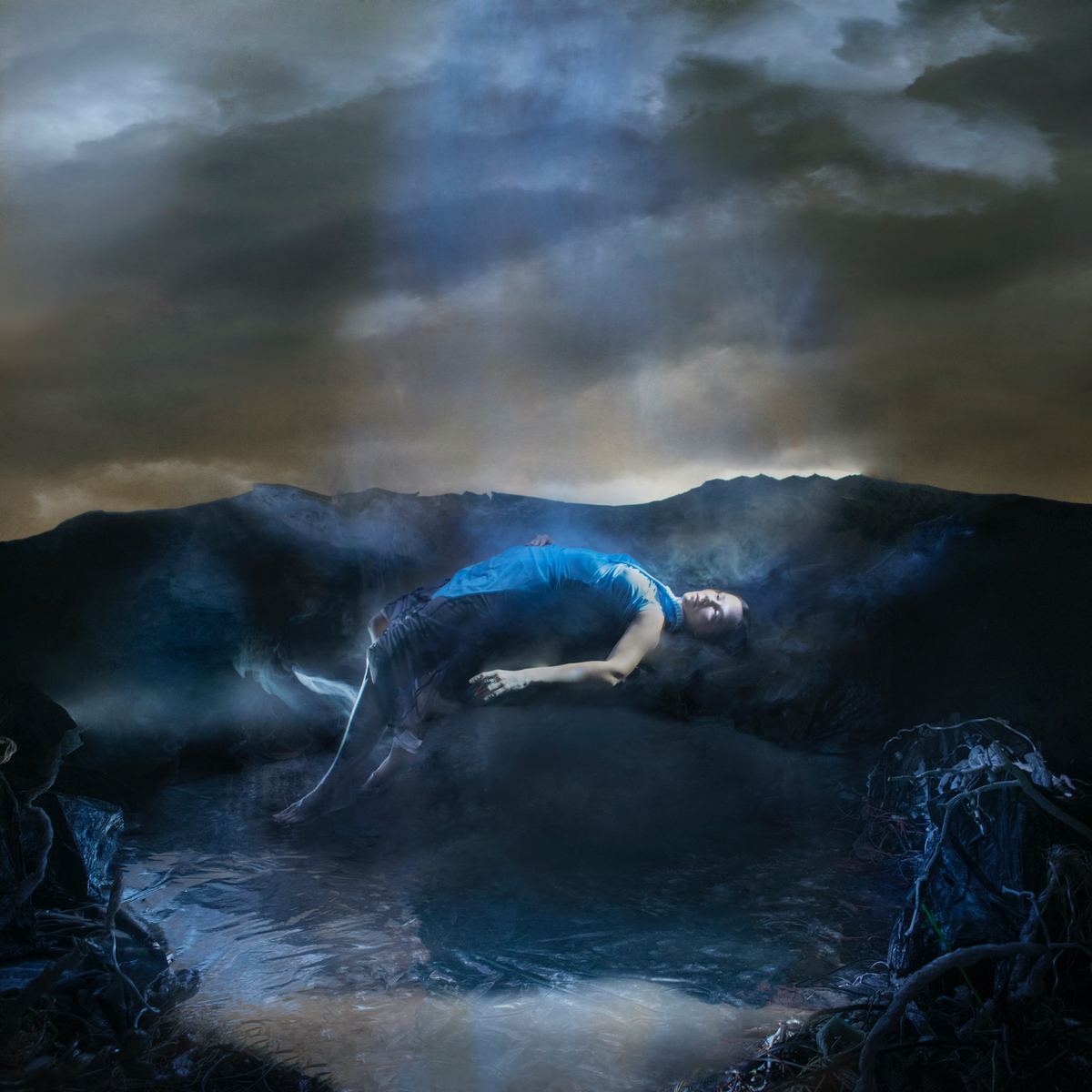
17. Emma Ruth Rundle, EG2: Dowsing Voice
Electric Guitar Two: Dowsing Voice, the second installment in Emma Ruth Rundle’s series that includes 2011’s EG1, is an album of largely improvised music, combining intricate guitar work with vocal experiments that are visceral, unsettling, and above all imaginative. Drawing on myth and magic, this self-described “weird art project” finds Ruth treading into the darkness of the Welsh countryside to explore desolate landscapes, underground caves, and goddess-like creatures. A 140-page book of visual art accompanies the album’s musical journey. “The combination of studio portraits – handmade props and costumes – film shots of the Welsh landscape etc – these images help to tell the ‘story’ of the album which is loosely based on Welsh folklore,” Rundle explained in a statement to Our Culture. “The self portrait on the cover is meant to capture the moment of rebirth. A coming back to life, back from the dead, from the womb of the cauldron of Pair Dadeni. If we are searching for the voice beyond the veil the moment it has been discovered is captured on the cover photo. It’s the moment of the arrival of the spirit.”
16. Sweet Pill, Where the Heart Is
Sweet Pill isn’t the only band making punchy, raucous emo songs, but few so viscerally paint anxiety as a constant battle, some kind of violently twisted game. The portrait on the cover of their debut album, Where the Heart Is, channels both the character and spirit of their music with similar potency. There’s obviously the bloodied face, but in Kerry Dunn’s painting I also see the anxiety Zayna Youssef sings of: the tangled thoughts, the heart being pulled apart, hope swarming like flies. “I got to meet the entire band, come to band practices and hang out with kids half my age,” said Dunn of working with the band, who briefly lived close to him in Philadelphia before the pandemic hit. “Getting to know Sweet Pill… has renewed my faith in the next generation. They are so supportive of each other, they hug every time they say goodbye.”
Of the process behind the cover, Dunn added: “We set up a photoshoot and just tried different ideas while I clicked away with my camera, at one point Zayna and Jayce performing acapella in my living room, at other times I had the band members wrestle… I wanted to capture struggle, inspired after some of my conversations with Zayna and hearing her reasons for writing the songs. The photograph I chose to work from is Zayna on the ground, and the hands are guitarist Jayce’s hands. It’s Zayna’s emotion in the songs that I wanted to mirror. I kept that in mind while I created this painting for Sweet Pill.”
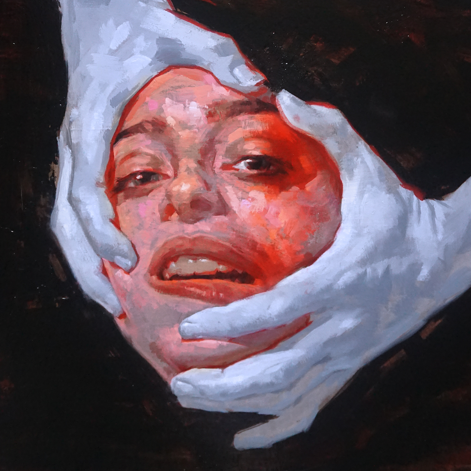
15. 070 Shake, You Can’t Kill Me
“I wanted your body, but it came with your soul,” 070 Shake sings on ‘Body’, a memorable line on her sophomore LP that seems to align with the work of Nicola Samorì, the Italian sculptor and artist whose painting graces its cover. One of the central themes in Samorí’s art is the physicality of the body, which he explores by transforming his paintings – removing, changing, and layers to achieve a dark, violent effect. When 070 Shake released Modus Vivendi, it was her refreshing take on soul music that made her stand out, and You Can’t Kill Me, like its artwork, centers on a swirling blend of old and new forms that defies easy categorization. The fraying face hints at the messiness of identity and desire: “The tyranny of the eyes impedes the work from being desirable in all its parts,” he has said. “I am looking for a continuous seduction, without psychological masks, also because I cannot look at people in the face; I don’t even remember them.” No matter the obfuscation, you can’t but see Shake’s tormented spirit reverberate through, both fearless and vulnerable in its yearning.
14. The Callous Daoboys, Celebrity Therapist
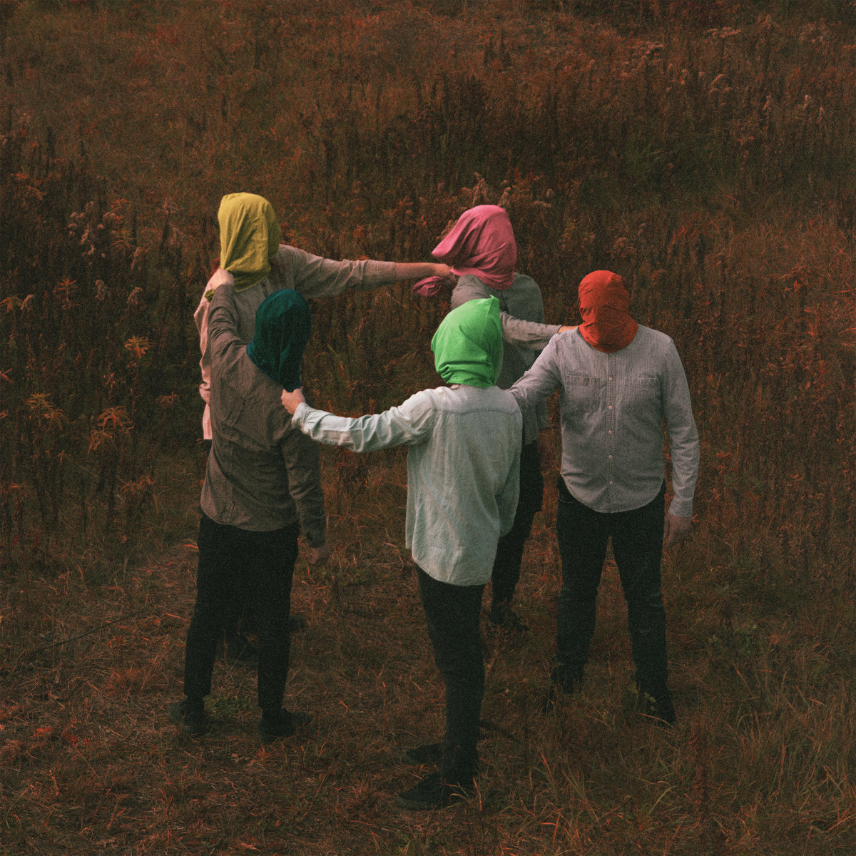
Celebrity Therapist is an album that deals with the cyclical nature of history. Sean Murphy’s front cover is certainly suggestive of that, but it also alludes to the unbridled heaviness and thunderous melodies that menacingly bring the album’s themes forward. “We knew that we wanted album art that was easily talked about and remembered,” frontman Carson Pace remarked in a statement. “So when people talk about the albums we’ve released, even if they don’t remember the name or the band that made it, they’ll refer to Celebrity Therapist as ‘Oh, it’s the one with the people in the hoods on it.’ Which is something that I expressed to Sean, that we wanted the album art to be significant and we wanted it to be memorable.”
“I gave Sean as much guidance as possible about what the album was about, as far as people moving in circles, history repeating itself, and one’s own personal history repeating itself,” Pace added. “I just wanted to make sure we got those words across. Sean isn’t an artist that typically uses a lot of color, so I wanted to make sure that some color was put into anywhere that we could possibly put into it, as I’m a huge fan of lots of colors being on an album cover. He thought it best to have all the hoods be different colors, and I think it turned out so well. I think it’s the perfect album cover for this album and it almost feels like we wrote the music to that piece. I think it’s the perfect album cover for this album and it almost feels like we wrote the music to that piece.”
13. Benny the Butcher, Tana Talk 4
Tana Talk 4 is the latest entry in a series of records that dates all the way back to 2004, following up Benny the Butcher’s 2018 studio debut Tana Talk 3. Mariella Angela, an oil painter who also worked with the likes of Future and Tyler, the Creator, did the cover for that last album, a painting of the Buffalo rapper’s older brother, Machine Gun Black, who was shot and killed in 2006. The lyricism on the two projects is clearly interconnected, with Benny reflecting on both his roots and the legacy he’s built, and the artwork reflects that thread. The sequel’s front cover is a reproduction of a childhood picture of Benny with Machine Gun Black on the left and his cousin Westside Gunn on the right. Gunn designed and curated the cover, which was painted by Angela and also served as the back cover for Tana Talk 3, highlighting a sense of camaraderie not just as a reminder of the past but part of his ongoing journey.
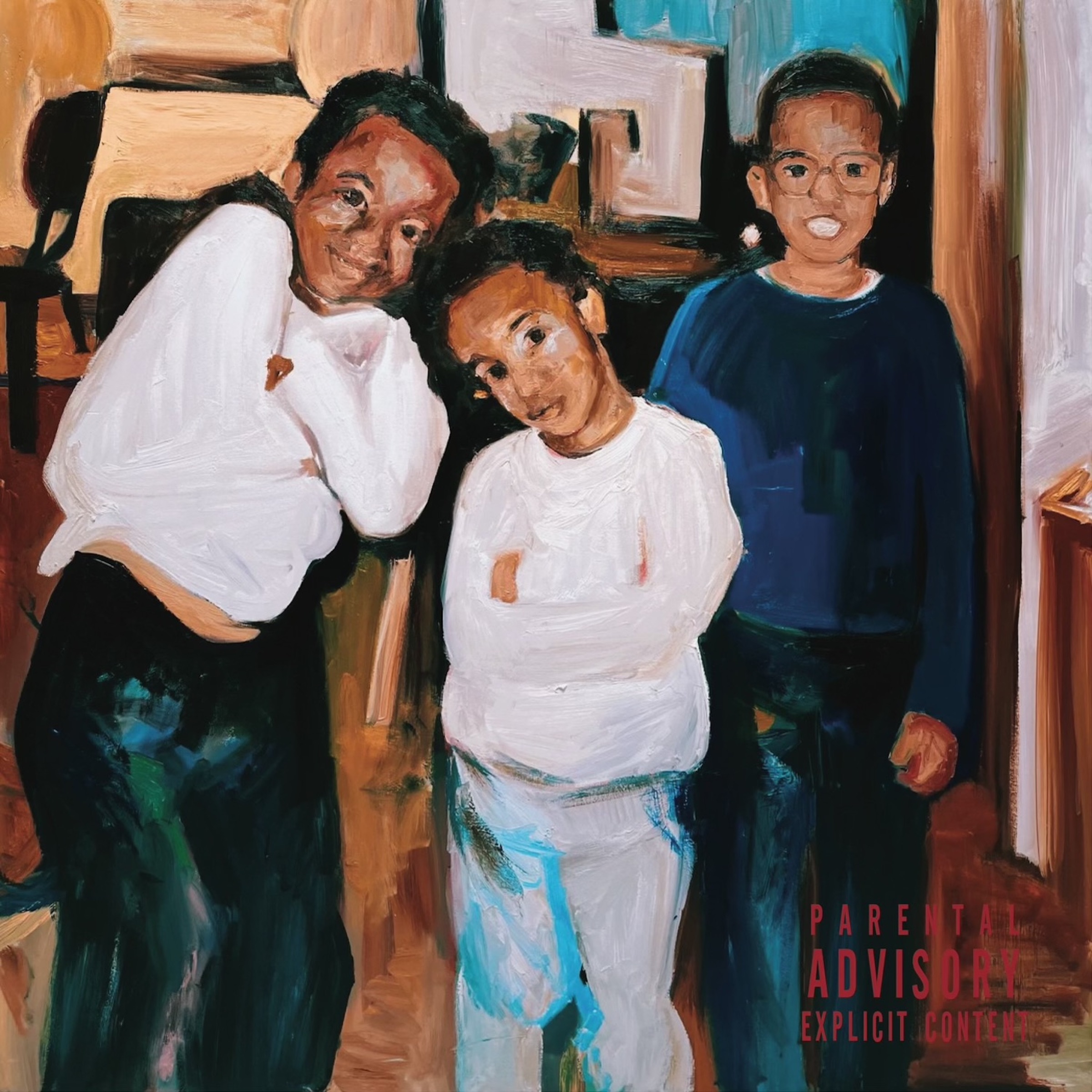
12. Kojey Radical, Reason to Smile
For a record titled Reason to Smile, it’s perhaps no surprise that Kojey Radical’s first full-length is a vibrant, uplifting collection. More than anything, though, it serves as a heartfelt tribute to family – the London rapper’s mother serves as a guiding force throughout the album, her journey an inspiration as well as a catalyst for his own growth. She also contributed voice snippets that are threaded across Reason and Smile, and appears on its cover, photographed by Nwaka Okparaeke, alongside the mother of his son, Rachel Ama. The stunning image reflects the ambitious spirit and euphoric nature of Kojey Radical’s music, imbuing it with Okparaeke’s dreamlike aesthetic against a naturalistic backdrop. But the heart at the center of it remains undeniable. “I just figured to myself, why would I focus on a negative when the positive has been a constant in my life?” he said in an interview. “I can’t think of a day when my mum’s not been there, so why wouldn’t I go that way rather than wallowing in self-pity?”
11. Bill Callahan, YTILAER
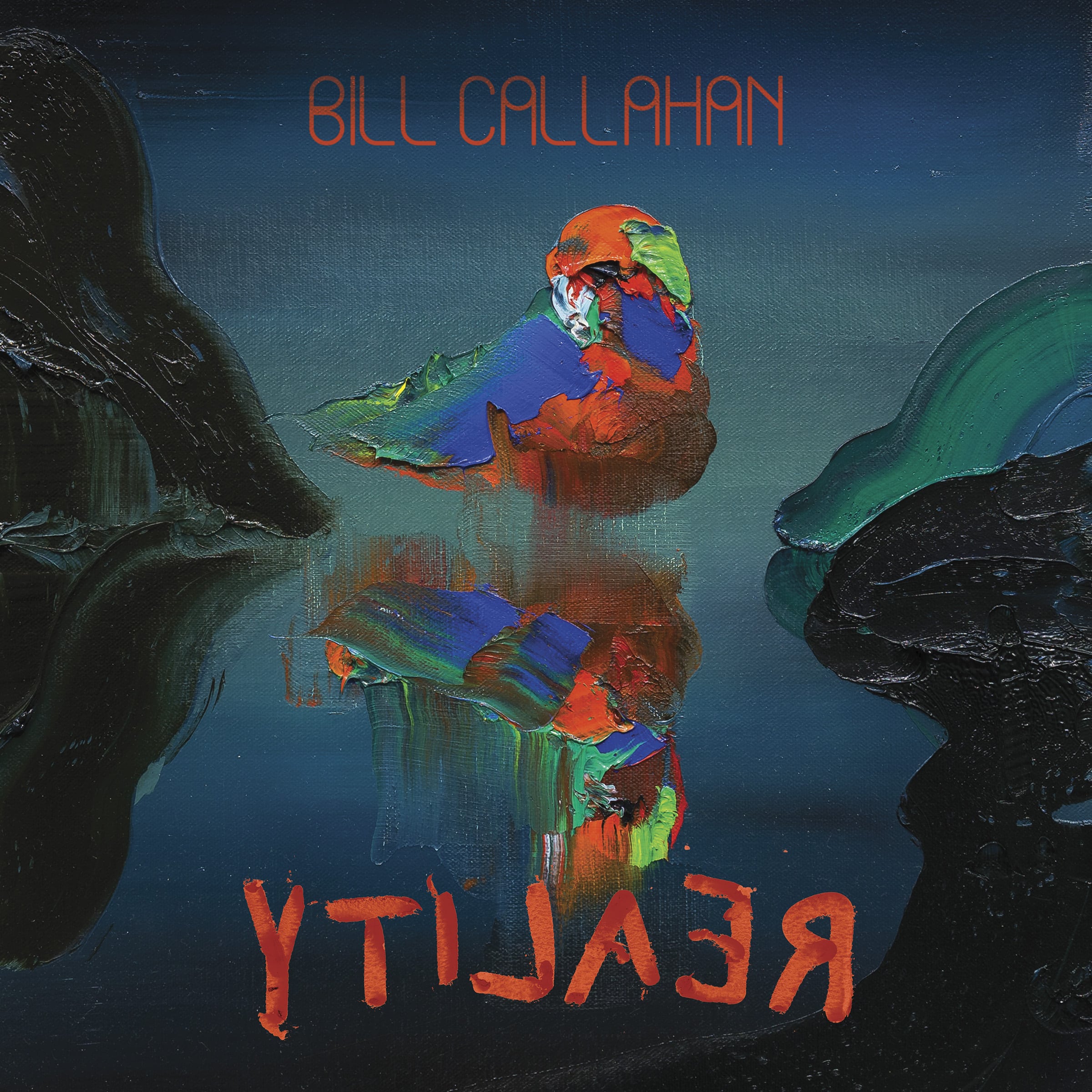
If you’re a Bill Callahan fan, you probably already associate Paul Ryan’s paintings with some of his most indelible work. The Virginian painter and art critic’s landscapes conjure a dark, imposing beauty that has graced the covers of Apocalypse, Dream River, and Have Fun With God, and for the first time since 2014, the artists teamed up for Callahan’s latest, YTILAER. Yet there is an even deeper alignment between Ryan’s colourful, semi-abstract painting of some kind of tropical bird and the dreamlike transcendence Callahan reaches toward, treasuring the in-between space signaled by the opening lines in ‘First Bird’: “And we’re coming out of dreams/ And we’re coming back to dreams.”
In the album’s inner sleeve, Callahan writes of the “exhilaration and dread” that Ryan’s paintings exude. “It can be waiting for you anywhere. But it waits for you particularly in spots of sublime beauty—shores, mountains, mid flight birds—and maybe most of all—in human faces, in vision. It’s an emanation and a projection. It travels both ways like that. It’s awestruck at the beauty and brutality in equal measure and how they co-exist in one breath. Each new painting by Paul is a breath of exquisite air as we come up from drowning.” In an interview with Paste, he noted that the significance of the YTILAER cover is symbolic in nature yet immediately palpable. “It’s like the weather,” he said. “When there’s a cloudy sky in [Ryan’s] paintings, I expect to start feeling raindrops. I try to have that immediacy, or that tactile nature, in the music. I think of it as something very natural sounding or human sounding.”
10. Jenny Hval, Classic Objects
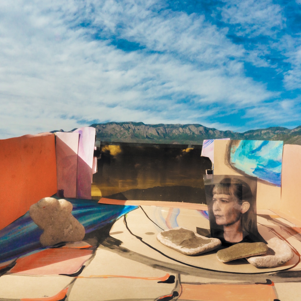
“I rearrange objects that my friend made for my show/ I’m not sure if these are art or just stuff she made for me,” Jenny Hval sings on the title track to her latest album Classic Objects, which oscillates between the banal and the otherworldly, the natural and the constructed. There’s a dreamlike harmony to the way different elements come together in the album’s artwork, set against blue skies that match the ethereal calm washing over Hval’s compositions. “The cover image was the result of a long collaborative process with one of my favourite humans, Annie Bielski,” Hval told Our Culture. “The idea was to make little shrine-like painted rooms and place them outside, opening up to the sky, the mountains and vegetation. To have the inside on the outside, or something like that. Blurring the lines between nature and the pandemic indoor life (which resembles the indoor life of many women throughout history).”
While Hval sent her input from her home in Oslo, Bielski worked on the visuals around her home in Albuquerque. Elaborating on the process, Bielski explained that she was initially inspired by a book on David Hockney’s work for the stage, which included maquettes he made for theater productions. “At the time I was working on the art, I was also rearranging furniture in my living room, repainting walls, reupholstering stools. Much of my creative energy was going into the objects in my space and the movement of those objects. I called it studio procrastination but it was also working out relationships between color and form and material and scale, all in the living room. Jenny’s lyric about arranging objects on the countertop as though it were a stage plot was in my head as well.”
“I already had a collection of small objects I found interesting: rocks, including some that Jenny collected while visiting me a year prior, fake ceramic fruit, things I found on walks,” Bielski continued. “I printed out an image of Jenny and started arranging her, the objects, and painted scraps from my studio inside of my fireplace to get a sense of a small room. Off the square page, into a rectangular space, with three walls. It felt like a shrine to art and friendship. It was also slightly ominous in the fireplace, like the house I was building could go up in flames at any moment.” From there, she put the work inside empty cowboy boot boxes and drove around Albuquerque just before sunset with all the objects in her car. “The Sandia mountains as a reliably steady backdrop felt expansive and grounding,” she concluded. “The sky on the back cover was shot in Norway by the brilliant Lasse Marhug, whose design and creative feedback led to the success of the cover. I love having Norway and New Mexico together in one final square object.”
9. Frankie Cosmos, Inner World Peace

Warmth, empathy, surrealism – these aren’t necessarily easy concepts to express visually, but they’re dotted across many of the artworks featured in this list. What’s especially unique about the Inner World Peace cover is that it also encompasses the playful sense of charm, wonder, and humour that defines Frankie Cosmos without straying from the introspection and minimalism of Greta Kline’s songwriting. Given that it was illustrated by the band’s keyboardist Lauren Martin, it’s no surprise the album art feels so at one with not just the lyrical content but the various shapes and textures that bring them to life, and the overall effect is both aesthetically satisfying and curiously endearing.
“Making this album felt very intimate and magical and we wanted the art to reflect that,” Martin told us. “Some of the objects on the cover are references to lyrics, some are references to our experience of arranging. We all workshopped the cover together – I would send sketches and rework them, adding or subtracting objects as we went – while trying to convey a sense of ‘Inner world peace’ which meant something different to each of us. We also wanted to add in an element of surrealism by giving the flower an eye and shrinking the planet down to the size of a water glass. I was inspired by Mark Dion’s work and the concept of collecting and organizing objects – I wanted to make a catalogue of this point in time.”
8. PUP, THE UNRAVELING OF PUPTHEBAND
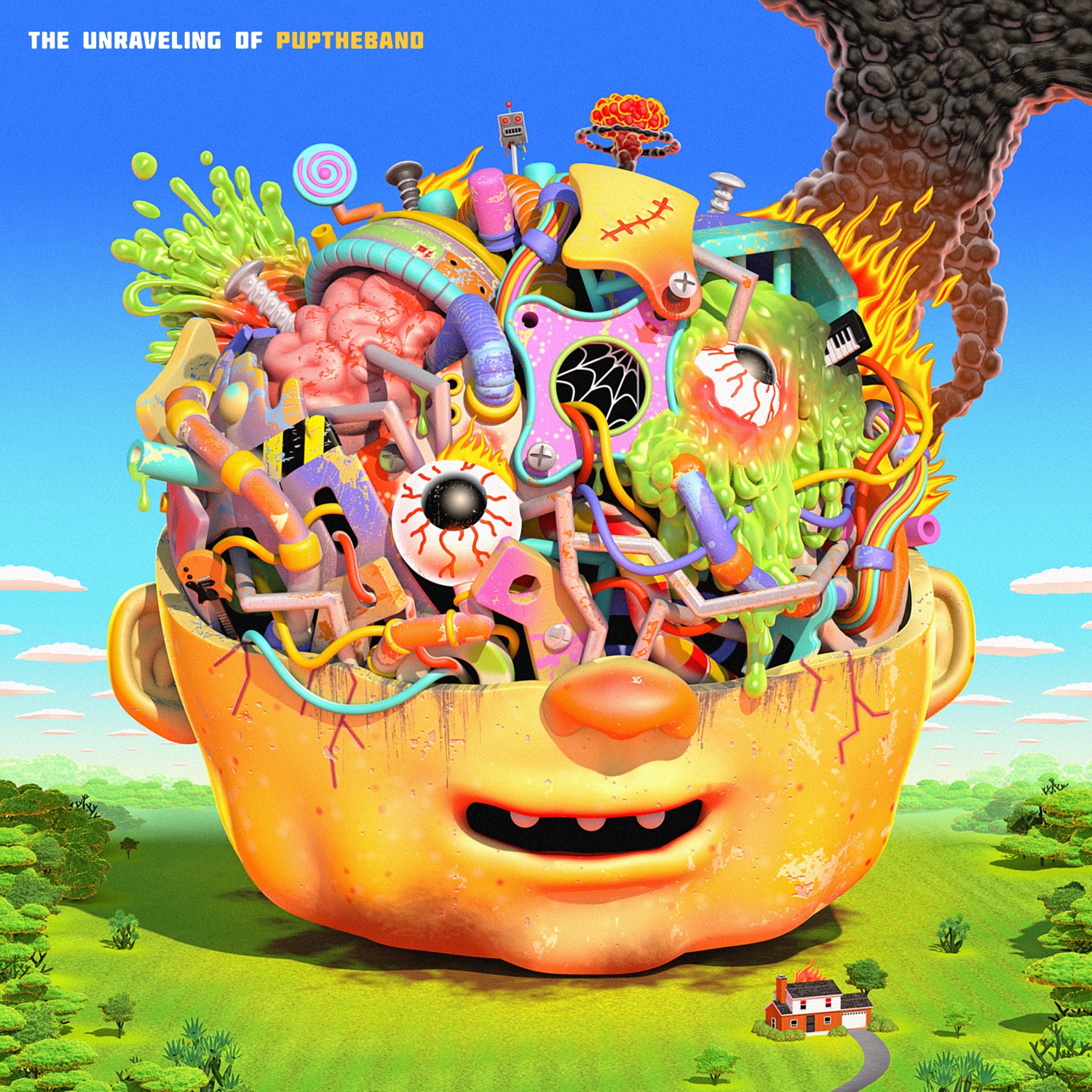
Spiraling anxiety is all but gone on THE UNRAVELING OF PUPTHEBAND, but the Toronto outfit turn it into punk music that’s gleefully chaotic, gloriously grand, and infectiously bright. Jordan Speer’s cover art might be as overwhelming as some of the sentiments the songs grapple with, but it is also dazzling, and of course, morbidly funny. “I’ve been a fan of Jordan/Beefstrong for a while,” PUP’s Zack Mykula commented. “Just amazing reflections of darkness, anxiety and (especially) humour throughout his work. So, naturally, I was ecstatic when he agreed to do the cover art for ‘The Unraveling’. Suffice it to say, he just got it. Quite literally the only direction I gave him was ‘I am not sure. I assume something chaotic that reflects the fact that we’ve all lost our minds a bit over the last 16+ months and (we) did something stupid with that energy.’ Like, that is directly copied from an early email. And what came back was this anxious monstrosity – whereupon seeing it I laughed audibly with astonishment. Some minor adjustments and adding easter eggs here and there, and it was finished. He’s just an amazing talent. We’re very fortunate to have had him on board.”
7. Destroyer, Labyrinthitis
Named after an inner-ear condition that causes dizziness and disorientation, Destroyer’s Labyrinthitis is not so much a haunting album as one where the protagonist is haunted, in large part, by his own imagination. You’re better off not trying to attach meaning or make concrete associations between the fragments Dan Bejar strings together across the LP; a song called ‘Tintoretto, It’s for You’, for instance, has seemingly little to do with the 16th century Italian painter. Similarly, the painting on the album’s cover – by Bejar’s wife and collaborator in Hello Blue Roses, Sydney Hermant– isn’t meant to be directly reflective of the album’s stylistic framework.
“It is from a series of paintings, drawings and video-work loosely based around the film Ludwig by Luschino Visconti,” Bejar said in a statement to Our Culture. “There is a ghostly quality to the painting which I kept coming back to, especially once I had landed on the title Labyrinthitis. The figures in the painting seemed lost in an idyll they would never emerge from. An evil spell or an illness. Although aesthetically very different from the music on Labyrinthitis, to me the painting perfectly summarizes the cursed nature of the record.” It’s whatever vague connections your mind might make between these characters and Bejar’s own that renders the cover so eerily evocative, whether the place it takes you is one of menacing uncertainty or strange comfort.
6. Beyoncé, Renaissance
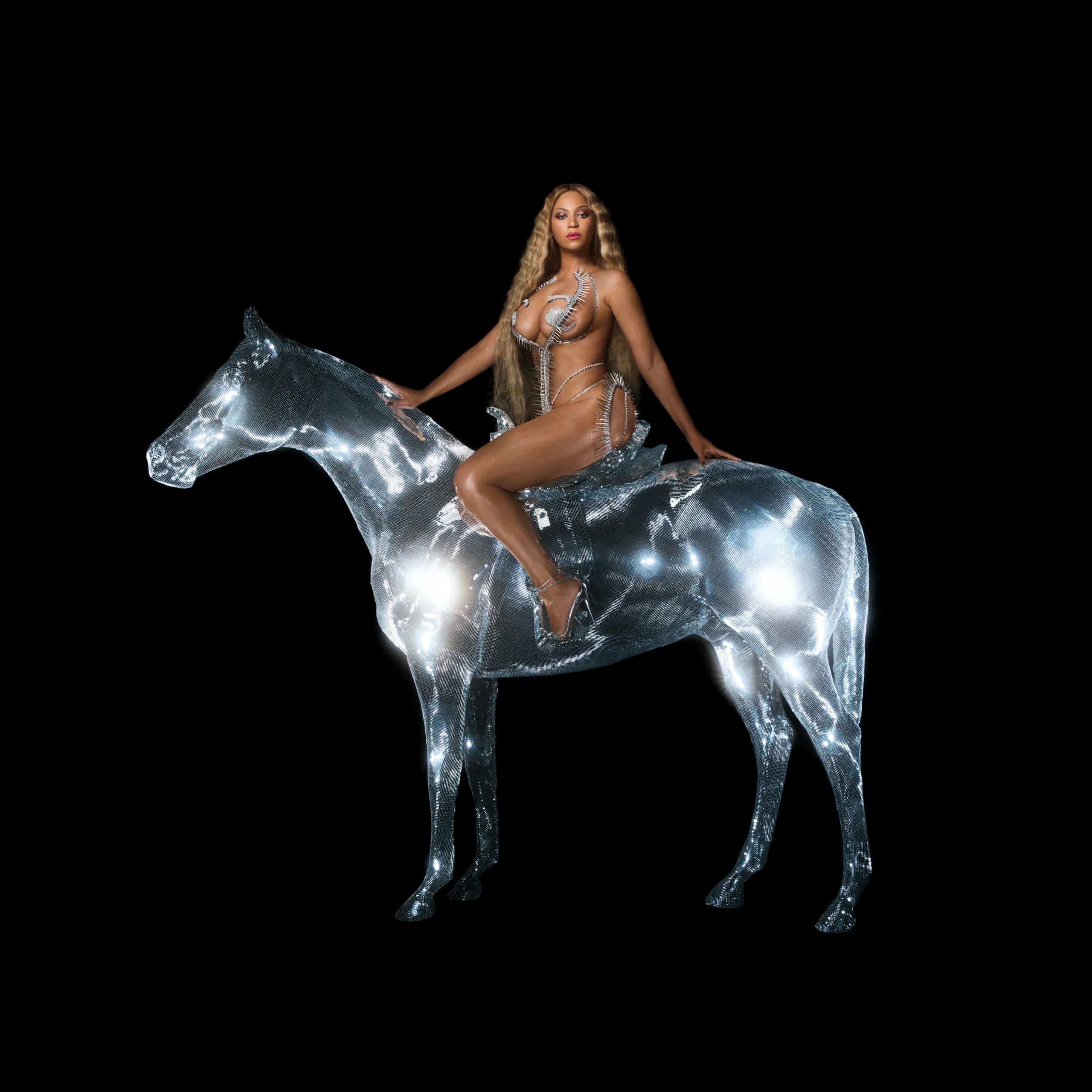
On the cover artwork for Renaissance, Beyoncé can be seen standing atop a glowing, crystallized horse. Set against a black background, the image – captured by French photographer Carlijn Jacobs – seems to revel in the symbolism of its iconography, which is multi-faceted. Most notably, it pays tribute to John Collier’s classic 19th century painting of the noblewoman Lady Godiva, who, according to legend, rode naked through the streets of Coventry, with her long hair draped so that it covered almost her entire body, as a means of protesting the oppressive taxes her husband imposed on its citizens. It also recalls a photograph of Bianca Jagger on horseback at Studio 54 in 1977, apparently nodding to the disco era the album was heavily inspired by. Though listeners might draw more connections still, those two references hint at both the musical and political themes that have come to define Beyoncé’s Renaissance era, as well as the ways in which they converge. “Creating this album allowed me a place to dream and to find escape during a scary time for the world,” she wrote in a note accompanying the artwork. “It allowed me to feel free and adventurous in a time when little else was moving.”
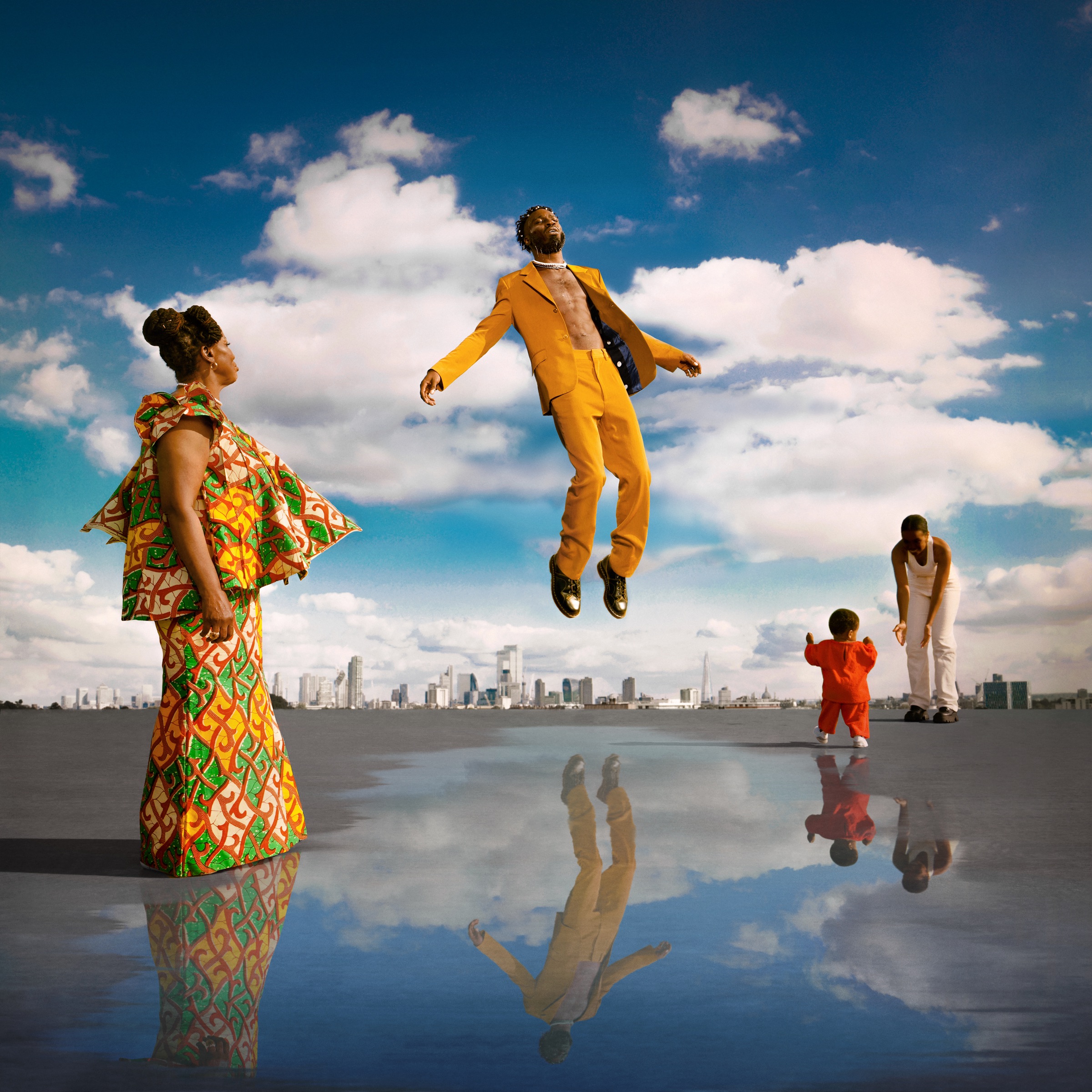
5. The Weeknd, Dawn FM
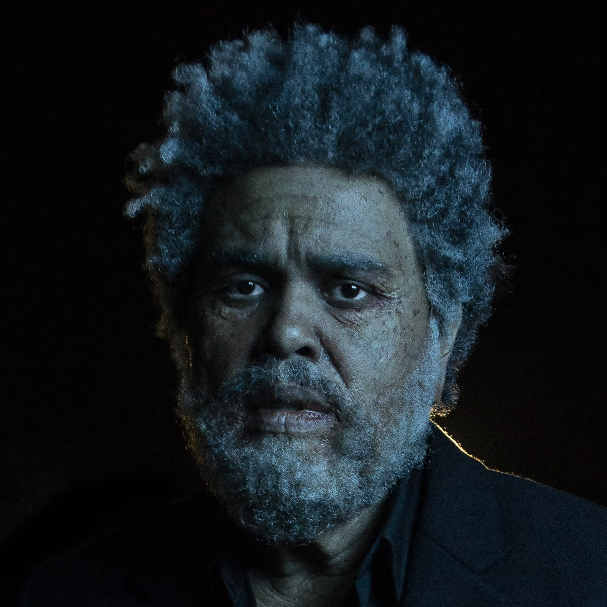
At the very start of 2022, the Weeknd surprised fans with the announcement of a new album, but revealing its cover art only left everyone more confounded. The image of Abel Tesfaye transforming into an old man didn’t exactly shed a light on the musical direction Dawn FM would take. Twelve months later, the artwork – captured by Matilda Finn with assistance from Alexander Federic and prosthetics by Mike Marino – remains one of the most memorable and striking album covers of the year without losing its enigmatic quality. In Tesfaye’s fearful expression, you can catch a glimpse of the existential despair that permeates Dawn FM’s journey, a nightmarish contrast to the blissfully retrofuturistic pop that propels it forward. Rather than worn down by mortality and grief, the Weeknd emerges with a newfound sense of maturity, and the portrait ends up signifying a kind of emotional sincerity more than just surrealism.
Of the process that led to the artwork, Finn told us: “I was lucky to be invited to listen to some of the tracks with Abel, where he explained the concept of the album – this radio station that you listen to on a road to purgatory. He said he wanted all the videos to be set in a club environment – but other than that was just an extremely respectful and free approach, I went off and pitched the video and we just got on and made it. The track he wanted me to do was ‘Gasoline’, which is my favourite track from the album too. I came up with the idea just as I concept all my work and that is by listening to the music intensely and seeing it. To me that is the purest collaboration, just let the music tell us the idea. So I saw this story between a young and old Abel, and the character of old Abel became this central figure in the album rollout.”
The photograph that makes up the Dawn FM cover was derived from the ‘Gasoline’ video. “I actually only took a few photos on set, as I was directing and it was a very ambitious shoot,” Finn added. “It wasn’t the intention for the photos I was taking to be cover art – I actually requested if I could take photos as that’s something I love to do on my projects. Abel then wanted to see what I shot and he loved this picture so much and said it would be the album cover. It just turned out beautifully and I’m so grateful for how it all came together.”
4. Black Country, New Road, Ants From Up There
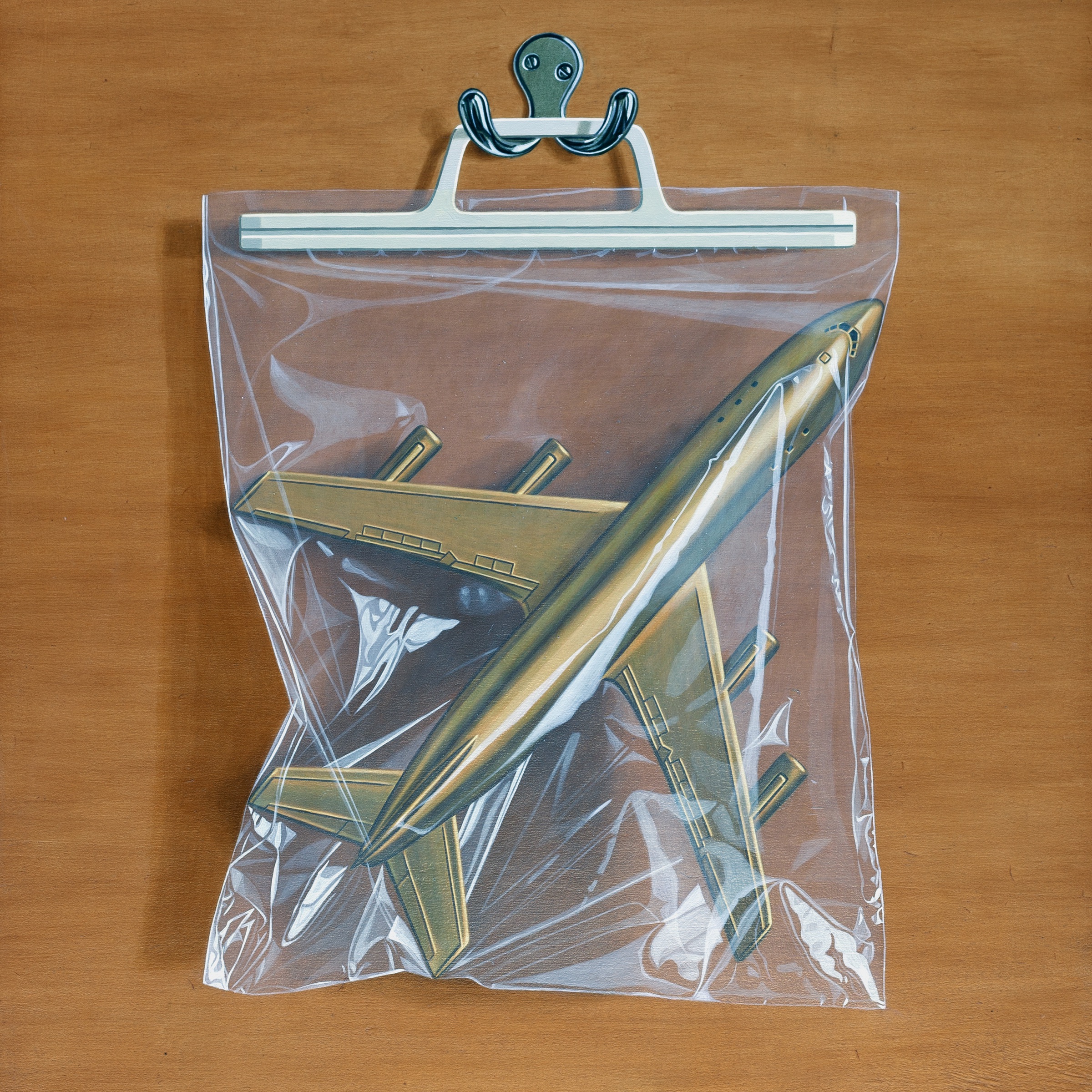
The Concorde supersonic aircraft – a scientific failure that became synonymous with the sunk-cost fallacy wherein we continue to pour resources into a project despite there no longer being a viable case for it – is such a perfectly and extensively used metaphor on Ants From Up There that it might come as a surprise that the cover art (which is a painting, not a photo) wasn’t commissioned by the band. The symbolism only becomes more potent when you consider that it’s part of a series of incredibly realistic works by British painter Simon Monk, in which superheroes, toys, and various old artifacts are trapped in a plastic bag, effectively crushing their imaginative potential. Although Black Country, New Road reach dizzying heights on their final album with lead vocalist and guitarist Isaac Wood, the stillness of the image is both haunting and hopefully ambivalent.
“Having my images used as the visual identity for an album as brilliant as Ants From Up There has been a fantastic experience for me, bringing my work to a totally new audience,” Monk told us in a statement. “The album cover painting was selected from my portfolio by the band rather than being commissioned as a new piece so it was made a while before the album was written. My plastic bag paintings were started as a solution to the problem of how to make a still life oil painting in the 21st century without it being boring and old fashioned. Looking at the golden aeroplane in the plastic bag now I see it as an image of frustrated desire. The potential power of the aeroplane is held in check but the bag is stretched and weak suggesting the possibility of soaring liberation.”
3. SASAMI, Squeeze
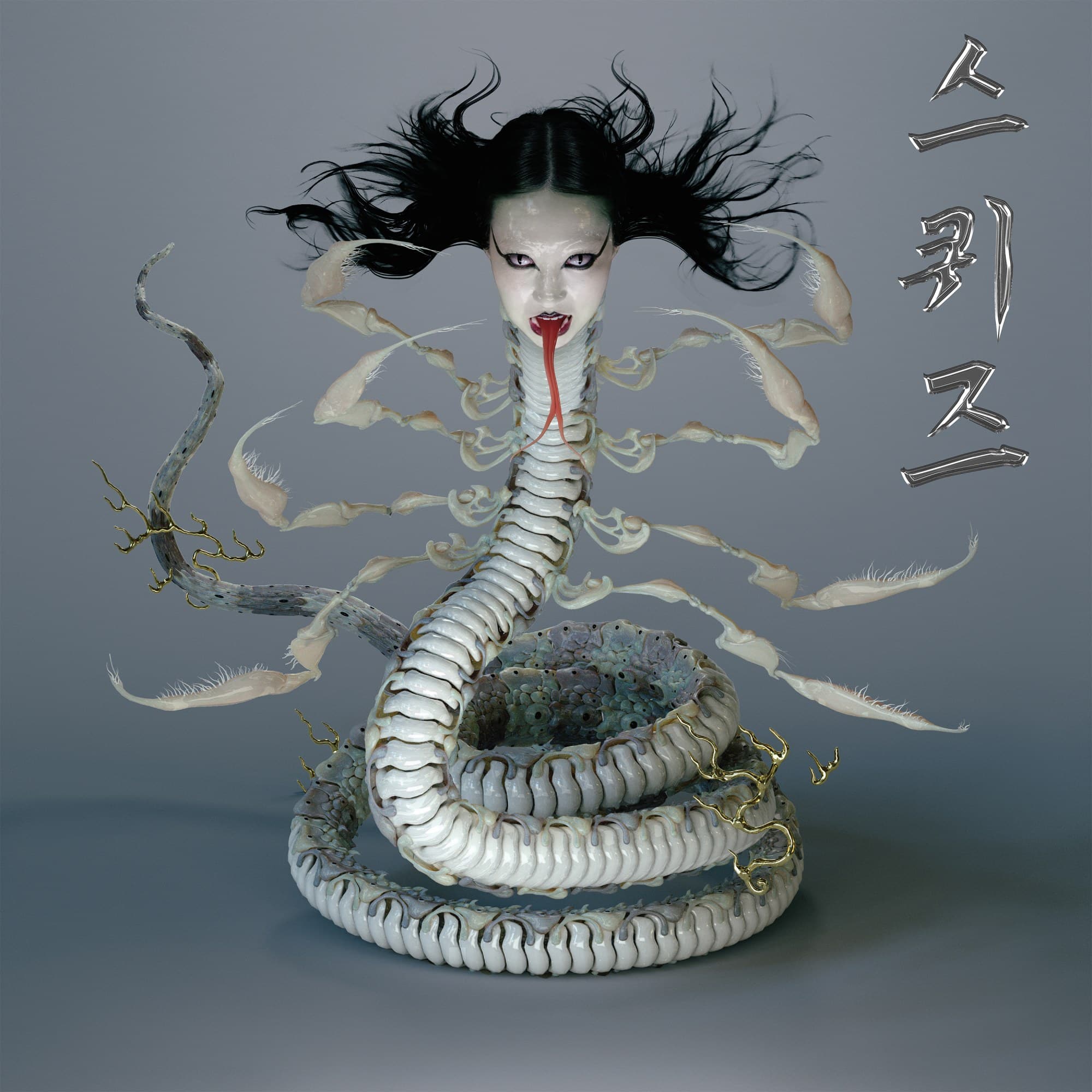
Like many of the characters artists embody in the album covers featured on this list, the Nure-onna is a symbol of multiplicity. While doing research related to her mixed Korean and Japanese heritage, SASAMI drew inspiration from the mythical creature, a kind of sea serpent with the head of a woman and the ability to either spare innocent humans or wrap her body around them, squeeze them, and drink their blood with her tongue. In the Squeeze artwork, Andrew Thomas Hwang not only explores the figure’s duplicitous nature, but uses it to depict a fantastical transformation of SASAMI as an artist.
“I think that when I started to understand and do some digging on the different accounts of the Nure-onna character, I was drawn to the visual of this feminine character who is kind of described [as having] this long beautiful hair and alluring presence,” Sasami told Nylon. “But the story goes that she’s actually quite murderous and villainous. I just like this combination of feminine and beauty mixed with villainy as opposed to victimhood. I feel like often femininity is linked with being delicate and being a victim. I liked flipping the narrative for this album that is so fantasy-based. I wanted to create my own visual narrative for this album from the get go.”
2. Björk, Fossora
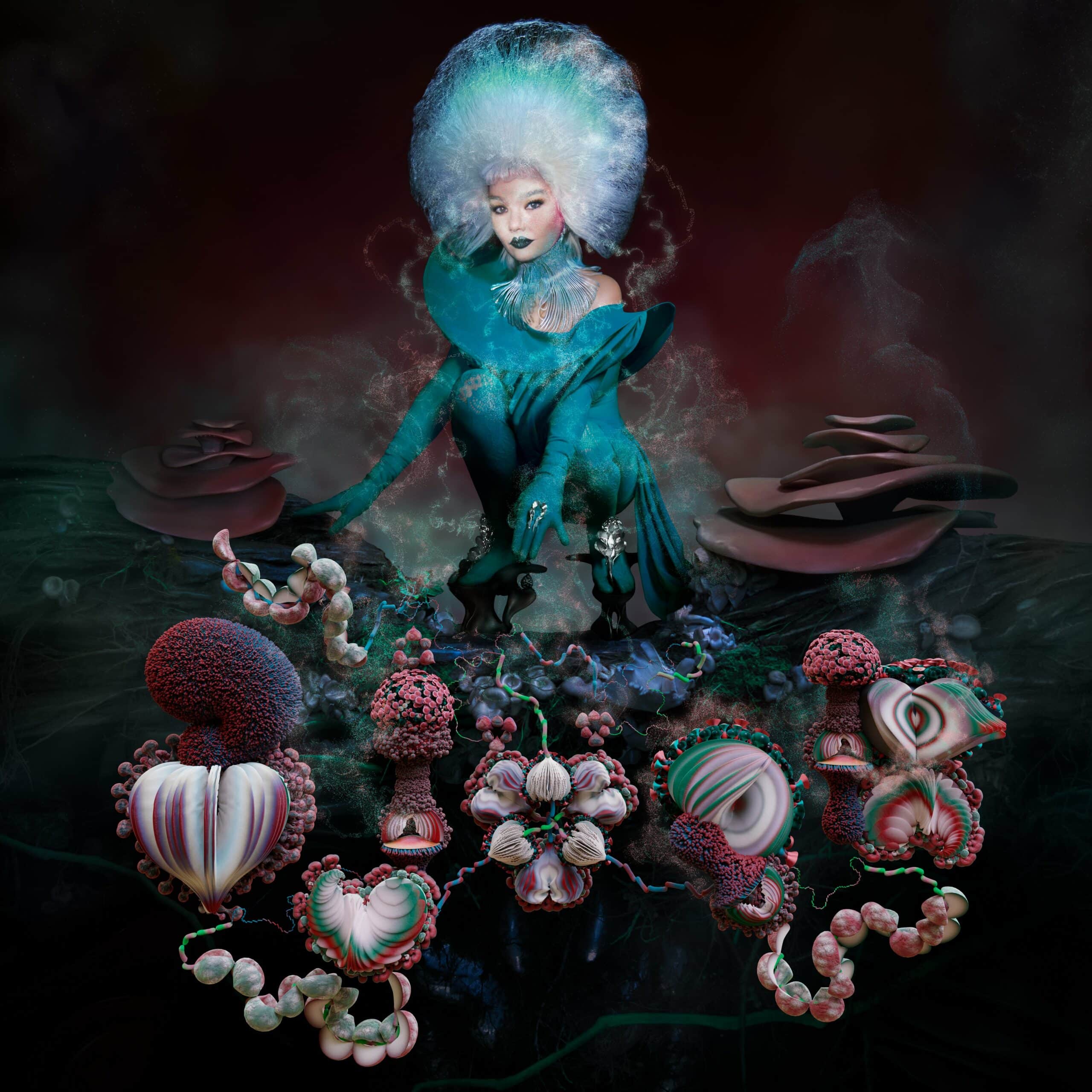
Every Björk release presents a plethora of elements worth dissecting, from the musical framework to the accompanying visual aesthetic, so it helps to mark out one distinctive feature. Fossora is, in Björk’s own words, her “mushroom album.” The icon’s obsession with fungi helped bring together the album’s themes, serving as a useful metaphor for the feeling of “landing on the earth and digging my feet into the ground.” This “return to Earth” is remarkably captured in the album’s cover, which shows Björk standing in a kind of regal position, almost alien-like, dressed in a wig that’s meant to resemble mycelium as she becomes one with the soil.
A long list of artists are credited for the artwork, which was photographed by Viðar Logi and co-creative directed by Björk and longtime collaborator James T. Merry. “The cover of Fossora serves as an almanac for the textures and timbers of the album,” Logi said in a statement to Our Culture. “Instead of focusing on a specific touchstone of the project we wanted the visuals of the cover to summarize the whole story. When planning the album cover we always knew that it needed to feel nocturnal, underground and mushroom-y.”
“It was a long, joyful process as we wanted to go to the very details of everything,” Logi added, noting that James Merry even made specific shoes for the shoot. “Overall it’s an overview of meetings and talks spanning 2 years of building the visual signature of Fossora – so when it came to plan the album cover itself we already knew what it was meant to look like since we had already spent such a long time crafting the world around it.” Like the sounds on Fossora, the result is earthy yet futuristic, fantastical in its opulence even as Björk clings to her roots.
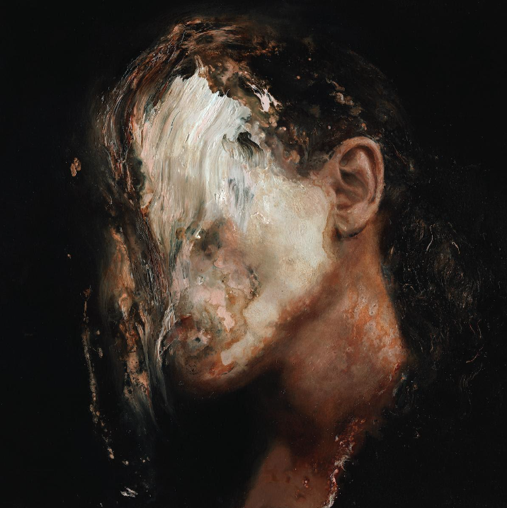
1. Perfume Genius, Ugly Season
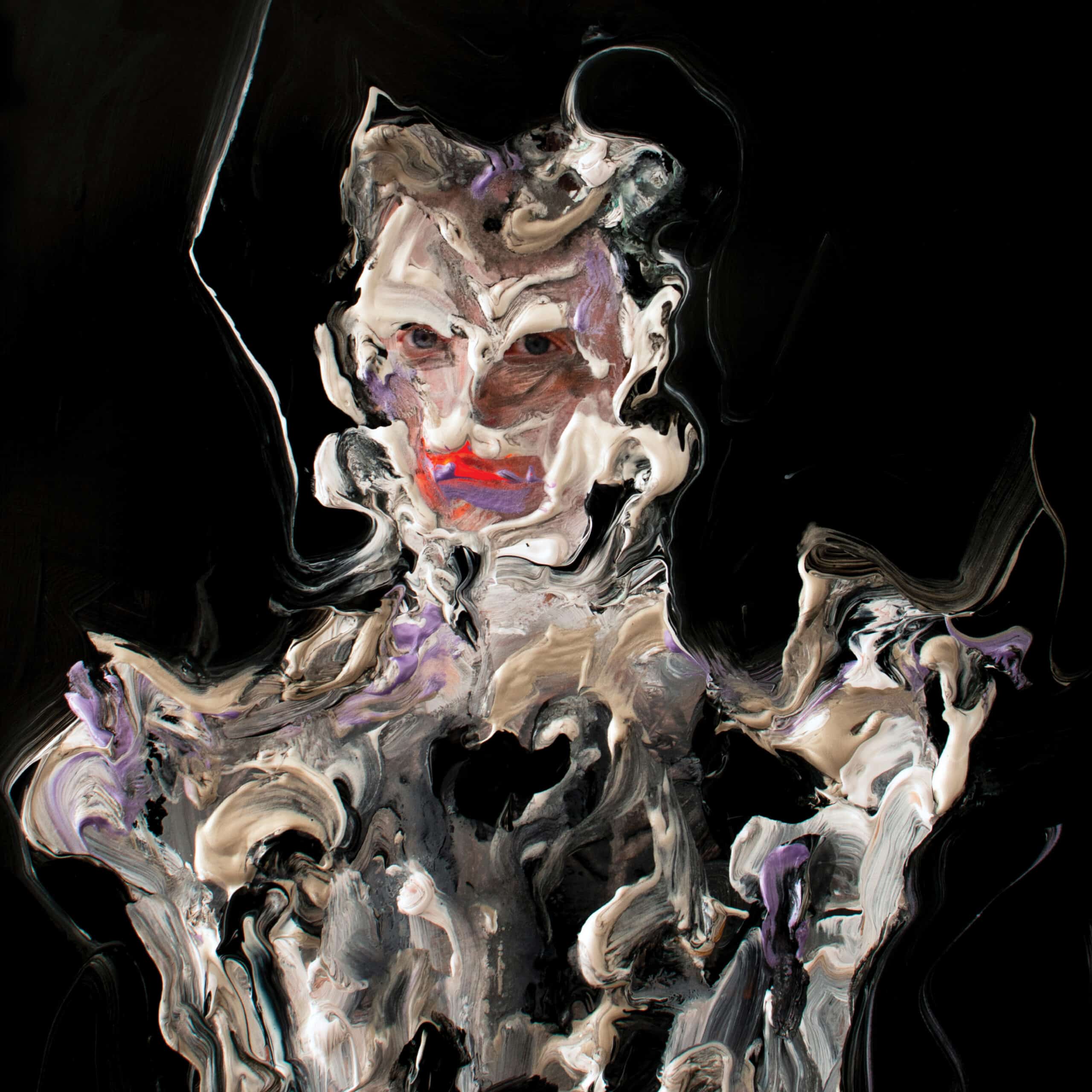
Ugly Season is a sprawling and genre-bending venture from Perfume Genius, one that finds him wandering through dark, hazy atmospheres and off–kilter textures. With a buried sense of time, Michael Hadreas revisits familiar themes in his discography – intimacy, queerness, the body – allowing them to dissolve and expand in different directions. “Listening to Ugly Season for the first time, I felt like I was entering a dream in which different sensations overlapped,” Nicasio Torres, who painted the album’s awe-inspiring artwork, explained in a statement to Our Culture. “On the one hand, its atmospheric, mysterious and sometimes dark air contrasted with a certain innocence that reminded me of a childhood of past centuries. On the other hand, his references to classical music along with pop and post-punk melodies united through Mike’s peculiar and wonderful voice moved me to a reality beyond thoughts and appearances. So I began a pictorial process where figuration and abstraction had to dialogue until we found the image that somehow reflected this premise.”
The image is enigmatic yet bold, imbued with an otherworldly transcendence that twists our notions of identity. In the act of shapeshifting, Hadreas appears both frenzied and defiant. “The cover of Ugly Season shows us a classic-style portrait of Mike dressed in some kind of suit or armor that evaporates with a fixed and penetrating gaze in contrast to a body that mutates and melts into space,” Torres added. “Through a dark atmosphere, the painting transcends Mike’s appearance to turn him into another character, strange and mysterious, beyond the apparently earthly. The disk is inhabited by different configurations of organic shapes, composed of the same paint and energy as the armor. Some abstract shapes look like somewhat monstrous animals but at the same time innocent. Like ancient fossils floating in space, accompanying Mike on this temporal sound journey.”
