
People often talk about album covers as points of entry, but they are also a means of remembering – a way of revisiting the world of an album with a single glance. To kick off our year-end coverage, we thought it fitting to highlight the album covers that have not only introduced us to new music, but also kept these albums in our memory long enough for list season. This is a roughly ranked list, but some of the albums have been placed in close proximity purely because of their aesthetic or symbolic similarities rather than any objective criteria. But they all, in different ways, have struck just the right mood or shaped our experience of an album. When we did the same list last year, only the Top 10 covers were accompanied by a blurb; this time, all 50 entries come with a short description. And to offer more insight into the process and concept behind these covers, we reached out to many of the artists featured for a written statement, or have included quotes from interviews or press materials relating to the artwork. Check out the list below.
50. Secret of Elements, Chronos

As Secret of Elements, German composer, multi-instrumentalist and producer Johann Pätzold makes music that straddles the line between modern classical and ambient electronica. Chronos, his first full-length since 2011’s Minds, journeys towards the abstract but is deeply evocative in its plaintive melancholy. The same goes for its cover art, one of many paintings Alice Sfintesco sent Pätzold, who had been a fan of her work for years. But it was the kiss that caught his attention the most; a fusion of two worlds. Alexandre Cazac, co-director of the French label InFiné, agreed that it should be on the cover. “For me it means after 10 years of working on Chronos: the conclusion. Coming home,” Pätzold told us. “There is so much inside: silence, peacefulness, hope, and freedom.”
49. Lunar Vacation, Inside Every Fig Is a Dead Wasp
Going with a title as long as Inside Every Fig Is a Dead Wasp is a bold idea for a debut album, but for Lunar Vacation, it was a perfect encapsulation of the record’s thematic throughline: bad things have to come for something sweet to grow in their place. “I figured it would be foolish of me not to show that inside every fig is a dead wasp, which was already such a compelling thing to imagine,” said Leo Horton, who painted the artwork, a pretty literal representation of the title that also hints at the playfulness and detail of the band’s songwriting. “Like the album, this scene needed to feel authentic, textured, multilayered and kind of momentous. I also hoped that like the title, it would appear surreal but be ultimately understandable.” The process involved continuously drawing the elements that appear on the cover: “At some point I had crafted eleven wasps that looked like each song felt, which you can see running down the left side of the cover. I kept drawing new figs in new styles, reworking, erasing and remixing older versions until we all felt as though this one had hit the sweet spot.”
48. Moin, Moot!
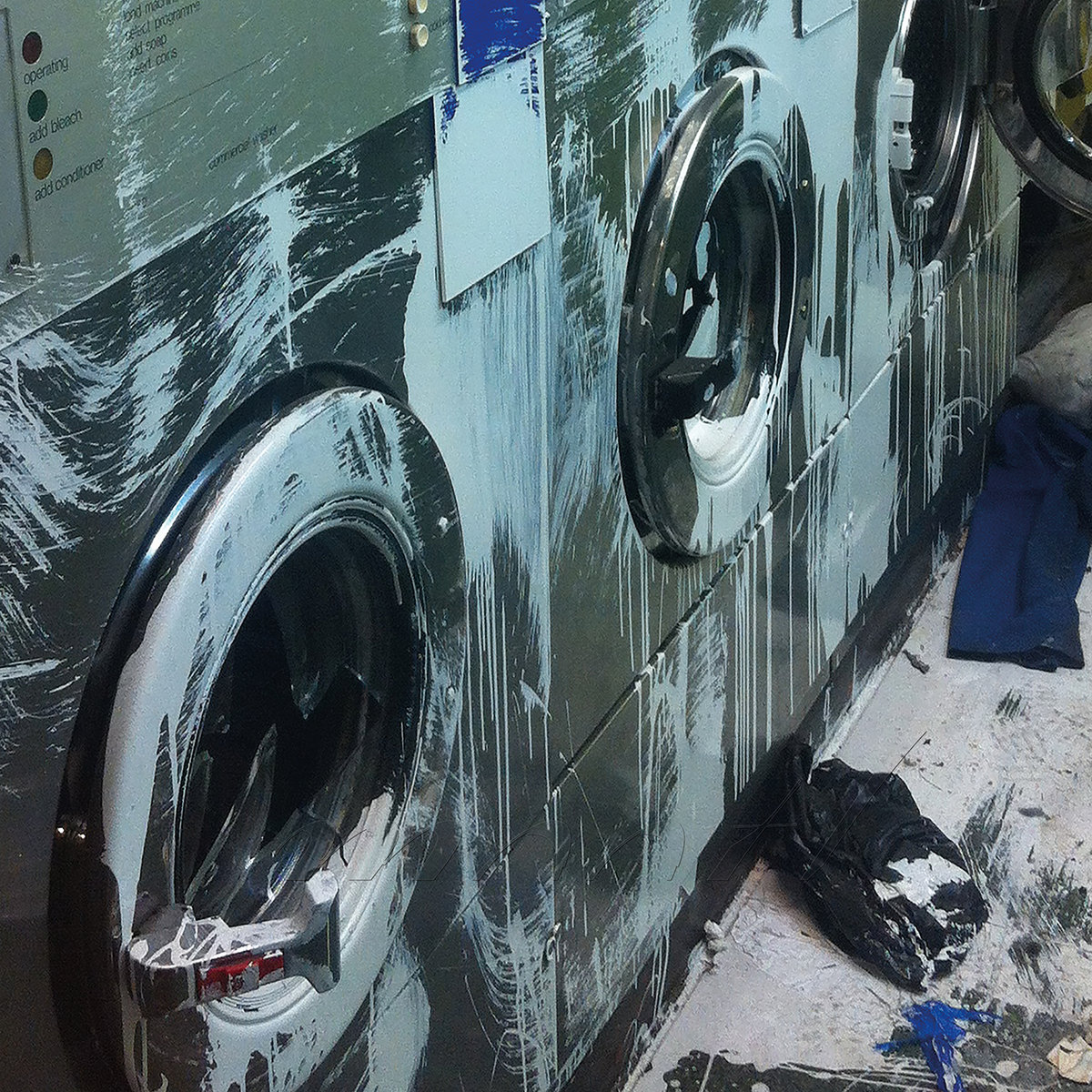
On their debut album under the Moin moniker, Raime’s Joe Andrews and Tom Halstead and longtime collaborator Valentina Magaletti channel a visceral intensity through a combination of live recording and studio techniques. The cover artwork for Moot! is as eye-catching as their music is immediate; a dozen influences pulse through the record, but any sense of familiarity or cleanliness has been intentionally destroyed. “We’re very visually-based and we work with designers, and there were a lot of suggestions floating around,” Halstead said in our Artist Spotlight interview. “This was a picture I took maybe six years ago. It was a laundrette in Hackney that had been vandalised, but in a very painterly way. By the point Andrews took a crop of the picture, it felt right. Like the samples the album is built around, the limited framing creates an enigmatic effect, but the whole is no less riveting.
47. Helvetia, Essential Aliens
Essential Aliens, Jason Albertini’s 10th album under the Helvetia moniker, was recorded at his home basement, conjuring a lo-fi aesthetic marked by a dreamlike intimacy and charm. Press materials describe it as a collection of “simple songs about keeping yourself from falling apart,” a kind of “weird blues.” The cover artwork, a painting by David A. Gaston, mirrors the sonic palette of the album, ideas spilling over the frame but thrown together in captivating fashion. But it also seems to allude to its subject matter; the story of Essential Aliens revolves around a recurring dream Albertini experienced wherein his life is upended by ghosts, and the painting can be interpreted as a particular interpretation of that ghostly presence. Familiar or not, it leaves a lasting impression.
46. The Marías, CINEMA
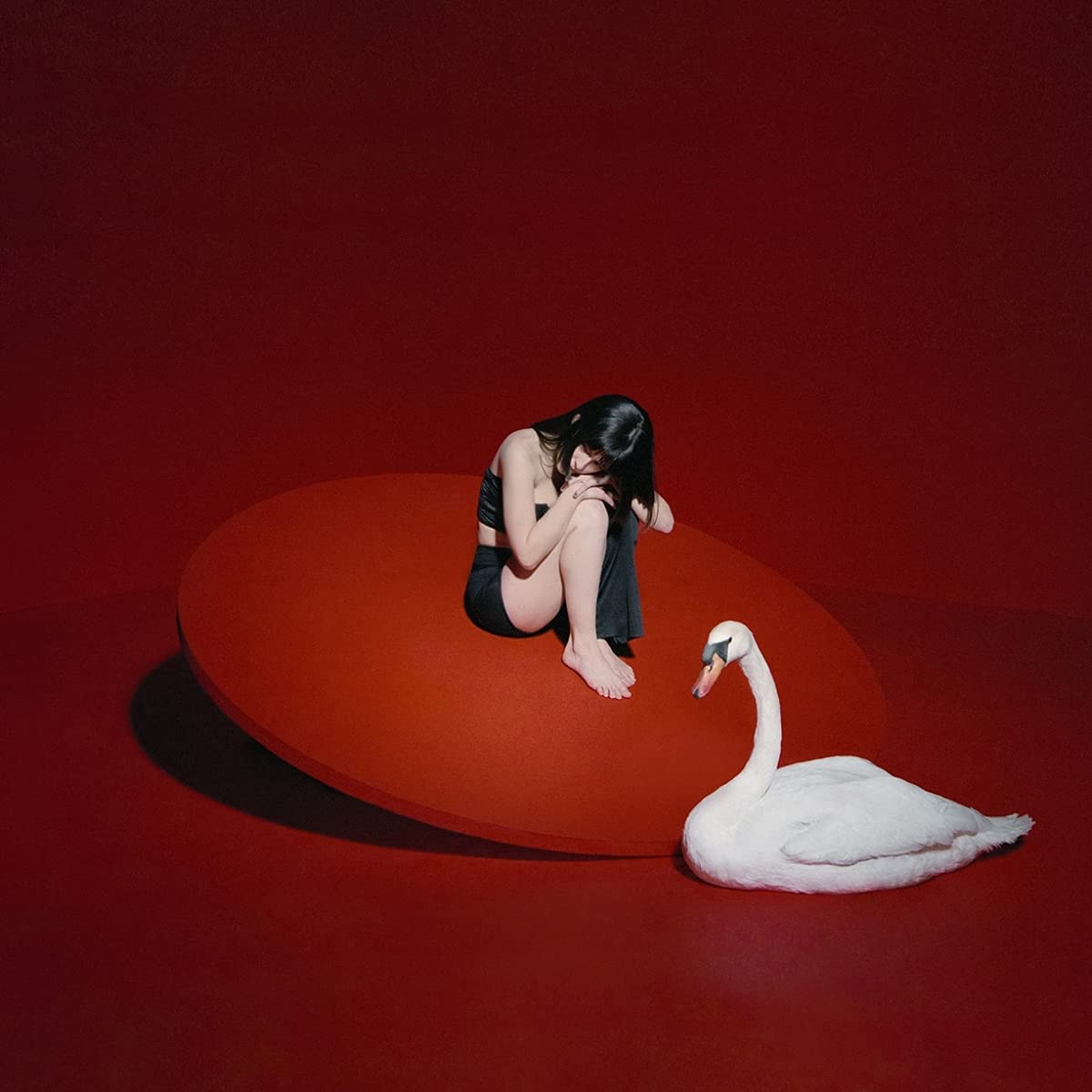
María and Josh Conway began writing music professionally in 2017, when they would write songs based on scene descriptions for film and TV. On their debut album, The Marías make their love for the big screen immediately known: the record is titled CINEMA, and the duo have cited influences such as Pedro Almodóvar and Krzysztof Kieslowski, which also seep into the album’s eye-catching cover – an image of María enveloped in a sea of red, with a white swan perched next to her. Photographed by Noah Dillon, it becomes an early tell of the overt romanticism and nostalgia that lies in the music, but there’s also something dreamlike in its ambiguity. After all, in their own words, The Marías’ goal is “to transport listeners to their own little movies inside their heads.”
45. Hayley Williams, FLOWERS for VASES / descansos
FLOWERS for VASES / descansos serves as an extension or prequel to the Paramore singer’s solo debut, Petals for Armor, but it’s also the first album she wrote and performed entirely by herself. In a sense, though, it finds Hayley Williams retreating into the background, focusing on sparser arrangements and creating the space required for healing; the track ‘Descansos’ is built around a field recording and a piano. Conceptually, one of her inspirations was Clarissa Pinkola Estés’ 1992 book Women Who Run With the Wolves, a collection of myths and stories centering on the archetypal idea of the skeleton woman. “Women have died a thousand deaths before they are twenty years old… They have hopes and dreams that have been cut off also,” Estés wrote. “Anyone who says otherwise is still asleep. All that is grist for the mill of the descansos.” These are stories of personal resonance, but in contrast to the cover for Petals for Armor, the FLOWERS for Vases artwork – a photograph by Lindsey Byrnes – focuses on striking a mood that is more ambiguous and abstract, a symbolic representation of grief and its effect on the body. Surrounded by her descansos, death and rebirth become one and the same.
44. Small Black, Cheap Dreams
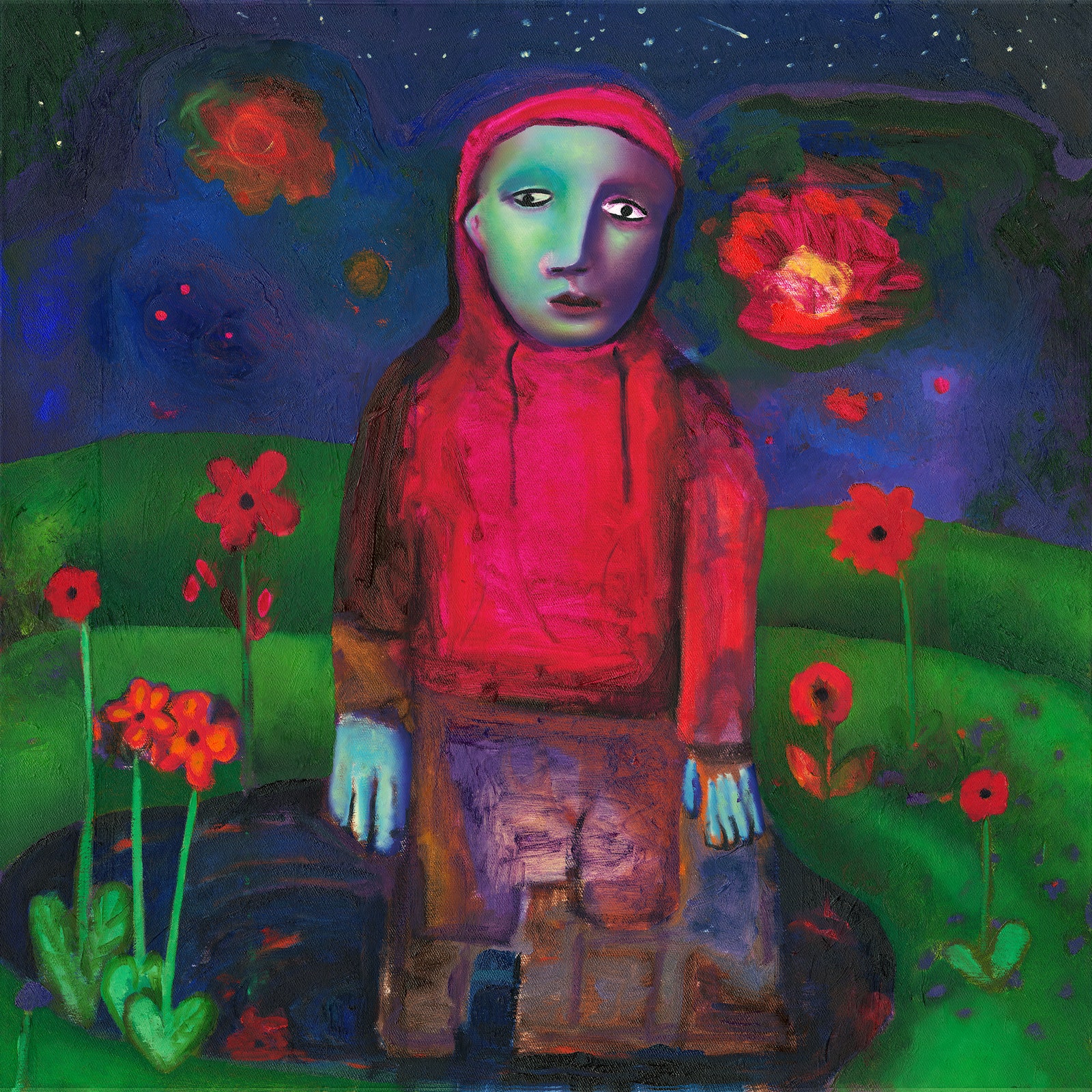
‘Duplex’, the lead single to Brooklyn-based chillwave outfit Small Black’s first new album since 2015, was written and recorded way before the world went into lockdown in March 2020. In a press statement, singer Josh Kolenikthe explained that the song’s lyrics “the absurdity of feeling alone amid the 9 million of us in NYC and yet suddenly, we were all isolated without much of a choice in the matter. In those weeks spent listening to the quiet out our Brooklyn windows, only broken by the occasional siren, unsure where the city or the world was headed, the song took on a new meaning.” A similar feeling seems to pervade the album’s evocative cover image, which was created by Ryan Draybuck, who also directed the video for ‘Duplex’. It is unclear what the lone figure might be searching for, whether they’re lost or simply exploring, but the perfect warmth of the flashlight, the hand outstretched as if to recognize a ghostly presence – it leaves an impression both haunting and comforting.
43. Mint Julep, In a Deep and Dreamless Sleep
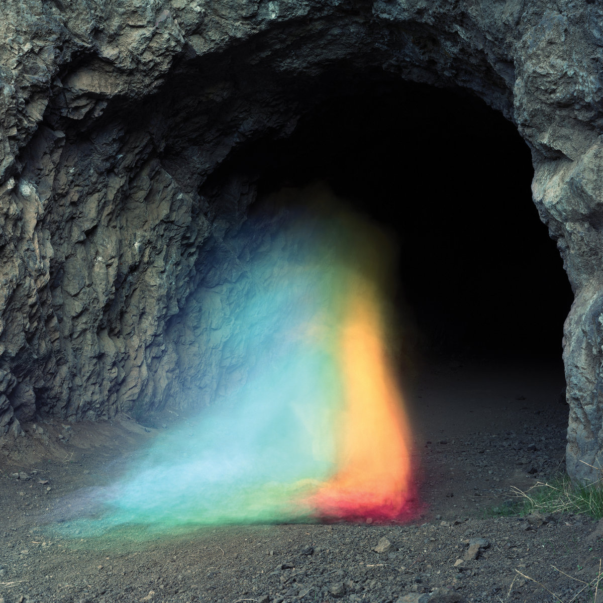
As its title suggests, In a Deep and Dreamless Sleep finds the duo of Hollie and Keith Kenniff conjuring the kind of ethereal soundscapes that will be familiar to fans of the project. At the same time, the album places an added focus on mood and texture, foregoing the verse/chorus structures of some of their past material and embracing an interpretive openness that is echoed in the cover artwork. “Hollie has a knack for finding wonderful cover images and she came upon a series by Brice Bischoff and they all had this otherworldly stark quality to them that seemed to really be aligned with the tone of the music and lyrics contained in the songs from this album,” Keith Kenniff explained. “There was one piece from his series in particular that had a great juxtaposition of a cold, rocky exterior with a beautiful colored fog/light combination that creates a wonderfully abstract form over the entrance to a cave. It’s precisely something one might conjure in a dream. The imagery is not emotionally instructive, but allows for a lot of interpretation; however, at the same time there’s elements about it (the color and the smooth flow of the shapes) that are inviting and soothing.”
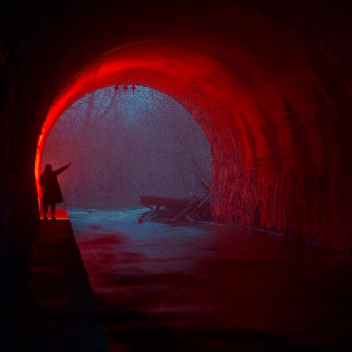
42. Clap Your Hands Say Yeah, New Fragility
If New Fragility sees the political and personal aspects of Alec Ounsworth’s songwriting naturally converge, the album’s cover image suggests the focus is really on the latter. The photograph, taken by Beth Ounsworth, may not give too much away, but despite its haziness, there is something direct, familiar, and oddly poetic about the scene on display. A similar quality ripples through the album, which Ounsworth recorded in Austin, Texas, eliciting a nostalgia you can’t quite put a finger on – a kind of delicate dance.
41. Lost Horizons, In Quiet Moments
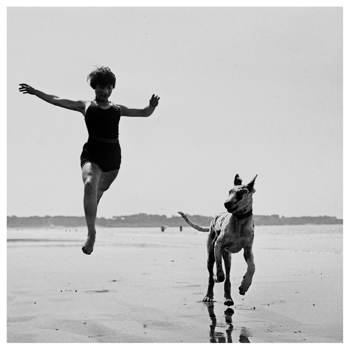
In Quiet Moments, the second album from the duo of Cocteau Twins’ Simon Raymonde and former Dif Juz drummer Richie Thomas, is subtle yet sweeping, capturing moments of contemplative intimacy that tend to linger in time. “The image I wanted to use for the album managed to convey so much of what the album was attempting to achieve,” Raymonde explained, referring to a photograph by Jacques-Henri Lartigue taken in the 1940s. “Elegance, capturing art in flight, with a backdrop of natural geographic beauty, both human and animal in accord, playfulness, solitude, and so many more things besides. When I saw it, I immediately knew that was the sleeve and no other image would suffice so I was thrilled to be able to license it from the Lartigue foundation. Huge thanks to Luke at Bella Union for ALL the accompanying parts and elements that make this sleeve art something I am massively proud of.”
40. Midwife, Luminol
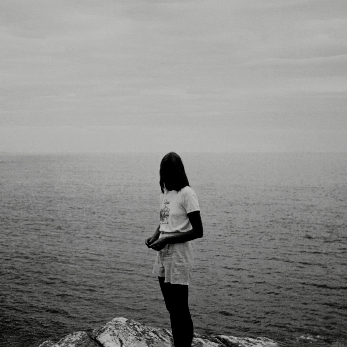
The cover image for Madeline Johnston’s enveloping third LP under the Midwife moniker, Luminol, is a picture of her mother taken in the 1980s, when she was around the same age as Madeline at the time of the album’s recording. Like the music itself, the figure is dark and elusive, its symbolic resonance amplified by the space surrounding it. “I’ve always loved this image, recently I was struck at how much it resembles me,” Johnston told us over email. “I like to imagine myself there, on some distant shore. I think standing on the edge of a large body of water conjures a feeling that I was trying to communicate with the themes of my album. The idea of the observer looking out into a void, and realizing the void is inside. It’s about the relationship between physical landscape and emotional landscape ~ returning to your truth somewhere in-between.”
39. Griff, One Foot in Front of the Other
On her debut mixtape, the Hertfortshire-born singer-songwriter known as Griff chronicles her experience of moving on from heartbreak. While the record’s bouncy synths and shiny production points to Griff’s pop ambitions and seem to hold enough power to lift her up, the black and white cover, photographed by Kerry Dean, hints at the poignant side of her songwriting, a reminder of the tentative steps taken in the wake of personal loss as well as the beginning of a new chapter. “It felt like how I feel towards everything, whether that’s my relationships with my family, with myself, with my love life or with my music career,” the singer told Apple Music. “There’s this sense of vulnerability and the unknown, and all you can really do is just put one foot in front of the other.”
38. Backxwash, I LIE HERE BURIED WITH MY RINGS AND MY DRESSES
I LIE HERE BURIED WITH MY RINGS AND MY DRESSES, Backwash’s relentless third album, finds the Zambian Canadian rapper channeling her rage into a form of defiance. But unlike other artists who trade in elements of noise and distortion, for Backxwash they become a vehicle for introspection, a quality that’s deftly captured in the album’s cover artwork. “While creating the cover art for I LIE HERE, I wanted it to carry the same crawling-out-of-one’s-own-skin feeling of the distorted beats and harrowing themes on the record,” creative director Merchant Vaporwave, aka Chachi Revah, explained. “A photograph of the artist felt like the most appropriately vulnerable way to do so.”
The reverse corpse paint Revah developed for the cover was inspired by Screamin’ Jay Hawkins, horror films, and conversations with Backxwash around identity. “One of our sources of inspiration was face paint and rituals used in her cultural heritage,” they continued. “She is half Tumbuka and half Chewa. Tumbuka Vimbuza is a healing dance, while the Chewa have Gule Wamkulu, which has some element of fear to it in both the costumes and delivery of the performance by the Nyau dancers. Backxwash’s artistry honours both these practices by sharing the horrors she’s experienced as a means of catharsis.”
37. Injury Reserve, By the Time I Get to Phoenix

By the Time I Get to Phoenix, Injury Reserve’s first album since the death of member Stepa J. Groggs, is at once direct and their most exploratory yet, fully leaning into the most experimental corners of the group’s sound. Parker Corey’s production places an added emphasis on mood and texture, sifting through an abstract and at times incomprehensible set of sounds. The result is both disorienting and immersive, qualities that are reflected in the cover art. “We went through a lot of versions before this one but once it appeared it was a different kind of instant connection with everyone we showed it to,” Corey explained. “The image itself was based on a screenshot of a poorly loaded YouTube video which happened to give it a really, really nice painterly bitrate compression across that red gradient. Then took that into Photoshop and tried to delicately add in the other elements to give it a bit more of a sense of space and exit/deserting.” In that space, both light and absence become overwhelming, distorted but true.
36. Foxing, Draw Down the Moon
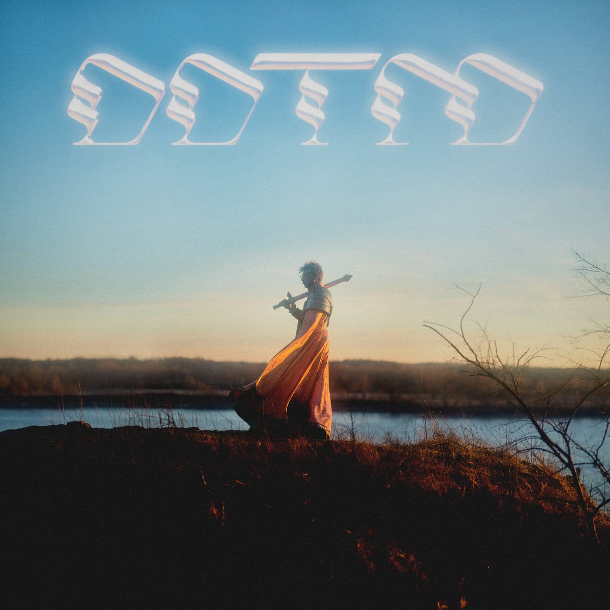
“So throw away the albatross/ Take fortune in everything/ And be the sword swinging back to the anvil that birthed it,” Conor Murphy sings on ‘Beacons’, one of the most danceable cuts off Foxing’s latest LP, Draw Down the Moon. Even simply in terms of style, the album’s cover – shot by Hayden Molinarolo – would seem to hint at the extravagance and glossy sheen of its sonic palette, a marked shift from the band’s previous albums. The bold, futuristic typography alone would be enough to distinguish it from their earlier output, indicative of the band’s sharp, pop-oriented approach. But like their lyrics, it’s also emblematic of a newfound confidence – it’s one thing that Murphy himself appears on the cover, but the fact that he yields a sword and cape is something else. The image alludes to the elements of fantasy and mysticism that have surfaced throughout the campaign, but it also just feels freeing.
35. Skirts, Great Big Wild Oak

Although the beautiful cover for skirts’ debut LP Great Big Wild Oak, predates the album itself, it shares a similar quality with the music. Alex Montenegro, the singer-songwriter behind the project, took the photo while on a hike in Mount Rainier National Park in Washington, where she was visiting a friend. “We get to this part of the trail, which is kind of like the peak point of the trail because you’re about to see Mount Rainer, and right aside from it is this beautiful pond, and I just see these people swimming in it,” she told us in our Artist Spotlight interview earlier this year. “I was just like, ‘Wow, that’s so magical. I have to take a picture of this.’” She got it developed, not knowing what she might use it for. When the opportunity arose, her memory brought her back to that moment. “For a while, we were going to incorporate drawings on the photo, but I think the day before, even after we commissioned my friend to do it, I decided, ‘Let’s just go just the photo,’” Montenegro said. It’s perfect as is: like her music, it’s equal parts nostalgic and enrapturing, and you can’t help but sit and watch as the stillness unfolds.
34. Harmony Woods, GRACEFUL RAGE
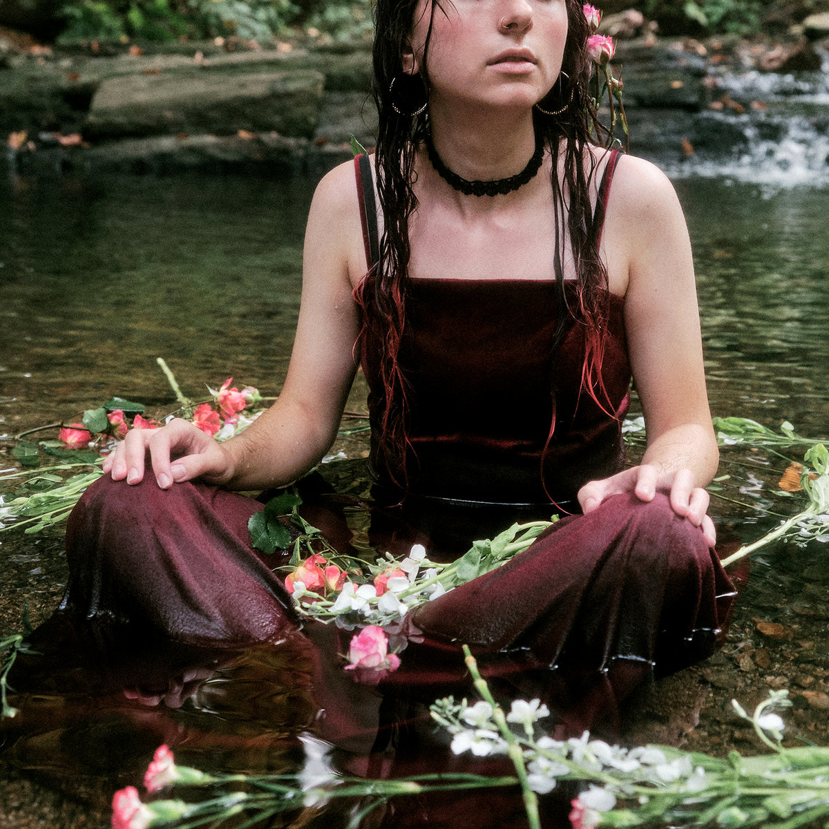
Produced by Bartees Strange, Sofia Verbilla’s third album under the Harmony Woods moniker is at once self-assured and searing in its intensity, a clear step up from the Philadelphia project’s previous records. Even as her most confident and multi-layered release yet, there is a sense that this evolution only amplifies the vulnerability in Verbilla’s songwriting; the artist has described GRACEFUL RAGE as “a record about confronting the emotional rubble that this trauma leaves in its wake.” In the deep reds of Brooke Marsh’s cover photo, you get a glimpse of the pain and anger that bleeds into its half-hour runtime. “You know I’ve spent the last 3 years/ On the verge of sinking/ Unsure of what’s been keeping me afloat,” Verbilla sings on ‘Easy’. But the image captures a moment of stillness, relief, and beauty, of fallen pieces arranged into art. Any sense of danger is kept out of the frame, but with the eyes cropped out, the feeling becomes impossible to relate. It’s a reminder that this isn’t about Verbilla, or even a certain person; it could be for anyone, and therein lies its power.
33. Darkside, Spiral
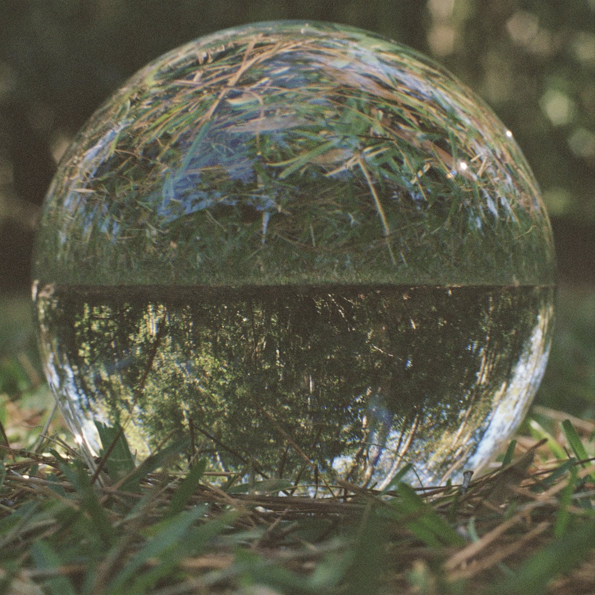
Spiral‘s atmosphere is seeped in earthy, organic tones that signal a deep familiarity with the natural world, a contrast to the alien soundscapes that permeated Nicolas Jaar and Dave Harrington’s 2013 debut as Darkside, Psychic. Jed DeMoss, who worked on the album artwork with Valentina Gonzo, explained, “For me, Spiral is a process and a fluid state, a continuous journey and an unyielding search. This surrender to evolution feels like the most important spiritual signature of the album. It was very important for me to honor this in finding an image.”
Spiral also showcases the youthful playfulness with which the duo approach their collaborative project, something the album cover hints at as well. “The image of the crystal ball on the cover is the first time it touched earth,” DeMoss added. “I subsequently shot it in all sorts of locations, but this was the first on the ground. Something about this youthful moment in the orb’s nascent life felt aligned with the music and the underlying searching quality of the music – like it is taking its first steps.”
32. Madlib, Sound Ancestors

Madlib’s Sound Ancestors is an exercise in paying attention to sound as well as mutating it. With Four Tet’s Kieran Hebden curating, editing, and arranging the songs from hundreds of recordings Madlib sent him over a period of two years, the collaborative effort becomes as much about the music’s emotional and sonic qualities as its history. The cover artwork, with its haunting, grainy effect, captures both the aesthetic and conceptual implications of the record. “Prior to working on the album I watched a documentary that explored the similarities between shapes created in cymatic (sound wave visualization) experiments and the structures of primitive lifeforms,” art director Errol F. Richardson explained. “The documentary speculated that perhaps sound could have had something to do with the origin of life. When I first heard the album title, I immediately thought about the possibility that sound could be, in a way, our ancestor. Coincidentally, I recalled that I had bookmarked an album of Richard Foster’s chladni plate photos years earlier. Thankfully, Richard was gracious enough to allow us to use several of his fantastic images for the cover.”
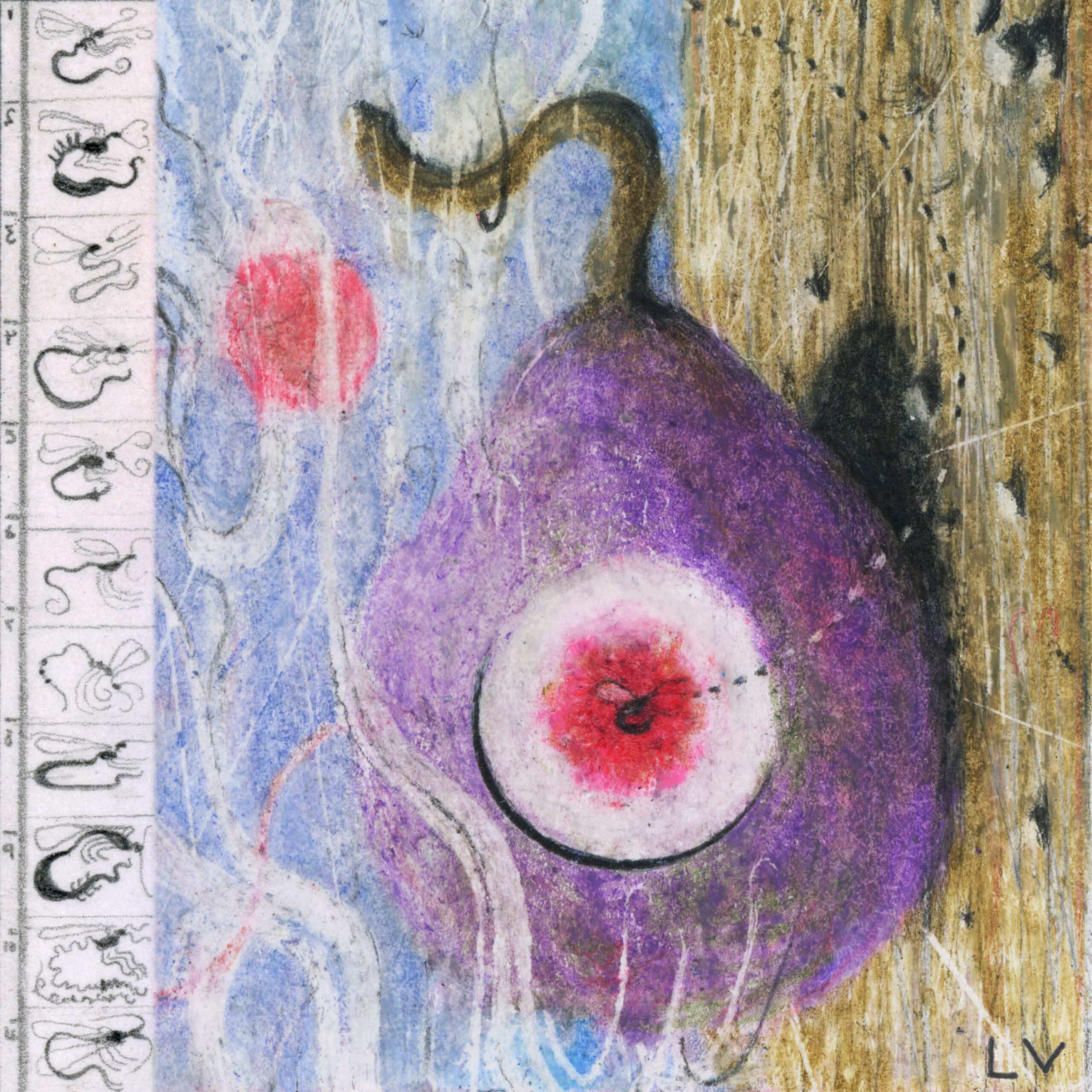
31. Kedr Livaskiy, Liminal Soul
Kedr Livanskiy’s music is grounded in the beauty of the physical world, but there are elements of it that seem to emanate from somewhere far off – whether the past or future, it’s not entirely clear. The Moscow electronic musicians beguiling fourth album, aptly titled Liminal Soul, relays an experience that feels both embodied and at times transcendental. Its cover artwork, designed by Livanskiy and frequent collaborator Flaty, was conceived as a continuation of the album’s vision, drawing inspiration from DIY covers prominent in the cassette culture surrounding genres such as neo folk, dungeon synth, and dark ambient. “I wanted to create a symbol, an icon (iconic image),” Livanskiy explained. “It was very important to convey the state of a transitional, non-articulated space and glow / shine from the darkness. It is an important idea that in dark / troubled times will still continue to exist somewhere within us. I also wanted to put a guardian symbol on the cover and asked Flaty to draw it for me.” Like the symbolism that’s buried into her music, its effect is at once elusive and enveloping.
30. Little Simz, Sometimes I Might Be Introvert
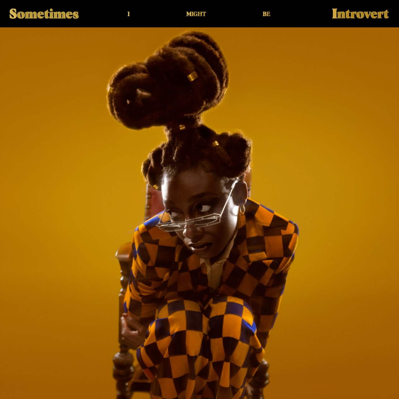
In the stylish cover for Little Simz’s Sometimes I Might Be Introvert, the London rapper sits in a wooden chair wearing a black-checkered suit, her expression betraying a hint of nervousness. Capturing her in what seems like a subtle moment of introspection, Nwaka Okparaeke’s photo feels apt for an album that stuns in its ambition and beauty without shying away from emotional vulnerability. The setting is one of royal elegance, but Simz’s posture suggests a sense of uncertainty with the position she’s found herself in – curled up as if to take up less space, unable to hold her head high. “I hate the thought of just being a burden, I hate that these conversations are surfaced,” Simz raps. “Simz the artist, or Simbi the person?” That might as well be the question swirling around in her head in that moment, but the picture seems to magically reveal both sides.
29. claire rousay & more eaze, an afternoon whine

In an afternoon whine, the gentle intimacy that has marked both claire rousay and mari maurice’s output is infused with a vivid kind of joy. Though not their first collaboration, the 30-minute release is the first project they made in the same room together, so any interaction of ideas takes on a natural, tangible quality, spilling over the frame. “We were looking for something that could visually represent the comfortable and confusing musical collaboration between us,” rousay explained, and the cover photograph, by Grace Herndon, seemed fitting. Like the music, it zeroes in on a perfectly small moment, arranged only so that it feels even truer. “Claire and I grew up together and I’m always honored when she reaches out to collaborate,” Herndon told us. “The cover photograph is intimate; sharing a blanket in the grass, a cigarette, a draping hand. And it is also constructed; colors too coordinated, a removal of the subject’s identity. There is a closeness and a distance, organic and artificial. To me, these themes parallel and complement the album really beautifully.”
28. Cosima, THE FUN IS HERE?

According to Cosima, the cover artwork for THE FUN IS HERE? sits at the opposite end of the sadness explored on the EP’s songs. “I wanted it to feel like the promises of joy that taunt you but somehow also comfort you when you are in emotional turmoil,” the London soul singer explained. “I spent 3 days in a picture reference library in January when it was snowing outside researching imagery of old holiday brochures and travel advertising; images of towels, beaches etc. I knew that it was the starting point for the world I wanted to build.” Inspired by Gidget movies and TV episodes, the end result also hints at the escapism that drove the project’s creation. Cosima might have drawn from lyrics she wrote on the walls of her bedroom and office, but the EP finds her somewhere else, in what seems like a state of total freedom and attention. “There’s someone stood across the ocean/ Waiting for me to come home,” she sings on ‘Philly’. The cover photograph, captured by Max Barnett, distills this ocean of time into a single image.
27. serpentwithfeet, DEACON

The album cover for DEACON shows serpentwithfeet embracing another Black man, illustrating the tenderness that seeps into every corner of the album. “I originally approached this project wanting to make something that felt very sensuous,” he said of the LP in a press statement. “Something a lot softer, a lot more gentle than my previous work. I wanted to create something that felt calm and restrained. This was my way of tapping into the energy many deacons possess.” The same energy emanates from the cover image, with its hazy backdrop and light colours; the framing is direct in its intimacy yet remains suggestive. For a deeper view of the feelings DEACON contains, it seems to say, have a look inside.
26. PACKS, Take the Cake
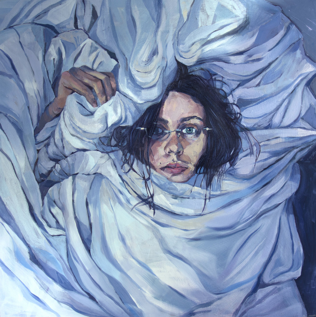
Madeline Link started writing the songs for her debut full-length as PACKS in 2019, while she was living in Toronto with her sister, Eva Link, and completed the album after they had to move back to the Ottawa suburbs in the spring of 2020 to quarantine with their parents. In our Artist Spotlight interview earlier this year, Madeline explained that she doesn’t really differentiate the tracks in terms of when or where they were written. The cover artwork, done by her sister, zeroes in on the feverish, dreamlike intensity that drapes over the songs, irrespective of their context or sonic differences.
“I knew I wanted her to paint something for the cover, and we both were talking about what state of mind provoked all of those songs to be written, what was the common thread of all of those songs,” Link said at the time. “And the common thread is that they were all written in a state – I have to kind of make sure that no one can really hear what I’m doing. So me poking my head out of a mess of comfy sheets, it’s like a visual metaphor for what those songs make me feel. When I write a song, it feels like I’m enveloping myself in a physical manifestation of comfort – even though a song isn’t a physical thing, it feels physical when you’re writing and playing a song.” In the same way, the cover painting feels like a truer representation of this state than a photograph could ever be.
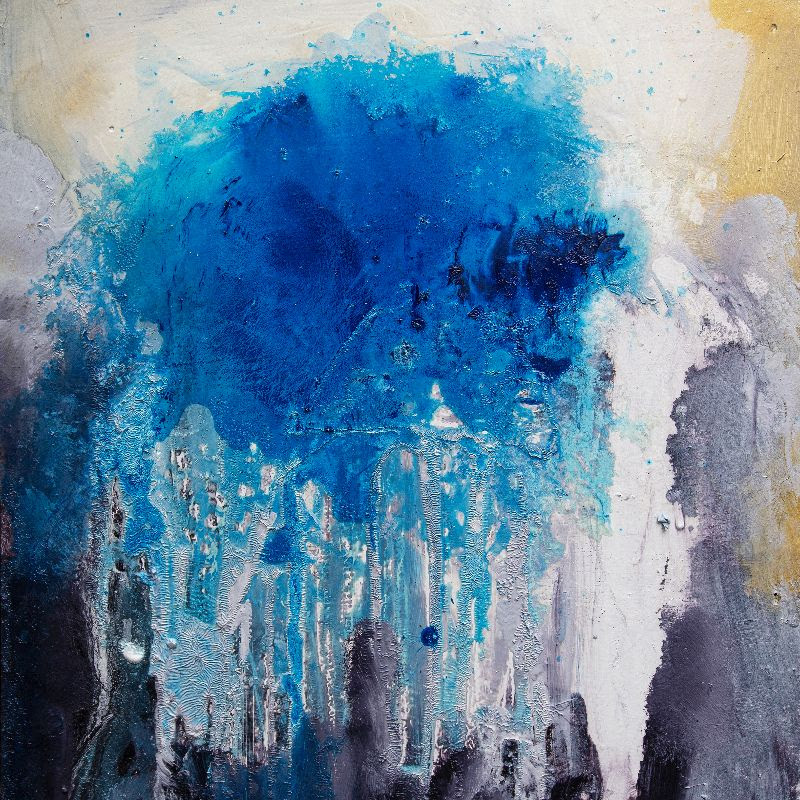
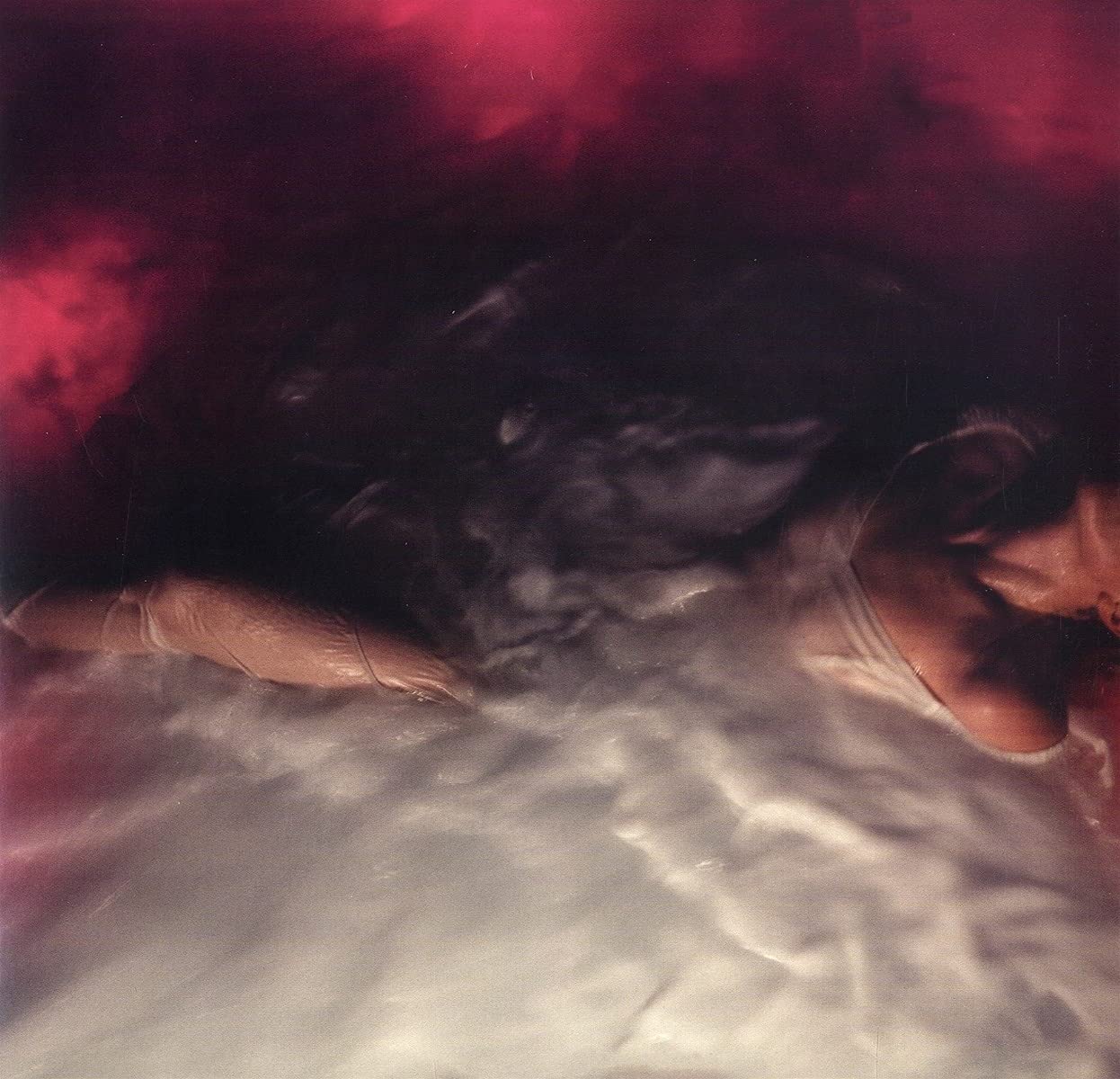
25. Tristen, Aquatic Flowers
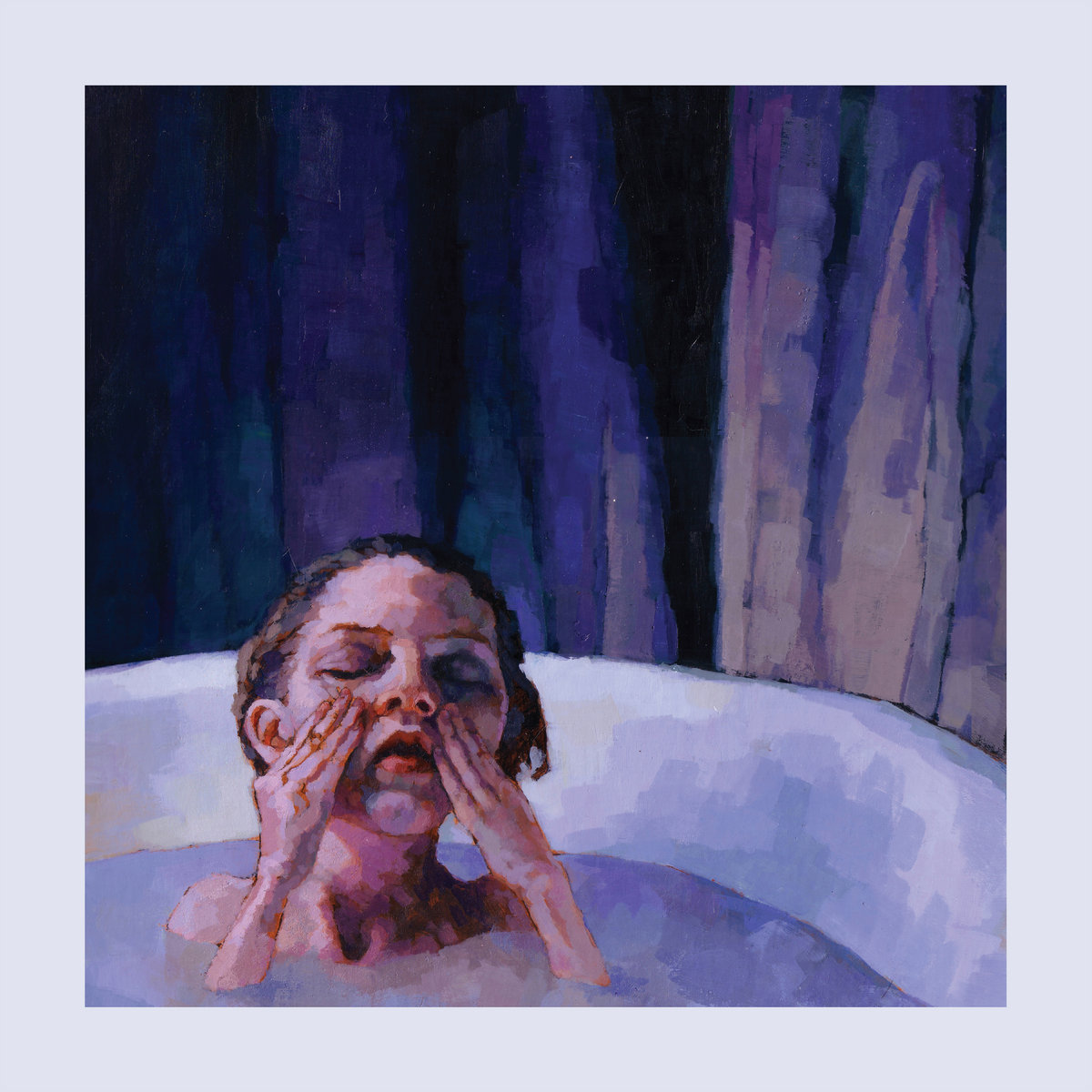
Nashville songwriter Tristen self-produced her fourth album, Aquatic Flowers, with her husband and musical collaborator Buddy Hughen in their home studio, dubbed Tight Squeeze. It was during this time that she found herself drawn to a painting by Megan Kimber, whose emotionally striking imagery is closely aligned with the qualities of her music. “The painting felt isolating, calm, and introspective in deep blues and purples,” Tristen said. “I kept this image as I collected songs that would become Aquatic Flowers, a phrase I also kept as a working title, which also seemed to fit the painting. I was growing a baby through writing and recording this record and when the record was finished, the pandemic hit and everything on the record felt almost ahead of its time and also right on time. Most of us would spend the next year simplifying our lives into small self care routines like soaking in a hot bath. Most of us would find ourselves lonelier than ever.” The portrait of the girl in the bathtub concentrates on a moment of solitude but gives texture to the darkness that clouds the mind, and when you sink into a similar state, the subject might as well be you.
23. Sad Night Dynamite, Sad Night Dynamite
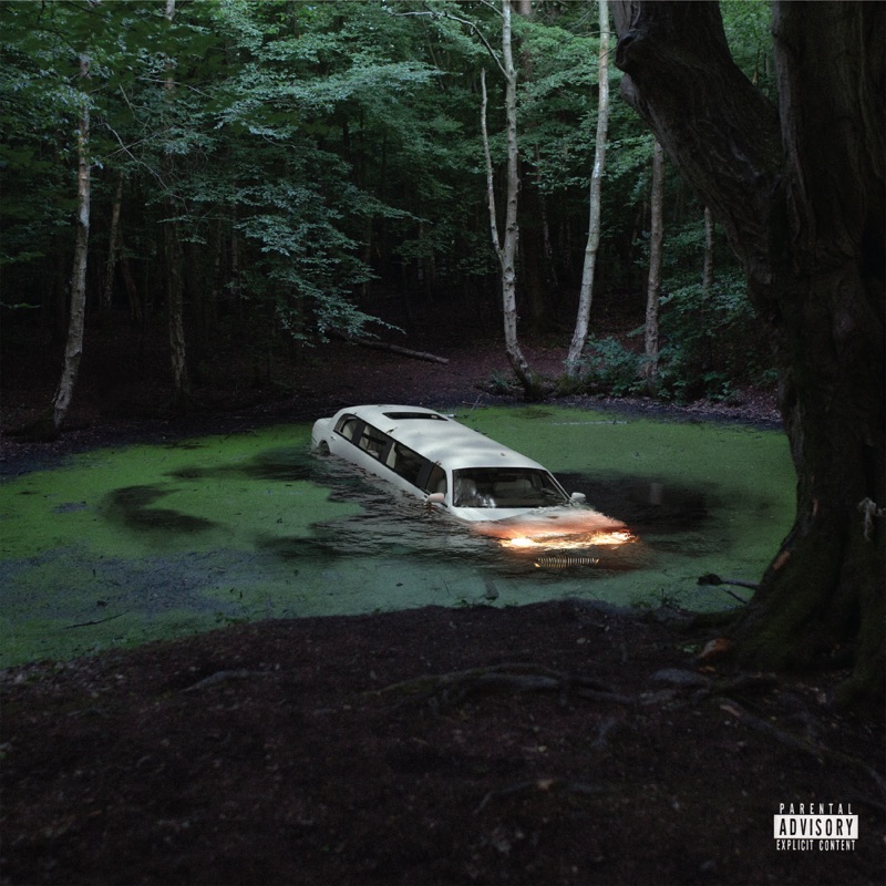
At once cinematic and lo-fi, Sad Night Dynamite’s debut mixtape is steeped in elements of fantasy that seem to have sprung from a dystopian nightmare. The visuals for the UK duo have been closely interlinked with the shadowy atmosphere of the music; the cover for their self-titled project features a white limo that has become a recurring symbol in their work, an unsettling image that was fleshed out into a story with the Alfie Dwyer-directed video for ‘Krunk’. “That visual is the centrepiece of the first mixtape and it represents us in a weird way. You can hate it if you want but once you get inside, you can’t help but love it,” Josh Greacen told NME, with his bandmate Archie Blagden adding: “it’s just so obnoxious, cinematic and so twatty. Plus I’m getting used to being taken around in limos, so it’s not going away anytime soon.”
22. The Weather Station, Ignorance
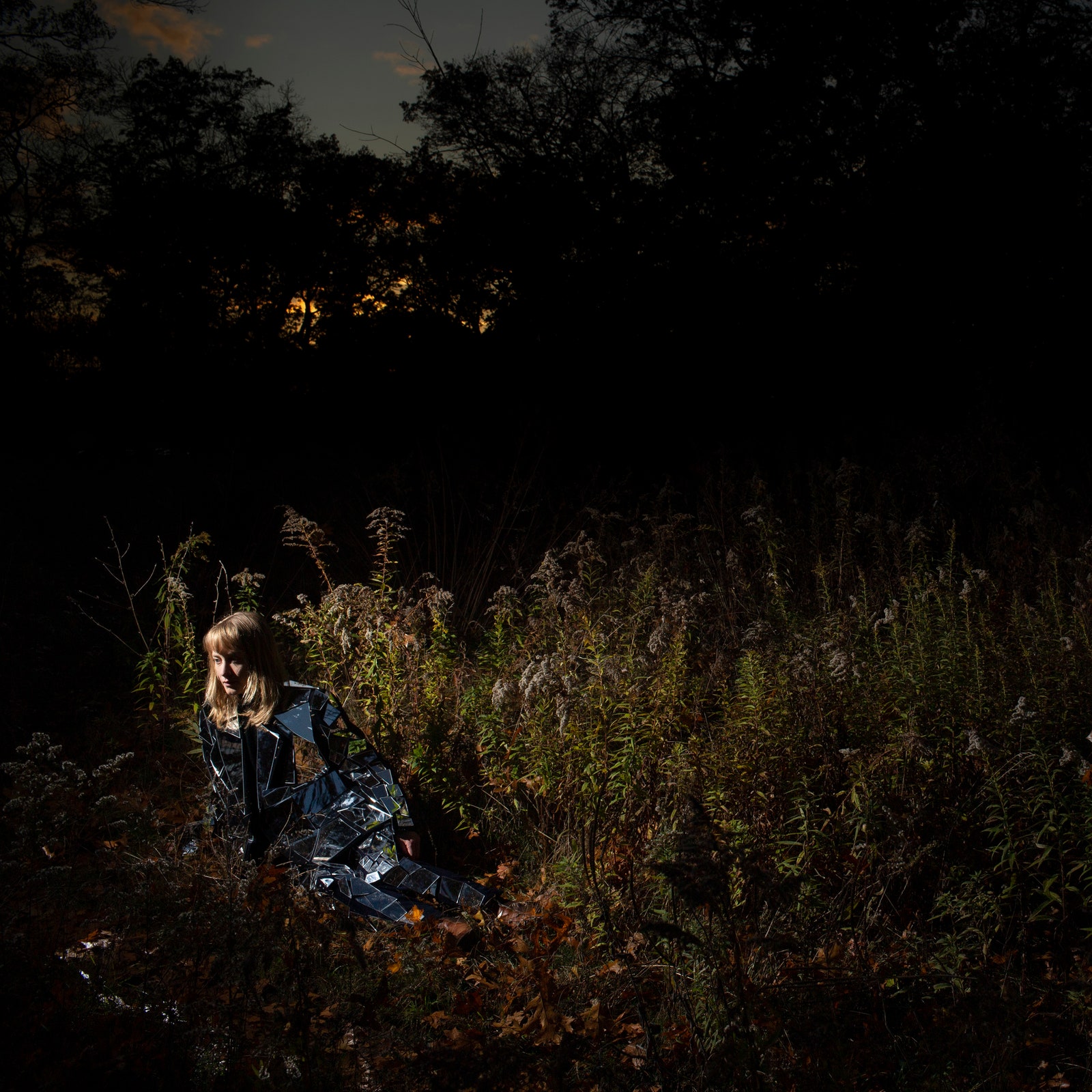
Tamara Lindeman had various things in mind when thinking about the artwork for her fifth album under the Weather Station moniker, Ignorance, which was partly written in reaction to the global climate crisis. “I knew that I wanted the cover to be complicated, and organic—like when you look at a marsh, or a pond, and there’s a lot of complex forms,” the Canadian singer-songwriter told Hook Journal. She was drawn to the way darkness sat underneath a painting by Brueghel the Elder that she saw at the Art Gallery of Ontario. She also knew that she wanted to be on the cover, but in a way that her figure would blend into the landscape, and wearing a mirror suit she had made achieved the desired effect.
She reached out to a photographer named Jeff Bierk, who agreed to work with her and infused the picture with his own style. “We took the photo in Hyde Park, which is just a big city park in the west of Toronto, but they let parts of it grow wild,” Lindeman explained. “Jeff was the one who came up with the lighting technique—it was midday when we took the photo, but he took it with a really strong flash and a really fast exposure, so it looks dark. I think it is a pretty good depiction of the sound of the album because it’s dark, but it’s light, it’s like night, but it’s day, it’s dramatic, but calm. That ambiguity is the exact feeling I wanted, and is a part of the theme of the record. When I saw the photos, I was instantly reminded once again of these old masters paintings. That perspective of the blue skies through the trees is my favourite part, because it doesn’t feel real—it’s perfect.”
21. Lala Lala, I Want the Door to Open
On her third LP, I Want the Door to Open, Lala Lala’s Lillie West dives into an exploration of identity; the way our and other people’s perception of it can distort how we experience the world, particularly when fed through the virtual space. “I was thinking a lot about this avatar concept, avatars we create for ourselves or other people create for us,” the Chicago musician explained in our Artist Spotlight interview. She wanted the cover to be “something that was slightly off, like you recognize it but it’s not true. It’s kind of in between a photograph and a painting.” Notably, the cover art for 2016’s Sleepyhead is a painting, while that for 2018’s The Lamb is a photograph. To capture this liminal state, she gave the artist Jane Kilcullen clues relating to the album’s lyrics, like the scissors and the rabbit. They remain fragments, not pieces to a puzzle, directing your attention to the only thing that appears recognizably human. “I wanted to create an uncanny representation of the record,” West said. “The central figure is like an uncanny me, in my uncanny world.”
20. Magdalena Bay, Mercurial World
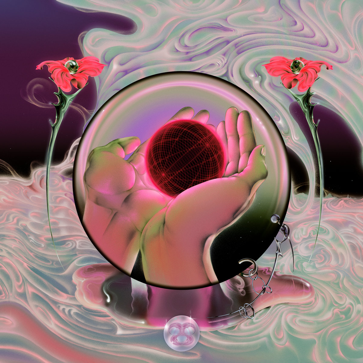
From the music to the visuals, everything Magdalena Bay create forms its own self-contained universe, as nostalgic as it is mystifying. Their debut album, Mercurial World, is their most fully realized and ambitious effort yet, accompanied by a Y2K-style website filled with old-school GIFs, cryptic messages, and scientific illustrations. But the album’s stunning cover artwork, by Ram Han, manages to encapsulate their aesthetic by offering a portal to that world in the form of a single image: two hands inside what looks like a crystal ball holding another spherical shape. It’s a symbol that can be traced back to their mini mix vol. 2 project: “I looked in my crystal ball/ Asked the mirror on the wall/ Evil men will always fall,” Mica Tenenbaum sang on ‘Nothing Baby’. On Mercurial World, it seems to exist in an altogether different dimension, but it’s once again tied to the promise of truth – on their website, a crystal ball icon directs visitors to a text box: “Tell me, what do you wish to know?” The mystery is never solved, but you want to escape into it anyway.
19. Loraine James, Reflection
Loraine James’ third album, released via Hyperdub, is at once dizzying and soothing, a collection of sounds that bend, swirl, and fuse into a seamless whole. This enhanced sense of cohesion is one of the sonic qualities mirrored in the album’s cover, which was designed by Manuel Sepulveda, a London-based graphic artist who has worked closely with the label over the last ten years under the Optigram moniker. It also reflects the dual nature that defines the record: uniquely personal and introspective, yet cryptic and guarded at the same time. James told i-D that though she initially approached the artist with a few ideas, she quickly decided to step back and leave it open to interpretation. The end result turned out to be a perfect encapsulation of her headspace. Over email, Optigram had this to say about the artwork: “With the twisted forms I wanted to show that even though reflecting on your life or self can sometimes be agonising, that process can still be illuminating and transformational.”
18. Bicep, Isles
Bicep’s music oscillates between cavernous and immediate. When the pandemic forced the Belfast-born duo to make an album suited for home-listening, it meant that the balance had to shift; Isles, their second LP, leans more heavily on an atmosphere of wistful contemplation. Studio Degrau’s cover artwork, conceived as part of “meta-environment where frozen body movements create sculptural memories of past dance moves,” was inspired by the way the album’s textures feed into complex, colourful patterns.
“By freezing moments in time as if we were Dadaist photographers capturing full movements in a frame, we’ve built a system that expresses the spectrum of emotions that live in the echo of the rhythms in the body,” they explained. “To allow movements to be seen from a distance is an act of memory, such as the state of suspension fuelled by techno on the dance floor or the memory of the sounds in the morning after. Isles has multiple covers as well as a lot of different angles of such sculptures in the overall campaign that expands the imagery of the album into the world of billboards, merchandising, announcement assets, and live performances. The fluorescent colors and direct pigments of the printed album electrify the physical nature of vinyl. They were chosen to dance, to ignite gasoline, and pulse light. A neon-flash.”
17. Dave, We’re All Alone in This Together
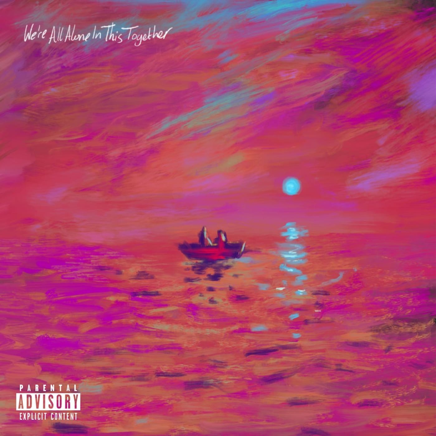
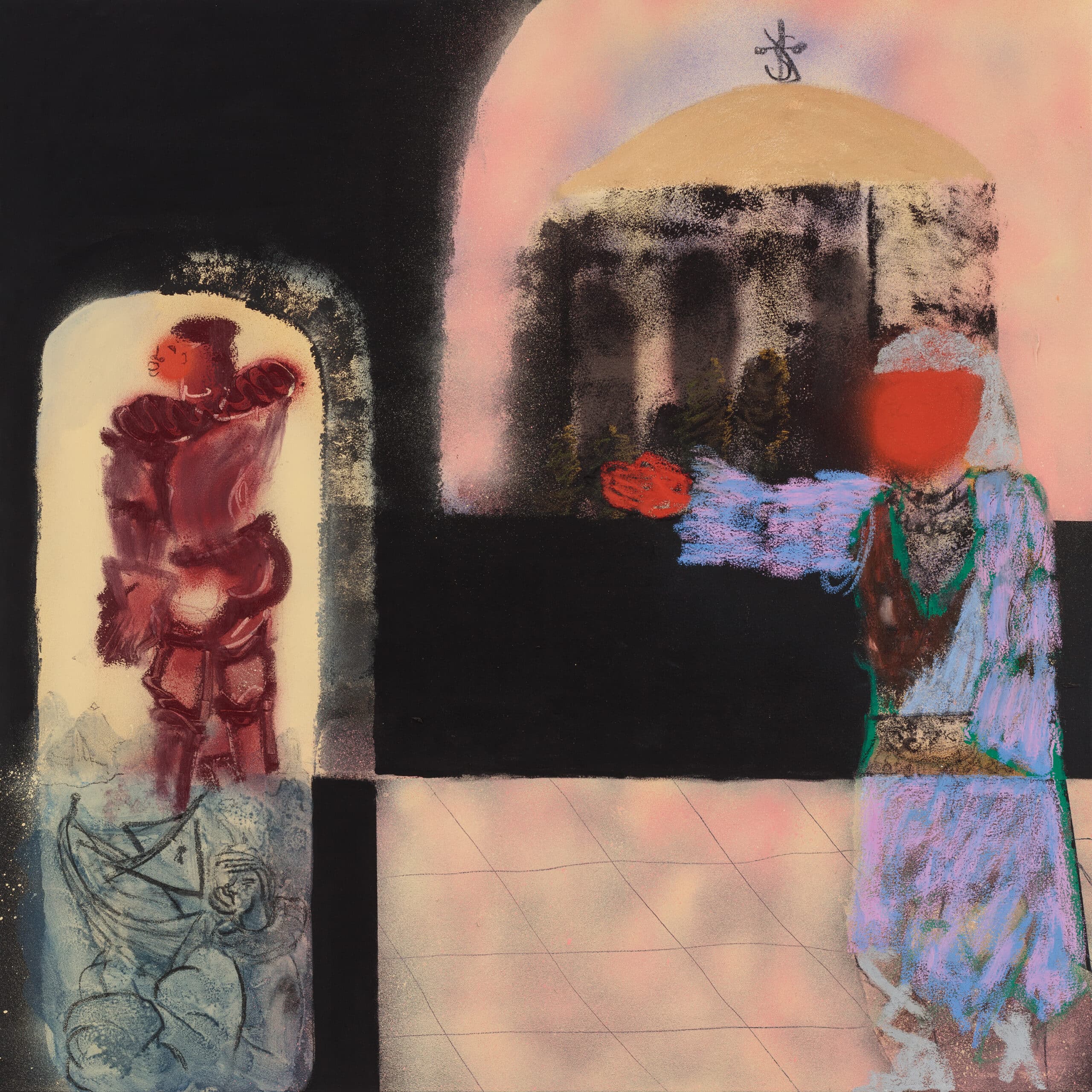
Two faceless figures grace the cover of Dave’s sophomore album, an image as evocative as its title: We’re All Alone in This Together. Like the body of water and the sky between them, they might as well be one and the same. “In the artwork, the people on the boat is me and my mum,” Dave told The Times. “As well as me and the listeners. The reflection of the blue sun is as eye-catching as the object itself, striking against a sea of violet and orange hues. The artwork, a reinterpretation of Oscar-Claude Monet’s 1872 painting ‘Impression, Sunrise’, was done by British artist Tyler Remikie, who also did the cover for Dave’s debut, PSYCHODRAMA.
“I feel like PSYCHODRAMA was me aged zero to 20,” Dave explained in an interview with British GQ. “Now, I get to go from zero backwards in time and explore stories from before, stuff that led up to the events of the first album: heritage, history, culture, my family, the countries that we come from, the regressive state of humanity in where we are now. Migration is a massive thing for me – boats, freedom of movement. The artwork represents that – the journey – all at the same time, as delivering life from the perspective of someone who has just come off the back of all this… It’s a massive change in character.”
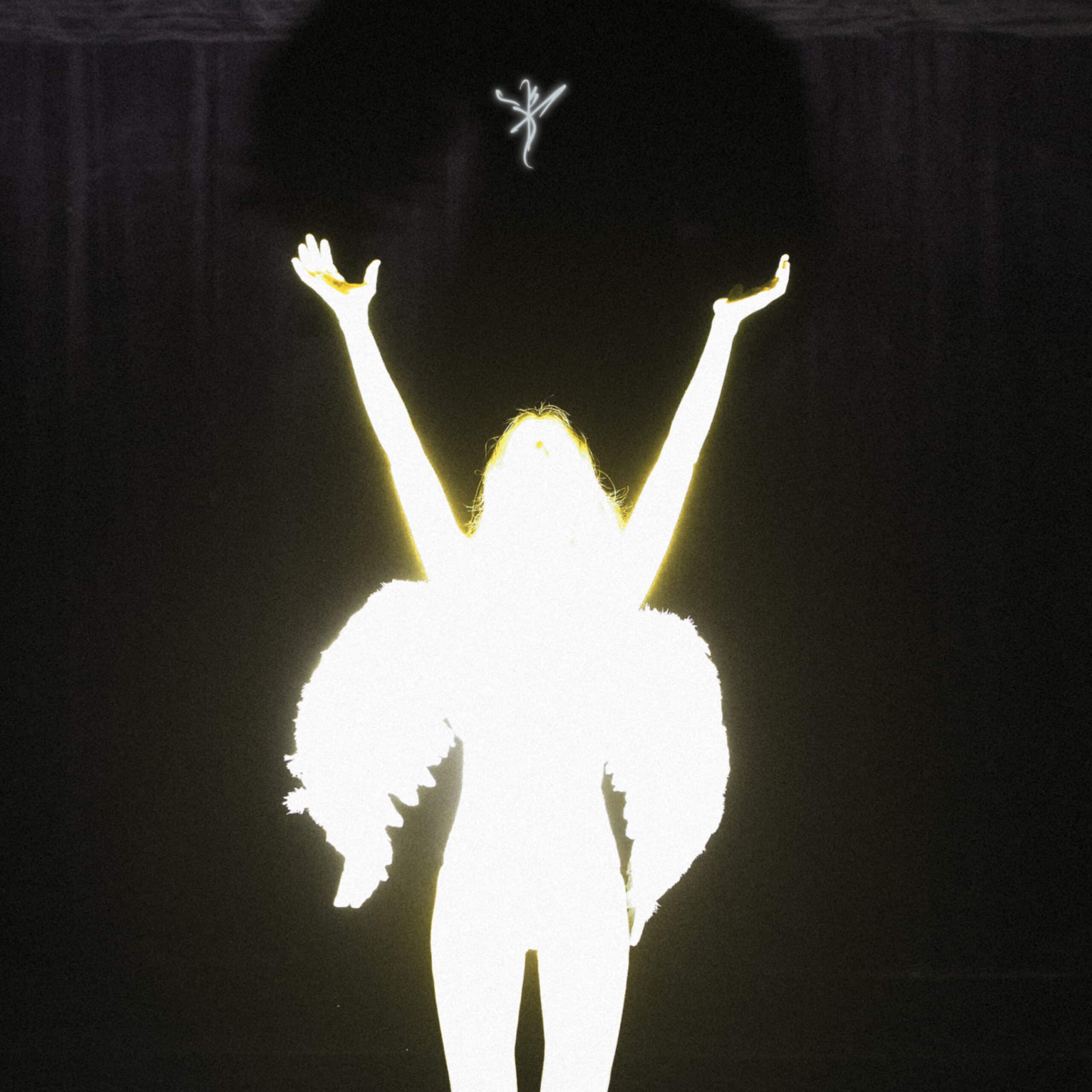
16. Halsey, If I Can’t Have Love, I Want Power
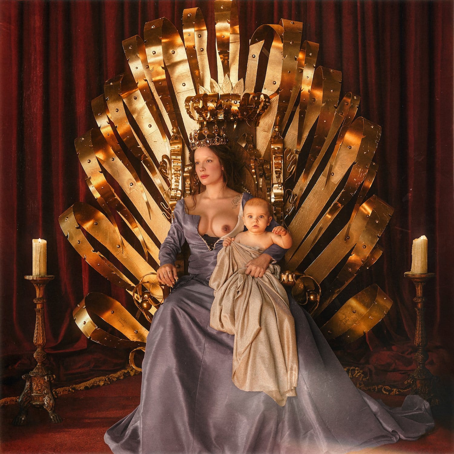
When Halsey revealed the striking cover art for their NIN-produced album, If I Can’t Have Love, I Want Power, it immediately set the stage for what was about to come. In a press statement at the time, the singer explained the connection between the themes of the record and its artwork: “This is a concept album about the joys and horrors of pregnancy and childbirth. It was very important to me that the cover art conveyed the sentiment of my journey over the past few months. The dichotomy of the Madonna and the Whore. The idea that me as a sexual being and my body as a vessel and gift to my child are two concepts that can co-exist peacefully and powerfully. My body has belonged to the world in many different ways the past few years, and this image is my means of reclaiming my autonomy and establishing my pride and strength as a life force for my human being.”
When it came to depicting these ideas, stylist Law Roach drew inspiration from a paitning by French painter Jean Fouquet titled ‘Melun Diptych’. “It was about becoming susceptible to her energy, her thoughts, her feelings, her love and her explanation of who this woman was,” Roach told Variety. The photograph of Halsey sitting on a golden was then captured by Lucas Garrido. “This cover image celebrates pregnant and postpartum bodies as something beautiful, to be admired,” Halsey added. “We have a long way to go with eradicating the social stigma around bodies & breastfeeding. I hope this can be a step in the right direction!”
15. Xenia Rubinos, Una Rosa

The story behind the cover for Xenia Rubinos’ Una Rosa is deeply entwined with that of the album itself. It depicts a music box once owned by her great-grandmother; the melody she remembers it playing is reimagined in the album’s title track. Camilo Medina, who is credited for the cover art design and layout, renders it in a way that not only captures its symbolic value, but also illuminates the qualities that Rubinos’ music exhibits; its effervescent energy, textural richness, the way she plays with sounds of the past to peer into the future.
“I wanted to encapsulate the energy of that fiber optic flower lamp my greatgrandma had in her room and found a photo of one online that I liked and asked Camilo to make a version of it,” Rubinos explained in a statement. “We worked on making the lamp feel like it was glowing and the box being crowded with flowers, some of them pressed against the plastic. I feel like the illustration Camilo made feels a bit nostalgic, fantasy but also like something a bit spooky and futuristic.” Medina added, “A big goal for me was to capture the surreal sentimental energy of the photo, more than just doing a realistic illustration of the image. I’m really proud of how it turned out.”
14. Indigo De Souza, Any Shape You Take
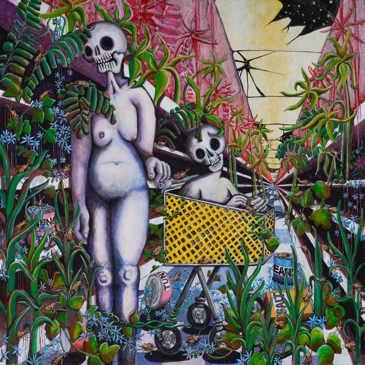
The cover art for Indigo De Souza’s second album, Any Shape You Take, was painted by her mother, who also did the artwork for her debut, I Love My Mom. As with her previous LP, the painting is based on a vision De Souza had. “It was really funny because I thought of this imagery and asked mom to do like an apocalyptic grocery store aisle scene, and for the child to be in the car and the mom to be pushing the cart,” De Souza explained in our Artist Spotlight interview. “And then COVID happened a little while after she finished the painting and I remember feeling so deeply spooked, like I had caused the panic. It just reminded me so much of the way that the grocery store aisles looked at the beginning of the pandemic.” And yet it also strikingly captures the spirit of her music: existential in nature, haunting in its intensity, but no less vibrant in execution.
13. girl in red, if I could make it go quiet
The cover artwork for girl in red’s debut album, a painting by the Norwegian artist Fredrik Wiig Sørensen, is mesmerizing and intimate in its melancholy, reflecting the qualities of Marie Ulven’s music. The singer-songwriter contacted Sørensen after coming across his paintings on Instagram, and was especially interested in one titled The Antizero. She ended up visiting the artist’s studio to have a closer look at the painting before purchasing it. “When I saw the painting, I saw me, and it feels like a headspace I’ve been in a lot,” Ulven said in an interview with Enfts Teribles. “It’s this dark place of thinking and also represents self-reflection, just like the album.”
“I had no idea of how much attention this album release was going to get worldwide,” Sørensen told us in a statement. “And I certainly didn’t expect that there would be so much fan art based on the painting in all shapes and styles. I recently saw a picture of a huge street art piece of the album cover on a wall in Mexico. That’s something I’d never expect. My best friend actually bought a painting made by a dedicated fan as a gift to me, so now I have my own version of the painting!”
12. Hand Habits, Fun House
On their most expansive and layered album to date, Hand Habits’ Meg Duffy sought to embrace all aspects of their identity. After discussing the potential artwork for the record with Curtis Santiago, they settled on a painting titled Whatever lay ahead he already accepted (2018) because it “felt non-binary,” the Los Angeles-based musician told them. Elaborating on the artwork’s significance in an interview with Bomb Magazine, Duffy said: “I love his miniatures and dioramas, but because they’re so based on the Black experience, it didn’t feel appropriate. I also love Curtis’s paintings, and the one that we ended up using on the cover shows a figure pointing and wearing pink and blue. Curtis asked me why I was drawn to this work. When I told him that it was partly because that figure felt trans, Curtis was like, ‘Yes, they are. That figure is taken straight from Paris Is Burning.’ I’d been watching that documentary and leaning into trans and drag histories while we were making the record, so the connection felt very special.”
11. Flock of Dimes, Head of Roses
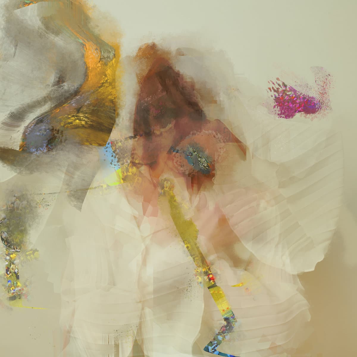
In Jenn Wasner’s second Flock of Dimes album, Head of Roses, processing and layering sounds creates not a separation from the self, but an enhanced view of what’s buried underneath. When we first hear her voice asking “How can I explain myself?” on opener ‘2 Heads’, it’s fed through a host of effects and electronic flourishes that are evocative of deep, irreconcilable grief. “Thematically, much of this record embraces duality—exploring the space between body and mind, for example, or the interconnectedness of love and loss,” Wasner told us in a statement. “Similarly, with the recordings themselves, we tried to match that energy and strike a balance between synthetic/digital and organic textures. I knew that I wanted the cover art to reflect that juxtaposition of the digital and the real, and had a loose idea that I wanted to create a piece of digital art out of a more straightforward photo portrait of myself. As usual, Graham took my initial concept and developed it into something far more beautiful than I could have imagined—expanding the original image into the perfect visual universe for my songs to live in.”
10. IAN SWEET, Show Me How You Disappear
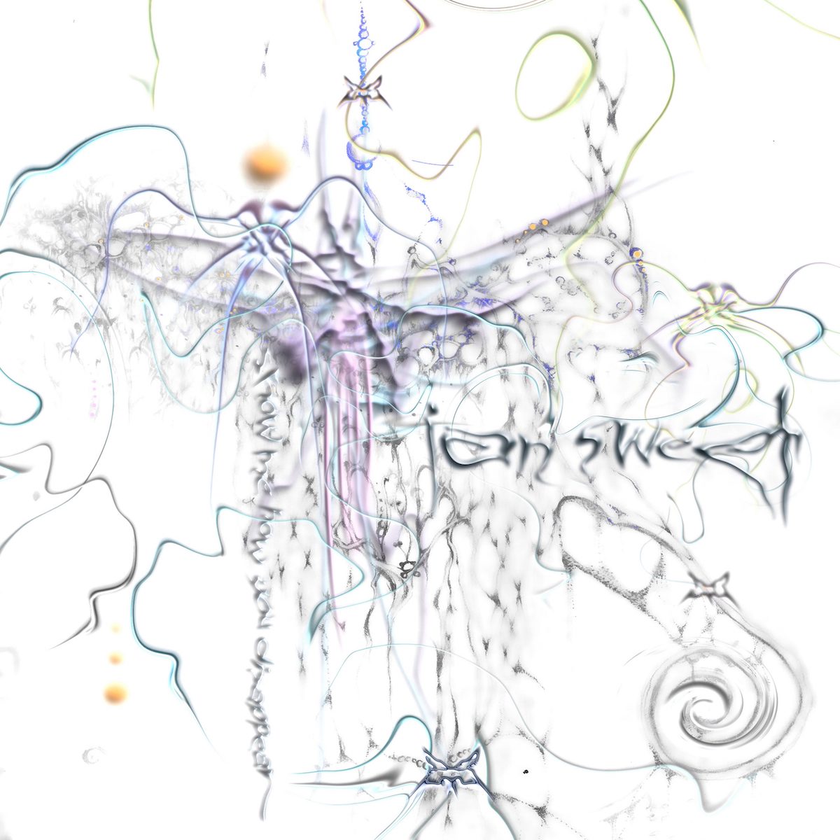
The dazzling cover artwork for Jilian Medford’s third IAN SWEET album, Show Me How You Disappear, was created by Milagros Lupotti, an artist she had been a fan of for a long time. The singer-songwriter wrote the new record after completing a two-month outpatient program to deal with increasingly severe panic attacks, and though the album cover is too abstract to suggest a linear journey towards self-acceptance, it encapsulates both the duality and intensity of the process. “The album art embodies both chaos and stillness – things I was feeling at the time of making this record,” Medford explained. “I was taking the steps to heal from trauma but still so overwhelmed by it. Within the explosive world that Milagros created, where you have to shuffle through the disarray of shapes and textures, you find harmony and order but only if you want to find it.”
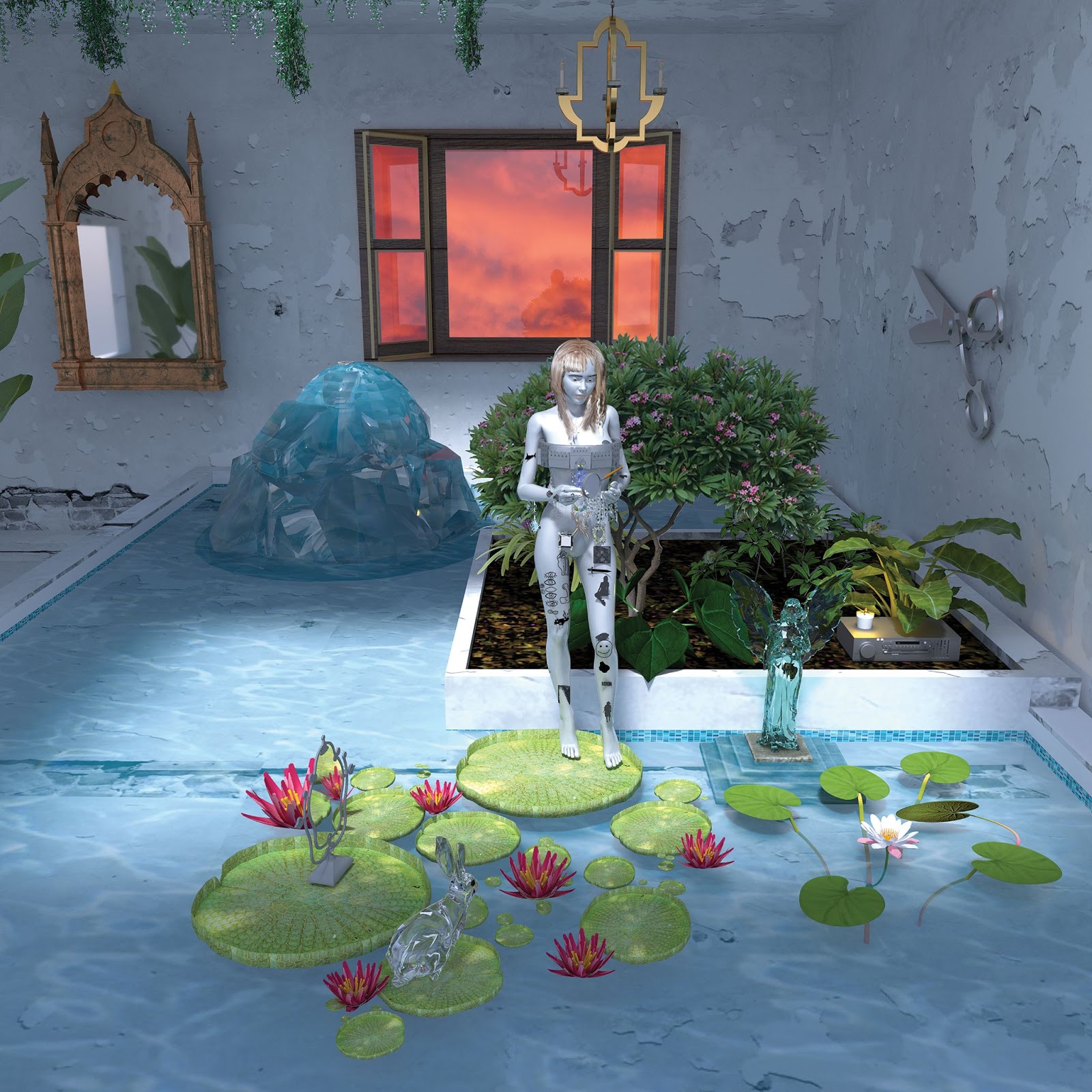
10. Claire George, The Land Beyond the Light
Claire George originally conceived The Land Beyond the Light as a break-up record, but the project took on a different weight in the wake of the death of a loved one due to addiction. When we spoke to the Los Angeles-based artist earlier this year, she explained that the artwork played a significant role in allowing her to access a world beyond the immediate heaviness of grief. When she encountered the work of Linda Westin – images of trees in nature with different lights projected upon them – she found it visually striking, but they also reminded her of her ex-boyfriend and his connection to nature. Expanding on the significance of the artwork in a statement, George explained, “While looking for visual inspiration for the album, I stumbled upon Linda Westin’s illuminated dendrology portraits, and felt immediately drawn to them. They inexplicably evoked exactly what I wanted people to feel when they heard the album – the nostalgic and whimsical nature of our very existence.”
“Digging deeper, I discovered Linda’s background in imaging neuroscience, which she mimics in her portraits,” she continued. “The image I chose for the album cover looks as much like neurons firing in the brain as it does like a portal to another dimension, which is how I like to think of the memories I’ve written into these songs. I’m so grateful to create a piece of art that will outlive my memory, and for Linda’s artwork and shared appreciation for science, which after all is our attempt to make sense of the strange universe we’ve found ourselves in.”
9. black midi, Cavalcade
The sophomore album from black midi is intentionally excessive and overpowering in its intensity, pushing the chaotic bent of their compositions into a more dramatic context. This shift in approach is reflected in the album’s cover artwork, which was created by David Rudnick, who is primarily known for working with electronic artists such as Evian Christ, Oneohtrix Point Never, and Nicolas Jaar and also collaborated with the band on their 2018 debut Schlagenheim. In contrast to the monochromatic textures that mirrored the alienation of Schlagenheim, Rudnick saw Cavalcade as “a more lurid fantasia that expands the language into interiors, eros, fantasy, memory,” he told Liberation magazine; “the palette had to leap into technicolour, had to feel more tactile. I told the boys the first time I heard Cavalcade it felt sensorily like all parts of the palette were decadent and expanded, but particularly scents, antique forgotten smells, Marlene Dietrich’s perfume, old heavy drapes, curtains, forgotten interiors, people alone in apartments, drinking heavy, tragic cocktails.”
Alfred Hitchcock’s Read Window served as an inspiration for the artwork; Rudnick and the band had conversations about the cover as a window to a square that allows access to the fantastical lives of its inhabitants. To that end, the artist used “French, pulp magazines and from old issues of Lui from the 1970s and stuff, bent into oblivion on the photocopier, elements cut out, photocopied again, until sources become mostly unrecognisable.” A grueling process, he admits, “but you can’t get the results digitally and it means that both the BM records have a vocabulary visually that’s hard for others to copy or adopt and I think that’s fitting for a band with such an outrageously distinctive sound.”
8. Spirit of the Beehive, ENTERTAINMENT, DEATH
The cover artwork for Spirit of the Beehive’s shapeshifting fourth album, ENTERTAINMENT, DEATH, was created by bassist/vocalist Rivka Ravede, a painting based on a photograph of her mom standing in front of Dante’s Inferno in 1988. “She’s looking off to the distance like she’s been there too long and she doesn’t want her picture taken but she’s getting in line for this sinister looking ride and remaining in this hyper reality anyway,” Ravede explained in a statement. Like the music itself, there’s multiple layers to it: it can be interpreted as a metaphor for the album’s exploration of the entertainment industry and the way it imposes on individual choice, or simply a portal to its feverish, strangely alluring musical journey.
“I painted the people walking into the ride as semi amorphous and faceless,” Ravede continued, “I wanted it to feel like a memory that becomes fiction, like it’s unclear what was reality and what was dream. Like when a low quality jpeg is copy pasted and formatted until the resolution is so bad it makes it hard to tell what it was to begin with. Nostalgia and the recycling of images of the past to quickly satiate a hunger for gratification and capital is a disease of the contemporary age which is a theme that’s meditated on through the album. We are all on the content farm, we’re all on a hunt for desire, not desiring anything in particular but for desire itself.” As ‘IT MIGHT TAKE SOME TIME’ puts it, “Do you realize you’re caught in a web?”
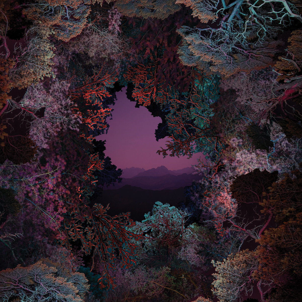
7. Cassandra Jenkins, An Overview on Phenomenal Nature
The cover photo for Cassandra Jenkins’ An Overview on Phenomenal Nature is more than just stunning; it seems to sparkle with the same energy that reverberates in the singer-songwriter’s meditations on grief and isolation. The image is taken from Norwegian photographer Ole Brodersen’s ‘Trespassing’ series, in which he introduces various objects such as floats, lights, and kites into nature, recording their movement during one long exposure. Brodersen, who met Jenkins while circumnavigating the Atlantic Ocean in a pilot cutter built in 1894, said his intention is to try and “capture the feeling of being present in a landscape,” a feeling not too dissimilar to the spirit that animates Jenkins’ music. This particular image, he explained, “was created using a kite, an LED-light and a long exposure. The light is connected to the kite‘s string, and moves with the motion of the kite. The setup was quite chaotic to watch; the light bouncing and spinning – but, when looking at the negative, the order of nature appeared.”
Jenkins called Brodersen as soon as she got the masters for her album. “I knew I had made a record that was worthy of pairing with his photographs, because it was so intertwined with my experience of the Norwegian landscape and my time with Ole’s family on the island of Lyngør, which is referenced in both ‘New Bikini’ and ‘Ambiguous Norway’,” Jenkins told us, adding that “Ole’s process has so much depth to it, but the photographs have a mysterious quality to them that also leave an immediate impression.”
She continued: “The album cover photo, in particular, captures the grandeur of the landscape at twilight (my favorite time of day) with a dense constellation of light dancing in the foreground that has a mystic quality that I felt matched the mood of the album. The light has a presence of a natural phenomenon of unknown origin– living somewhere between lighting, murmuration, and the milky way, and it hints at the kismet of capturing something through the lense that might otherwise go unseen. When referring to the light in the photograph, I often found myself calling it the ‘ghost’. For me, it carries with it the presence of what the surrealists always referred to as the ‘marvelous’–that part of the self, nature, and the relation between the two lying beyond the reach of reason and rationality. It feels like a river that’s always flowing through my lived experience, and the fleeting moments of tapping into it keep me in a state of constant wonder.”
6. Japanese Breakfast, Jubilee
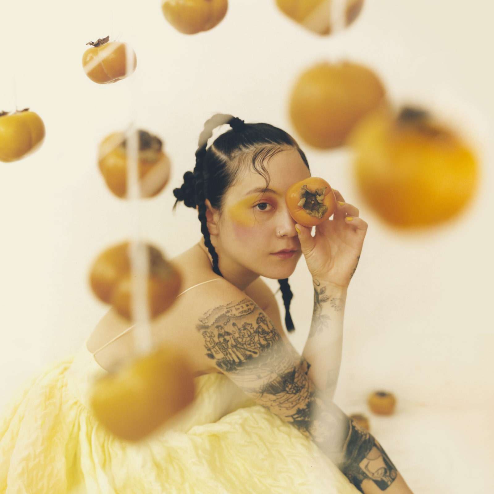
To get the full impact of an album cover, you sometimes have to set it alongside the rest of the artist’s discography. On its own, Jubilee’s album cover emanates warmth; next to Psychopomp and Soft Sounds From Another Planet, its brightness explodes. More than evocative of a shift in mood, though, it’s also deliberate in its symbolism. “I saw a picture of hanging persimmons, and I was thinking about the context of the record,” Japanese Breakfast‘s Michelle Zauner explained to PopMatters. “I wanted to do a very warm palette because Psychopomp is this sort of melancholic, blue sky color and Soft Sounds is really dark red and black. So I wanted to see yellows and oranges and warmer tones on the next record. I knew I was going to be wearing yellow, and then when I saw these hanging persimmons, I thought it was so beautiful and was a pretty apt metaphor. It’s a fruit that starts out very bitter and hard and unpalatable; then, time allows it to mature into something sweet. As someone whose narrative is so rooted and in grief and loss, it felt fitting to be embracing sweetness in this way.”
This emotional progression between albums is undeniable, but I admit the framing of Jubilee as an album about joy didn’t sit right with me at first. It seemed somewhat reductive, if not deceptive; it’s a smoother, more vibrant record for sure, but still devastating at times, and not in the least one-dimensional. I took it as an invitation to dig into the nuances of Zauner’s writing, the bitterness and pain that lingered in the corners of the album. But with each repeated listen, Jubilee became sweeter, more palatable, and altogether infectious; its melancholy textures more comforting. The cover image might be steeped in metaphor, but the feeling – the rush – is nothing but tangible.
5. Julien Baker, Little Oblivions
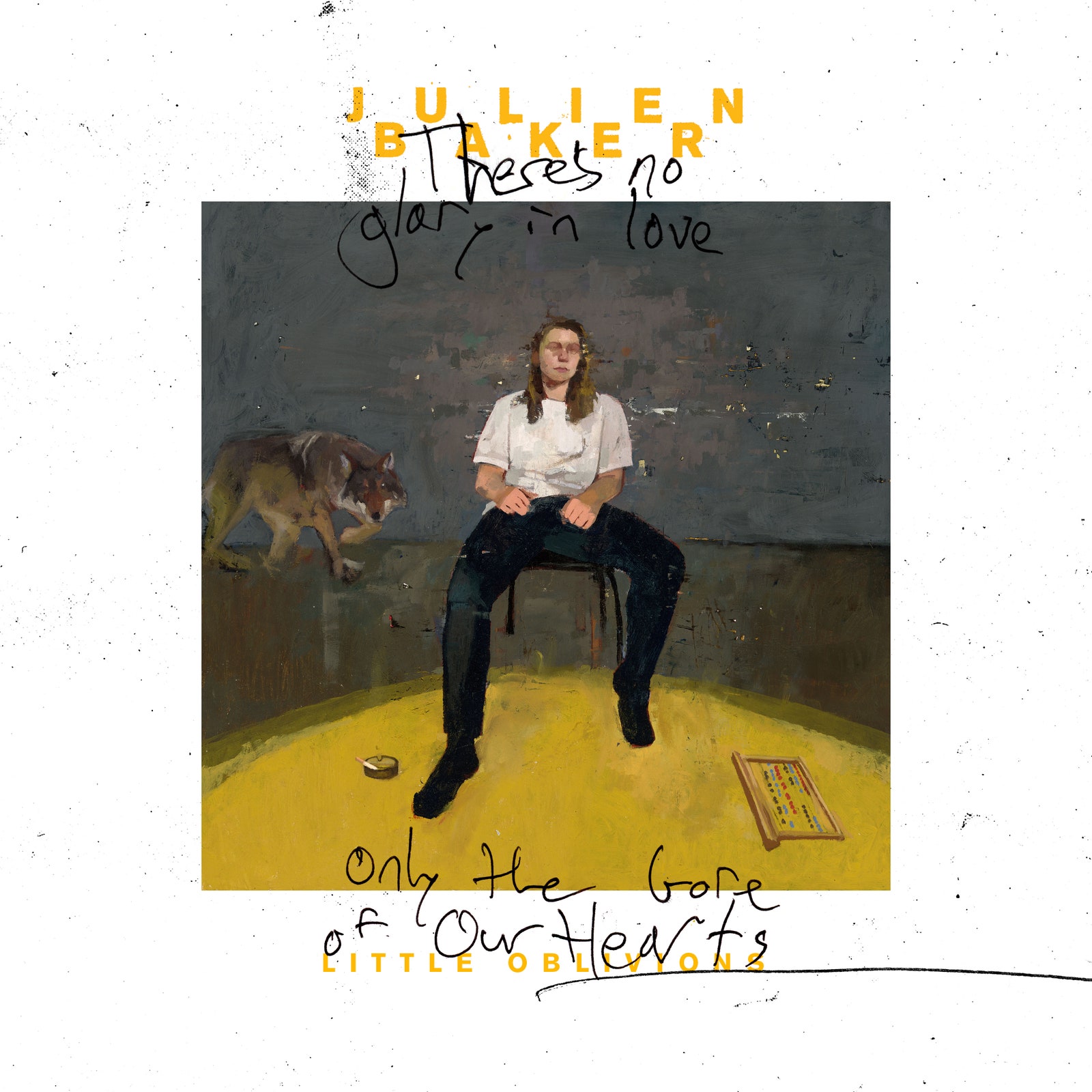
Though Julien Baker’s music has become known for its wrenching vulnerability, a certain level of ambiguity has come to mark her album covers. Though she was absent on Ryan Rado’s impressionistic cover painting for 2017’s Turn Out the Lights, the one that graces her third album, Little Oblivions, places her likeness front and center, between the scribbled lyrics “There’s no glory in love/ Only the gore of our hearts,” from the track ‘Bloodshot’. Any distinctive features are obscured, however, as if to underscore the dissolving sense of self that Baker wrestles with in the music. Everything else about artwork, created by the oil painter Wylee Risso, seems to also prevent identification, but contributes to a haunting, dreamlike atmosphere. “I remember we were talking about, like, group therapy, rehabilitation, things like that,” Risso recalled in our Behind the Artwork interview. “I kind of got this mental image of a group therapy session, my immediate mind was in, like, a gymnasium. Everything became kind of abstracted.”
Had his approach been more direct, the result may not have been as evocative, hinting at the way Baker’s music resonates even when it resists any kind of resolution. One of the reasons Risso chose to obscure certain features in order to portray a dark mental state was that it had already been a pattern in his own self-portraits; in the same way, a listener might connect to the songs not because of their autobiographical content, but because they can mirror their own lives. “I felt very close to Julien, even though her and I have no relationship,” Risso said. “When the album came out, obviously it’s cool that I see my artwork places or see people posting it, but there’s like a deeper emotional thing there that is kind of hard to pinpoint.”
4. Porter Robinson, Nurture
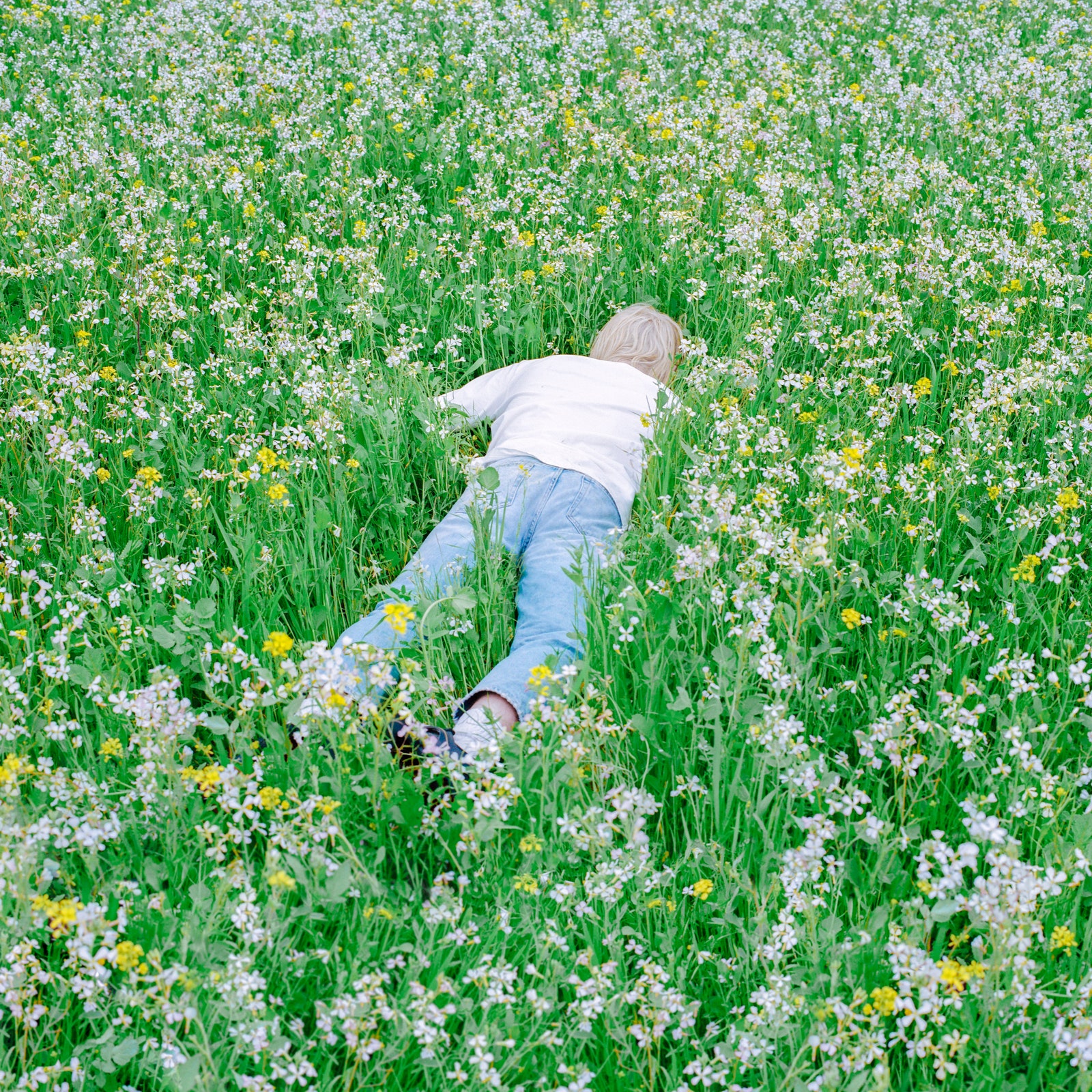
On the cover artwork for Porter Robinson’s Nurture, the 28-year-old producer can be seen lying facedown in a meadow of flowers – but that wasn’t originally the plan. Collaborating with art director Samuel Burgess-Johnson, who previously worked with artists such as The 1975 and Tove Lo, Robinson and his team tried various different ideas. “We did a little photoshoot to try to get the album cover that was sort of a liminal spaces vibe,” he explained to Entertainment Weekly. “But what we were ultimately imagining was a white sky and a perfect Windows XP-style hill with me standing there or maybe not me standing there.” The image that became the cover was the last shot they captured after Robinson decided, on a whim, to dive head-first into the ground. “There was nothing we could do to improve it with our usual design tricks,” he added. “This is it, no context needed.”
The cover is simple but bold, earnest yet tinged with fantasy – it seems to encompass everything the album stands for. “There’s a lot of pain, there’s a lot of sadness, but there’s also a lot of hope,” Robinson told EW. “It’s like this hug to the entire earth or this embrace of reality and that’s a motif of the album. It makes me feel like the music does — a little bit of self-consciousness, a little bit of a sense of beauty. Laying facedown on the ground like that is the most vulnerable you can be.”
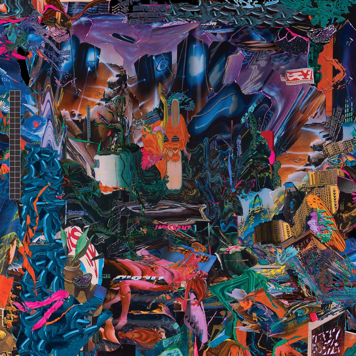
3. Squid, Bright Green Field
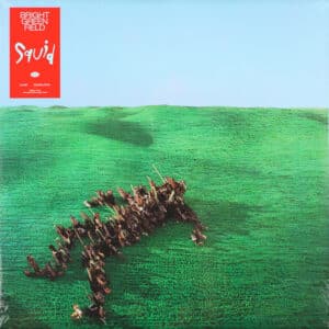
Against a musical backdrop that blends elements of post-rock jazz, krautrock, and funk, Squid’s Bright Green Field delivers a critique of modern society that draws from both imagined places and real-world environments – especially London. The album’s cover artwork is a collaboration between Kamitani Lab at Kyoto University, Felix Geen, and Lanning Sally, who handled the design, packaging, recoloring, touch-ups, and typography. The concept came from an idea Felix Geen had for the video accompanying the single ‘Narrator’, which captures thousands of 3D scanned parts of the city. These were then used to build the figure of a man at the center of the cover. “We gave audio and pictures to Dr Yukiyasu Kamatani, who uses a machine learning algorithm to visualise brain activity,” guitarist Louis Borlase explained. “He played snippets of the album along with images to subjects in his lab. The textural images that came back gave Felix the landscape under which his city figure is lying on.”
Elaborating on the process of creating the cover, Geen said: “The cover artwork for Bright Green Field was created using a collage of 3D scans and computer generated textures. The grass and sky was created using a Photoshopped mashup of various artworks from Yukiyasa Kamitani. Kamitani is a neuroscientist and brain decoder at Kyoto University & ATR, he used brain scans of people listening to the Bright Green Field album in combination with a Generative Adversarial Network (GAN) to produce abstracted ‘machine dream paintings’. GAN art is a very interesting topic in itself since it explores ideas of machine learning and computer vision. These GAN artworks formed the textures for my 3D environment. I augmented these textures by projecting them onto a 3D landscape with rolling hills reminiscent of the iconic, pastoral Windows desktop background. I then added the outline of a splayed human figure, reminiscent of ‘Danger of Death High Voltage’ signage that you find outside electricity substations.”
A working draft of the cover image was then passed on to Lanning Sally to apply finishing touches and develop the packaging for physicals. “Ultimately we abandoned typography on the front cover because everybody [the band and myself] agreed the cover image was so striking without it,” Lanning said. “It was a labor of love for us all, and Felix’s turbo cityscapes and the fascinating neural images from the Kamitani Lab made designing the rest of the project really intuitive and fun.”
2. Arca, Kick ii, Kick iii, Kick iiii, Kick iiiii
In many ways, Arca’s Kick series – the first installment of which was released last year, with the rest having been unveiled just this week – serves as a testament to the multidimensional, uncontainable nature of the Venezuelan artist’s identity. But while there are clear distinctions between each volume, which lean into a different side of the artist’s varied palette, they are all uncompromising and remarkably layered in their own right, resisting definition even as they embrace a more “straightforward” sound. 3D artist Frederik Heyman, who previously collaborated with Arca on her ‘Nonbinary’ video, has done an outstanding job of bringing this vision to life, imbuing each of the four covers with a particular mood and loading it with nightmarish, euphoric imagery.
“Rarely do I find the unique synergy as the one I have with Alejandra,” Heyman said in a 2020 interview with Kanon. “Working with her allows me to go out of my comfort zone and explore new artistic territories. It’s a new language we’ve developed: we supplement, expand, don’t limit, merge worlds. I love to work with extended mood and storyboards in general. With Alejandra we bring it to another level, taking the time to develop a new narrative in the visuals through detailed research and sketches as a base. We consider each minor and major visual element as of equal importance and narrative necessity, revisiting the past by recycling symbolism, reshaping them into an alternative present.”
1. Mogwai, As the Love Continues
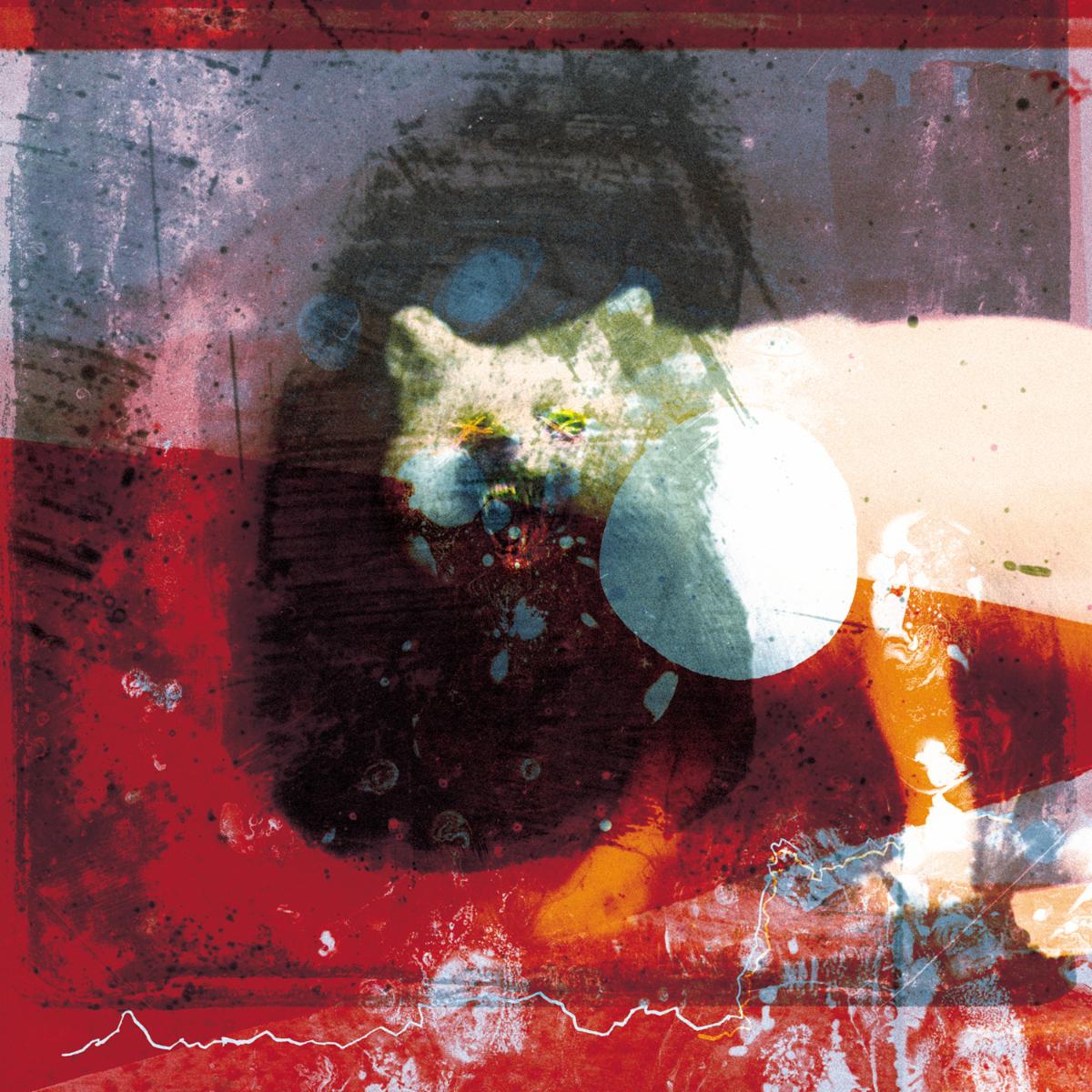
In addition to collaborating with bands like the Twilight Sad, Frightened Rabbit, and others, Dave Thomas, aka dlt, has worked with Mogwai on almost every album since 2006’s Mr. Beast. His role varies depending on the project, but his work on the band’s last three studio albums has been more illustrative and prominent. Furthering the approach he took with 2017’s Every Country’s Sun, the artwork for Mogwai’s first UK number 1 album, As the Love Continues, might be his most striking achievement yet. Based on a Library of Congress glass negative image taken in Russia in the 1910s by Sergey Prokudin-Gorsky, the heavily edited image captures Mogwai’s immersive layers of sound in all their intensity. “I wanted to start playing that game with the visuals, and they were these multi levels of stuff where it felt like one was falling apart and they were almost bleeding into the next level,” Thomas explained in our recent career-spanning interview. “The image of the arctic fox was one I found from these turn of the century old photos, and it was something about the mood of it that just struck the right chord for the sound of the record. It’s one of those things that’s almost unexplainable.”
Commenting on the album’s success, Thomas said: “That one was completely unexpected from both my point of view and the band’s point of view that it’s become what it has. I don’t think anyone had felt that a band or like Mogwai or any of the stuff I work on would go anywhere near number one ever.” He added: “It’s been amazing to see it pop up all over the place. It kind of comes into its own. Even two weeks ago, going in and seeing all the stuff around SAY awards [Mogwai won the 2021 Scottish Album of the Year award after being shortlisted four times] in Scotland and seeing the album image on a stage, it just takes its own kind of life.”
