
In 2025, the Recording Academy finally introduced a new Grammy category for Best Album Cover. It’s complementary to, but distinct from, Best Recording Package, and it made sense for it to be announced the year that award went to BRAT – thanks to the impact, of course, of its front cover. It’s important to consider album artworks not just in the context of the record package but the visual world surrounding the music, which can extend to videos, merch, and even press photos. But sometimes, it’s all about that one image. The front cover can communicate more about an album than an artist does throughout an entire marketing campaign. In putting together our list of the best album covers of the year, we gather quotes from the artists behind them – in many cases, the same people who made the music – to better understand how different art forms feed into each other. Once again, this is an unranked list aiming for a kind of aesthetic flow, but we’ve singled out our top 10.
Giant Claw, Decadent Stress Chamber
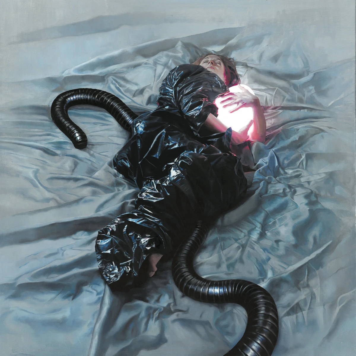
After a few years of releasing music as part of the collective Death’s Dynamic Shroud, Orange Milk co-runner Keith Rankin returned to the Giant Claw moniker for Decadent Stress Chamber, a head-spinning, maximalist, and kinetic collection of what he calls “free pop.” Without quite falling into the “hyperpop” category, it does play with hyperreal, collagist qualities, which are echoed in the cover art painted by Rankin’s longtime partner and collaborator, Ellen Rankin. “Our process is usually to make an image digitally, collaging and airbrushing elements which Ellen will use as reference for a final oil painting,” Rankin told Our Culture. “For Stress Chamber we did a photoshoot for the painting reference, so everything except the worm on the cover is in camera, we stuck a bunch of lights inside a clear easter egg. The idea for the image came like a flash of inspiration, so it was especially satisfying seeing it come together almost exactly how it was imagined.”
Ian Nyquist, Gilded
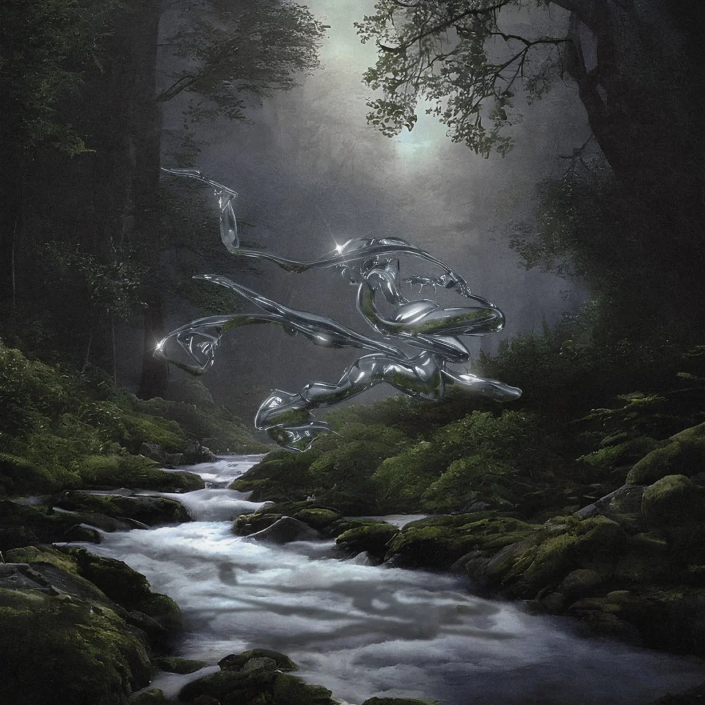
Ian Nyquist’s fluid approach to tradition is echoed in the mesmerizing cover art for Gilded, courtesy of Dylan Anderson. It offers a gateway into the producer’s unique fusion of electronic and traditional Irish music, its metallic edges and dark atmosphere shapeshifting midair, like a ghostly creature (a hare?) floating through and simultaneously warping the landscape. Like Nyquist’s music, however, the image only emphasizes the soft, organic textures that form its very foundation, simply liquifying whatever symbolism they may carry.
Sunny War, Armageddon in a Summer Dress
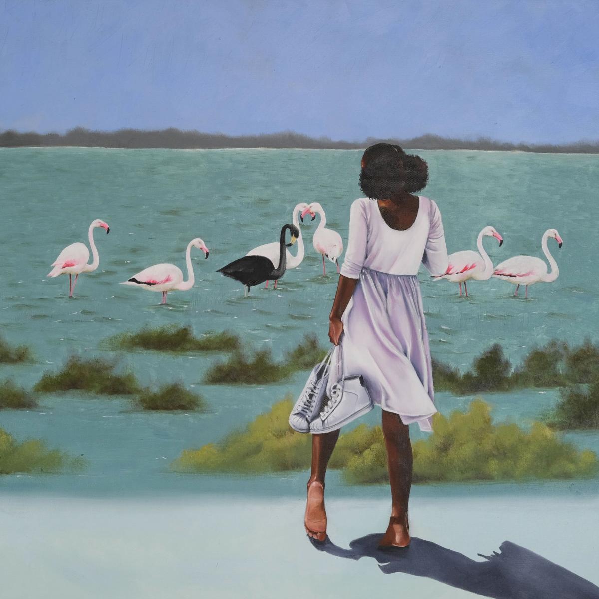
For the cover of her vivacious new album Armageddon in a Summer Dress, Sunny War originally wanted to use a photograph of black flamingos she saw in an old issue of National Geographic – she never knew they existed before seeing it. “It turned out to be very difficult to find the photographer and was looking unlikely I’d get to use the photo for my album,” the singer-songwriter explained in a statement to Our Culture. “So I then attempted to paint a version of the photo. I liked the painting enough to hang it in my hallway but not enough to use for album art. Luckily, I remembered meeting the now Chicago-based artist, Adrienne Brown David. I first saw her work at 100 Men Hall, a historical African American landmark in Bay Saint Louis, MS on Chitlin Circuit and MS Blues Trail. I was there to play Booker Fest celebrating James Booker ‘The best black, gay, one-eyed junkie piano genius New Orleans has ever produced.’ Adrienne made the poster for that event, which now resides on my bedroom wall. She also made a lot more beautiful murals in that space. I’ve been following her on Instagram ever since just to get peaks at her portraits. I told her the idea I had for the album cover and she made a painting more beautiful than I ever could have imagined.”
Sophie Jamieson, I still want to share
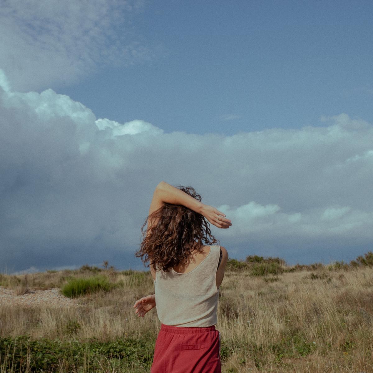
On ‘Camera’, the first song on her striking album I still want to share, Jamieson sings about not being able to get the focus to land, trying to embrace the blurriness. The focus is just right on the album’s cover, which sees her back turned to the camera, staring straight into the sky. “I wanted the cover of this record to suggest lightness, air and constant motion, but without a clear trajectory of freedom,” Jamieson told us. “It was one of those shoots where I didn’t know exactly what I was looking for but I knew we would find it, and I knew what it was when I saw it. For me this album feels like reaching for an idea of freedom that is actually unattainable, but can be danced with, explored and moved around. The colours blue and red felt instinctively representative of this record, balancing warmth and longing with cool detachment and an untouchable goal to finally land in love.”
Hannah Frances, Nested in Tangles
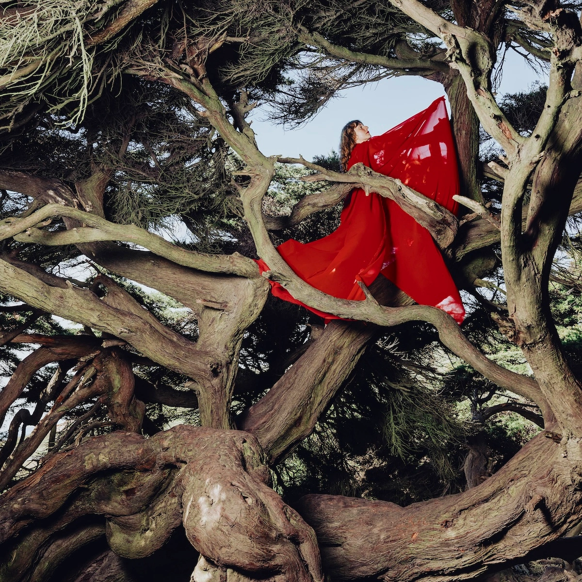
When we reached out to Hannah Frances about the cover of her previous album, Keeper of the Shepherd, she discussed the idea of “prayerful self-burial,” whereas its follow-up seems to branch outward in every way. “It was slower to coalesce: I was going through a lot of emotional stickiness, anxiety, and heaviness, so that was my expression of feeling like I needed to lift myself out of something, whereas I think Keeper of the Shepherd was going into something very deep, really sinking into it,” she explained in our Artist Spotlight interview. “That’s why all that music has a somberness or a density to it that feels very much like being on the ground, in the roots of something, in the dirt and the moss. As this record started to take shape, the visuals I was playing with lyrically – birds, the sun, the sky, the branches, all of it was very different from Keeper of the Shepherd. I think that’s why it started to become clear in my mind that the album cover was definitely going to be trees and tangled branches.”
Frances experiences the relationship between music and visuals as a kind of synesthesia. “I knew I had to find the perfect tree,” she recalled. “I was on the hunt for a tree for a good month or so. I was asking all my friends around the country – maybe I was gonna go to the south and find some wild, old live oaks. I ended up going to the West Coast, to California, where I knew there were incredible cypress trees and live oaks. At that time of year, it was April, so the West Coast and the South were the only places that had a lot of life to them, because I live in the Northeast, in Vermont, and everything in April is pretty much still dead. I was like, ‘I need an album cover pretty soon, so I think I have to go to California to find the perfect trees.’ But I always saw red and blue. Obviously, it’s a little on the nose, because I talk about trees and tangled branches. I was like, ‘There’s no other way I can express this concept.'”
Planning for Burial, It’s Closeness, It’s Easy
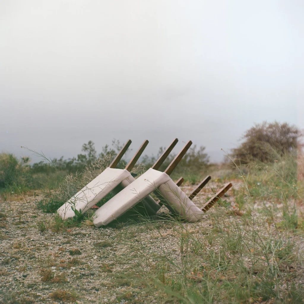
Planning for Burial’s unrelenting blend of shoegaze, metal, and ambient blurs the line between melancholy and optimism. The cover photo, captured by Megan Elyse Lloyd, could have zoomed out to the vast loneliness of the desert, but instead it centers on two chairs that, at a glance, look almost like an abstract sculpture, a representation of a couple who had to leave something behind. “I’ve been a fan of Megan’s work since we first met 12 years ago when I played with one of her old bands,” project mastermind Thom Wasluck, who is also credited for the layout and design, told us. “When I first saw the photo, the hues and texture to me spoke of sadness & grief, but the fact that there are two chairs added a layer that made me feel hopeful, that you don’t have to suffer alone.”
“When Thom approached me about using some of my images for It’s Closeness, It’s Easy I was ecstatic, and very moved,” Megan Elyse Lloyd added. “Already being a fan of Planning For Burial and Thom’s writing, I was familiar with the beautifully sad and gut-wrenchingly painful movements in his songs, which are somehow able to create this space to carry you through memories of your own grief and survival. Knowing this, I felt the images of mine he chose, specifically the image of the chairs photographed in the desert, would help support his next album. About 4 years ago, my partner at the time and I drove to Joshua Tree for the weekend. We had just moved across the country a year prior, and at this time, our relationship was falling apart. It had been snowing off and on that day in Yucca Valley, and we had decided to go for a drive.”
“We were listening to Esther Perel’s podcast ‘Where Should We Begin’ when we passed by the chairs in the distance to our left,” she continued. “Most likely identifying with the struggling couple silently in our minds, something about the chairs moved us enough to pull over and turn around to take a few photos. The chairs, they just looked so sad and abandoned against the snowy desert sky, but abandoned together; trauma-bonding you could say. As for the other images utilized in the album art, the desert couch and fields of dried brush, I feel they are very telling of my grounded devastation that the relationship would soon be over, but that there would always be love there.”
Racing Mount Pleasant, Racing Mount Pleasant
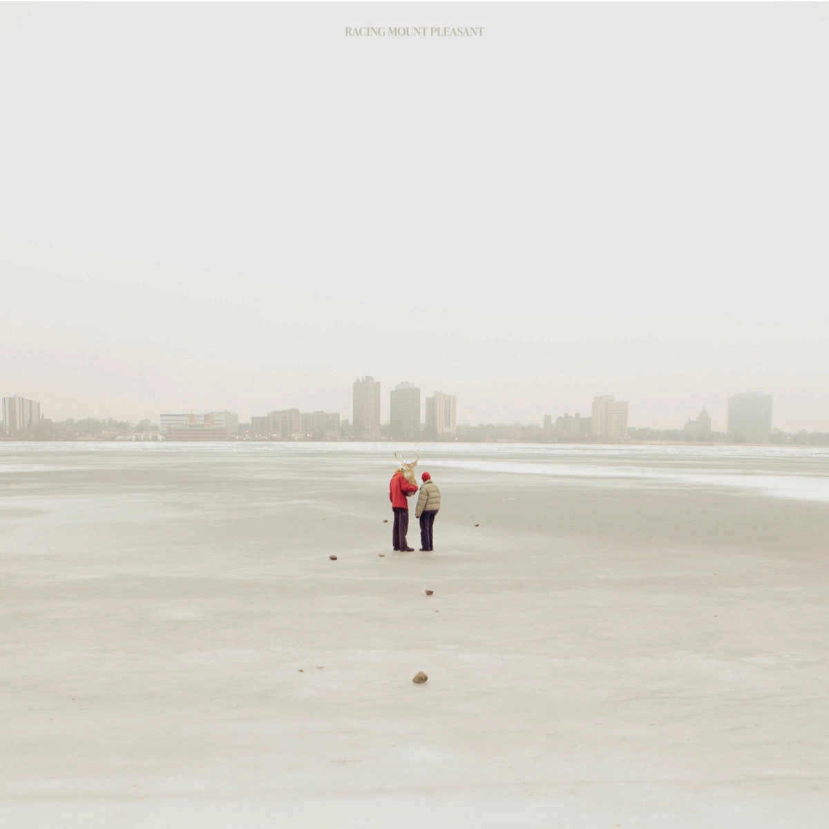
Racing Mount Pleasant take their name from an exit off the highway on the way to Chicago. On the album cover of their self-titled debut LP, we’re far away from the city, looking in on two figures standing together on a frozen expanse; the sky is pale, and the entire frame is so muted it almost undermines the warmth of the crew’s music. How can such a vast space hold such emptiness? And what might the two people – one lifting a deer trophy, for some cruel reason – have to say about it all?
Hannah Cohen, Earthstar Mountain
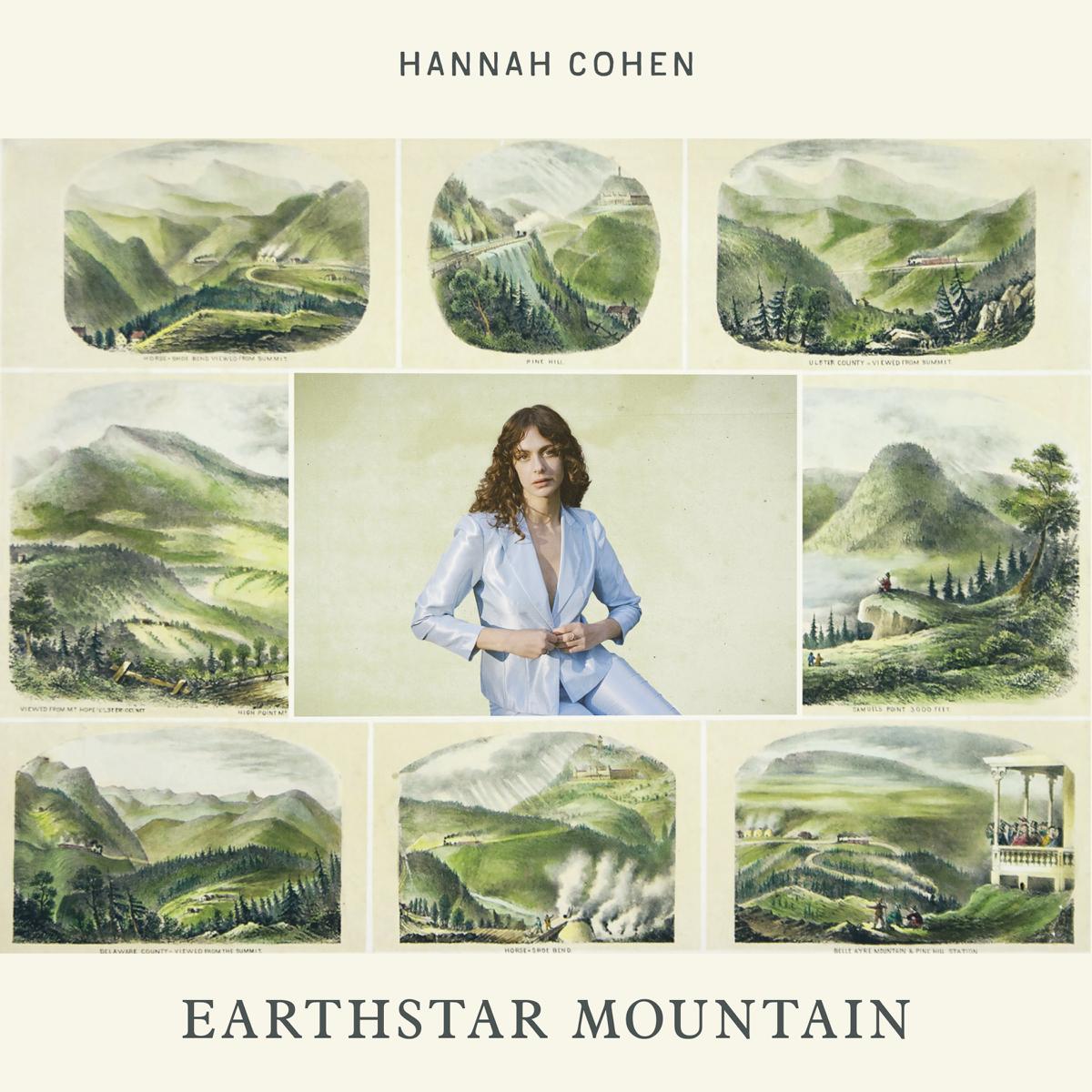
Hannah Cohen’s first album in six years serves as a love letter to the Catskills, where she and her partner Sam Owens moved prior to the release of Welcome Home. The album cover for Earthstar Mountain sees the singer-songwriter, donning a blue suit in the middle of an 1882 lithograph of the Catskills. “I was trying to find an image to use for the album or something close to it,” she recalled in our Artist Spotlight interview. “My mom works in the book art world, the antiquarian print press, and she said, ‘You should reach out to the Institute of History and Art in Albany. I bet they’d have that in their collections.’ And of course, they did. So we reached out to them, and they gave me permission and licensing to use the image. I just fell in love with it. To me, the record cover has these little vignettes, and I felt like those could be a song each. I think about a song being like a window into someone’s life, a little keepsake, so I felt there was some synergy there.”
Weirs, Diamond Grove
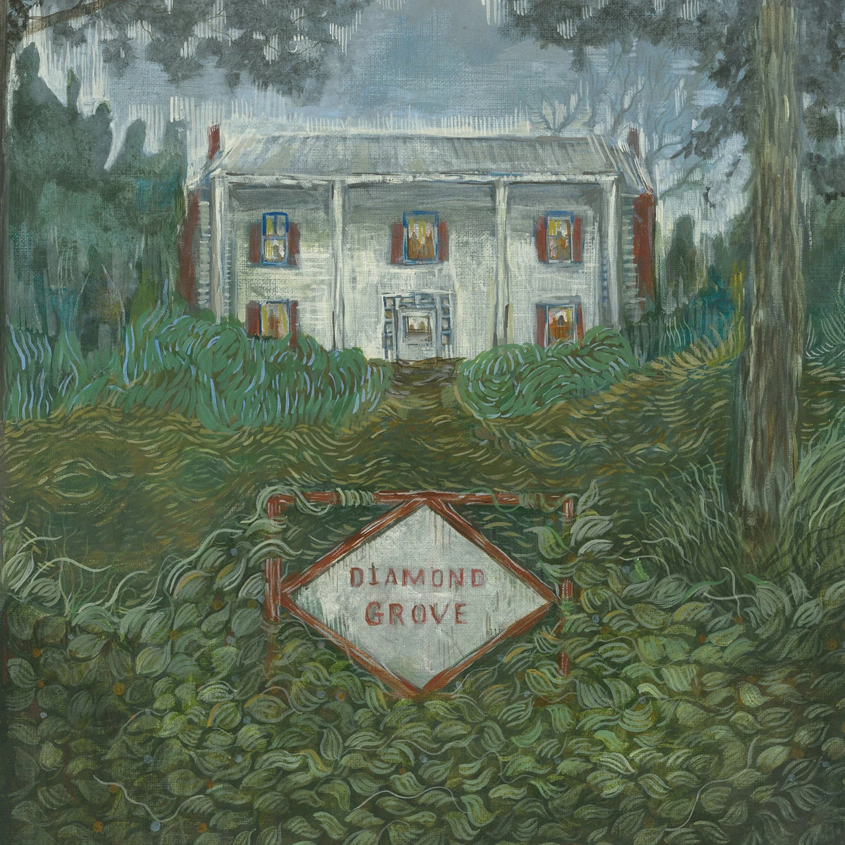
When it comes to folk and gospel music, the North Carolina-based music collective Weirs strike a delicate balance between tradition and abstraction. Band organizer Oliver Child-Lanning wanted to imbue the record with a real sense of time and place, gathering friends to record in farmhouses, fields, and an abandoned silo. Indeed, Diamond Grove is the name of the specific dairy farm in Virginia where Child-Lanning’s grandfather once lived, and whose site-specific features the group utilized for the recordings. Though Sarah Bachmann had never been there, her portrayal of it for the album cover carries that sense of reverence. “The idea for this cover came together through a collaborative process,” she explained. “I worked from photographs that Weirs shared with me as the source material. I tried to translate a vision for the cover that Oli described. Faint figures inside and along the treeline. kudzu growing over the sign. Greens and blues. I haven’t had the chance to visit Diamond Grove in person, but places like it are some of my favorite subjects to paint. While working on the cover, I listened to the album repeatedly, which was a joy. I’ve been a big fan of Weirs since their first release. it’s a huge honor to be asked to create an album cover for a band I hold in such high regard.”
Florist, Jellywish
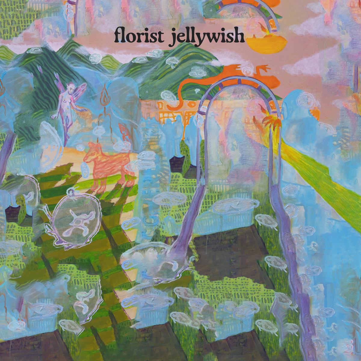
Florist’s Jellywish, like so much of their music, blurs the line between cosmic and everyday intimacy, a space embodied by Vera Haddad‘s wondrous cover painting. “The painting I made for Florist’s Jellywish is an off-center, technicolor meeting place for all the characters and questions that emerged from each song on this record,” Haddad said in a statement to Our Culture. “I listened to the album on repeat and wanted to memorialize a heavy, grounded feeling of being in a body on earth going through an experimental montage – in paint. Gritty-granular details of everyday life shared canvas with warping ancient artifacts and emblems of magic myths. The aim was to create a physical oil painting glitch in time that felt in touch with something from our contemporary moment. I felt pulled to focus on a planetary-perspective, maximalism and liminal experiences. Henry Darger and illustrations of fairytales were big inspirations.”
Teethe, Magic of the Sale
In many ways, Magic of the Sale expands on the world Teethe started building with their 2020 self-titled debut, using a lot of the same methodology, all the way down to the artwork, painted by the band’s own Madeline Dowd. “Our second album, even with the artwork, I feel like zooms out and you get to see into the world,” she said in our Artist Spotlight interview. “It feels the same, but it’s just so many more layers.” Dowd ended up recreating the character in a different setting, full of colour and sly confidence – though seemingly stretched out of the same eerie, worn-out expression.
Ichiko Aoba, Luminescent Creatures

One of a few artworks on this list deeply inspired by the ocean, Ichiko Aoba’s Luminescent Creatures is in part a document of the Japanese singer-songwriter’s visits to the Ryukyu Archipelago. It serves as a continuation of Windswept Adan not only in her musical collaboration with composer Taro Umebayashi and sound engineer Toshihiko Kasai, but in her visual world-building alongside photographer Kodai Kobayashi. The front cover for Luminescent Creatures specifically homes in on the album’s ethereal, underwater ambiance. “We spent a lot of time just talking, whether that was discussion of the music, or just smaller stuff, like: ‘Hey, how are you today?’ We just got to know each other on a very deep level,” she told Boulder Weekly. “Spending months, years, sharing the minutiae of daily life got us to the point where we trusted each other so deeply that we could give honest feedback. It stopped really mattering who had composed the song, who had done what. We almost melded together.”
Jefre Cantu-Ledesma, Gift Songs
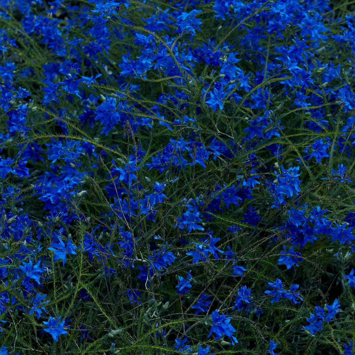
The gentle, serene beauty of ambient experimental artist Jefre Cantu-Ledesma’s latest record is perfectly mirrored in Traianos Pakioufakis‘ cover photo – perhaps this year’s most beautifully blue album cover. “My photograph Blue Wildflowers was made on overcast day near York, Western Australia in September 2017 whilst on assignment for the clothing brand MAN-TLE,” Pakioufakis told us over email. “Western Australia’s topography is said to be several million years older than that of Australia’s eastern counterpart due to an unknown extinction-level event. It is for this reason Western Australia has a broader and richer array of wild flowers, their colours and structures unlike anything else in the world. The blue in this photograph is very much real and natural, perhaps the photograph is even more dull than it is in reality. It needs to be seen to be believed.”
Alex G, Headlights
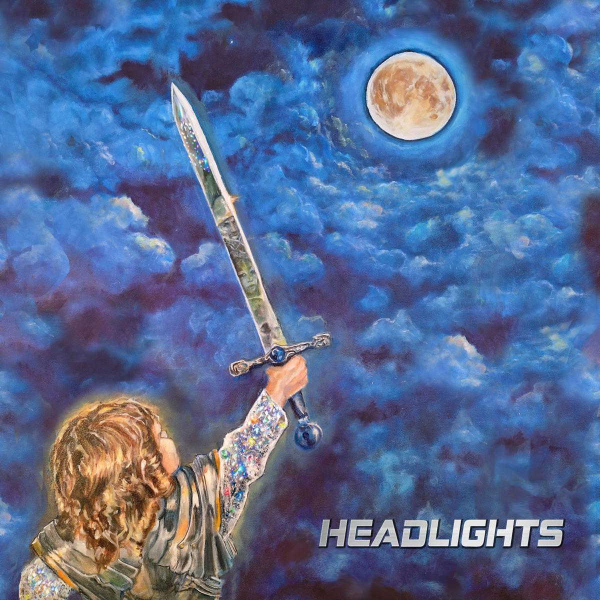
Rachel Giannascoli has been a part of the visual world behind her brother’s music for over a decade, and the siblings continued their collaboration as Alex G made the jump to a major label. Like the collection itself, there’s something eerily triumphant about the artwork for Headlights, depicting a young knight raising his sword towards a full moon. The artist talked about the process behind the artwork while keeping it open to interpretation in a rare Instagram interview, saying, “For this one, I saw the cover with the insert in my mind from the beginning rather than putting those aspects together as I went along. It was a feeling I was trying to get across by using these images.”
Great Grandpa, Patience, Moonbeam
Great Grandpa’s Patience, Moonbeam is as multi-layered as a dream, fully-realized yet open-ended. Though the process behind it was collaborative, the artwork was made during a particularly solitary period for singer Al Menne. “The artwork for patience moonbeam was a welcome point of focus on a tour where I traveled entirely alone for about three weeks,” he told us in a statement. “On long drives I imagined something mystical as I listened to what then existed of patience, moonbeam. I went back and forth on whether the moon imagery was too on the head. I landed on: ‘there’s gotta be a moon what are you crazy?’ My method for the album art was as piecemeal as the creation of the actual music. I drafted the idea over and over. Squeezing water color paints from their small metallic tubes. I hand painted and collaged layer after layer. At a certain point I printed out, and painted over the top on printer paper. I did that a few times until I got the texture I desired. I wanted something to feel abstract, but whole. Like a dream where some things are the outline, and some things are solid like the moon.”
Flock of Dimes, The Life You Save
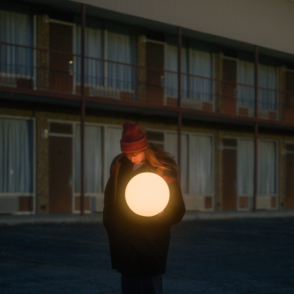
When the cover photo for Flock of Dimes’ The Life You Save was taken, in October 2024, Jenn Wasner was in the final stages of finishing the record. “My friend/brilliant photographer Graham Tolbert was in town visiting from St. Paul, so I wanted to seize the opportunity to try to get a few new press photos,” she told Our Culture. “I was living in the tiny town of Haw River, NC at the time, and there was an abandoned motel nearby, so we decided to try to snap a few pictures there. I had a vague idea of wanting a very dull/muted photo centered around something glowing – in my mind, maybe a flash, something reflective? I had a few props, including the ‘orb’ that ended up making it into the artwork here, but when we got to the motel it was unseasonably frigid and windy, so we only took a handful of shots before heading home. I was stunned when Graham showed me the results – I knew fairly quickly at that moment that this would be the album cover.”
Erika de Casier, Lifetime

Lying on a bed after a long day can be both a lonely and luxurious feeling; Erika de Casier’s music perfectly embodies it. “Hit midnight/ Not even a text to hold me warm,” she sings on ‘The Chase’ off her self-produced album Lifetime, and that might be her glancing at her phone as it lights up on the gorgeously sepia-toned front cover, photographed by Xavier Luggage. Or it might be her slipping into the realization of the title track: “The answer was all inside, not in a stranger/ It lingers in my body when I realize that love is all we have.”
Maribou State, Hallucinating Love
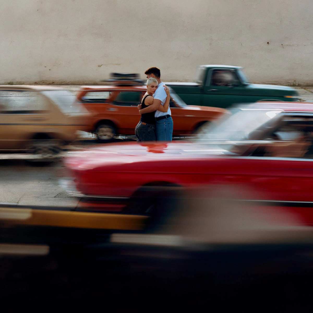
Entire albums on this list don’t have the amount of personnel credited for the cover of Maribou State’s Hallucinating Love, from photographer James Rees to Cinemoto UK, which supplied what a commenter on r/whatisthiscar described as a “fun mix of cars :)”. At the heart of it, though, is a genuine moment of human connection reminiscent of the final scene of Lost in Translation – a man and a woman embracing in the middle of the road. Though the couple is centered on the frame, they’re zoomed out just enough for the chaotic blur of their surroundings to be a character of its own. But you could zoom out way further and the intimacy would still speak volumes, grounding the restlessness of modern life.
Hayden Pedigo, I’ll Be Waving as You Drive Away
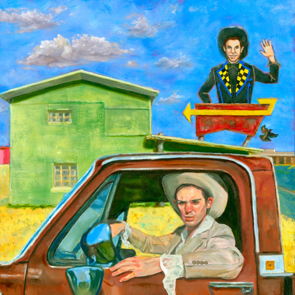
Jonathan Phillips‘ artwork offers a kind framework for Hayden Pedigo’s ‘The Motor Trilogy’, which was completed this year with I’ll Be Waving as You Drive Away. On the album’s Bandcamp page, the fingerstyle guitarist goes as far as to say the “cover paintings have created entire worlds for my albums to live in.” While still somewhat haunting – or rather disarming – the new album’s cover isn’t as disturbing as the previous two, which featured Pedigo in corpse paint or standing in front og a burning car. “No face paint, no blue skin, the character on the front is no longer a character — it’s actually just me,” Pedigo explained. “I’m trying to tell the audience, I actually want you to meet me, I want you to know who I am.”
Deafheaven, Lonely People With Power

Deafheaven have a history of iconic album covers, and Lonely People With Power adds to that list while distinctly fitting into the record’s themes. On the song ‘Body Behaviour’, an older male role model shows a younger boy pornography – “I found it funny that virtually every guy I know has some version of that story, with a father or uncle or older cousin or whoever,” the band’s George Clark has said, and one version of it is depicted on the album cover, captured by Nedda Afsari. “We were digging into the aesthetic around a gritty San Fernando Valley early-’90s motel,” Nick Steinhardt said in a comprehensive interview with UPROXX. “It’s not necessarily a celebrated period of aesthetics or graphic references. We’d have a whole different bag of things to mine from. So the motel that this is loosely based around is not some cool noir neon that you wish was saved in a museum somewhere. The stuff we were referencing is very banal and, honestly, quite bad.”
oklou, choke enough
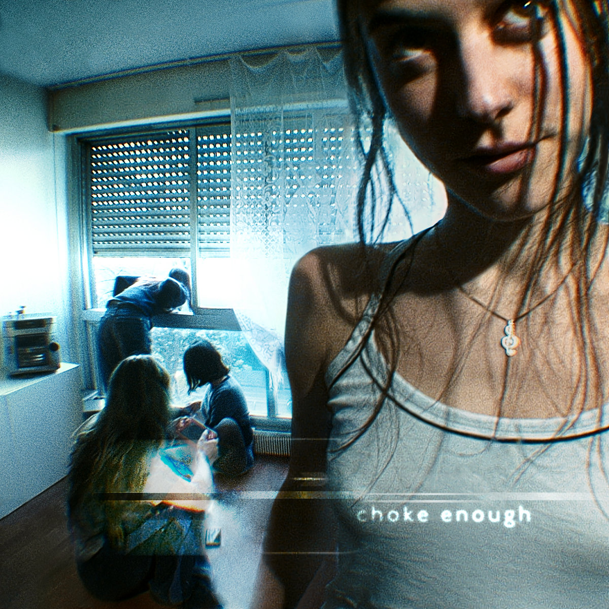
By the time oklou started thinking about the visual aesthetic of choke enough, whose blue-green undertones distinguish it from the earthiness of 2020’s Galore, she’d already spent a couple of years steeped in its musical and lyrical world. Shot by oklou’s partner, photographer Gil Gharbi, and overseen by designer Kim Coussée, the artwork’s spontaneous immediacy was intentional. “On the cover of the album, we were in an apartment and we’d been filming for two hours,” oklou told PAPER. “I love this picture because it feels stolen; it’s not in the pose. We didn’t want a perfect angle. I’ve never seen images of my face that felt so real to me. I really wanted to get into more lo-fi inspiration. I think color choices can characterize these different ways of capturing images. The blue and greenish vibes are sci-fi; it’s giving Minority Report and Matrix, obviously. I just loved it for its nostalgic quality.”
Kelora, Sleepers
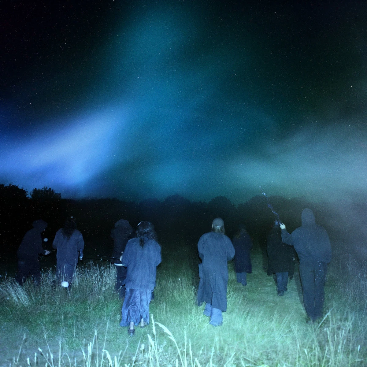
The gloomy atmosphere of Kelora’s Sleepers is almost hallucinatory, an effect captured spontaneously on the album cover. “The Sleepers cover art is a photo made with barely any editing or post processing,” the London-via-Glasgow duo told us in a statement. “We went to the location at night with our friends and we paced around with sound and visual recording equipment. As we finished and were packing up some local teenagers who had been smoking weed in the woods approached us looking really nervous and asked ‘We were watching you there… what were you doing? Are you a cult?'”
Momma, Welcome to My Blue Sky
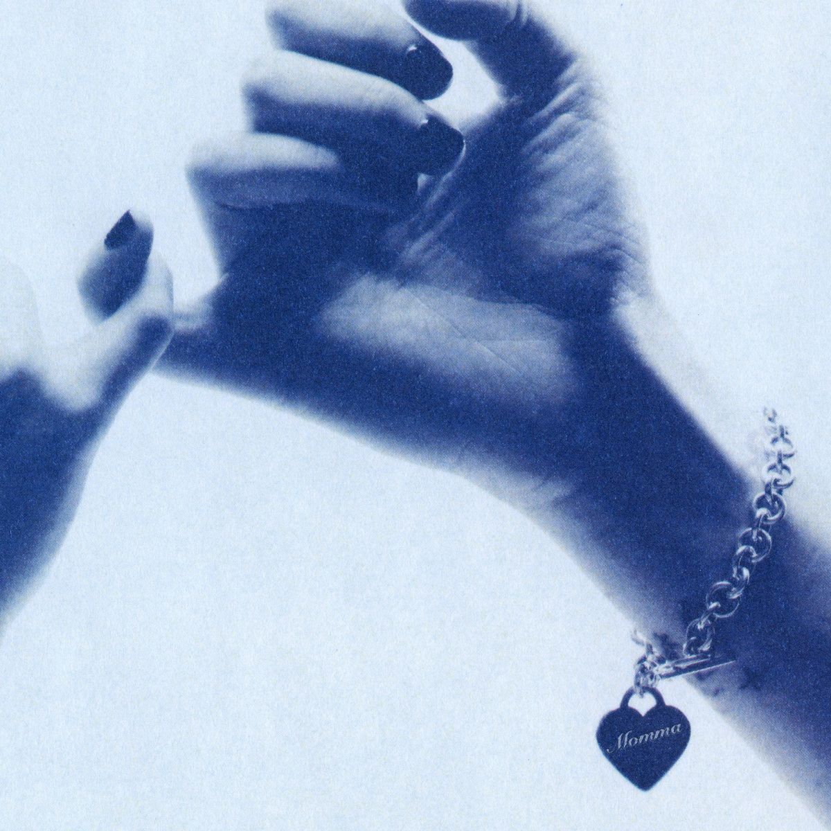
Momma approached Daria Kobayashi Ritch with the idea of using a pinky promise for the Welcome to My Blue Sky cover, presenting a few visual references they were drawn to. “What struck me immediately was how tactile all the images felt—most were made using alternative printing processes,” Kobayashi Ritch explained to Our Culture. “With the rise of technology, I often feel the human quality in imagery can get lost, so I was really drawn to the handmade, imperfect, intimate nature of what they shared.” She continued, “That tactile, human touch felt essential to incorporate, especially for an album that speaks so openly about life and the vulnerability and messiness that come with being human. As we continued exploring, we found ourselves gravitating toward cyanotypes. They carried the physical, hands-on process I loved in the references, while also subtly nodding to the blue sky in the album’s title. It felt like the perfect intersection between the emotional tone of the music and the visual language we wanted to create.”
“The final image features Etta and Allegra’s hands, which felt only right—this album is a tell-all drawn from their own personal experiences, many of which they lived through together,” Kobayashi Ritch added. “That closeness is part of what makes Momma so special: the band keeps everything deeply personal and within the family. Tasks that are often handed off to third parties—recording, engineering, visual development—are all done in-house. Aron handles the recording and engineering, Etta and Allegra concept the visuals, Etta creates the artwork, and I, Aron’s sister, photograph it. It’s a collaborative process rooted in deeper connections, which is exactly what we wanted the cover to reflect.”
crushed, no scope

In video game lingo, a “no scope” kill refers to shooting a sniper rifle at close range without aiming at your target. In press materials, crushed’s Bre Morell has joked that “it might might also mean like, having no future, getting no-scoped by life.” Listening to the duo’s debut album, it’s clear that Morell and Shaun Durkan home in on their pop influences, which range from trip-hop to ’90s alt-rock, by pure instinct rather than long deliberation, which makes “no scope” a good metaphor for their musical approach, too, and the cover image – bold despite its muted, grainy feel – an even better representation. “I’m haunted by your stare in everything I do,” Morell sings on ‘oneshot’, and that just might be her shooting it back.
yeule, Evangelic Girl Is a Gun
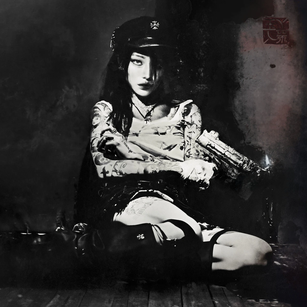
If you know yeule as a self-identified “cyborg entity” making hypnagogic, genre-blurring pop, you might not be aware that Nat Ćmiel studied fine art at Central Saint Martins College of Art and Design. Though painting is more of a hobby for them now, yeule’s still a very visual person, and they tend to map out an album’s visual world before its sonics. “The album design is very, very thought out, and I pick my collaborators really carefully,” yeule told The Creative Independent. “Vasso Vu, who shot the album cover for Evangelic Girl is a Gun, also has a fine art background. I spend time with a lot of painters. The intentionality of the medium of painting is very sensual and very personal, and it’s very deep. Inside the psyche, I feel like mark-making is one of the most profound mediums, compared to music. But music is a whole package and an industry of its own. So is the fine art world. But to answer your question, I don’t really have as much time as I would like to do painting, but I make time.
Blind Equation, A Funeral in Purgatory

The cover of Blind Equation’s A Funeral In Purgatory isn’t purely mournful; there’s something strangely luminous about it, if not quite as blissful or glitched-out as James McHenry’s latest brain-melting project can sound. Offering some insight into the artwork, created by Paris Shadrovovstov, McHenry said: “Paris (angelgasm) has been a long time friend & collaborator for Blind Equation and I have let them handle nearly all of the visual direction for the band since my debut LIFE IS PAIN in 2021. A Funeral In Purgatory is a much darker, more atmospheric record and I wanted the artwork to reflect that. A lot of the inspiration I wanted to take from came from a lot of 90’s Peaceville Records doom album artwork, like The Silent Enigma by Anathema, Turn Loose The Swans by Anathema & etc.”
“One of the first drafts of the album artwork was a more abstract yet neonlike landscape that I think reflected the vision I was going for, but I felt like it needed more,” McHenry continued. “The girl on the cover was a 3D model that Paris had designed in Blendr and was wanting to use for Blind Equation for some time, and I felt like this record was the perfect time to use it. Using the original draft as a background & color scheme for the artwork, they created what became the final draft of the album artwork and I knew instantly that this was the one. It perfectly captures the feeling of grief, gloom, and, yet in a strange way, hope.”
Masma Dream World, PLEASE COME TO ME
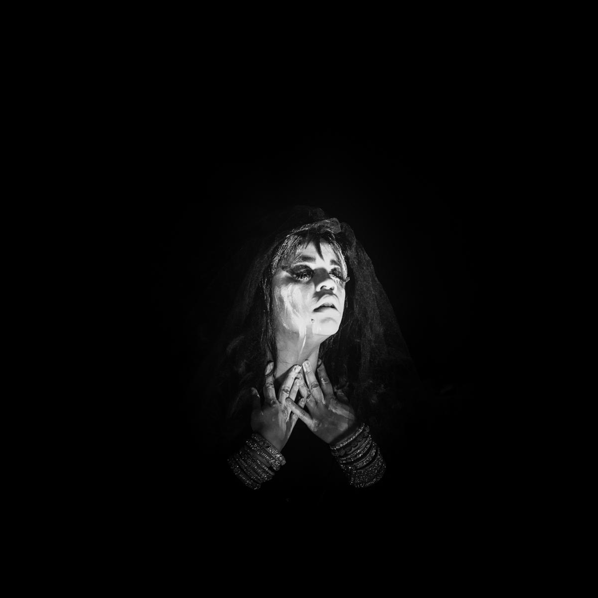
Devi Mambouka, the experimental musician who records as Masma Dream World, identifies the primary inspiration for her music as a universal energy that, depending on your cultural or religious context, comes with different names. For her, as she explained in our Artist Spotlight interview, it’s Mother Kali. She points out that not a single civilization exists without some version of the Divine Mother embedded in it, and that is who she is calling out for in the title of her latest album, an invocation visualized in the cover artwork, which she described as such: “I cry in despair as this deep sadness and longing for love drives me to seek death. No remedies or ancient spells can stop the monsters that haunt my dreams. Yet, I cry out to you, O Dark Mother, the only one who can save me from the clutches of this hell. PLEASE COME TO ME!”
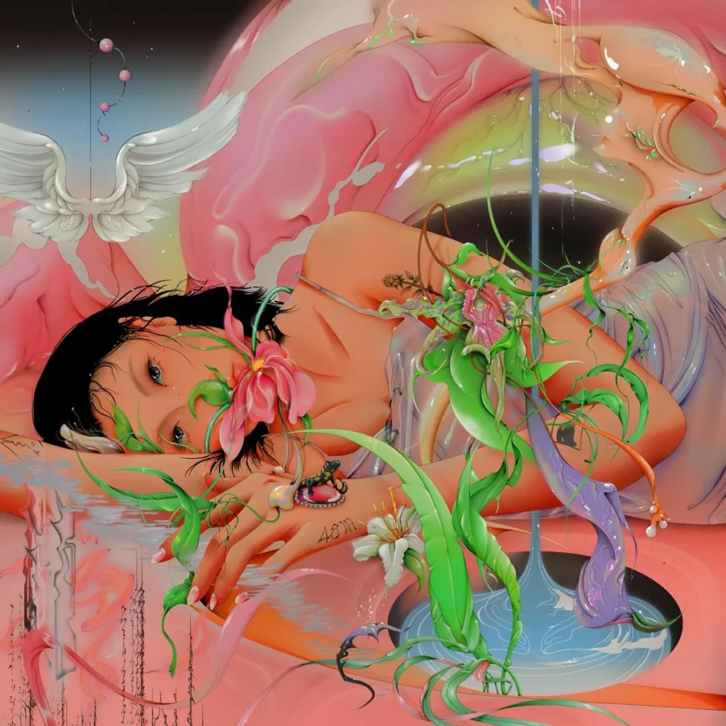
Saya Gray, SAYA
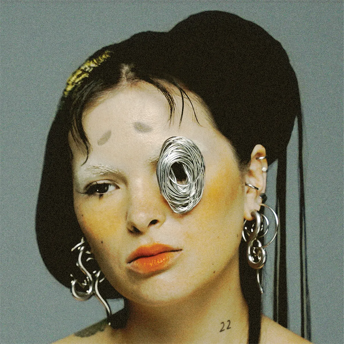
On SAYA‘s striking front cover, Saya Gray’s hair and makeup allude to her Japanese heritage, which she spends much of the album unpacking. The artist’s great-grandmother was a performer during Japan’s Edo period, playing traditional Japanese instruments like koto, which is also heard on the record. The image was conceptualized alongside Gray’s friend and collaborator Jennifer Cheng, and while certain elements were styled to reflect the past, there are some contemporary touches, too, like the metallic spiral covering her face. “We had this idea of remnants – of who you are, of a house, a relationship, or a past life,” Gray explained in an interview. “Jenn had the idea of putting objects in front of my face.”
Tortoise, Touch
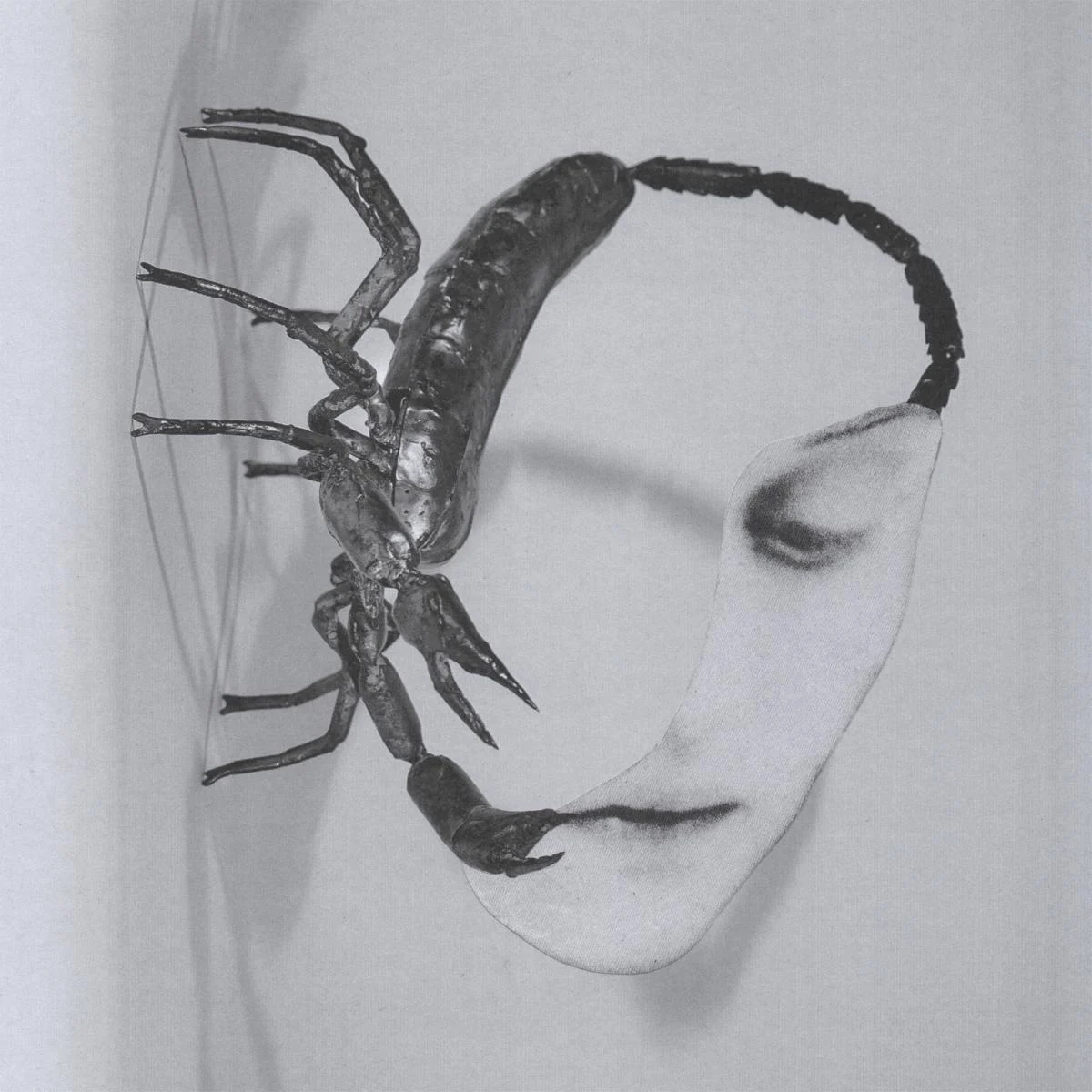
The cover of Touch, Tortoise’s first LP in nine years, is a meticulously stitched collage featuring a scorpion sculpture photographed by Heather Cantrell. Using the photo, the collage was made by Paw Grabowski at the invitation of drummer and multi-instrumentalist John Herndon, while Jeremiah Chiu did the entire album package design. Scottie McNiece, co-founder of International Anthem, which released the album, said, “I suppose it’s notable to say here that the scorpion sculpture was made by John McEntire’s father, Martin McEntire,” a mechanic and welder. But aside from that notable fact, the band has aptly preserved a sense of mystery around the front cover. Speaking with The Guardian, McEntire remarked, “Why he made it, I have no idea. He made exactly two sculptures in his life. He always had like a dozen little projects going at any given time, but … totally random.”
Drouth, The Teeth of Time
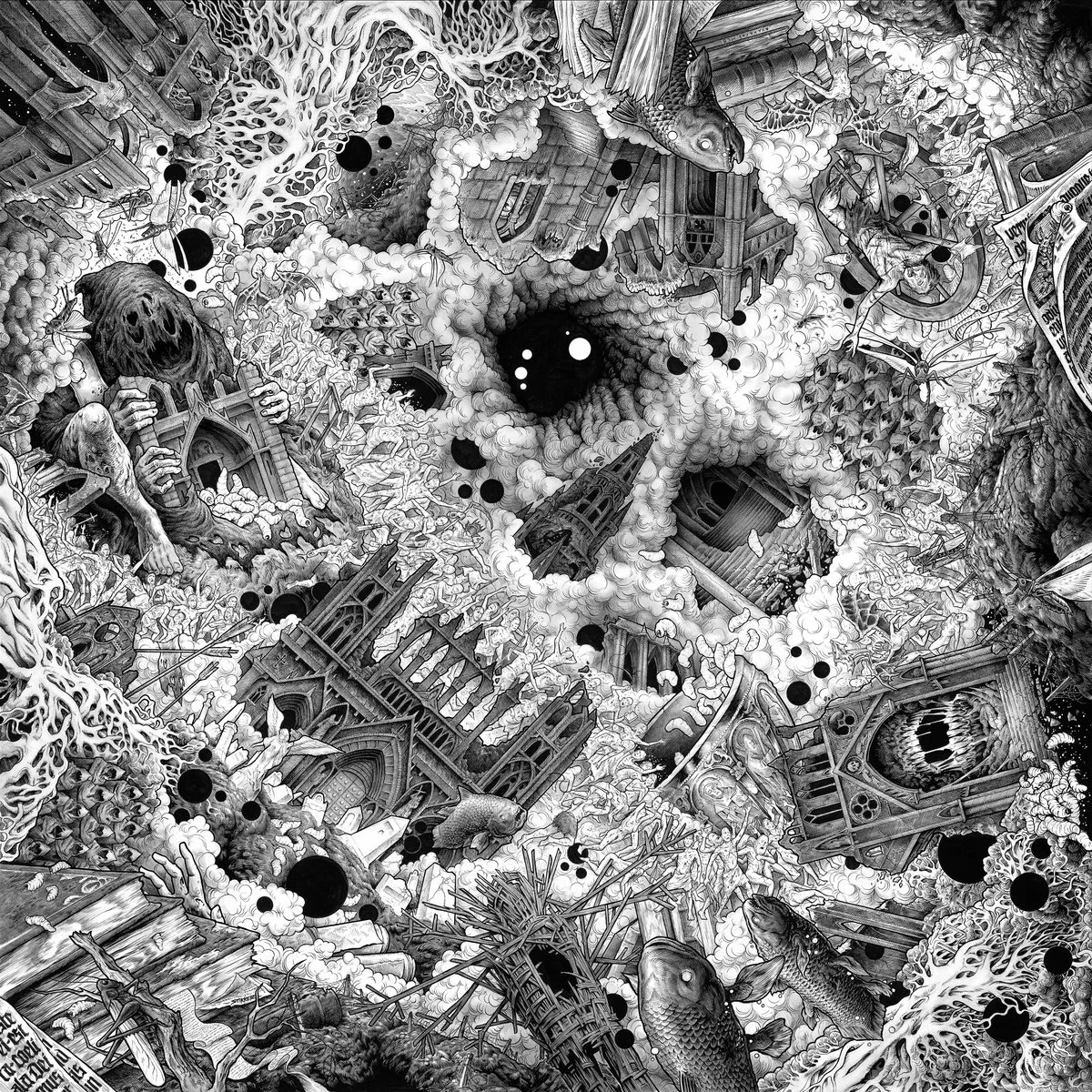
Matt Stikker, vocalist and guitarist of the Portland, Oregon black metal outift Drouth, designs the band’s artwork, and he painstakingly tapped into the frenzied, terrifying nature of The Teeth of Time while drawing its cover. “The artwork for The Teeth of Time is an effort to synthesize the lyrical themes of the record into a sort of tapestry of madness,” Stikker told Our Culture. “Rather than laying out a coherent narrative, the songs represent something closer to snippets of nightmares half-remembered after waking. As a visual counterpart I did my best to draw from our lyrics and fuse these fragments together into a symbolic dreamscape representing the mutability of time and the mystery of death that is the framework of human existence. The original piece, which is around 30″ square, was rendered with pencil and ink over the course of several months and well over a hundred hours of labor.”
Courting, Lust for Life, Or: ‘How to Thread the Needle and Come Out the Other Side to Tell the Story’
Courting’s third album in as many years is a joyful and vibrant collection of dance punk, earnestly playing with genre stereotypes balanced out by the indie rockers’ signature self-awareness. Lisa Signorini‘s cover art is striking, in part, because it suggests a world of colour while literally being drained of it. “As a band, one of our main artistic throughlines is to take cliches that are considered somewhat redundant and try to realise them in a more sincere way,” Courting said in a statement to Our Culture. “Considering the first part of our album title, we had the idea that our album cover should have a relationship with rock and roll stereotype at a surface level (motorbikes, leather jackets etc.) but then be presented in a completely sincere light. We reached out to Lisa who I think saw the beauty in the idea and executed it perfectly. For this album, we wanted everything to be black and white to play around with the idea of duality – but also kind of wanted everything to look as sleek as possible, as if it had came out of a perfume advert.”
Ryan Davis & the Roadhouse Band, New Threats From the Soul

A lot of album covers catch your attention by foregrounding weird, psychedelic shapes, but New Threats From the Soul works kind of inversely: its intricate structure is oddly pleasing to the eye before you start noticing its eerie, supernatural details, the kind that also creep into Ryan Davis’ deceptively straighforward music. The singer-songwriter, who did the artwork himself, explained in an email: “I initially had something completely different in mind for the general direction of the New Threats record cover. When I went to pull out an old drawing pad to get started on it, I saw a very roughly penciled-in version of the artwork that ended up being what we did use for the album art. It was something I had started years ago but had apparently lost the vision, which isn’t entirely common for my art practice these past 7 or 8 years. I like to finish what I start, it’s an important part of the process, just in terms of my own internal satisfaction…”
“But anyway, upon rediscovering, I stared at the sketch for about 45 seconds and that’s all it took to feel like this weird abandoned sketch of a psychedelic fish tank or whatever it was supposed to be at that stage would in fact be perfect, thematically speaking, for the overarching and/or underlying vibe of the songs therein,” he continued. “It took some digging in and carving out and slow refining of said themes, but in the end it felt and still feels pretty spot-on in its loose portrayal of a micro-environment for id, ego, and earthly nature to overlap and inhabit congruently. I don’t know what or where the image is supposed to be, exactly, but it feels like a window into the soul, or some sort of supernatural petri dish. There’s a bit of an aquatic-life motif throughout the songs on this record as well, which adds to the overall weight of the image. I’m pretty stoked with how it all came together.”
Clipse, Let God Sort Em Out
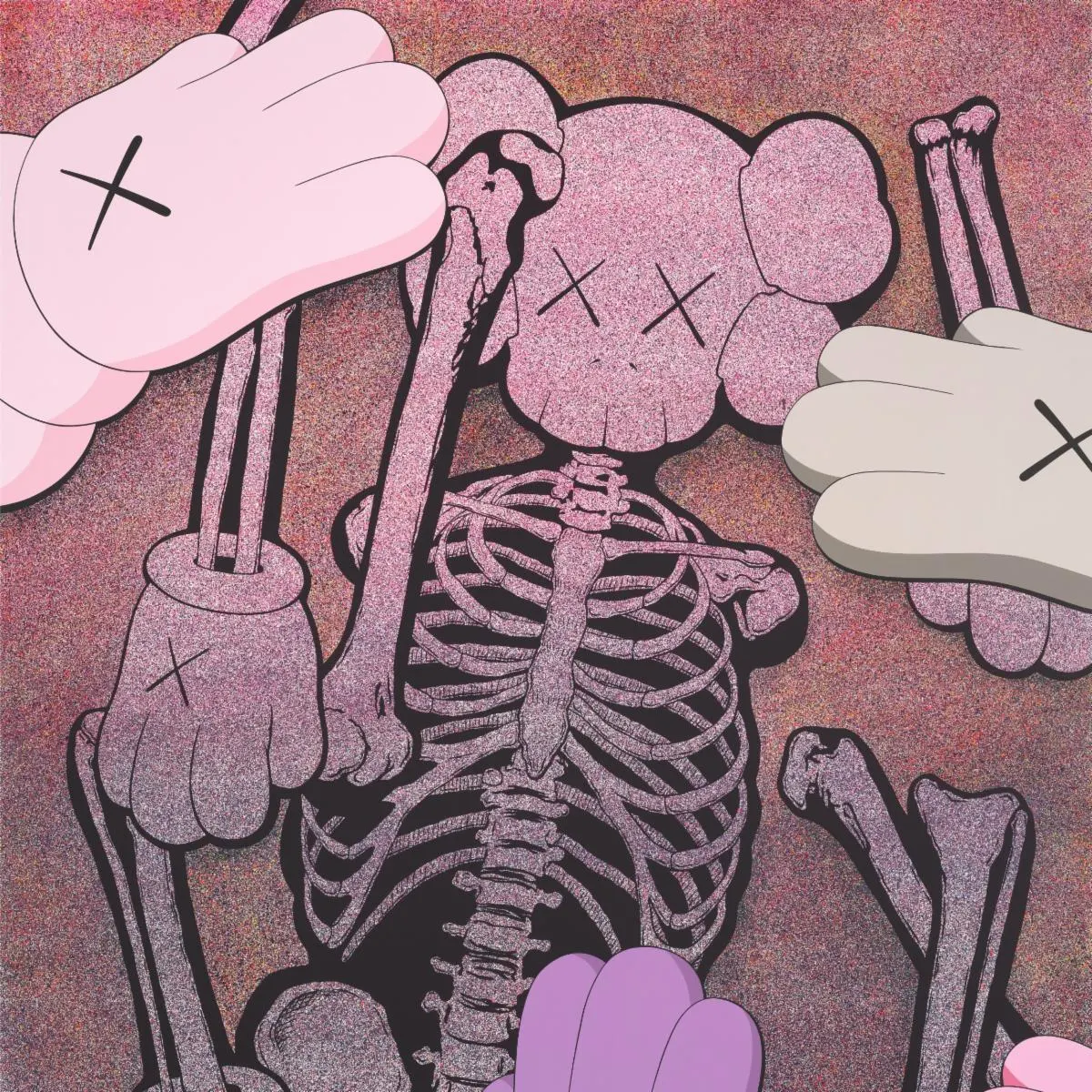
The cover of Pusha T and Malice’s comeback Clipse album centers on a figure by Kaws, the contemporary artist born Brian Donnelly, who also designed the cover for the duo’s previous album. Let God Sort Em Out‘s visual identity, though, offsets its cartoonish sensibility with a darker tone via the dismemberment of its character. “The approach was to work with the people we’ve been working with since the group was first around, and introduce where everyone is in their current careers,” Pusha T’s manager, Steven Victor, told Billboard of their marketing approach. “We’ve known KAWS for 20 years; he did the cover for Til The Casket Drops, so we’ve been friends and fans and had a relationship with him for a very long time.”
Sumac and Moor Mother, The Film
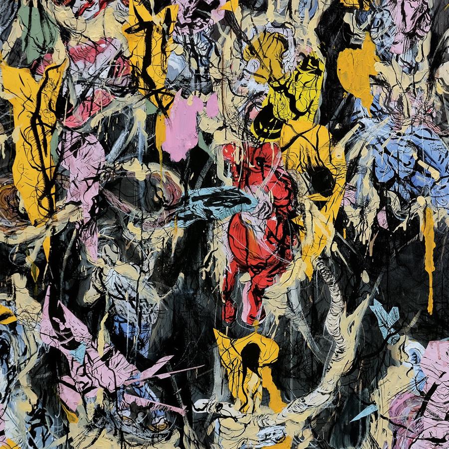
The painting that graces the cover of The Film – the atmospheric yet vigorous collaborative LP from experimental metal band SUMAC and avant-garde artist Moor Mother (Camae Ayewa) – was born out of conversations between Ayea and SUMAC singer/graphic designer Aaron Turner. As Turner told Our Culture, Ayea provided some reference photos of wheat-pasted images she found on city streets in Australia while on tour. “She suggested using these compositions as the basis for album art, reinterpreted as paintings or drawings. While taking the music we’d made and lyrics written by Camae as a cue, I first made a series of smaller paintings loosely based around the individual characters in her photos, cut them out and began layering them on a canvas. The canvas already had undergone several rounds of underpainting, and as the characters were added, further painting and drawing was done between successive layers. Listening to the finished mixes of the album at high volume was critical during the process – the sounds and the spirit needed to be forcefully pushed into the canvas. While working on the piece I kept taking photos and looking at various crops of it to get a different perspective on it, and find which portion worked as a cover – this process was repeated until it felt finished and a defined album image emerged.”
Gonemage/Lammoth, Aetherfrost Caverns

Garry Brents has had a prolific year, releasing a couple of EPs and a full-length under both his Gonemage and Sallow Moth monikers, plus an album as Homeskin, a “daytime counterpart” to Gonemage. Two of those projects, Sallow Moth’s brutal death metal assault Mossbane Lantern and Gonemage’s four-track EP with Lammoth, Aetherfrost Caverns, come with striking artwork by Jacob Devlin, an artist from Ohio who works primarily in fantasy and heavy metal-themed acrylic paintings. Devlin helps paint the scene for the collaboration’s icy, cavernous, and video game-like symphonic black metal, its chaotic textures and rugged edges – while affirming that yes, it’s dark, but also more colourful than a lot of music with similar genre tags.
Mogwai, The Bad Fire
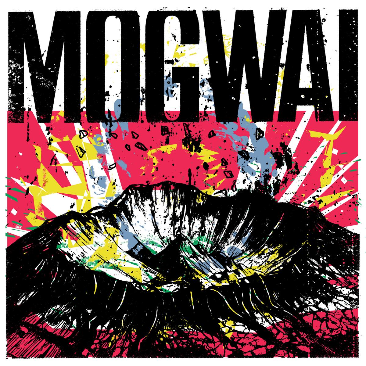
Dave Thomas has had a long-running creative relationship with Mogwai, which we dove into for our career-spanning feature with the artist, also known as dlt. His artwork for As the Love Continues topped our list of the best album covers of 2021, and his work for The Bad Fire encapsulates the cataclysmic quality of listening to the band’s music as both a headphones-on and live experience. Recorded in Blantyre, Scotland, the record takes its name from a Scottish colloquialism for Hell, a fact Thomas was not aware of until the very final stages of the artwork. That’s when the band landed on the title, though Thomas had been working to visually match the music’s aesthetic since he first heard the rough mixes in June 2024. At this stage, all the tracks were also untitled. “Starting with the track on the record that would later be called ‘God Gets You Back’, its looping melody line playing throughout – it brought to mind an image of something immense and slow-moving,” Thomas told us. “The rhythms and sounds suggested to me a spiralling object, geological in scale—overwhelmingly large, immovable. Something that evoked some sort of impending dread that you can’t quite put your finger on. This sort of set the scene for the imagery I had in mind as I listened to the whole album, sort of fragments of details from the same landscape.”
Inspired by fantasy and science fiction comics from the early 20th century, the cover expands dlt’s approach in mirroring not just the intensity but the textural depth of the compositions. “This time after drawing the elements in black ink pen, I used an old photocopier to reprint them numerous times and left whatever photocopy noise, dust and dirt that was picked up to remain in the image,” he explained. “To counter the hand-done black line art there was something cleaner and more digital that I felt might capture some of the more delicate sounds I was hearing. The word that kept coming to mind was ‘crackling’. A sort of visual version of flickers of static or sparks as they fade. I was seeing these in bright colours that could contrast the black. I created some simplified vector shapes and masked areas of painted and ink-rollered texture into those.”
Although this is the first Mogwai album in a while to feature both the band name and title on the cover, Thomas made sure it aligned with that texture, which he also applied to the additional imagery for the physical package. “I wanted something bold and legible, but that would have an impact and fit the textured feel of the artwork. I experimented with adapting and clipping the letter shapes using a narrow, bold typeface. The vertical lines at each end of the word MOGWAI felt like they would fit neatly into the square shape of the cover. Alongside the band logo, I also created a bespoke typeface that I photocopied, treated and rescanned in the same way as I had with the line drawing to give it a bit life / texture.”
Yetsuby, 4EVA
Sofia Hjortberg‘s cover artwork for 4EVA feels synthetic yet human, kaleidoscopic in detail yet smoothly textured; you could easily stare at it for the entirety of the album’s runtime. “I’m always a fan of the dreamy and the surreal – listening to 4eva made me really want to tune in to those aspects of Yetsuby’s music, which I also felt contained a mixture of dark and light,” the artist told us. “The cover ended up becoming a mix of a lot of things, just like the album itself: organic vs. digital, softness vs. edge, serenity vs. intensity. I tried capturing the tactile feel of the album’s soundscape through lots of texturing. My wish for the listener is that experiencing the album will be enhanced by having this artwork to look at; there are so many details I hope people will notice. With an image like this, I want you to be able to zoom in on even the smallest part and still find it interesting and captivating.”
Japanese Breakfast, For Melancholy Brunettes (& sad women)
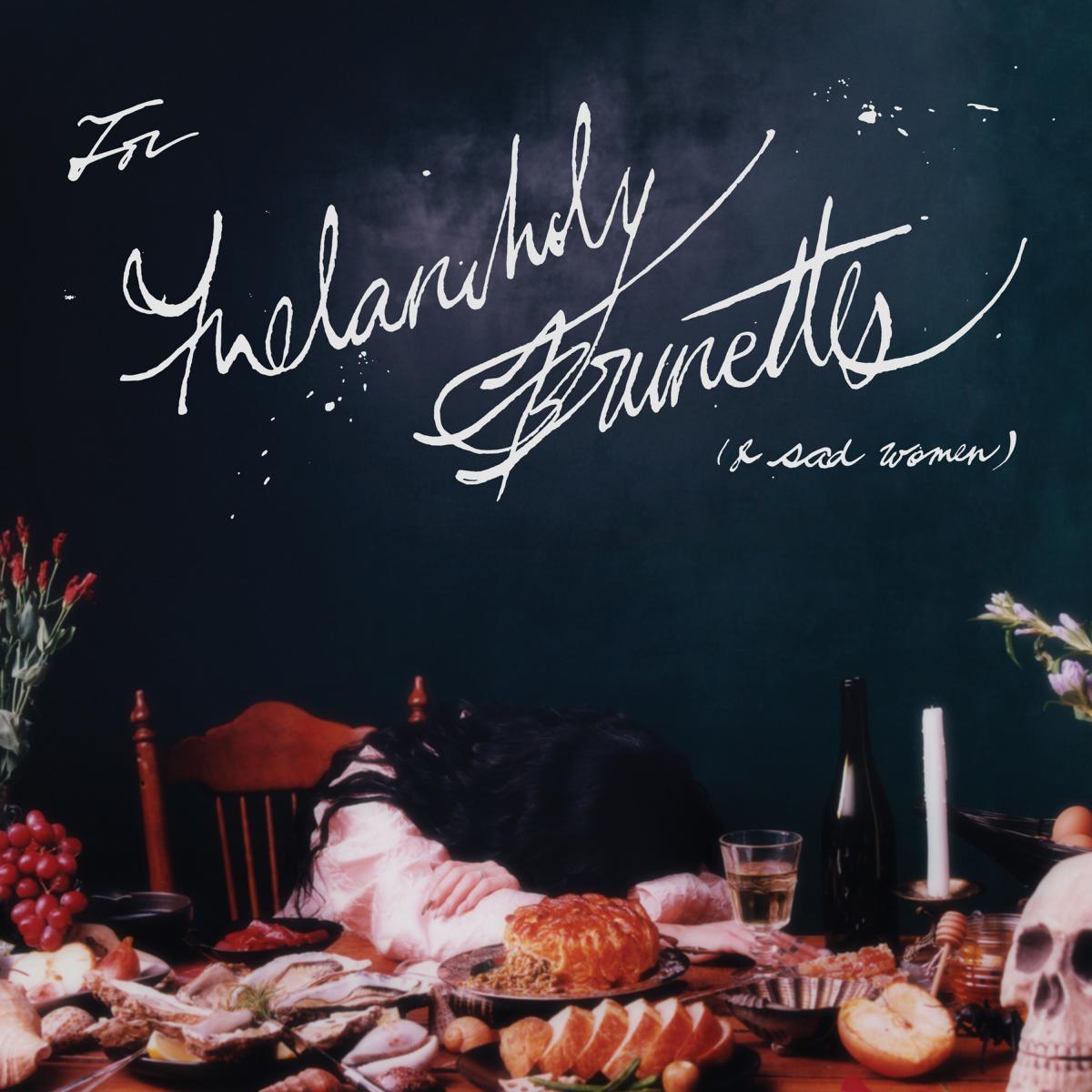
In both its musical and visual identity, Michelle Zauner took the baroque-pop influences behind her latest album quite seriously. Days before announcing For Melancholy Brunettes (& sad women), she posted a selection of paintings of women looking melancholic before revealing the memento mori-inspired cover of her fourth album, picturing her passed out on a table. She liked the idea of being on the cover without having her face featured, she told Vault Magazine, elaborating: “I wanted it to feel like a painting or still life and then have the set design and props all correspond to a symbolic meaning. There’s obviously the skull, which is memento mori; I think a lot of this record is kind of about contemplating mortality. There are oysters, which are a nod to the Venus in a Shell in Orlando in Love, and honey water and a milky broth, both track titles. There is a bowl of guts, which I referenced in Here is Someone, and there’s a vase of flowers, which I referenced in Winter in LA. So, all the objects on the table are nods to different lyrics. I wanted to emulate these myths or presuppositions of what certain things are supposed to stand for in still-life paintings. I also think it can be interpreted that there’s just a wealth of goods in front of me, and somehow, it’s still overwhelming and exhausting.”
Perfume Genius, Glory
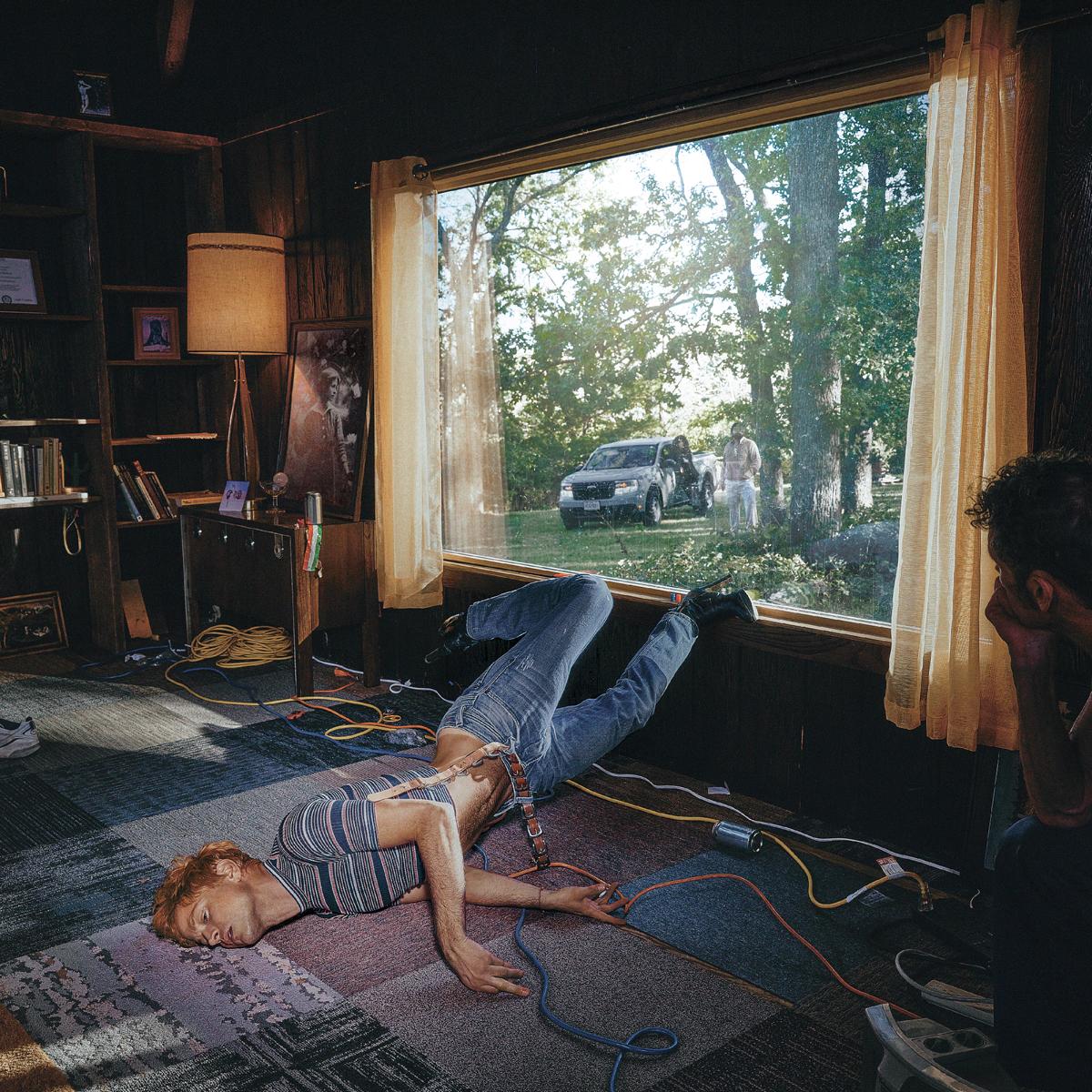
Perfume Genius has a history of extraordinary album covers; we named the album cover for his previous album, Ugly Season, the best of 2022. This year, it was exciting to see Glory named one of the first Grammy nominees for Best Album Cover, partly because of how off-putting it still is. Though not painted over as in Ugly Season, Mike Hadreas’ figure still appears slightly contorted, dramatically sprawled on the floor while the world looks in indifferently. Hadreas worked with photographer Cody Critcheloe by sending him a list of film scenes, including from The Piano Teacher and Julien Donkey-Boy, using them less as visual than energetic influences. In an interview with UPROXX, he singled out a scene in a Polish movie called Humanity, where a man is consoling his friend who just confessed to killing a little girl. “And then his friend comes into the room and starts consoling him, and then they start making out, which feels completely bizarre [laughs]. You don’t know how to feel. There’s tenderness, but then it’s also really revolting. There’s something really human about it. I wanted the album cover and the videos to have that energy.”
HAIM, I quit
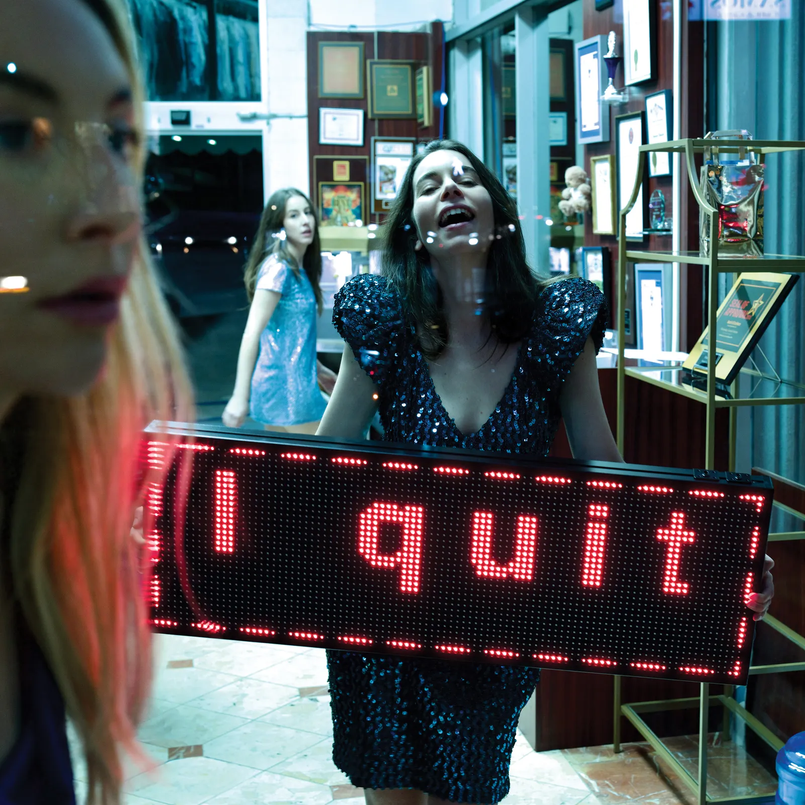
In addition to offering Alana Haim her acting debut in 2021’s Licorice Pizza, Paul Thomas Anderson has directed several of HAIM’s music videos. With his cover photo for the sisters’ latest album, I quit, he’s also responsible for what might be the band’s most stylish cover – an aesthetic that carried over into the band’s live shows, which turned the I quit sign into its own playful character. “Mostly it just seems to work until it’s clear we all need to be in the same space together and then someone calls ‘roommate meeting’ and we get together and figure it out,” PTA told GQ of his collaborative relationship HAIM. “We seem to be in a nice natural cycle of collaboration. It’s not going anywhere, if that makes sense. We’re stuck together.”
10. Malibu, Vanities
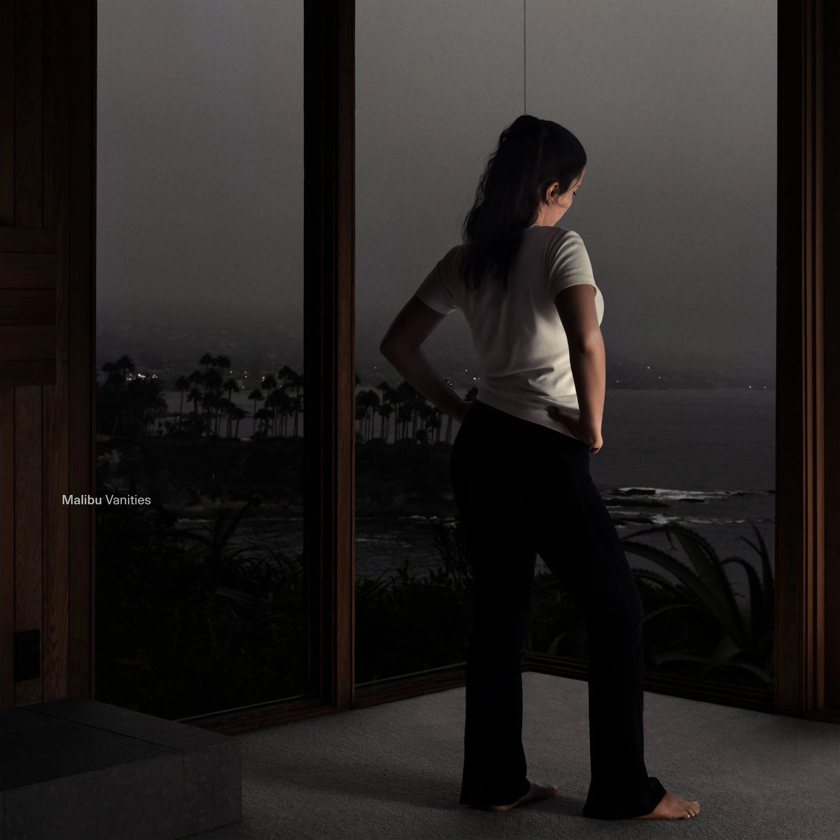
In a conversation with Meaghan Garvey that gets at the heart of the liminal yearning in Malibu’s music, Barbara Braccini said that the inspiration for the Vanities cover was an Alex Colville painting that happened to be hanging in the interviewer’s living room. When contacted via email, photographer Igor Pjörrt recalled another variation of that theme, made altogether softer and hazier in their hands, that served as a jumping-off point. “The departing idea for this image was a still from Beyoncé’s ‘Ring the Alarm’ music video, where she’s facing a window overlooking a rather beautiful stormy coastline. In that frozen split second, there’s something peaceful to her pose and the scenery that feels very distinct from the energy of the video and the music itself.”
“We both liked the idea of having Malibu present in the cover without necessarily seeing her face, playing instead with the idea of the audience observing her while she herself observes the landscape from the apparent safety of her glass-walled home,” Pjörrt added. “In the distance, fog seems to settle as a storm approaches. There’s a sense of waiting, of helplessness in the slow acceptance of a fate larger than oneself. To me, it also speaks to the experience of the sublime – the landscape reflecting something powerful back at you, confronting you with an inexplicable longing for something else, something more – something deeper.”
9. Ninajirachi, I Love My Computer

Call it controlled chaos, but Ninajirachi’s I Love My Computer cover evokes that feeling of knowing your bedroom is a mess and knowing precisely where everything is – regardless of whether you’ve used it in the past decade. Rather than alluding to the artist’s heavily digitized universe, the photo tangles together all the material objects that serve as its portal. “The bedroom was my very first instinct for the cover art in mid-late 2024,” Nina Wilson told us in a statement. “my friend aria orchestrated the mess and took the photo in my actual bedroom using stuff from around my house and borrowed from friends. my friend john and i brainstormed ten or so alternate ideas and we almost commissioned a giant steel structure to shoot for it instead, but ended up going back to my first instinct.”
8. billy woods, GOLLIWOG

billy woods’ masterful new album takes its title and cover art from a kind of rag doll, a racist caricature once common in British and American culture. “I think I first heard about GOLLIWOG while hanging out with woods listening to music,” photographer Alexander Richter recalled in a statement to Our Culture. “I remember him telling me he was working on an album that had a horror-inspired feel to the writing and he asked if I would want to make the album packaging photos. I think I next asked him if he had a title and that’s the first time I heard the word GOLLIWOG. Prior to that day, I had never heard of that word and was not familiar with those dolls. After some explanation of the word and the historically racist doll, I knew the photos were going to be challenging to make. woods’ friend made him a GOLLIWOG doll so my focus was to photograph it in real world situations. Fortunately, woods and I have been working together for so long that the inherent trust he has for my work leaves me with space to create without a ton of oversight. We discuss ideas/locations but woods really lets me create what I feel is right and then we make selects from there. Truth be told, I was a bit nervous to photograph the doll in real life settings.
“Fortunately though, no one went crazy when they saw me photographing the GOLLIWOG out in the city,” Richter continued. “One lady did say ‘what a cute doll’ which felt very uncomfortable. In the end, we chose the cover photo with the GOLLIWOG on abandoned railroad tracks in Queens. I really like how the doll is obscured a bit by the branches and bush that was around on that sunny but cold October morning. I’m a big fan of this packaging. I love the backwoodz original album art, as well as the Polaroid cover that they did in China. I think overall, the photos really match the feel of the music and tone of the record. I’m grateful always that woods believes in my art and asked for it to be the first thing his listeners interact with before hearing the music. I think by now Backwoodz Studioz fans know that we really pride ourselves on making iconic work that will stand the test of time and this cover does just that.”
7. Deftones, private music
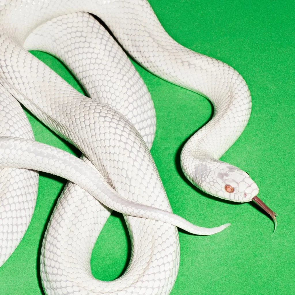
Visually, private music continues Deftones’ tradition of using white animals on their album covers, and the albino snake – captured by Kenneth Cappello – is every bit as striking as the iconic White Pony or Diamond Eyes‘ white owl. It also ties into the song ‘ecdysis’, which references the process of shedding skin in reptiles. In an interview with Moshpit Passion, drummer Abe Cunningham said that “[the snake] was one of the first images that we saw when were were getting the artwork together and we’re like, ‘That’s it, stop. That’s the one’.” He added: “It was a clean image juxtaposed with whatever was in the background. I don’t think there’s too much more than that. Maybe there is?”
6. Djo, The Crux

Neil Krug has earned a spot – sometimes multiple spots – on these lists for as long as we’ve put them together. His cover photos are often sleek yet distinctive, but rarely as visually busy and filled with easter eggs as this one for Djo, which is in the running for Best Album Cover at the Grammy. Yet the frantic, vibrant scene does little to detract from the photo’s immaculate composition. Above it all, an airplane tows a banner reading, “I’m sorry Cindy and I love you,” but Joe Keery won’t tell you what it means. He does admit that Rear Window was on the mood board, though – “and the edge of real and fake.”
5. Wednesday, Bleeds
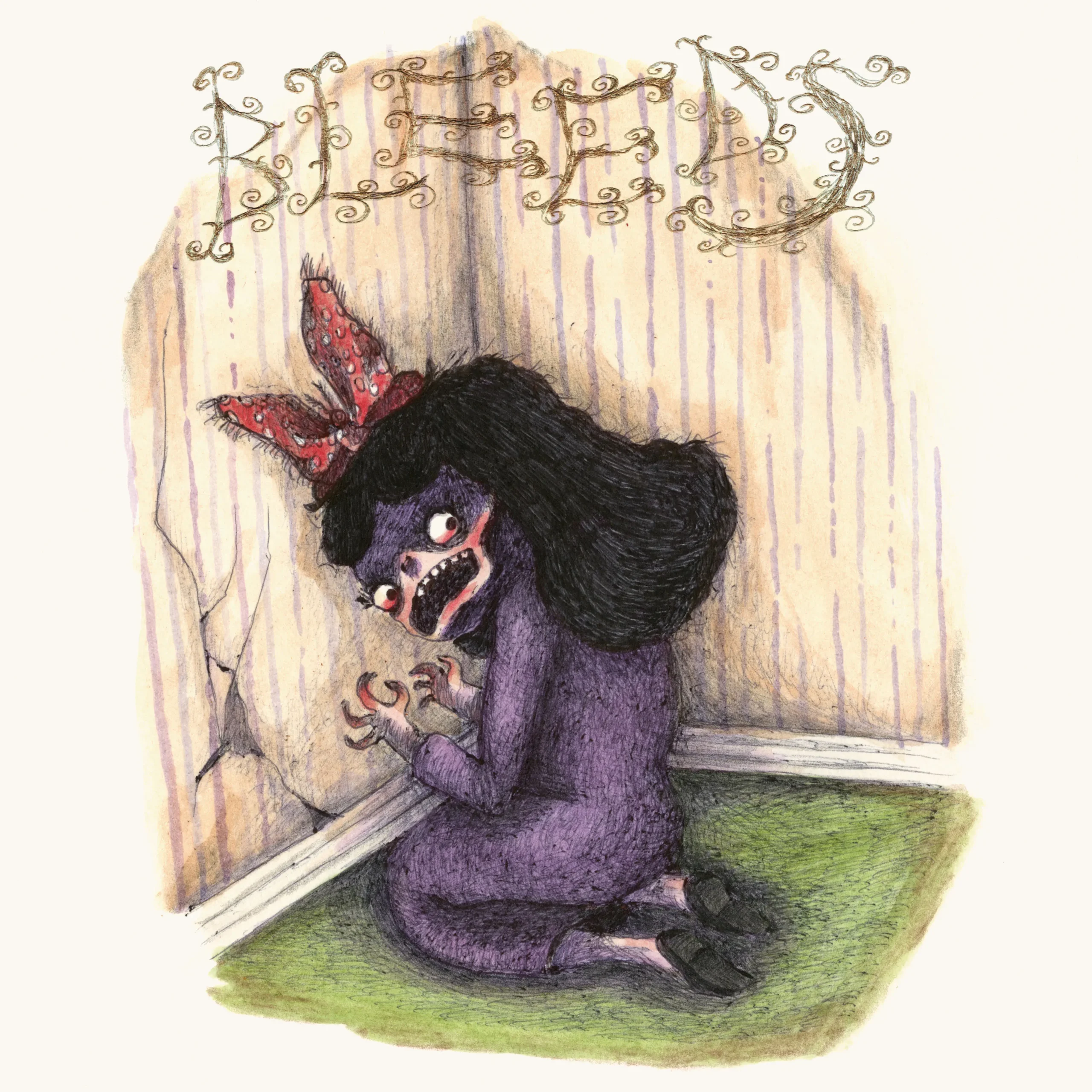
Karly Hartzman’s lyrics tend to blur the line between horror and humour, especially when filtering memories. That contrast is highlighted in Kamila Mlynarczyk‘s artwork for Bleeds, which is evocative of children’s illustrations but accentuates the eerie details that often get amplified through the passage of time. It’s like tuning into old Cartoon Network shows and realizing how dark they actually were – and then realizing you could say the same about your entire childhood. “I had been a fan of Kamila’s work for years, it captures the way that my memories from childhood feel more than any other visual art,” Hartzman shared over email. “The fear and wonder and powerlessness that comes with being a kid which leads to the disturbing discovery how the world works: all of this is described with this cover to me.”
4. Real Lies, We Will Annihilate Our Enemies
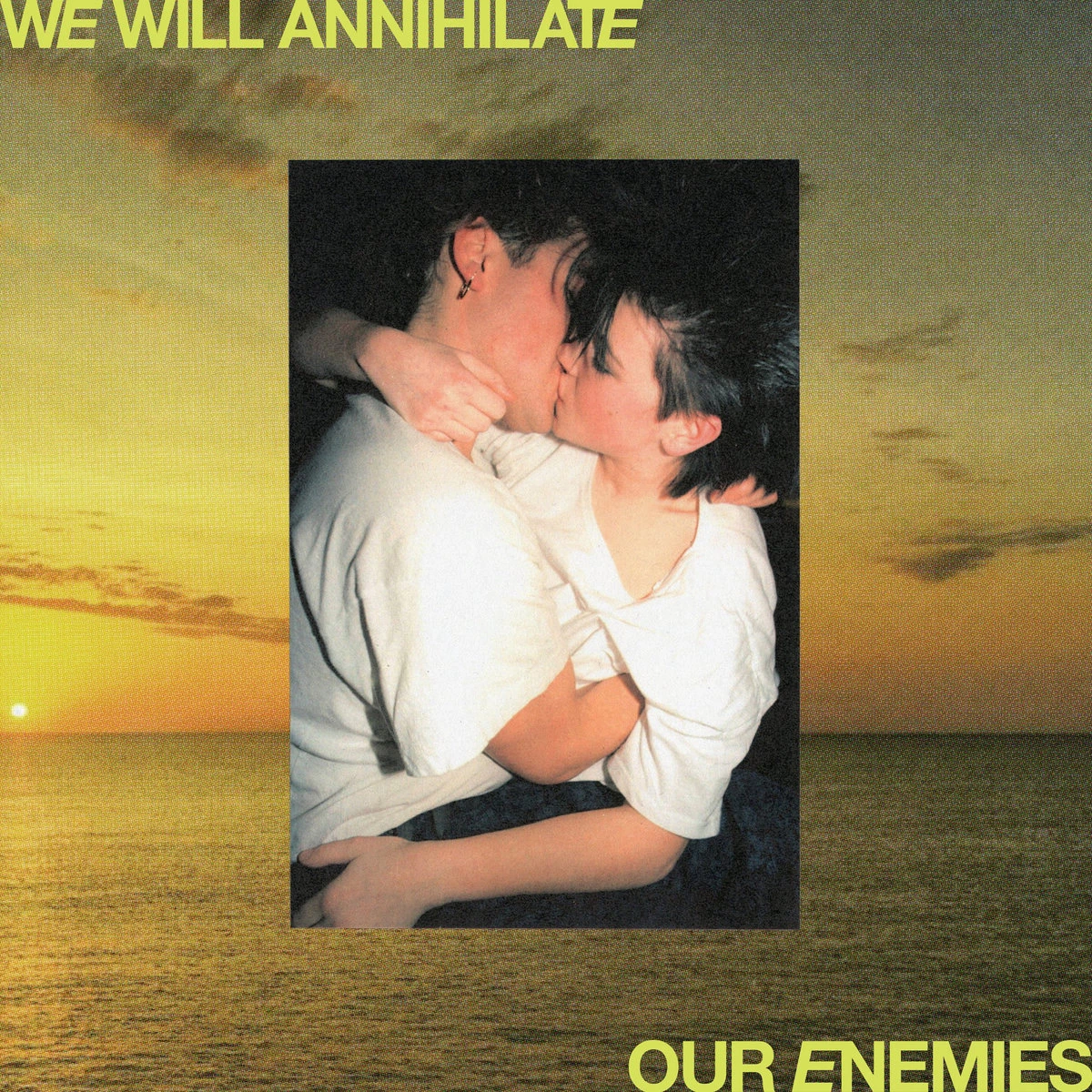
There’s multiple layers to the cover art for Real Lies’ We Will Annihilate Our Enemies, as sumptuous and romantic as the music it contains. It centers on a photograph by the legendary Tom Wood, with creative direction by Galen Bullivant and graphic design/layout by Luke Owen. “We had to create something attention grabbing but that still felt like us,” the band’s vocalist and lyricist Kevin Lee Kharas told Our Culture. “Modern life is a game of sharp elbows: between the thirst traps, war footage, culture war trolls, and endless videos of public transport punch ups, music can fall away. Especially music like ours, which is deliberately devoted to nuance and mapping the ambiguous gaps between on the emotional map. I’ve always been a romantic. I decided a while ago that it was a more noble task to try to stay romantic and to romanticise the modern world than to endlessly lament its endless irritations and tragedies. So I decided to live in that world and take what I could from it – by deploying the most obnoxious album title I could think of alongside the most romantic imagery I could find: two star-crossed teenage lovers sharing a first kiss against an impossible Balearic sunset. Initially, I mocked up a crap 68kb version of the cover on Preview after realising what it needed to be whilst drunk. My friend Ciaran is the son of Tom Wood, the legendary Scouse nightlife photographer, and he chose the perfect photograph from the archive to go with the title of We Will Annihilate Our Enemies; it’s my favourite art we’ve produced as a band and I’m eternally grateful to Ciaran, to Tom, and to our graphic designer Luke Owen and creative director Galen Bullivant for helping bring it to life.”
3. Jane Remover, Revengeseekerz
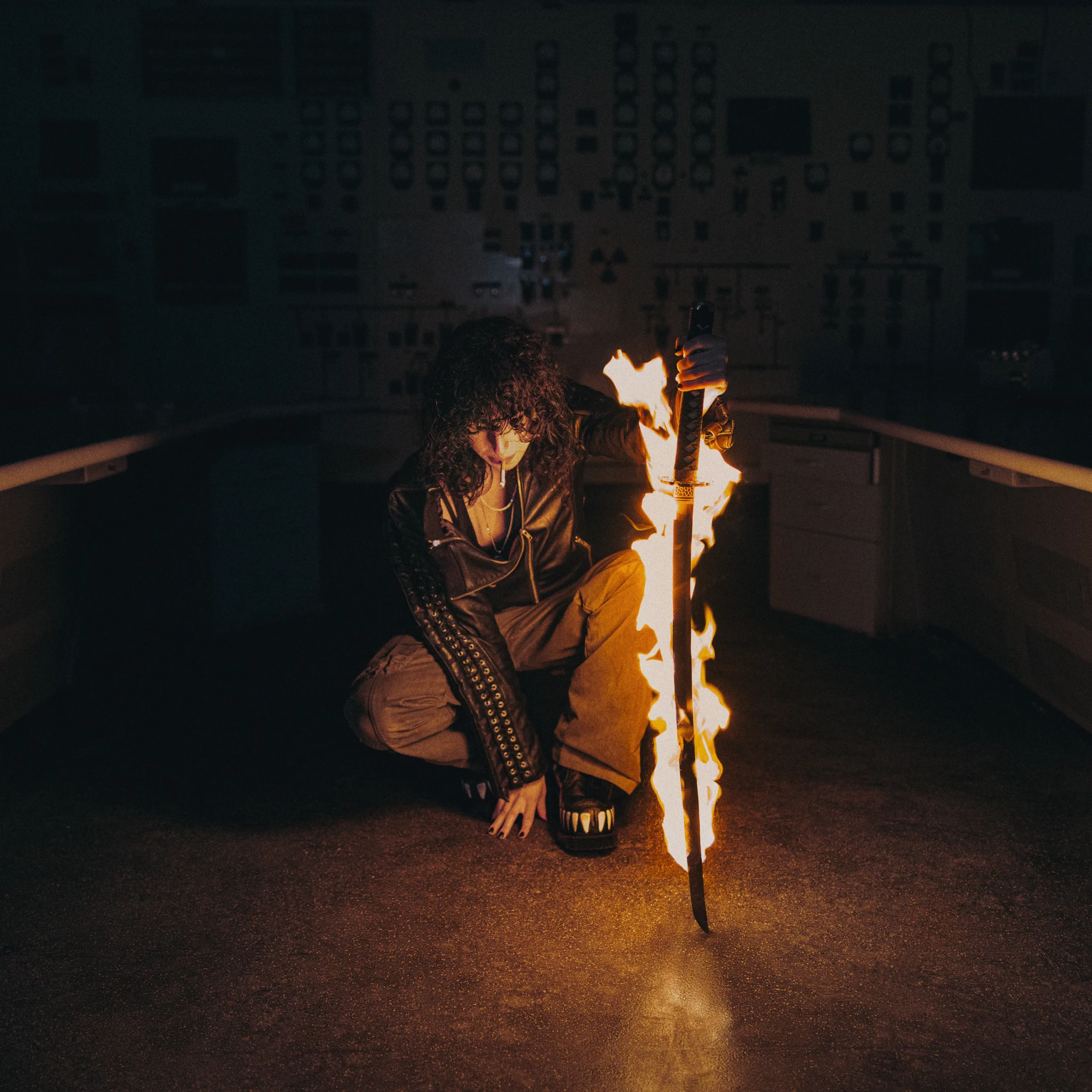
The cover photo for Revengeseekerz might be a dramatic one, but it’s a great fit for the blown-out, explosive sound of Jane Remover’s latest album. The fire is real, too. In an interview with PAPER, Jane Remover explained how they came up with the idea with photographer Brendon Burton. “I gave him a visually rough idea of, ‘This is what I’m thinking,’ and it was honestly based off of a lot of video game screenshots. And then we scouted a place, and we shot in Oxnard, California. And he was like, ‘This is how you make a fire.’ Essentially. It’s basically just butane, water, and soap. Basically the water doesn’t catch fire, it’s just the bubbles. And since the bubbles are in contact with the water, so the second the fire touches the water it gets put out. So you don’t really get burned.”
2. Quadeca, Vanisher, Horizon
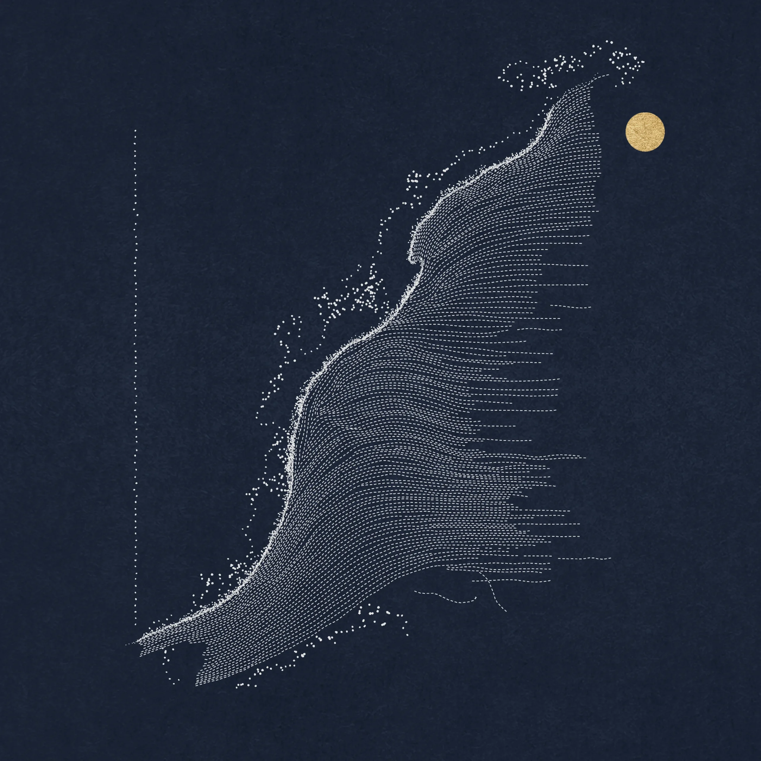
Quadeca’s most ambitious and exploratory album, Vanisher, Horizon centers on a sailor’s voyage; the rapper actually learned how to sail for the accompanying visuals. The campaign’s most captivating image, though – minimal yet wonderfully intricate – is the cover art by Digiyams. “Vanisher is an apocalyptic concept album about a sea voyage to reach the horizon,” Quadeca said in a statement to Our Culture. “The cover is an artful twist on nautical maps, where dots and dotted lines are typically used to represent positional information. The dots form an abstract shape that doubles as both ocean waves and a wing (the climax of the album happens when the narrator encounters a mythical sea dragon called the bakunawa who brings about the end of the world. The cover kind of looks like a dragon wing which is also cool.” Maruja’s Harry Wilkinson contributes significantly to the album, which leads us to…
1. Maruja, Pain to Power
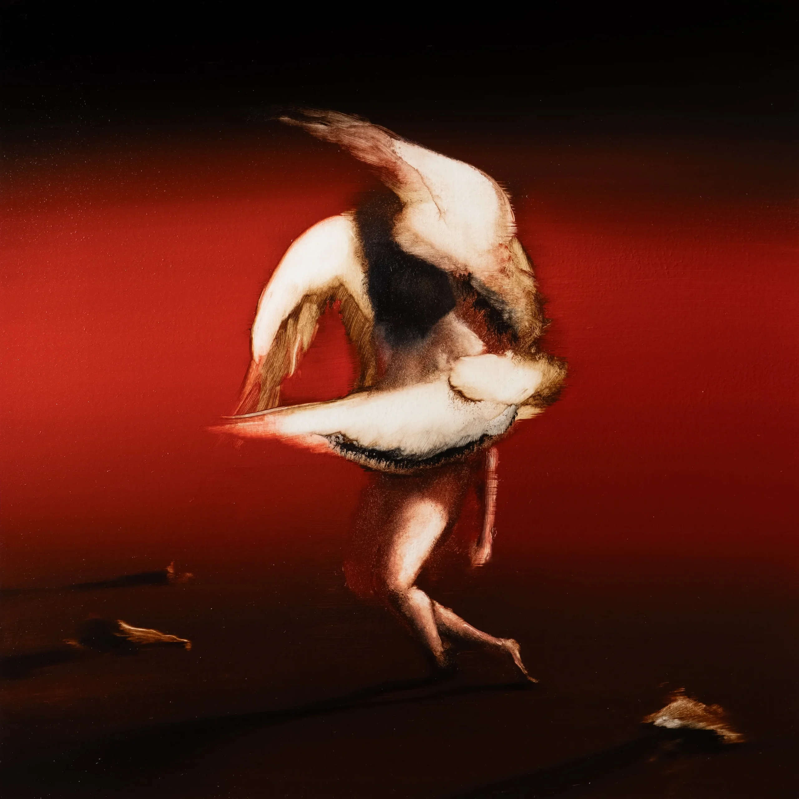
Maruja describe the cover artwork for their debut album, Pain to Power – at once stunning and discomfiting – as “sitting somewhere uncomfortably in-between worlds, hauntingly familiar, yet dauntingly unknown.” The Manchester jazz-punk band made our best album covers list last year for the photograph gracing their Connla’s Well EP, but this cover exists in a realm of its own. It was made by Mikey Thomas, a childhood friend whose practice shares the same roots, histories, and folklore as the band’s music.
“Mikey is someone we knew growing up in Stockport playing in bands, but as we somewhat parted ways a few years ago, we dedicated our time to honing our musical craft,” the band explained in a statement. “Mikey delved into the world of visual art. Still honouring the same philosophy that he learned as a musician, a philosophy we share and deeply uphold today – similar to our writing process, Mikey relies on improvising. Tapping into Flow state and allowing the tools of those around you to channel the work, this art bears the true essence of creativity. We couldn’t think of anything that fits the music as uniquely as this artwork does, it elevates and completes the world of Pain to Power – something only great artwork can achieve.”
Thomas reflected on the collaboration in an Instagram post, saying, “The first time I heard the album was the day the band finished recording in the studio. We listened to it in full together that same evening. It was immediately clear to me – from the flashes of images that it was conjuring in my mind – that my job was to inhabit the world of this album and attempt to draw out and crystallise some of the flashes I was seeing of this enormously rich and deep world they had created.” He added, “Every act of making and translation both reveals and distorts and reveals the world that it spawns from. Painting has made me sensitive to this process and equally sceptical of categories. I see these works almost like captured byproducts, slowed down fragments of the album filtered through a form of visual and audible rhyming.”
