In today’s health-conscious age, more and more consumers are focused on feeding their families fresh produce. This trend has led to a massive surge in demand for fresh fruit and vegetables, organic produce, and farmers’ market offerings.
However, there is a critical aspect often overlooked by many in their quest for farm-fresh goodness: recall data. This information, which reveals which products have been pulled from the market due to safety concerns or violations, can be an invaluable tool in selecting the freshest, safest produce possible.
Research, But Don’t Judge Unduly
Before we dig too deep into this, it’s important to note that a past recall doesn’t necessarily mean a product can’t be trusted in the future. The producer is likely to have done everything in their power to rectify the issue and prevent it from recurring.
Sometimes recalls may have occurred due to issues outside the brand’s control (for example, products may have become contaminated long after leaving the brand’s supply chain). That being said, good, transparent recall information should always be provided – even if the brand has improved its processes or is not responsible for the problem.
For example, Taylor Farms recall information is widely and freely available, indicating honesty and transparency. Other brands may not be so honest, which is often more of a red flag than the recall itself.
The Role of Recall Data in Ensuring Safe Produce
Staying abreast of recall data is a good way to avoid risky products – especially for food vendors. For end consumers, knowing which products to avoid can help keep you safe and healthy.
For food businesses (for example, restaurants, pop-up food vendors, and so on), it’s even more important to know about recall notices from anywhere in your supply chain. If, for example, an ingredient you have used is recalled due to contamination, you will probably need to dispose of and/or thoroughly clean everything that ingredient has come into contact with, or you risk your food making people sick.
Commenting on Recall Transparency
So, following recall notices is important – but sometimes finding and interpreting recall data isn’t easy at all. Not all companies are transparent about their recalls, and the information may not be readily accessible to consumers. Additionally, the layperson may not understand the science behind food safety, leaving them unsure of the implications of a specific recall. To those struggling with these obstacles, fear not. Food safety organizations, as well as groups such as the FDA, provide easily digestible (no pun intended) information and details about the steps companies are required to take to rectify the situation.
The Risks of Ignoring Recall Data
Ignoring recall data can lead to grave consequences. Consuming adulterated foodstuffs leads to foodborne illnesses. At best, you might feel a little queasy for a while. At worst, you could be hospitalized, or worse. Paying attention to recall data and cleaning out your cupboards if anything you own has been recalled can slash your risk of contracting nasty illnesses.
Recall Data Supporting Responsible Consumerism
Apart from the health-related aspect, paying attention to recall data also contributes to responsible consumerism. Regularly investing in products from a manufacturing company that doesn’t seem to have learned its lesson about safety can indirectly encourage poor handling or negligence. Alternatively, supporting brands with a solid safety record and transparency about any recalls helps promote better habits industry-wide.
An Informed Consumer is a Healthy Consumer
Paying careful attention to recall data when purchasing fresh produce is more than just a shrewd move to ensure your personal health and safety. It’s a statement – a commitment to high standards of food production and a refusal to compromise on health and safety. So, the next time you find yourself wandering among the aisles of fresh fruits and vegetables, remember to arm yourself with knowledge. It’s your most potent weapon in the fight against foodborne diseases and a proactive strategy towards promoting overall food safety.
Records are similar to books in one odd way: people judge them by their covers. It isn’t fair, but it’s the reality every indie artist deals with when releasing new music. And with streaming platforms flattening everything into a square thumbnail, the bar for album art keeps rising. How do you stand out from the sea of similar covers?
Well, AI may be able to help. In a somewhat controversial way (according to many) but still useful way.
But first, let’s get this one thing out of the way: AI cannot “replace designers,” nor is its purpose to push every artist into the same aesthetic. It’s simply a faster, cheaper way to explore ideas you don’t have the budget, time, or technical skill to test manually.
How to Create Album Covers with AI
Start from the song, not the software
Begin with a short brief you can hold in one sentence: what does the lead single want the listener to feel when they first see the cover? Turn that sentence into three visual anchors (e.g., “fractured polaroid,” “grainy synth lines,” “muted teal/umber palette,” etc.). Use those anchors as constraints during each AI pass. Constraints are good: they make creativity practical.
Rapid concepting: iterate like a musician
Run multiple quick passes that test a single variable at a time. For example:
Pass A: composition and framing (portrait, square, negative space)
Pass B: texture and grain (film, canvas, glitch)
Pass C: typography scale and placement
Each pass should produce 6–12 variations. That volume reveals patterns and false leads fast; then you keep the strongest parts and remix them. Many musicians report higher experimentation rates now that editing cycles shrink (and some surveys show dramatic adoption of AI among creative professionals).
Tools and techniques that help
Use model blending and style transfer to remix visual histories: pair a 1970s LP-scan aesthetic with contemporary geometric layout. Fine-tune or supply reference images to steer the outcome toward your specific voice (you can train a small LoRA or use image-based prompts).
When you need surgical fixes (remove a mic stand, widen the canvas, or tune color balance) use lightweight editors. For instance, Krea’s Image Editor lets you edit images with AI and handle inpainting or outpainting quickly.
Texture, scale, and legibility (some practical rules)
Design at the intended final size first (usually 3000×3000 px for platforms), then test smaller sizes; thumbnails expose failures quicker than full-res comps.
Keep primary type readable at 150×150 px. If your logotype becomes a blur, redesign the mark.
Use textured layers sparingly (subtle grain or print halftone communicates tactility; heavy texture can obscure faces and typography).
Combine Human Craft With AI Control
AI gives you speed, but it doesn’t give you discernment. That part stays on you. Besides, that’s where most of the creative satisfaction lives. So, take what the model produces — the surprisingly good, the almost-there, the “wow, this looks like a lost bootleg from 1998” — and decide what deserves to move forward, what needs to be cut out, what needs improvement.
In essence, you want to treat AI outputs as raw materials rather than finished visuals. So, pull your favorite candidates into a pixel editor, then start shaping them with the same intentionality you’d use when finishing a track. For example, adjust the color balance to match the emotional temperature of the record. Replace a font that doesn’t quite match the energy of the songs. Tighten kerning. Remove that one strange artifact in the corner that you didn’t notice until the tenth time you looked at it.
Small edits matter more than people expect. A tiny change in contrast can change how a face reads. A one-point adjustment in type size can take the layout from amateurish to confident. And when an AI-generated image leans too “clean,” do introduce controlled flaws like dust, scan marks, subtle distortion, etc., to anchor it in a real-world aesthetic. Those flaws often make the final design feel grounded and intentional.
It’s also best to use comparative rounds as part of your workflow. Set two or three shortlisted versions side by side and look for the one that supports the music rather than competing with it. The right cover has a sense of inevitability: you look at it and think, yeah, that’s the one that actually fits the project. AI can’t make that call. Only your taste can.
When all is said and done, the simplest way to think about this part of the process is that AI drafts, but you direct. You make the final pass.
Digital casino platforms exist at an interesting intersection of design disciplines. They must convey trustworthiness while maintaining excitement, balance information density with visual clarity, and create distinctive identities within crowded markets. The aesthetic choices these platforms make reveal assumptions about their audiences and the cultural moment they inhabit.
The sweepstakes casino category, which exploded from roughly 30 operators to more than 180 between 2020 and 2025, provides a compelling case study in digital design evolution. Each platform attempts to distinguish itself while working within genre conventions that users expect.
Colour Palettes and Emotional Signalling
Most sweepstakes casinos employ rich, saturated colour schemes dominated by purples, golds, and deep blues. These choices connect to longstanding associations between these colours and luxury, wealth, and entertainment. The historical link between purple and royalty translates into digital spaces where platforms seek to evoke exclusivity and value.
Gold accents appear universally across the category, though implementation varies. Some platforms use metallic gold textures attempting photorealism. Others employ flat gold tones that read more contemporary. The choice signals different aesthetic values and target demographics.
Black backgrounds dominate the category, creating contrast that makes games and interface elements pop. This also reduces eye strain during extended sessions, a practical consideration given that users may engage for hours. The darkness creates focus, drawing attention to the bright game thumbnails that constitute the primary visual content.
Typography and Trust
Font choices in digital gaming spaces serve dual purposes. They must maintain legibility across devices while conveying appropriate personality. Most platforms select sans-serif typefaces for interface elements, prioritising clarity over character.
Headlines and promotional content often employ bolder, more distinctive typography. These moments allow platforms to express brand personality that gets suppressed in functional interface text. The contrast between decorative headlines and utilitarian body text creates visual hierarchy guiding user attention.
Numbers receive particular attention in gaming contexts. Prize amounts, bonus values, and game statistics appear in typefaces optimised for numerical clarity. These often differ from the platform’s primary font, recognising that users scan for specific numerical information within larger visual contexts.
Layout Patterns and User Flow
Sweepstakes casino layouts follow established conventions borrowed from traditional casino design. Games arrange in grid formats allowing rapid scanning. Category filters appear prominently, enabling users to navigate vast libraries. Featured content occupies prime screen real estate, with platforms promoting specific games or bonuses through placement and visual emphasis.
Mobile responsiveness has become non-negotiable as smartphone usage dominates engagement. Platforms must translate desktop experiences to smaller screens without losing functionality. This constraint influences desktop design as well, since elements that translate poorly to mobile often get reconsidered across all formats.
Scrolling behaviour varies between platforms. Some favour infinite scroll approaches, continuously loading content as users navigate downward. Others implement pagination, creating defined sections users move between deliberately. The choice affects how users discover content and how platforms control engagement flow.
Visual Differentiation Strategies
With 180-plus platforms competing for attention, visual distinction matters commercially. Some operators embrace maximalist aesthetics, layering effects and animations to create sensory-rich environments. Others pursue minimalist approaches, using restraint as differentiation within an excessive category.
Thematic branding offers another differentiation path. Platforms like SweepShark employ underwater aesthetics throughout their interfaces. Sweet Sweeps commits to candy-themed visuals. These thematic choices extend from logos through game selection to promotional materials, creating cohesive visual worlds.
Resources offeringsweepstakes platform reviews like Sweepsy, a thorough comparison resource, catalogue different operator aesthetics and approaches for those researching visual variety across the category.
Animation and Movement
Digital casino platforms employ animation extensively. Game thumbnails often include subtle motion attracting attention. Promotional banners cycle through offers using animated transitions. Win celebrations explode across screens with particles and effects.
The density of animation varies significantly between platforms. Some maintain relatively static interfaces, reserving motion for specific moments of emphasis. Others create constantly moving environments where stillness barely exists. User preferences divide on which approach feels more engaging versus overwhelming.
Performance considerations constrain animation ambitions. Platforms must function on varied hardware, from latest smartphones to older tablets. Animations that perform smoothly on powerful devices may stutter on less capable hardware, creating negative experiences for users with older technology.
Evolution and Iteration
Gaming platform design evolves continuously. Comparing current interfaces to those from five years ago reveals substantial changes in visual approach. Trends from broader digital design, including dark modes, rounded corners, and gradient backgrounds, appear in gaming contexts after establishing themselves elsewhere.
New platforms often adopt contemporary design trends immediately, while established operators update gradually. This creates generational differences visible when comparing long-running platforms against recent launches. Neither approach guarantees better user experience, since familiarity and novelty both carry advantages.
The visual language of digital gaming continues developing as the category matures. Design choices that feel standard today may seem dated within years as conventions shift. Platforms maintaining relevance will need to balance consistency with evolution, preserving recognition while avoiding stagnation.
Further exploration of digital design principles appears through resources includingAIGA, the professional association for design, andIt’s Nice That, which covers contemporary creative work across disciplines.
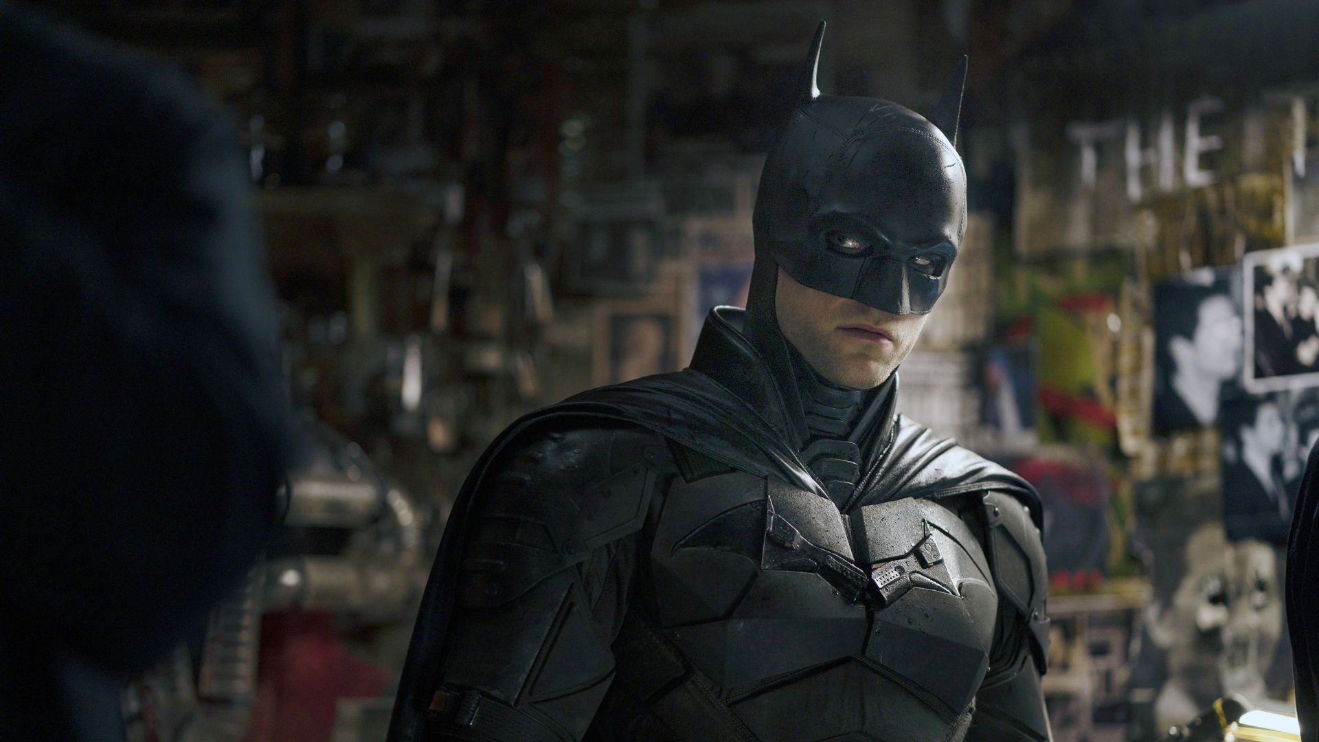
Matt Reeves’ The Batman gave us a noir-heavy detective story that was both grounded and gory, introducing a younger, angrier Bruce Wayne who was still learning what it meant to be Gotham’s Dark Knight. Three years on, The Batman Part II is finally in development at Warner Bros. and now stands as one of the most anticipated DC movies, despite Robert Pattinson’s Caped Crusader sitting outside the main DCU under the Elseworlds banner.
Barring all the production delays and release date pushbacks, development on The Batman Part II has been coming together quite nicely, with the script now locked and production set to kick off sometime in spring 2026. Director Matt Reeves has already started to share more details surrounding the sequel, as have cast members like Colin Farrell, who has described the script as “a contemporary genre masterwork.”So, based on what has been officially confirmed so far, along with leaks and rumours circulating, here’s everything we currently know about The Batman Part II, including its release date, expected cast, story details, and more.
The Batman Part II: Release Date
After a number of delays, The Batman Part II has finally locked in a release date of October 1, 2027. While it’s later than initially planned, we don’t think there will be any further delays as the script is locked and filming is expected to begin in spring 2026.
The Batman Part II: Cast
Matt Reeves and co. are keeping things fairly hush-hush when it comes to the cast of The Batman Part II, but it’s safe to say many of the original cast members will be back for the sequel. That includes some obvious names, starting with Robert Pattinson, who will reprise his role as the brooding Bruce Wayne. Colin Farrell is also back as Oz Cobb, having confirmed to Variety that he’ll return, though he won’t have a prominent role this time around. Other cast members like Zoë Kravitz as Selina Kyle/Catwoman, Jeffrey Wright as Jim Gordon and Andy Serkis as Alfred Pennyworth are also expected to return for The Batman Part II.
Not everyone from the wider Batman universe will be returning, though. Despite her excellent performance as Sofia Falcone in The Penguin TV series, Cristin Milioti won’t be appearing in The Batman Part II. The reason, as Reeves explains, is that the script for The Batman Part II was already far along by the time the HBO series premiered. “Cristin’s not in this one,” Reeves told MTV at The Emmys. “But that’s because we were so deep into the script by the time we were in the show, so. But we’ll see. I mean, I think she’s incredible. What she did in the show is just astonishing. And what Lauren (LeFranc, showrunner) did in creating that character – I mean, creating this version of the character – is so special.”
As for new additions, few would have pegged Scarlett Johansson to show up in a DC movie, let alone one set in Matt Reeves’ Batman universe, but the Black Widow actress is now reportedly in talks to join the sequel. According to The Hollywood Reporter, Johansson is in final negotiations to star in The Batman Part II, with Jeff Sneider’s The InSneider recently revealing that Johansson is being eyed to play Gilda Gold, the wife of Harvey Dent.
While Warner Bros. hasn’t made anything official yet, her involvement would definitely add some serious star power. Another potential addition could be Tobias Menzies, who is reportedly being eyed to play Amadeus Arkham, the founder of Gotham’s Arkham Asylum. As things stand, none of this has been formally confirmed, so it’s better to treat all of this with a degree of caution. Here’s what the current expected cast for The Batman Part II looks like:
Robert Pattinson as Bruce Wayne/Batman
Andy Serkis as Alfred Pennyworth
Jeffrey Wright as Jim Gordon
Zoë Kravitz as Selina Kyle/Catwoman
Colin Farrell as Oz Cobb/The Penguin
Scarlett Johansson
Tobias Menzies
Image Credit: Warner Bros.
What Will The Batman Part II Be About?
While Matt Reeves and co-writer Mattson Tomlin are officially done with the script for The Batman Part II, there’s still very little clarity around what the sequel’s plot will actually involve. However, given how things ended in the first film and where The Penguin leaves Gotham, the plot going into The Batman Part II will likely pick up in a city still reeling from the fallout, with a brewing power struggle threatening to consume Gotham’s criminal underworld.
Reeves himself has been careful not to reveal too much, but did offer some insight as to where the sequel might be headed. Speaking at the Emmys, he explained that one of his main goals with the sequel was to push further into Bruce Wayne as a character. “One of the explorations, for me, was to do something that pushes even further into the character of Bruce Wayne because the first story is so much about the Batman,” Reeves told Happy Sad Confused.
“I always wanted, in the movies, to make sure [they were] focused on his character. I never wanted to lose Rob at the center of these stories – and that’s what we set our aim on. So, we had to pick the right villain that digs into his past. I won’t tell you where we ended up but we’re super excited about it, and I will say it’s never really been done in a movie before.”
Colin Farrell, who plays Oz, has confirmed that he will appear in “five or six” scenes and that The Batman Part II will pick up just a few weeks after the events of The Penguin. During an interview with Comicbook.com, Farrell revealed, “It conveniently worked that the death (of Carmine Falcone) at the end of The Batman and the devastation within Gotham opened up a power vacuum that then Oz could try and capitalize on. That was perfect for the parallel eight hours that we had. And then (The Batman Part II) will pick up, whatever, a few weeks after the show ended.”
Farrell has also been openly enthusiastic about the film’s script, calling it “a contemporary genre masterwork” and adding that he was “emotionally moved” after reading it. “My perspective is that it’s a work of contemporary genre brilliance. It really is. Matt toils so hard, and he puts himself under such pressure. And he realizes what this character and this world mean to so many people, and he knows it’s been around for decades; he’s the man for the job. He really is. He’s a brilliant filmmaker,” Farrell told Variety.
“The thing about Matt, as well, is that, as commercially minded as he is, he’s also so intellectually rigorous. This film, like the first one, works on multiple levels, both as pure entertainment and as an investigation into the psychology of the characters of Bruce Wayne and Batman. It’s really, really moving. I found myself very emotionally moved while I was reading it.”
In a typically understated fashion, Robert Pattinson has described the sequel as “cool.” Reeves, meanwhile, has made it clear that Pattinson’s Bruce Wayne will be dealing with the fallout of Gotham’s destruction. “This was a time of great turmoil in the city, it’s literally the week after what happened,” the director told Digital Spy. “Much of the city is in desperation, so police can’t get everywhere, there’s crime everywhere, it’s a very, very dangerous time. (Batman’s) out there trying to grapple with the aftermath of everything that happened, which to some degree he blames himself for.”
Beyond that, details remain tightly under wraps. There’s still no confirmation surrounding who the sequel’s main villain will be, though Reeves has teased that the villain for The Batman Part II has “never really been done in a movie before.” Speaking to MTV on the Emmy Awards red carpet, Reeves revealed, “And so picking the right villain that digs into what that does, that goes into his past and his life, that was what drove that discussion. I won’t tell you where we ended up, but we’re super excited about it. And I will say it’s never really been done in a movie before. So we’re excited.”
Is There A Trailer For The Batman Part II?
There’s no trailer for The Batman Part II just yet, as filming hasn’t started.
Are There Any Other Films Like The Batman Part II?
If you’re looking to scratch that same itch while waiting for The Batman Part II, 2022’s The Batman is the obvious place to start. Aside from that, Christopher Nolan’s Dark Knight trilogy is a must-watch, sharing some clear DNA, especially in how Gotham is shown as a living ecosystem. If you’re looking for something outside the superhero genre, David Fincher’s Se7en and Zodiac are excellent crime and detective thrillers.
Lily Allen was the musical guest on last night’s episode of Saturday Night Live, which was hosted by Josh O’Connor. She performed two songs from her latest album, West End Girl, ‘Sleepwalking’ and ‘Madeline’. Dakota Johsnon made a cameo on the latter, playing the part of the woman her husband is cheating on her with. She also appeared in a sketch called ‘Lily Allen Brunch’. Watch it happen below.
When you’re moving serious capital in the market, even a tiny price swing can make or break the trade. That’s where crypto OTC trading enters the picture. It gives traders a way to execute high-value deals without stirring the market or tipping off the crowd.
Crypto OTC Trading — How It Works
In simple terms, OTC (over-the-counter) means a cryptocurrency transaction happens directly between two parties rather than through a public order book. Instead of broadcasting your intent across an exchange, an OTC desk matches you with counterparties behind the scenes. Think of it as stepping out of the noisy trading floor and walking into a private room where the price negotiation actually makes sense for larger orders.
Most desks start by verifying your identity through KYC and compliance checks — just like opening an institutional-grade account. Once approved, you can request quotes for specific crypto pairs and volumes. The desk provides an indicative rate, then a firm quote, and handles settlement once both sides agree. It’s a streamlined workflow designed to reduce friction and give traders more control over their trading conditions.
Crypto OTC Trading vs. Exchange Trading
So let’s discuss the difference:
Public vs. private execution. On exchanges, every order you place is visible, which can signal intent to the market. With OTC, transactions are negotiated privately, keeping your strategy safe from front-runners and reducing market impact.
Price formation. Exchange prices depend on available liquidity in the order book. When those books are thin, large orders can move the market. OTC lets you negotiate pricing based on broader market conditions rather than whatever is sitting on the book at that moment.
Traditional platforms offer standardized tools and limited interaction. OTC desks can provide more flexible settlement options, direct communication, and tailored support for traders handling substantial volumes.
High Liquidity and Other Benefits of OTC Crypto Trading
Here are the advantages:
Deeper liquidity. Good OTC desks aggregate liquidity from multiple sources, not just a single venue. That means they can handle large orders — from tens of thousands to multi-million-dollar blocks — without triggering sharp price swings or slip-ups in execution.
Better execution for size. When you’re placing a massive buy or sell, avoiding slippage is half the battle. OTC reduces the risk of pushing the price away from you, helping traders lock in more predictable fills even during fast market conditions.
Enhanced privacy. OTC desks keep transactions off the public radar. This level of privacy helps protect trading strategies, shields high-value investors from unwanted attention, and prevents competitors from reverse-engineering your moves.
At the end of the day, OTC is where serious cryptocurrency players go when precision matters more than speed alone. It offers discretion, reliable execution, and access to deeper markets that regular platforms simply can’t match.
Venue: Safe House 1, 139 Copeland Road, London, SE15 3SN
Unnamed, Unhollow, Unwritten, Unsevered is a duo exhibition by Xinyu Huang and Iris Jingyi Zeng at Safehouse 1 in London, presented as part of PhotoMonth London 2025. Inside this fragile Victorian-era structure, the two artists construct a temporary sense of “home”. Here, home is neither stable nor definable, nor a place to return to. It forms quietly in the intervals between moving and dwelling, only to dissolve at the moment it takes shape. It circulates silently through the body and memory, leaving subtle yet persistent traces. These traces gesture toward the fissures and unbreakable bonds between generations, as well as the points of self-anchoring one attempts to hold onto while navigating through a shifting life trajectory. The exhibition title, Unnamed, Unhollow, Unwritten, Unsevered, reflects the artists’ ongoing encounters with home amid continual migration and provisional dwellings — wandering at the threshold of “home”, and touching “home” within the perception that wanders.
The exhibition unfolds through four interwoven bodies of work. Xinyu Huang’s Home and Thirty- One form the soft layer of “home” through color imagery and the warmth of everyday objects, while Iris Jingyi Zeng’s Where the Trees Remember and Under the Tree trace the remnants of space, the shadows of time, and the immediate attachments a migrating body keeps reaching for, articulated in black-and-white, in negatives, and in the touch of stitching.
The Home series was photographed in the old houses of Xinyu’s paternal and maternal grandparents, the places where her parents grew up. This “home” is not part of her lived environment, yet it forms the backdrop of her life. She never truly inhabited it, but was shaped by it through language, family history, and intergenerational memory. She approaches its traces through a tactile mode of seeing, not to understand their meaning, but to understand the distance between herself and these marks. The images, printed on fabric, hang with a gentle downward pull in the space, forming a temporary, soft, and unstable structure, like a curtain drawn up yet always on the verge of loosening, allowing the shape of “home” to appear and dim with the movement of air. Her sensing of this “home” also gestures toward her relationship with her parents and elders: intimate by birth, yet marked by a vast expanse of intergenerational blankness.
Thirty-One is a diary of May 2024, attending to the texture of time in a lighter, more delicate way. Each day that month, Xinyu brought home a leaf, arranged them according to the positions of that month’s calendar, and made a single Polaroid. Thirty-one leaves, each with its own quiet arc of withering, form a calendar that offers a purposeless, simple, and unguarded way of looking at the traces of time and life, or rather, of being in a mutual gaze with them. The deviations, warmth, grain, and unpredictability of Polaroid film make time itself tangible. The work is not a record of withering, but a record of the daily act of seeing. It is an ongoing breath that quietly murmurs, again and again, “I am still here” — a gentle locating of the self amid drift and uncertainty.
Where the Trees Remember, Iris Jingyi Zeng, 2024
Where the Trees Remember begins at a moment when a home is gradually being emptied. Iris starts recording from the departure of her first flat mate, as she herself sets out with a new life, leaving behind the place in which she lived the longest since moving away from home. A “home” is being dismantled even as another begins to form. The traces of the old and the blankness of the new overwrite one another, while the tactile memories carried by objects, like the roots of a tree, rearrange themselves in the act of transplantation. The black-and-white images catch the tremor of light on a cup, the disassembled furniture, the plants by the window, the scuffs left on the floor — shifts of temperature as objects are moved, replaced, and set anew. They are not a recollection of memory, but a suspension of it at the threshold between presence and absence. Here, “home” is transitional, yet never hollow. It stretches through the very act of change, like a root system adjusting its direction as it moves, revealing a subtle form of presence that emerges within migration.
Under the Tree, Iris Jingyi Zeng, 2024
Under the Tree turns its gaze to a large tree just outside the balcony. On a summer afternoon when a road sign had been placed beneath it for construction work, Iris noticed the tree and began a sustained, patient observation that carried her from summer into winter. The still road sign accompanied the tree as it moved from fullness to bareness, becoming a stable anchor amid the shifting rhythms of passersby and traffic. On the day the last leaves fell, the sign was removed, and winter arrived. The falling leaves, the turning light, and the cyclical breath of the seasons are reassembled, through the softness of the negative and the touch of stitching, into a form of seeing that rests closer to the body. The stitching resembles both mending and holding on, a gesture toward grasping a stable coordinate within a life of continuous moving. The work is soft, thin, and delicately fragile, stirring with the slightest wind, weaving a breathing rhythm with the color images floating in the space.
What binds the four bodies of work into a shared exhibition is not simply their engagement with “home”, but the way they collectively reveal how “home” appears within lives marked by continual relocation and shifting ground. “Home” is not a location, nor a fixed emotional memory, but a perceptual field that is continually being generated. It is composed of traces, of repeated gestures of locating oneself, of histories inherited but never lived, of intimacies and distances taking shape. It arises from the surface of ordinary life as much as from the unfinished echoes of memory, at once tangible and vacant, residual yet continuously rewritten.
The two artists’ parallel upbringings, together with their trajectories of moving across different cultural contexts further clarify this theme. The rapidly shifting landscape of East Asia, especially within contemporary Chinese society, shaped by accelerated urbanization and continual collisions of changing circumstances, has produced a distinct intergenerational structure and a uniquely discontinuous texture of lived experience. “Home” thus appears both intimate and distant, tender and detached: it is somehow held in suspension, yet inscribed deeply into the body through language, habit, and culture. As they move across cities, countries, cultures, and languages, “home” becomes at once a pull and a rupture in their lives — both an origin and a direction that remains in continual formation.
The spatial character of Safehouse 1 is not part of the exhibition’s theme, yet it resonates naturally with the works. Peeling walls, exposed beams, fissures, sealed doors, casually nailed planks, and the traces of a space seemingly always on the verge of being altered constitute a porous environment in which the works are gently woven rather than rigidly installed. Images and space approach one another slowly, forming a rhythm of breath between color and monochrome, between objects and plants.
The fabric prints hang with a gentle downward drift, set in counterpoint to the hardness of the beams, creating a temporary, soft, and unstable structure, like a curtain raised and always ready to loosen again, allowing the shape of “home” to appear and fade with the movement of air. Broken bricks and branches sit quietly, paper surfaces gather slight creases as nails do not align, echoing the cracks of the room. The works settle into the fireplace, gather around raw holes in the wall, move across its fractures and along shifting lines of sight, allowing image and architecture to meet in the seams where “home” takes shape.
On the middle floor, a darkened room is almost entirely sealed from light, with four lightboxes as the only source of illumination, letting the image to appear in the dark as an instance of light, like the form of “home” coming into view within suspended silence.
Unnamed, Unhollow, Unwritten, Unsevered is not to answer what “home” is, but to show how it is sensed, touched, and brought into being. It offers a view of “home” as something held between rupture and connection, steadiness and unsteadiness, as memory and trace suspended yet indelibly present. It is a quiet and intimate attempt to build a personal history through fragments, gestures, and remains. Here, “home” is not a place to return to, but a state continually felt between movement and pause — an unnamed yet unhollow, unwritten yet unsevered “home” that is simply there, quietly present.
Graphic t-shirts today are no longer just casual wear; they are a cultural statement. Brands that connect with young adults understand the shift and use custom graphics to communicate their beliefs, identity, and values. Relatable graphics or messages on t-shirts or tees that reflect social causes, humour, youth trends, or pop culture create a bridge between brands and the younger generation, thus helping companies stay relevant in today’s fast-changing fashion industry.
For brands transitioning from traditional advertising to using branded wearables, graphic tees provide a more authentic connection with young buyers. The messages or visuals remain visible throughout daily interactions on social media, on college campuses, or in offices, unlike short-lived digital ads. With young buyers unapologetically sharing their views on various matters, graphic tees have become a potent communication tool that even serves as an effective branding strategy.
Why Do Graphic Tees Appeal to the Young Generation?
Young consumers today seek products that they can use as a canvas to express their views and personalise them based on their interests. Graphic t-shirts fit perfectly with their interests and modern culture, making them a go-to choice for youth-driven fashion. Let us dig deeper.
Tuning Designs Into a Communication Tool
Bags, belts, accessories, or ties do not carry well the messages that youngsters want to convey. Graphic tees do. Whether using a humorous quote or displaying a cause-driven message, young buyers prefer brands that do not just focus on the fashion quotient. Modern consumers want to make statements that align with their personal beliefs, and graphic tees do that in a subtle but powerful way.
Promoting Community Connections Through Social Sharing
Today’s youth are addicted to sharing their outfit images through social media posts. They can hardly resist showing off their style to friends, colleagues, and relatives. When they do so, wearing their custom-made tees, they catch everyone’s attention. If viewers relate to messages and quotes, they instantly connect with the sharer. The relatability makes the t-shirt more meaningful, which in turn organically builds a community and reinforces the brand’s image within the industry.
Keeping Up With Fast-Changing Trends
Young adults are always following emerging new trends, be it memes, pop culture, K-pop, music, series, or social media trends. And because graphic designs are easy to update and produce, they allow youngsters to revamp their tee collections without spending money on expensive clothing.
Versatility for Regular Outfits
Today’s young adults prefer stylish, meaningful, and versatile clothing. Graphic tees pair well with any jacket, jeans, layers, and joggers. Whether it is for college, events, casual outings, or social posts with friends, they have the option to pair tees with any pants. This versatility makes custom tees a dependable choice for everyday fashion, requiring minimal effort with styling.
How to Strengthen Your Brand Loyalty?
Brand loyalty grows and becomes stronger when the younger generation identifies with the brand’s values and creativity. By offering on-trend graphic t-shirts, brands can foster trust and develop a long-lasting relationship that goes beyond a single purchase.
Use Designs Of Youth Interests
Young consumers stay loyal to brands that tap into social trends, causes, humour, music, gaming, or anything else they relate to. Make designs or use graphics to stay relevant.
Provide Quality and Comfort
Consistency is key to building brand loyalty, and this same principle applies to young consumers. When young buyers know that the t-shirts are comfortable to wear and of durable quality, they are more likely to return.
Keep the Collection Limited
One way to connect with young buyers and capture their interest is through exclusive drops, theme-based launches, or artist partnerships. Limited stock creates urgency and keeps the brand in the buzz. You can also create polls and contests or organise campaigns to invite customers to participate. The results will help you identify what the younger generations are currently into, which will aid in design.
Conclusion
Graphic tees help communicate with the target audience through value-driven, relatable images and text messages. Brands should align culture with comfort and durability and add exclusivity and interactive experiences to develop loyalty and encourage repeat purchases.
We just got the first official trailer for Charli XCX’s upcoming A24 mockumentary The Moment. In addition to being in the film’s cast, A. G. Cook also composed the score, and today he’s shared its first offering, ‘Dread’. The track hauntingly weaves in samples of the Charli XCX-assisted Icona Pop hit ‘I Love It’. Check it out below.
The Moment‘s soundtrack arrives on January 30, the same day the film hits theaters.
The war between the Elves and Sauron is going to reach its breaking point in Season 3 of Prime Video’s The Rings of Power.And with filming now done and dusted, the TV series is finally inching closer to explaining how the One Ring will come into play. The prequel, set thousands of years before Tolkien’s novels, chronicles the major events of Middle-earth’s Second Age and the forging of the titular Rings of Power.
As you might remember, Season 2 ended with Eregion in ruins, Khazad-dûm unsettled, and Númenor in growing turmoil, all of which seems to suggest that Season 3 will likely take the plot toward the major Second Age conflict that eventually culminates in the Last Alliance. So here’s everything we know so far about Season 3 of The Rings of Power, including the release date, casting updates, and what the plot is leading up to.
The Rings of Power Season 3: Release Date
As frustrating as it may sound, we’re still waiting for an official release date for The Rings of Power Season 3. This is hardly surprising given that production concluded in December 2025 and the series will likely head into a lengthy post-production phase, which will take time considering the scope of the series’s VFX and editing demands.
Optimistically, The Rings of Power Season 3 could land on Prime Video sometime around the summer of 2026, but take all of this with heaps of salt since nothing has been officially confirmed.
The Rings of Power Season 3: Cast
Just like the first two seasons, The Rings of Power Season 3 will see the return of the main cast, including Cynthia Addai-Robinson as Míriel, Robert Aramayo as Elrond, Morfydd Clark as Galadriel, Daniel Weyman as Gandalf, and, of course, Charlie Vickers as Sauron. As with any new season, Season 3 is bringing in plenty of fresh faces and one of the more interesting additions is Stranger Things alum Jamie Campbell Bower.
Per Deadline, Bower will be playing a “handsome high-born knight”, currently going by the code name “Arlen.” English actor Eddie Marsan is also set to appear in Season 3, although little is known about his character beyond that he has a brother and a Scottish accent. Back in June, Prime Video also announced that Andrew Richardson, Zubin Varla, and Adam Young have joined the Season 3 cast. Richardson will be a series regular, while Varla and Young will have recurring roles. For the time being, details about their characters are being kept under wraps.
Here’s what the expected cast list for The Rings of Power season 3 looks like for now:
Charlie Vickers as Sauron
Morfydd Clark as Galadriel
Robert Aramayo as Elrond
Benjamin Walker as Gil-galad
Daniel Weyman as Gandalf
Sophia Nomvete as Disa
Owain Arthur as Durin IV
Kevin Eldon as Narvi
Lloyd Owen as Elendil
Maxim Baldry as Isildur
Trystan Gravelle as Pharazôn
Cynthia Addai-Robinson as Míriel
Ismael Cruz Córdova as Arondir
Tyroe Muhafidin as Theo
Markella Kavenagh as Elanor “Nori” Brandyfoot
Jamie Campbell Bower
Eddie Marsan
Megan Richards as Poppy Proudfellow
Ciarán Hinds as the Dark Wizard
Ema Horvath as Eärien
Leon Wadham as Kemen
Rory Kinnear as Tom Bombadil
Image Credit: Prime Video
What Will The Rings of Power Season 3 Be About?
It seems like time jumps are becoming pretty common in big shows these days, and the latest to join the club is The Rings of Power Season 3. Here’s what the official synopsis for Season 3 reads: “Jumping forward several years from the events of season 2, season 3 takes place at the height of the war of the Elves and Sauron, as the Dark Lord seeks to craft the One Ring that will give him the edge he needs to win the war and conquer Middle-earth at least.”
In an interview with Radio Times, showrunners J.D. Payne and Patrick McKay revealed that each season of the show is structured around “major tentpole moments” from Tolkien’s Second Age timeline, with JD Payne claiming that the duo had this strategy in mind from day one of their five-season plan for the show. “In some ways it was a plan from the very, very beginning. The earliest days we were talking about this project and this property and where we thought there was a story that demanded to be told. What’s great about this era of Middle-earth’s history is that there are these incredible tentpole events,” Payne explained. “They’re laid out in the appendices in the books. We fashioned the show so that each season would, you know, be built around a couple of these major tentpole moments… And you have to stay tuned to see what we do next time.”
Even Sauron actor Charlie Vickers offered up some hints as to where things might go for Galadriel and his character in Season 3 and upcoming seasons. Speaking with GamesRadar+, Vickers said, “I think there’s definitely going to still be a presence. I think it was a confrontation. But I think, as you see in The Lord of the Rings books, he is still present in her mind,” Vickers said. “And I think as long as this show continues, they are the forces of good and evil. And I think that connection will endure for the show. It’s not all over yet.” He went on to add, “This is only the beginning for him. I think that’s the exciting part.”
All of this leads us to believe that the plot for The Rings of Power Season 3 could centre around the “Last Alliance of Elves and Men” event that took place during the Second Age, when Elves and Humans banded together to take on Sauron. The alliance eventually led to the Siege of Barad-dûr, in which both Elven and Human kings were slaughtered, but Isildur managed to rip the One Ring from Sauron’s hand and end the war.
The Rings of Power Season 2 ended with Sauron in a place of true power, having duped Celebrimbor into forging an alarming number of powerful rings and now bent on creating a twentieth ring capable of commanding all others. The Rings of Power Season 3 might see Sauron expanding his influence across Middle-earth while simultaneously highlighting the mounting resistance against him.
Is There A Trailer For The Rings of Power Season 3?
There’s currently no trailer for The Rings of Power Season 3, which is understandable given that production ended in December 2025.
Are There Any Other Shows Like The Rings of Power Season 3?
There’s no shortage of big, ambitious fantasy shows to enjoy while you wait for The Rings of Power Season 3. FX’s Shōgun is an excellent place to start, especially if you’re into political drama. You also can’t go wrong with Game of Thrones or House of the Dragon, both of which deliver the genre’s signature character-driven storyline and large-scale conflicts. And if you’re looking for something that brings together monsters, magic and humor, you can’t go wrong with Netflix’s The Witcher.