
According to a recent report from Consumer Affairs, Americans spend roughly four and a half hours on their phones every day, which is up 52% from 2022. The report also notes that we check our phones roughly 200 times a day.
In a time when graphic design is center stage on our smartphones, the work of Ingrid Schmaedecke feels tangible. From a green gelatin exhibition title that slowly dissolves over time to a sake-lover illustrated cat that has become a cult icon in Greenpoint, Schmaedecke’s portfolio defies the “flattening” of modern branding.
A designer, architect, and strategist based in Brooklyn, Schmaedecke has spent the last eight years building a reputation for material logic—a design philosophy where the medium is just as important as the message. Whether she is working on environmental wayfinding for major museums or a digital archive for indigenous construction techniques, her goal remains the same: to create identities that don’t just look good, but behave with intent in the physical world.
For many designers, “style” is a signature. For Schmaedecke, it is a variable. “The material and visual language in each case comes from the concept, never from a personal style,” she explains. This approach allows her to pivot between projects that seem, on the surface, to have nothing in common.
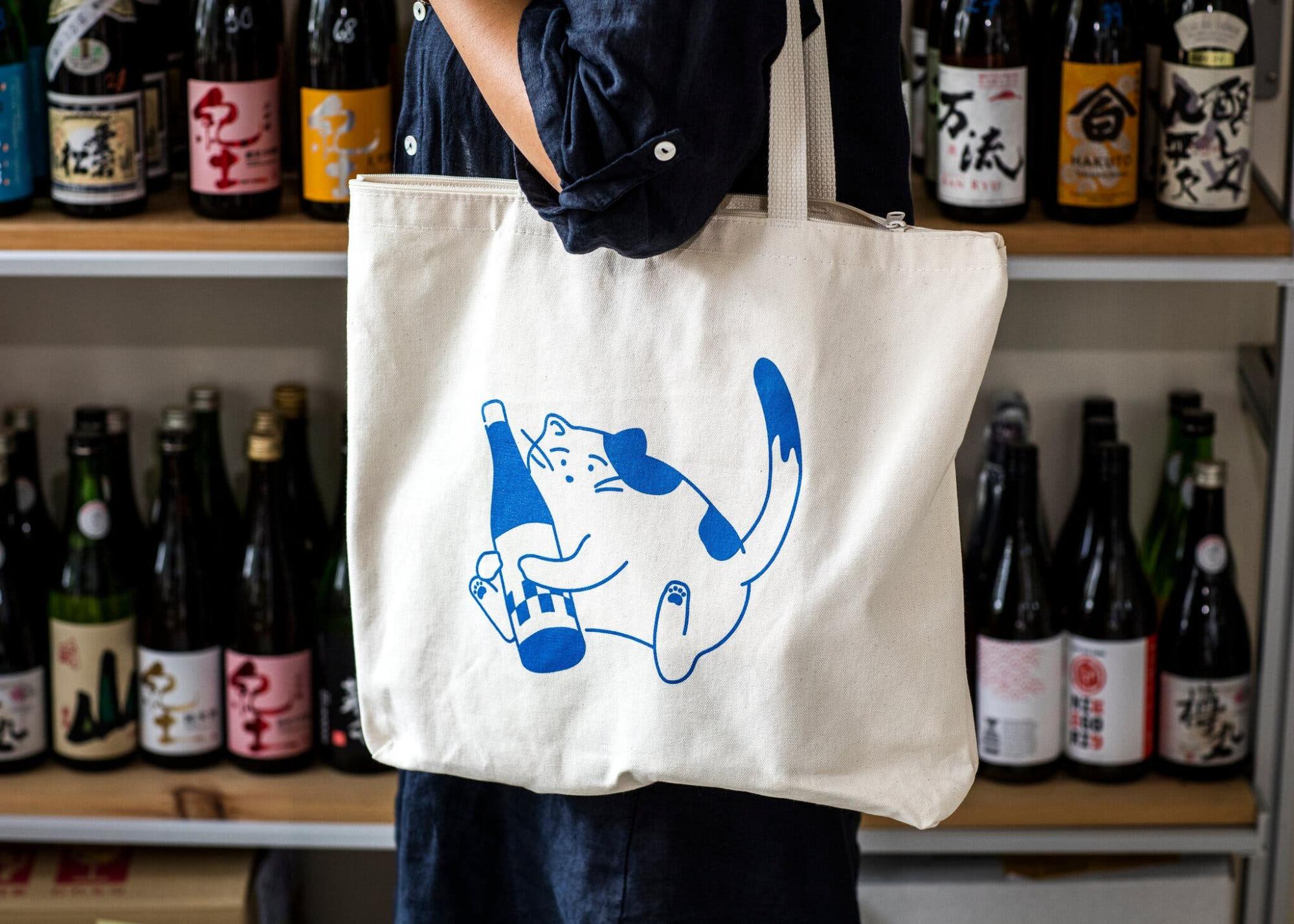
Take, for example, her work at Isometric Studio for Bin Bin Sake. The brand is centered around a “disarming” character—a chubby, relaxed cat named Bin (Japanese for “bottle”). What began as a loose sketch in a notebook during a client meeting blossomed into a comprehensive visual system. Bin Bin is seen serving, napping, biking, and partying across tote bags, bingo cards, and storefronts.
“The client wanted something different from the traditional Japanese ‘Maneki-neko’ (the beckoning cat),” Schmaedecke recalls. “Bin Bin ended up carrying a lot of the identity. People post photos of the tote bag with their own cats, and I sometimes spot people wearing it on the streets. It became something people genuinely adopted.”
In this instance, the “design” wasn’t just the logo; it was the warmth and relatability that allowed a commercial brand to enter the domestic lives of its customers.
Schmaedecke’s obsession with materiality isn’t a recent development; it’s built into her DNA. Growing up in Brazil, she watched her father work in his woodshop, eventually building things alongside him. This tactile upbringing led her to a Bachelor of Architecture from the Federal University of Paraná (UFPR), a degree that fundamentally shaped her spatial thinking.
Before moving to the United States, Schmaedecke established herself in the Brazilian design workforce. At the Museu Paranaense in Curitiba, she served as the Coordinator of the Graphic Design Department. There, she wasn’t just designing posters; she worked alongside the museum’s direction on the institutional re-design, collaborating with anthropologists and curators to ensure that the museum’s visual identity resonated with its diverse cultural mission.
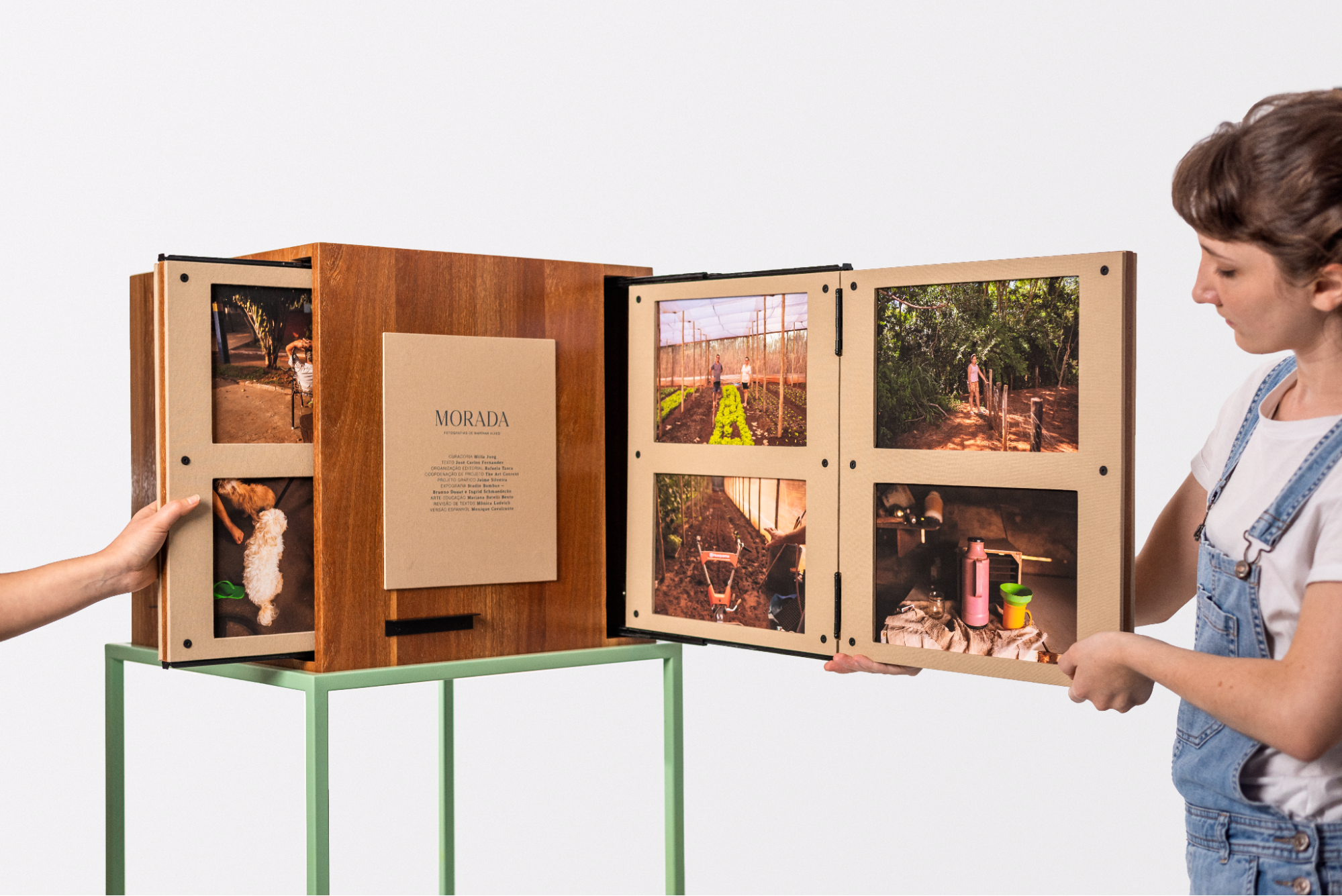
Her architectural roots are perhaps most visible in the Caixa Morada, a project that sits at the intersection of furniture and exhibition design. The wooden structure is a literal “exhibition in a box” that folds into its own shipping container and unfolds into a full-scale display. It is a masterclass in logistics and aesthetics, proving that an exhibition can be a three-dimensional object that designs itself into its own constraints.
While some of her work is designed to dissolve, other projects are designed to be timeless. One of her most significant contributions is Dimensão Imaterial do Habitar e Construir Indígenas (The Immaterial Dimension of Indigenous Living and Building). Working alongside a team of architects and anthropologists, Schmaedecke led the graphic design for the project at the Museu Paranaense, bridging a gap between archival history and living communities. The museum held over a thousand photographs and films of the Xetá, Kanhgág, and Guarani peoples from the early 20th century—images that the communities themselves had often never seen.
Schmaedecke designed the digital archive and visual system for the project, which recorded the oral responses, memories, and technical building knowledge of indigenous representatives as they viewed the archives.
“This project needed to last, to overcome the forgetting,” she says. In this context, the visual system wasn’t about “looking good” for a design gallery; it was about legibility, care, and accessibility for a community reclaiming its own history.
By drawing on her multidisciplinary background—ranging from her co-founding of Studio Bombus, a practice spanning graphic design, furniture, and architecture, to her work with ATO1Lab at the Oscar Niemeyer Museum—Schmaedecke treats every project as a spatial challenge. Whether it’s a character on a tote bag or a wayfinding system in a massive cultural institution, she asks: How should this behave over time?
In Schmaedecke’s world, design is not a static image on a screen. It is a living thing—something that multiplies through social media, dissolves in a gallery, or preserves a culture for the next century.
“I always want the identity to do something beyond looking good,” she concludes. “It should carry an idea.” And in an industry often obsessed with the “now,” Schmaedecke’s focus on the “how” and the “where” is precisely what makes her work feel so permanent.
Images courtesy of Ingrid Schmaedecke and Isometric Studio.
