

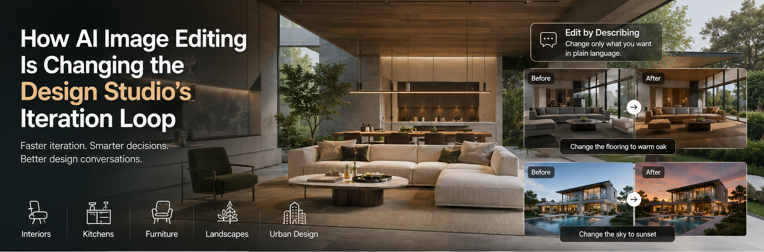
Ask most designers what slows down early-stage work, and they won’t say rendering quality. A good visualization has never been easier to produce. What they’ll describe instead is the loop: a client wants the living room in warmer oak instead of grey, or the façade in brick rather than bare render. Each of those is a small change. Each one, historically, meant re-rendering, re-shooting a mood board, or rebuilding a scene from scratch.
That gap between “small change to ask for” and “large amount of work to produce” is where a lot of design hours quietly disappear. It’s also where the current generation of prompt-driven AI image editors is landing, and why the tools worth paying attention to aren’t the ones promising the most photorealistic single image. They’re the ones that let you change one thing without breaking everything else.
In short: the useful shift for designers isn’t better renders. It’s the ability to make a targeted, plain-language edit to part of a visual, keep the rest consistent, and do it fast enough to iterate live with a client. That collapses the cost of exploring options across every design discipline, from interiors to landscape to the street.
What actually changed: local edits, not fresh rolls
Early text-to-image tools treated every prompt as a new roll of the dice. You’d get something nice, ask for one adjustment, and the whole image would regenerate, often losing the parts you liked. That’s fine when you want novelty. It’s painful when you have a scheme a client already approved and you just want to test a variant.
The meaningful change is that editing moved from “regenerate the whole thing” to “change the region I named and leave the rest alone.” Google DeepMind’s Gemini image model is one of the systems that made this kind of consistent, prompt-based local editing reliable, and a wave of browser-based products has since wrapped that capability into workflows aimed at non-engineers.
For a studio, the practical translation is simple. You can point at a region with words, “swap the flooring for wide oak”, “replace the overcast sky with early evening light”, “make the sofa a deeper green”, and only that region changes. The composition you set up holds. That’s the behavior that turns a generator into something a designer can actually use in a revision cycle.
Interiors and finishes: testing the material palette
This is the most immediate fit. Interior work lives and dies on the material and finish palette, and clients almost never sign off on the first version. You present a scheme, they react to it, and you iterate, usually several times, often in the same meeting.
Prompt-driven editing lets you restyle an interior and swap finishes on the surfaces you name without redrawing the room. A browser-based editor like Imagvio AI is built around exactly this pattern of local, consistent edits, so you can take one approved render and generate the warm-oak variant, the polished-concrete variant, and the terrazzo variant from the same base, keeping furniture, layout, and lighting stable across all three. Instead of describing options in words and asking the client to imagine them, you show them, side by side, while the conversation is still live.
The point isn’t that this replaces a finishes board or a proper material spec. It’s that the exploratory phase, the part where you’re narrowing from ten ideas to two, gets much cheaper, so you spend the expensive tools on the two that survive.
Kitchens, furniture, and decor: staging without a reshoot
The same mechanics carry straight into kitchen design and home staging. A kitchen is essentially a materials-and-layout problem with high emotional stakes for the client, cabinet finish, worktop, splashback, hardware, lighting temperature. Being able to hold the layout fixed and cycle the cabinetry from matte navy to natural timber to handleless white, in minutes, changes how a specification conversation goes.
For furniture and decor, the useful move is staging. You can take a room and add, remove, or restyle pieces, test a different rug, clear the clutter for a cleaner presentation, try the same space furnished for two different buyer profiles, without booking a photographer or building a 3D set. For anyone doing property presentation or interior styling, that’s the difference between one static image and a small set of targeted variations built from it.
Landscape, garden, and urban scenes: previewing what isn’t built yet
Landscape and urban design have a specific version of the same problem: the thing you’re designing takes years to mature or exist at all, but the client wants to see it now. A planting scheme reads completely differently at year one versus year ten. A streetscape proposal is easier to support when people can picture it populated, planted, and lit rather than as a bare massing model.
Prompt-based editing helps here as a previewing and communication aid. You can take a site photo or a base render and test greener, denser planting, add mature trees, change the paving material, or restyle a public space for a different time of day, while keeping the underlying geometry recognizable. At the urban scale, the same approach lets you show a proposed intervention dropped into its real context and adjusted quickly as feedback comes in.
This is also where honesty matters most, and I’ll come back to it: these are persuasive concept and presentation images, not measured proposals. They’re for aligning people on intent, not for anything that feeds construction.
The part designers underrate: keeping a presentation set consistent
Here’s the capability that designers underrate. Most client presentations aren’t a single image, they’re a set: multiple rooms, multiple angles, a before-and-after, a sequence across a site. The old failure mode of AI images was that every image in that set looked like it came from a slightly different project, different light, different style, subtly different space.
The tools worth using now hold identity and scene consistency across a set. The same room, the same material story, and the same lighting logic survive from image to image. For a studio, a consistent set of eight presentation visuals is worth far more than one stunning render that doesn’t match the other seven. Consistency, not the peak quality of any single frame, is what makes the deck look like one coherent project, and it’s the thing that used to be hardest to get.
The honest limits
None of this replaces the core of the job. A restyled render is a concept and communication tool, not a construction document, not a measured drawing, and not a substitute for BIM. It won’t hold dimensional accuracy, it doesn’t know your local code, and it will happily produce a beautiful detail that can’t be built. Treat the output as a way to align a client on intent and to explore options quickly, then take the two that survive into your real production pipeline.
Two practical caveats worth knowing before you lean on any of these tools. First, most run on a credit or subscription model with a limited free tier, enough to evaluate whether it fits your workflow, not to run a whole practice on for free, so test it on your own project images before committing. Second, check the terms on commercial use and on how outputs are watermarked or labelled; many of these systems, including the underlying Google models, embed invisible provenance markers, which matters if you’re presenting AI-assisted visuals to a client or the public.
Firms are already reorganizing around this, as ArchDaily’s look at rethinking the architecture firm for the AI era lays out. The studios getting value from these tools aren’t the ones chasing the most impressive single image. They’re the ones using fast, consistent, local editing to shorten the loop between an idea and a client seeing it, so more of the design conversation happens with something concrete on the screen. Quality was never really the bottleneck. Iteration was.

