In an age dominated by meticulously crafted narratives and high-gloss fictional dramas, Emmy Award-winning producer and director Ben Phethean stands out as a purveyor of the raw, the real, and the relentlessly adventurous.
With a resume that includes global Netflix phenomenon “F1: Drive to Survive” and the unflinching grit of “24 Hours in Police Custody,” Phethean has carved a niche for himself by diving headfirst into the unpredictable worlds of unscripted television, proving that truth is often stranger, and far more thrilling, than fiction.
Phethean, celebrated for his versatile expertise spanning documentary, factual, and factual entertainment, embodies a philosophy that sees danger not as a deterrent, but as an essential ingredient for compelling viewing. For him, good unscripted TV is inherently adventurous, offering a vital escape from the mundane.
“Escapism,” as Phethean explains, is at the heart of it. “As humans, we spend our whole lives locked into routine. Whether it’s social, educational, professional or domestic, we are slaves to our responsibilities. I’ve always found a great film or book can help me escape the relentless pull of modern life, and unscripted TV is the same.”
He asks: “What better way to forget about your problems than by diving into an exotic world full of thrilling and complex problems that someone else has to solve? Because it’s non-fiction, and the characters are relatable, you imagine yourself in their situation, it’s like a little adrenaline hit from the comfort and safety of your own home.”
This yearning for vicarious experience fuels Phethean’s passion for documentary, his chosen medium. “On a selfish level, it’s because I get to live a million different lives,” he muses. “You embed into other people’s worlds and capture their experiences across the whole range of human emotion. It’s like unplugging from your own matrix and plugging into someone else’s for a week, month or even a year. It becomes addictive.”
The allure is further amplified by the authenticity of the moment. “There’s a beauty in capturing things that are happening for real too, without having the chance to get a second take. You’re documenting an unscripted moment in someone’s life that could never happen again, it could be the best or worst moment in their lives, and it’s unfolding in front of you in real time.”
F1: The “Drive to Survive” Phenomenon
Phethean’s dedication to capturing these unrepeatable moments propelled him to an Emmy Award in 2025 for producing “F1: Drive to Survive” Season 6, a series he also directed across three seasons for Netflix. The show’s stratospheric success is no accident, according to Phethean.
“I think the series is so popular because it’s like a Hollywood blockbuster in documentary form; high-end, high stakes, human drama at 300kph. Exotic locations that wouldn’t be out of place in a Bond film, Shakespearean levels of treachery and backstabbing, beautiful A-list celebrities, euphoric highs, meteoric lows, and multimillion dollar cars slamming into walls at top speed – what’s not to like?” he asks.
Beyond its entertainment value, “Drive to Survive” has had a monumental impact on the sport itself. Phethean highlights its role as a “catalyst for the growth of car racing in the US,” transforming the perception of Formula 1.
“DTS took the stuffy, mechanically focused image of F1 and rebranded it as a sport about personalities and politics,” he said. “It became a gateway drug to the sport for young people and non-fans to understand the world and the rules and therefore enjoy the races. Since DTS first aired, all of the teams have seen a surge in value, due largely to increase in US viewership, and the second American team will join the grid in 2026 with Cadillac. Not to mention the Apple TV film ‘F1’ produced by and starring Brad Pitt. The sport keeps growing.”
Such immersive storytelling demands immense personal commitment. As a self-shooting director, Phethean’s work on “Drive to Survive” was a test of endurance. “The F1 season lasts from March to December and follows 24 races across the globe; I would spend half the year away from home with a 15kg camera on my shoulder chasing after F1 drivers. You go into most race weekends with a focus on a particular team or driver and you shoot absolutely everything you can with them until you’ve captured something special. Even if it means getting a few doors slammed in your face in the process.”
Behind the glamour and speed, “relentless access negotiation” was a constant challenge. “The drivers are extremely busy and are kept on minute-by-minute schedules as soon as they arrive at a race weekend, so getting any time with them becomes a constant negotiation with their communications teams and managers,” said Phethean. “These conversations can require months of back and forths before a team finally agrees to give access to a particular off-track scene or interview. And even then the driver may just decide not to turn up on the day.”
Preparing for interviews on such an evolving show is a dynamic process. “The driver or team’s story is constantly evolving throughout the season and can completely change direction after a single race result,” Phethean explains. An edit-based team in London constantly tracks character trajectories, adding and removing questions. Phethean then custom-built interviews based on his knowledge and the edit team’s input, ensuring each conversation pulls the plot forward. Ultimately, it falls to him, as the director, to sit down with the character and ask the questions, often navigating delicate emotional territory.
The ability to capture “unexpected snippets of humanity” stems from a deeper virtue: Trust.
“Building trust with the drivers and team principles is key. I spent years following particular characters and you learn to develop an unspoken language with them,” he said. “When to push and when to back off. Ultimately, once they’re comfortable with you being there they let you into all sorts of highly personal and emotional moments in their lives.”
Into the Crucible: “24 Hours in Police Custody”
From the high-octane world of F1 to the intense confines of a police station, Phethean’s journey through “dangerous, risky TV” took a stark turn with “24 Hours in Police Custody” for Channel 4. He describes it as one of the “hardest jobs I’ve ever done.”
“You might get a call at home from the production team on a Sunday night at 8 p.m. telling you to go to a police station to film a suspect that has just been brought in, and that your taxi is en route,” he said. “Once you arrive at the police station, you may not leave for a full 24 hours until the police have charged or bailed the suspect. So you do really shoot all night; and then again all day. The adrenaline keeps you going though, you feel like you become part of the investigation which is exhilarating.”
While there were no NDAs, a rigorous vetting process by the British Police, taking months, was a prerequisite. Interviewing suspects and detectives presented vastly different challenges.
“Interviewing the detectives was much easier for me because it’s way less emotional for them; they discuss tactics and strategy,” he notes. “Interviewing the suspects can be incredibly hard, but also extremely rewarding. You have to ask permission from a suspect for an interview and if they agree the officers will let you step inside the cell with them. For some of these people it’s the worst or most traumatic day of their lives, they can be unpredictable, emotional or even aggressive, and so, as a documentary filmmaker, when the suspect does open up to you it’s a real privilege.”
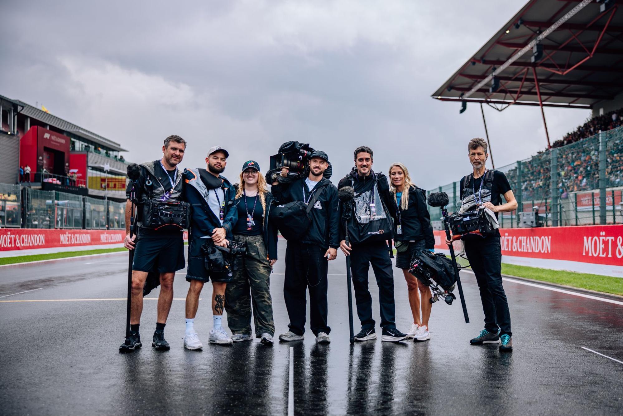
Photos of Ben Phethean by Sam Cousins and Alex O’Connor.
Today, 25 February, marks the birthday of Pierre-Auguste Renoir, the French painter born in Limoges in 1841. His early life was shaped by financial hardship, and his family’s circumstances meant he had to leave school at thirteen to take up an apprenticeship at a porcelain factory, where he frequently tired of the subject matter and sought refuge in the galleries of the Louvre.He had a real talent for singing, too, good enough that the composer Charles Gounod urged his parents to put him forward for the Opera chorus, although the porcelain factory ultimately won out.
In his adult life, Renoir became one of the central figures of Impressionism, sketching alongside Monet at La Grenouillère on the Seine, where their shared experiments with loose brushwork and the fleeting effects of light and water would define a movement. He lived long enough to make one final visit to the Louvre in 1919, where he saw his own artwork hanging alongside the masters he had spent a lifetime studying. He died later that year, aged 78.
Here are five paintings to celebrate on Renoir’s birthday.
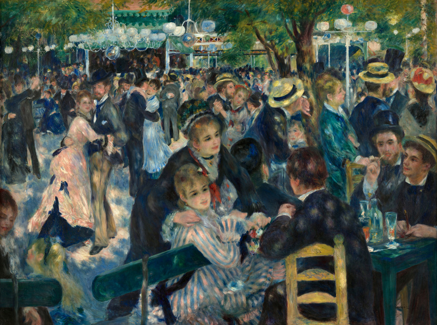
Bal du moulin de la Galette (1876)
Bal du moulin de la Galette by Auguste Renoir, 1876. Image source: Wikipedia
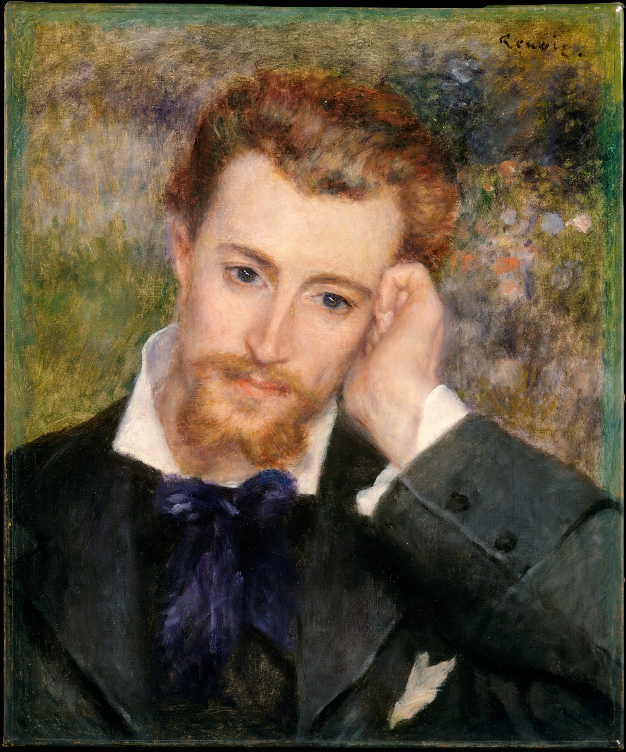
Eugène Murer (1877)
Eugène Murer by Auguste Renoir, 1877. Image source: Wikipedia
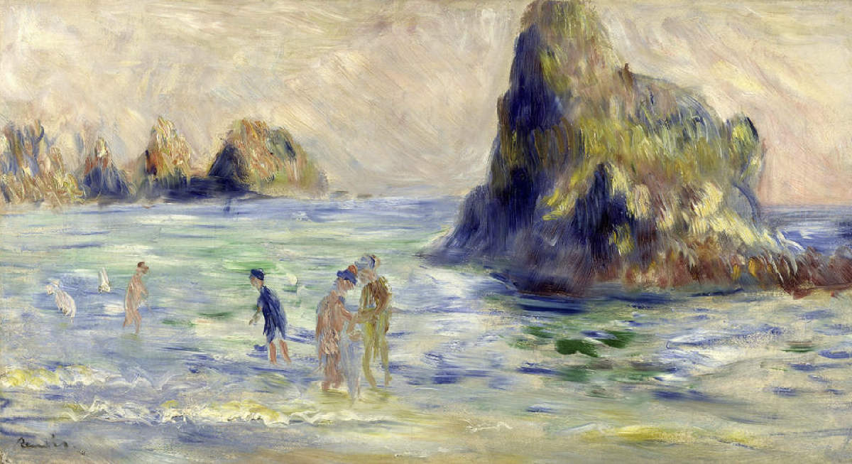
Moulin Huet Bay, Guernsey (1883)
Moulin Huet Bay by Auguste Renoir, 1883. Image source: The National Gallery
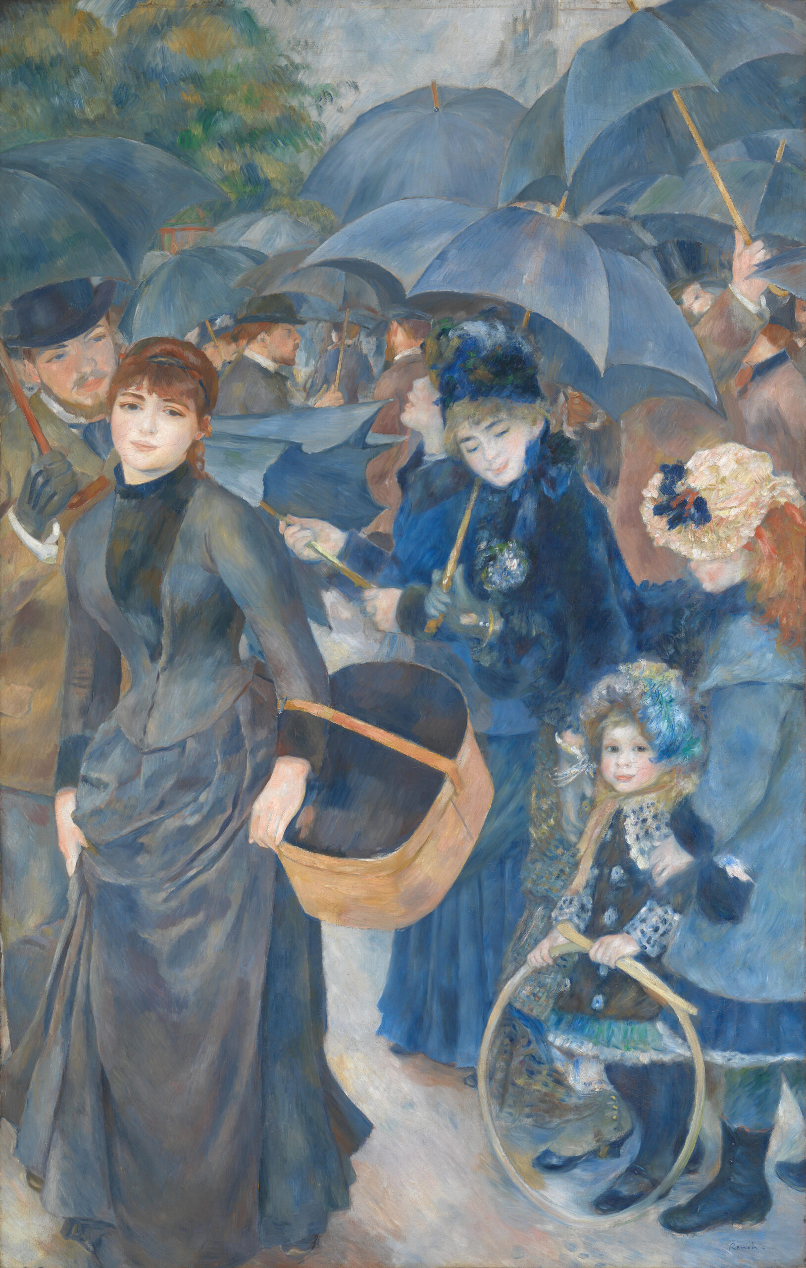
The Umbrellas (1881-86)
The Umbrellas by Auguste Renoir, 1880s. Image source: Wikipedia
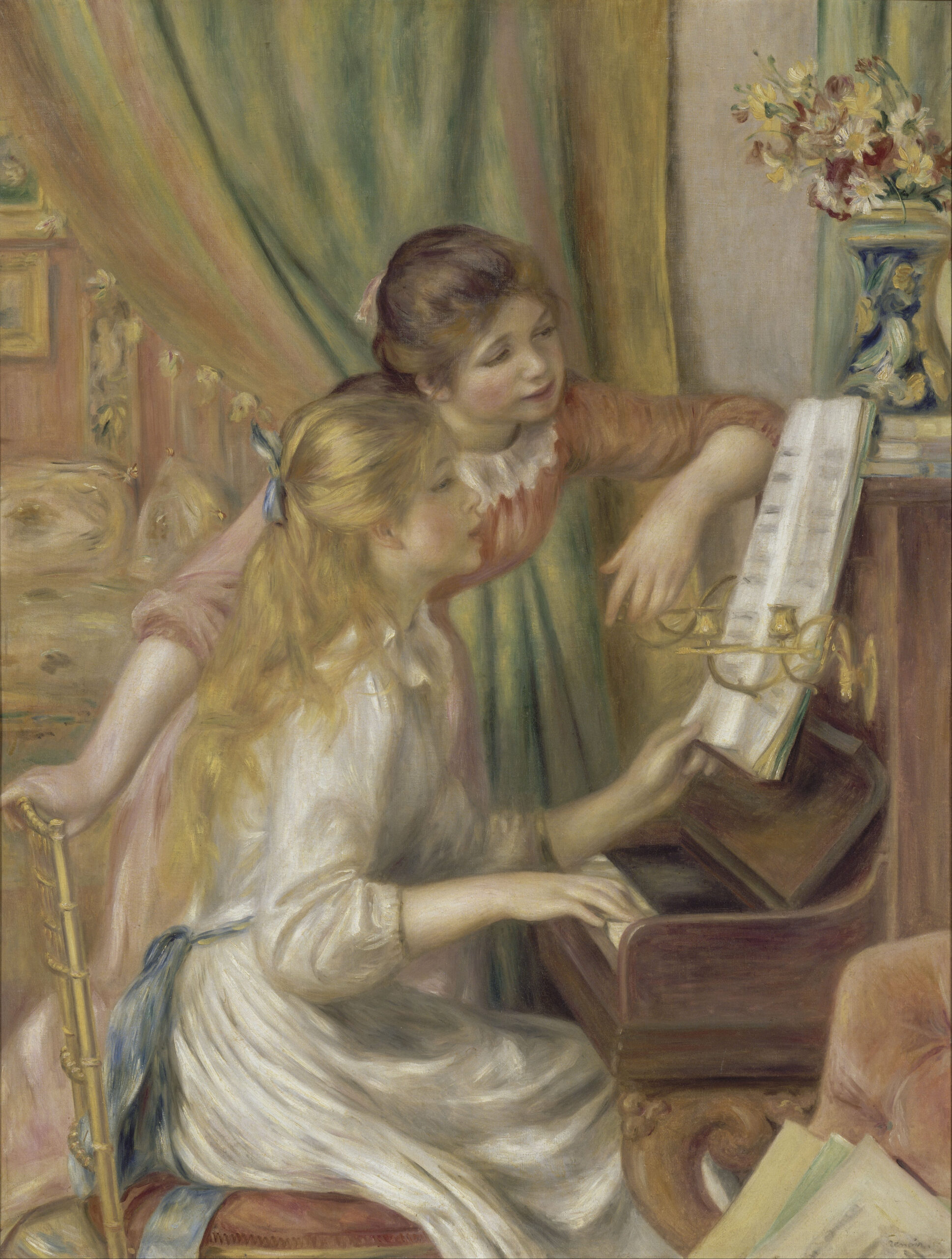
Girls at the Piano (1892)
Young Girls at the Piano by Auguste Renoir, 1892. Image source: Wikipedia
The Oakland-based artist who makes music as Maria BC remembers first encountering Marissa Nadler’s music about a decade ago, when Bury Your Name was released. In a newsletter post announcing their ongoing tour with Marissa Nadler, the Artist Spotlight alum describes being struck by the ghostly, skyward quality of her songs, singling out ‘Weightless Above the Water’, where Nadler sings, “I’m way out of range here but closer to the moon/ They forbade me for trying again and again.” It’s fascinating, then, how the cosmic and forbidden intersect in Maria BC’s creative process, which they liken to being in a spaceship lit by a bunch of candles. Marissa Nadler can relate. She sees Maria BC as a kindred spirit, a younger musician who also has one foot in the avant-garde but shows a love for classic songwriting – more than ever on their fantastic third album Marathon, which comes out on Friday via Sacred Bones, the same label Nadler has been on since they discovered her.
In the latest installment of our In Conversation series, Marissa Nadler and Maria BC talk about their relationship to performance, dreams, self-production, and more.
How are you both feeling with the tour so far? Marissa, I know that for your latest record, New Radiations, part of the intention was for it to be simpler to play live. And Rian, your new album Marathon isn’t out yet, but I’m curious how playing live has affected your relationship to the music.
Marissa Nadler: Just to clarify, I think I did say that in an interview, but it came out wrong. My creative process is definitely not linked to how I’ll present it to the world, but once I realized that the songs were sounding good stripped down, then it occurred to me, this isn’t necessarily such a bad thing. With the previous record [The Path of the Clouds], there’s so much production and musicians and guest stars that it was really difficult to bring those songs to life in a live setting. I was really never able to present the beauty of the layers in a live fashion, so the new record definitely was easier for that purpose. But one thing I find interesting about Rian and myself – Maria is producing their own records right now and always has, and that is something that I started to do later in my career, for the last two. I’m really curious about your production recording process, after we talk about this tour.
Maria BC: Translating things to the live setting is always tricky for me, because I really love having my vocals layered a lot. I think a certain effect of the music is lost if that’s not there. I’ve done trial and error, trying different ways of incorporating that into the live set, especially when I’m playing by myself. As tricky as that sometimes can be, it ultimately feels really good to take on that challenge, especially right now, when this album, Marathon, is about to come out but isn’t out yet. I’m at this place where I’ve heard the songs on the album so many times, especially from having recorded and produced it myself. You can overhear something and it destroys your relationship to it temporarily, but then putting the live set together can reconnect you emotionally to the music and rehabilitate some things. Also, performing the music and hearing it juxtaposed to and in conversation with Marissa’s music is really special, and I think brings out different aspects of the songs.
Marissa, to answer your question, performing my music live is something that came really late for me, and still feels really new to me. I think I was very early in high school when I got GarageBand and started recording at home, and home recording was co-constitutive with writing songs. One enabled the other, and it was, for a long time, this kind of forbidden thing that I would do in the spaces between other things that I had to do or felt like I should be doing or focusing on. The way that I feel when I go into the recording space that I’ve set up for myself, it’s like I’m in my spaceship [laughs], my fantasy world that’s forbidden and only I understand it. I’m in complete control, and it’s like a child play space. But also very dark, and I light a bunch of candles. How has that evolved for you?
MN: I find this tour particularly interesting because they’re such musical kindred spirits, and there’s a generational gap between us. What you were saying about putting our vocals, which are both often very layered on record, in a live setting – that has been a challenge for me as well, coming to terms with what I can and cannot do in a live setting, and accepting that it will be different, that it is not gonna have ten Marissas or all these background vocals. Trying to pick and choose the essence of the songs, and knowing that people, when they see live music, want to hear something a little different. “It’s okay to be raw” has been something that I’ve learned later in life.
You said that performing came later than recording for you – I wish, in some ways, that that was the case for me, because I’m still so shy, and I had such stage fright that some of my early years were really marred by that. The invention of so much of this recording technology that’s come throughout my career has emboldened and enabled me to really improve in a live setting. When I was in early high school, I had a four-track recorder with a tape cassette – it wasn’t that long ago, but you have to remember, the internet is a fairly new invention, so when I was in high school, we had an actual class on what a search engine was. I didn’t have a cell phone until the end of college. When I finally did get GarageBand, I sucked at it. But then the past eight years, I’ve learned Pro Tools, and it has changed my life. What you said – “I’m in my spaceship, I’m in my fantasy world” – it’s very similar for me, and to be able to finally have the tools to record myself and not have other influences marring my creative vision has been great.
I think it’s really cool that, in this day and age, people can grow up and, from a very young age, have access to this really amazing technology to make very high-quality recordings without having to pay a producer to tell you what you should or shouldn’t do, or to tell you to take less reverb off. I think we have a lot in common with that. The interesting thing about being vaguely ambient musicians for both of us is that without the verb, and without the dream zone additions, I think that your music still stands up very strongly, even if you were to play unplugged on the street. That’s, to me, the mark of a great songwriter.
MBC: Thank you!
MN: It was hard for me – I would never, in my early years, even play without eight seconds of verb in my voice. And then as I got older – I did that song with John Cale without any reverb at all, and people really responded to it. It taught me I can play with this, I can shock people a little by pulling the veil away. It’s been really cool to see the different iterations of your project, even on this tour so far. That’s a bunch of questions and answers all at once, but that’s a conversation, right?
MBC: Yeah. Aw, thank you, that makes it feel so good to hear. It does feel a bit like a pulling back of a veil, and it takes a certain leap of faith to trust that what people connect to in the music is the material, and also some other unnameable quality that comes from the body, rather than from the production. There’s such a powerful quality to your voice, and it’s inherently spiritual, even beyond adding reverb. The soul, the timbre of a person’s voice – that can’t be emulated or taken away by certain effects, or faked by effects, either.
MN: I know what you mean. Some of my favorite musicians, even some of my peers that I love to see play live, like Angel Olsen – she’s a friend of mine, but I’ve seen her play in tiny rooms with no verb, and then with her six seconds of verb. To me, it’s the same, because it’s that voice, it’s the songwriting. So, when you said forbidden earlier – I’m really interested in your upbringing, and I wanted to ask you a little bit about that. I know that you’re from Ohio. I know you took voice lessons as a child. I read your Wikipedia.
MBC: Oh no. [laughs]
MN: Because when we just met on this tour for the first time, we haven’t talked about our childhood. Was this music career something that was supported by your family?
MBC: I mean, it was unexpected, the path that I took, but music was always a big part of my life. My dad is a musician, my mom an actress, and I was brought up singing and performing in church a lot. I was raised primarily by my mom, and she really encouraged me to sing, but the songwriting thing was unexpected. And supported, now, for sure.
MN: That’s great.
MBC: I was the only child of a single parent, and I had a lot of time to myself to explore an insular world. I would just sing to myself all the time to sort of keep myself company and explore more deeply my inner world. I think that’s still where the music comes from. Yeah. For you, when you were a child in your home, where was music coming to you? What was your relationship to music like?
MN: My parents were real hippies, so they took us to tons of really great concerts. My first concert was Jethro Tull and Procol Harum. We went to see the Rolling Stones. I went to see Neil Young solo with them when I was in high school. They’re big music fans, and Mom wanted to be a singer in high school in a band, but I’ve never really heard her sing. She claims to have had a really beautiful soprano, but I don’t know, she never sings. But they were real hippies, so they had a great record collection. And then my brother played guitar in a jam band in high school.
I always loved to sing, but I never took any music lessons or any vocal lessons, because I was the artist – I painted, I was the kid in the art room, and a little too shy to be in choir. When I was about 13, I started to play guitar righty, even though I’m a lefty, just because that was what was in the house. I had a Bob Dylan songbook that had every one of his songs, and that’s how I started to play, based on reading songbooks and reading tablature, and started writing songs really quickly after that. I tried to take lessons. As an art educator now, I’ve realized a lot about the learning styles of certain creative people, and why music lessons didn’t work for me. But back then, I was like, “I don’t want to learn ‘Ode to Joy’, I’m already writing these crazy songs.” I was, like, 12.
My brother is an incredible writer, and he is really responsible for my real focus on lyrics in my writing. When I was a kid – I told you this last night – he would take record covers, the vinyl, and I distinctly remember him being like, “What do you see? What kind of world are you in?” And he would help me write short stories. You can get his books in the bookstore now, he’s a renowned novelist, but back then, I was just jealous of how good of a writer he was. I was like, “Man, if only I could write as good as that.” But of course, it’s because he worked on it, and a firm believer that the more you work on something, the better you get. I’m not a believer that people’s first record is their best ever.
MBC: Yeah.
MN: So, with new writing, especially the last two records, I’ve painstakingly interrogated every noun, every verb, every adjective. Stuart gave me advice when I was struggling with some of the meanings behind this sci-fi fantasy record that I made, and he was just like, “Go through every noun.” I really did, and it’s just fun to have that kind of craftsmanship, not just to a painting, but to the lyrics themselves. I have a lot of respect for all elements of the song, whether it’s the length of the verb, or the turn of the phrase, the hook, the bridge.
MBC: This is bringing up so much I want to ask you. Going off the last part, I think that’s so beautiful that you have a prose writer’s influence in your work. I’m also curious how your experience of writing lyrics compares to your experience of writing stories and text, because for me, I feel like they’re such distinctly different mediums. With lyrics, you have to think about where the syllables fit into things and in your voice. How much is the relationship between the words and the melody coming up for you when you’re writing a song?
MN: It is a real push-and-pull. The Path of the Clouds is my most story song record, where there’s a song about D.B. Cooper, there’s a song about the escapees from Alcatraz, there’s a song about Bessie Hyde. I wanted to fit in all those details, so I was really focused on the story. But then, to find the hook or the chorus, it is a push-and-pull where I don’t think that anybody would listen to the Alcatraz song and know that it’s about that. I think I’m probably the only person that knows that, because I like the way “Did you give up the ghost” [on ‘Well Sometimes You Just Can’t Stay] sounded. With this new record, I was more leaning towards the sound of the words. It’s always a happy battle, but most of the time, I’ll pick the musical over the analytical. If I like the way something sounds, even if it doesn’t make sense, I’ll say, “Well, it sounds great, so I’m gonna keep it.” That’s the creative license. I still have so much fun writing songs: that’s when you know you’ve picked the right path.
Marathon‘s your third official record that’s coming out on the 27th, and it’s your 27th year of living. When I made my first record, Ballads of Living and Dying, I was still in art school. I wrote it on a typewriter; I was a real Luddite. I was like, “Technology is gonna ruin the universe,” and I still kind of think that. But I didn’t think anybody was ever gonna hear that record. I thought I was gonna be a painter. I thought, no way in hell is this weird music, with me singing Pablo Neruda songs and sea ditties – there was just a lot of weird stuff on the album, and it just coincided with psychedelic folk having a moment. This was in 2003, 2002 even. When you made your first record, did you know that people were gonna hear it, or did you make it in that spaceship vortex where it was just your private balm? And were you surprised that people did hear it?
MBC: I put out an EP first, and the EP I put out was called Devil’s Rain. When I made that, I self-released it. I think I took three weeks to make it, and it was truly just me working in the forbidden space. It was just for myself, and I really did not think anyone was going to hear it. It got picked up, and I made the first album, Hyaline, thinking, “Some people I don’t know might hear this.” I didn’t think it would get much traction. I’ve been ceaselessly surprised and delighted by people’s interest in what I’ve been trying to do.
You also asked about how it feels now, three albums, and I’ll say, it never stops feeling good to make music, exciting, and also challenging. But new challenges crop up all the time, and having an audience is not not part of that. It’s made me fixate on certain details, maybe, that I wouldn’t otherwise, which is for the best, I think. But at this point, I’ve entered interesting new territory where I used to feel like every time I wrote a song at all, it was a miracle. I know that I can do it now, so I have to kind of create obstacles or something for myself. Cole Pulice, who plays saxophone on the new record, picked up the guitar a couple years ago, and they were telling me that it was so exciting to play around on guitar. They feel like they have so much muscle memory, and even “baggage” with the saxophone, just because it’s an instrument that they know so well, and they’ve written so much on. Having this new physical landscape with the guitar opens up new stuff for them. There’s something like that happening where, now I pick up the guitar, and it feels really familiar, so I have to try new things.
MN: Is that why you’re experimenting with open tunings, for instance?
MBC: Yeah, exactly. That helps so much.
MN: The same thing for me. I get so bored gravitating to the same things with the muscle memory. I’m already over DADFAD, open D minor, which is my favorite tuning. I’m not sure if you know this, but if you go to Joni Mitchell’s official website–
MBC: Yes, I remember you said that!
MN: You can see all the tunings, and they’re so crazy. It’s just hard to get into them live. You need, like, 8 guitars. Or, I don’t know, you seem to get them in pretty quick. But I think open tunings are a really great way to force yourself to find new ways into the song.
MBC: I want to jump into something I’ve been eager to ask you, which is your training and life as a painter. How has your music and your fine art co-evolved, if at all? Have they influenced each other?
MN: When I write lyrics, it’s all setting-based. For instance, in ‘Bessie, Did You Make It?’, my lyrics are really painterly, I think, just because when I look outside, I want to take a picture of everything I see. Painting and drawing was my first love. My mother’s a fine artist, an abstract painter, so my whole childhood was just drawing and painting. My music, as I’ve gotten more ethereal and ambient, some of my newest bleak landscape paintings are just degraded to the point of nothingness, which is funny to me. In high school, I would do these highly rendered, realistic charcoal portraits, and now it’s a wash of nothingness. It cracks me up that if you were to come over to my house, it’s all white and bleak, and there’s not a single bit of color in the entire house. It’s like my Zen monastery.
I’m leading that way musically – I’m not sure what direction my next record’s gonna be, but I know that to have longevity as a musician, you have to shake it up. The Path of the Clouds was a super psychedelic and very Pink Floyd record; unfortunately, it came out during the pandemic, so I wish more people had heard it. There’s still time. But I think this next one’s gonna go in the Harold Budd territory of nothingness – either super ambient or super jazzy. They’re like the same brain, to answer your question. There’s no separation between the two, and that’s very clear in my music videos, the five that I’ve made so far.
MBC: But do you feel like there are ideas or parts of yourself that you can explore in one medium, but not the other? Or do they both feel there’s infinite possibilities?
MN: That cliche, a picture is worth a thousand words, is really true. You can have a photograph that is so iconic that it captures the essence of everything you’ve ever wanted to say. Much like a poem, even a short poem, like an Emily Dickinson poem, can encompass so much. Part of the challenge with songwriting is that it doesn’t have to be a story, it can be just a short amount of words, so it’s like, “How do you take that one picture?” One of my favorite photographers is Francesca Woodman.
MBC: Oh, love her.
MN: I love her so much. We went to the same art school, and she took a lot of those pictures where I went to school. The ghostly quality of her photos – I don’t even know how to describe it. That’s why different art forms still all exist and have their place. Why do people still paint if you can take a photograph? I’m a painting teacher when I’m not on tour, so I talk about that a lot with my students: the challenge to leave realism behind, the challenge to not be tethered to representation. It’s the same thing in music, why avant-garde music – I think you and I both have our foot in the avant-garde worlds, a little bit of crossover, where my first tours were with Sun O))) and Earth and Boris, all these crazy bands. I obviously love classic songwriting, but I also really love weird stuff. I know we haven’t let you talk at all, but this is good, though, right?
It is. This is such a beautiful back-and-forth that I really feel no need to interject. One topic I wanted to mention, in case it doesn’t come up naturally, is dreams. Rian, in our last conversation, you said you love talking to people about their dreams, which seep into both of your latest records, thinking of the songs ‘Bad Dreams Summertime’ and ‘Night & day’. Is that something you’d like to discuss, even when it comes to affecting your day-to-day on tour?
MBC: For my part, with ‘Night & day’, something that’s been coming up for me for the past couple of years is that I haven’t been remembering my dreams, which to me feels like such a loss. I wake up early for my day job and immediately start my day, and I do think it’s true that to remember your dreams, you have to be in a practice of writing them down and sitting with them when you wake up in the morning. And I think it’s been true for all time that artists are really influenced by their dream life. It feels sad to me that I’ve been losing access to that, and the song is touching on that feeling. The lyric is, “And in the light, I try to remember” – the moment of sitting up in the morning and trying to remember the night, which is the divine time. It’s when you’re most in touch with hidden parts of yourself and the world.
But on this tour, I haven’t been popping up quite so early in the morning – now and then, but not every time – so I’ve been doing more of staying still at the moment of waking. And I’ve been finding that I’ve been retaining more of my dreams and feeling more like the feeling or timbre of them has been resonating through the day. That’s one of many things that I’ve really loved about being on the road. What about you, Marissa?
MN: Similarly, I don’t often remember my dreams anymore, which is a shame. Maybe this sounds like a little bit of a cop-out of an answer, but I feel like the waking world feels like a dream so often. I think the longer I live, the more places I go, the weirder the government gets here, everything feels very surreal. Oftentimes I do feel like I’m disassociating and proceeding through life in a dreamlike state. Like that first show we had in Asheville, where I had trouble because I didn’t have my music stand, and that’s my little security blanket. My partner, Milky, was like, “You don’t need this, you wrote these songs.” And I was like, “I do need this right now.” Because I start to wander, and during that show, I vividly felt my soul above my body. I try to stay tethered to the ground most of the time, but seeing the world in that way can be very creatively fun. But I do think that there’s a dreamlike quality to both of our musical worlds because of the love of ambience and atmosphere that can carry over.
MBC: You’ve mentioned feeling like there’s an arc to you over time finding your voice. I’m curious if there was a specific moment when you feel like you settled into that, and also, if you feel comfortable sharing how that feels in your body – where your voice lives.
MN: That’s a great question. Listening back to my work, it’s interesting, the first record sounds kind of like I do now, in a way. It sounds natural. But then the second record and the third record, Saga of Mayflower May and Song 3: Bird On the Water – that’s when other people started to hear me, and I got record reviews, and I started to listen to other people’s influence. Little Hells as well. Like all singers, I’ve got a little bit of affection on those three records. If you listen to somebody like Bob Dylan’s first record, he was obsessed with Woody Guthrie, and I could list a zillion examples of this. On the second record, I had just toured with Josephine Foster, and I was like, “I love her weird voice, and I want to be an opera singer, too.” I was 22 years old. I was so young when I made those that, listening back, the songs are still good, but all I can hear is affectation.
And then I wrote July, and that’s where I think I found my real voice. I’m such a staunch defender of late-career works, because some of my favorite Joni Mitchell records are late-career records. I’ve listened to her my whole life: I can trace the trajectory from her romantic idealism of her early work to this jaded misanthrope, to this drug-addled party girl, to some form of acceptance. It’s so interesting to listen to her grow up through these records, and I can hear that in myself, too. I am old enough, finally, to not cringe looking back on the early work.
In terms of where my voice sits in my body now, I’m singing a lot more from my chest voice. I had all head voice back then, but I’m pushing more from my diaphragm, so I have more power and more control. I can yodel now.
MBC: Oh, sick.
MN: Because there’s two voices, the chest voice and the head voice, and the concept of the yodel is throwing it from one to the other. Not until the second half of my career did I really find my voice, and my last four records, I like them better than my early ones. You have such an incredibly strong start, so it’ll be so interesting to watch your trajectory and where you’re gonna go next musically. I did have one last question for you, because this is your release week, and it’s a big deal. What is the biggest room that you would like to play if, like, this record blows up? Could you see yourself taking this project into a large room, or do you prefer the cozy ones?
MBC: I feel so drawn to intimate spaces. I’m trying a new thing – when I go back home to the West Coast, I’m putting a five-piece band together for my record release shows, and I’ve never done this before, so that might reveal something. I’m really excited for that, but the show I’m playing in San Francisco is at a 100-cap movie theater, a space I really love, and an intimate one. I chose it for that reason, and I don’t really see myself in a big space. [laughs] Another is I like to feel close to the audience.
MN: Me too.
MBC: Also, to feel a little shrouded, maybe. I like – I think we share this – when the lighting is more of a wash, and it’s hard to imagine getting an effect that I desire scaled up. I also think it’s a totally different medium. I haven’t really been to very many arena shows in my life – or I’ve been to one as an adult, and it was a Björk show. And I was just thinking the whole time, this is a completely different universe than thinking about the music.
MN: I do think it’s possible. I saw Neil Young in high school play acoustic with candlelight, with just him, a guitar, and three different pianos and organs. And the audience was pin-drop quiet. I saw Elliot Smith in high school; he has a huge influence on me. I think it’s possible to get that pin-drop quiet, intimate audience on a larger scale, but it’ll be interesting to see, because the concept of playing in front of a large group of people terrifies me. I’ve done a few opening slots for big bands, and it was too much for me.
This interview has been edited and condensed for clarity and length.
Five short films created by students have just been added to the catalog of Disney+, bringing the work of emerging artists to one of the world’s most influential streaming platforms.
At first glance, nothing in these films suggests they were produced within an academic setting. The rendering quality, character animation, lighting, compositing, and overall storytelling reflect professional studio standards. Yet each of these projects was completed within a single academic year as part of ESMA’s 3D Animation and Visual Effects program.
That contrast is what makes the news particularly striking.
Studio-Level Quality Within an Academic Framework
The five shorts, Swing to the Moon, Coquille, Je suis un caillou, La source des montagnes, and Œil pour Œil, were developed as graduation films. Produced by teams of students working under structured production conditions, they demonstrate a level of technical execution and artistic coherence that rivals independent professional productions.
From expressive character animation to cohesive art direction and high-end rendering, the films blur the line between student work and industry output. Their presence on Disney+ extends their reach beyond festivals and school screenings, placing them directly in front of an international audience.
The fact that these films were conceived, produced, and finalized within one year underlines the intensity and organization of the training model behind them.
The School Behind the Films
Based in France, ESMA has established itself as a significant player in 3D animation and visual effects education. The school is currently ranked 4th worldwide in the Top Creative Schools: 3D Animation category by The Rookies, a reference ranking within the digital arts field.
Its alumni now contribute to major international productions, and one of its recent graduation films was a finalist at the 2026 Annie Awards, one of the industry’s most respected distinctions.
The 3D Animation and Visual Effects program is delivered in French, and also in English on several of the school’s campuses, welcoming students from different international backgrounds.
With five of its student films now available on Disney+, ESMA adds another milestone to its trajectory, highlighting the level of production that can emerge from an academic environment in just one year.
Ira Dot is the project of Canadian musicians Ryan Akler-Bishop and Eddy Wang. As artists, the duo have stretched their work across a wide canvas: Wang is a filmmaker, multidisciplinary artist, and PhD student at the University of Pennsylvania and Akler-Bishop (an occasional Our Culture contributor) is also a filmmaker, multidisciplinary artist, and co-editor-in-chief of Big Toe Magazine. Their artistic breadth is reflected in the elasticity of their music. Their music traverses genres such as electrocoustic rock, ambient techno, and pop. Since founding the band in 2019, the pair first cut their teeth playing in local venues in Toronto. For the last five years, Akler-Bishop and Wang have been recording their debut album In Blue Time, out Friday, in cities across the United States and Canada. The album brings together Wang’s ethereal vocals and Akler-Bishop’s eclectic production to produce a sonic palette of textures both harsh and serene.
We caught up with Ira Dot for the latest edition of our Artist Spotlight series to talk about their varied inspirations, philosophy, filmmaking, and more.
I’d like to begin with the album’s title, In Blue Time. The colour blue has a wide range of emotional associations, from melancholia to coolness to standing in for a sense of calmness. What was the title’s genesis and what does being in blue time mean to you two?
Ryan Akler-Bishop: In terms of genesis: when we were applying for grants, we needed a project title in order to submit. We didn’t have a clear concept of what the album would be yet, so I just put down In Blue Time. It felt like it encapsulated the melancholic tone of the music. Eddy was uncertain about the title at first, but I kept putting it down in the hopes that it would seep into his subconscious and become a natural shorthand for the album.
I have a poor sense of rhythm. When I think of the title, it sparks the mental image of someone calling me out and saying, “Ryan, you’re playing out of time”. I like to imagine I respond with the excuse, “No, I’m actually playing in blue time”, as if there’s some alternative temporality where you can play outside of rhythm, but sound still links together.
Eddy Wang: Melancholia is a big theme in the album. And I feel blueness is the most melancholic of colours. In fact, William Gass calls blue the colour most suited for interior life. Actually, if I could read William Gass for a moment, I think his book On Being Blue captures what we’re trying to get at with the blueness, as well as the blue timeliness of the album [grabs a book from his shelf]:
Of the colors, blue and green have the greatest emotional range. Sad reds and melancholy yellows are difficult to turn up. Among the ancient elements, blue occurs everywhere: in ice and water, in the flame as purely as in the flower, overhead and inside caves, covering fruit and oozing out of clay. Although green enlivens the earth and mixes in the ocean, and we find it, copperish, in fire; green air, green skies, are rare. Gray and brown are widely distributed, but there are no joyful swatches of either, or any of exuberant black, sullen pink, or acquiescent orange. Blue is therefore most suitable as the color of interior life. Whether slick light sharp high bright thin quick sour new and cool or low deep sweet dark soft slow smooth heavy old and warm: blue moves easily among them all, and all profoundly qualify our states of feeling. (Gass, On Being Blue, pg. 75)
Gass is gesturing at a kind of movement within blue. Though blue is melancholically tinged, it’s able to move between states like bright, high, smooth, heavy, etc. I feel that captures the formal dynamics of the album, which is invested in this kind of always moving-ness, interior movement that blue offers.
Do you think your research process worked in reverse of what you’d expect, where you actually created the title, and then that guided you to explore what the colour blue meant for you?
EW: David Bowie has talked about how many painters only title their piece after it’s done. I’m a true believer in theory, and so I wouldn’t say there is a binary opposition between the language of how we describe the record and the music itself. I would say that ideas put in language are intuitions of what existed before, just translated into a linguistic form. I also wouldn’t reduce the creation of this record into a kind of idea-then-work linearity. Anyways, I might add that the body itself has a theory that it expresses in the work. That body is informed by many things, and theory is one of them. Maybe you could say that instead of this linear research process that the theories informing the album are also in blue time.
Well, alongside these sorts of meanings and connotations of blueness, there’s also very much a collision of different sounds and musical genres such as pop, electroacoustic, and noise rock featured on the album. How would you classify In Blue Time’s genre?
RAB: I think the eclecticism of the album stemmed from this being the first time we approached creating music seriously. We had no sense of where our aptitudes lay or even what our inclinations were. We set our horizons very broad, so the final result is a hodgepodge of sounds. The next record will surely be more focused, but I like to think of this album as a body with all these disparate organs performing their own task, but they come together as one being.
EW: I think the eclectic form of the album, the way sounds shift and swerve into these different genres, reflects the aesthetics of movement and migration that coincided with the recording of the album. Ryan and I recorded In Blue Time in so many different cities and so many different places. I think that always-on-the-move-ness is reflected in the formal style of the album.
I’m sure this presented some challenges – writing and recording music while living in different countries. So what did your actual recording process look like? I believe some sessions were recorded in closets, cabins, as well as studios.
RAB: Eddy and I met in 2019 when we were in a research group. He would come to my dorm room and we’d record music. I would feed a USB mic into the closet where he’d sit and sing. As our recording process evolved, we wound up in more professional spaces: the Second Spring studio in Vancouver and The Music Gallery in Toronto, for instance. When we talk about this album being a meld of all the different experiences over the course of five years of our life, you also hear that in the sounds in the audio equipment that’s used from these trashy USB microphones to ones that are more expensive than my apartment.
Could you talk a little bit more about the process and the album’s evolution from five years ago to today? Did the project scope and shape change a lot over this time?
RAB: I think time is a huge factor when you think about its eclecticism as well, becausewhen you make an album for five years, that’s half of your 20s right there. My aesthetic priorities changed drastically from the album’s inception to now. For instance, some of the earlier recordings (like ‘Blue Stucco’) are playing with the idea of pop artifice: something I gravitated towards in 2020. I wanted to test the synthetic possibilities of the voice, to see if digital manipulation could, counterintuitively, actually make it more human. I was listening to a lot of autotune-heavy pop records like Ecco2K’s E, but also more garish autotune tracks like Lil Wayne and Nicki Minaj’s ‘Knockout’ or that Farrah Abraham electropop record. I loved the idea of scraping off as much biological data as possible from the human voice. By the end of recording the album, we had shifted away from this, and the music sounded completely different from that starting point.
In addition to being musicians, you’re also filmmakers and you guys actually made films together. So do you view the music and the other art that you’re collaborating on as disparate, separate projects or are they part of the same conversation? Do they inform each other?
RAB: A major difference is: when Eddy makes a movie, he’s the writer and director, and I’ll produce it or be the DP. I adopt the role of trying to actualize Eddy’s ideas, and vice-versa when I’m directing a movie. But when we make music, it’s very much a collaborative process. It’s like a blood pact, where our blood commingles into some new DNA concoction.
EW: With films, because there’s so many moving parts, you need to be a bit of a big-brain puppeteer. While with music, even the band structure itself opens it up for more dialogical relationality. Arthur Schopenhauer says music “refers to the innermost being of the world and of our own self.” He writes that music doesn’t express a particular, definitive pleasure or affliction, but pleasure or affliction itself. In the philosophy of art, music is often held up as one of the most expressive mediums, something that speaks more closely to the language of life. Film, to me, is more critical, more intellectual. I mean that in a good way as someone who adores theory. But I’m definitely making films informed by a bunch of film theory.
RAB: Music has the capacity to be very instinctive. Some sections of In Blue Time are improvised; improvisation is the cornerstone of much modern music. At the same time, it’s hard to make a truly improvised film. Even in the case of improvised performances from actors (or live documentation), the principle of improvisation is then mediated and lost through the process of editing. Filmmaking is almost always a more considered, intellectual process. Music has a better chance at getting to the unrepressed emotional realm.
On the topic of Eddy’s melodies, I was very struck by the raw vocals and the lyrics on tracks such as ‘Bodies’ and ‘Goose Eggs’. Eddy, how do you approach writing and singing from this vulnerable, emotional place? I don’t know if the music has a therapeutic side, but there’s certainly a very raw, vulnerable side to the album.
EW: I approach art through an embrace of vulnerability and its nude affordances. It’s less therapeutic and more me saying, “These are the things I have to say at this moment, this is what I have to offer to you.” I think a lot about the figure of the amateur: Ryan and I talk a lot about the position of non-mastery in creating art. I try to write from a place of vulnerability, because otherwise what’s the point? Like, what are we doing here making art if we don’t think it’s important to us?
There’s something beautiful in vulnerability; it’s about acceptance. I find it very humbling, actually. Like I’m saying, “I’m giving you something, I’m unsure of how it’s going to be received, I’m maybe scared of how you will react, but I’m going to go ahead and say it anyways.” I don’t really think I have a great voice. I mean, I have a very particular voice, and that’s something I’m quite aware of. There are two main genres of early Chinese American vernacular music: the muk’yu or wood-fish songs and the Gam Saan (Gold Mountain) songs. These songs were popular with the peasants and the merchant class, and sung in a way that almost necessarily had to go against institutional forms of training. Combined with that, in the historical record we find that the early (white) critics of Chinese American singers often characterized their sound as nasally, guttural, sounding like dogs, etc. I think situating my own perceived imperfections in this larger racist history has helped me better understand the stakes of Ira Dot.
On the topic of following in the lineage of Chinese artists and musicians, this album also evokes Chinese traditional music and Beijing opera. I was wondering if you guys wanted to talk a little bit about incorporating elements from this tradition of music.
EW: Beijing opera is definitely the biggest. Three songs feature my mom, who grew up singing Beijing opera. In ‘Goose Eggs’, her voice grounds the interlude and on ‘Days’, it becomes literally the backbone. Then, in ‘Melancholia’, my mom’s voice closes the album. At one point, Ryan said he sees a lot ofIra Dot songs as country songs. That’s an interesting way to think about the album. What does it mean to write a country song when you’ve been historically cast as the alien – without a country or a sense of belonging – which has been the historical position of the Chinese Canadian subject?
I see a kind of negative genre of non-belonging being explored in In Blue Time. If Asian subjectivity is defined by the fact that it’s racially invisible in the black and white binary, what does it mean to make hyphenated music as a kind of operation of this non-belonging and negation? It might look like a kind of country music founded on the negation of the country, of the nation.
RAB: I don’t remember what I was blabbering about with the country music point. But a lot of country music has this perception of being a white American staple. Obviously, a cursory glance at today’s radio landscape of bro-country confirms this. But a lot of country’s origin comes from West African music. The banjo emerged from West African lutes. Much of the early songwriting borrows from Black spirituals and work songs. As country assimilated into pop culture, and even divorced itself from the white working-class connotation, these Black origins have been ignored, which is often the case when genre migrates into mass culture.
EW: Ryan is on point with this forgetting of country’s Black origins. And we can see that in the historical record. There’s incredible work out there archiving both Black and white American folk traditions. Harry Smith’s anthology of folk music is brilliant and wonderful. That said, it doesn’t archive the Asian American folk tradition. There’s that album from the 70s, A Grain of Sand, but otherwise, there’s a difficulty in speaking about what Chinese Canadian or Asian North American rock music might look like. It’s fairly easy to talk about what Chinese rock or pop music looks like, there’s a whole tradition of it. But I’m hesitant to subsume the aesthetics of the diaspora into the tradition of the mainland, Asian North American music I think has a more hybrid dimension to it.
I also wanted to bring up the album’s cover, which features a cat bleeding into this blue background. It’s very striking. I was wondering if you could talk a little bit about the album cover, maybe the influence of animals on the album.
RAB: Sometimes an instrument can sound more human than the human voice. There’s a great piece that Pharoah Sanders does with the Jazz Composer’s Orchestra called ‘Preview’. He’s screaming into his saxophone, making this abject wail. Somehow, an instrument sounds more human than an actual human voice. Sometimes the opposite can happen too: a human voice can evoke something non-human. Eddy’s voice feels like a soft meow to me. I mean that as an enormous compliment; the feline is one of the great species. Sometimes when I listen to Eddy sing, I close my eyes and picture a cat crooning to me. And so, it always made sense for the album cover to be a big, beautiful feline.
The album’s almost out in the wild. What’s next for Ira Dot? Any more live performances planned? And is there a new album in the planning stage as well? Are you guys gonna tackle any other colors on the colour spectrum ?
RAB: Live show in Toronto on March 17. It’s gonna be a rager.
EW: It’s gonna be in a church.
RAB: A church rager. In terms of LP2, that’s maybe coming out in 2036. My favourite colour is purple. Maybe we can make a great purple album.
EW: Yeah, we’ll be like Sufjan Stevens. We’ll just have to do a new colour every album.
This interview has been edited and condensed for clarity and length.
American Football have returned with their first new song in eight years, ‘Bad Moons’. Fittingly clocking in at eight minutes, the desperately radiant single leads their recently-confirmed album LP4, which is due May 1 via Polyvinyl. It’s accompanied by a slow-motion montage music video from directors Alex Acy and Rémi Belleville. Check it out below.
“‘Bad Moons’ is actually a Frankenstein of two different demos we’d been passing around for quite a while: one playful, with children playing and toy-pianos plinking; one brooding, with guitars screeching and drums bombasting,” singer-guitarist Mike Kinsella said in a statement. “I had already been singing the “(…) in the dark” mantra over the latter, so the biggest challenge for me was thematically bridging the innocence and buoyancy of the first act with the deep despair of the second. I decided to begin the song as a child. Or, rather…two. Stacked up in a single trench coat; secretly, reluctantly living the life of a grown man, accruing all of his missteps and guilt along the way. By the end, these missteps are almost spilling out of the boys. A cathartic confession, hopefully at least somewhat relatable to anyone listening who’s ever lived a life.”
Acy added of the video: “I think part of growing up is realizing you can only become more empathetic with others once you become empathetic with yourself. I think boys often have a harder time grasping this, which leads to a lot of dumb & regrettable actions. Rémi & I grew up together and felt like we could connect around this concept from a shared & honest point of view. Quebec, where we grew up & the Midwest feel very similar in a lot of ways. It only felt right to anchor the video in rural Canada.”
The Rock & Roll Hall of Fame 2026 nominees have been announced. Sade, Phil Collins, Mariah Carey, Joy Division and New Order, Oasis, the Black Crowes, Iron Maiden, and Billy Idol made the shortlist this year, alongside first-time nominees Luther Vandross, Lauryn Hill, Wu-Tang Clan, Jeff Buckley, Melissa Etheridge, INXS, New Edition, Shakira, and P!NK.
The Class of 2026 will be revealed in late April, with the official ceremony set to be held in the fall. An international voting body of more than 1,200 artists, historians, and members of the music industry will determine the inductees, in addition to a fan vote on the Rock & Roll Hall of Fame’s website.
The Black Crowes
Jeff Buckley
Mariah Carey
Phil Collins
Melissa Etheridge
Lauryn Hill
Billy Idol
INXS
Iron Maiden
Joy Division/New Order
New Edition
Oasis
P!NK
Sade
Shakira
Luther Vandross
Wu-Tang Clan
Walk into a supermarket at 5pm and you’ll likely hear something mid-tempo, recognisable, and oddly… inoffensive. Step onto a casino floor and you’ll notice a similar “safe” musical gravity – even though the stakes, lighting, and energy feel wildly different.
Casinos are just the loudest example – but the same logic shows up online, where “atmosphere” is built through UX and friction (how many steps it takes to pause, pay, or leave). For background on how modern online gambling ecosystems work internationally, LuckyHat’s online crypto casinooffers a straightforward overview. Once you see it, you’ll start hearing public spaces differently.
What “sonic branding” actually is (and why it’s everywhere)
Sonic branding (also called audio branding or sound branding) is the deliberate use of sound – music, jingles, ambient noise, even silence – to influence how a place feels and how you behave inside it.
Attention shaping (what you notice, what you tune out)
Identity signalling (this is a “premium” place, or a “fun” place, or a “safe” place)
Retailers, hotels, gyms, cafés, airports, and casinos all use the same toolkit. The difference is that casinos combine it with another powerful layer: machine audio, chimes, and reinforcement cues – a whole separate soundscape within the soundscape.
Tempo: the invisible “pace dial” in your environment
Tempo is the simplest lever because our bodies respond to rhythm. We tend to synchronise movement with a beat more than we realise – walking speed, browsing speed, even how “busy” a space feels.
In the real world, research has found that music tempo can influence walking behaviour and movement pacing in everyday settings. (If you want the academic rabbit hole, there’s a readable summary in Frontiers in Psychology on tempo and walking speed.)
In high-footfall moments, faster music can make a space feel more energetic, quicker, and more “moving.”
Casinos sit in a very specific sweet spot: they often want you comfortable and steady, not rushed and not bored. That’s why the background music (separate from the machine audio) tends to avoid extremes. Too fast can feel frantic; too slow can feel sleepy. Mid-tempo keeps things flowing.
Familiarity vs novelty: why you hear songs you already know
If you’ve ever thought, “Why is it always something I recognise?” – you’re picking up on a rule.
Familiar music does a weirdly useful thing: it takes up emotional space without demanding cognitive effort. You’re less likely to stop and analyse it. It becomes atmosphere.
That’s why “public space playlists” lean towards:
recognisable hooks
clean production
stable rhythm
simple emotional tone (positive or neutral)
lyrics that don’t pull too hard in one direction
It’s not that brands don’t want you to feel something – they do. They just don’t want you distracted.
In supermarkets, familiarity makes errands feel smoother. In hotels, it makes lobbies feel “safe.” In gyms, it turns effort into momentum. In casinos, it supports the core goal: keep the environment steady, immersive, and easy to remain inside.
Why silence is rare – and what it signals when it shows up
True silence in a public commercial environment is surprisingly uncommon. When it does happen, it tends to mean one of three things:
Luxury Some high-end spaces use quiet (or near-quiet) as a status signal: calm, privacy, exclusivity.
Discomfort (by design) Fast-food places have been known to use sound choices to encourage turnover. Silence can also be used to make people feel “done” faster.
Transition moments The gap between tracks, the hush before a big announcement, the quieter corridor between loud zones – silence becomes a cue: you’ve moved from one kind of space to another.
Casinos are the opposite. They rarely want hard silence because silence breaks immersion. Instead, they use layers: background music, ambient crowd noise, and (most importantly) the constant texture of machine sound.
The casino difference: sound isn’t just branding – it’s reinforcement
Here’s where casinos diverge from most retail: the machines themselves generate sound intended to be noticed.
Even if the background playlist is “comfort music,” machine audio is designed to:
confirm actions (“you pressed a button”)
punctuate outcomes
create a sense of momentum
make the space feel active, even if nothing dramatic is happening
It’s why casinos can feel “alive” at 2am. The playlist provides the mood. The machine sound provides the pulse.
Online casinos try to recreate this too – not just with visuals, but with micro-sounds, animations, and interface cues that keep the experience feeling responsive and continuous.
This is also where “friction” matters. In physical spaces, friction is walking to the ATM, stepping outside, finding a cashier. Online, friction can be a payment step, an ID check, or a withdrawal delay. Crypto payments can change how that friction feels – and that’s one reason they’ve become part of the conversation around modern casino design.
If you’re curious about that layer purely from an explanatory standpoint, thisBitcoin Cash casinos overviewbreaks down what BCH is and why some gambling platforms support it.
The retail crossover: why shops borrow the same tricks
Once you see the pattern, you can’t unsee it.
Retail spaces and casinos both rely on:
dwell time (how long you stay)
pace (how quickly you move/decide)
emotional regulation (calm enough to remain, stimulated enough not to disengage)
A mini listening guide: how to spot sonic branding in the wild
Try this the next time you’re out – no headphones, just attention.
1) Notice the tempo (without counting BPM). Does the space feel like it’s asking you to move faster, slower, or just coast?
2) Listen for familiarity. Do you recognise the song within 10 seconds? If yes, that’s intentional.
3) Check the emotional colour. Is it warm and nostalgic? Bright and upbeat? Minimal and “expensive”? Music often does brand work that logos can’t.
4) Pay attention to transitions. Do tracks change at predictable intervals? Do loud zones bleed into quiet zones, or are they separated cleanly?
5) Watch your behaviour. Are you browsing more slowly? Standing longer? Feeling calmer? Feeling slightly rushed? Don’t treat it as mind control – treat it as environment design.
The bottom line: you’re always in someone’s soundtrack
Sonic branding is a quiet kind of power because it rarely feels like marketing. It feels like “the vibe.” But the vibe is built – track by track, cue by cue, room by room.
And once you start listening, you’ll realise it’s not just casinos. It’s supermarkets. It’s hotel lobbies. It’s gyms. It’s waiting rooms. It’s the world’s most common invisible design language – one that shapes how we move, feel, and stay.
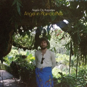
Angelo De Augustine has announced a new album: Angel in Plainclothes is set for release on April 24 via Asthmatic Kitty. The follow-up to 2023’s Toil and Trouble is led by the mesmerizing new single, ‘Mirror Mirror’, which finds him singing, “Tell me your mother in heaven won’t cry in vain/ The way you treat your life like it’s just a game/ Tumbling down like an endless waterfall.” Check it out and find the album cover and tracklist below.
“Usually when I make music, I’ll sit down with one instrument and write the song,” De Augustine explained in a press release. “In ‘Mirror Mirror,’ I didn’t stick to this principle and was messing around with the tape machine’s varispeed function- seeing what would happen if I slowed down what I’d recorded on the bowed psaltery, creating an unusual droning noise. The song came from experimenting with layering sound in a very free way and watching as the structure of a song revealed itself.”
In early 2022, after collapsing and being hospitalized with an undiagnosed illness, De Augustine went through an arduous journey of relearning how to walk, talk, see, hear, and play music. “When I made Toil and Trouble I was in a really bad state, having just been released from the hospital and only about halfway through the recording of the album,” the singer-songwriter said. “I had accepted that I was going to die and that I should do all I could to finish the record. I didn’t believe that I was going to survive the illness, let alone ever make music again.
“The experience unfortunately broke me and everything that I thought that I knew or could count on,” he continued. “With this new record, I’m trying to pick up the pieces of who I was and figure out who I am now. I am on a journey where I feel like I may have been given a second chance at life, and I’d like to live it.”
1. Empty Shell
2. Pet Cemetery
3. Spirit of The Unknown
4. The Cure
5. Mirror Mirror
6. Cosmic Ride
7. The Universe Was Our Mother
8. With a Love So Kind
9. Pictures On My Wall
10. Goodbye Baby Blue
A little less than a year ago, WU LYF returned with their first single in 14 years, ‘A New Life Is Coming’. Today, they’ve formally announced their long-awaited second album: the follow-up to Go Tell Fire to the Mountain is called A Wave That Will Never Break, and it arrives on April 10. The urgently hopeful opener ‘Love Your Fate’ is out today. Check it out below.
“To love one’s fate is to look upon all this — without the fantasy of naïve optimism, nor with the cynicism of bitter despair — but with sober acceptance…” singer Ellery James Roberts shared in a statement. “Freedom is the choice that begins with surrender… So love your fate. Love this time, this ache, this burning world.”
Produced by Sonic Boom, the new album will be released directly through the band’s L Y F community rather than prioritising major streaming platforms. They explained:
With the help of you all we have written, recorded, and produced the long awaited second WU LYF record.
The vision for the L Y F has been with us since the start; way back in 2010 when we first sold the white on white bandana with the Heavy pop / Concrete Gold 12″ – We foresaw a community of like-minds that would gather around the flame of our music, and through whose direct support we could operate with freedom, autonomy & the truth; to play our own (infinite) game – alas we were young, foolish, and didn’t have the means or the infrastructure for the impulse to reach its full potential.
Now 15 years later here we are – the initial version of the L Y F membership platform has been an experimental proof of concept – we have learnt a lot from it over the past year and behind the scenes we have been building Version 2.0.