In this segment, we showcase the most notable albums out each week. Here are the albums out on July 24, 2026:
Charli XCX, Music, Fashion, Film
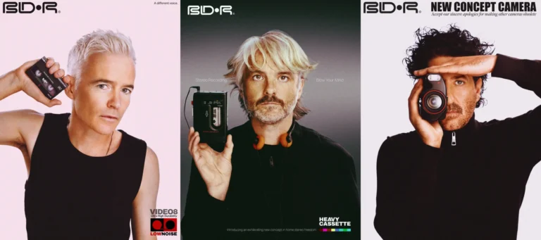
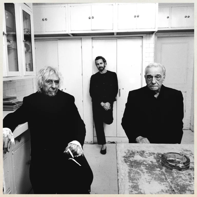
Charli XCX‘s Music, Fashion, Film has arrived. Billed as her “rock album” before it was even formally announced, the record offers a bracing and characteristically messy examination of the pop star’s life post-BRAT. Ahead of its release, Charli shared the singles ‘Rock Music’, ‘SS26’, ‘Wink Wink’, and ‘Camera’, along with their Instagram-exclusive b-sides. It spans 11 tracks and clocks in at just over 30 minutes, while the cover features three icons from each titular category: John Cale for music, Marc Jacobs for fashion, and Martin Scorsese for film.
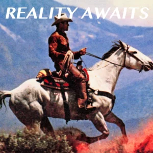
The Strokes are back with a new album, Reality Awaits. The 9-track LP reunites the band with producer Rick Rubin, who helmed 2020’s Grammy-winning The New Abnormal. It was previewed by the heavily AutoTuned singles ‘Going Shopping’ and ‘Falling Out of Love’. Back in May, Albert Hammond Jr. defended the album in response to a commenter who wrote, “Albert I know you don’t like it bro you can tell us.” He said: “It’s my favorite album we’ve ever done. I can’t express how beautiful it is. I listen to the whole thing and wanna start from the beginning again. It grows and grows and becomes intoxicatingly good.”
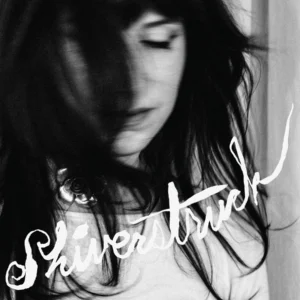
Jilian Medford remembers noting down Shiverstruck, the title of her latest album as IAN SWEET, in her notes app one rnight. “I was just lying in my bed, and it popped in my head,” the singer-songwriter said in our inspirations interview about the record. “I had written the word before I had written the song. It was while I was writing a lot of these songs, so they were starting to kind of have the same conversation, and they were starting to exist and building a world. ‘Shiverstruck’ felt like the word that they could all orbit around, because to me, that word just feels like you’re being caught off guard, you’re being swept away by life. It gives you this overwhelming feeling that you can’t name or explain: the joys, the hardships, the longing, the yearning of life all feel encapsulated in that word.”
Nick Hakim’s new album, I Can See, is intimately atmospheric and imaginative. Following 2022’s Cometa, the record was crafted over five years that saw him grapple with the end of a record deal and the dissolution of a long-term relationship. Having worked on everything from Adrienne Lenker’s Bright Future to Lil Yacthy’s Let’s Start Here, Hakim assembled a strong team of collaborators, including Andrew Sarlo (Dijon, Bon Iver), and mastered by Heba Kadry (Björk, Ryuichi Sakamoto, Gorillaz).
Alex Cameron has returned with his fifth record, Late to Set. The follow-up to 2022’s Oxy Music features production credits from Mark Perkins, Zach Dawes, and Maxim Ludwig, as well as the early singles ‘Red Hook Rain’, ‘Jesus Never Had No Porno’, ‘Satue Down’, and ‘Red Hook Rain’. According to press materials, “This is the sound of a man walking out on somebody else’s family. Into a new world afraid to remember what it used to be. These are songs of protest against life itself. This is the world our fathers feared. And here is its soundtrack.”
After teaming up in 2019 for the joint mixtape Anger Management, Rico Nasty and Kenneth Blume have reunited for a new LP, RX. At 20 minutes, it feels like a sequel, updating the frenzied, playful sound that has become the Maryland rapper’s trademark. “I missed someone that was honest with me,” Rico commented. “And I missed someone who knew me back then, before I had any success. I felt like if I’m going to get back to doing me, I should go back to someone who can be real with me, somebody who’s not too serious or draining.” Blume added, “From the day we met, no one has made me laugh harder or pushed me further out of my comfort zone. RX feels like homecoming. This project is a reminder of where she came from, what made us all fans; and a scary look at how much better she KEEPS getting.”
Tyla, A-Pop; Sam and Louise Sullivan, Love & Devotion; Trophy Wife, Pathetic; REZN, Cycles in the Infinite Dream; Lockstep, I Know What I Saw; Amedeo Cappelletti, Kind Stranger; kelz, A Sweet Passerby; Willow, The Thread; Robyn Hitchcock, The Confuser; Dorio, Agent Friday & The Perfect Angel; Mayday Parade, Sugar; Carter Faith, Cherry Valley Forever; Waterparks, JINX; Scorn-Fury, Outside the limits of your Sight.
“Looking at my life in its final form/ The shape it took, I’d never seen before,” Jilian Medford sings on ‘Silver Screen’, a highlight from her new album Shiverstruck. She might as well be describing the ever-shifting trajectory of IAN SWEET, the moniker that serves as less and less of a vehicle to separate herself from her music. When AI-generated soundalikes start releasing fake music under your pseudonym, what choice do you have but to put your rawest self out there? There’s a wildness to the SUCKER follow-up, which wraps your heart in a knot from the breathtakingly vulnerable opener ‘987’ to the self-reflexive ‘Jilian’. Working with producer Ben Allen, Medford had never pored over her own lyrics this much, never spent so much time focusing on the vocals. But it’s the opposite of any sense of perfectionism that renders this a never-before-seen version of IAN SWEET; not final, but probably unrecognizable to the one that came before or the one that might follow. We’re lucky her songs send shivers down your spine just the same.
We caught up with IAN SWEET to talk about acupuncture, Neko Case, smudged lipstick, and other inspirations behind her new album, Shiverstruck, which is out today.
In what ways did you feel his presence behind the scenes while writing the record?
It’s so beautiful having an animal. It’s something you don’t even really realize, that you just have this other living being with you at all times that you have to take care of and feed and be a mother to. I’ve had Blue now for six years, and every day, I can’t believe I’ve kept him alive, kind of. [laughs] It’s still shocking to me that I have been taking care of this other thing. Both writing and recording the record, he was there with me every single moment. I also brought him with me to Atlanta, where I recorded, and he came to the studio every day. I was kind of nervous, because he’s a bit of chaotic energy, and he can nip at people’s heels. He’s just unpredictable in an amazing way, but once he loves you, you’re in, and he’s the most loyal, precious thing ever. It was really special being in the studio with him, knowing what kind of dog he is; he’s part Jack Russell and part Chihuahua, so he’s definitely got wild energy. And he’s a rescue dog, so he’s got all that baggage with him, too. I was like, “I hope he’s quiet. I hope he behaves.”
And it was really beautiful. He would be in the room with me while I’d be doing vocal takes. He would scratch at the door when I’d go in, because he’d be sad that I left the room, and I’d be like, “Okay, I’m gonna let you in.” He just would sit there completely silent, just staring at me, or be dead asleep as I was recording vocals. It almost makes me want to cry – this creature that I have, who’s normally very energetic, very crazy, wild, but as soon as I was singing, he kind of knew that it was time to just settle in and quiet down. It was really special having him there, doing my vocal takes, and then looking over at him, either looking up at me, or just falling asleep and being so comfortable in the space. A lot of those moments are documented as well; in the vinyl, there’s a pull-out poster with a lot of photos of the studio time, and he’s made his way into every photo, because he was just there in every moment.
This may be a strange question, but were there moments you can think of, be it in the studio or when you were writing, when it seemed like he kind of understood what you were feeling before you even knew it?
I think that really is so true about animals, and also rescue dogs who have been through a lot of their own trauma as well, their own experiences. He very much reads into a lot of my emotions and is very in tune with what I’m going through. I definitely feel like he was aware of it and brought such great energy, even to the writing process. I was writing a lot of the songs in my apartment in New York, and I’d get in my head about something, and then he and I would just go on a walk. I’d just let it go and forget and have moments with him; he’s kind of a tool for me to get out of my head. He represents more to me than just being my dog. I’m looking at him right now because he’s laying right here. [laughs] Yeah, he’s definitely a part of me.
Did he in any way inspire the line “You’re a dog licking at open wounds”? Were you looking at him when the metaphor came to you?
Maybe subconsciously. I’m sure he was in the room when I was writing that, but I have seen him continue if there’s something happening, he’s constantly looking at his paws, and it’s like, “That’s not gonna help you. I think that actually makes the wound worse.”
Driving on the 101 with the windows down and the AC blasting
That’s my favorite way to drive in general, and it’s also a beautiful way to listen to Shiverstruck, especially when you get to the final track, ‘Speed Demon’. Do you tend to only listen to music when you’re driving, or do you sometimes sit in silence and let melodies or lyrics come to you?
Both, for sure, but I do drive in silence, a lot of the time. I do my best thinking and writing and rewriting and just general brain work when I’m driving. I love driving, and that’s something I really missed when I was living in New York for the last three years. I feel really safe and locked-in and creative in my car. I did just get a new car, though. Well, it’s an old car, it’s a 2006 Mercedes, it’s very old. It only plays CDs, so I can’t really have the option to play anything, and it’s been weird. I haven’t listened to my music in the car yet, which is my favorite way to listen to my own music as well. If I’m gonna test a demo or something, I really often want to do it in the car, but I haven’t. And I don’t think my record label’s planning on making CDs, so maybe I have to burn one. [laughs]
The thing with the AC down and windows blasting is that it brings me back to my childhood. My dad would never let that happen. He’d be like, “If we have the AC on, we have to have the windows up.” It’s such a rule, but I don’t know why it is a rule. On a hot day, that is just so nice. I love having the windows down and driving. Traffic sucks, but it’s not the worst. I like doing my thinking in the car.
The phrase “on the run” comes up on a couple of songs, both ‘Speed Demon’ and ‘La La Love Me’. I’m curious about how this theme of escapism came up for you, whether while you were living in New York or coming back to LA.
I was feeling really trapped in New York and having a hard time there, emotionally. With my surroundings, I felt like I couldn’t get out fully or be by myself. There’s a lot of moments in New York of feeling isolated, but never alone. You’re always surrounded by people, but there’s kind of a lonely feeling. Although I love New York, and I loved my time there as well, a lot of this record is me fantasizing, in a way, about wanting to be back in LA. On ‘Silver Screen’, I talk about driving through Laurel Canyon and mention the 101. I was like, “I want something simple like that. Something so simple will be healing for me, to have an escape and be able to be by myself fully.” I wanted to go back to those small things that, at the time, I didn’t think really mattered too much, but then in retrospect, driving in my car with the AC on and whatever is actually really important to me. It’s really something kind of essential to my happiness, and I was missing that. Missing these little simple things that I took for granted.
Acupuncture
All of 2024 and 2025, I would constantly get strep throat. Once every couple of months, I was getting really bad throat infections and getting really sick and couldn’t figure out what was going on. I was like, “Maybe my immune system’s super busted. But that was all in the midst of writing the record, and also, going to Atlanta to record it, and I was praying to God that I didn’t get sick. Somebody recommended I start doing acupuncture as a form of both relieving stress and anxiety, but also for building back up my immune system and getting that regulated. So, I found a really incredible Chinese medicine doctor who I did acupuncture with, and it was really amazing and very healing. It allowed me to slow down and be really present.
I remember one sessoins where the acupuncturist was like, “I’m gonna shut off the lights, you’re gonna be in here for a half hour stay still.” She was like, “Envision what your future you want your future to look like. Do some manifesting, don’t let your mind spin on things that are currently happening. Look towards the future.” And I don’t really do that. I don’t ever take the time to envision what I would want things to look like. Sometimes I’m just so caught up in the moment, or not looking at good things in the future, maybe tripping about something bad. I did end up having to get my tonsils removed, which was not so great. But still, the acupuncturist really helped me through being sick and the healing after that, too, because it was so sensitive and scary to have a surgery on my throat. But now I feel like I’m at my best health and singing shape because of it.
So you recorded the album before the surgery, with that persistent anxiety of getting sick?
Yeah, it’s been four or five months since I got them out. I luckily did not get sick at all during the recording, so I think acupuncture really helped me during that time. But now that I have my tonsils out, I’m definitely feeling so much better. I feel like I used my voice in a different way on this record. I was really wanting my voice to be at the forefront, intentionally. I feel like on past records, I might have buried it behind production, or been a little bit afraid to have it presented so on a platter. I wanted to have it be kind of the star of the record, and let everything else take shape around it. The vocals took the most time out of the whole record, just because I was wanting that to be the focal point and statement piece. It was a lot of singing. Definitely my voice would get strained, but I was taking really good care of it, and taking really good care of myself, too. The anxiety was very much present, for sure, but I tried to push through it.
Blacklisted by Neko Case
I discovered this record only a few years ago. I had always heard about Neko Case and everybody was recommending her, but never really went super deep in. It’s interesting, because it’s not like my music sounds like hers, but that’s the same with a lot of my inspirations. My music doesn’t sound like them, but I think it’s the person in the music that I’m inspired by, and how fearless they are. Her record is so raw, and you can feel her humanity and what she’s going through, through mostly her vocals. Her voice is just so pure, and she sounds perfect to me, but it’s always flawed, in a way. I don’t think she’s messing up notes or anything, but she has that energy of wanting the takes to feel really personal and not like she’s chopping it all up to make it one perfect take. I took a lot of inspiration from that.
The record feels really alive, and especially the song ‘I Wish I Was the Moon’ – I think I played that a thousand times over and over again. It’s the most beautiful song I’ve ever heard, and the lyrics are crazy. “I’m so tired, I wish I was the moon.” I mean, something so simple like that is just the peak level of songwriting for me, where you’re not overthinking it, and you just have a lyric that you can put out there, and it can be universally understood, but it’s also so personal.
Is working with a producer something that helps you deal with the feeling of a vocal take being flawed?
Yeah, I’m really hard on myself with vocals, and it can be tough for me to listen back. But I think that the producer on this record, Ben Allen, really helped me feel confident in the vocals, and was always lifting me up and being like, “This is a fucking killer take.” I would be like, “Ugh, I don’t like it.” And he was like, “This feels very real, and you can feel you in the moment here.” That was something I was learning to lean into in real time. I think that if you have people around you that you trust, and you trust their opinions, and they’re incredibly talented – why would they want to put something out there, too, that wouldn’t sound good? Everybody’s on a team together. That gave me permission to not overthink it and feel comfortable singing crazy takes that I might have completely botched. I would throw out a lot of ideas of, “Let me try this, let me try that,” or him being like, “Let’s try this.” There was no, “No, that’s not gonna work.” Like how I’m saying with Nico, your most flawed take might be the best one. You just don’t know.
I saw in a post with Blueberry that you had a shirt that said, “What part of no don’t you understand,” which I love.
Yeah, I love that one. I don’t know how this began or what it is, but I just find a lot of comfort in these T-shirts. Knowing that they’ve all been owned by someone in the past, there’s rips and holes, and that it’s had a life before me – I mean, that’s all vintage stuff, but there’s something kind of goofy about the Looney Tunes stuff, because I’m like, “Did this belong to a child? [laughs] Who was wearing this? What’s the story behind this?” I’m a huge Space Jam fan and always have been. I have an old song, ‘23’, that’s kind of about Michael Jordan. My dad was a basketball referee, so I grew up loving basketball, but I think I fell in love with the Looney Tunes in Space Jam. It’s not like I’m a big collector or anything serious, but if I find a good Looney Tunes tee, I’m gonna get it. Especially Taz. [This interviewer is wearing a vintage T-shirt with Taz.] I don’t know what it is about Taz. I think Taz was my first crush or something. [laughs] I just love his whole thing, and I’ve got a hilarious T-shirt that I’ll have to send a picture of. Wait, what does it say on the shirt?
It says, “Now try your password,” and there’s a lock.
Oh, that’s funny, and he smashed it. I love how crazy he is.I’ve got a really epic shirt from him with a cowboy hat on, cowboy boots, playing an acoustic guitar with a headset. He’s like a country music star. It’s my favorite shirt ever, and it’s so precious I almost barely wear it. I don’t know what it is, I just really cherish the energy. I feel like as a kid, I was very Taz. I was running around and causing chaos, and it just feels really nostalgic and sweet to me.
Is what you wear important to you at all when you’re writing?
Not particularly writing, but I think in the studio, I want to show up. I feel like I’ll remember those days forever, so it’s kind of burned in your mind, how you showed up that day. I have so many photos from that studio day of that shirt, of “What part of no don’t you understand” and there’s so many photos of Blue and I together, where he’s looking and begging for a treat or something. I just think it’s really funny that I’m wearing that shirt.
Smudged lipstick
In general, messy and not totally manicured looks or vibes, like the imagery of somebody wiping their lipstick away, or having made out with someone and it’s everywhere – this record’s full of those imperfections. I was also kind of in a messy, chaotic period in my life, living in New York and figuring things out, and not wanting everything to be pristine and perfect, and feeling really okay with that. For the first time in my life, I can not be totally put together and present a less precious version of myself to the world. I’ve just been feeling that way even post-making the record. I really wanna let it go and let it be open and not overthink every little thing, even when it comes to your makeup or your outfit. I just want to be raw with it all.
Did the decision to return to LA still feel like an act of self-restraint, like you were pulling back from the messiness, or drawing a line between that life and this one?
I feel a lot better being here, mentally. I don’t ever want to draw a line or a wall between the two, because everything in my life kind of flows into the next moment or next thing I’m gonna be doing. The messiness of New York and the late nights were so formative and important and have led me now to want a little bit more of a stable, calm life. I’m getting older, I want to really settle into who I am and find that inner peace and comfort that can be hard with the chaos of New York. But without that, I wouldn’t have really wanted to return. So if I didn’t have that experience, I would have just been in LA being like, “I’m bored.” [laughs] But I had to get a little bit shaken up to appreciate what was coming next.
‘Superstar’ by the Carpenters
This song actually was the first song I ever was given to sing in a voice lesson when I was 13 years old by my voice teacher. That’s when I discovered Sonic Youth, too, because they covered it. So I was 13 years old, being like, “Whoa.” This song has always been in my life, in one way or another, but why it came in so clear making this record is the restraint that this song has. It’s never trying to go anywhere huge. It’s just telling this story kind of quietly, but it’s not making a huge statement or having these huge final moments of a song. I feel like the song ‘Shiverstruck’ was kind of inspired by this song. Originally, that song was gonna have this big, huge ending, and everything was gonna be hitting in crazy. I was listening back to this song by accident, and I was like, “I think I want to cut that end part completely. I just want to pull back.” I want to pull back on the reins and not feel like every song needs to explode to be emotional. That’s why the song was so important to me in the process. It’s devastating, but it’s not overly produced – just in its quality, just by existing, it can pull at your heartstrings. That was what I was trying to achieve on a lot of these songs.
You mentioned ‘Shiverstuck’, and I wanted to ask how you landed on that word for the title. Of course, my mind also went to the Coldplay song ‘Shiver’.
Oh, I love Coldplay. [laughs] We all know I love Coldplay, and I love that first record especially. But I remember writing down the song title in my notes app one night in my apartment. I was just lying in my bed, and it popped in my head. I had written the word before I had written the song. It was while I was writing a lot of these songs, so they were starting to kind of have the same conversation, and they were starting to exist and building a world. “Shiverstruck” felt like the word that they could all orbit around, because to me, that word just feels like you’re being caught off guard, you’re being swept away by life. It gives you this overwhelming feeling that you can’t name or explain: the joys, the hardships, the longing, the yearning of life all feel encapsulated in that word.
This interview has been edited and condensed for clarity and length.
RIP Magic – Marco Pini, Felix Bayley-Higgins, Beth Boswell-Knight and Pedro Takahashi – have dropped a new single called ‘Light Over There’. The woozy, sluggish track follows the James Murphy-produced ‘5words’ and ‘Screwdark’. Check it out below.
The Avalanches have teamed up with Karen O for a new single, ‘Blue Shadows’. Built on a sample of Blue Gas’ 1984 Italo single ‘Shadows From Nowhere’, the track follows previous singles ‘Together’ and the Jamie xx collab ‘Every Single Weekend’. Check it out below.
“’Blue Shadows’ was an idea of Andy’s that was almost lost to time until Tony stumbled across it in an old folder and began championing it as a potential album song,” the group’s Robbie Chater explained in a press release. “It’s since become one of my favourite Avalanches tunes. Many moons later and thanks to the kindness of Claudio Casalini and the estate of Celso Valli, it looked like Tony’s dream for Blue Shadows might come true.”
“I included it in a selection of song ideas for Karen, we wanted her to hear it although I never imagined a vocal would be possible; the demo had such a peculiar, singular mood,” he continued. “What she recorded still amazes me after months of listening, it’s so achingly forlorn and somehow sounds as if it always existed as a song. I don’t know how that is possible, or what she was channelling, some people just have access to a higher plane I suppose!”
Karen O added: “When Robbie sent me Blue Shadows I jumped at the chance to collaborate. The Avalanches last record We Will Always Love You was a gift to humanity in 2020 and I’ll count it as one of my Top 10 forever. The Avalanches frequency is high, I’m so happy to be asked to slide into it.”
Startup ideas orbusiness plans won’t truly materialize without marketing. But strong marketing rarely happens by accident. And nowadays, AI tools have become an essential part of it. AStatista report even projected that marketing budgets will increasingly be dedicated to AI-driven solutions. So the question isn’t about whether you should use AI. The problem now is that most guides focus on marketing tools in general. When in fact, marketers need to focus first on AI tools for marketing strategies.
There’s a difference between a tool that writes your Instagram caption and a tool that tells you which customers to target, which message actually lands, and which channel to bet on. A reasonable first step is to uncover audience insights, automate campaign planning, personalize customer experiences, and validate ideas. All before investing valuable budget and time in execution.
That said, this guide highlights the specific options that actually shape strategy — the decisions you make before a single piece of content goes out.
Top Five Best AI Tools for Marketing Strategies
HubSpot AI
Image Credit: HubSpot AI
HubSpot AI focuses on the groundwork every campaign strategy should start from. While it’s packed with tools for every GTM team’s needs, one of its standout offerings is the Marketing Hub. It has features designed to help attract, convert, and engage visitors. Practical solutions are what it emphasizes. Marketers can use it to generate leads and automate marketing. It even includes a Showcase ROI feature that shows marketing efforts that actually boost revenue. It helps determine the smartest investment.
Key Features:
Predictive scoring for identifying high-converting prospects
Converting traffic to capture higher-quality, sales-ready leads
AI-assisted email, landing page, and blog generation
Pricing:
Free Package
Starter Package – $20 per month
Professional Package – $890 per month (billed annually)
Enterprise Package – $3,600 per month (billed annually)
Real Use Case:
Software companies can use HubSpot AI to find accounts in their pipeline that actively research competitor products. Doing so helps them to rethink their quarterly outbound strategy to prioritize those accounts. Not just send follow-ups to everyone or those sitting cold in the CRM for months.
Salesforce
Positioning itself as a CRM platform, Salesforce helps marketers transform customer data into strategic decisions. With its Agentforce Marketing, users can analyze customer behavior, predict purchasing intent, recommend personalized experiences, and optimize campaigns. Salesforce can decide which channel, which offer, and when to act. So marketers can expect it to be more of a decisioning engine. It recommends the next-best action and produces only the content necessary.
Key Features:
Providing adaptive customer experiences
Predictive customer insights and segmentation
AI agents for every customer interaction, channel, and workflow
Pricing:
Free Trial
Starter Package – $25 per month
Pro Package – $100 per month (billed annually)
Enterprise Package – $175 per month (billed annually)
Unlimited Package – $350 per month (billed annually)
Agentforce 1 Sales Package – $550 per month (billed annually)
Real Use Case:
Salesforce can help online retailers outpace competitors. Its suite of tools allows them to identify customers likely to purchase seasonal products. It makes it easier to launch personalized email campaigns.
Jasper AI
Image Credit: Jasper AI
Jasper AI may initially come off as just a platform forturning strategy into execution. But its Jasper IQ works as a strategic governance layer. Not just a writing feature. It excels at enforcing a single brand position across a scaling content operation, where a style guide sitting in a shared doc would otherwise get ignored. By defining brand voice, tone boundaries, and forbidden language, marketers ensure every message stays aligned across campaigns. It keeps a growing team from drifting off-brand.
Key Features:
AI-powered campaign and content generation
Templates for blogs, ads, emails, and social media
AI agents for end-to-end marketing workflows
Pricing:
Free Trial
Pro Package – $69 per month
Business Package – Custom Pricing
Real Use Case:
Fashion labels can lock their positioning across separate content writers inside Jasper AI. With this AI tool, there’s no need for them to manually review every post to keep campaigns aligned with the brand’s actual market position.
SparkToro
Marketers need to understand who they’re trying to reach, and SparkToro helps them do that. At its core, it approaches strategy by focusing on where audiences spend attention and what that means for channel and budget allocation. Specifically, its audience research feature shows customers’ demographics, media consumption, most-used social networks, topics of interest, and much more. These insights help marketers make informed decisions about where to show up before deciding what to say.
Key Features:
Media planning and channel prioritization from evidence
Collecting information about the audience’s behavior, characteristics, and demographics
Reliable results from Google SERPs, clickstream, and public social profiles
Pricing:
Free Package
Personal Package – $50 per month
Business Package – $150 per month
Agency Package – $300 per month
Real Use Case:
SparkToro enables marketers to conduct audience and market research more efficiently. Like finding where remote professionals consume content before launchingAI tools for productivity. This allows for a smarter selection of advertising channels and partnership opportunities.
Wynter
Image Credit: Wynter
Wynter is built for one job: testing whether the messaging lands with actual buyers. Using a proprietary network, marketers can validate positioning, landing pages, value propositions, and marketing copy. Since it taps into actual B2B professionals, users get results based on real reactions rather than an internal team’s best guess about what resonates. What’s more, it has tools for brand tracking, preference testing, landing page testing, and others.
Getting feedback from over 80,000 verified B2B professionals
Pulls in data across diverse industries, buyer roles, and regions
Monitoring brand awareness and perception
Pricing:
Free Package
Pay-as-you-go Package – (Price varies based on usage)
Pro Package – $20,000 per year
Elite Package – $40,000 per year
Real Use Case:
A B2B company can test its landing page for a cybersecurity platform with Wynter. With feedback from IT decision-makers, they can identify unclear messaging before advertising begins. As such, they can avoid discovering it fell flat after the budget’s already spent.
Choosing the Game-Changing AI Tools for Marketing Strategies in 2026
No doubt. These AI tools for marketing strategies help marketers replace guesswork with data-driven decisions. But it won’t matter unless marketers define their marketing bottleneck first before choosing one. It’s best to prioritize the tools that begin with understanding the audience, continue through personalized campaign execution, and improve through continuous testing and refinement.
And that’s what these recommendations promise. Strip away the content-generation features, and a clearer pattern shows up. HubSpot and Salesforce tell you who to prioritize. SparkToro tells you where to be. Wynter tells you what to say once you’re there. Jasper keeps that message consistent at scale. Then you can ensure every campaign launches with greater confidence and a stronger chance of success.
From major retrospectives to exhibitions exploring textiles and photography, Berlin’s museums have plenty to offer this month. Here are four exhibitions that opened in July and deserve a spot on your summer itinerary.
Hamburger Bahnhof continues its ambitious programme with Matter of Care, Care of Matter, a group exhibition by ‘Materialistin’ bringing eight Leipzig-based women sculptors together. The installation explores labour, collective practice and solidarity. Blending social commentary with experimental artistic practice, the exhibition asks how materials themselves carry histories, encouraging visitors to reconsider their relationship with the physical and economic world.
American artist Glenn Ligon’s Double America takes centre stage in a special presentation at the Neue Nationalgalerie this summer. First created in 2012, the striking neon work spells the word “AMERICA” twice: once backwards and once as a mirrored reflection, inviting viewers to question ideas of identity, history and national mythology. Presented as part of the We the People programme, the installation uses the simplicity of language and light to challenge the notion of a singular American narrative
What happens when sculpture is viewed through the lens of a camera? Photography Tells Sculpture examines this relationship between three-dimensional artworks and their photographic reproductions, pairing around sixty historical and contemporary photographs with medieval and Renaissance sculpture. The result is an exhibition that reveals how perspective, light and framing fundamentally shape the way we experience art.
Textiles take centre stage in this survey of Sofie Dawo, whose radical approach blurred the boundaries between art and craft. Dawo deliberately disrupted and deconstructed her fabrics, allowing chance to become part of the creative process. Featuring 22 works alongside selected drawings on paper, the exhibition highlights the originality of an artist whose influence continues to resonate heavily.
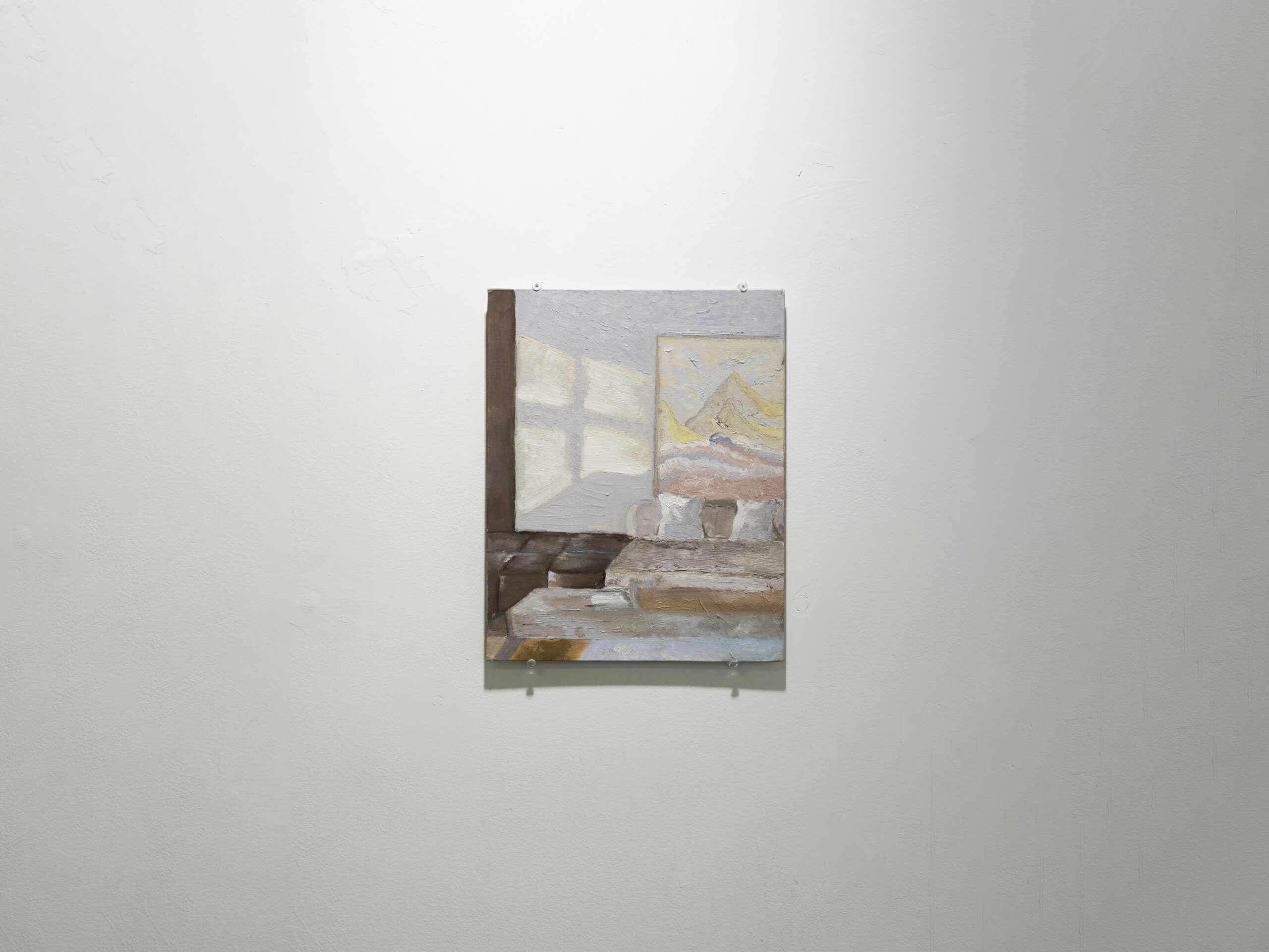
About the size of an A4 sheet, Yue Zhou’s Another Window (2025) prompts its viewers to move closer. Through this strategy of requiring proximity, she turns her painting into a tiny portal into an aesthetic experience where perception gives way to “phantasy” — in the Kantian and psychoanalytic sense of imaginative projection, and therefore distinct from ordinary “fantasy” — as if one could live inside the painting through the inner realm of imagination.
The viewer’s visual field is taken in by the subdued, gentle colour palette that characterises the interior scene depicted; the steely tone of its wall recalling the sky of a cold, snowy winter day. This atmosphere-setting mirrors Zhou’s conceptual framework, which aims at allowing the pictorial object to merge interior and exterior, room and landscape. Thick, corpulent dabs of paint add to the sculptural element in the architectonic composition represented in the canvas. Within Another Window, a painting hangs on the wall; a further move toward the boundary blurring that the artist claims both structurally and phenomenologically. As a result, in this work, the inner decor conjures up in the viewer’s mind what is left outside its margins: an idyllic alpine landscape, as refreshing as the mood of the interior space. The reflection beside the painting on the wall further invites what lives outside the room to materialize behind the viewer’s eyes; both a clue to and an afterimage of a window deliberately left beyond the compositional frame.
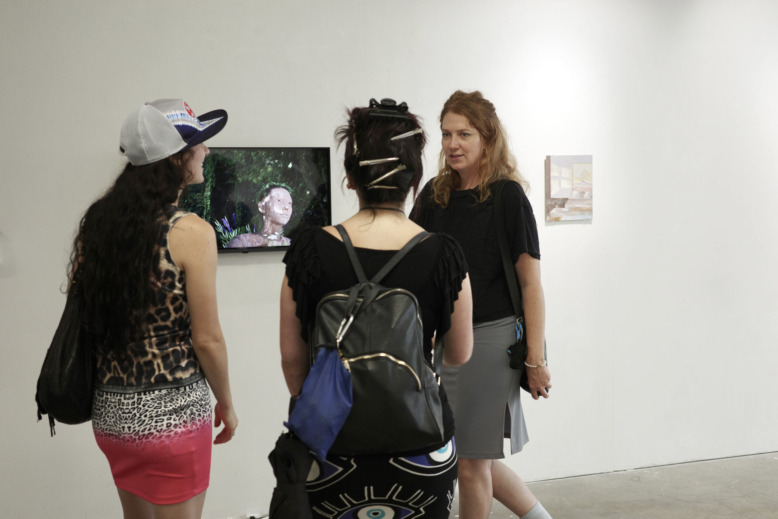
“Another Window”, 2025. Installation view at the A Space Gallery. Courtesy of the artist.
Another Window activates not only perception and imagination, but also memory. This work functions as a catalyser that reawakens what lingers in our reminiscences of the past, and that allows residual impressions left on the mind to resurface from oblivion. It is conceived in ways that both structure how we see or imagine, and activate recollection. It reminds us that a work of art is not a representation of the world seen from a fixed perspective, but rather, as the American philosopher Nelson Goodman puts it, is a “way of worldmaking”. As such, Another Window belongs to the type of aesthetic experience where images do not merely depict a pre-existing world but construct one of their own. It asserts that reducing a painting to an illusionistic representation of the world by way of applying paint onto canvas denies its potential and undermines its essence, as a painting is capable of generating parallel worlds and constitutes an epistemological domain in itself.
“Another Window”, 2025. Installation view at the A Space Gallery. Courtesy of the artist.
By mobilising Merleau-Ponty’s phenomenology, Zhou allows viewers to oscillate between gaze, remembrance, and perception. By drawing on Goodman, she allows them to plunge into the epistemologically generative dimension of art. Within Another Window’s realm, the pictorial domain is dynamic, rather than static, and the viewer is part and parcel of the artwork, establishing a range of relationships whilst identifying symbols and metaphors, and thereby recognising the world through the interpretation of the artwork, and the artwork through their personal experience of the world.
The way people arrive at an online casino has changed. A decade ago the entrance was a deposit screen: put money in, then play. Now, for a large share of first-time players, the front door is an offer that asks for no money at all. A small credit lands in a new account before any card is charged, the word “free” does the advertising, and a page of conditions does the actual work. This is the no-deposit offer, and it has quietly become the most common way a curious person first steps inside a real-money casino site.
It fits a wider habit the culture has already settled into. Most of what people stream, download, and play now arrives without a payment attached at the point of entry. The ad-supported music tier, the free game that monetizes later, the trial that converts if you forget to cancel: these trained a generation to expect that trying something should cost nothing. Online casinos adopted the same entrance, then attached terms far heavier than anything a music app would dare. If you want to see that machinery written down in full, PlayUSA’s no deposit casino player guidance spends most of its length on playthrough math, cash-out caps, and eligible-game rules rather than on the size of the headline number, which tells you where the real content of the offer lives.
That gap, between how loud the word “free” is and how quiet the conditions are, is the whole subject here. Not because most readers want a casino account, but because the no-deposit offer is the sharpest example of a pattern the culture now runs on everywhere. Everything a free music tier merely implies, this version is obliged to spell out.
What a No-Deposit Offer Actually Is
A no-deposit offer is a promotional credit a casino grants a new player for registering, before that player funds the account. It usually takes one of a few shapes: a small amount of bonus cash, a set of free spins on a named slot, or a fixed window of “free play.” The point, from the operator’s side, is to remove the deposit decision from the moment of first contact. You are inside and playing before you have weighed whether to spend anything.
The credit is genuinely granted without a deposit, so the word is not a lie. What the word omits is that the credit is not the same as money you can withdraw. It is a conditional balance, and the conditions are the product. Understanding the difference between the two is the single most useful thing a first-time player can do, and it is exactly the part the marketing is designed to skip past.
Why “Free” Became the Default Front Door
The no-deposit offer works because it borrows an expectation the culture already built. Free tiers taught audiences that the entrance to almost anything should be frictionless, and that paying, if it happens, comes later and by choice. Casinos did not invent this reflex. They inherited it and turned it up.
The logic is the same funnel used across streaming and mobile games. A free entry point gets people through the door, builds a habit of opening the app, and creates a pool of registered users who can later be converted into depositing players. A minority who deposit and keep playing funds the offer for everyone who tried it once and left. The no-deposit credit is the queue for the paid product, not the product itself. Where it differs from a free music tier is the exit: a music tier ends with you having heard something, while a casino session ends with a chance-based result and, often, an emptied bonus balance.
The Terms Are Where the Offer Actually Lives
Read any no-deposit page and you find the same load-bearing terms, in roughly the same order of importance. The headline figure is the least important line on the page.
The first term is the playthrough or wagering requirement. A bonus must be bet some multiple of its value before any winnings can be withdrawn. A $25 no-deposit credit at a 40x requirement means $1,000 in total wagers before a cash-out is possible. The second term is the maximum cash-out, a cap on how much of any winnings you can actually keep, often far below what an optimistic run might produce. The third is game eligibility: slots usually count fully toward the requirement, while table games count little or nothing, so the offer steers play toward the highest-hold games on the site. The fourth is the expiry window, frequently just a few days, after which the credit and anything won with it disappears.
None of this is hidden, strictly speaking. It is simply not what the word “free” advertises, and it is written in the part of the page a first-time player is least likely to read.
Four Versions of “Free,” Side by Side
The no-deposit offer is easier to judge when you set it next to the gentler free offers it borrows its language from. The pattern that matters is in the last column: the terms get heavier and more numerical as you move down.
The offer
What genuinely costs nothing
What you actually hand over
Where the real terms live
Ad-supported streaming
Access to most of the catalog
Attention and listening data
Plan page: ad load, feature limits
Freemium app
The core features, indefinitely
Steady pressure toward the locked upgrade
Upgrade screen and feature comparison
Free-to-play game
The full game, start to finish
Time, plus optional spending by a minority
Store page, item odds, pass expiry
No-deposit casino offer
A small starting credit
Registration, ID checks, agreement to wagering terms
Playthrough multiple, max cash-out, eligible games, expiry
Read down that column and the trend is hard to miss. The further you go, the wider the distance between the headline word and the actual obligation, and the no-deposit offer sits at the far end of that spread.
Where These Offers Are Actually Legal
The marketing volume around online casinos badly overstates how many people can legally accept the offer at all. Real-money online casino play in the United States is restricted to 21 and up, and it is legal in only eight states as of mid-2026, one of which had not launched its market yet. That is a much smaller map than the advertising implies, and a reader outside those states is not the audience for a no-deposit offer no matter what an ad promises.
New Jersey is the most developed of these markets; its online casino revenue overtook its brick-and-mortar casino revenue in 2025. Michigan and Pennsylvania each host a substantial roster of licensed operators. Maine is the newest addition and, as of mid-2026, had not gone live yet, with launches expected during the year through the state’s tribal nations and their commercial partners. The point is not to memorize the list but to notice how narrow it is. Several of the largest states, including California and Texas, have no legal online casino at all, which means most no-deposit ads a reader sees are for products they cannot legally use.
Sweepstakes Casinos Are Not the Loophole They Look Like
Faced with that narrow map, many players run into sweepstakes or “social” casinos, which use a dual-currency model: a free play-only coin, plus a promotional coin that can be redeemed for prizes under a no-purchase-necessary framework. These sites often advertise their own no-deposit-style giveaways and present themselves as the nationwide alternative to licensed real-money play.
They are not a safe universal option, and the legal ground under them has shifted hard. Over 2025 and 2026 a growing list of states moved to ban or restrict the model. California’s ban took effect on January 1, 2026. Connecticut made operating one a felony. Indiana, Maine, Oklahoma, and Tennessee passed prohibitions or restrictions of their own, and several other states have acted through legislation or attorney-general enforcement. Availability is shrinking and depends entirely on where you are. Treating a sweepstakes site as a way around your state’s rules is exactly the assumption these laws were written to shut down.
A Slot Is Not a Game You Get Better At
There is a specific intuition a no-deposit offer quietly encourages, and it is worth correcting plainly. A reader who spends time with games learns that effort converts into outcome: study the systems, get measurably better, clear the level. That fluency does not transfer to a casino floor, and the offer benefits when players assume it does.
A slot has no skill curve. It is chance-based, and no amount of study changes the distribution of results. Return to player, the percentage often quoted in casino marketing, is a long-run statistical average across enormous numbers of spins, not a promise about your session or your bonus credit. Even in games where skill exists, correct blackjack strategy reduces the house edge without ever removing it. The built-in advantage is a design constant, not an opponent you can outplay. As this magazine has noted in its coverage of how frictionless design is reshaping what players expect from digital play, ease of entry has become part of what feels like good design, which is precisely why a smooth no-deposit signup can feel like skill-neutral fun rather than what it is.
How to Read a No-Deposit Offer Like a Press Release
Anyone who follows culture develops a reflex for the gap between what a press release says and what it means, and that reflex is the right tool for a no-deposit offer. The questions are the same. What is the actual claim? What number is being led with, and what number is conspicuously missing? An offer that headlines a credit amount but hides the playthrough figure is doing what a press release does when it leads with a superlative and buries the date.
There is a formal standard behind the instinct, and it is older than any of these products. US regulators decided long ago that the word “free” needs supervision, and the rule still holds that the terms of a free offer must be disclosed clearly and conspicuously at the outset rather than after signup. That converts vague unease into a concrete test: were you shown the wagering requirement and the cash-out cap before you accepted the credit, or only after you had registered and started playing? A legitimate offer passes it. The ones that fail tend to fail in the same direction, and it is rarely the direction that favors the player.
Why This Entrance Is Here to Stay
The no-deposit offer is not going to disappear, because the expectation it feeds is not going to reverse. The habit of trying things for free at the door is set across the whole culture, and casinos are simply one of its more aggressive adopters. Every product that tried to hold a paywall at the entrance eventually built a free-flavored way in, and watched most of its new arrivals use it.
That is not a reason for panic, and it is not an argument that “free” is always a trap. Plenty of free offers, in music, games, and streaming, are honest trades where the cost is attention and the exit leaves you with something. The no-deposit casino offer belongs to a narrower category, the one where the currency is real money and the outcome is chance. For that category the useful habit is small and unglamorous: read the terms before accepting, notice when the word “free” is carrying more weight than the sentence around it can support, and remember that a headline credit with no visible playthrough number is telling you something about itself.
Frequently Asked Questions
Are no-deposit casino offers actually free?
The credit is genuinely granted without a deposit, so the word is not fraudulent. But it normally arrives with wagering requirements, maximum cash-out limits, restricted eligible games, and short expiry windows, which is why serious guides on the subject spend far more space on the terms than on the headline amount. The credit is a conditional balance, not withdrawable money.
Why do online casinos give away credit before you spend anything?
For the same reason streaming services offer a free tier. The offer removes the payment decision from the moment of first contact, builds a habit of using the site, and creates a pool of registered players who can later be converted into depositing customers. A minority who go on to deposit fund the promotion for everyone who tried it once and left.
What is a playthrough or wagering requirement?
It is the number of times the bonus value must be bet before any winnings can be withdrawn. A $25 credit at a 40x requirement means $1,000 in total wagers before a cash-out is possible. Combined with a maximum cash-out cap and a short expiry window, it is the main reason a “free” credit rarely converts into money you keep.
Can I use a no-deposit offer anywhere in the US?
No. Real-money online casino play is 21 and up and legal in only eight states as of mid-2026, one of which had not launched yet. Most states, including several of the largest, have no legal online casino, so many no-deposit ads are for products a given reader cannot legally use. Sweepstakes sites are not a reliable workaround, since a growing list of states has banned or restricted them.
How can I tell quickly whether a no-deposit offer is fair?
Look for the obligation before you accept it, not after. Regulators have long held that the terms of a free offer should be stated clearly and conspicuously at the outset. If the wagering requirement and cash-out cap are easy to find and stated up front, that is a good sign. If you have to hunt for them, or they appear only once you have registered, treat the word “free” as marketing copy rather than a description.
A new sports comedy is climbing the Netflix ranks. The Hawk, which stars Will Ferrell as a washed-up golfer, is currently the third most-watched show on the platform.
With 4.8 million views this week, it’s also a Top 10 show in 16 countries. While the series hasn’t received great reviews from critics, the general audience seems interested enough to demand more. Could a follow-up be on the way? Here’s what we know so far.
The Hawk Season 2 Release Date
At the time of writing, Netflix hasn’t announced plans for a potential The Hawk season 2.
That said, the title isn’t listed as a limited series. The streamer might be waiting to assess viewership before making a decision either way. Having Will Ferrell and Molly Shannon in the cast is a big draw, so it all comes down to how many people tune in.
If Netflix ends up giving the green light, new episodes could arrive sometime in late 2027.
The Hawk Cast
Will Ferrell as Lonnie “The Hawk” Hawkins
Molly Shannon as Stacy
Jimmy Tatro as Lance
Fortune Feimster as Sam
Chris Parnell as Anton
Katelyn Tarver as Natalie
David Hornsby as Radford
Luke Wilson as Golden Fisk
What Is The Hawk About?
A sports comedy, The Hawk revolves around Lonnie “The Hawk” Hawkins, a former golf superstar. The kind who refuses to accept that his best days are behind him. So much so that the aging champion decides to make one last attempt at completing his career Grand Slam by winning the U.S. Open.
His comeback brings him back into the PGA spotlight, but it also puts him on a collision course with his son, Lance. The latter is a rising golf star himself who has a complicated relationship with his father.
Over the course of the show, Lonnie battles rivals and personal demons. Since this is a comedy, his pursuit of one final major becomes increasingly chaotic. By the time the last episode rolls around, Lonnie comes very close to accomplishing his goal. We won’t spoil whether he does or doesn’t, but viewers will find out by the time the end credits roll.
If The Hawk season 2 happens, it will likely continue Lonnie’s story as he attempts to reignite his career. For the sake of sports comedy fans everywhere, we’re keeping our fingers crossed.
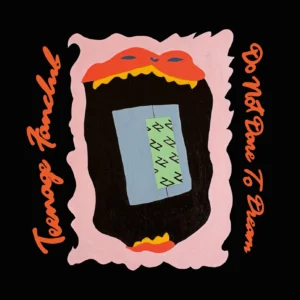
Teenage Fanclub have announced a new album, Do Not Dare to Dream, which is set for release on October 9 via Merge. The follow-up to 2023’s Nothing Lasts Forever is led by the warm and catchy ‘Day In The Sun’. It comes paired with a video filmed on location at Black Bay Studio on Great Bernera by Donald Milne. Check it out below.
Commenting on the album title, the band’s Norman Blake said: “Those ‘dare to dream’ sentiments are kind of ridiculous. I don’t think the world works that way.” Raymond McGinley added, “We can still be cheerful and optimistic in the face of things not being great.”
Do Not Dare to Dream Cover Artwork:
Do Not Dare to Dream Tracklist:
1. There Was You
2. Tomorrow People
3. Over and Over
4. Be With You Tonight
5. The Same Air
6. I Do Not Dare To Dream
7. Take Time
8. Day In The Sun
9. Somewhere To Land
10. Young And Wise


 Charli XCX‘s Music, Fashion, Film has arrived. Billed as her “rock album” before it was even formally announced, the record offers a bracing and characteristically messy examination of the pop star’s life post-BRAT. Ahead of its release, Charli shared the singles ‘Rock Music’, ‘SS26’, ‘Wink Wink’, and ‘Camera’, along with their Instagram-exclusive b-sides. It spans 11 tracks and clocks in at just over 30 minutes, while the cover features three icons from each titular category: John Cale for music, Marc Jacobs for fashion, and Martin Scorsese for film.


 The Strokes are back with a new album, Reality Awaits. The 9-track LP reunites the band with producer Rick Rubin, who helmed 2020’s Grammy-winning The New Abnormal. It was previewed by the heavily AutoTuned singles ‘Going Shopping’ and ‘Falling Out of Love’. Back in May, Albert Hammond Jr. defended the album in response to a commenter who wrote, “Albert I know you don’t like it bro you can tell us.” He said: “It’s my favorite album we’ve ever done. I can’t express how beautiful it is. I listen to the whole thing and wanna start from the beginning again. It grows and grows and becomes intoxicatingly good.”
 Jilian Medford remembers noting down Shiverstruck, the title of her latest album as IAN SWEET, in her notes app one rnight. “I was just lying in my bed, and it popped in my head,” the singer-songwriter said in our inspirations interview about the record. “I had written the word before I had written the song. It was while I was writing a lot of these songs, so they were starting to kind of have the same conversation, and they were starting to exist and building a world. ‘Shiverstruck’ felt like the word that they could all orbit around, because to me, that word just feels like you’re being caught off guard, you’re being swept away by life. It gives you this overwhelming feeling that you can’t name or explain: the joys, the hardships, the longing, the yearning of life all feel encapsulated in that word.”
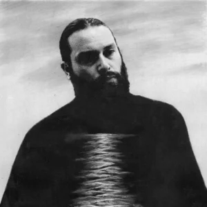 Nick Hakim’s new album, I Can See, is intimately atmospheric and imaginative. Following 2022’s Cometa, the record was crafted over five years that saw him grapple with the end of a record deal and the dissolution of a long-term relationship. Having worked on everything from Adrienne Lenker’s Bright Future to Lil Yacthy’s Let’s Start Here, Hakim assembled a strong team of collaborators, including Andrew Sarlo (Dijon, Bon Iver), and mastered by Heba Kadry (Björk, Ryuichi Sakamoto, Gorillaz).
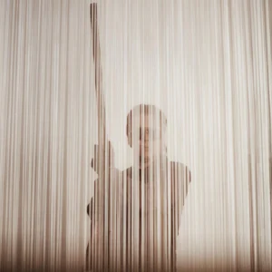 Alex Cameron has returned with his fifth record, Late to Set. The follow-up to 2022’s Oxy Music features production credits from Mark Perkins, Zach Dawes, and Maxim Ludwig, as well as the early singles ‘Red Hook Rain’, ‘Jesus Never Had No Porno’, ‘Satue Down’, and ‘Red Hook Rain’. According to press materials, “This is the sound of a man walking out on somebody else’s family. Into a new world afraid to remember what it used to be. These are songs of protest against life itself. This is the world our fathers feared. And here is its soundtrack.”
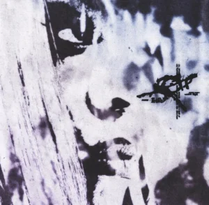 After teaming up in 2019 for the joint mixtape Anger Management, Rico Nasty and Kenneth Blume have reunited for a new LP, RX. At 20 minutes, it feels like a sequel, updating the frenzied, playful sound that has become the Maryland rapper’s trademark. “I missed someone that was honest with me,” Rico commented. “And I missed someone who knew me back then, before I had any success. I felt like if I’m going to get back to doing me, I should go back to someone who can be real with me, somebody who’s not too serious or draining.” Blume added, “From the day we met, no one has made me laugh harder or pushed me further out of my comfort zone. RX feels like homecoming. This project is a reminder of where she came from, what made us all fans; and a scary look at how much better she KEEPS getting.”