For most of gaming’s modern history, the question “what do you play on?” had a short list of answers, and they all involved a box wired to a television or a tower humming under a desk. The console was the altar. The controller was the rite. To be a gamer meant, in some quiet way, that you had committed: to the hardware, to the price tag, to the living-room real estate. That definition is fraying, and the thing pulling it apart is already in your pocket.
Mobile is no longer the scrappy younger sibling of “real” gaming. It is the largest part of the industry by a wide margin. In 2025, mobile generated an estimated $103 billion globally, more than half of all gaming revenue, while serving as the entry point for roughly 83% of the world’s players. To put that in perspective, the console segment that defined the medium for decades brought in around $46 billion. The center of gravity has shifted, and it shifted toward the device almost everyone already owns.
Access is the whole story
The simplest explanation is also the most powerful: a smartphone is already there. A new console costs somewhere between $400 and $700 before a single game is purchased, and that is to say nothing of a gaming PC. A phone, by contrast, is a sunk cost most people justify for texting, maps, and the camera. Gaming rides along for free, or close to it.
That difference compounds across five years. Between 2020 and 2025, mobile revenue grew by roughly 63% while console revenue expanded only about 7% over the same stretch. The gap isn’t really about taste. It’s about who can get in the door at all, and how quickly. When the barrier to entry collapses from several hundred dollars to zero, the audience stops looking like the traditional gamer demographic and starts looking like, well, everyone.
The casual majority
This is where the cultural picture gets interesting. The person tapping through a match-three puzzle on a commute, the parent grinding a city-builder during a kid’s nap, the teenager who has never touched a controller but logs hours in a social sandbox like Roblox — these players rarely call themselves “gamers,” yet collectively they dwarf the enthusiast core that the marketing machine has historically chased.
Their habits reshape what gets made. Sessions are shorter and more frequent. Onboarding has to be instant. And the business model bends accordingly: free-to-play now accounts for the overwhelming majority of mobile revenue, with the actual money arriving later through in-app purchases, cosmetics, and subscriptions rather than a single upfront sale. The product isn’t the game so much as the relationship with it.
That economic logic has a geographic consequence, and it’s the part of this story the headline revenue figures tend to bury. Growth is no longer concentrated in the established gaming capitals of North America, Western Europe, and East Asia. The fastest expansion is happening in regions where the smartphone is the only gaming device most people will ever own, and where free-to-play removes the last reason to hesitate. Anyone trying to understand where the next billion players actually come from should be paying close attention tomobile gaming trends in smaller markets, because that is increasingly where the curve bends upward. The Middle East and Africa, for instance, rank among the fastest-growing regions in the world by player count, driven almost entirely by mobile-first adoption rather than console upgrades.
The structural shake-up
None of this means mobile has hit cruise control. The segment’s hypergrowth years are largely behind it, especially in mature Asian markets, and the easy expansion has given way to a more complicated, more competitive landscape. According toNewzoo’s annual games market report, privacy rule changes, regulatory pressure, and shifting app-store economics have all cooled the explosive pace, while direct-to-consumer payments are quietly rearranging how revenue flows between developers and the platform gatekeepers.
There are casualties inside the boom, too. Some of mobile’s largest genres are contracting even as the overall pie grows, a reminder that “mobile gaming” is not one monolithic thing but dozens of distinct economies, each with its own audience and its own ceiling.
What it means for the rest of us
The console isn’t dying. New hardware and a strong slate of big-budget releases gave that segment its best momentum in years, and there will always be experiences — the sprawling single-player epics, the competitive shooters — that demand more than a touchscreen can offer. The future is not phone-versus-console so much as a quiet rebalancing of what counts as gaming and who gets to do it.
What’s actually changing is the cultural default. For a generation now coming of age across much of the world, the first game, the formative one, the one that defines what play even feels like, won’t arrive on a disc or a download to a dedicated machine. It’ll arrive the same way everything else does now: through the glass rectangle already in their hand. The altar moved. We just carry it around with us.
Chat Pile have announced a new album, Who Loves the Sun, which is slated for release on September 4 through the Flenser. It’s led by the churning single ‘Deep Blue’, which comes with a video directed by Stephen Mondics. Check it out below, and scroll down for the LP’s cover artwork and tracklist. (I also urge you to take another look at that press photo above, surely the cutest picture of a noise-rock group you’ll see this year. Look at those half smiles! The dog!)
“This record focuses on my grievances with the modern world,” vocalist Ray B said in a statement. “AI, genocide, climate change, the power elite, $$$$ hoarding pigs – all that shit fucks up your life and mine. The band is definitely stretching out their abilities on the album and I too felt inspired to go further- as a huge fan of Boston, I like to think Brad Delp is somewhere up there, smiling down, as I take the layering to new heights, but who can say? We have fun with it.”
Bassist Stin added: “This album contains a healthy dose of the usual Chat Pile airing of grievances against the state of the world, but deeper at it’s heart I feel Who Loves the Sun is grappling with the challenges of trying to keep one’s humanity in a time of extreme anti-humanity.”
About ‘Deep Blue’, Stin had this to say: “This is the first track we wrote for the album and the one that helped set the tone for the whole thing. I personally love this because it sounds like Chat Pile doing a Billy Squire song. It’s our ‘Lonely is the Night’, which is actually a fake Led Zeppelin song so who knows what the hell we’re actually doing here?”
Raygun continued, “Technology is rapidly ruining our lives, all promise seemingly squandered on the worst things, like killing people, wasting resources, destroying art- shrinking our brains and pulling us further apart than ever before.”
Last year, the Oklahoma outfit collaborated with Hayden Pedigo for the joint LP In the Earth Again. Their previous album was 2024’s Cool World.
Who Loves the Sun Cover Artwork:
Who Loves the Sun Tracklist:
1. Creature
2. Deep Blue
3. Same Rules
4. PEN I S MALL
5. Shrine
6. Intruder
7. Christabel ’26
8. Influence
9. Family Funeral
10. October All the Time
If you’re an emo fan in 2026, you’ve already heard a veteran act return with a triumphant album inspired by divorce. Is another one, where the singer is also in his late 40s and wrestles with a second divorce, too much too soon? If you’re an emo fan in 2026, the answer is most definitely not. Neither American Football’sLP4 nor the new Death Cab for Cutie album, I Built You a Tower, ride purely on nostalgia, but Ben Gibbard and company were certainly energized by the anniversary tour celebrating DCFC’s Transatlanticism and the Postal Service’s Give Up in 2023. Which is a very unemotional way to assume what it must have felt like to be on the road revisiting at least one seminal breakup album at the height of a new separation, if one with drastically different consequences at this stage of adulthood. Working with producer John Congleton, who proved more than capable of balancing the band’s gentle and aggressive sides on 2022’s Asphalt Meadows, Gibbard copes by building another world of sorrow that simultaneously breaks away from old habits – musical and otherwise.
1. Full of Stars
On the opening track, Ben Gibbard describes himself as a victim of insatiable anguish, an external, adolescent-like entity he’s bound to for life. But instead of feeding it from the get-go with mountains of distortion, he sculpts ‘Full of Stars’ as an acoustic plea for kindness in a moment of pure exhaustion, gradually inviting his bandmates for a gentle pick-me-up. Because even though the song ends on a note of resignation around the relationship, he steers away from self-pity and gracefully paints his own dissociation in celestial terms, as if language can go at least some way toward mending the pain.
2. Punching the Flowers
Third-person narration allows Gibbard to crank up the distortion as he sings of slammed doors and words sharpened like knives, a violent tension restlessly mirrored in drummer Jason McGerr’s nervy groove. The guitars twinkle upward as Gibbard seems to zoom out on the chorus, offering a more philosophical view of a viscerally unnerving dynamic: “It always seemed he was punching the flowers/ Ruminating like a fatalist for hours.” In the past, he might have called this man’s soul rotten or cold; as a more mature lyricist, he describes it as mildewy, like a towel you could never wash clean without contaminating another.
3. Pep Talk
The band splits the difference between the first two songs, opting for clean guitars and settling for a more subdued rhythm that still makes way for Gibbard’s reflections. Here they’re more grounded: instead of being stuck in bed with “a head of stars,” the narrator is simply “lying in bed, giving myself a pep talk.”
4. I Built You a Tower (a)
Over a guitar melody and drum beat that seem slightly at odds with each other, the singer corrects and complicates the accusation thrown at him on the opening track: “You claimed I’d built a wall/ That obstructed all your exits.” Gibbard isn’t deflecting responsibility, but constructs a more robust psychological argument: “I built you a tower” because “I needed you contained.” He later finds a more evocative, “soundless spire,” from which music might be the only savior.
5. Envy the Birds
The pulse quickens and the instrumentation thickens again on ‘Envy the Birds’, which puts us at the center of a fight but snaps out of it in the chorus, fixating on the “birds soaring in the silence.” When we speak without words, he contends, no one gets hurt. Could the same be true about singing?
6. Stone Over Water
As the anger melts into shame, ‘Stone Over Water’ recycles the same sleepless thoughts, mellowing them out with a drum machine and loopy guitar melody. Though it starts with a joke – “In my mind there’s a fog/ San Francisco couldn’t handle” – the rest of the song is totally earnest; you could imagine it replacing Gibbard’s theme song forthe Apple TV show Shrinking.
7. How Heavenly a State
‘How Heavenly a State’ is actually the gnarliest song on the album, ricocheting off jittery guitars and a mechanized rhythm section. “Death lingered in your doorway,” Gibbard begins, having reached total acceptance of the collapse. It’s what leads to that ethereal bridge, which culminates in the promise to breathe for another human being; that is, assuming the voice on the other end is a person, and not a looming figure romanticizing the darkest way out.
8. Trap Door
Lyrically, ‘Trap Door’ is most cutting in its use of pronouns: “I pledge myself to your misery,” “If only the winners write history/ There will be nothing on our page.” There’s a tactfulness to Gibbard’s anguish that washes off resentment like the muted synthpop that drives the song forward; there’s more than a bit of the Postal Service spilling over here.
9. Riptides
Gibbard points the finger back at himself – there’s not a single you or us in ‘Riptides’. “And though I’m feeling fine/ Roughly half the time,” he sings, “There’s a fatal flaw/ In my heart’s design.” And though “there’s too many riptides in this ocean to proceed,” the song itself could hardly soar louder – until it brings itself to a halt.
10. The Flavor of Metal
While Gibbard keeps mining nature for metaphors, there’s a lightness to his melancholy, suggesting that the storms may never seem to end, but they at least might calm into a drizzle. When he stretches his voice on “Nothing happens every time I pray,” it’s followed by a brief, sprightly solo, which seems to retort: Is nothing really such a bad thing?
11. I Built You a Tower (b)
The album ends with the only track where the instrumentation and the lyrics are totally in lockstep with each other, with shoegazy guitars matching the torrent of exhaustion that finally knocks the singer for good. It was only a few moments ago that he made the cliched “It takes just a little light/ To find its way through the cracks” ring true, but the second part of the title track sulks and thrills in equal measure. “So tired” may not be the most hopeful words to end the album on, but they resonate as the final thought before sleep actually hits you. In the context of I Built You a Tower, that’s a big win.
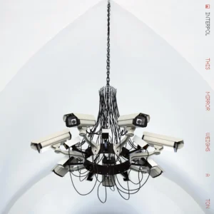
Interpol have announced their eighth studio album, This Mirror Weighs a Ton. Arriving on August 28, the follow-up to 2022’s The Other Side of Make-Believe marks their debut release with Partisan Records. The band has also shared two songs from the album, the slow-burning title track and ‘See Out Loud’, the latter of which features guitarist Daniel Kessler’s first vocal since Turn on the Bright Lights‘ ‘PDA’. Take a listen below.
This Mirror Weighs a Ton was recorded with producer Andrew Wyatt at his downtown Manhattan studio. Dave Fridmann mixed the album, whose cover artwork features an Addie Wagenknecht piece currently held in the Whitney’s permanent collection.
“I wondered what it would be like to keep the parts perfectly legible, because everyone in that band writes such great parts, and to add some different spatial dimensions to it,” Wyatt said in a press release. “It was something almost a little bit more like chamber music — the musical ideas bear scrutiny without needing the sonic treatment of it to carry all the weight. It was also nice to add a trick or two I picked up over a couple decades of making pop records.”
Kessler commented, “I was right next to Andrew when he started doing these incredible things with the sound design, and it was just so exciting. I remember thinking, I don’t have context for what kind of music this is — these big crashes happening before Paul even had a vocal. Logic would have said maybe this is an instrumental. Then Paul just got up, went into the back room and started singing those melodies — and suddenly it was clearly not going to be.”
This Mirror Weighs a Ton Cover Artwork:
This Mirror Weighs a Ton Tracklist:
1. This Mirror Weighs a Ton
2. See Out Loud
3. Iron City
4. Wounded Soldier
5. Wings On Fire
6. Ever The Actor
7. So Rides The Reindeer
8. Darling Thoughts
9. Wake Up
10. Enemy
11. Bird and The Serpent
12. Sudden
Chappel Roan’s ‘Pink Pony Club’ is one of those songs that is instantly recognisable from the first few bars. You probably throw your hands in the air and head to the dancefloor as soon as you hear those familiar dulcet tones announcing ‘I know you wanted me to stay’.
After all, this song is as lovable asChappell Roan herself, and like Roan with her striking style and self-assured uniqueness, it also speaks broadly to a generation who just want to be themselves.
Interestingly, though, the song was far from an overnight success. In this article, we’re going to deep-dive into the song’s history and themes, as well as asking one key question – how exactly has it managed to capture the hearts of an entire generation? Keep on reading as we explore!
Understanding the Song’s Origins
You only need to glimpse the video for Pink Pony Club to get a feel for its LGBTQ vibes and fabulous message, but what exactly are the song’s origins? Well, it all started when Roan first visited a gay bar in West Hollywood, where she saw firsthand a level of self-acceptance that she’d simply never experienced before that point. Interestingly, though, Roan used the inspiration of a hot pinkstrip club in her hometown of Missouri as the stylish backdrop for the song that we’ve all seen in the video. But what about those heavy synth tones and iconic pop layers, which Roan’s label at the time actually dissuaded her from using? Well, that’s self-explanatory, isn’t it? When better to be yourself than when getting lost in a pop power ballad that makes you want to reach right for your hairbrush?
Why wasn’t it an Immediate Hit?
As mentioned, Pink Pony Club might have made its fame after the release of Roan’s debut studio album ‘The Rise and Fall of a Midwest Princess’, but its history spans way back to April 2020, when, we’ll be honest, it didn’t immediately reach a huge audience. This was due to a few unfortunate issues, the majority of which stemmed from Roan’s label at the time, Atlantic Records, which resisted the song for around a year, and then dropped Roan shortly after its poorly timed release. It’s also fair to say that the world might just not have been ready for an empowering pop anthem of this degree back then. Thankfully, five years later, the truth couldn’t be more different.
What we Love About Pink Pony Club in 2026
Three years on from a second release that still didn’t exactly take the charts by storm, Pink Pony Club has been streamed well over a million times on Spotify. More than that, there’s a strong argument that this is the empowerment anthem of our generation. Not only does it perfectly capture the supportive, sassy self-acceptance that we could all do with practising right now, but it’s also paved the way for a new musical era, complete with unashamed synthesisers, power pop vibes, and a sound that really is irresistible!
Macarena Rojas was born in 1985 in Lima, Peru. She studied Architecture at the Universidad Peruana de Ciencias Aplicadas and subsequently transferred to the Communications Department, where she graduated in 2009. In 2012 she did the General Studies in Photography Program at the International Center of Photography in New York and in 2017 she received her Masters in Fine Arts at The Royal College of Art in London. Her work has been exhibited in Black Box Projects Cromwell Place London (2022), Crisis Galería Lima (2019), Art Lima (2018), Museo AMANO Lima (2018), Camden Arts Center London (2017), Edinburgh College of Art (2016), Museo de Arte Contemporáneo Lima (2016), ArtBo Bogotá (2016), Museo Nacional de Bellas Artes, Santiago de Chile (2014), Wu Galería (2014-2015), International Center of Photography New York (2012), Triskelion Arts New York (2013), amongst other public and privately held exhibitions.
She lives and works in Lima.
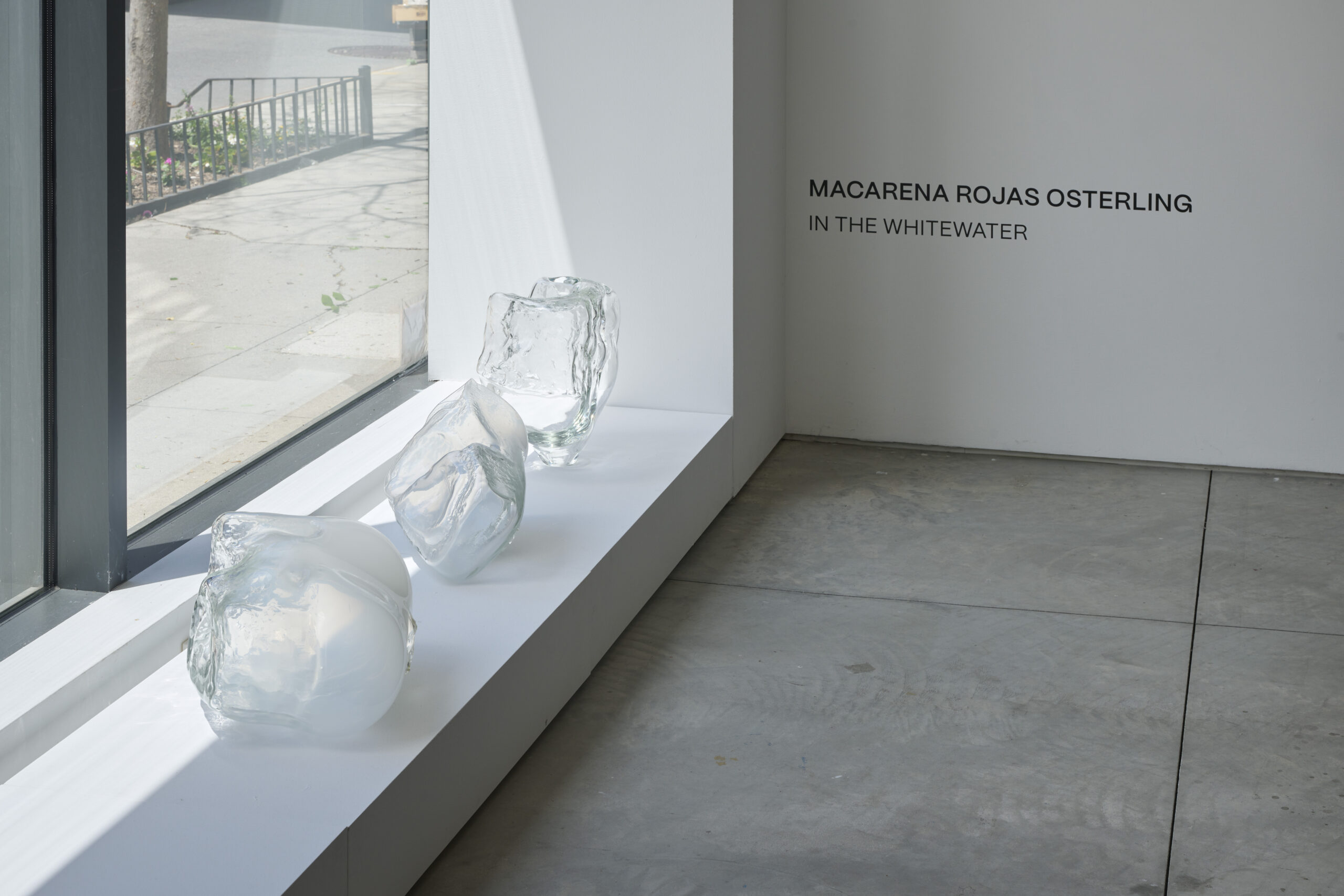
Rojas Osterling’s work can currently be viewed in Look How Brightly, a group exhibition at London’s Britannia Row curated by Jenn Ellis and Alex Mills, which brings together artists whose practices interrogate questions of identity, absence and presence, fragmentation, and transcendence. Osterling’s solo exhibition In The Whitewater is currently on view at Praxis in New York through July 10, unfolding a body of work that moves between pressure and release, where forms seem to dissolve and re-emerge in shifting states.
You were based in the UK for many years before returning to Peru. How has being in your home country affected your artistic practice?
I was based in the UK for many years — I did my master’s at the RCA — and honestly I still feel like I’ve only just returned home. I think the thing I’ve valued most about being back in Lima is having the Pacific Ocean five minutes away from me. In many ways, I think the ocean completely infiltrated the newer works.
It probably drew me toward the glass sculptures first. They appear very different from the drawings because they’re pristine, almost clinically clean — no scratches, no visible chaos — but the process itself is actually incredibly intuitive and messy. Even when I’m trying to extract or hold a very specific gesture of water, the making process involves surrender and unpredictability.
The same happens in the collage paintings. They carry traces of sand, salt, erosion, water damage… The papers almost feel as if they’ve been submerged in the ocean for years. There’s a fragility to them that interests me a lot.
I think returning to Peru affected the newer works more directly. The drawings are different because drawing is something I’ve done my entire life. They almost transcend geography for me. They mutate in language, density or form, but the impulse behind them remains very constant wherever I am.
Photo credit: Claire Esparros
Your art expresses and embraces the effects of ADHD, and the chaotic nature of motherhood. What has it meant for you to make work that reflects the way your mind actually functions?
Motherhood was a difficult experience to process, especially with a brain like mine, which really struggles to compress information into simple conclusions. I always feel I have too many answers to everything. My mind doesn’t work in straight lines — everything becomes slightly labyrinthine, slightly contradictory. I tend to see things in shades of grey.
For a long time, I was insecure about speaking openly about the way my mind functions because I carried this almost stereotypical ‘Latin American artist complex’ — this feeling that I should be speaking about something more politically urgent or externally important. I felt guilty making work that was so rooted in my own inner life.
But at the same time, I’m a very instinctive and honest artist. I don’t really know how to make work about subjects that don’t genuinely belong to me emotionally. I can research something intellectually, of course, but art for me is much more visceral than that. I need to feel some kind of authorship over the experience.
Eventually I realised that the personal isn’t isolated from the collective. The way we think, fracture, parent, fail, obsess, or experience overwhelm is shared by many people. So at some point I stopped resisting it. Speaking about motherhood, ADHD, chaos, fragmentation — it ended up feeling like the most natural thing I could make work about.”
I love how your art embeds everyday fragments like grocery lists, notes or your children’s writing. The work becomes a very genuine mosaic of your life. What do those personal elements represent to you?
They’re traces of a very specific moment in time. Grocery lists, children’s notes, ticket stubs, reminders — as banal as they may seem — are actually part of the psychological landscape I was living inside of.
For me, they reflect the day-to-day reality of a mother’s brain, especially during those years of raising young children, where everything is happening simultaneously. You’re trying to work, parent, organise, remember, survive emotionally… all at once. The boundaries between creative life and domestic life completely collapse.
It’s funny because I think many mothers probably experience this mentally — corporate mothers answering emails while managing ten invisible layers of thought at the same time — but in my work it becomes very visual and exposed.
A lot of these drawings were also made while navigating separation, moving countries, midlife, exhaustion, and transformation. So the works become accumulations of thought, memory, anxiety, logistics, affection, language… all compressed into one surface.
What interests me is precisely that rawness. I want the work to remain immediate, and deeply connected to the moment I’m living through. Even the most ordinary human experiences can carry enormous emotional weight.
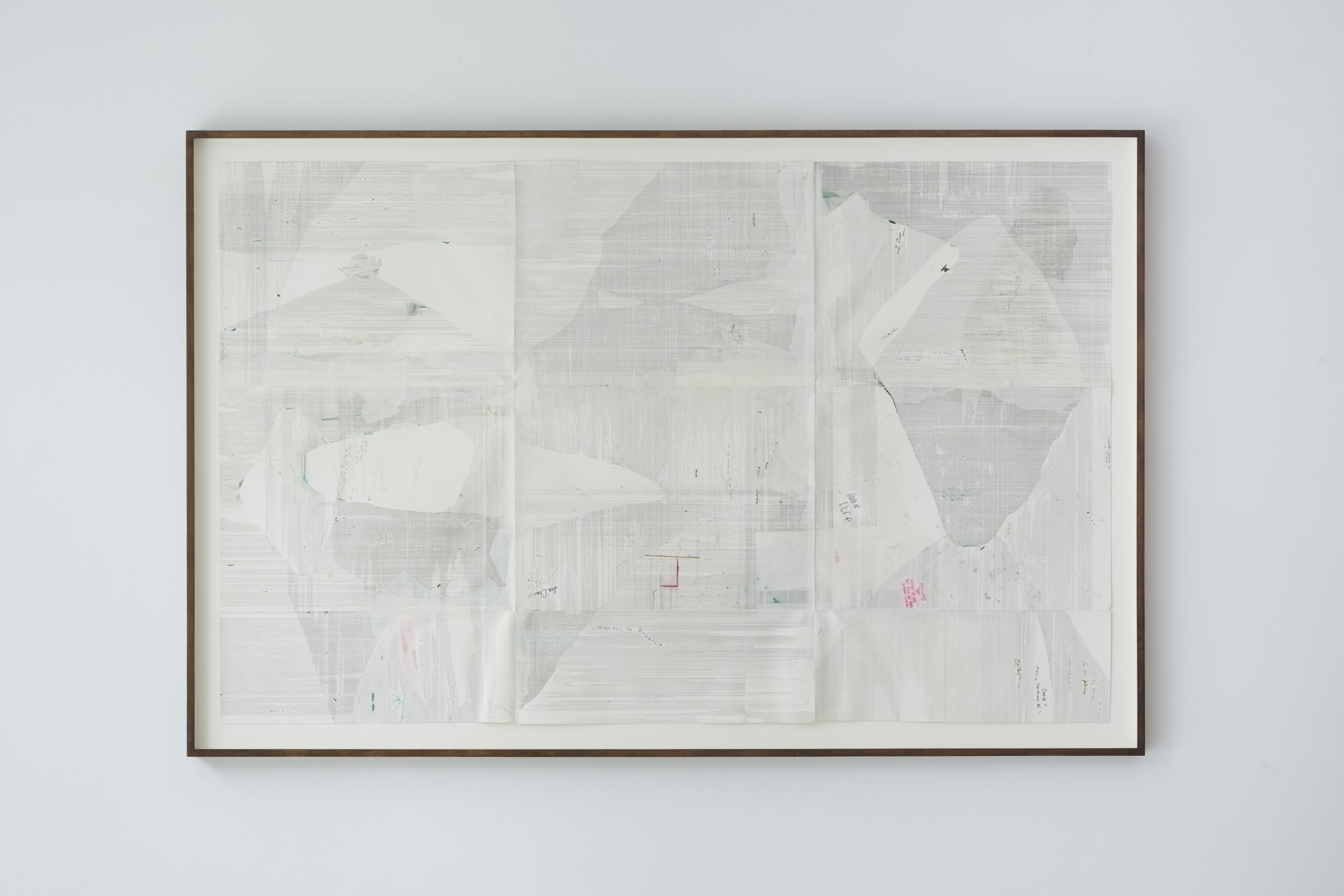
Shapes of the Whitewater III by Macarena Rojas Osterling, 2026 Drawing on Paper 45 x 71.5 inches (114.3 × 181.6 cm) Framed in stained wood, optium Photo Credit Ian Tong
On the other hand, works like La Muna feel like almost like an architectural representation of your mind – sequences, data… Parts of it look like something out of an ECG printout. Does the act of that visual mapping bring relief?
That’s a very interesting question because I’ve often felt there are certain expectations placed on Latin American artists — almost preconceived ideas about what our work should look like, what subjects we should address, even what emotional or visual language we should use.
But interestingly, I think my attraction to systems, sequencing, repetition, mapping, and structure comes precisely from growing up surrounded by instability. Part of that was personal — my own family dynamics — but part of it was also the experience of growing up in Peru during a very unstable period. There was terrorism, hyperinflation, unpredictability. You never really knew what was coming next, economically or emotionally.
So in many ways, these works are probably a response to that. The grids, the data-like structures, the almost architectural mapping of thought… yes, I think they do bring a certain sense of relief or containment. When you grow up surrounded by chaos, you become very attracted to systems that can organise, predict, measure, or hold experience together.
What interests me is that this impulse coexists with a very emotional and intuitive practice.
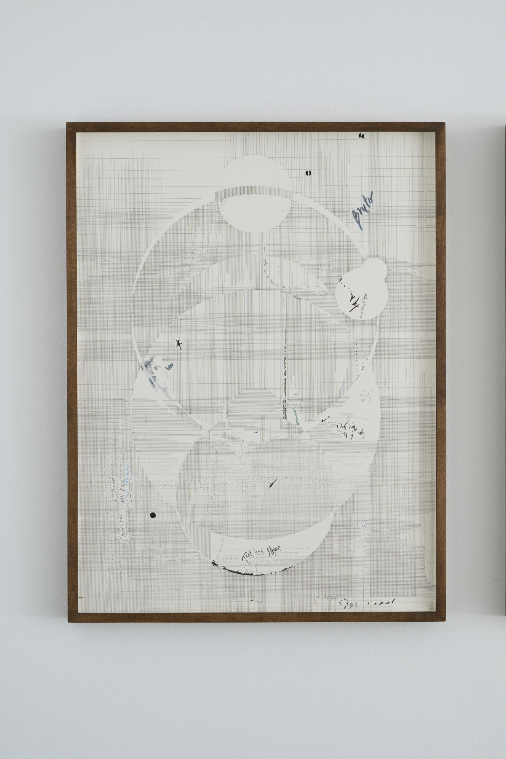
La Muna II by Macarena Rojas Osterling, 2026 Drawing on Paper 18×24 inches (46×61 cm) Framed in stained wood, optium Photo Credit Ian Tong
Many people experience competing thoughts or unfinished tasks as obstacles to productivity, but you’ve transformed those experiences into the artistic process itself. When did you realise that these interruptions weren’t something to work against, but could actually become the work?
I think I really began embracing chaos during my MFA. At that point I realised it was impossible to operate under the same conditions as many of my peers. I was a very young mother, and I simply couldn’t stay for every lecture, attend every opening, socialise constantly, or fully immerse myself in the art world ecosystem because I had a child waiting for me at home. At first, that felt like a limitation and even a kind of failure.
But eventually I understood that making art for me wasn’t optional: I’ve never really known myself without making work. So instead of trying to separate my life from the practice, I intuitively started absorbing all of it into the work itself: my son, exhaustion, fragmentation, interruptions, emotional overload, unfinished thoughts. At some point I stopped seeing those interruptions as something preventing the work and realised they actually were the work.
I think motherhood also changed my relationship to honesty as an artist. Before that, I still felt pressure to speak about subjects that perhaps seemed more intellectually or politically legitimate. But becoming a mother made me realise that the experiences closest to us can also contain enormous complexity and universality. It suddenly felt much more honest to speak about emotional overload, vulnerability, domestic chaos, attachment, and the fragmentation of everyday life. As my children have grown older, the work has evolved beyond motherhood itself into broader emotional experiences, but the core idea remains the same: the more honestly we speak about our inner lives, the more other people recognise themselves inside the work.”
Your glass works appear very different from the density of the drawings. What drew you toward glass as a material?
I had been wanting to portray water for a very long time, and I felt the drawings had certain limitations in terms of capturing that physicality. Glass suddenly allowed me to hold gestures of water in a much more spontaneous way. The result was actually quite unexpected because it was my first time working with the material, but I love that many people read the sculptures almost as ice fragments or frozen water formations. Even when people don’t consciously think about the ocean, they still emotionally connect the works back to water, which feels very meaningful to me.
I also think the glass works operate almost like a form of breathing space in relation to the drawings. The drawings are psychologically dens. Sometimes I need relief from that intensity myself, which is probably also why I started making the collage works and more spatial pieces. The glass introduces silence and pause into the practice while still speaking about fragility and instability I guess.
Installation view of In The White Water at Praxis, May 7 July 10, 2026 Photo Credit: Ian Tong
Are there any exhibitions or artists that have nourished you creatively lately?
I’ve recently been very inspired by the work of Jacqueline Qiu and Elise Peroi. Both are weavers, and you can feel the final work is very intuitive, and the thread has a life of its own.
It’s interesting because people often become confused by my drawings. Some think they’re textiles or thread rather than drawings because the way I build surfaces is so repetitive and layered that it almost resembles weaving. So I think I’m naturally attracted to weaving as a medium.
Beyond visual art, reading nourishes me creatively a lot. Recently I’ve been very immersed in the writing of Rachel Cusk. I’m deeply drawn to confessional literature and to writers who can transform emotional experiences — especially around relationships, identity, motherhood, or separation — into something intellectually sharp but still vulnerable. I think I connect very strongly to middle aged female writers in general because we are all going through a bit the same.
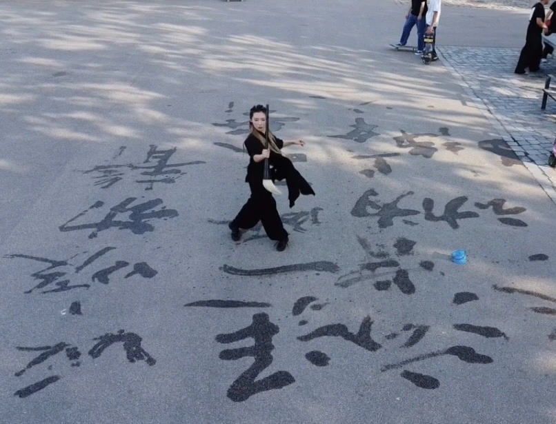
At first, it is not entirely clear whether Jiaying Gao is writing or dancing. A long brush touches the floor. Water darkens the surface for a moment. A line appears, lengthens, thickens, trembles, and begins to vanish. The dancer’s body follows the brush, or perhaps the brush follows the body. What begins as calligraphy gradually becomes choreography; what looks like writing soon becomes drawing, painting, breathing, and remembering.
This ambiguity is one of the work’s strengths. Gao does not simply combine dance and calligraphy as two separate art forms placed beside one another. Rather, she turns writing itself into a choreographic event. Each stroke is produced not only by the hand, but by the whole body: the rotation of the torso, the transfer of weight, the suspension of breath, the pressure of the feet against the floor, and the controlled release of force through the arm into the brush. The result is not calligraphy accompanied by dance, but a choreography of inscription.
In Vapour Words Disappear, Gao performs with water and brush on the floor, creating an ephemeral script that never settles into permanence. Some marks resemble Chinese characters; others dissolve into abstract strokes, curves, pools, and fading traces. At moments, she writes large characters with the solemn concentration of a scholar; at others, she draws with the intuitive freedom of a painter. Yet the work never becomes simply a demonstration of calligraphic skill. Gao keeps a precise distance from the marks she makes. She does not illustrate language. She approaches it, withdraws from it, circles around it, and lets it disappear.
The most compelling moments occur when the marks become difficult to read. Some do not look fully like words, Chinese characters, or paintings. They hover between script and image, between linguistic sign and bodily trace. This illegibility is not a weakness, but one of the work’s most generous gestures. It allows writing to be experienced beyond language, as pressure, rhythm, density, direction, and disappearance. For viewers who cannot read Chinese, the work remains open: not as a text to be decoded, but as a physical and atmospheric event.
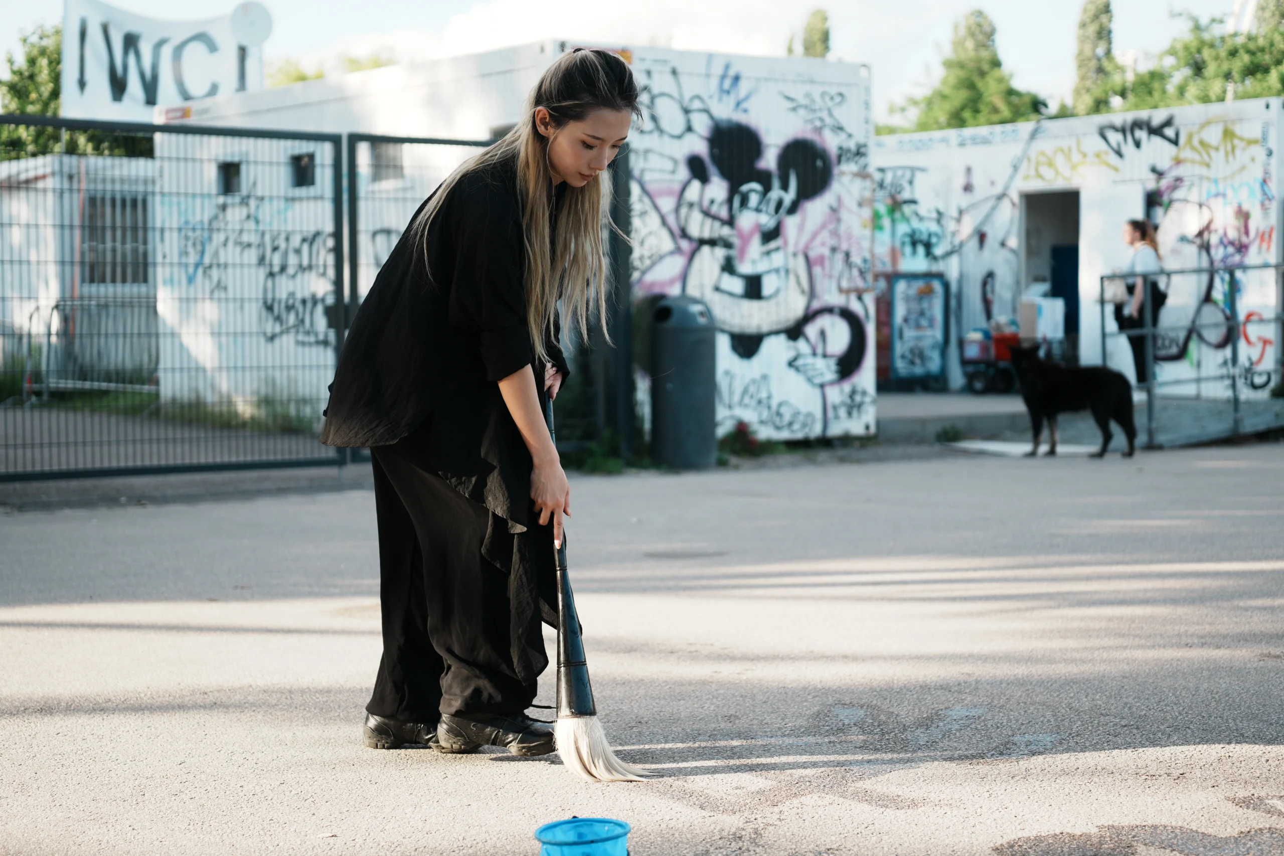
This openness gives the floor a strangely pictorial quality. It becomes less a writing surface than a landscape. Like ink in Chinese painting, the water creates an ambiguous spatial field: near and far, full and empty, visible and fading. There is no colour, and yet one senses tonal variation. A saturated stroke feels close, almost bodily; a drying trace recedes, becoming pale, atmospheric, nearly unreachable. The work produces depth not through perspective, but through disappearance.
Sound plays an unexpected role. When the brush is newly filled, the stroke is smooth and quiet, almost liquid. But as the water begins to run out, friction starts to speak. The brush scratches against the floor; the stroke becomes hollow, broken, no longer full. One hears the dryness before one fully sees it. The material condition of the brush changes the movement, and the movement changes the meaning of the writing. Gao does not conceal this depletion. She performs it.
This attention to friction gives the work a tactile intelligence. The audience is not only watching the line; they are sensing its resistance. The floor is no longer a neutral stage but an active surface, one that receives, absorbs, refuses, and erases. In this sense, the work changes how dance is watched. Attention moves between the dancer’s body and the trace it leaves behind, between the gesture and its afterlife, between movement and the floor’s slow return to emptiness.
The work’s tempo is equally subtle. At the beginning, one might expect the whole performance to unfold slowly, in a meditative rhythm. But Vapour Words Disappear has its own inner pulse. Sometimes Gao moves with extreme slowness, allowing the audience to watch the stroke grow wider and wider beneath the brush. At other times she accelerates, moving faster than the water can hold. The trace cannot always keep up with the body. The gesture arrives, but the mark is already failing. The dance becomes a negotiation between intention and evaporation.
The atmosphere of the space becomes part of that negotiation. In warm conditions, the words disappear quickly. Heat, air, humidity, and floor texture become quiet co-performers, determining how long each mark can survive. Gao’s authorship is therefore never absolute. Each word is made in collaboration with the environment, and each disappearance is partly choreographed by the room itself.
Because the weather is warm, the words vanish almost as soon as they are formed. This gives the performance a quiet urgency. Gao repeatedly attempts to write a large word, but the act is always threatened by its own disappearance. There is something almost Sisyphean in this effort: the repeated return to the floor, the refilling of the brush, the attempt to write again what cannot remain. Yet the work is not tragic in any simple sense. Its repetition becomes remembrance, resistance, and release. The point is not to preserve the word, but to inhabit the time of its appearing.
The work reveals Gao’s calligraphic skill, but it also reveals something more internal than technique. The brushwork carries the memory of training: control of weight, wrist, breath, centre, rhythm, and force. At the same time, it exposes the instability of all such control. A stroke may begin with authority, then fracture. A character may appear legible, then turn into mist. The performer’s discipline is visible precisely because the medium refuses permanence.
Although Gao evokes the image of the scholar-calligrapher, she does not simply reproduce a traditional literati practice. She relocates it through the dancing body, through public space, and through a contemporary performance vocabulary. What might historically be associated with the solitary, often masculine figure of the calligrapher is here reworked through embodied authorship, breath, labour, and exposure. Tradition is not presented as heritage to be preserved intact, but as a practice to be tested through movement, disappearance, and relation.
There is a strong sense of breathing throughout the work. The words breathe. The dancer breathes. The floor seems to inhale and exhale through moisture and dryness. Presence and absence are not opposites here, but phases of the same movement. A stroke appears, expands, thins, evaporates. The body returns. The brush is refilled. Another mark begins. The work quietly evokes a yin-yang logic: fullness and emptiness, memory and forgetting, action and erasure, expression and silence.
As the performance continues, the audience’s attention shifts from what is written to when it disappears. One begins to watch time itself. When will Gao return to the place where the first word has already vanished? When will the brush need water again? When does a stroke stop being a word and become only a trace? These questions make the work almost meditative, not because it is still, but because it trains perception. The audience is invited to notice the smallest transformations: a dark line becoming grey, a wet surface turning matte, a gesture outlasting its material evidence.
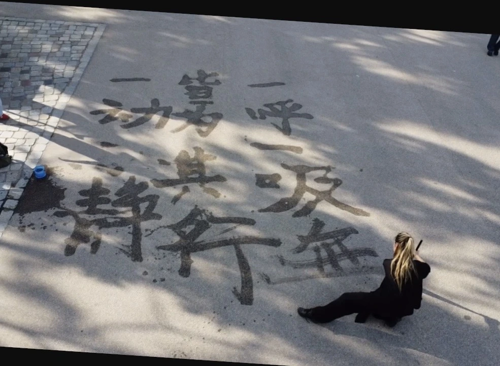
At certain moments, audience members come forward and write their own words on the floor. Some use Chinese; others write in different languages. The surface gradually becomes a collective script, a place where people leave what they want to say, or perhaps what they cannot say elsewhere. Yet every contribution shares the same fate. It will dry, fade, and disappear.
Here the floor becomes a temporary archive of private utterances. It is an archive without storage, a record that refuses to remain. Its value lies not in preservation, but in the shared act of release. The audience does not merely observe the work; they enter its fragile economy of appearance and disappearance. Their words are held briefly by the floor, then returned to air.
This gives Vapour Words Disappear a quiet politics of erasure and memory. Beneath its meditative surface, the work asks what kinds of language are allowed to remain, what forms of expression vanish before they are recognised, and how memory might persist even when material evidence has disappeared. It is a question that extends beyond calligraphy. What do we remember when we express ourselves? What do we remember when we dance? What remains when a temporary art form leaves the space almost exactly as it found it?
By the end, what remains is not the word itself. Nor is it the completed image of writing. The floor is almost clean again, as if the performance has performed a kind of spiritual and visual cleansing. Yet something has shifted. The traces may have vanished from the surface, but they linger in the eye, the ear, and the body of the spectator. Perhaps they have already vapoured into memory. Perhaps that is enough.
What is striking about Gao’s work is its refusal to choose between discipline and fragility, tradition and experiment, writing and dancing, visibility and disappearance. Vapour Words Disappear is at once a performance, a painting process, a calligraphic meditation, and a participatory ritual. It leaves almost nothing behind, and yet its disappearance is precisely what gives it force. For a brief time, dancer, water, brush, floor, and audience share the same air. In that shared temporality, the work finds its most delicate and persuasive form.
Fantasy has always been part of human culture, but its function is shifting. What once served primarily as storytelling or entertainment is increasingly becoming a framework for identity, emotion, and even intimacy. As digital culture evolves, fantasy is no longer just something people consume — it is something they actively use to reshape personal experience.
One of the clearest places this shift is visible is in the design of intimacy products.
For much of the past two decades, the industry leaned heavily toward minimalism and discretion. Products were often designed to be neutral, ergonomic, and non-threatening: soft silicone, muted colors, and forms that avoided drawing attention. The goal was to normalize use while still respecting a lingering sense of taboo.
Today, that design language is changing. Increasingly, products are being created not just to function, but to evoke. Sculptural forms, bold colors, and highly stylized aesthetics are becoming more common, reflecting a broader cultural move toward expressive, identity-driven consumption. In this context, intimacy products are beginning to resemble objects of design and storytelling rather than purely private tools.
This shift closely mirrors the rise of online subcultures where fantasy aesthetics have long been central.
Different communities, in particular, have shaped distinct visual and emotional approaches to fantasy. In anime and manga-influenced spaces, designs often emphasize exaggeration and stylization — smooth forms, vibrant colors, and a sense of playfulness. In furry communities, the focus tends to be on anthropomorphism and emotional connection, blending human and non-human traits in ways that emphasize identity exploration. Meanwhile, RPG and Western fantasy traditions often draw from mythology and monster lore, favoring textures, asymmetry, and “otherworldly” forms that feel less familiar and more immersive.
These aesthetic differences are not just visual — they shape how fantasy is experienced. Some emphasize comfort and identity, others novelty and transformation. Together, they have helped build a visual language that is now moving beyond niche communities and into broader consumer culture.
There are also measurable signals behind this shift. Online platforms like Reddit, Discord, and niche marketplaces have seen steady growth in communities centered around fantasy design, creature art, and alternative aesthetics. Search interest in terms related to “fantasy-inspired” products and “non-human design” has trended upward over recent years, reflecting a wider curiosity that extends beyond traditional fandom spaces. What was once highly specialized is becoming increasingly visible.
But the deeper shift is psychological.
Fantasy in intimacy is not only about novelty or escapism in the conventional sense. It can also create distance from real-world expectations — particularly those tied to body image, gender roles, and performance. Non-human or creature-inspired designs remove familiar reference points, which can reduce comparison and judgment. Without those benchmarks, the experience becomes less about meeting expectations and more about exploration.
This is part of what makes the trend compelling, but it also raises more complex questions.
If fantasy allows individuals to step outside of real-world frameworks, does it also reshape what they expect from intimacy itself? Does repeated engagement with highly stylized or non-human aesthetics change how desire is formed or expressed? And as these experiences become more immersive, where does the boundary between imaginative play and emotional reliance begin to blur?
These are not necessarily negative developments, but they suggest that the rise of fantasy intimacy is not purely aesthetic. It reflects a broader renegotiation of how people relate to their own desires.
Independent creators and smaller brands have been particularly influential in this space, often drawing directly from internet-native aesthetics rather than traditional product design norms. Instead of prioritizing subtlety, many embrace bold, creature-inspired forms and detailed sculpting that reference mythology, sci-fi, or entirely original worlds.
Brands like JulietToys, for example, illustrate how this approach is entering more mainstream visibility, particularly among companies exploring creature-inspired and fantasy-driven design systems. By focusing on fantasy-driven design systems — including creature-inspired forms and highly stylized collections — they align closely with the visual culture emerging from online communities. In these cases, the product is not just an object, but part of a larger imaginative framework.
Its fantasy products collection reflects the growing appeal of mythology, sci-fi, and creature-inspired aesthetics in intimacy design. This aligns with a broader shift in consumer behavior. Younger audiences, in particular, tend to value products that reflect identity, taste, and narrative context. Across fashion, home design, and digital goods, there is a growing preference for items that feel curated and expressive rather than neutral or purely functional. Intimacy products are increasingly part of that same ecosystem.
At the same time, fantasy itself is becoming more culturally normalized. The aesthetics of games, anime, and digital art are now deeply embedded in mainstream design trends, influencing everything from collectibles to interior decor. As these visual languages become more familiar, their presence in more personal categories feels less surprising.
What is changing is not just what people buy, but how they relate to those choices.
Fantasy, in this context, is less about escaping reality and more about expanding it. It offers alternative ways of engaging with identity, emotion, and desire — ones that are less constrained by convention and more open to interpretation. Whether this ultimately leads to greater freedom, new forms of dependency, or simply a broader spectrum of experience remains an open question.
What is clear is that intimacy, like many other areas of modern life, is becoming more expressive, more aesthetic, and more intertwined with imagination.
Fashion follows a calendar that bears little resemblance to the one hanging in your kitchen. With the first bikini-defrosting of the year, fall campaigns begin colonizing your feed. One minute you’re working on your first sunburn, the next you’re being sold coats the size of studio apartments. Not exactly what you want to see between horizontal sips of a martini and poor SPF decisions. Nobody respects time less than fashion. Except, of course, New York. A ten-minute errand becomes a five-minute errand, even in kitten heels. A run to the closest subway station takes three minutes, even when Google Maps insists on seven. Being late somehow requires arriving early. Even coffee brews faster. Balenciaga understands that rhythm.
But Chanel did too, staging its Métiers d’Art show in a subway station. A slightly bizarre choice, until you remember that Gucci took over Times Square. Too much New York? Try a museum. Louis Vuitton picked The Frick as a gentler alternative. Pick your fighter, just make sure it’s somewhere within Manhattan. The American luxury customer has been in a particularly good mood lately, and the pattern doesn’t really feel accidental. Balenciaga’s version of the city comes in a campaign of three one-minute clips, titled A New York Minute. At the center of it is Sarah Pidgeon, who recently introduced herself to a much larger audience as Carolyn Bessette-Kennedy in Love Story. Behind the scenes is Oscar-nominated filmmaker Celine Song, and Pierpaolo Piccioli’s vision for the label.
The shorts follow Pidgeon through a series of city moments. Taxi rides. Taxi drivers shouting that you forgot your bag. Dry-cleaning runs. Dry cleaners suggesting you’ve forgotten your ticket. Walks that somehow get interrupted by movie scenes. Naturally, there’s a common thread running through all of them. Besides the city’s accelerated sense of time, there’s always a Balenciaga bag in the frame. A Le City here. A Rodeo there. A Le 7 Bowling somewhere in between. Each clip ends with a peek behind the curtain, though there’s more of that over at @keeppprolling, where Pierpaolo Piccioli occasionally swaps creative direction for photography, joined by Monaris and Zora Sicher.
In a crowded casino lobby, most slot games get only a quick glance. A player scrolls, pauses for a second, maybe opens the demo, and makes a decision almost on instinct. Some games look sharp right away. Others feel cluttered or forgettable. It does not take long to decide whether a title deserves more than a few spins.
That reaction is not only about jackpots or stacked bonus features. It is more basic than that. Do the symbols make sense together? Does the music suit the theme, or does it feel random? Does the bonus round feel like part of the same idea, or like something dropped in just to tick a box?
This is why demo mode still has a purpose. A short free session lets you get a feel for the game without pressure. You notice small things. Are the icons clear on a small screen? Does the pace feel comfortable? Does the feature round fit naturally with the base play? Those details matter more than most marketing blurbs.
For players who care about design and atmosphere, a quick test is usually enough. You either fall into the game’s rhythm or you do not. It is usually as simple as that.
Theme Is More Than a Skin
The best themed slots do more than dress a nice image behind the reels. They build a useful and a clear theme with its own palette, pace, logic and style that all match. If a game based on folklore, romance, mystery, or adventure, that same idea should show up through the symbols, the reel animation, the way wins are shown, and the bonus features too. When those parts do not connect well, the game can feel thrown together instead of properly designed.
This matters because slots are read fast. Players do not sit through a long tutorial or a gradual build the way they might with console games like wild hearts and the witcher 3. They pick up the rules by watching the screen. If the theme does not help explain the game, it is only decoration. A good slot uses theme as shorthand for how the whole experience should feel. Even a title as simple as Wild Hearts already suggests a mood, so players expect the reels and feature design to support that feeling from the start.
The First Minute Tells You Whether the Design Holds Together
Symbol Logic and Contrast
Start with the basics: can you tell premium symbols from low-value ones without squinting? Do the wild and scatter icons stand out straight away? Is the background doing too much? Clear visual hierarchy matters, especially on mobile, where ornate artwork can turn readable reels into visual fog. A polished slot gives each important element enough contrast and enough space to breathe.
Paytable language matters too. RTP is an average measured over a large number of plays, not a result you should expect from one short session. That is useful context when you are judging a demo, because the point of those first spins is not to prove what you will win. It is to see how the game communicates its rules, pace, and feature structure.
Sound, Tempo, and Feature Cadence
Audio often decides whether a theme feels complete. Good sound design creates a pulse without bullying the player. A light romantic theme should not sound like a combat game. A darker title should not celebrate small line wins with the same blast it uses for a major feature. During demo play, you notice fast whether the soundtrack supports the setting or simply fills silence.
Pace matters just as much. Some slots rush from spin to spin with no room to absorb the result. Others drag. The most satisfying titles find a middle ground, where animation adds tension but does not slow the whole session down. That timing becomes even more important when a bonus round lands. If the transition is smooth, the feature feels earned. If it arrives like a completely different product, the theme breaks.
Why Demo Mode Still Has Real Editorial Value
Demo play is useful because it strips away the pressure to chase a result. When there is no deposit behind each spin, you are freer to notice texture, readability, and flow. That makes demo mode a better test of craft than many marketing pages, which tend to talk about RTP, multipliers, and free spins without showing how the game actually behaves from moment to moment.
A short session with the Wild Hearts demo slot on Betandplay Casino can show more than a list of features ever will. You quickly see how the reels set in motion, how often the wild symbols appears, whether the paytable is easy to follow, and whether the bonus rounds fit feels natural. If that harmony is missing in demo mode, it rarely improves when real money enters the picture.
Mobile Is Where Many Slots Win or Lose Attention
A slot can look strong on desktop screenshots and still feel clumsy on a phone. Touch targets may be too small. Reel windows may crowd the text. Menus may hide the rules behind too many taps. Since so much casual play now begins on mobile, demo mode is the quickest way to spot that friction. If a title is hard to read or awkward to control on a smaller screen, the problem shows up almost at once.
This is also where restraint pays off. Some developers treat every empty corner as a place for sparkles, counters, or side animations. On mobile, that clutter adds up fast. Cleaner layouts tend to age better because they let the theme come through without drowning the player in motion. Good mobile slot design follows the same principles seen in broader digital product design: clarity, balance, and ease of use matter more than visual noise.
The Small Details That Separate Polished Slots From Forgettable Ones
Look at how the game teaches itself. Are bonus triggers easy to understand? Does the paytable explain side mechanics in plain language? Are the reel stops legible enough that wins feel earned rather than arbitrary? Players do not need academic precision from a casual slot, but they do need coherence. If the game cannot explain its own rules cleanly, the theme loses force.
Then look at what happens after a few minutes. Does the title still feel distinct, or has it already become a blur of generic sounds and interchangeable symbols? Strong slots keep a sense of identity even in ordinary spins. That is usually a sign that the designer cared about more than the headline feature. It means the base game has texture, not just the bonus round. When a game like Wild Hearts is sold as a themed experience, the reels and feature flow should make that identity clear without extra explanation.
What Good Themed Slots Borrow From Other Culture Formats
The best modern slots often take cues from film, pop art, and mobile game design without simply copying them. They use poster-like framing, album-style colour, and the kind of quick pacing people expect from short mobile games. That mix helps themed slots still feel current, even in a crowded market. They are not just gambling products. They are small pieces of digital entertainment, competing for attention with everything else on the screen.
That is also why players notice when a slot feels cheap. A weak theme reads like filler because people are now used to polished visual systems everywhere, from streaming apps to mobile games. A good themed slot respects that standard. It gives the player a clear mood, a readable interface, and a bonus structure that belongs to the same world as the reels.
First Impressions Still Count
Demo slots stay useful because they help players judge feel before they judge outcome. The first few spins tell you whether the symbols make sense, whether the sound is doing real work, and whether the feature design fits the theme. That is enough to separate a thoughtful title from one that relies on surface flash.
For readers who move between games, apps, art, and music with the same eye for presentation, that test remains worthwhile. A slot does not need to shout to be memorable. It needs to know what it is, and every part of the screen has to support that answer.