In this segment, we showcase the most notable albums out each week. Here are the albums out on July 8, 2022:
Burna Boy, LOVE, DAMINI
- Listen / Buy

- Spotify
- Apple Music
- Physical
 Nigerian star Burna Boy’s new album, LOVE, DAMINI, has arrived via Atlantic Records. The 19-track LP features collaborations with Ed Sheeran, J Hus, Popcaan, Blxst and Kehlani, J. Balvin, Khalid, Victony, and Ladysmith Black Mambazo. “That’s how I like to sign all my letters, because I didn’t know the proper [signoff],” Burna Boy said of the album title in a Billboard interview. “It’s a bit personal [because] it’s bringing you into my head on my birthday — when you turn 31 and ain’t got no kids, everything is going good and bad at the same time. You reflect and then you get as lit as possible. Then you sleep and wake up and reflect again. I’m reflecting on everything — what I’m doing and what’s happening where I’m from. Where I’m from is a part of where I’m going.”
Viagra Boys, Cave World
- Listen / Buy
- Spotify
- Apple Music
- Physical
 Viagra Boys have returned with their third album, Cave World, out now via YEAR0001. The album follows 2020’s Welfare Jazz and was produced by Pelle Gunnerfeldt and DJ Haydn. Ahead of its release, the Stockholm post-punks previewed the LP with the songs ‘Punk Rock Loser’, ‘Ain’t No Thief’, and ‘Troglodyte’. Cave World is “inspired by current events,” according to press materials, aiming “to tear through the insanity and confusion the world currently finds itself in.” Singer Sebastian Murphy said in a statement: “I just wrote down, ‘Who is the true ape?’” Murphy also added in a statement. “People look down at apes as primitive life forms, but we’re just this horrible, lazy society killing each other and starting wars, while they’re able to love and feel. Does that make them the true ape or us?”
Metric, Formentera
- Listen / Buy
- Spotify
- Apple Music
- Physical
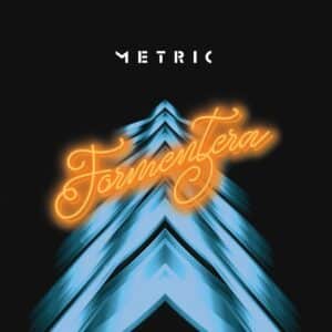 Metric have released a new album called Formentera. It marks the band’s eighth album, following 2018’s Art of Doubt, and includes the previously unveiled singles ‘All Comes Crashing’ and ‘Doomscroller’. In an interview with NME, frontwoman Emily Haines described Formentera as “probably the most important record that we can make other than our first album.” She explained: “Logistically, we could not get our band across the border and that was the longest we’ve gone without playing a show since we started. There was a sense that this could actually be it – a lot of people are not going to bounce back in our industry. There’s always a sense of urgency [when making a record], but it was really pronounced and the sense that we have to manifest our way out of this, it’s all we can do.”
Brent Faiyaz, Wasteland
- Listen / Buy
- Spotify
- Apple Music
- Physical
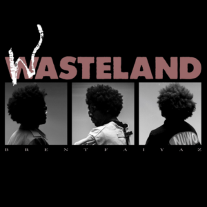 Brent Faiyaz has a new album out called Wasteland. Released via his own label Lost Kids, the Grammy-winning singer’s proper follow-up to 2017’s Sonder Son boasts guest appearances from Drake, Tyler, the Creator, Alicia Keys, Raphael Saadiq, and Tre Amani, while Jonathan ‘Freeze’ Wells serves as executive producer. Jordan Waré provides string arrangements and production on several of the record’s 19 tracks, with additional contributions from The Dream.
Katy J Pearson, Sound of the Morning
- Listen / Buy
- Bandcamp
- Spotify
- Apple Music
- Physical
 Katy J Pearson has issued her new album, Sound of the Morning, via Heavenly Recordings. The follow-up to the singer-songwriter’s 2020 debut Return was written and recorded in late 2021 and was co-produced by Ali Chant and Dan Carey. The singles ‘Talk Over Town’, ‘Alligator’, ‘Game of Cards’, and ‘Float’ preceded the record. “I want people to feel things with my music, but I don’t want to cause my listener too much trauma,” Pearson said in press materials. “Counselling is expensive, so you’ve got to pick your battles…”
Party Dozen, The Real Work
- Listen / Buy
- Bandcamp
- Spotify
- Apple Music
- Physical
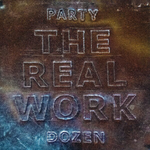 Party Dozen have put out their third album, The Real Work, via GRUPO/Temporary Residence. It follows the Australian noise-rock band’s 2020 record Pray For Party Dozen and marks the first Party Dozen album to feature anyone besides the core duo of saxophonist Kirsty Tickle and percussionist Jonathan Boulet; Nick Cave contributes vocals to the previously shared track ‘Macca the Mutt’. The band also released ‘Fruits of Labour’, The Iron Boot’, and ‘The Worker’ ahead of the release.
Wu-Lu, LOGGERHEAD
- Listen / Buy
- Bandcamp
- Spotify
- Apple Music
- Physical
 Wu-Lu, the project of south London-based artist Miles Romans-Hopcraft, has dropped his new album LOGGERHEAD via Warp. The record features collaborations with Asha, Lex Amor and Léa Sen, as well as contributions from Ego Ella May, Morgan Simpson (black midi), Demae, and Mica Levi. It was previewed with the singles ‘Blame’, ‘South’, ‘Scrambled Tricks’, and ‘Times’. “I’ve had a sharp turning point over the last few years. I’m going to express myself rather than holding it in,” Wu-Lu said in press materials. “When I say ‘Loggerhead’, I mean me. It’s a mono feeling, insular. It’s internal.”
Quinton Brock, My Shadow
- Listen / Buy
- Spotify
- Apple Music
 My Shadow is the debut full-length by the Buffalo-bred, Brooklyn-based artist Quinton Brock. Out now via Shadow Panther, the 17-track album features guest appearances from Portugal. The Man., Travie McCoy, and Pink Siifu. Brock, who cut his teeth with the surf/blues rock duo The Get Money Squad, shared a string of singles prior to the release of the LP, including ‘To The Moon’, ‘There For You’, ‘Touch’, and the title track.
Other albums out today:
Caterina Barbieri, Spirit Exit; Laura Veirs, Found Light; Wormrot, Hiss; NoSo, Stay Proud of Me; James Bay, Leap; Delicate Steve, After Hours; BERRIES, How We Function; Mush, Down Tools; Journey, Freedom; Spiral Stairs, Medley Attack!!!; Antti Tolvi, Spectral Organ / Feedback Gong; Maxim Mental, Make Team Presents Maxim Mental in Maximalism; Fireground, Dreams; Flowertown, Half Yesterday; Ian Daniel Kehoe, Yes Very So; Rae Morris, Rachel@Fairyland; Alice Cohen, Moonrising.
 I’m The One Who Loves You’")